Content may contain affiliate links. When you shop the links, I receive a small commission at no cost to you. Thank you for supporting my small business.

Greige paint colors remain an incredibly popular and versatile choice of paint color in 2024. If you’re looking to refresh a room (or your whole house!) then you’re going to want to see this list of the best greige colors by Sherwin Williams and Benjamin Moore.
What is Greige?
Simply put, gray + beige = greige. If you love gray paint colors but find them tricky (those dark blue/green/purple undertones!) then greige is probably the perfect choice for you.
Greige paint colors are so popular for interiors because of their versatility and their ability to work with so many color schemes. Thanks to their warm undertones, they work in a variety of lighting conditions, too.
They are, in my opinion, the perfect neutral that will work in any home.
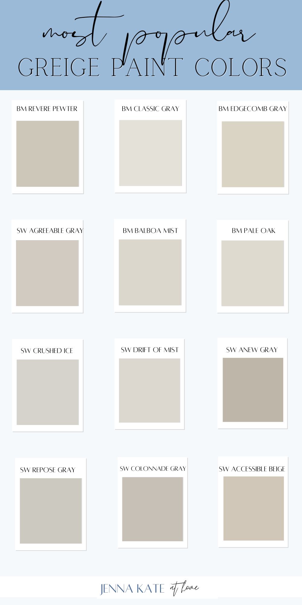
1. Benjamin Moore Revere Pewter
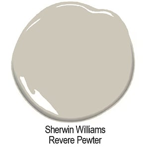
Benjamin Moore Revere Pewter has been a very popular greige paint color for many years now. With an LRV of 55, I’ve personally, I’ve always found it a little dark and muddy, especially in low-light rooms, but it’s one of those colors that actually looks much better on the whole wall than when you just paint a swatch.
I really do think it works best in rooms with lots of bright light, as it is not a light and bright paint color. It’s also a great choice for kitchen cabinets and dining rooms, serving as the perfect backdrop for various decor styles.
2. Benjamin Moore Classic Gray
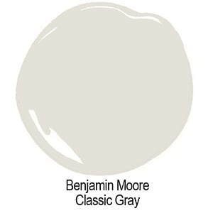
BM Classic Gray OC-23 is a beautiful light color. If you want to make your room feel light and airy, this is a great choice to both brighten and warm up any space. It is one of my favorite greige colors and one I recommend time and time again.
Depending on the light, it can skew more gray or considerably warmer, much like many greiges in this category. In a room with a lot of warm light, that beige undertone will become more apparent, in an east-facing or north-facing room, the gray undertone will be more pronounced.
Classic Gray has an LRV of almost 74, making it an off-white paint color. It’s one of my top choices for a light and bright look, perfect for creating a space feel open and welcoming.
3. Benjamin Moore Edgecomb Gray
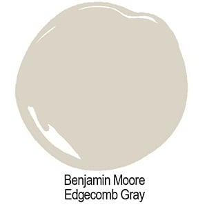
Dare I say the perfect greige paint color? BM Edgecomb Gray HC-173 is light enough to feel airy, but still has enough saturation to make trim pop.
Edgecomb Gray works equally well with light woods, dark woods and the dreaded honey oak. With an LRV of 63, it’s hovering right at that sweet spot of the perfect saturation…not too dark and not too bright!
Skip the paint chips, order REAL samples!
Skip the paint chips from the store that are an inaccurate representation of the true color of a paint. Don’t clutter your house with a gazillion messy paint samples. Instead order my favorite peel-and-stick paint samples (real paint!) from Samplize.com. Order today and have them tomorrow!
4. Sherwin Williams Agreeable Gray
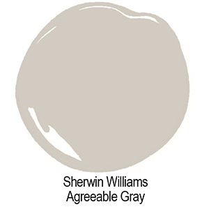
In my opinion, Agreeable Gray is one of the cleanest greige paint colors with virtually no unwanted undertones. This is why the color tends to coordinate with almost everything.
Agreeable Gray has an LRV of 60, making it a lighter greige – light enough so it doesn’t take over the room yet still has enough contrast against white trim. A really great choice for a light and airy/beachy/fresh feel.
Not only does Agreeable Gray make for a great wall color (or whole house color) but it looks stunning on cabinets, too.
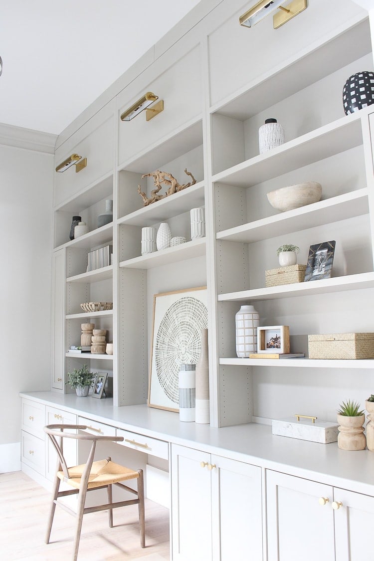
5. Benjamin Moore Balboa Mist
Balboa Mist is a beautiful shade of greige that looks particularly good in bright rooms with crisp white trim.
It has an LRV of 62, making it nice and brighten but still with enough saturation that it won’t look washed out.
Balboa Mist has a teeny tiny bit of a pink undertone, but it’s really passive and barely noticeable but does help to add that lovely warmth to it. However, if you’re sensitive to pink definitely be sure to sample it in your home before committing.
6. Benjamin Moore Pale Oak
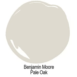
Pale Oak is another popular light greige paint color, but it’s not a great whole-house color due to its many undertones.
In the right light, it’s a beautiful fresh greige. In the wrong light, it can flash its pink-violet undertone which can be very noticeable and unwanted.
Pale Oak has an LRV of 70 (off-whites start at 72) so it can look a bit washed out in a really bright room, but it’s the perfect range for that bright and airy look in less well-lit spaces.
7. Sherwin Williams Crushed Ice
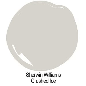
SW Crushed Ice (SW-7647) has become increasingly popular over the past couple of years but isn’t as versatile as some of the other greige colors, due to its pink undertone. Crushed Ice has an LRV of 66.
I’ve personally sampled this color twice, once for my kitchen remodel and then again for my bathroom remodel, and both times I could not get past the violet undertone.
However, I have seen it in other spaces and loved the fresh look it brought to the room.
8. Sherwin Williams Drift of Mist
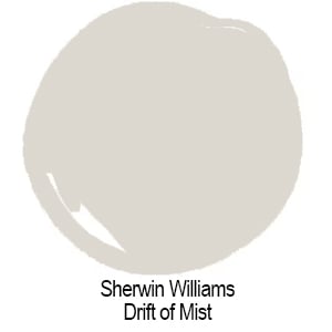
SW Drift of Mist (SW-9166) has an LRV of 69, making it a lovely light paint color. It has a slightly green undertone, similar to Repose Gray, but it can be more apparent.
In my home, the green undertones in this paint color are almost like a pastel green but it is less obvious on a whole wall than when sampling paint colors side by side.
Drift of Mist is a good choice to get that soft gray look in areas that don’t get a lot of natural light. It’s a really nice choice when the majority of your finishes have cool undertones (like below).
I particularly love this color with a coastal palette full of blues, greens and white that also pull in natural wood tones. I think that’s where it really shines, and brings a really soft casual look to a space.
9. Sherwin Williams Anew Gray
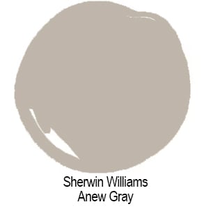
Sherwin Williams Anew Gray is a subtly warm gray that looks its best in a room with south-facing or warm western afternoon light. In darker rooms or those with cooler light, it will lean much more into the gray.
Anew Gray has an LRV of 47, making it a more a of a medium-depth color. I generally prefer colors above an LRV of 60 to maintain that light and airy feeling.
With that being said, if you’re looking for more depth of color for a particular room, perhaps a dining room or office, or you’re pairing this with a half wall of wainscoting, it may be perfect for you!
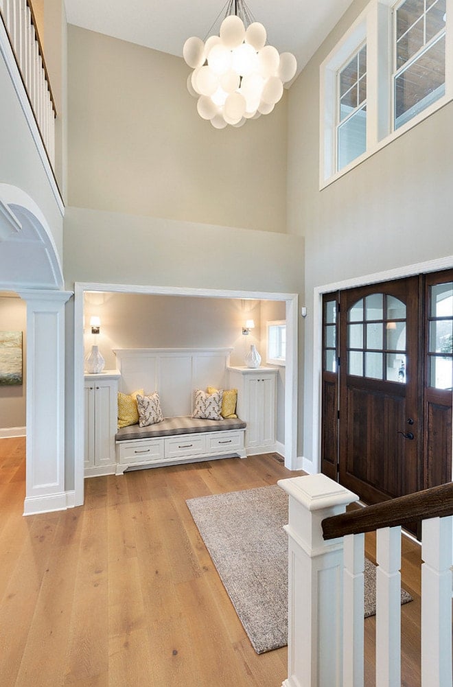
10. Sherwin Williams Repose Gray
Compared to SW Anew Grey above, you can see that SW Repose Gray (SW-7015) is in fact much closer to gray. It’s my favorite of the warm gray paint colors and because SW Repose Gray (SW-7015) is so popular, and works so well in any exposure, I decided to keep it in here.
I’ve used it throughout my home and simply adore it. Here in my kitchen it looks decidedly more gray but in darker spots, the warm tones really come out so that it never looks cold.
Repose Gray has an LRV of 58, and it has both a green and a hint of a purple undertone, depending on the light. Mostly, you will see the green in the shadows while the passive purple can show up in well lit areas.
If you find Repose Gray works for you but it’s not quite as light and airy as you want, consider have it mixed at 50% strength. While I originally had my entire main floor painted Repose Gray, it has since been repainted at 50% strength and it is now my all-time favorite paint color.
11. Sherwin Williams Colonnade Gray
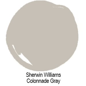
A wonderfully warm and versatile gray. I used SW Colonnade Gray (SW-7641) on our patio bulkhead this past summer and instantly fell in love. It’s a wonderful color for a north facing room, too and really pops against white trim.
With an LRV of 53, I prefer it in really well-lit rooms, but if you want a darker vibe, you can do that too.
12. Sherwin Williams Accessible Beige
SW Accessible Beige has become increasingly popular over the past couple of years, and is definitely one of Sherwin Williams’ top selling paint colors in 2024. It’s a beautiful soft greige with a taupe undertone, and makes a great cabinet and wall color.
It looks beautiful with wood trim as well as bright whites, and its LRV of 58 puts it the sweet spot of colors that do well to brighten up a room, while still maintaining their color and not washing out.
How to Pick The Perfect Greige For YOUR Home
First decide whether you want a light and bright color or a more saturated shade. Research the color online and narrow down your picks to three or four choices.
Paint swatches on large foam board so that you can move it around your room and see how the color changes as the day goes on. You’re looking for any weird undertones that might become apparent in the room.
Luckily, with a greige paint color this should be very minimal as the dominant undertone should be beige/brown.
Light Reflectance Value (LRV)
As I talk about paint colors I always touch on their LRV number. This number is on a scale of 0 – 100, with 0 being pure black and 100 being pure white. This will help give you an idea of how dark or bright a paint color is.
For comparison purposes, a bright white like Benjamin Moore Chantilly Lace has an LRV of 93, while a black paint color like Sherwin William Tricorn Black has an LRV of 3.
The sweet spot for a paint color that’s not too dark or too light is around 62. If you find this interested, learn more about why LRV is important when choosing paint colors.
What Colors Go With Greige?
Greige paint pairs wonderfully with crisp white trim to add contrast. The beauty of greige paint, however, is that it really works with everything. Whether you have a lot of warm wood furnishings or lighter colors, you’ll find the perfect shade of greige for you.
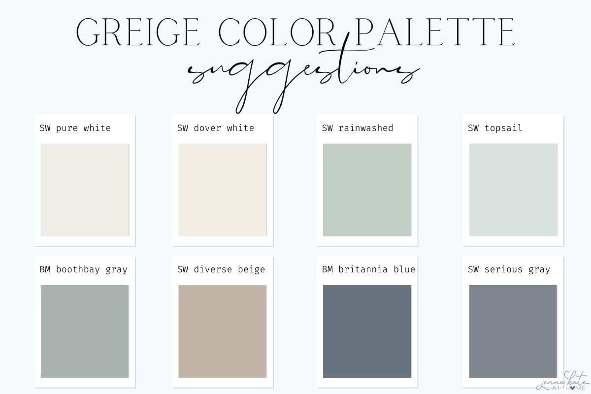
Here’s some ideas for colors that coordinate nicely with greige paint colors:
- SW Pure White
- SW Dover White
- SW Rainwashed
- SW Topsail
- BM Boothbay Gray
- SW Diverse Beige
- Bm Britannia Blue
- SW Serious Gray
What Trim Color Looks Best With Greige Walls?
You have two choices when it comes to coordinated white paint colors for your trim and doors.
- Pick a slightly warm white paint color such as SW Pure White or even BM Simply White or BM White Dove.
- Choose a bright white with a neutral undertone such as SW High Reflective White or BM Chantilly Lace.
FAQ’s
As more and more people shift away from the cool grays that were trendy a decade ago, greige has become the trend for today.
Even if considerably warmer tans and beiges become the “it” thing for interiors, greige will always have its place because they are colors that work so well in a variety of home styles and decorating styles.
Neutral paint colors will always have their place as they serve as a blank canvas for whatever other colors you choose to decorate with. Greige paint colors have the perfect balance of warm undertones and cool that tend to work in any room.
Because greige paint colors are gray colors with a beige/brown undertone, they work well in both cool and warmly lit spaces. They warm up cold, northern light, and complement already warm spaces really well (I’m talking southern exposure but also spaces with lots of wood tones).
Of course, it’s still important to delve into the specifics of each paint color, as some will be better suited to your personal situation than others. Always consider how your room faces as well as how much light it gets, and the fixed elements in a room (lots of dark wood for example) that could potentially impact (reflect back on) the color on the walls.
So with that being said, I’m breaking down the most popular greige paint colors to help you make your decision!
Absolutely! Greiges with higher LRVs can help brighten a space. Consider the room’s lighting and use samples to find a shade that doesn’t turn too shadowy or lose its warmth in dimmer conditions.
Don’t Forget To Always Use Real Paint Samples!
Don’t forget – no matter what you’ve read or photos you’ve seen online, it’s really important to sample paint colors in your home before committing!
Samplize provides real paint samples that are easy to move around your home, and cheaper than buying a gazillion paint pots! It’s the only way I buy paint samples.
Final Thoughts
Is a greige color the right choice for you? I honestly don’t think you can go wrong with greige, as long as you pick one with undertones that work for your space. Greige is a great option for a neutral paint color and allows you to easily bring in other colors as part off your overall color palette.
If you love gray, but it feels too cold in your home, greige is the way to go. If you have an abundance of warm light and find that many colors are overly warm, then the gray undertones in greige paint colors will help soften that look to create an inviting atmosphere that you’ll love.