Content may contain affiliate links. When you shop the links, I receive a small commission at no cost to you. Thank you for supporting my small business.
Picking the right paint color for your home doesn’t need to require a degree. With these simple tips, you’ll learn how to pick the right color every time.
If you are starting from scratch with a new build, then you may be lucky enough to have the option to start by choosing your paint colors before purchasing anything for your home. If you can do this – awesome! Pick a neutral color that you can flow throughout your house so that when it comes time to purchase couches and other expensive items, everything will work together nicely.
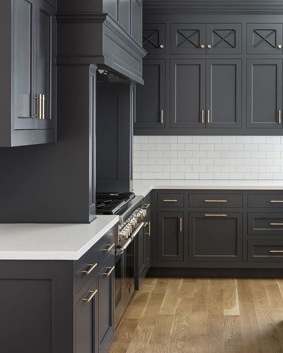
If, like the vast majority of us, you have to work with what’s already there – I suggest picking an inspiration item for your decorating plan, taking stock of permanent fixtures in your space (i.e. you a paint color that goes with oak kitchen cabinets) and THEN work on choosing your paint color.
How Do I Choose the Right Color for my House?
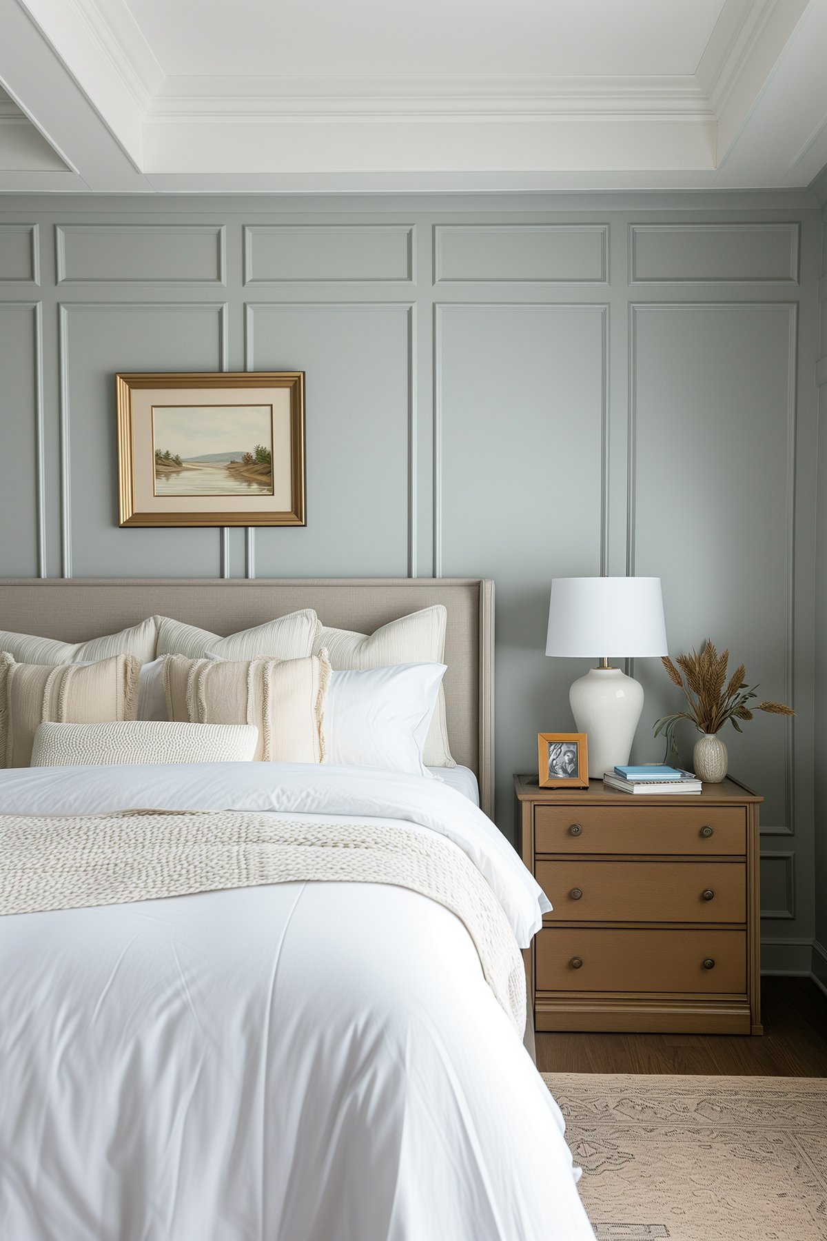
Choosing the right color for your house involves understanding color theory, the color wheel, and how different colors interact. Consider the mood you want to create in each room, such as a calming blue in the bedroom or a creamy yellow in the kitchen.
Interior paint colors should complement the furniture, artwork, and other design elements in the space.
Where to Start When Choosing Paint Colors
While the colors you choose for your home are a personal choice, understanding how colors work – and how they will work in your home and with your furniture and fixtures – will save you a lot of stress and wasted money in the long run.
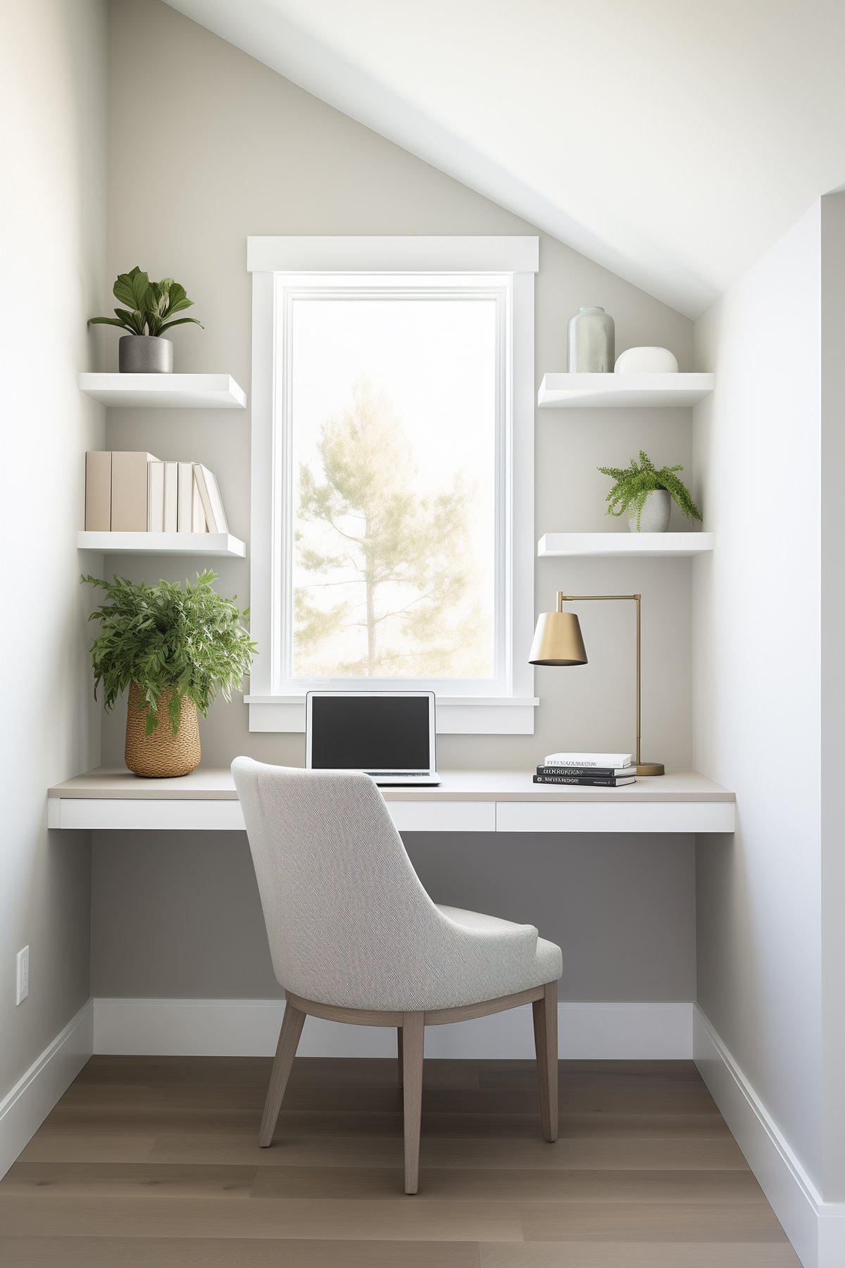
The best way to narrow down what colors you want to use on your walls and as part of your decor, is to look in your closet. What colors are you typically drawn to?
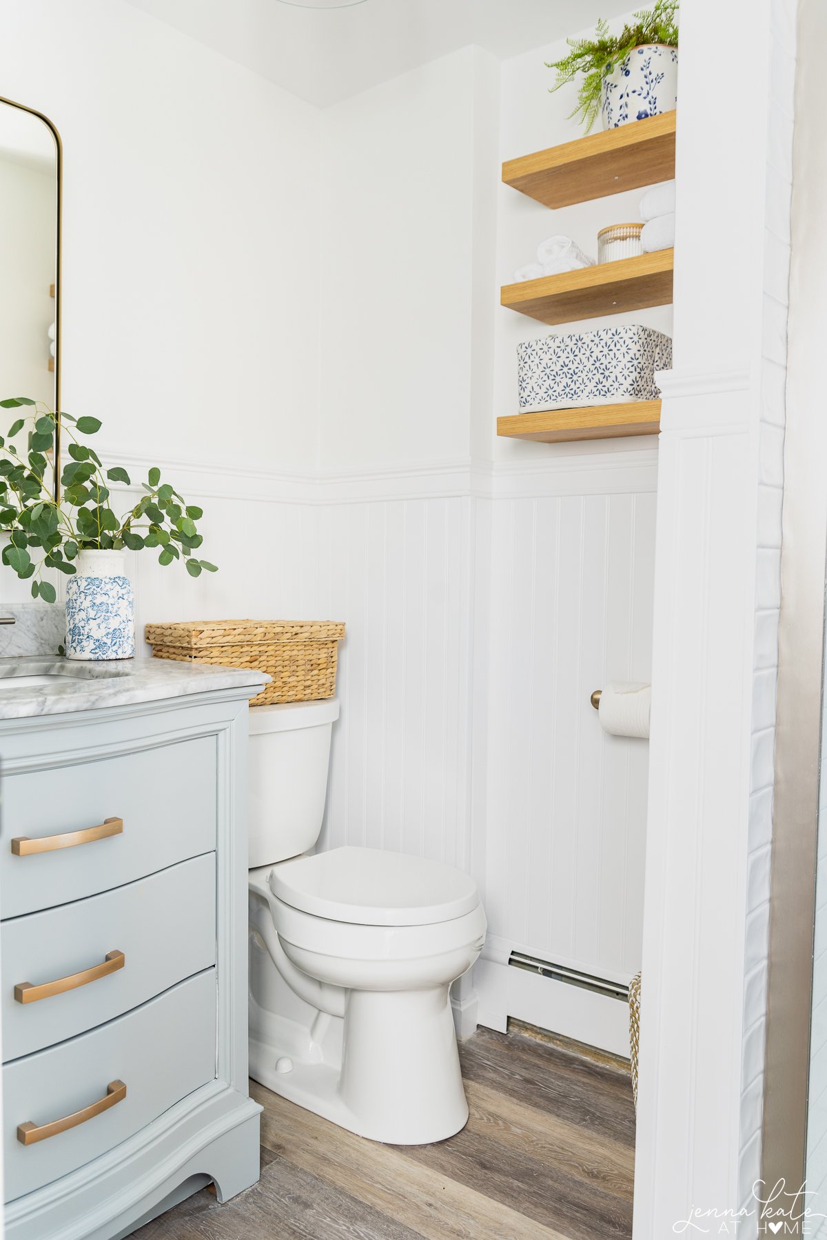
My closet is full of blues, grays and whites. I rarely ever stray from those colors! It’s not intentional. Those are just the colors I love. And they are reflected in my home (and business branding, too!).
Identifying your colors and using them throughout your home will ensure that your personality and style is evident. It will also ensure that you’re choosing colors that you won’t quickly tire of!
I’ve written a whole other post about Choosing a Whole House Color Palette that delves into this topic a little more and explains why sticking to a neutral color palette for the majority of your home is a good idea.
How to Understand Paint Undertones
Unless you’re dealing with white, black or pure gray, every color has an undertone.
I’ve found that the easiest way to figure out the undertone of any paint color is to look at the darkest color on the color card.
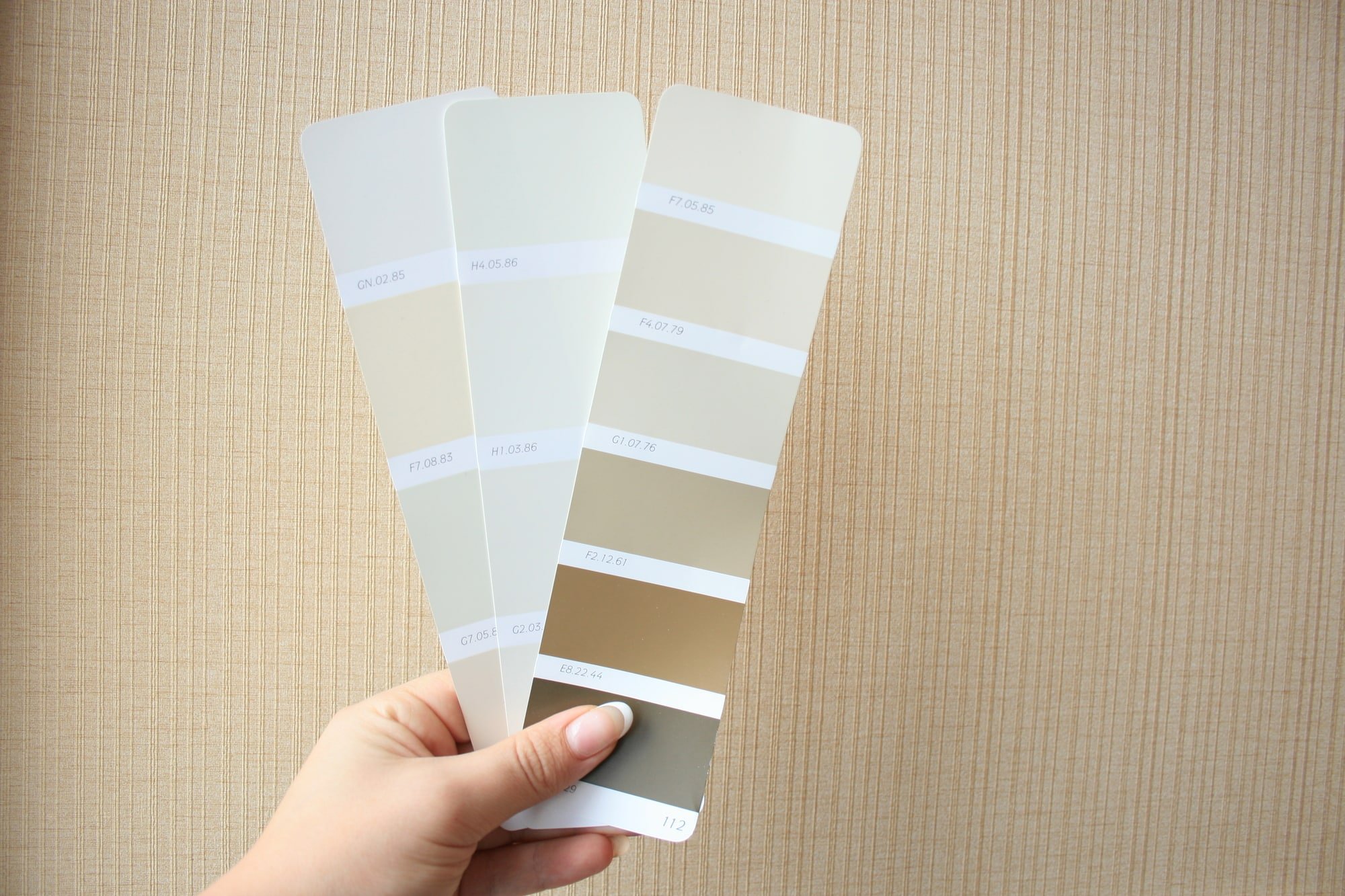
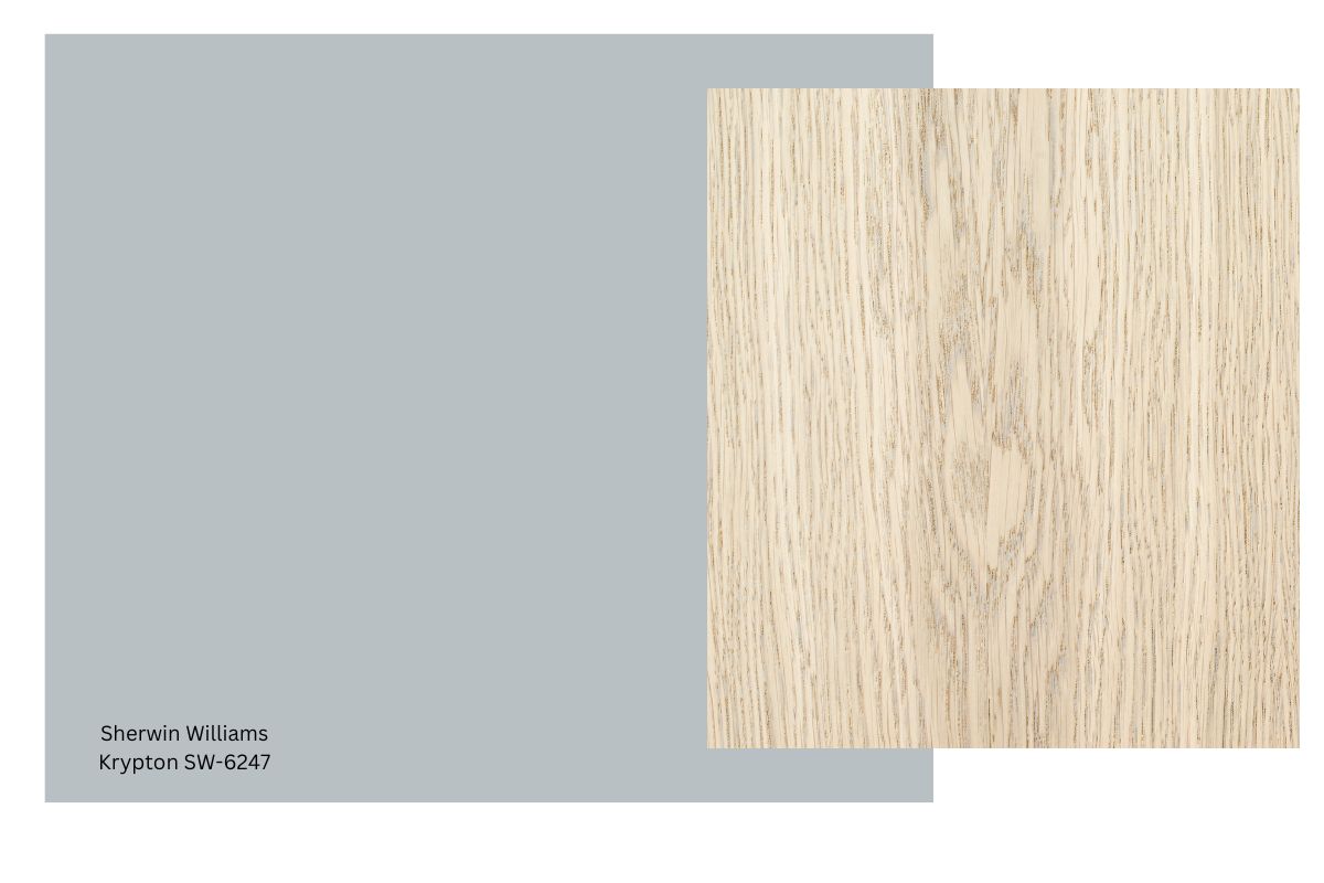
Take a look at the paint chip above. See how the darkest shade is brown? That shows that the lighter shades will have brown undertones, making them true beiges.
Even when dealing with the lightest color on a color card, pay attention to the undertone. You can be sure that during at least one point of the day, that undertone will become apparent.
Why Do Paint Colors Look Different on the Wall?
Paint chips are a printed representation of the paint color and do not always 100% accurately reflect the final color.
Additionally, paint colors will look different depending on the time of day and the aspect of the room. A west-facing room won’t have much sunlight in the morning, making the paint color appear cooler. Conversely, the same room will have lots of warm afternoon light that will bring out the warmth in a color.
A North facing room never gets direct sunlight. Northern light has a gray cast, too, so it brings out cool tones in paint colors. Conversely, a south facing room gets warm direct sunlight throughout the day and will bring out the warmth in colors.
RELATED: The Best Paint Colors For Every Room Exposure.
Finally, the paint sheen you choose also impacts how a color looks. The same paint color in a flat finish will look darker than that paint color in a semi-gloss finish. This is because the semi-gloss finish is shinier and reflects more light back into the room, thus appearing lighter.
With that being said…
Always Test Paint Colors in Your Home Before Committing
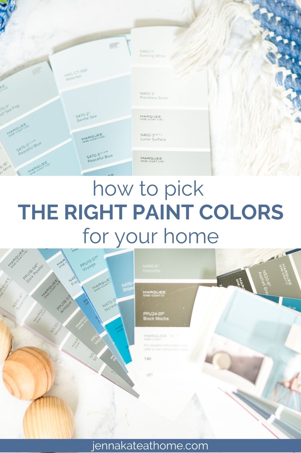
It’s important to always buy samples of the paint colors you are considering. So as not to spend a fortune on samples, narrow down your choices to 2 – 3, and get samples for those.
In recent years, I have completely stopped buying paint sample pots and instead started purchasing these peeL & stick samples. Not only is there less waste, but they are less expensive and so easy to store. Plus, unlike traditional paint chips, these samples are made with REAL paint so the color is accurate.
Tips for Sampling Paint
Paint the colors on some white poster board and move it around the room during different points of the day to see how the color changes. Or stick the peel and stick sample on your wall (they are repositionable!). Take note of undertones you don’t think you can live with!
Not only that, but place paint swatches near your white trim and position them next to your couch, wood furniture, or anything else that has a strong undertone that might affect the paint color.
Test the different paint colors on different walls in the room to observe how they change under different lighting conditions, such as natural light and artificial light.
Still unsure of the undertone? Compare the sample to pure white (white printer paper or poster board) and then next to another similar paint color. The undertone will pop right out at you.
Don’t Forget To Always Use Real Paint Samples!
Don’t forget – no matter what you’ve read or photos you’ve seen online, it’s really important to sample paint colors in your home before committing!
Samplize provides peel and stick paint samples made with real paint, that are easy to move around your home, and cheaper than buying a gazillion paint pots! It’s the only way I buy paint samples.
Which Paint Sheen to Choose
As a general rule, washable matte or eggshell paint for walls and satin or semi-gloss for trim and doors. Ceilings are usually flat, unless you’re dealing with bathroom ceilings which require more consideration.
I’ve written an entire post dedicated to this topic, discussing in more detail why paint sheen can make colors look slightly different.
RELATED: How to Choose The Correct Paint Sheen.
Why Does Gray Paint Look Blue on the Wall?
All paint colors have undertones, and gray is no different. Gray undertones range from yellow and purple to green and blue. If the shade of gray you chose has even a faint blue undertone and your room receives cooler light, the blue undertone may become evident.
For those of you who particularly struggle with picking grays: If you want a cool gray, look for a bluer undertone. If you want a true gray, look for a black undertone and if you want a warmer gray, look for a brown undertone.
How Accurate is Paint Color Matching?
Typically, paint color matching is about 90% accurate. Since paint brands typically have a slight variation to their base tint, there will inevitably be a slight difference in the final color.
If you are color matching and painting all your walls and trim, the difference is usually not glaringly obvious. However, if you’re touching up a spot and used a different brand previously, you may very well notice the difference.
RELATED: How to Paint Walls and Trim Like a Pro.
How Do I Know What Colors Will Work in My Home?
Find Color Inspiration Inspiration for your home’s color scheme can come from a variety of sources, such as a favorite piece of art, nature, or even an inspiration piece like a rug or pillow. Use these items to guide your paint color choices and create a harmonious color palette for your home interior.
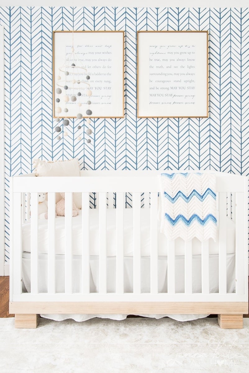
The inspiration for my son’s nursery was this pretty blue and white wallpaper. If I had started with the paint color on the walls first, I probably wouldn’t have realized that they needed to be white (I’m usually a gray walls kinda girl!).
Because I had such a graphic element in this room, picking the paint color afterwards was also essential to stop the room from looking too busy.
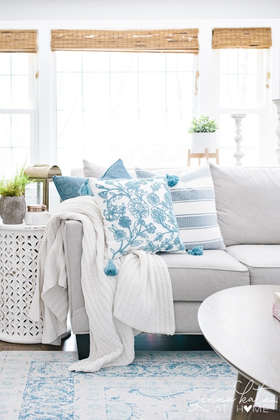
In my older boys’ shared bedroom, I started with the navy blue duvet covers and worked my design around them. They became my “pop of color” and I kept everything else simple, clean and neutral so that they remained the focal point.
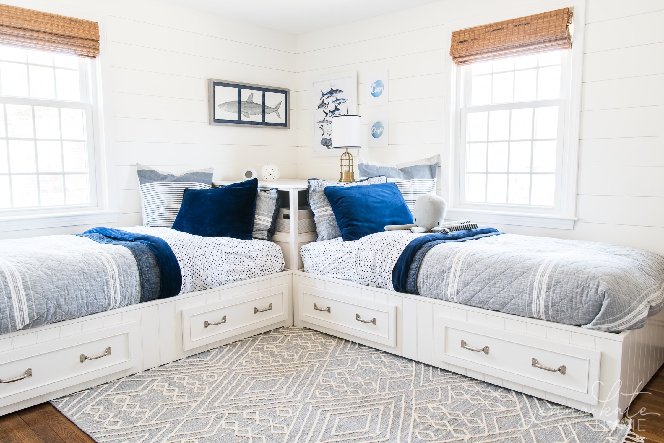
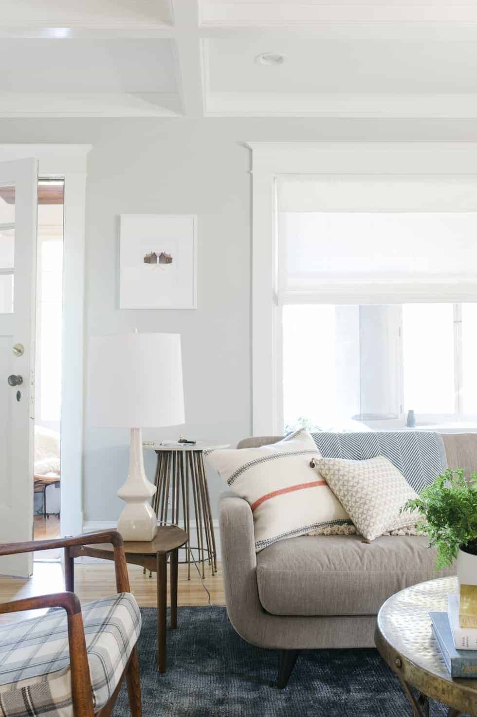
Are you seeing a common thread in my home, yet? It’s blue! Blue is my accent color or “pop of color” depending on the room. It’s my main color to decorate with, in varying degrees, but it’s never on the wall. I could do an accent wall with a bold color, but keeping the walls neutrals means it’s easy for me to switch up the color scheme of a room should I choose to do so in the future.
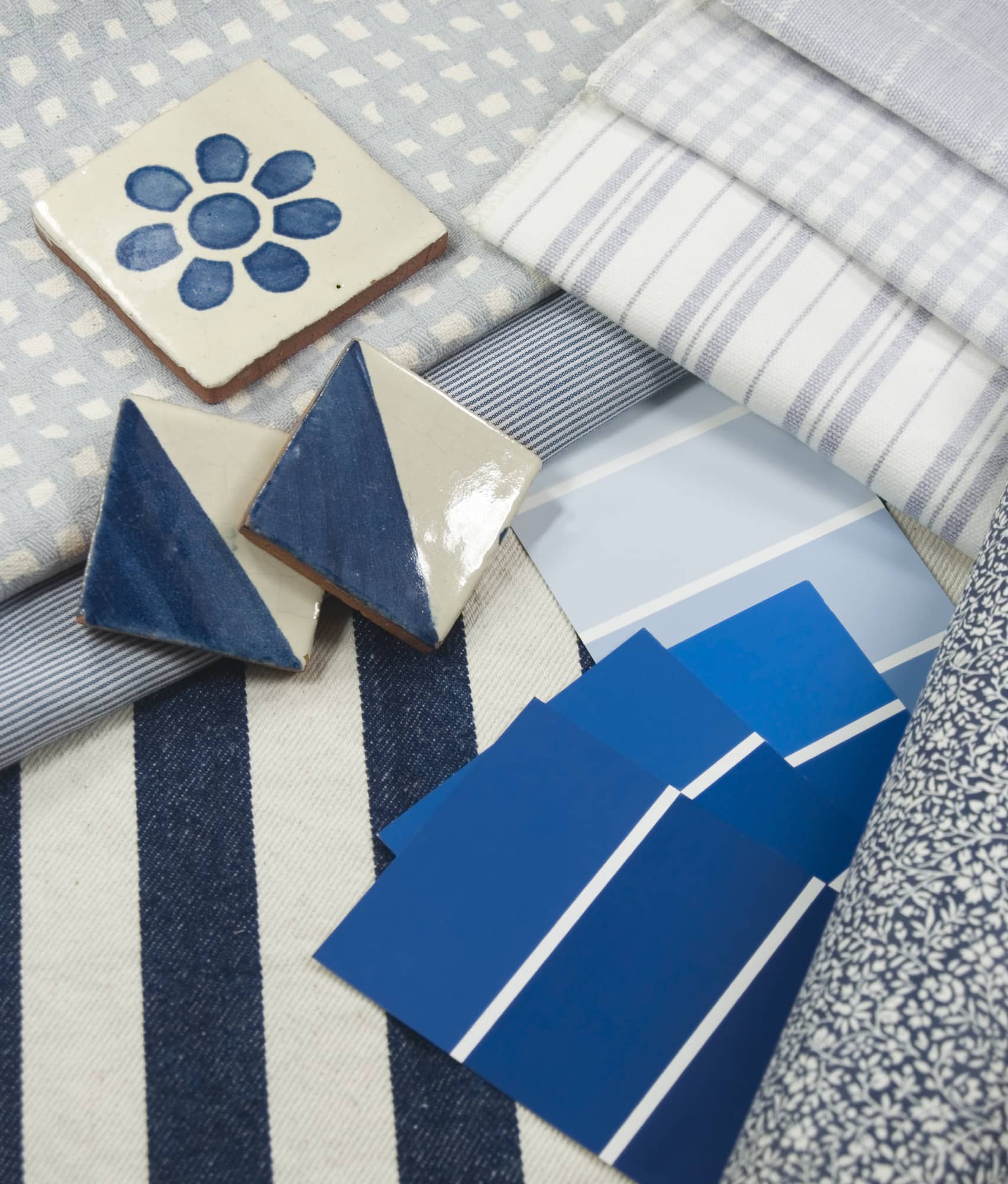
Whether it’s the rug, the couch or even a throw pillow – pick something as your starting point and find a paint color that will work with it.
Using this method of inspiration is a sure fire way to stop “analysis paralysis” when deciding on a paint color that you’ll love and that will work in your home.
If you’re starting from scratch and don’t have any decor yet, picking simple neutral colors like greiges, whites and off-whites serves as a clean backdrop that makes decorating a breeze.
Should I Paint My Whole House the Same Color?
Painting your whole house the same color can create a cohesive look and feel, but it’s not always the best choice.
Different rooms serve different purposes and can benefit from different paint colors that reflect their function. Plus, choosing one paint colors that works in all the different room exposures can be tricky.
For instance, warm colors in the living room and cool colors in the bathroom.
However, using a single neutral color palette throughout can unify the spaces and make your home feel larger, especially in small spaces.
Consider Room Size
Room size significantly impacts how a paint color looks. Lighter colors can make small rooms appear larger, while darker colors can add depth and coziness to larger areas. Natural light also plays a crucial role, with north-facing rooms often requiring warmer tones to offset the cool light.
Final Thoughts
Armed with all this information, you’re going to be well on your way to picking the perfect paint color for your home. Remember, it’s your home and you want it to be a reflection of you – not what someone else thinks is you.
Enjoy the process and don’t overthink it. Remember to narrow down your choices from the paint chips and buy samples. If you need extra help, Consulting a color expert at a paint store like Sherwin Williams or Benjamin Moore can provide insights into the latest trends and color psychology.
If you are going to be picking one color for your entire house, err on the side of simple and neutral. It will look timeless and classic. It’s much easier to change out accessories than have to repaint your entire home.
Please help: With warmer white kitchen cabinets, (silestone calcutta gold quartz countertops and cloe white backsplash and vicenza counters in baths), can I still use BM White Dove throughout the house–planning to do walls flat and trim semi gloss, but all White Dove. The walls would definitely be warmer than the counters, but is this a problem? I really like BM White Dove.
I think that will work! The calacatta gold and cloe tile have enough warmth in them. Plus, your walls won’t be directly touching the solid white of the counters. I suggest painting a large piece of foam board and putting it next to your samples to see how you like the look.