Content may contain affiliate links. When you shop the links, I receive a small commission at no cost to you. Thank you for supporting my small business.
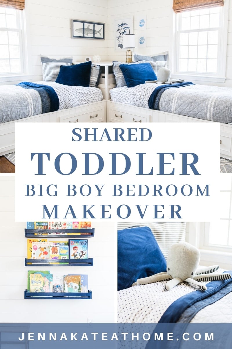
A dark toddler bedroom turned into an awesome shared boys room with coastal touches of navy, gray and white. See the full before and after makeover.
I’ve been planning this room makeover in my head for the past year, and I’m SO glad I finally bit the bullet and got it done.
[adthrive-in-post-video-player video-id=”imEAZURk” upload-date=”Wed Mar 25 2020 00:00:00 GMT+0000 (Coordinated Universal Time)” name=”Shared Boy Bedroom Makeover” description=”Navy and grey design style makeover. Shared bedroom for 2 boys featuring shiplap and coastal animals”]
The Before
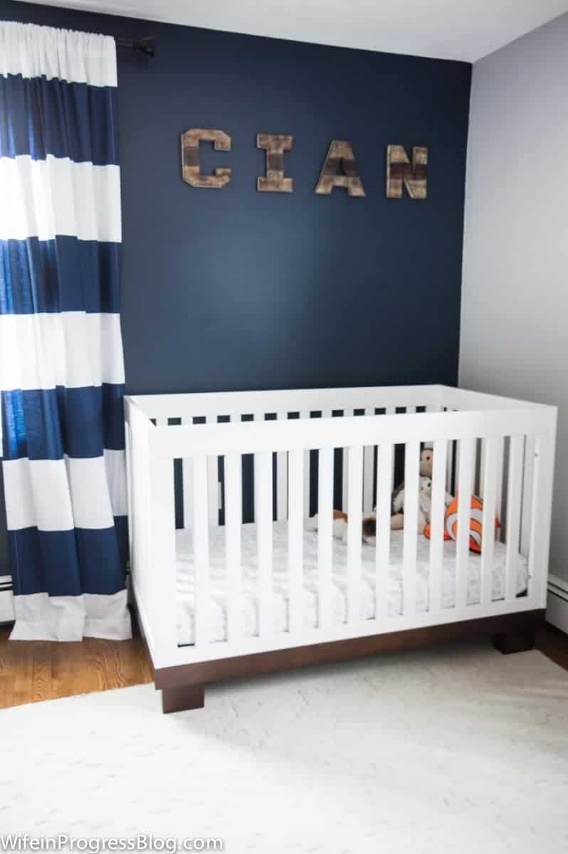
My 5 year old son’s room was the last space in our house to remain untouched since buying this house over 4 years ago. Well, not totally untouched. We did paint it when we moved in. But I was SO desperate to have a navy blue wall somewhere…anywhere in the house, that I went with an accent wall in here.
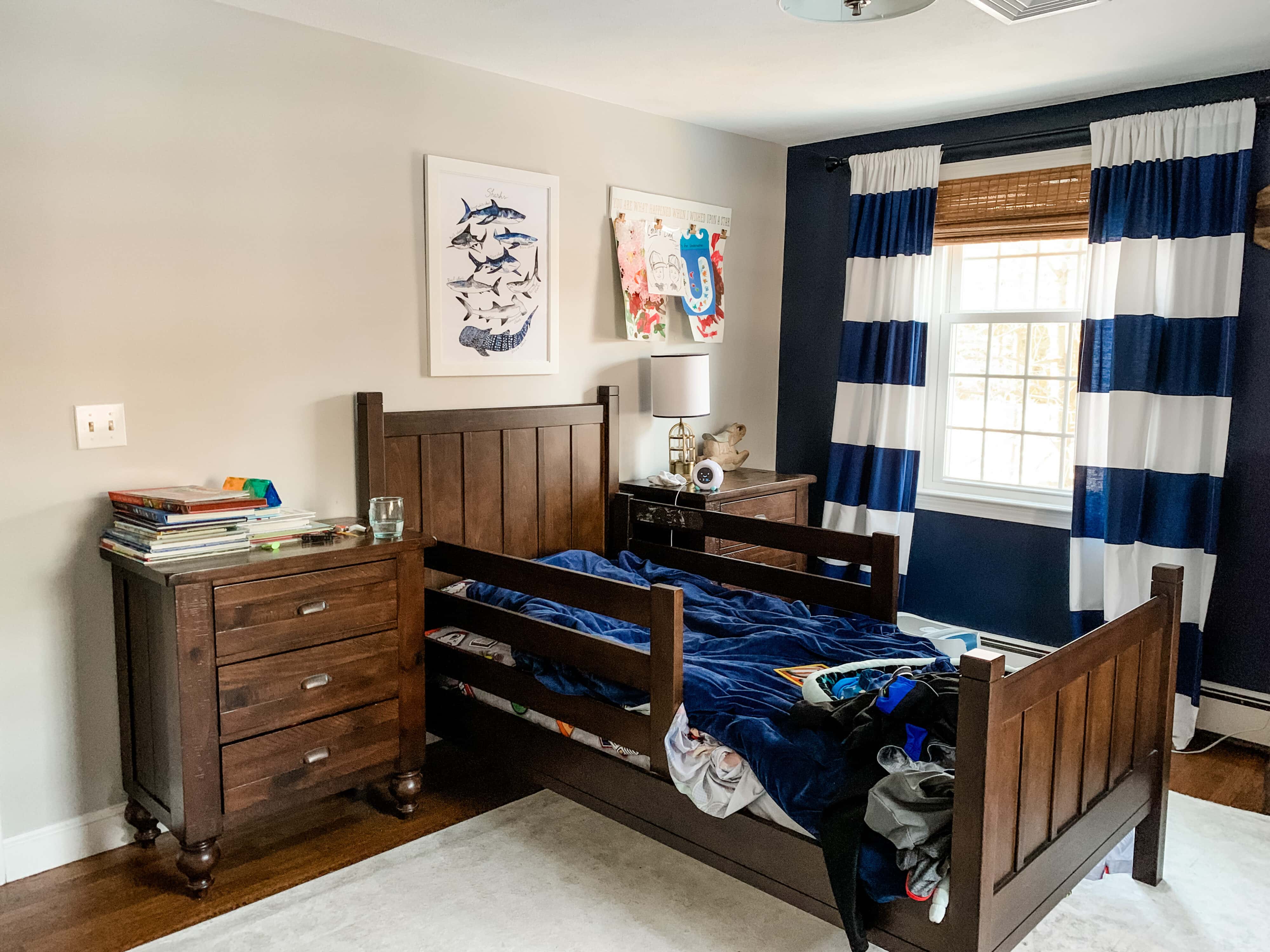
Big mistake. Lesson learned. While this North Eastern facing room gets great morning light, once noon has passed there’s nothing. Pair that with a very dark wall and you’ve got yourself one heck of a dark room.
Main Goals For The Room
I talk more about my design process in my YouTube video but to summarize, I had two main goals:
- Lighten the space
- Figure out a furniture layout that would allow for 2 beds
Our bedrooms are all a pretty decent size, but all have windows smack bang in the middle of two walls. Plus a closet door on another wall and then of course the entry door. I’m not a fan of headboards in front of windows and I have a thing about symmetry that I always have to take into account, too.
Other Considerations For The Design
Since Aidan, our third son, was born in September, we had to give up our guest room to make a nursery for him. Conor, my 3 year old, is not ready to share a room with his 5 year old brother just yet. Both of the older boys are amazing sleepers and I value my sleep too much to mess with that right now!
However, in a few years, Conor will be sharing this room with Cian. Right now, having 2 beds means that we have somewhere for guests to sleep if they come over (Cian can bunk with us on an air mattress if need be!).
The After
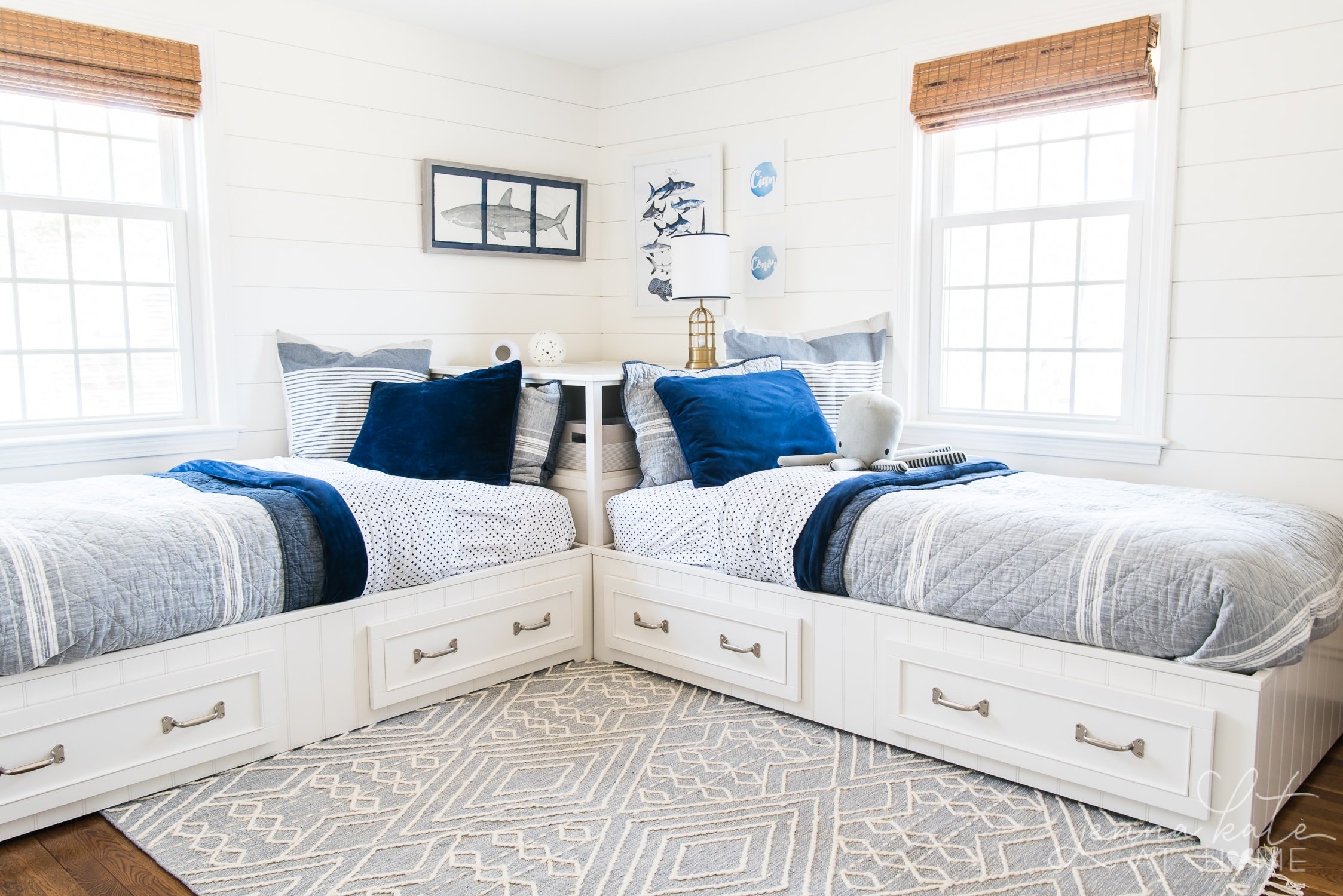

Design Plan
I knew the navy wall needed to go in order to lighten the room up but I wanted to keep some touches of navy and have a coastal feel, without being beachy or nautical.
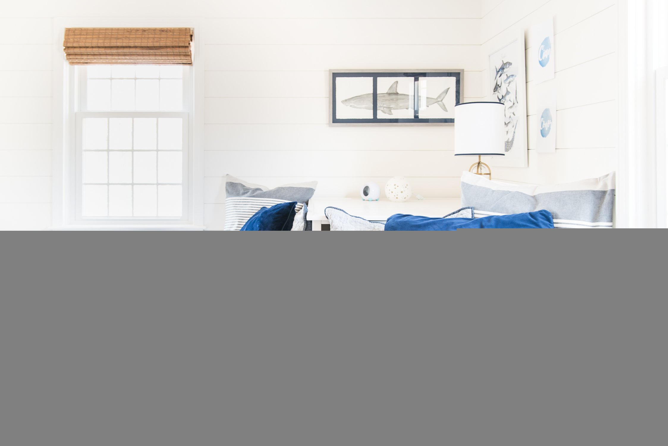
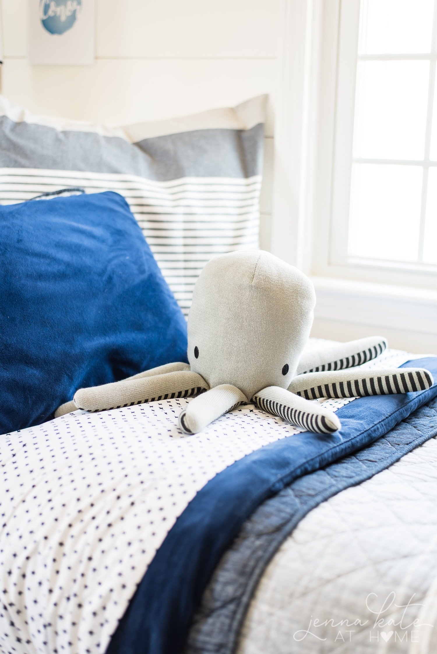
With my son’s favorite navy duvet cover as the starting point for the design, I worked on incorporating texture and pattern in a subtle way that would make the room feel cozy and sophisticated, while still looking like a pretty awesome kids room.
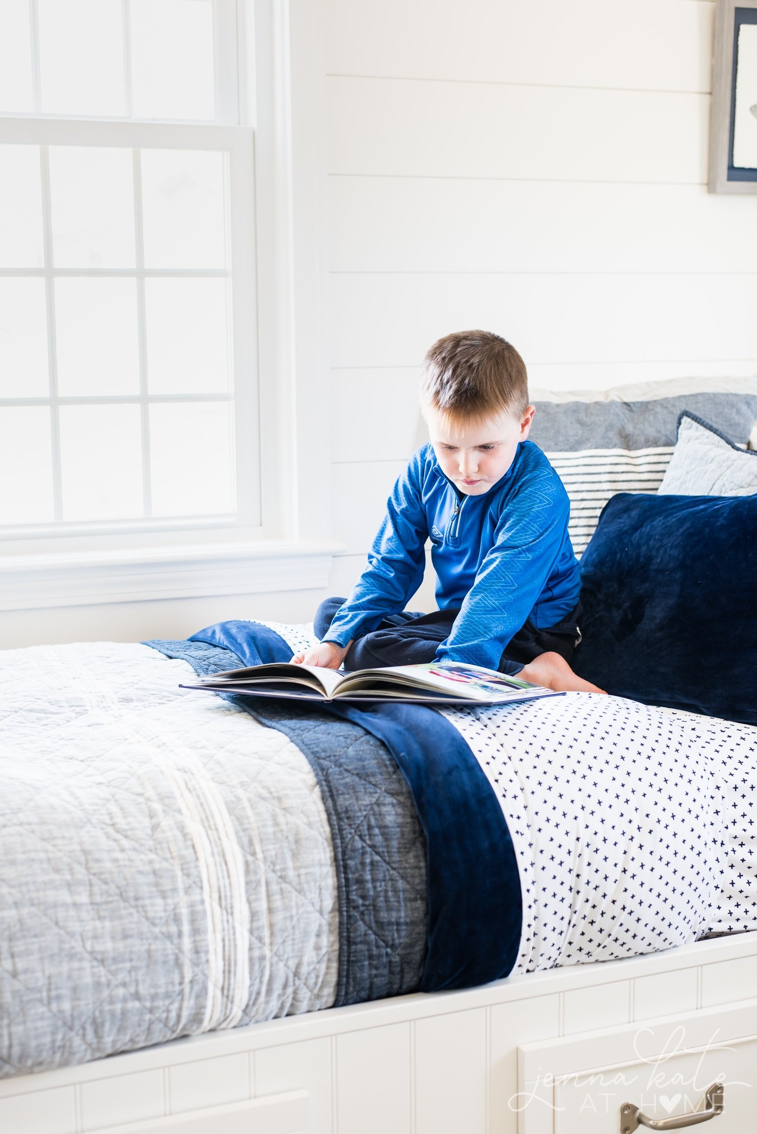
In order to bring as much light and warmth into the room as possible, I veered away from my usual grays and instead opted for a warm white paint color, Benjamin Moore’s Simply White.
The shiplap walls were painted with a matte finish while the doors and trim are the same color but in the satin finish.
One of my personal goals this year is to simplify our home and remove a lot of the “stuff’ that bogs down the spaces. This means less clutter, less cleaning and rooms that magically stay so much cleaner and organized!
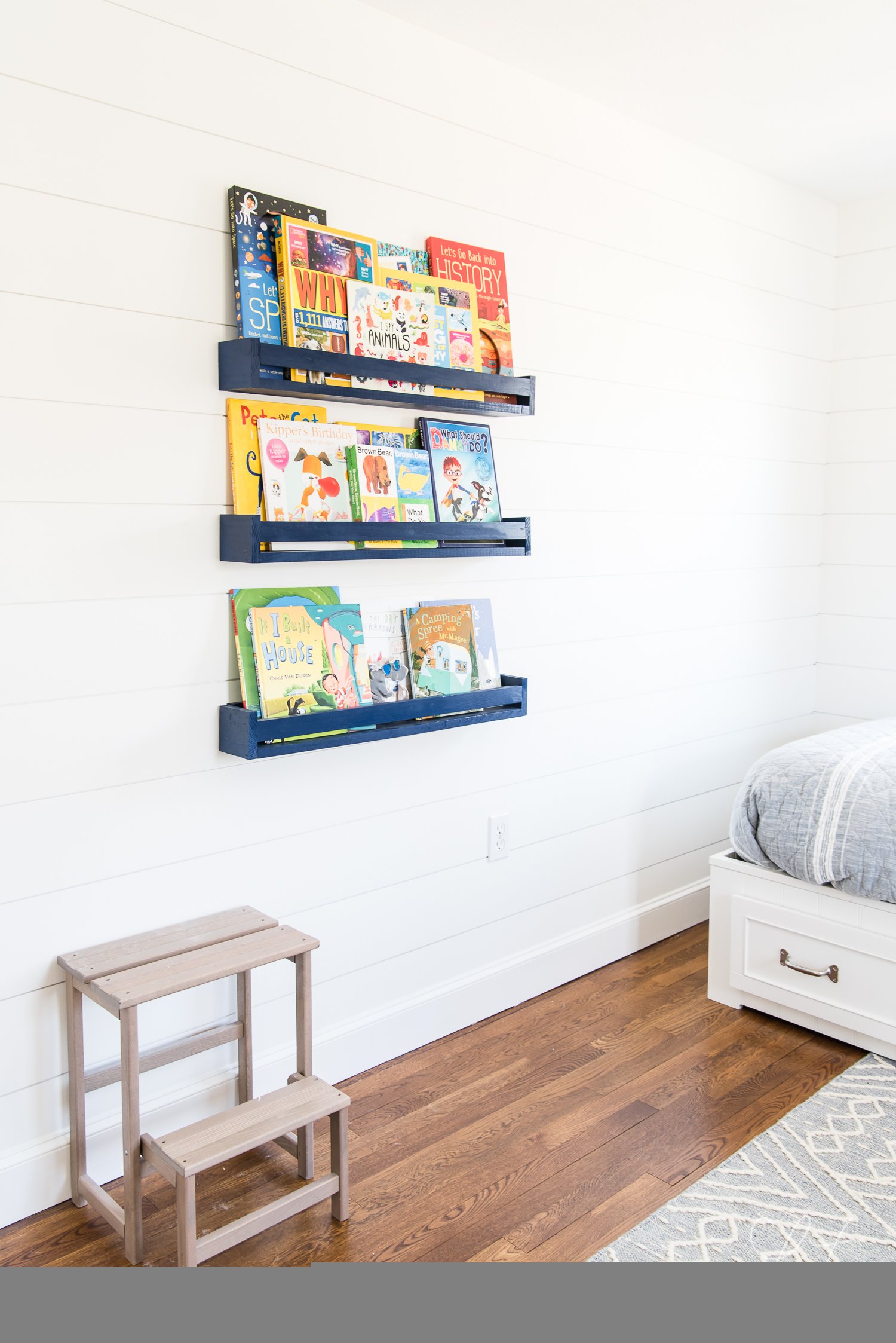
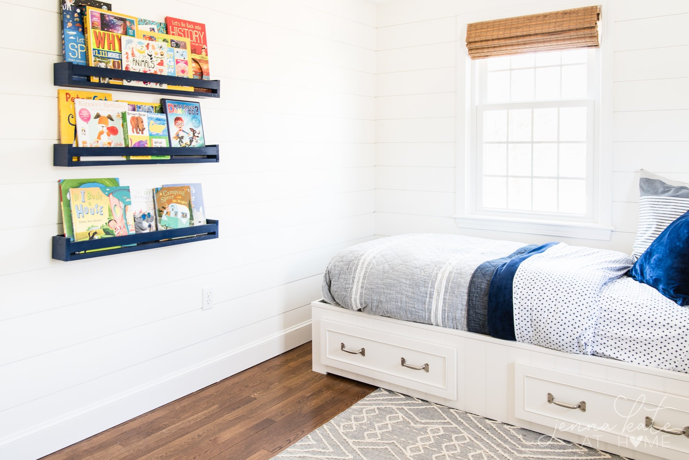
With that in mind, I wanted to keep the “stuff” in here to a minimum. No unnecessary furniture, not too much art on the walls and of course, somewhere to put all the books that my kids love to read.
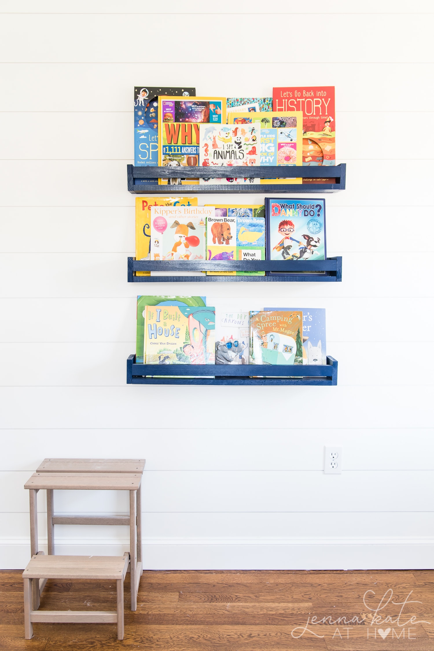
Adding Texture
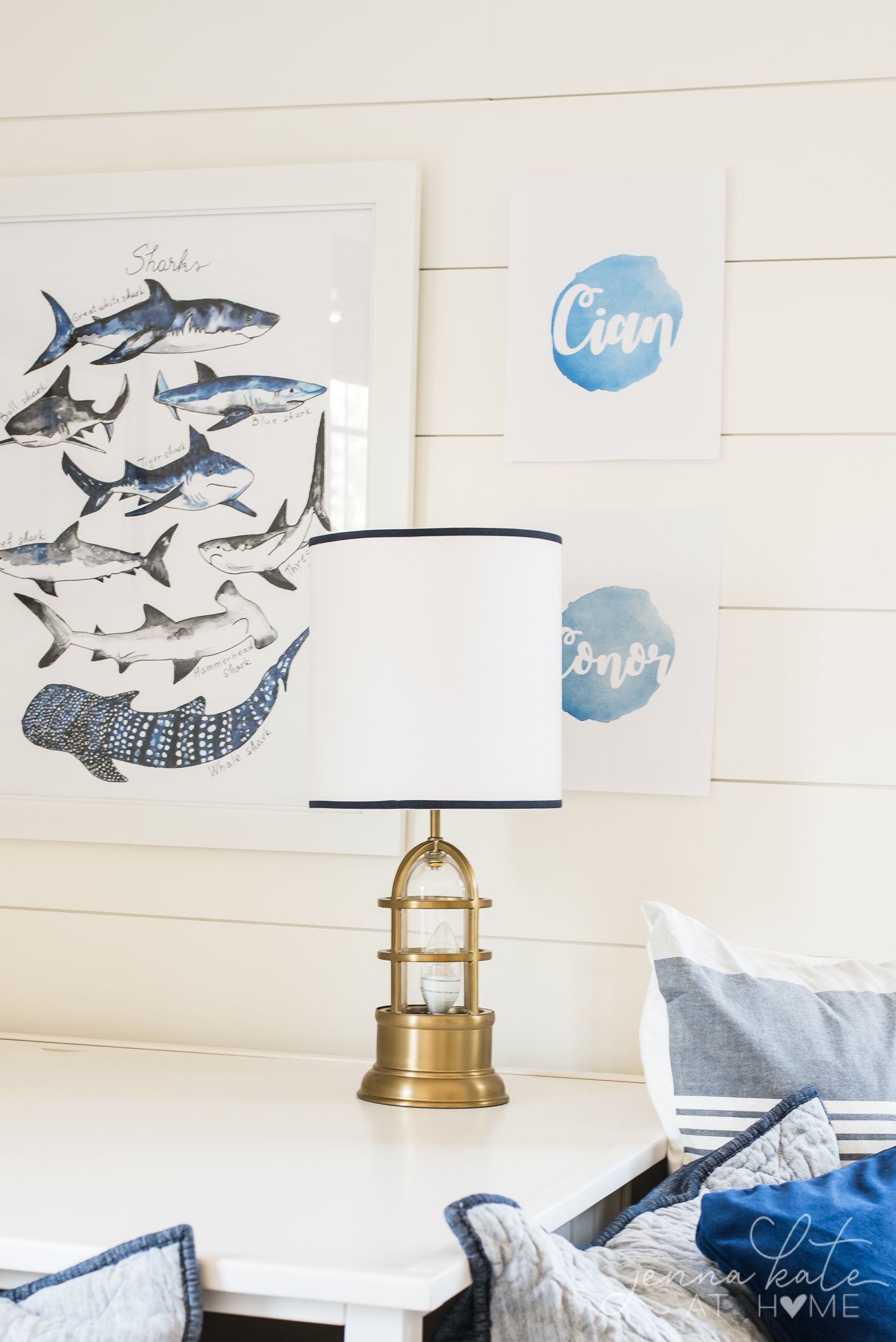
With minimal artwork, I was worried that the walls would look empty once they were painted. I knew I wanted a lot of texture in the room, so adding shiplap to the walls seemed like a perfect way add coziness, texture and stop the walls from feeling empty.

Furniture Layout Solution
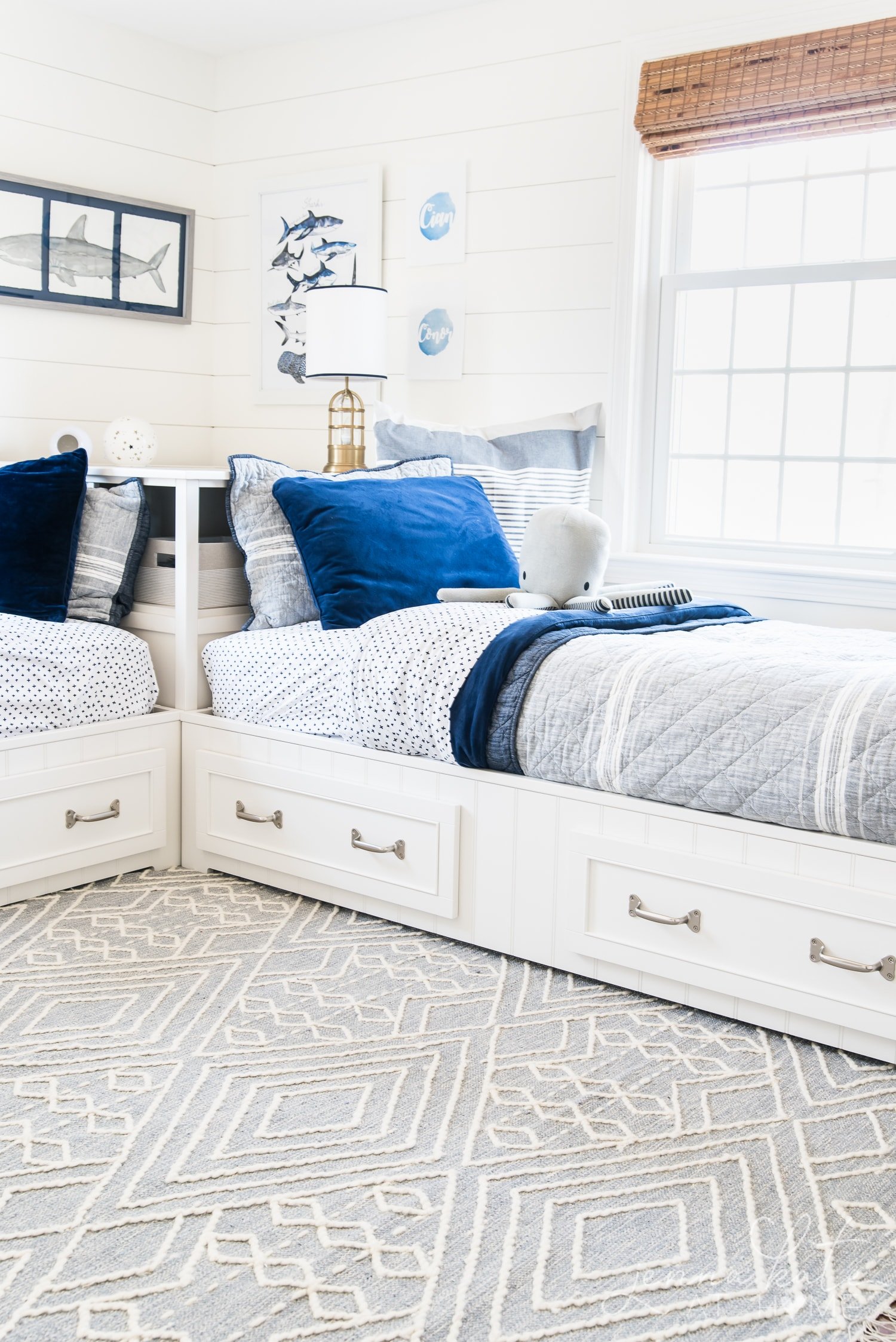
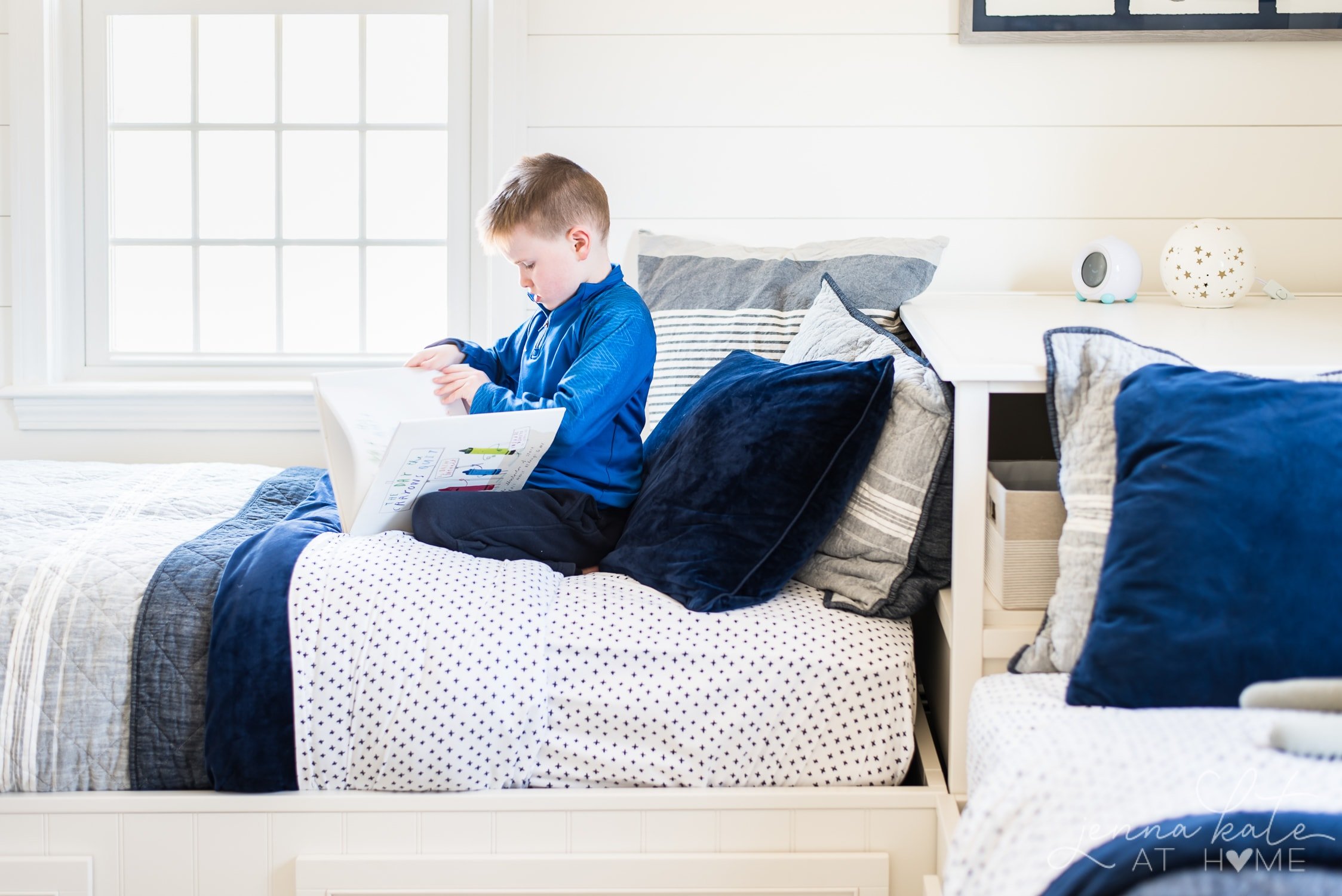
For months, I struggled to find a layout for 2 twin beds that made sense, but they always ended up looking awkward. That was until I found this bed and corner unit combo. So clever! And it got rid of the need for nightstands and provided tons of extra storage!
Keeping it Fun For The Kids
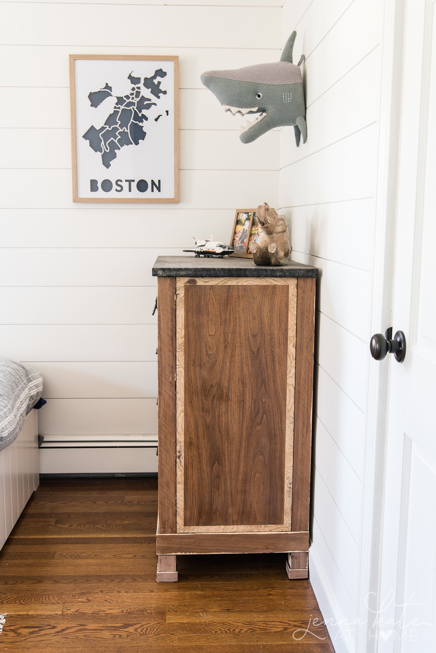

Ensuring that this room will be one that will grow with the boys was important to me. I wanted it to still look like a kid’s room, but not feel childish. By swapping out the art prints and shark head, this room will easily transition to a tween or teenager room when the time comes.
Please subscribe to my YouTube Channel for more videos and design content. Watch my YouTube video below to see the full before and after process!


Jenna I love your designs so simple yet beautiful and elegant. With each makeover I’m learning to go outside my comfort zone. Thank you I continue to be inspired by your style.
Beautiful. Many homes have an obstacle on each wall. Why don’t builders think about this?
We have three boys, the oldest boy while having his own bathroom his closet is right behind the bedroom door it’s a real pain if it’s not shut. Our smaller boys share a bathroom and same with the linen closet. You cannot walk in this bathroom without hitting that door. (My kids never shut it)
Pocket doors would be a dream
For all my closets!
Nice work;)
My kitchen designer always says it’s because most builders are men and they just don’t think of these things! I’m sure there’s some truth to that!!
Great job! Looks happy, clean, bright and airy.
Thank you!