Content may contain affiliate links. When you shop the links, I receive a small commission at no cost to you. Thank you for supporting my small business.
Paint is a relatively inexpensive way to completely transform a room, and dark rooms are no exception. By choosing one of the best paint colors for dark rooms, you’ll completely transform how the space looks and feels.

However, there are some considerations you need to take before choosing the perfect paint color as well as other considerations to take into account to turn your room into a beautifully bright space.
How To Make a Dark Room Brighter
First, determine why the room is dark (no windows, north facing or light is blocked by what’s outside the windows). Then,
- Add more artificial light if needed;
- Lighten the paint color on the walls;
- Bring in lighter fixtures and furnishings.
1. Why Is Your Room Dark?
Before we even tackle the subject of the perfect paint color for your space, it’s important to consider why your room is dark:
- Is it a north-facing room?
- Or is it an east-facing room that only gets morning light?
- Does it have little natural light because of minimal windows or because it’s a basement room?
- Is the light blocked by hills or buildings outside the window?
Understanding why your room is dark is an important first step in deciding the right paint colors and whether other elements will have to first be modified in order to achieve an overall brighter look.
This is because paint colors don’t give you light, they only reflect it.
The light they reflect is dependent upon the amount of light in the room, the type of lighting (natural or artificial) and finally, the color on the wall and the furniture/furnishings in the space.
Determine The Mood or Feeling You Want In The Room
Do you want your room to feel like and airy or with lots of personality and drama?
The mood or feeling that you want your room to convey should be your first consideration before you even think about paint colors, as it will dictate the color you end up choosing (this is true for any room, not just dark ones).
If you want a light and airy, casual yet cozy feeling to your space, you will want to stick to light colors.
If you want more drama, more personality, and more pop to your walls, then a darker, more saturated color will be what you want.
Getting a Light and Airy Feel in a Low-Light Room
So many of us love the bright, fresh feeling that lighter colors bring to a space.
In recent months, I’ve slowly been adding lighter neutrals and lighter furniture and accessories to the rooms in my home because they make so many of these spaces feel bigger and brighter.
However, lighter colors do not always mean white paint! In fact, contrary to what you may think, if you have a low-light room, a stark white can actually make the situation worse!
Why Painting Your Walls White Is Not Always The Answer
Contrary to popular belief, painting your walls white is not always the best solution for brightening a dark room.
Whether you have a north-facing or just generally low-light room with minimal windows, the light plays an important role in how your wall color looks.
The reason rooms with white paint look so bright and fresh is that the light in those rooms reflects off the walls and bounces around the room. In contrast, a room with black walls will absorb the light so no light will bounce around.
Furthermore, northern light has a gray tint to it, so any cool shade of white will look cold and gray. So white paint colors that have a gray or blue undertones, will look flat and drab in these cold gray light.
If your room has little natural light – or this colder gray light in the case of a northern exposure room – adding white to the walls will only compound your problems.
What Colors Work Best in a Low Light Room To Make it Brighter?
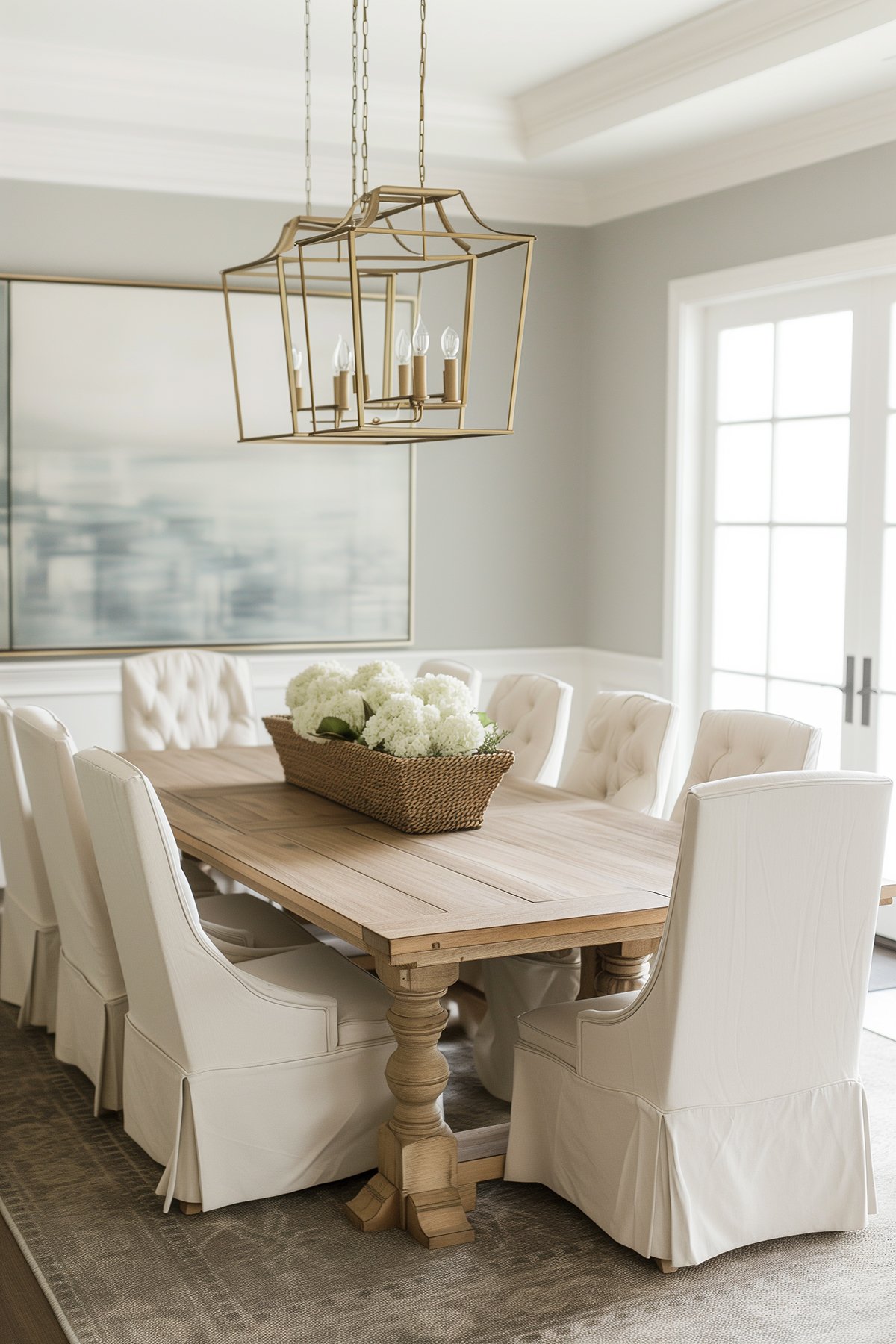
If you want to keep the wall color as light as possible, I prefer light, neutral paint colors to lighten a room, and particularly paint colors with a warm yellow or beige undertone.
Consider the LRV (light reflectance value) of a color and keep it above 64 if you’re looking to brighten things up.
It doesn’t have to be full-on yellow or cream but it does need to have that hint of warmth to stop it feeling flat or washed out. These warm undertones also help to counteract the gray tint that comes with a northern exposure.
If you lean towards blues and grays like I do, they can work well, you just need to pick ones with a warmer undertone.
Adding Light to Dark Rooms
If northern light is not your issue, and your room is a basement, a small space like a windowless powder room or one with small windows, adding artificial light is your best bet.
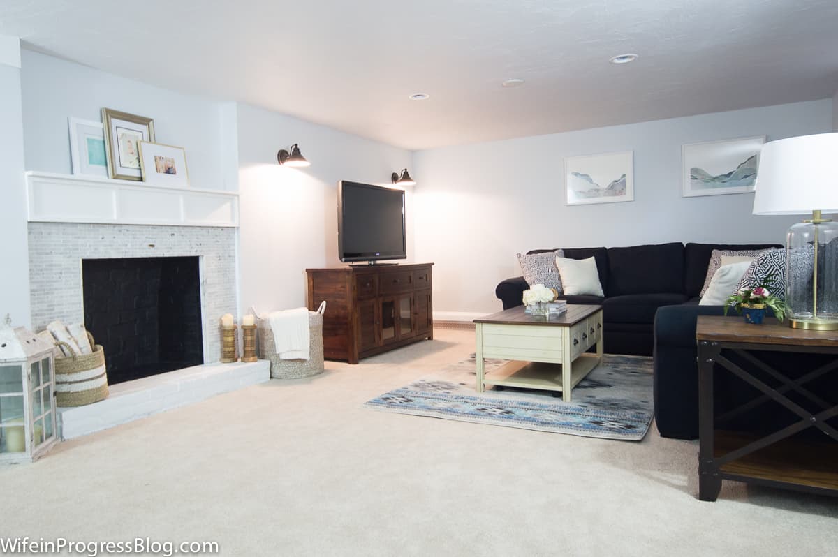
In my basement (which has two tiny little windows), we used the color Behr Reflecting Pool. This is not a color I would use in my northern-exposure bedrooms as it would read too cold, but in our basement it reads light and fresh, thanks to all the recessed lights and table lamps and the sconces next to the TV.
These lights not only brighten the space but add warm light, too.
The Importance of Furniture
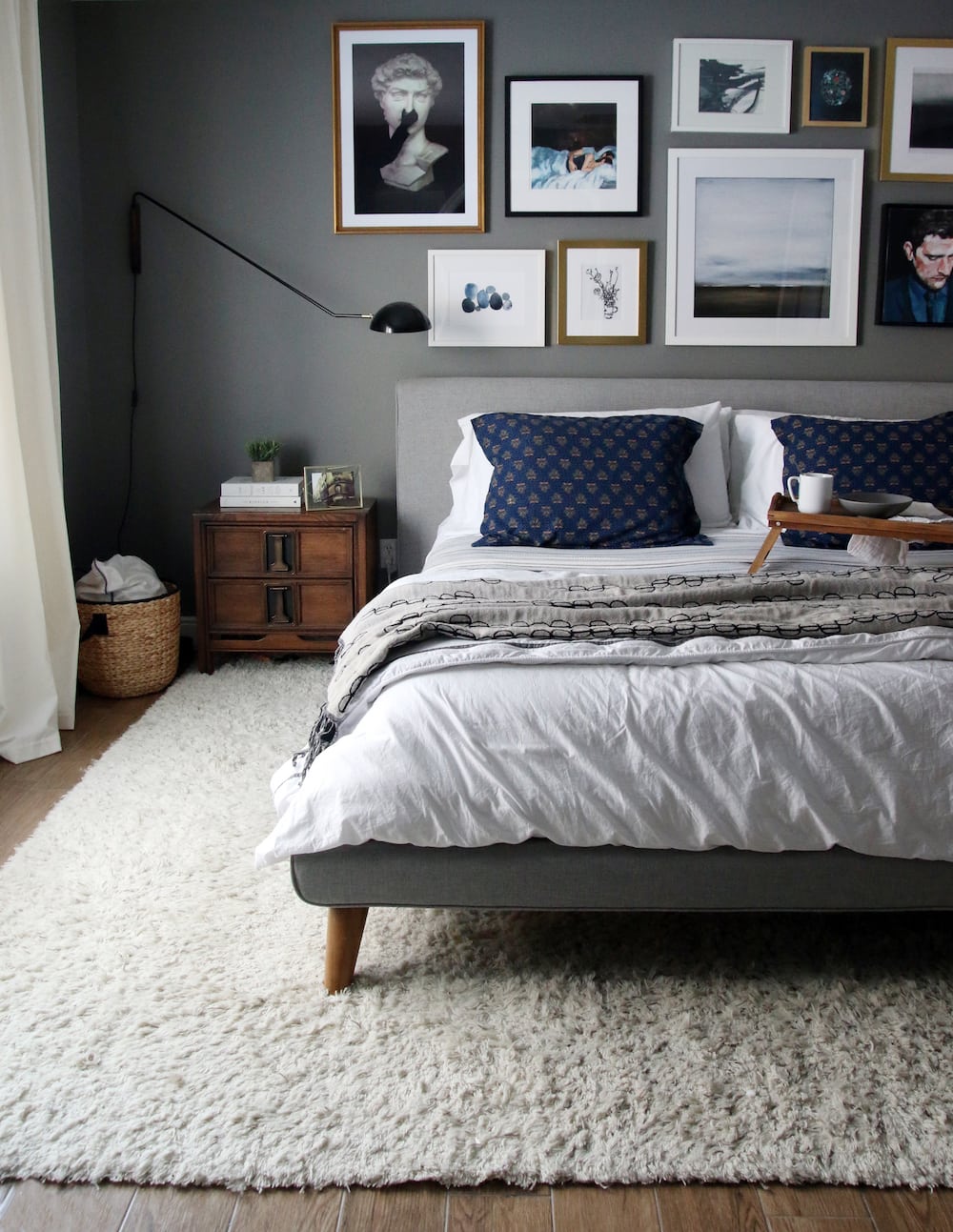
Don’t forget that furniture plays an important roll, too. Dark, drab furniture will make the space feel just as cold as the wrong paint color (see master bedroom photos below).
If you really want to achieve a light and airy feeling, then keep the furnishings light, too.
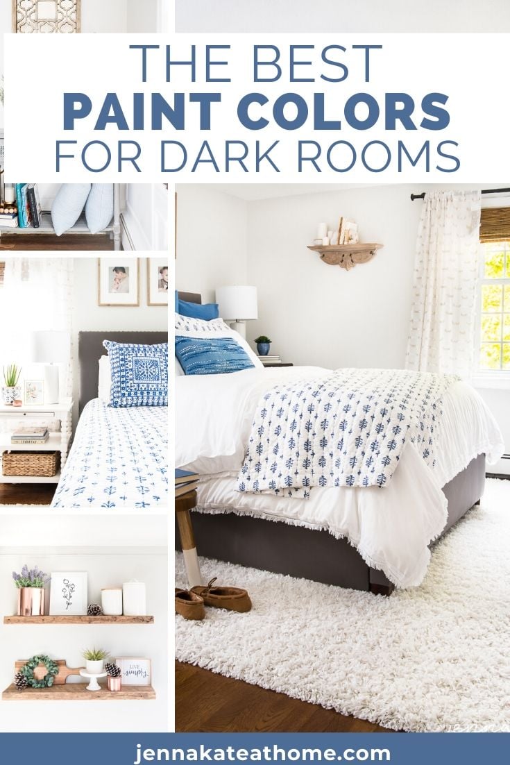
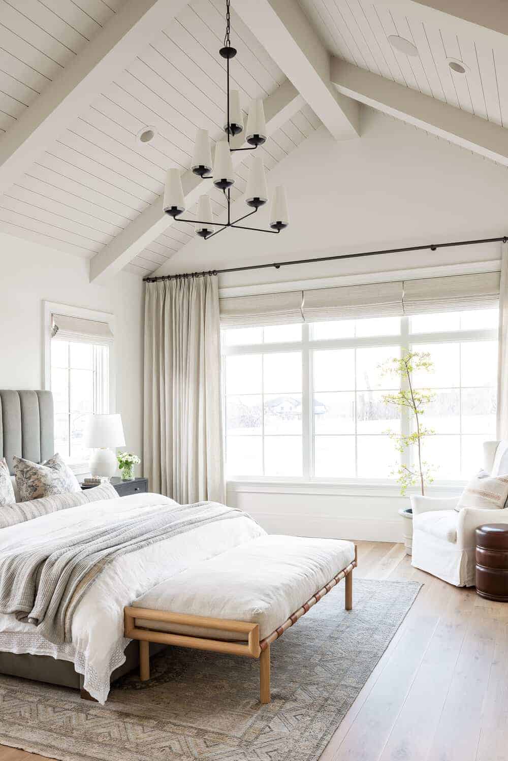
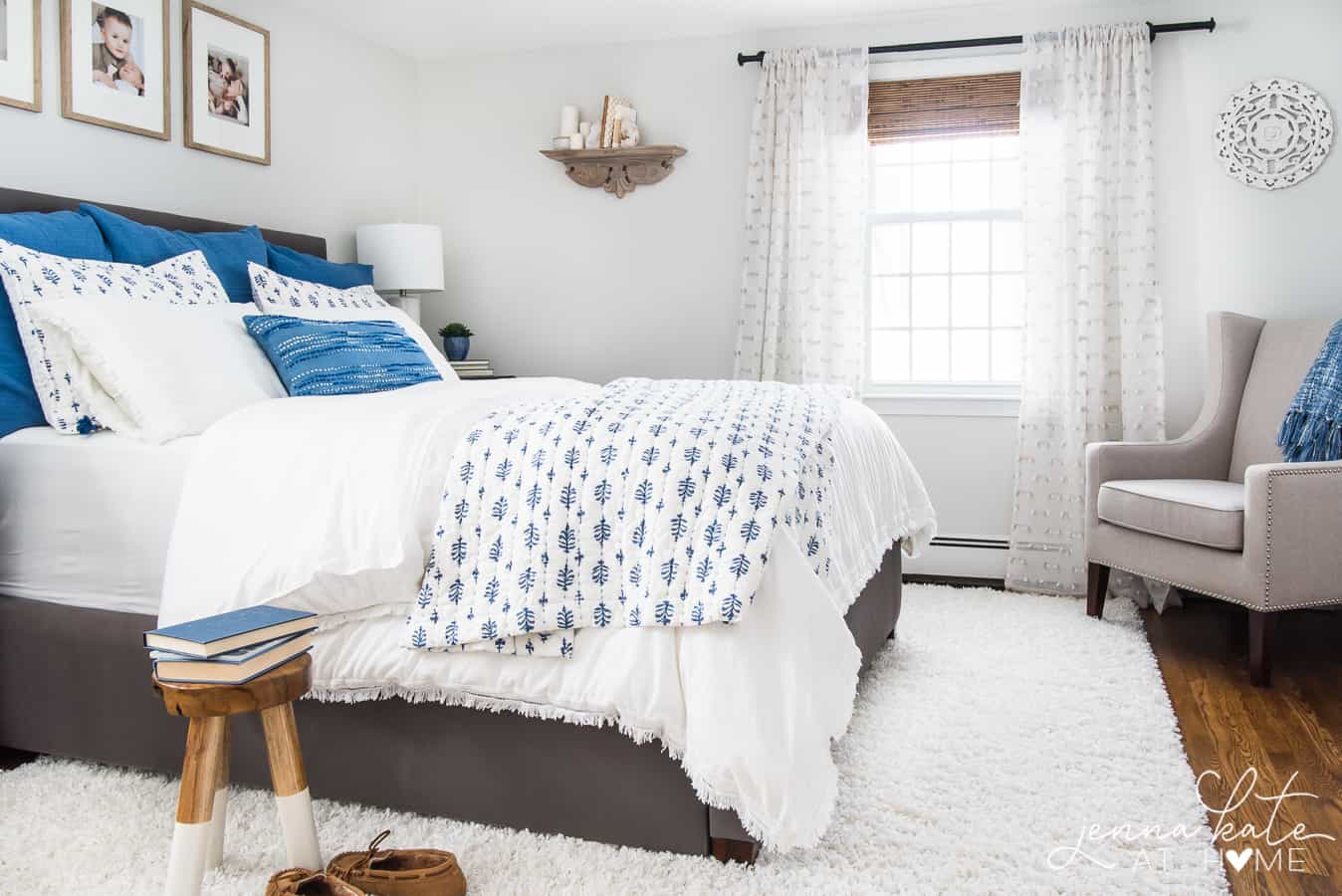
A good example of this is my master bedroom. Here you can see the before and after.
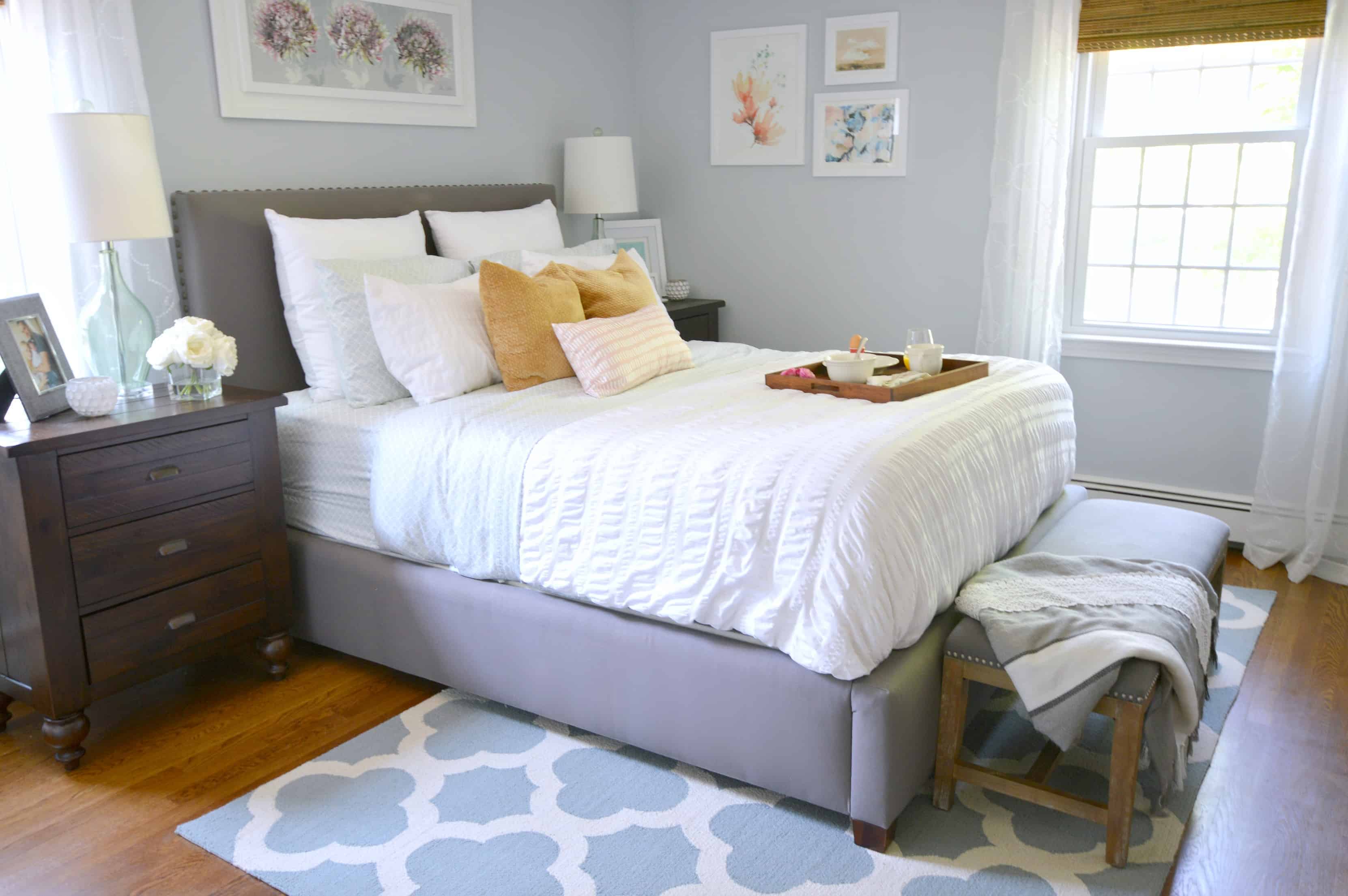
Before, the walls were painted a blueish/gray, Behr’s Light French Gray. It’s a beautiful color but I chose it before I understood the lighting in this space.
It’s a western exposure room, so it’s cold throughout most of the day save for a couple of hours of sunshine in the late afternoon. The cold light really brought out the blue in this paint color and the room always felt dull and cold as a result.
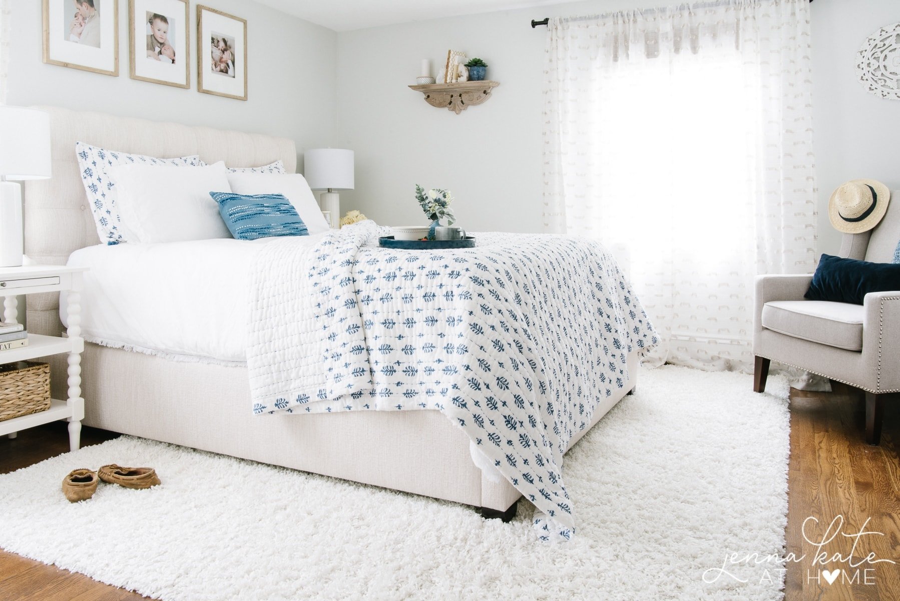
I repainted it one of my favorite light grays, Paper White, which has just enough warmth to stop it falling flat, while still giving that bright, crisp look that I wanted. However, the room still felt a bit flat and drab.
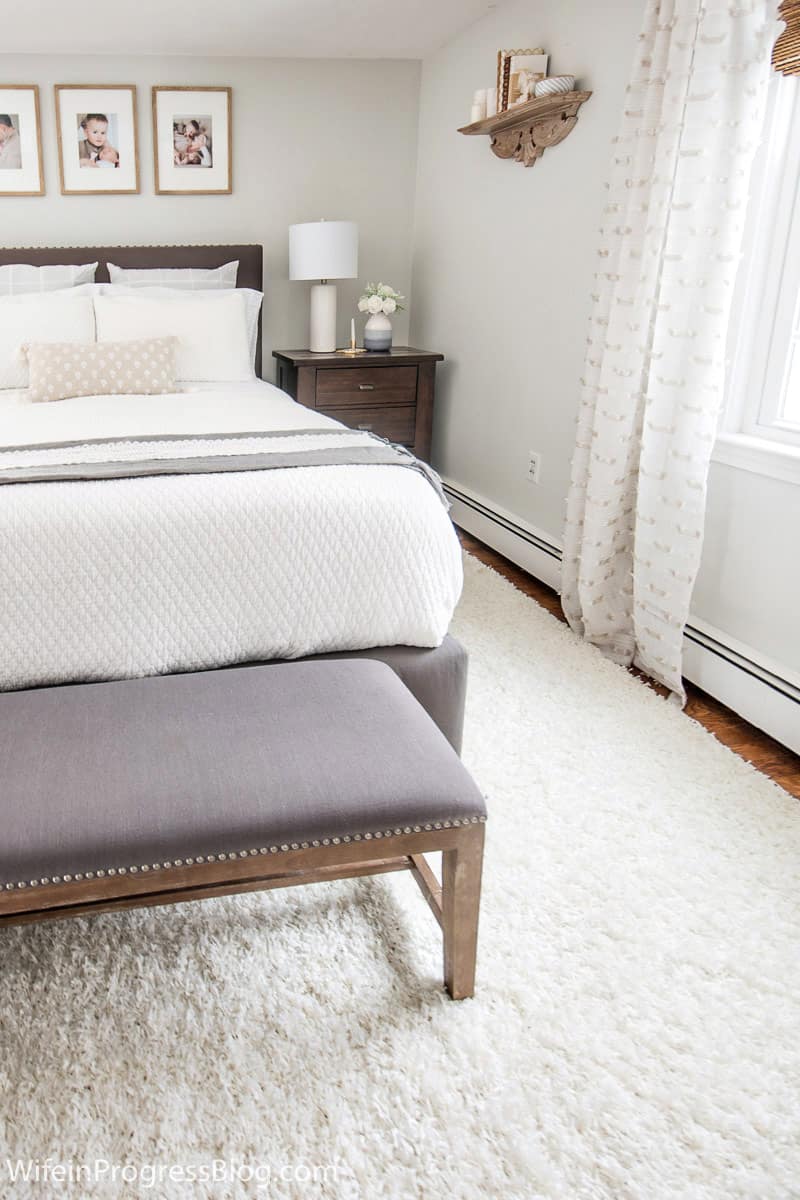
Now, notice how the furniture plays a huge roll in how this paint color appears.
Yes, initially, the new paint color made the room feel considerably brighter, but by switching out the dark wood furniture for lighter furniture, suddenly the room is transformed.
Paint Sheen
Another important aspect to consider is the paint sheen.
Flat sheen wall paint is becoming increasingly popular for walls – primarily because it hides uneven textures the best, but it’s not a good choice for a darker room where your intent is to brighten up the space, as there are no reflective particles to help reflect the light back into the room.
This doesn’t mean you need to put semi-gloss paint on your walls!
Do, however, stick to an eggshell finish which has just enough sheen to reflect light while not highlighting imperfections in your walls.
My Favorite Paint Colors and Brands For Dark Rooms
Hopefully all the aforementioned info makes sense. With that being said, there are some paint colors that I go to time and time again when I’m dealing with small, low-light or just downright dark rooms.
Just remember – no matter what paint color you choose, you need to first identify why your room is dark and amp up the amount of lighting accordingly.
Paint colors should ALWAYS be tested before committing. So many different elements play into whether a color will work in your room (the color’s undertones as well as colors reflecting from the furniture/fixings in your space). Learn more about this in my ebook.
I have written full paint reviews on many of the colors mentioned below. Where this applies, the paint color name is linked for you to click through to the full article.
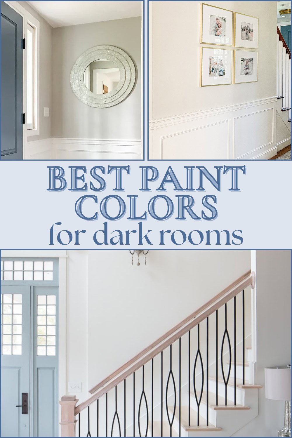
The Best White Paint Colors For Dark Rooms
When studying these photos, look to the darkest point of the photo (for example, the inner corner of a wall, or a portion in shadow) to see how the color looks at the darkest spot.
This will give you the best idea of how it will look in a darker room.
I don’t suggest a TRUE white for a north-facing room, as it will continue to make that room feel unbalanced, flat and cold. Instead, you’re going to opt for warmer, creamier whites. Even if that room has a secondary exposure of eastern or western light, that gray northern light will always be dominant, meaning that any warm white will always be cooled down by the grayer, cooler light.
With that being said, here’s my picks for the best white paint colors for dark rooms:
1. Sherwin Williams Alabaster
Alabaster is a beautiful creamy white that doesn’t disappoint. It is a great option for north-facing rooms that need that touch of creaminess to add warmth to the walls.
2. Sherwin Williams Pure White
SW Pure White is a soft white that works in virtually any space. In warmer light, the warm tones are amplified and in cooler light, its slight gray base becomes more apparent. It’s a great choice for walls and trim, and works well with both warm and cool colors.
3. Benjamin Moore White Dove
BM White Dove is truly an almost perfect soft creamy white with a slightly gray base to stop that warmth becoming over powering, It’s an excellent choice for walls, trim and cabinets.
4. Benjamin Moore Simply White
Closer to a basic white, BM Simply White has just enough warmth to stop it feeling cold. This is also a great choice for white trim and kitchen cabinets. But be careful – unlike SW Alabaster, Simply White does not have a gray base to tone down the yellow, so it can quickly become too yellow if you have a lot of warm incandescent lights.
5. Benjamin Moore Swiss Coffee
Another beautiful light but warm paint color. Artificial light will bring out more of the yellow tones but that may be a good thing in a particularly dark and dull room.
Neutral Paint Colors
If white and off-white is not your cup of tea, a simple neutral paint color in a shade of gray or beige may just do the trick.
6. Benjamin Moore Repose Gray, lightened by 50%
Incredibly popular for good reason, Classic Gray works in almost any space. It’s a beautiful warm gray that still reads like a neutral gray.
7. Sherwin Williams Colonnade Gray
A wonderfully warm and versatile gray. I used Colonnade Gray this past summer and instantly fell in love.
It’s a wonderful color for a dark room, too and really pops against white trim.
8. Benjamin Moore Paper White
I repainted several of the darker rooms in my home Paper White and absolutely adore how it looks in all of them.
It’s bright, modern and a very light gray. It has just enough warmth to stop it feeling cold but not so much that it takes it out of the light gray territory.
9. Benjamin Moore Classic Gray
If you’re looking for a slightly more saturated gray, then Classic Gray is a great choice. I would keep the furniture and accessories a lighter color to further brighten up a dark space, otherwise it can appear a bit on the dark side (like below).
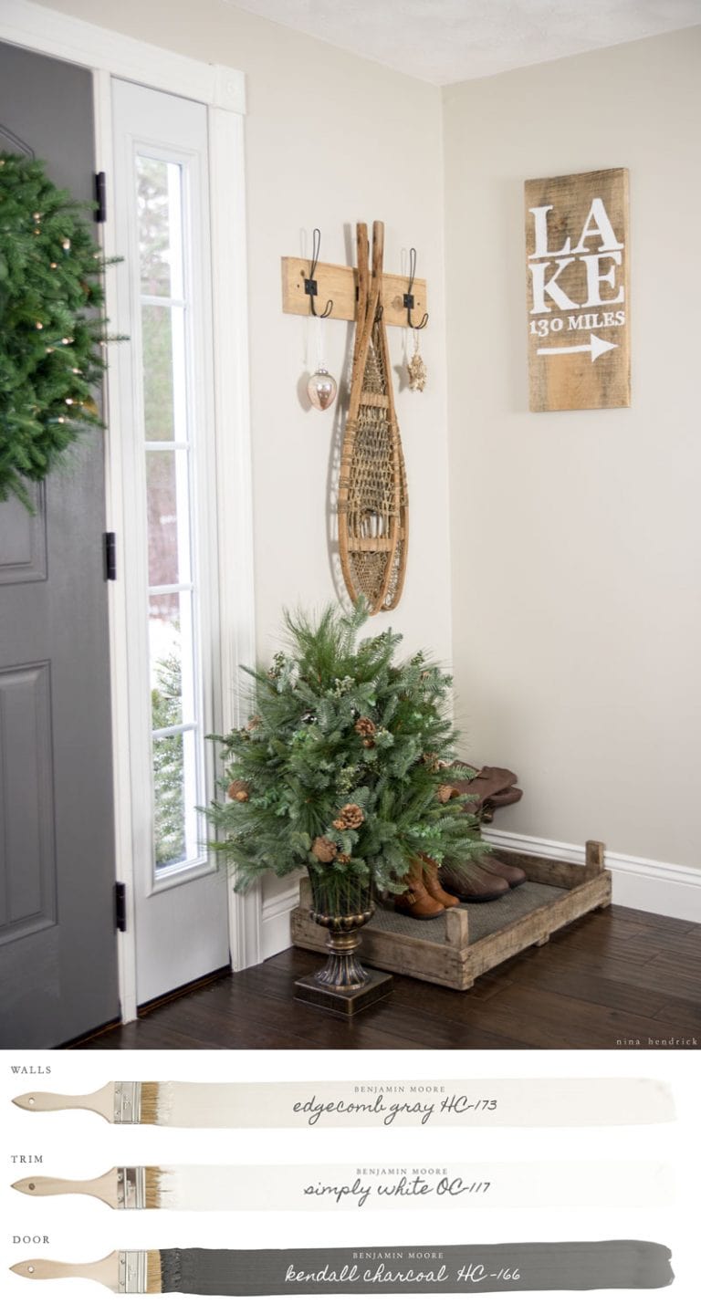
10. Benjamin Moore Edgecomb Gray
Edgecomb Gray is much more a “greige” (a mixture of gray and beige) than a true gray.
In the picture below, you can barely see any of the gray tones at all. It is a beautifully warm color that works in dark and bright spaces alike.
11. Benjamin Moore Pale Oak
Benjamin Moore Pale Oak is an incredibly popular creamy shade of greige. While it has the tendency to lean slightly pink in some lights, it’s a great neutral paint color to warm up darker spaces. It looks amazing paired with white trim, and makes other colors really pop (especially greens and blues).
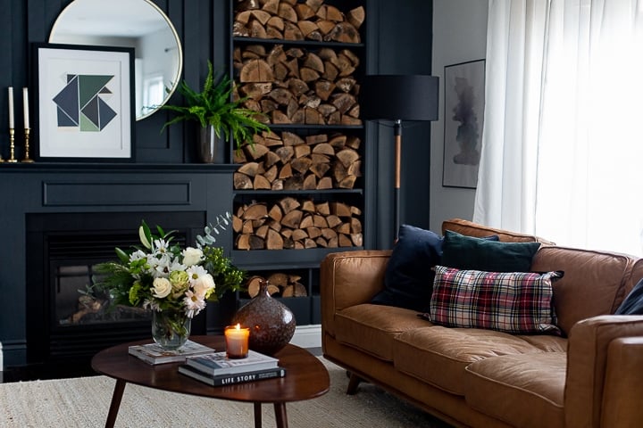
Dramatic, Saturated Paint Colors
Sometimes all you need to bring life to a dark room is some personality via the right paint color. A good dose of contrast (and some good artificial lighting!) can totally transform a flat, dark room.
12. Benjamin Moore Chelsea Gray
Hands down winner, pair it with bright white trim for stunning effect
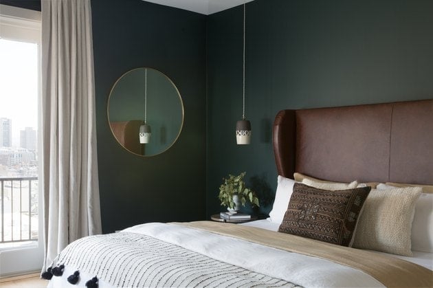
13. Behr Hostaleaf
This paint color paired with a warm white (like BM White Dove) is a match made in heaven! Green is a warm color, so it adds moodiness and drama without making the room feel cold.
14. Benjamin Moore Salamander
Another amazing moody green. It looks super elegant paired with rich mahogany and antique brass.
15. Benjamin Moore Kendall Charcoal
I adore Kendall Charcoal for a dramatic accent wall. Just don’t be afraid to really amp up the artificial light!
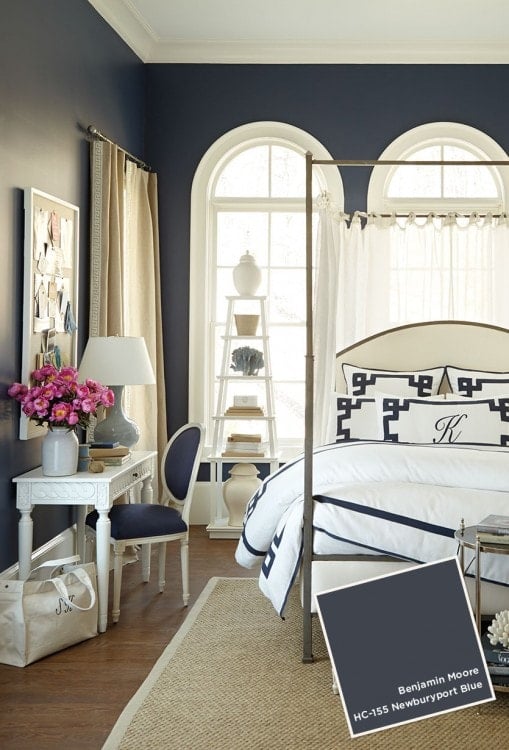
16. Benjamin Moore Newburyport Blue
Pair this navy blue paint with some crisp white trim to really make it pop and add serious wow factor.
17. Sherwin Williams Serious Gray
Another one of my all-time favorite colors. It’s a bit of a chameleon – sometimes it looks like a really dark gray, other times a dark gray/blue and even sometimes just downright blue.
But this is the exact reason I love it! It never bores me!
Don’t Neglect The Ceiling
Don’t underestimate the power of a bright white ceiling to really brighten a room. The difference between a muted white paint color and a ceiling bright white can be a game changer.
While you can certainly use a tinted paint color on your ceiling, using the standard ceiling bright white paint from either Benjamin Moore or Sherwin Williams will give you a beautifully bright, crisp white that reflects light back into the room.
Can You Paint a Dark Room a Dark Color?
Yes! If it’s done right you can paint a dark room with darker shades of paint. Sometimes working with what you have in an already dark room is easier than fighting it.
Embrace the darker aspects of your space and complement its moodiness with rich, dramatic colors. This is a great way to inject personality into a darker room.
Low light rooms can always be made to feel brighter with other tricks such as good lighting (think lots of can lights, sconces and floor lamps) lighter drapes and mirrors that bounce light back into the room.
Keep shades on lamps white, wood trim white and add in metallics like silvers and mercury glass to instantly achieve the light reflecting properties that you need to visually brighten the space.
These tricks are especially important when dealing with spaces like basements that really have almost no natural light coming in.
Don’t Forget…
Don’t forget – no matter what you’ve read or photos you’ve seen online, it’s really important to sample paint colors in your home before committing!
Samplize provides real paint samples that are easy to move around your home, and cheaper than buying a gazillion paint pots! It’s the only way I buy paint samples.
Final Thoughts
Selecting the perfect paint shade for a dark room is not just about picking a color from a swatch. It’s a nuanced process that requires a deep understanding of the unique characteristics and intricacies of the space in question. The natural and artificial light sources, the reason for the room’s darkness, and even the mood you wish to evoke – all play a major role in your decision.
Understanding the “why” behind a room’s darkness can guide you towards a choice that both complements the room and achieves your desired atmosphere. Remember, the color on your wall is not a sole source of light; it’s a reflector. The light it throws back is influenced by its surroundings: the type of lighting, furnishings, and other room fixtures.
The mood you’re targeting – whether light and airy or dramatic and moody – will also sway your color decision. If a breezy, spacious aura is what you’re after, warmer undertones in neutrals can be your allies, while richer, more saturated colors can contribute to a moodier, more character-filled ambiance.
While many gravitate towards white to brighten spaces, it’s essential to realize that not all whites are created equal. The undertones in white can significantly impact the feel of a room, especially in spaces with northern light exposure. And while neutrals can be a safe bet, considering the warmth of those neutrals is crucial, especially for spaces that get less natural light.
Lastly, it’s not just about the walls. The furniture, fixtures, and even paint sheen play considerable roles in determining how the final room feels. In spaces where you’re aiming to amplify brightness, your furniture should echo this sentiment. Paint sheen, too, can subtly enhance the room’s brightness.
Ultimately, the ideal paint color for any dark room is not a one-size-fits-all answer. It’s a mixture of understanding your space, discerning the mood you want to create, and considering all elements in the room. With these considerations at the forefront, you can transform any dark room into a space that speaks your language.

Such an informative article! I love all things paint related and this helps me to understand what will work best in my North facing home. I have tried many grays and blues that ended up looking purple. I ended up with a Copper Haze in the Living Room and Tea Leaves in the bedroom. They look great and warm. But that was years ago auld I’m ready for some warm white now!! Thanks so much!
I love how you redid your master bedroom. Are you able to tell me where you purchased your sheers? I am looking to redo my front living room (which is west faced and minimal natural light) and I’m thinking the sheerness with a bit of texture would compliment my room.
Thanks Debbie! I purchased the sheers at HomeGoods about 5 years ago but I’ve them and similar several times since!
I know this is an older article, but I just want you to know how helpful it is. Your explanation of light, or lack of, was like a light going on. See what I did there, lol. I have a north facing no window, only door, living room. I always picked colors I liked without thought of lighting, and it never was the one. Now I know what undertones look for and sheen. Your examples are very helpful too. I think this next go round will finally get the look I’ve been searching for. Thank you
Glad it was helpful!
Can you tell me where to find the light colored upholstered bed you switched to in the master bedroom?
It was from Raymour & Flanigan but it’s now sold out.
so it is very helpful to be used as a reference in organizing
Hello !
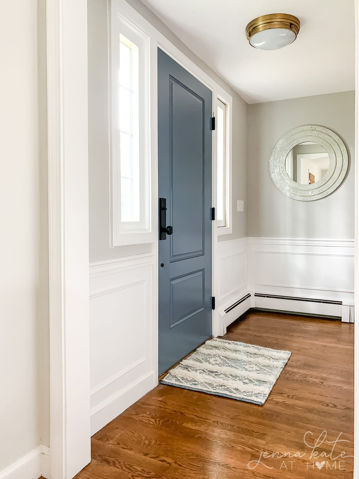
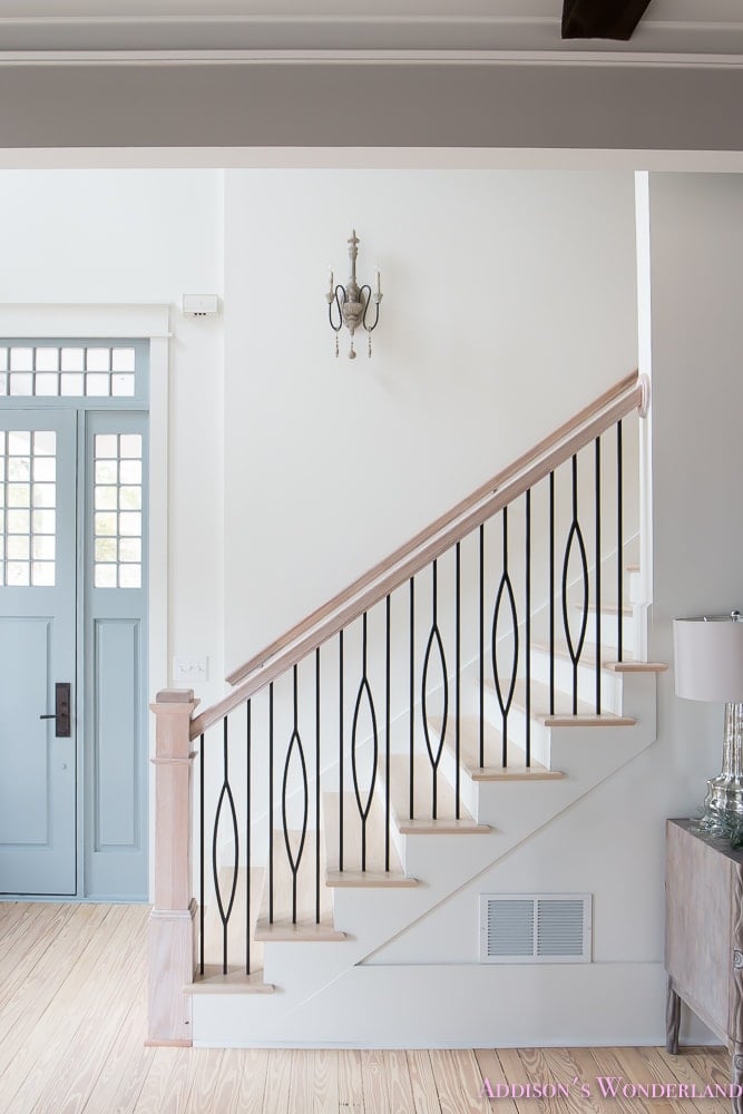
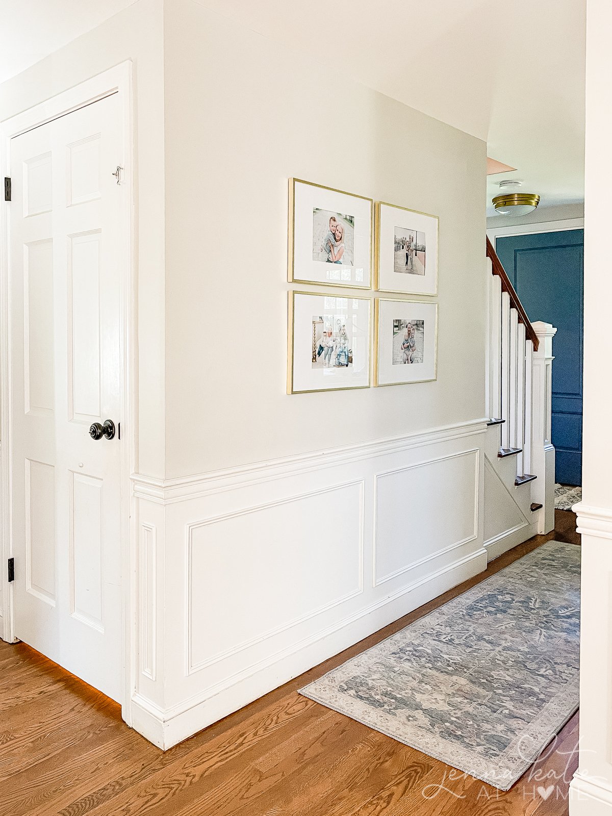
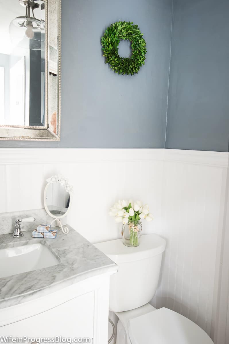
What color is the blue door? Are the walls in that picture the repose gray?
Yes, the walls are Repose Gray. The door is a factory finish color from Harvey Building Products, called “Wedgewood”