Content may contain affiliate links. When you shop the links, I receive a small commission at no cost to you. Thank you for supporting my small business.
Learning how to balance warm and cool colors in your home is a designer’s top secret to achieving an attractive and balanced look.
Can You Mix Warm and Cool Colors in a Room?
Have you ever felt that your room just doesn’t feel right? Something is missing, it just seems a bit ‘flat’ and you can’t quite put your finger on what’s wrong.
When it comes to interior design, the art of mixing warm and cool colors is essential in creating a space that feels balanced and inviting.
So yes, you absolutely can mix warm and cool tones, but there’s a way to do it.
The Art of Creating Tension While Designing a Room
There’s a design term called ‘tension‘. Tension means deliberately creating a contrast in a room to make it more interesting and dynamic. It’s like when you mix different styles together to create a sense of excitement.
Rooms that lack tension lack creativity and imagination. They are rote, predictable, and uninspiring.
For example, imagine a room with both modern and traditional elements. The clash between the clean and simple modern furniture and the detailed and fancy traditional accessories creates tension that makes the design more captivating.
It’s similar to how a painting with different colors or textures catches your eye, or how a song with different melodies evokes emotions.
Tension in interior design is about combining contrasting elements in a way that looks balanced and appealing.
Today we’re going to talk about creating tension by using complementary colors.
Should I Use Mainly Warm or Cool Tones?
You might be drawn to one tone more than the other, but it’s crucial to embrace the harmony that can come from combining these contrasting hues in your room.
I personally am drawn mainly to cool tones, since I gravitate towards more of a modern coastal design aesthetic. But too many cool tones in one space can feel cold and uninviting, while too much warmth might just feel like it’s missing something.
By thoughtfully playing with warm and cool tones, you’ll end up with a space that exudes character, charm, and a sense of flow.
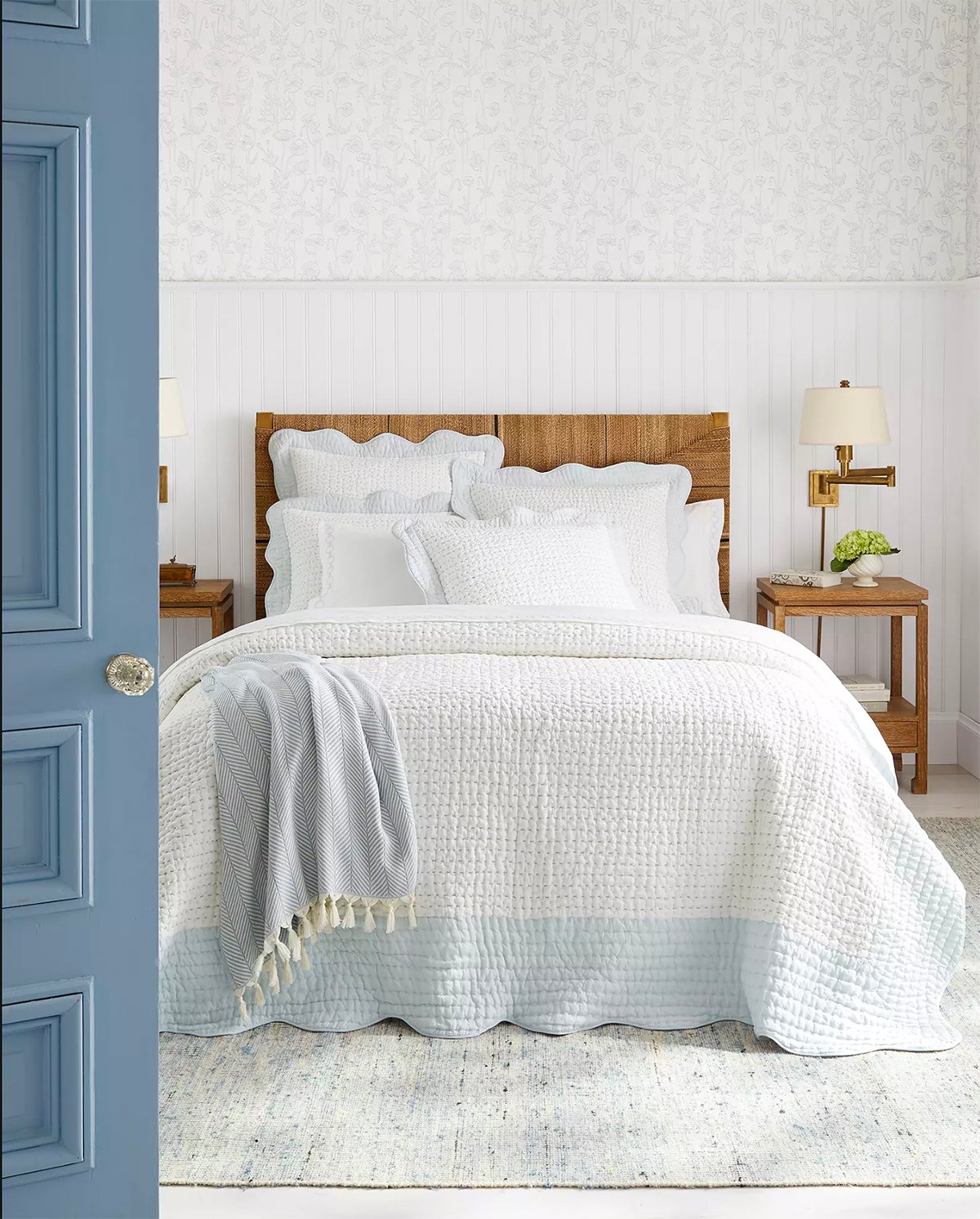
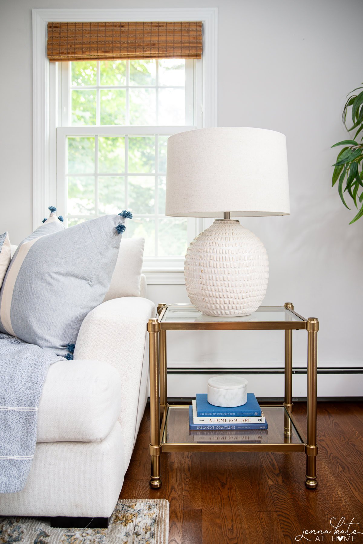
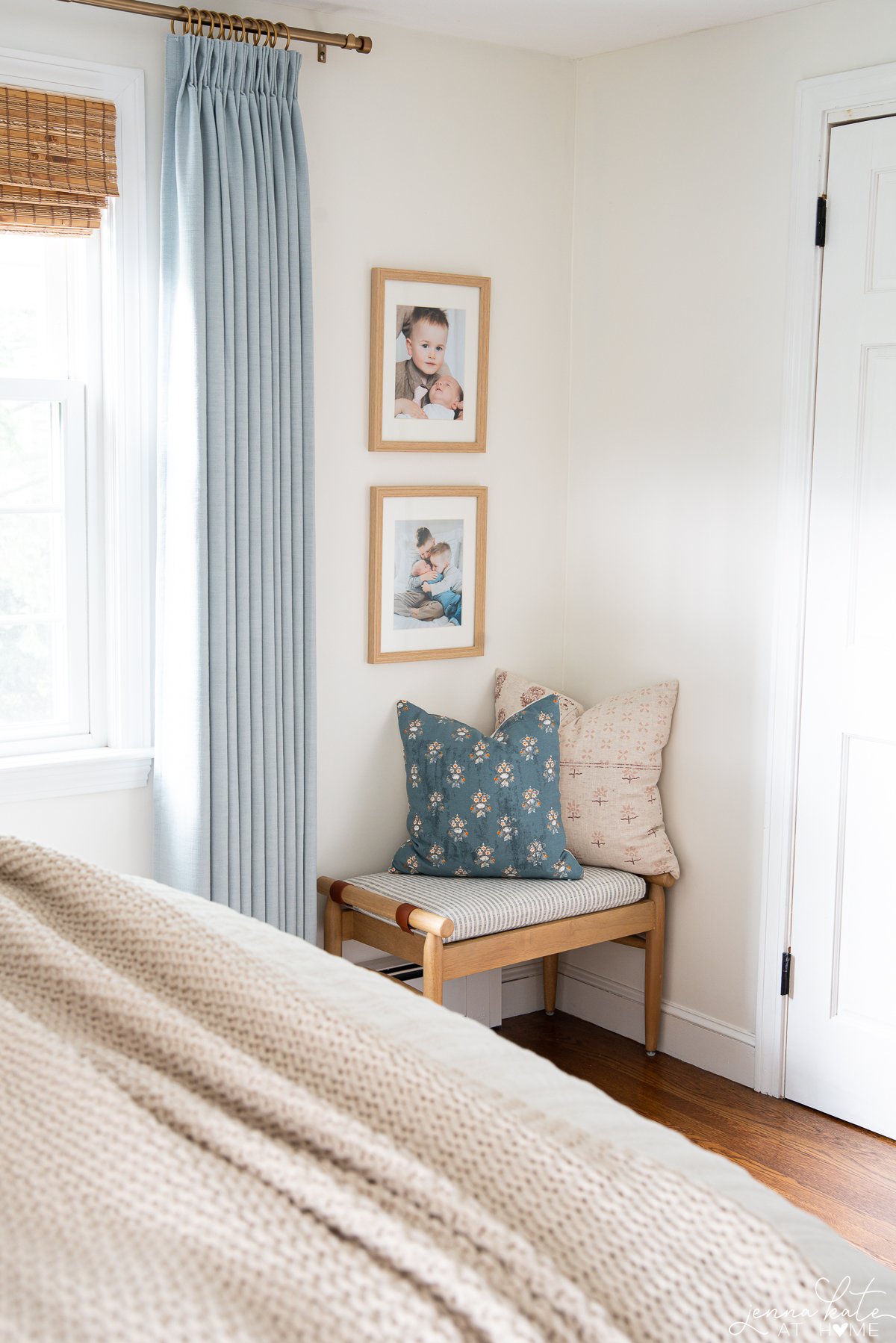
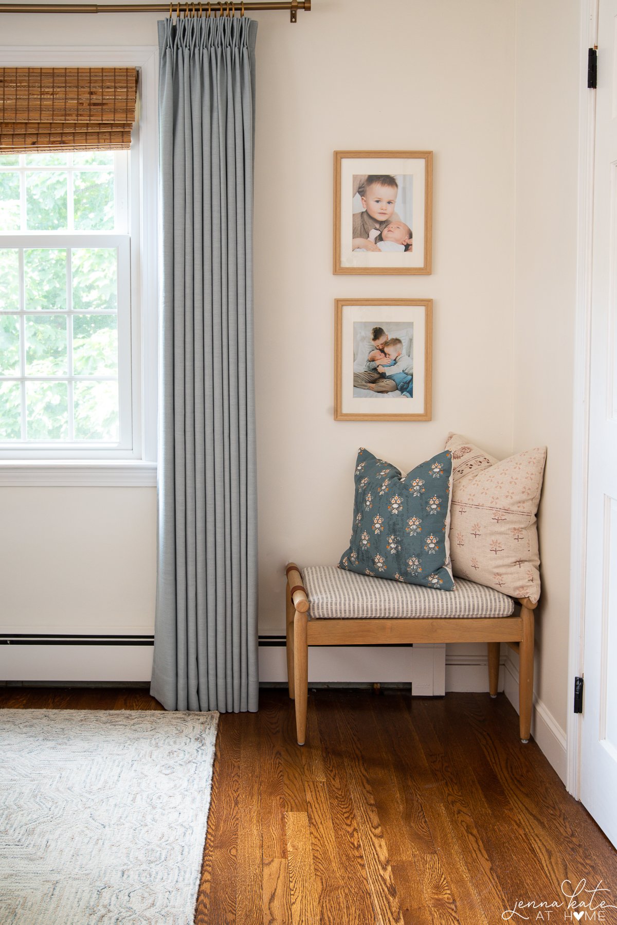
Note the contrast between the soft blues and whites and the rich rattan and antique brass sconce.
Remember that your goal is to create a visually appealing environment that feels welcoming while maintaining a sense of coherence.
You’ll want to consider the existing colors in your furniture, walls, and decorative accents while gently introducing new shades that either amplify warmth or coolness.
It’s important to strike a delicate balance without overpowering one color palette. It’s a good idea to stick to a ratio of 80/20. So either 80% warm with 20% cool or vice versa.
Understanding Warm and Cool Colors
Color Wheel and Color Theory
The color wheel is a visual representation of colors arranged in a circular format, allowing you to see the relationships between them. The color wheel is divided into two main categories: warm colors and cool colors.
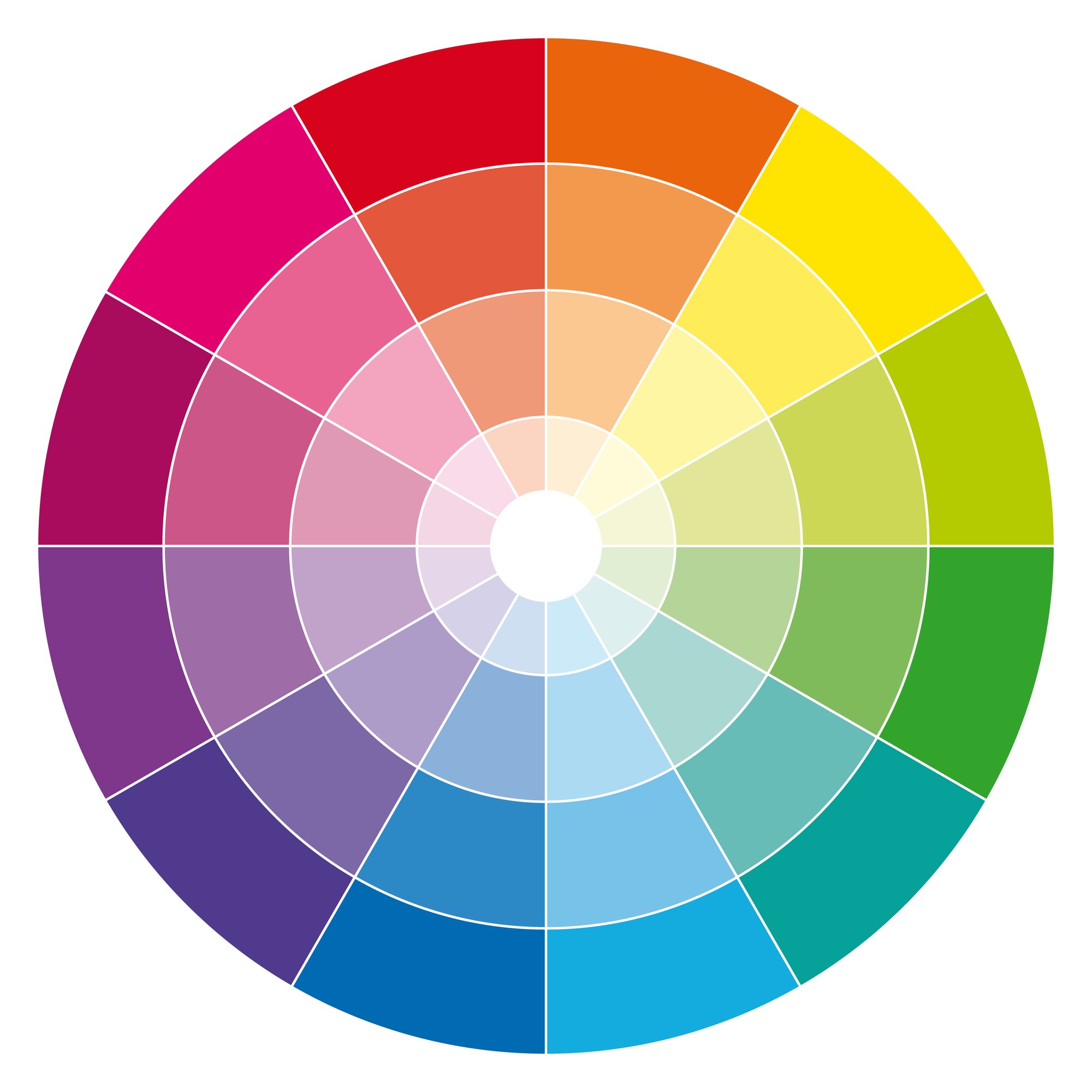
To understand how to mix warm and cool colors in a room, it’s essential to familiarize yourself with color theory. Color theory is a set of principles that help guide you in choosing and combining colors to create visually appealing and harmonious spaces.
The warm colors are red, yellow, and orange. The cool colors are green, blue and purple.
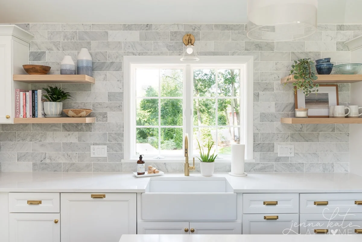
Complementary colors are those that are opposite each other on the color wheel. For instance, blue’s complement is orange.
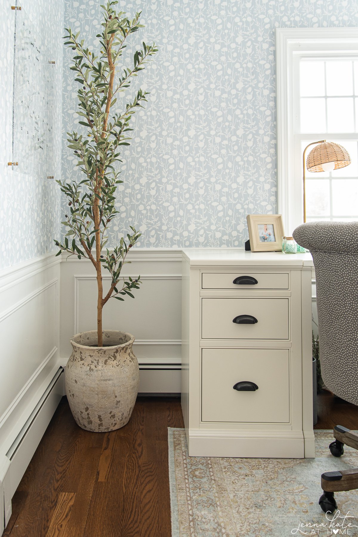
When you pair blue with orange, it makes the blue come to life and really pop. That is why you’ll see blue paired so often with warm wood tones, rattan and rich brass.
Sometimes it’s not immediately obvious whether a color is warm or cool, particularly when you’re dealing with shades of white or gray.
Design Tip
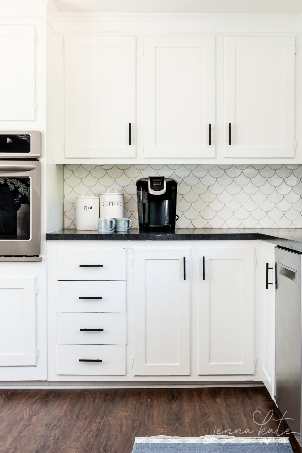
Most of us are not decorating with pure shades of red, yellow, blue or green, especially when we’re dealing with paint. Understanding how to correctly identify undertones is important in order to balance the tones in a room.
How to Create Balance and Contrast
Balancing Warm and Cool Tones
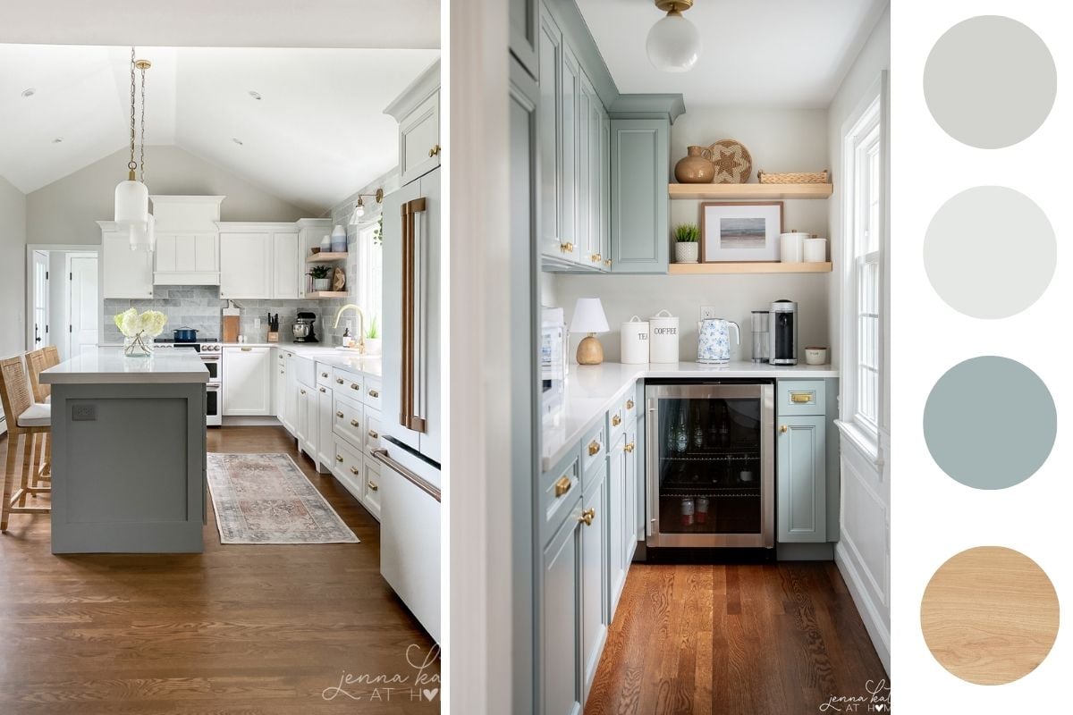
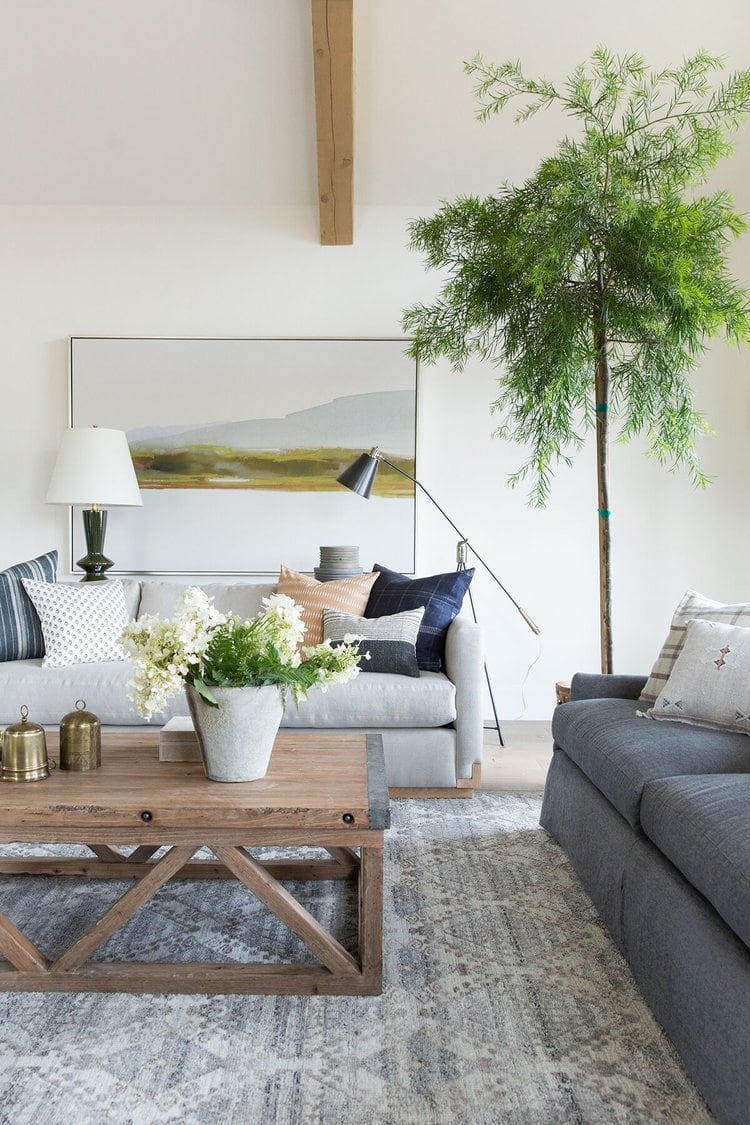
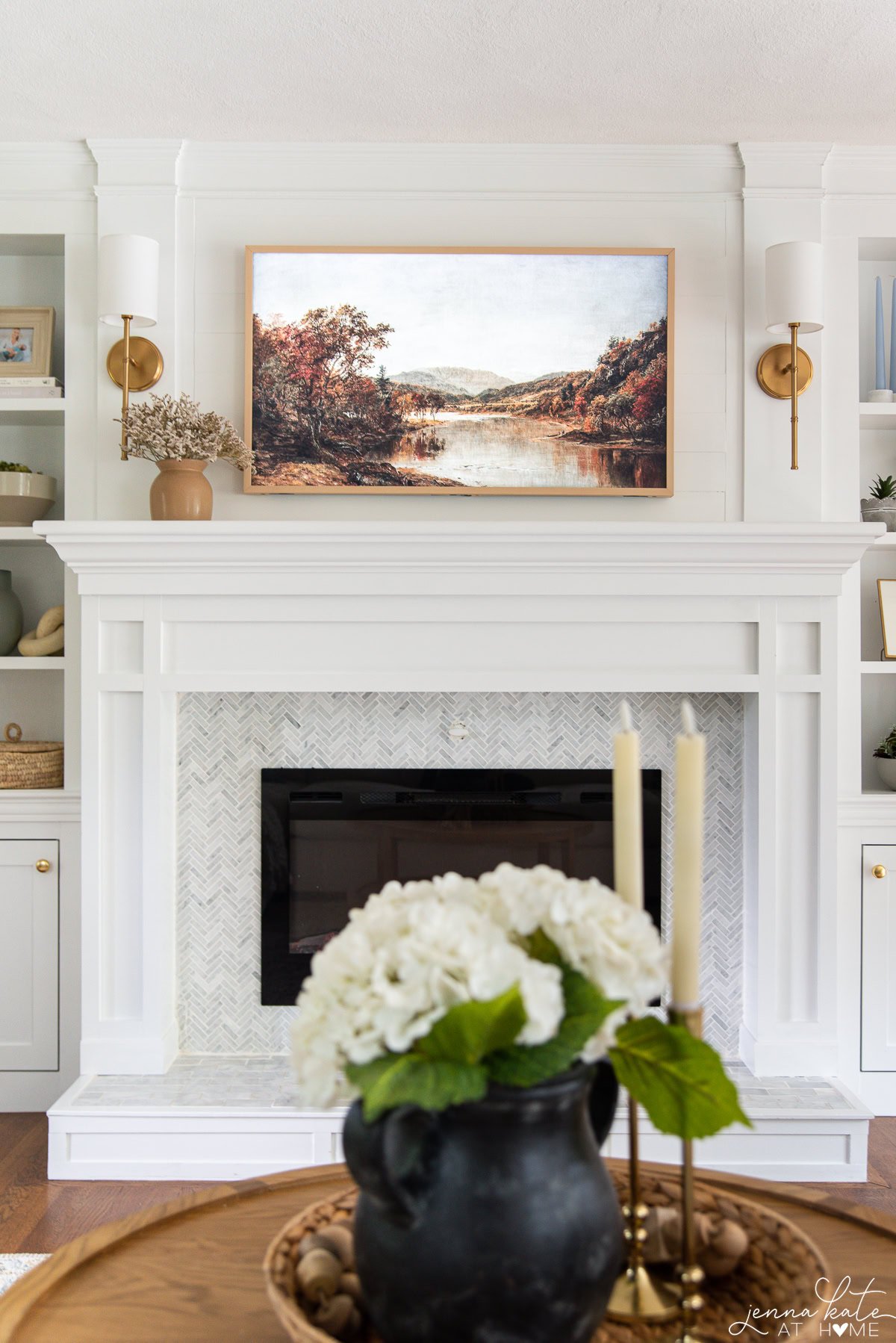
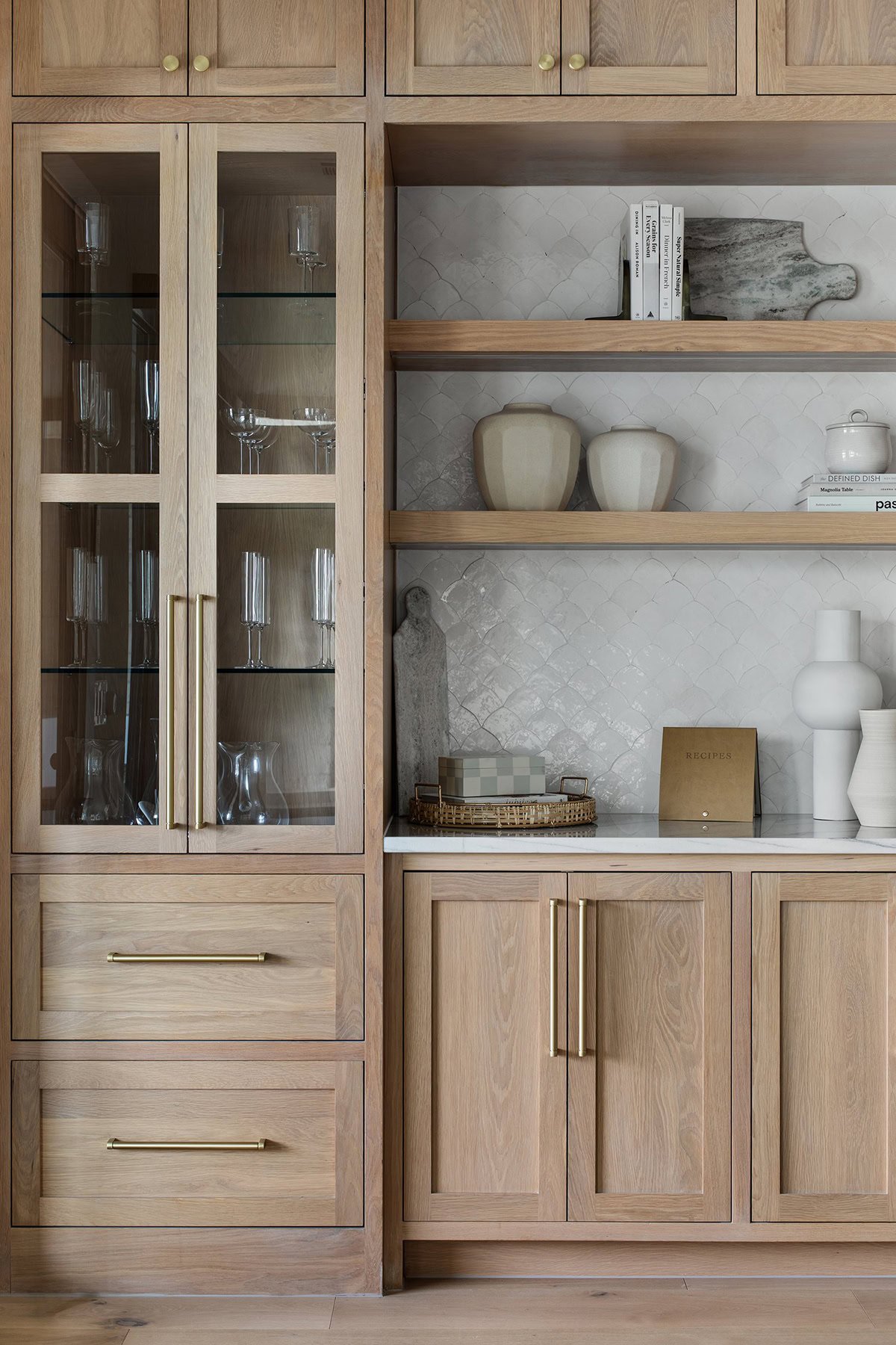
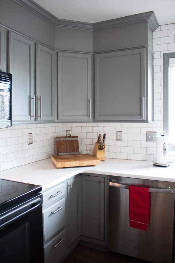
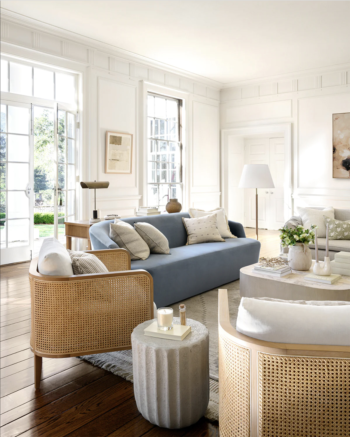
If you have a room with predominantly cool walls, add warmth with furniture and textiles in warmer hues. The easiest way to do this is to bring in wood tones. Light to medium toned woods creating a beautiful warm contrast with cooler tones like whites, blues and greens.
There’s a reason you’ll see so much wood in coastal inspired decor. Otherwise, the designs would feel one-note and just fall flat.
Conversely, if your walls are warm shades, incorporate cool elements such as blue, gray or green accents to achieve balance.
Using these contrasting elements will make your space feel layered and sophisticated.
RELATED: Mixing Metals in a Bathroom.
Using Neutral Colors
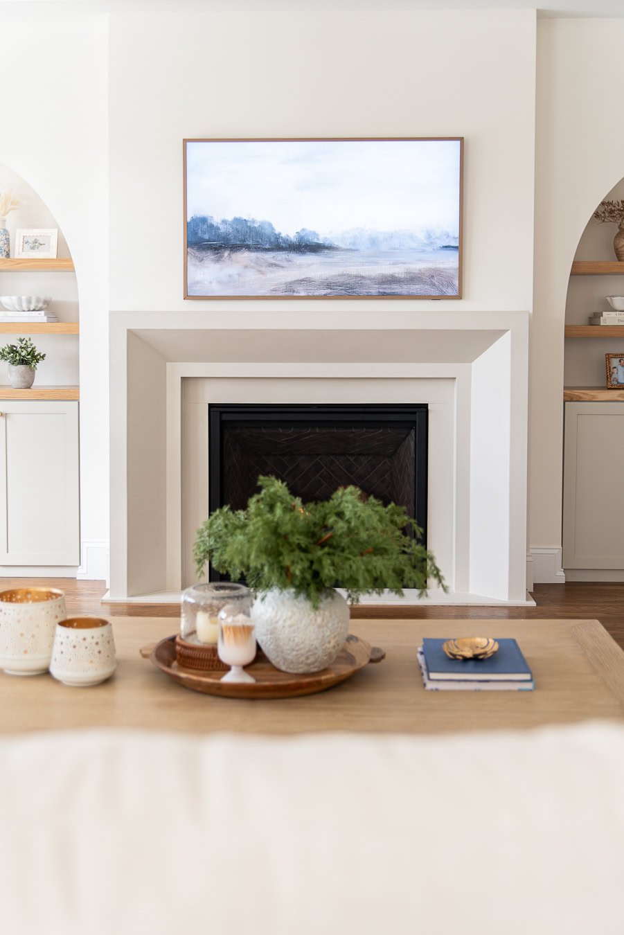
Neutral colors, such as white, beige, and gray, serve as a way to bridge the gap between warm and cool colors in your space.
By incorporating neutral hues into your room’s design—whether through wall colors, furniture, or large area rugs—you’ll create a cohesive and harmonious backdrop for layering colors.
Working with Different Furnishings and Accessories
By far the easiest way to achieve a balanced look between warm and cool is to follow the 80/20 rule. The major items – the wall color and all large pieces of furniture should be the same tone, either warm or cool.
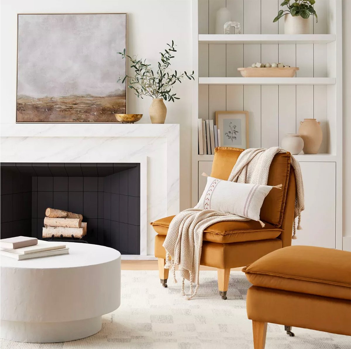
The rich velvet chairs in this stunning ochre color had the contrast that this room needs to really pop. Everything else is kept light and neutral so that the chairs are the main focal point to create the tension.
Then, layer in the opposite tone through accessories such as accent chairs, rugs, throw pillows and artwork.
- Pick pieces that balance the room’s color palette
- Use bolder colors sparingly to avoid overwhelming the space
- Pair neutrals with more vibrant hues for a balanced look
Frequently Asked Questions
First, choose a dominant color, either warm or cool, to set the room’s overall mood.Then, add complementary colors from the opposite temperature range to create balance and contrast.
Make use of transitional hues, like neutral shades, to seamlessly blend the colors. Remember that color proportions and placement matter—an 80/20 ratio works best.
Blue with yellow or orange tones (think brass and wood) are always a good choice. Green works equally well.
A mostly neutral room with warm white walls and brass accents will benefit from a rich pop of green. while a masculine space filled with cool grays with come to life once you add rich brown leather chairs.
The key is to select colors that complement each other and bring a sense of balance to the space. Experiment with different shades and intensity levels to find what works best for your room.
First, analyze what’s currently in your space. If your room has predominantly cool tones (lots of cool white, blue, gray), then start by bringing in some wood tones or brass. This can be as simple as a new coffee table or wooden boxes on a shelf, or just switching out your previous table lamps for new brass ones.
If you room is mainly warm, try adding in some throw pillows with a blue pattern or tree in the corner of the room that has lush green foliage.
Final Thoughts
As you embark on this color journey, keep in mind that it’s all about trial and error. Don’t be afraid to experiment with various combinations until you achieve the desired effect.
Use your intuition and pay attention to how the mix of warm and cool colors resonates with your personal style.
Trust that your creative efforts will result in a beautiful and cohesive space that you’ll enjoy for years to come.