Content may contain affiliate links. When you shop the links, I receive a small commission at no cost to you. Thank you for supporting my small business.
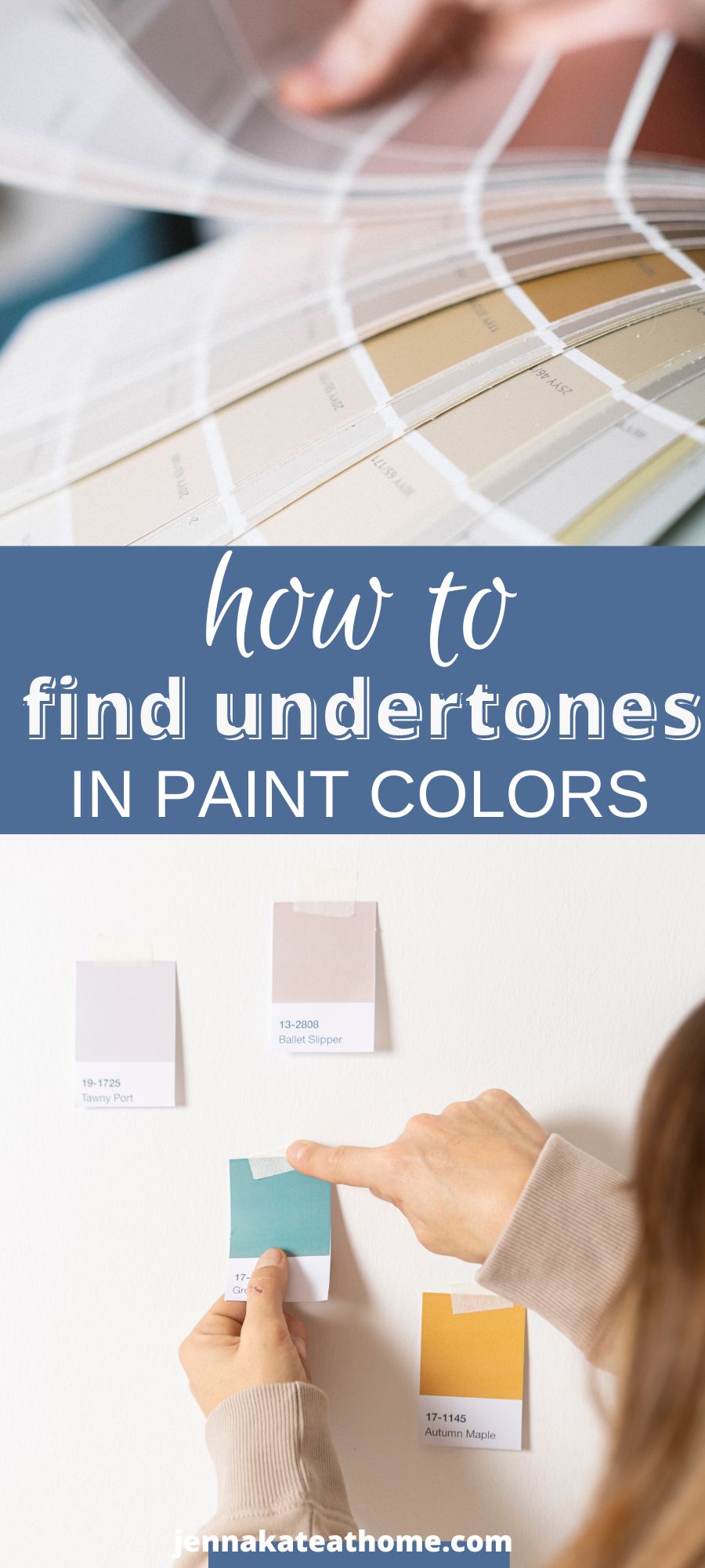
Learn how to determine undertones in paint colors with these expert tips and techniques. Once you see how easy it is to spot undertones, you’ll never choose the wrong paint color again!

When selecting paint colors for your home or any project, it’s crucial to understand the undertones present in each color. Undertones are subtle hues that can greatly influence the overall appearance of paint colors, making them appear warmer or cooler.
To master the art of identifying undertones, you need to delve into the color wheel, which reveals the relationships and combinations that work harmoniously.
Even neutral colors have undertones that can impact various elements, such as tiles, carpets, fabrics, and countertops. By grasping how to choose colors based on their undertones, you can achieve the desired look and atmosphere for your space.
Understanding Undertones
Masstones and Undertones
When choosing paint colors, it’s essential to understand the difference between mass tones and undertones. The mass tone is the predominant color you see at first glance. Gray, blue, red, white, etc.
The undertones are the subtle hues hiding within the mass tone, which may not be immediately noticeable. Undertones become more apparent when you place paint colors next to each other, especially when comparing similar shades.
Four Easy Ways to Help You Spot Undertones in Paint Colors
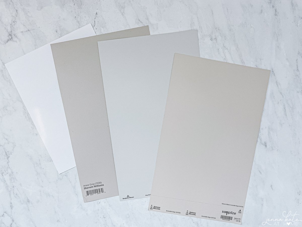
- Paint Color Strip: Examine the colors on a paint color strip, focusing on the mid-to-darker shades rather than the paler ones at the top. This helps identify undertones, especially in light neutrals or white.
- Comparison to True Colors: Compare your chosen color to a “true” color from the same family. For example, if you’re examining a red hue, compare it to a known true red to discern if it leans more towards yellow or violet undertones.
- White Paper Test: Place your paint sample next to a white paper and observe any differences in color or hue. This test helps reveal undertones.
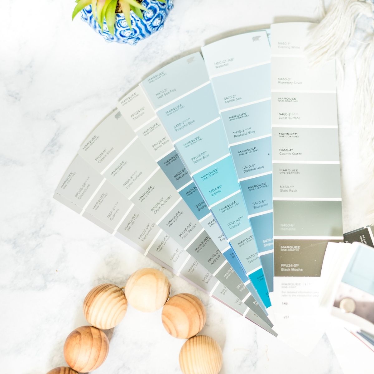
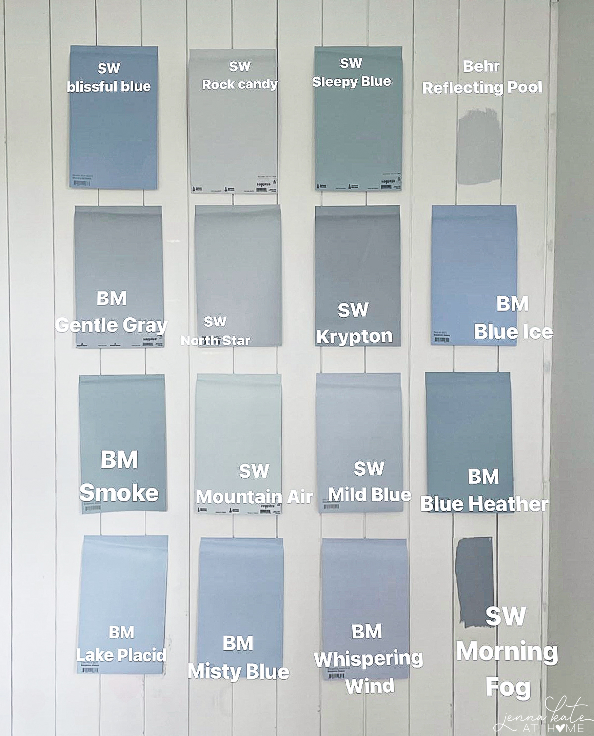
- Comparison of Similar Colors: Compare two similar colors, such as two shades of blue, side by side to highlight their respective undertones.
Cool Colors and Warm Colors
Colors are typically categorized into cool and warm temperature ranges. Cool colors have undertones that are green, blue, or purple, while warm colors have undertones that are orange, yellow, or red.
When selecting paint colors, consider if it looks warm or cool to you and the mood you want your space to have. By determining a color’s temperature, you can better understand its undertone and how it will interact with other colors in your design scheme.
Color Wheel
Think back to what you learned about color in grade school art classes. The color wheel is an essential tool for artists and designers since it shows the relationships between primary, secondary, and tertiary colors.
In terms of understanding undertones, comparing a paint color to the colors in the wheel can help determine whether its undertone is more yellow, violet, or any other hue.
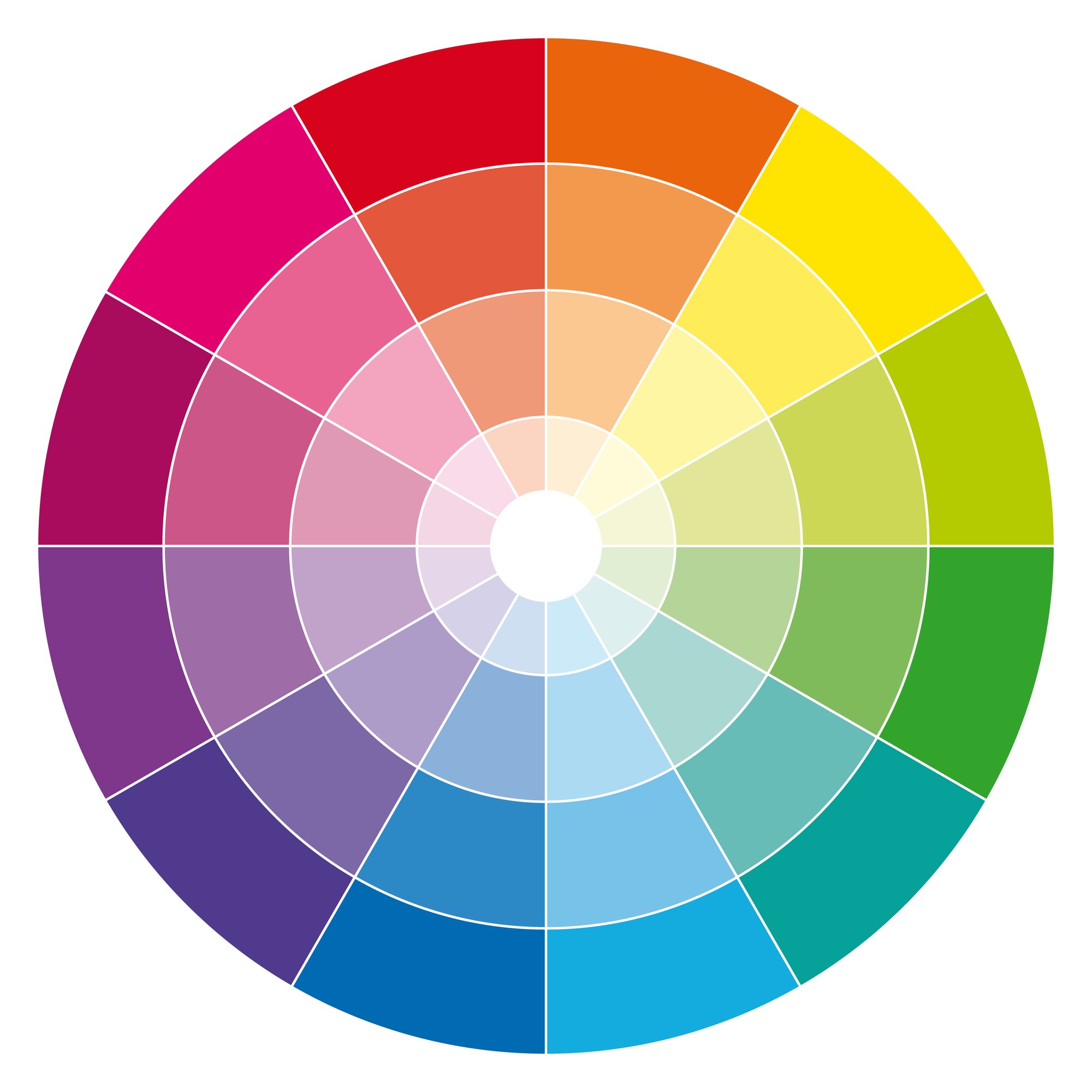
Comparing your paint colors to a color wheel can help you determine the hue that may be hiding within it. It’s also a helpful tool to help you coordinate colors in your home.
Identifying Undertones in Paint Colors
Once you know how to, it’s easy to train your eye to see the undertones in colors. Here are some ways to do it:
Comparing to White Paper
- Obtain a pure white piece of paper.
- Place a small amount of your chosen paint color on the white paper.
- Compare the paint color to the white paper, noting any differences in color or hue.
I think this is the easiest way to quickly spot undertones. By comparing your paint color to a pure white, you can see any subtle undertones more easily.
Using a Paint Strip
- Get a paint strip for the color you’re considering.
- Examine the darkest shade on the strip.
- Determine the undertones present by observing any additional colors or hues in the darkest shade.
This process particularly helps in understanding the undertones that might be present in the lighter shades on that color strip.
Compare to Similar Colors
- Compare two similar colors (2 blues for example) next to each other and their respective undertones will become more apparent.
Studying the Paint Color Formula
- Request the paint color formula from the paint store (or look it up online).
- Examine the formula for different pigments that have been mixed to create your desired color. You can see how much red, green or blue has been added.
- Identify the undertones by recognizing which pigments are more dominant in the formula.
Understanding the paint color formula can help you determine the underlying hues in the paint itself, giving you a better idea of the undertones present.
Exploring Color Families and Undertones
Undertones can make or break your design, adding depth and harmony, or clashing horribly with other colors in your space. Understanding color families will help you make better choices when it comes to choosing colors for your home.
- Red Undertones: Red hues can exhibit undertones ranging from orange to pink or purple. Comparing them to true red helps identify whether they lean towards yellow, violet, or remain close to true red.
- Blue Undertones: Blue shades can encompass undertones of green or violet. Comparing them to true blue helps determine if they lean more towards green or violet.
- Green Undertones: Green colors may have undertones of blue, yellow, or gray. Comparing them to true green helps discern whether they lean closer to blue, yellow, or maintain their green integrity.
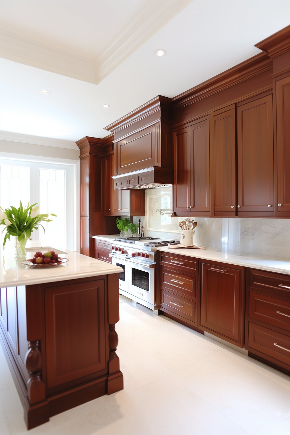
- Brown and Taupe Undertones: Browns can possess undertones of yellow, orange, or red, while taupe can lean towards violet or pink. Comparing them to true brown or taupe reveals the dominant undertone.
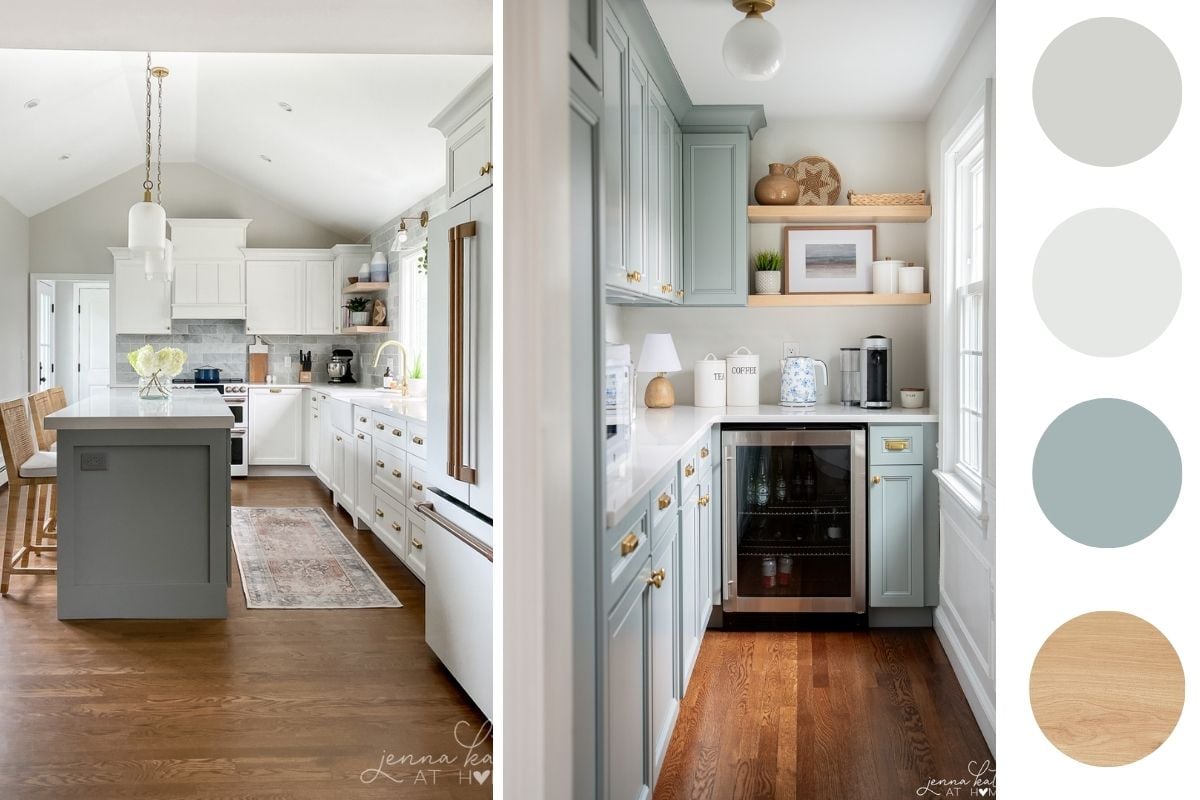
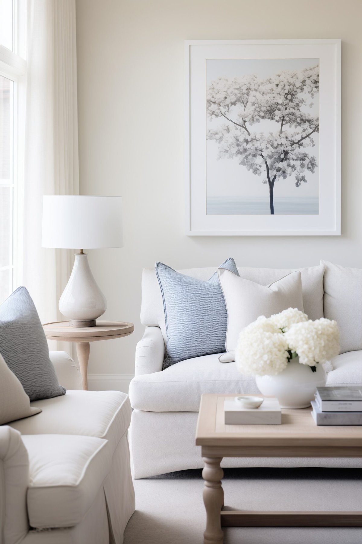
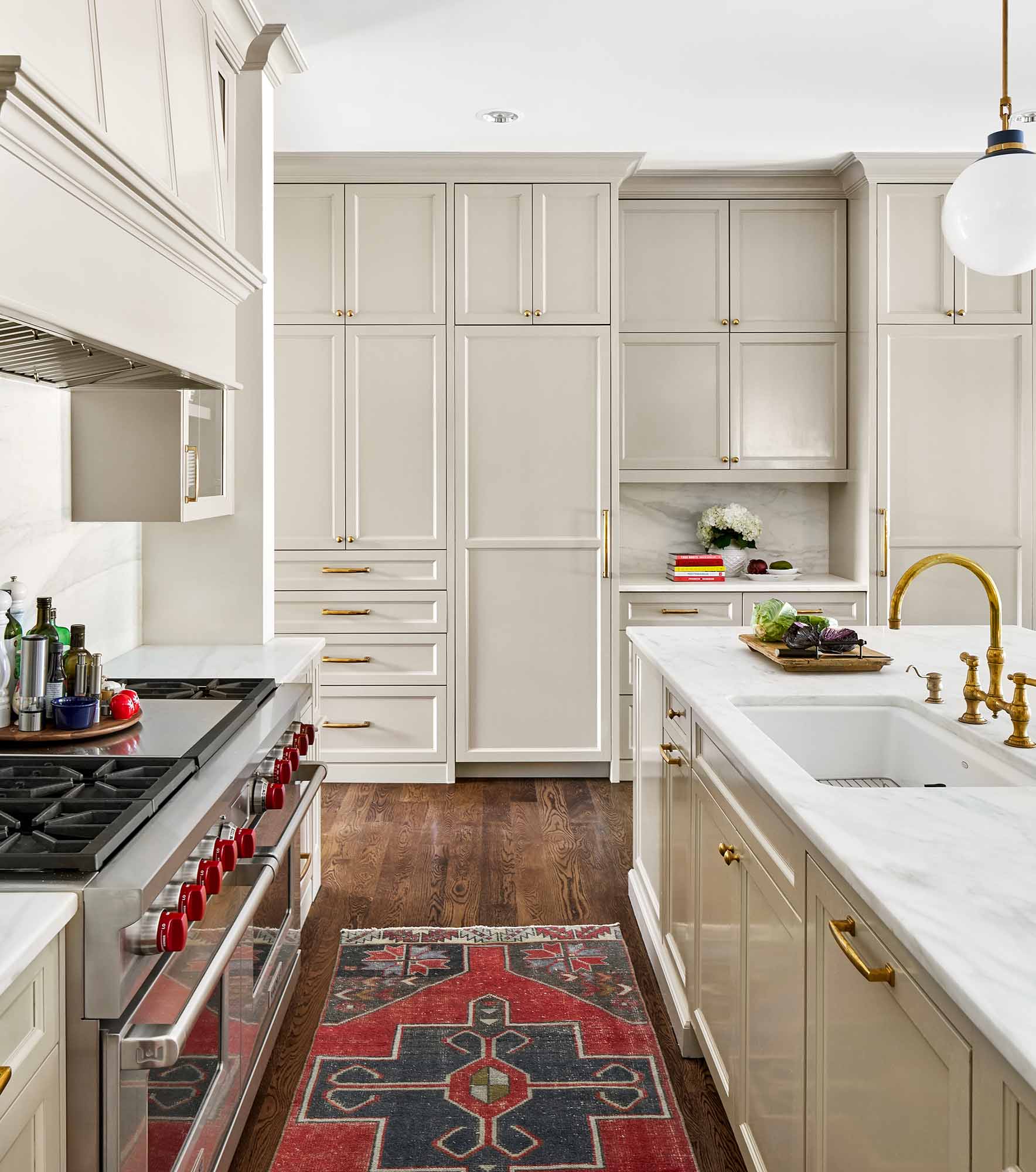
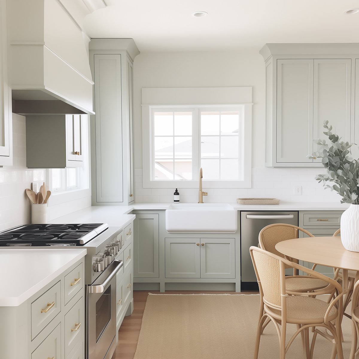
- Neutral Colors: Gray, beige, and white can have various undertones. Gray can exhibit undertones of blue, green, or purple/pink/violet, while beige might lean towards orange or pink. White can reflect any color due to its high light reflectance value (LRV). Comparing them to true gray, beige, or white helps to identify undertones, and comparing different shades of gray reveals their undertones.
Tips for Choosing Paint Colors with the Right Undertones For Your Existing Finishes
Look at your Fixed Elements
When selecting paint colors for rooms with existing cabinets, trim, or flooring, it’s essential to coordinate undertones for a cohesive appearance.
Observing the undertones in these elements helps guide your choice of paint colors. While matching undertones is generally recommended, you can also choose complementary colors that enhance rather than match the existing finishes.
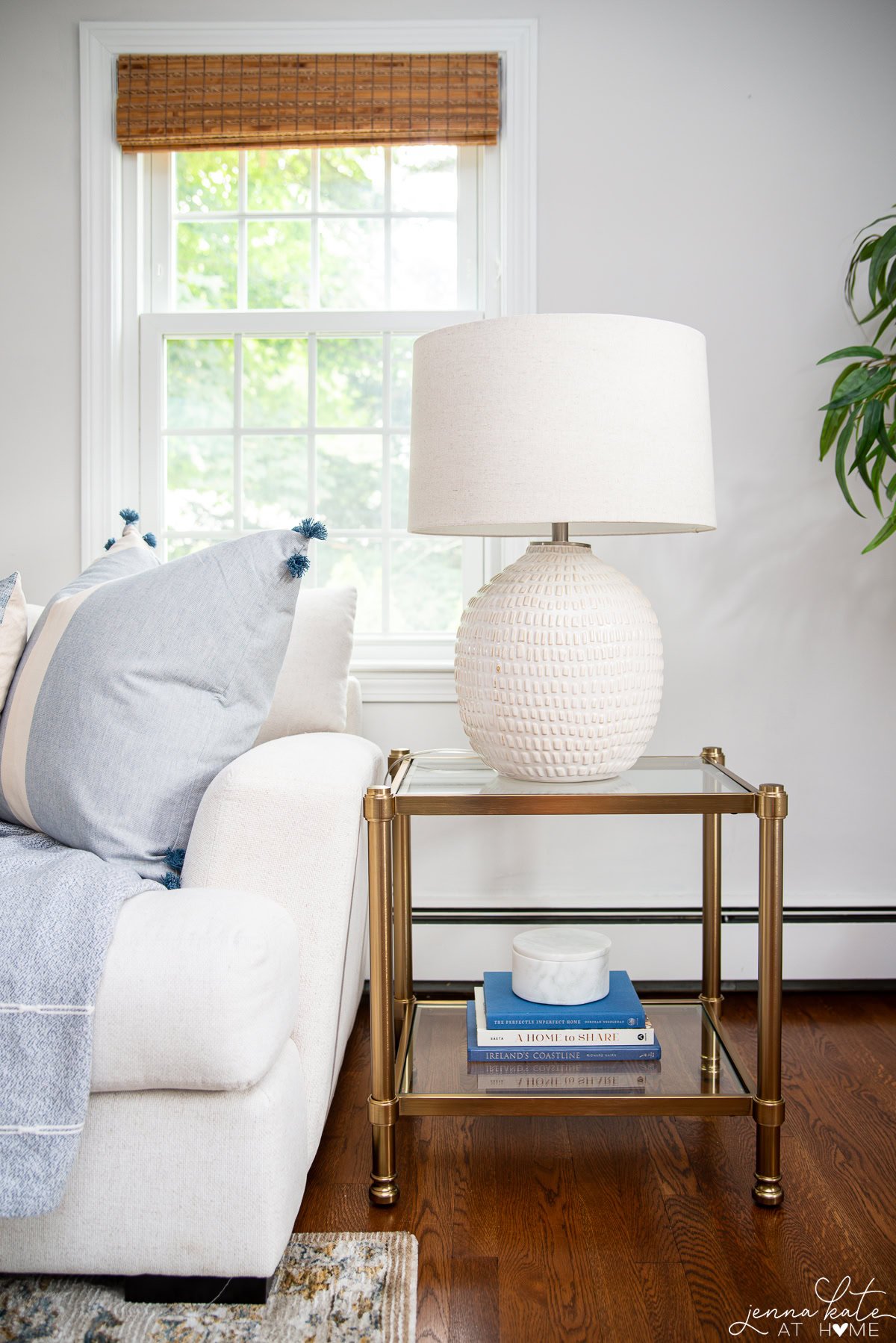
Remember to consider fixed elements like cabinets and trim, matching or coordinating their undertones with your wall color. Flooring should also be taken into account when selecting paint colors, aiming for a balanced and cohesive room. Rugs can play a significant role in determining paint color undertones, so choose colors that complement the dominant hues in your rug.
Related: Best wall paint colors to complement dark wood floors.
By understanding how undertones work and considering existing finishes, you can choose paint colors that harmonize with your space, creating a cohesive and pleasing environment.
Remember to also take into account lighting conditions, both natural and artificial, as they can affect how colors appear in a room. With practice and an eye for undertones, you’ll become a pro at selecting paint colors that bring your vision to life!
Matching Flooring
Flooring, just like cabinets and trim, is a fixed element. To achieve a well-balanced room, you should take into consideration the undertones and finishes of your flooring, as well as the other elements in the room.
You do not always have to match the undertones of the flooring to the wall. While it’s essential to create a cohesive aesthetic, you have the freedom to choose wall paint and flooring that complement, rather than match, each other.
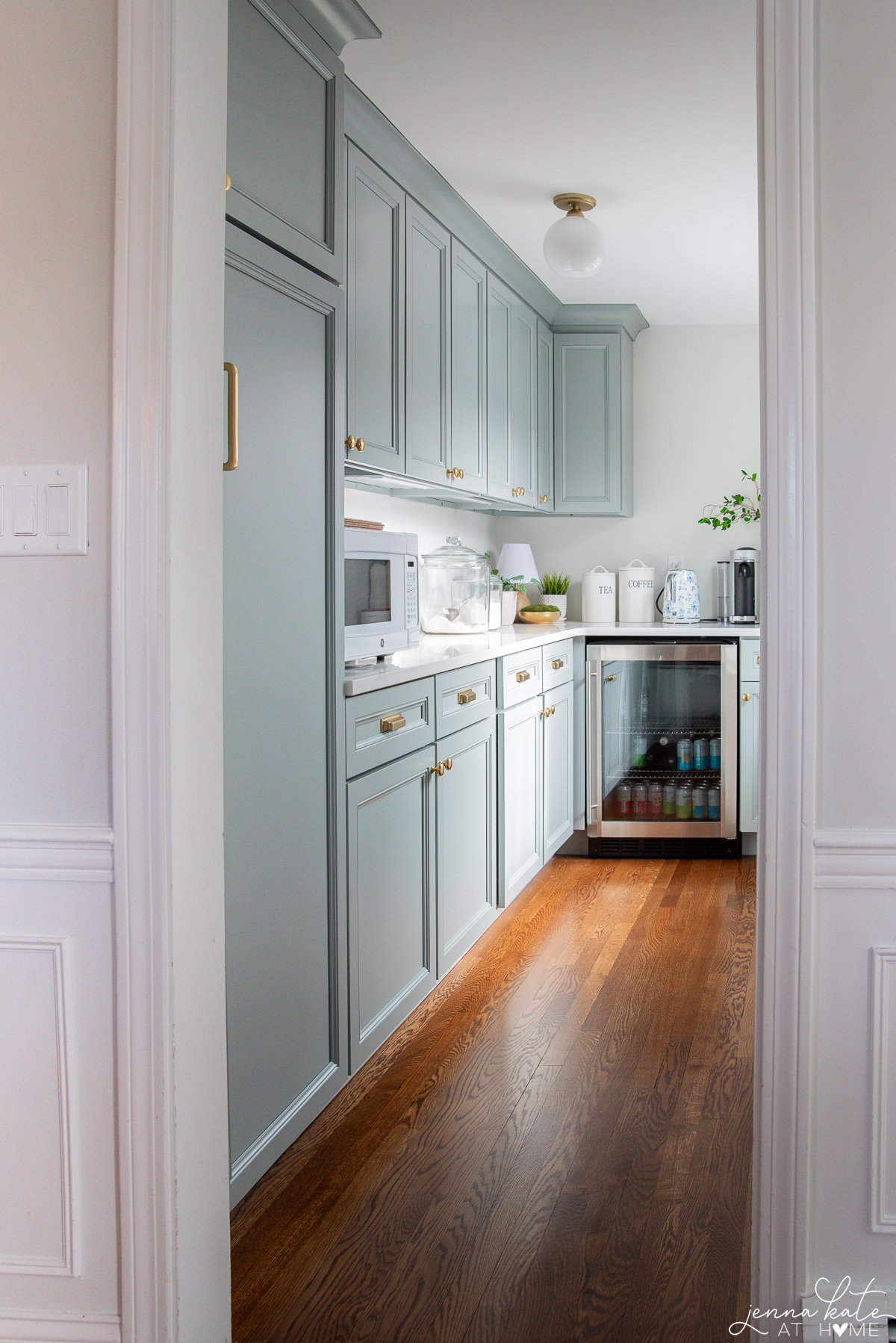
Warm undertone woods, like those with green undertones or pink undertones, can work equally well with warmer wall colors, neutral colors, and whites with a warmer undertone.”
However, if you have grey flooring, it’s recommended to go with blue tones or other cool-toned colors, as mixing warm colors into a really cool color palette is a lot more difficult.
Incorporating Rugs
Rugs can play a significant role in determining the best paint color undertones for your room. Examine the dominant colors and undertones in your rug and find paint colors that complement them. This approach will ensure that your chosen paint color works well with the rug and helps tie the room together.
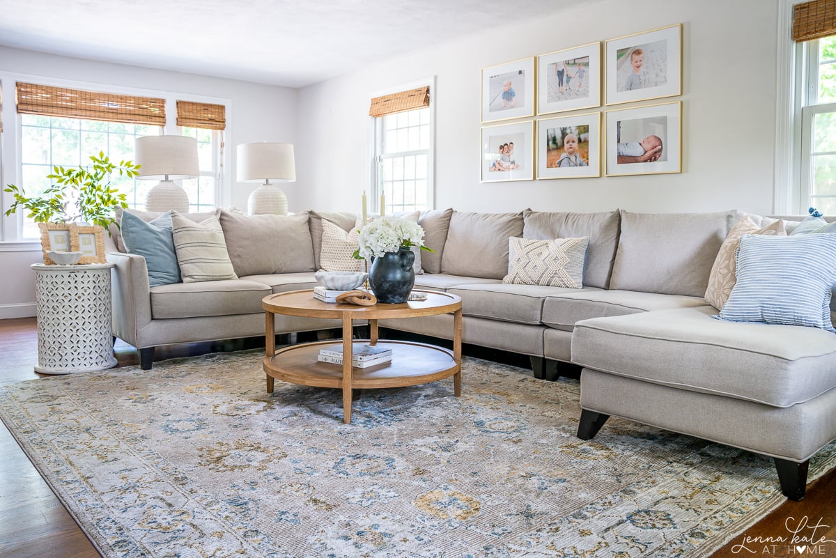
For example, if you have a neutral living room rug with a subtle blue pattern, consider paint colors with cool undertones to create a cohesive look. You can also pull out that shade of blue to incorporate into other decorative items in your room.
When selecting paint colors for your walls, it’s important to consider the color of your floors. Luckily, most homes have baseboards that separate the floor from the wall, which makes the transition less obvious.
If you have cool-toned floors, for example, gray LVP or tile, you’ll want to stick to cool-toned colors on your wall. If your floors are very warm, like honey oak, warmer colors will look best. Medium-toned or lighter-toned woods still favor warmer-toned paint colors, but you can get away with cool-toned to balance out some of the yellow undertones.
How Lighting Affects Undertones
Lighting conditions can significantly affect how colors appear in a room, altering their perceived undertones. Understanding how different lighting sources interact with paint colors will help readers make informed decisions and ensure the desired look and feel of their space.
The impact of natural and artificial lighting on paint color undertones is a crucial consideration when designing and choosing colors for your space. Lighting can significantly alter the appearance of paint colors, affecting their undertones and overall visual effect.
Natural light, with its ever-changing qualities throughout the day, can have a profound influence on how paint colors are perceived. Different times of the day, seasons, and geographical locations can result in varying intensities and color temperatures of natural light. For instance, warm, golden sunlight in the morning and evening can enhance warm undertones in paint colors, while cooler, bluish daylight can bring out cool undertones. It’s essential to test paint colors under different lighting conditions to ensure the desired undertones are achieved consistently.
Artificial lighting, such as incandescent, fluorescent, or LED lights, also plays a significant role in how paint colors appear. Each type of artificial light emits a different color temperature, which can interact with paint colors and create a shift in undertones. Warm-toned lights can amplify warm undertones, making them appear more prominent, while cool-toned lights can enhance cool undertones. It’s important to consider the type and color temperature of the lighting used in your space to select paint colors that harmonize well and maintain their intended undertones.
To accurately assess how lighting affects paint color undertones, it’s recommended to observe the colors at different times of the day under both natural and artificial lighting. Consider placing paint samples near windows to gauge their appearance in natural light and test them under various artificial lighting conditions in the room where they will be applied. This process will help you make informed decisions and ensure that the undertones of your chosen paint colors remain consistent and harmonious in different lighting scenarios.
By understanding the impact of natural and artificial lighting on paint color undertones, you can create a space that looks and feels just as intended throughout the day. Careful consideration of lighting conditions will allow you to achieve the desired atmosphere, enhance the undertones you desire, and create a cohesive and visually pleasing environment.
Final Thoughts
Do you feel like you now have a basic understanding of paint color undertones? With a little practice and training of your eye, you’ll become a pro at it in no time! Always remember not only to look for the dominant undertone but also consider what colors you’re planning to pair it with and how the color may be affected by natural or artificial light.