Content may contain affiliate links. When you shop the links, I receive a small commission at no cost to you. Thank you for supporting my small business.
Looking for a soft, airy gray that toes the line between white and color? Benjamin Moore Paper White (OC-55) might be exactly what your home needs.
Unlike many pale grays that come with strong undertones or feel too cold, Paper White offers a refined, subtle wash of color that shifts gently with the light — and works almost anywhere.
This review will go beyond the basics. I’m sharing:
- What Paper White actually looks like in real homes
- How it compares to similar colors
- How it behaves in tricky lighting
- Trim and cabinet pairing tips
- What makes it different from just another “off-white”
Quick Snapshot
- Type: Soft gray with white tendencies
- Undertones: Subtle green-blue (but can disappear in many rooms)
- LRV: 74.41 (light and bright, but not stark white)
- Best for: Bedrooms, bathrooms, trim, cabinets, whole-house use
- Pairs well with: White Dove, Chantilly Lace, Boothbay Gray, Hale Navy, Edgecomb Gray
What Color Is Benjamin Moore Paper White?
Paper White is best described as a whisper-light gray with just enough pigment to stand apart from a true white. In many rooms, it reads like a soft dove gray, while in others it can look nearly white. It’s crisp without being stark and never feels sterile.
This is a color that plays nicely with others — especially cool whites, blues, soft greens, and even mid-tone woods.
jenna’s Tip
If your room gets too much natural light, Paper White may wash out and look whiter than expected. In low-light spaces, it softens to the perfect quiet gray. It shines in rooms that need to feel light but grounded.
What Are Paper White’s Undertones?
What makes Paper White so usable is that its undertones rarely shout. You may see a whisper of:
- Blue or blue-green in north-facing rooms
- Slight green or gray undertones when paired with warm wood
- Soft cool white in bright natural light
It’s not immune to undertone shifts — no gray is — but it is less bossy about them than many others in the same category.
Real Room Behavior: Light + Direction
North-facing room: Slightly cooler, gray tones more apparent
South-facing room: Appears lighter, sometimes off-white
East-facing room: Soft and neutral in the morning, can feel cooler later
West-facing room: Bright and warm by afternoon — this is where Paper White can look nearly white
What is The LRV?
Paper White has an LRV of 74. In comparison, most bright whites have an LRV somewhere in the 80’s or low 90’s, so at 74 it definitely is a light gray.
Light Reflectance Value (LRV) is an indicator of the amount of light that is reflected by a color when it is illuminated by a light source. A higher value (closer to 100) means that a color will reflect more light back at you and a lower value (closer to 0) means that a color will appear darker, or absorb more light.
Where to Use Paper White
This is one of those rare colors that works in:
- Bedrooms: calming, airy, and non-distracting
- Bathrooms: pairs beautifully with marble, brass, and chrome
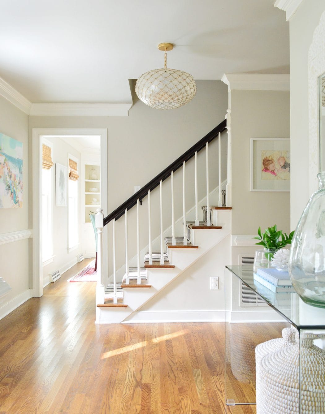
- Hallways and stairs: reads soft without absorbing all the light
- Trim or cabinetry: for a more tonal, less harsh contrast
- Kitchen walls or even cabinets: stunning with white quartz or warm brass
And yes — I’ve used it in multiple rooms in my own home.
Best Trim & Cabinet Pairings
Paper White works beautifully with:
- SW Pure White – clean but not too stark
- BM Chantilly Lace – high contrast, ultra-modern
- BM White Dove – warmer trim that softens Paper White’s coolness
- Paper White itself – for a minimalist, tone-on-tone look
On cabinets, it reads custom and elevated, especially with brass or matte black hardware.
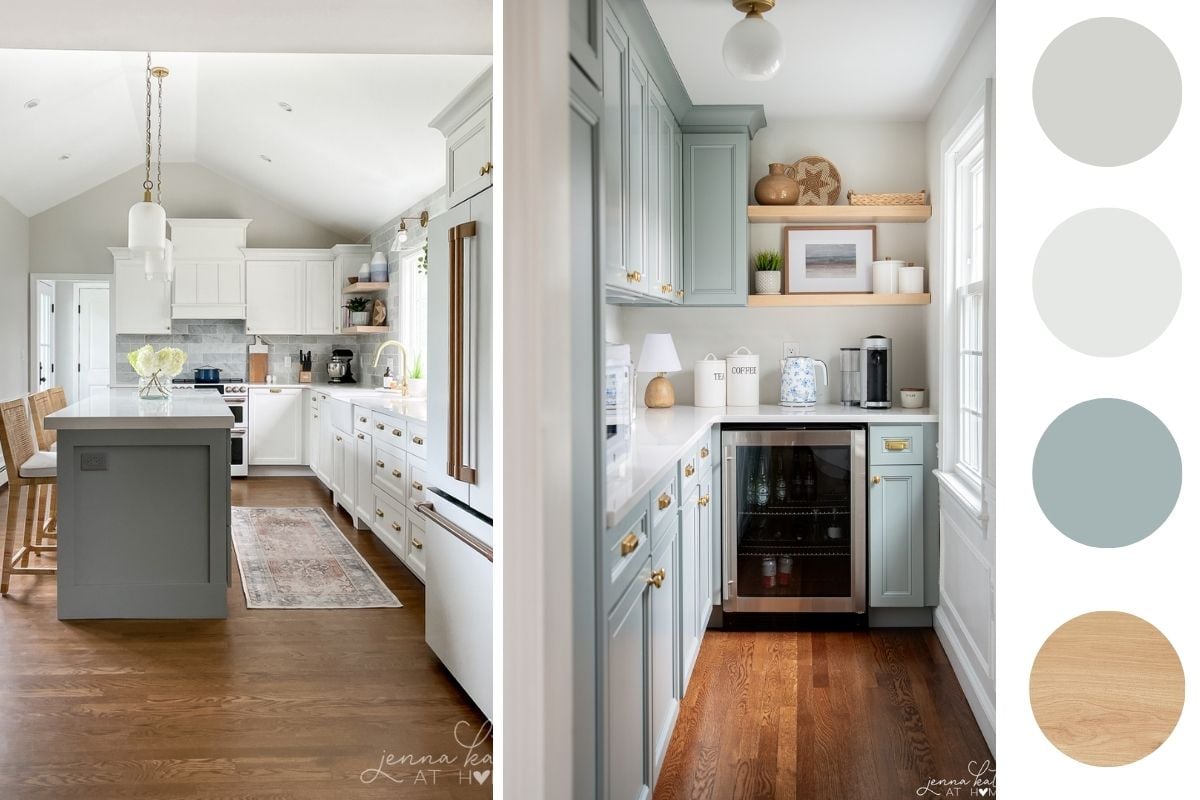
Coordinating Color Palette for Benjamin Moore Paper White
Because Paper White is such a soft, subtle gray, it plays well with a variety of tones — from crisp whites to dusty blues, muted greens, and even warm wood accents. Here’s a curated palette to help you build a cohesive, designer-approved look around this shade.
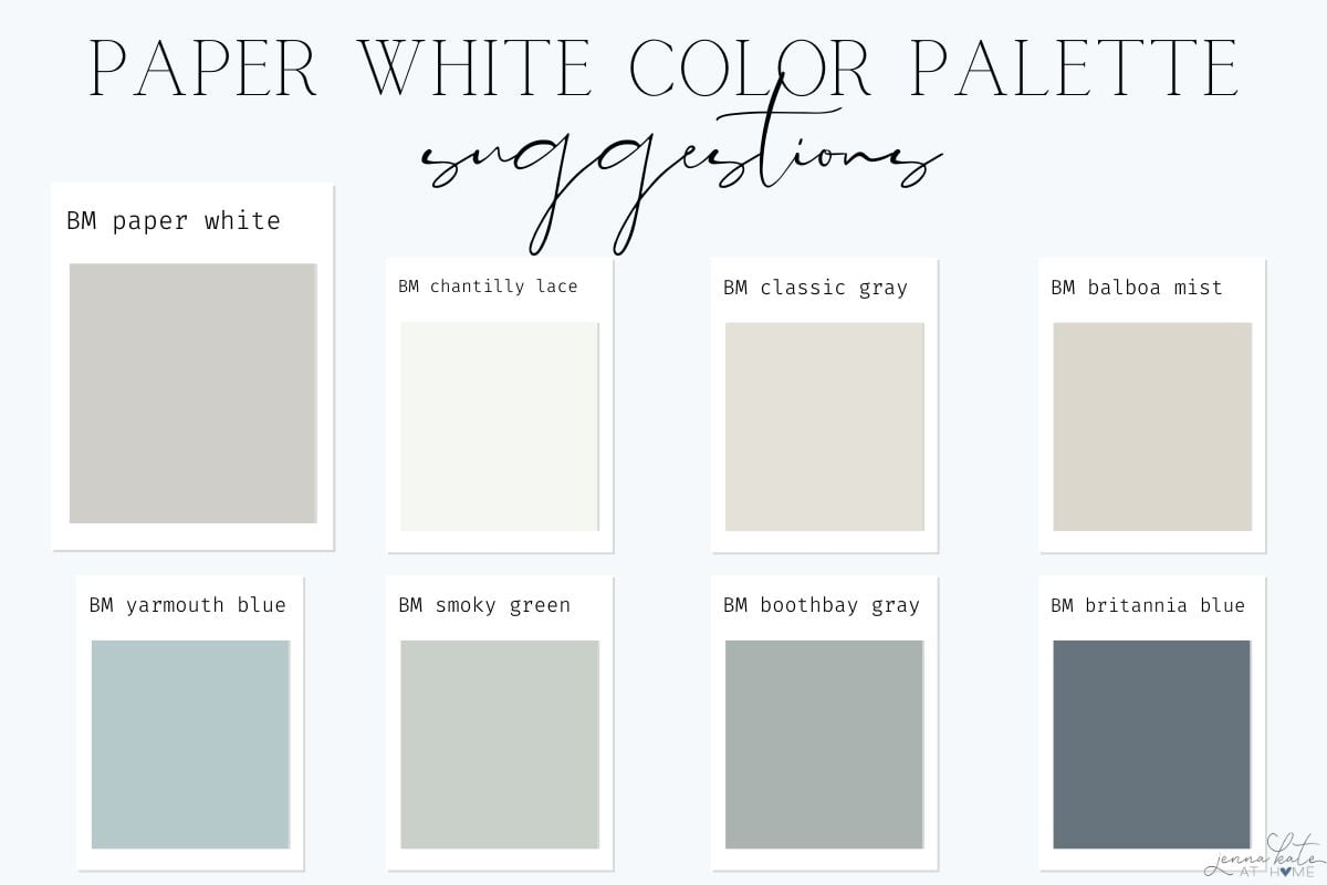
Trim + Ceiling Colors
- Benjamin Moore Chantilly Lace (OC-65) – Brightest white, perfect for modern contrast
- Benjamin Moore White Dove (OC-17) – Warm and creamy, adds softness
- Benjamin Moore Paper White (OC-55) – For a tone-on-tone look, use it on trim and walls in different sheens
Accent Wall or Cabinet Colors
- Benjamin Moore Boothbay Gray (HC-165) – Muted blue-gray that complements Paper White’s cool edge
- Benjamin Moore Britannia Blue (1623) – Deep, dramatic contrast that still feels classic
- Benjamin Moore Cheating Heart (1617) – A near-black charcoal that looks amazing on cabinetry or doors
Soft Coordinating Neutrals
- Benjamin Moore Balboa Mist (OC-27) – Warmer greige that plays beautifully in adjacent rooms
- Benjamin Moore Edgecomb Gray (HC-173) – Light greige for spaces that need more warmth
- Benjamin Moore Classic Gray (OC-23) – Subtle and soft, keeps the palette neutral and calm
Pops of Color
- Benjamin Moore Beach Glass (1564) – Tranquil coastal green, perfect for bedrooms and baths
- Benjamin Moore Smoky Green (CC-700) – A muted sage that adds a touch of nature
- Benjamin Moore Yarmouth Blue (HC-150) – A fresh, breezy blue with just enough saturation
jenna’s Tip
Think of Paper White as the supporting actor — it elevates everything around it. Use it to set the stage for accent colors to shine.
Paper White Compared to Other Popular Grays & Whites
Want to understand how it stacks up? Here’s a paragraph-style breakdown of Paper White next to other favorites:
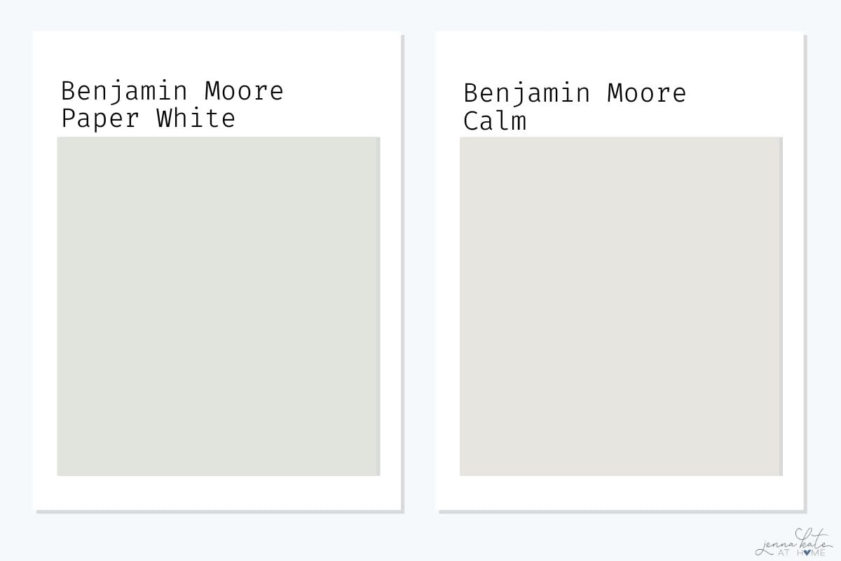
Paper White vs Calm
Benjamin Moore’s Calm is a great alternative—similar vibe but a touch warmer and more purple-gray depending on the light.
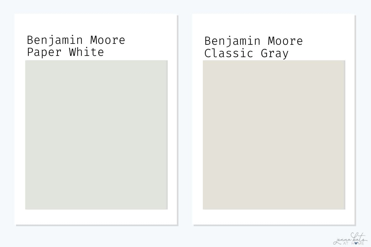
Paper White vs Classic Gray
Classic Gray is warmer and more beige-leaning. If you want something with a bit more definition and less warmth, Paper White is the better choice.
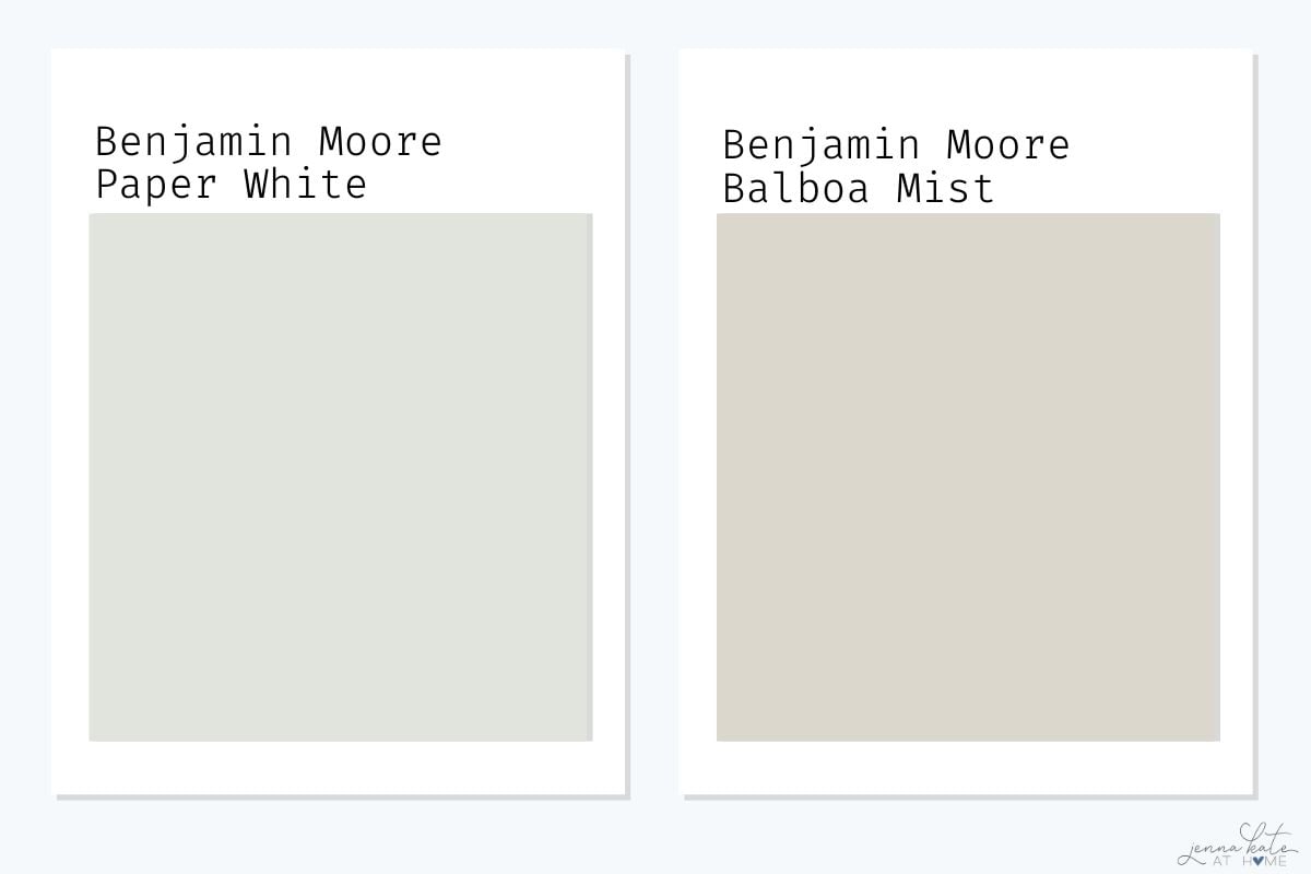
Paper White vs Balboa Mist
Balboa Mist is also a warm greige that looks distinctly beige in certain lights. Paper White will always skew cooler and brighter.
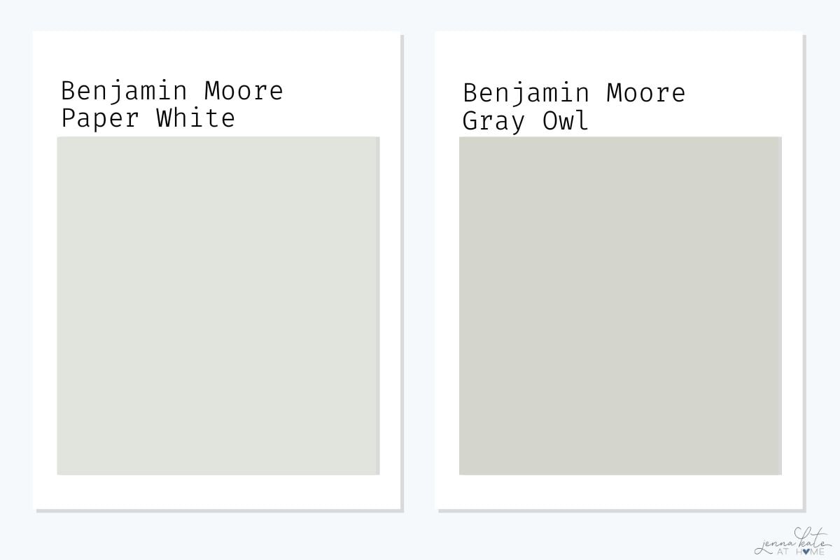
Paper White vs Gray Owl
Gray Owl has more prominent green-blue undertones and can feel more color-saturated. Paper White is softer and closer to white.
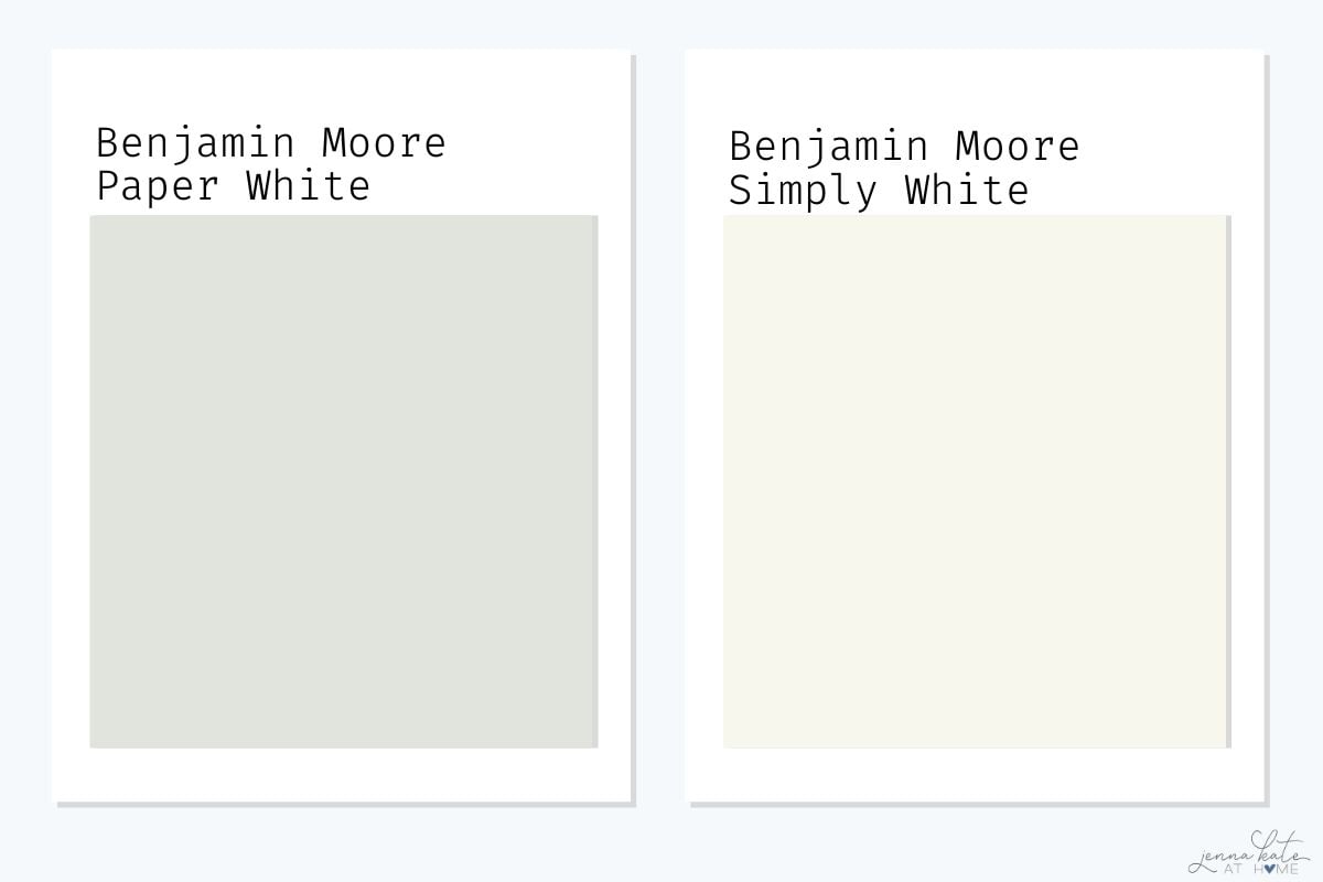
Paper White vs Simply White
Simply White is much brighter with a yellow undertone. Paper White feels more grounded and balanced in rooms that get a lot of sun.
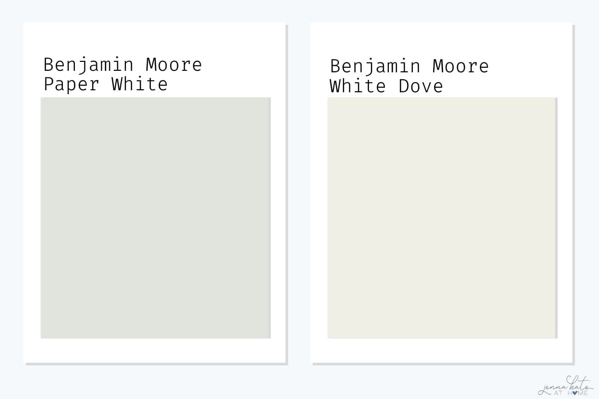
Paper White vs White Dove
White Dove is creamier and warmer. Use White Dove if your fixed finishes (tile, flooring) lean beige. Choose Paper White if you want cool contrast.
jenna’s Tip
If you’re painting a large space or open floor plan, test Paper White alongside trim, floors, and major furnishings. It’s often the quietest option in the room—which is a good thing when you’re layering in other textures and colors.
Real Room Examples
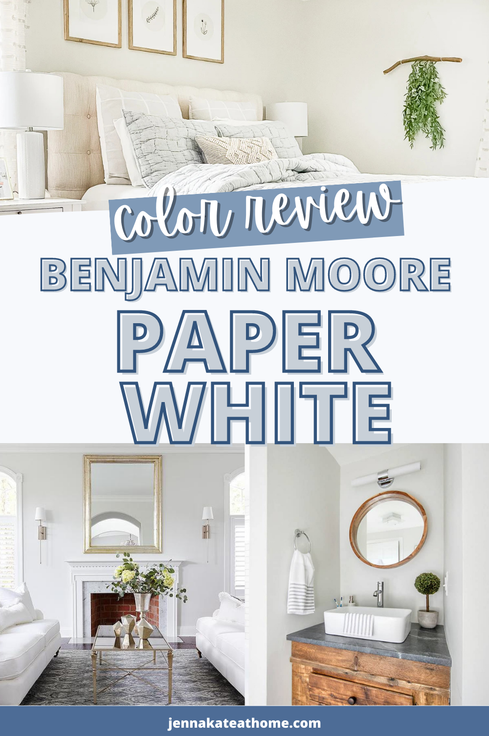
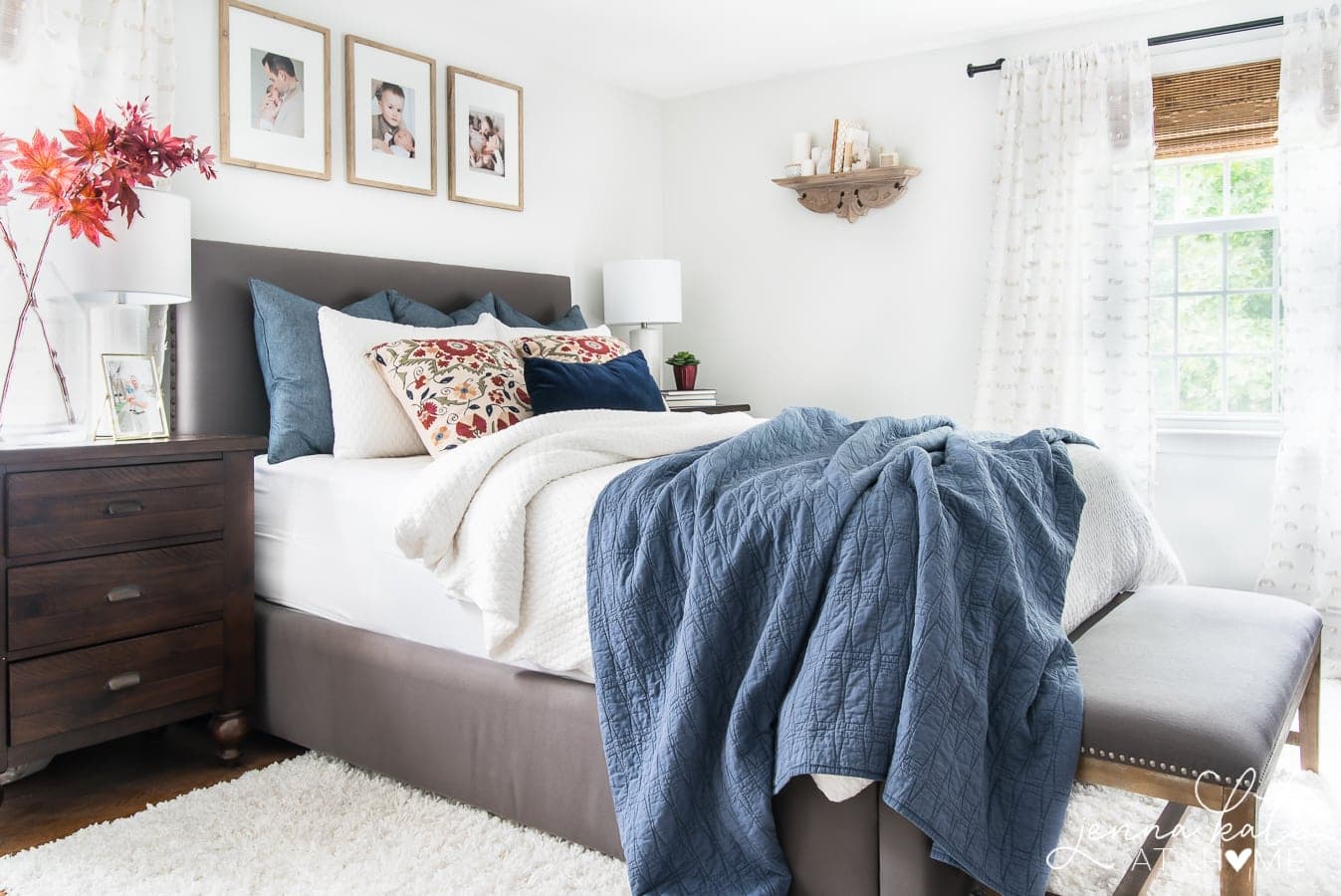
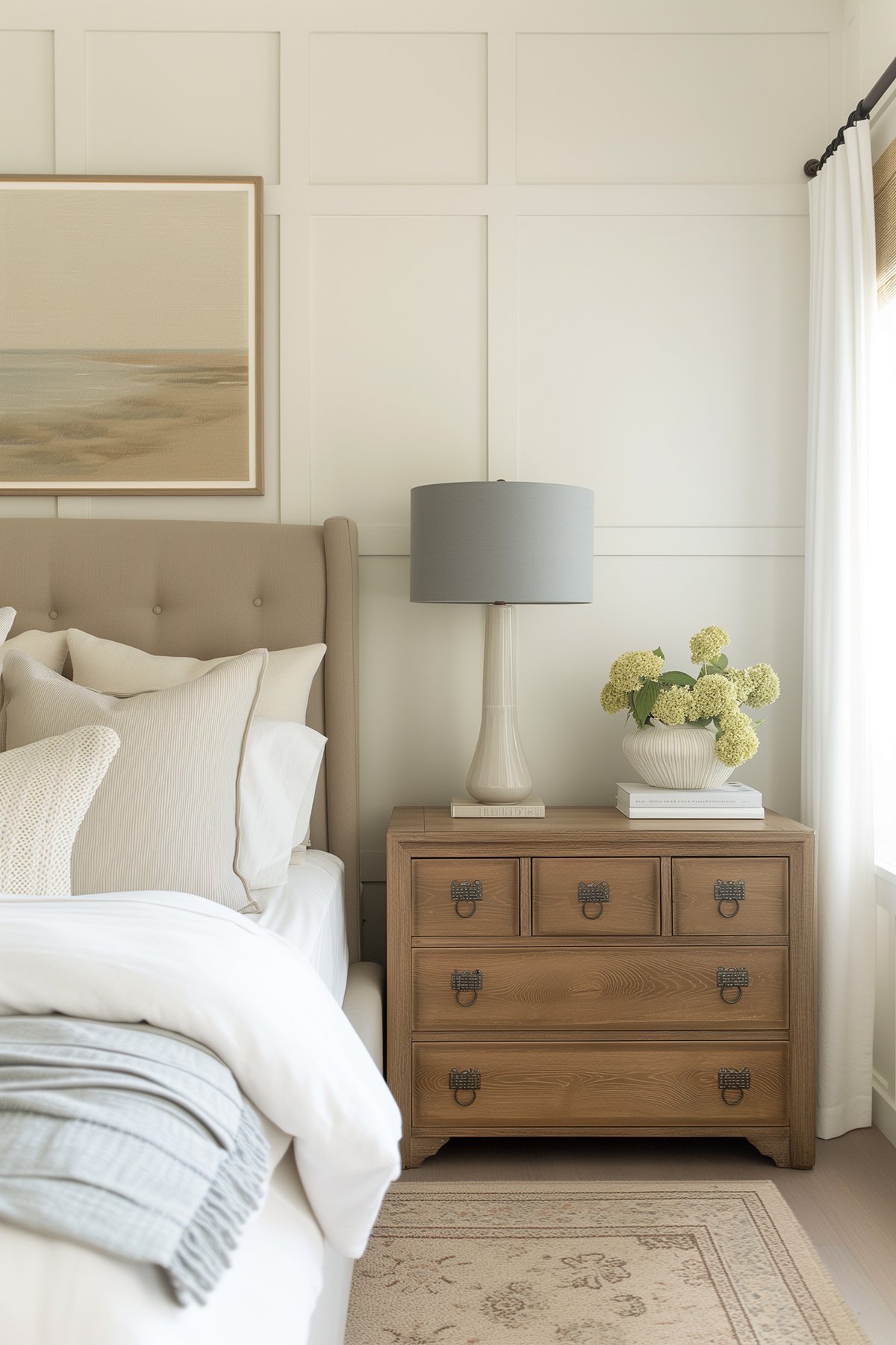
I’ve now used Paper White in two rooms in my house – my guest bathroom and more recently in my master bedroom and it looks equally stunning in both.
I think Paper White shines brightest when everything else is kept simple. Feel free to use Paper White for both the walls and as a trim color. It’s the best way to keep things minimalistic and easy.

In both the above and below photos, the surrounding colors are calm and neutral, resulting in a bright and airy space.

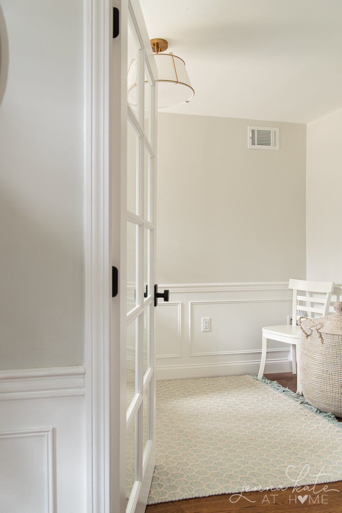
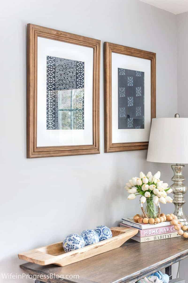
Sometimes pairing grays with wood can result in undesirable undertones, but not with Paper White. They’re the perfect match!
Pay close attention to where the vanity below meets the paint. No purple, yellow undertones, or any other funky colors in sight!

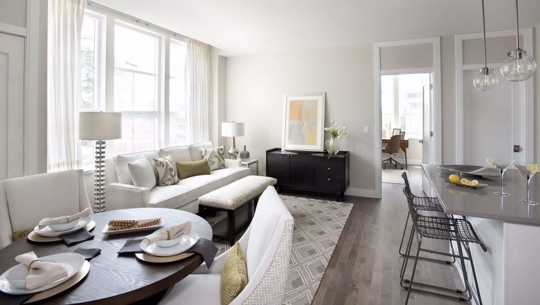
The off-white curtains and bed linens in the bedroom below show how pairing this paint color with something warmer really brings out the “creaminess” of the paint. You’ll find the perfect balance by doing so!

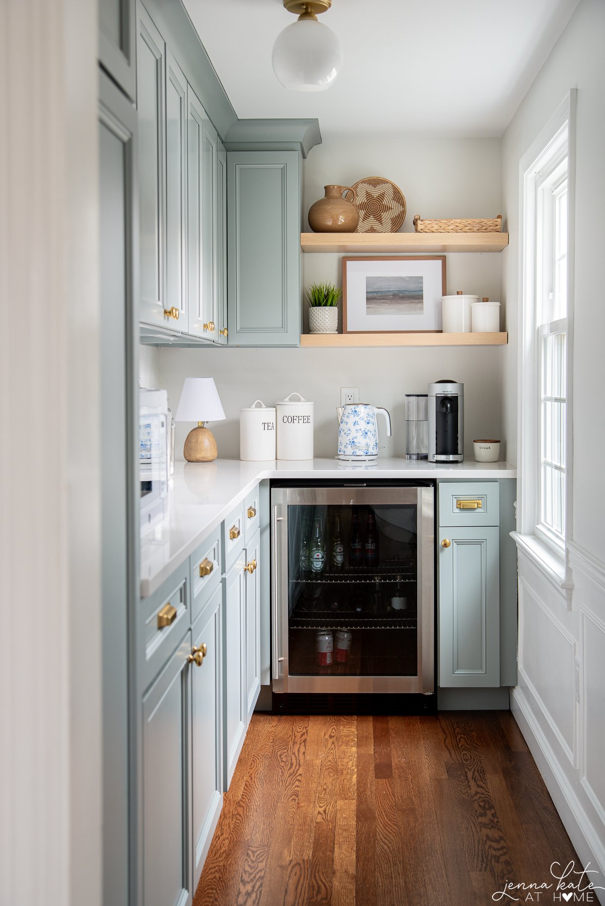
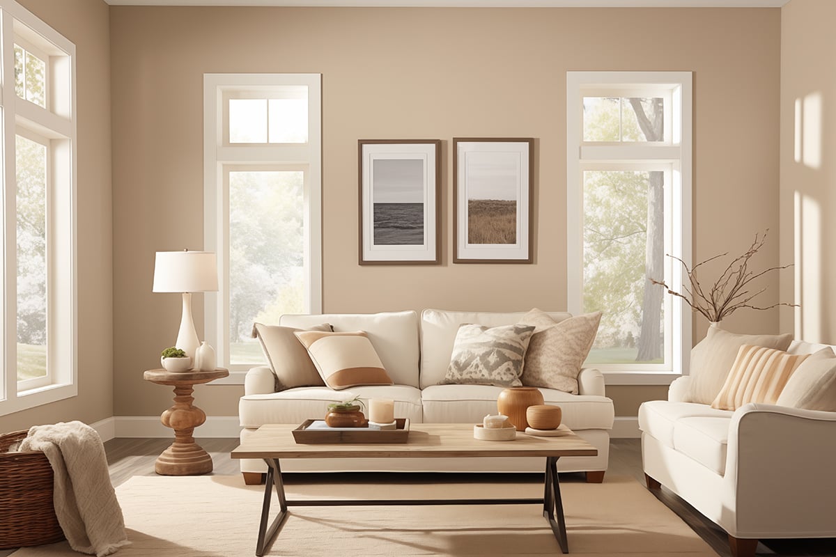
In the living room below, you can see on the left where it’s getting a lot of bright light that the wall almost has a white look.
In the shadows, the gray is more obvious. That’s why I particularly love this color in a north-facing room that might not get much light.
If you have a very bright room and want a solid gray, then Paper White might verge on being too close to white (and a little washed out) for your needs. But, this all depends on your personal preference!

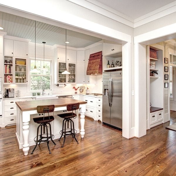
Get ready for these white kitchen cabinets.. jaw dropping gorgeous!

Finally, you can see how well Paper White works in this stunning kitchen as a wall color and kitchen cabinet color.
Who Should Use Paper White
Choose Paper White if:
- You want a soft gray that leans fresh, not muddy
- You love tonal, modern palettes that aren’t stark
- Your home has north-facing or low-light rooms and needs brightening
Skip Paper White if:
- You’re looking for a true white
- You want a warm beige or greige
- Your space has a lot of yellow or red-toned fixed finishes
Don’t Forget…
Don’t forget – no matter what you’ve read or photos you’ve seen online, it’s really important to sample paint colors in your home before committing!
Samplize provides real paint samples that are easy to move around your home, and cheaper than buying a gazillion paint pots! It’s the only way I buy paint samples.
Frequently Asked Questions
Not at all. It reads serene and soft. Just add some warm layers—linen, wood tones, or warm lighting—and it will feel perfectly balanced.
Try BM Chantilly Lace for contrast or BM White Dove for a softer, tonal feel.
Yes, and it looks custom and elegant—especially with modern hardware and natural wood accents.
Rarely. It might pull slightly green near warm floors or blue in cool light, but usually it reads as a light gray or soft off-white.
It is! Just expect it to show more gray or even a whisper of cool green/blue. It won’t look dingy.
No—it’s a soft gray-white. In bright light it might look white, but when paired with a real white trim, you’ll see the difference.
Final Thoughts
Benjamin Moore Paper White isn’t your bold statement color—but that’s its superpower. It’s a whisper-soft backdrop that can make everything else in your space shine. If you want a light neutral that gives you subtle color without drama, Paper White just might be the one.
Have you used Paper White in your home? I’d love to hear where and how it turned out—leave a comment below or tag me on Instagram @jennakateathome so I can see it in action!

Jenna Kate, I so appreciate your experience and practical assessment of paper white, and especially in comparison to the other colours you set beside it. I find a lot of reviews to be quite impractical or there’s a bit of revealing evidence suggesting the reviewer has never used the colour they are reviewing. Your review has been helpful, indeed. Perhaps I’ll send you a photo later on :-). —Sincerely, Lorna
I am looking to paint an upstairs living room with a lot of windows overlooking the bay. We already have lots of lights blues and tans in the home and I want something a bit different. Was considering paper white in this room but afraid it will look too white and I want a noticeable bit of contrast. Any suggestions for a color that would be a shade darker than this one? Or even a very light gray with a blue undertone. I’ve tried so many different colors that I officially am lost! :)
What color are the cabinets in the first photo?
Love your insight! Our main living area will be City Loft with our adjacent, well-lit master *bedroom* to be painted Collonade Gray…..wondering if paper white would be ok in the connecting Master Bath or not? OR…. would Paper White look good in an adjacent room to City Loft paint?