Content may contain affiliate links. When you shop the links, I receive a small commission at no cost to you. Thank you for supporting my small business.
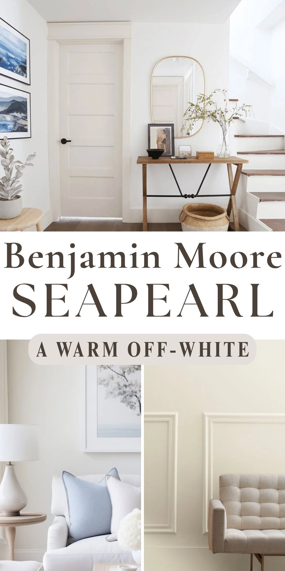
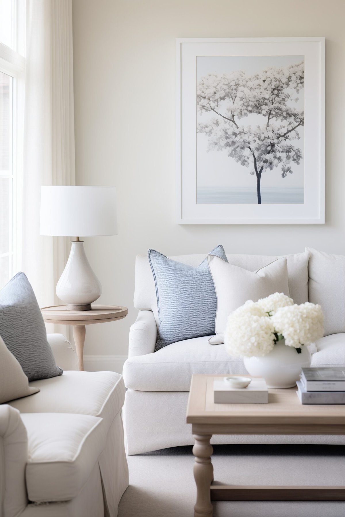
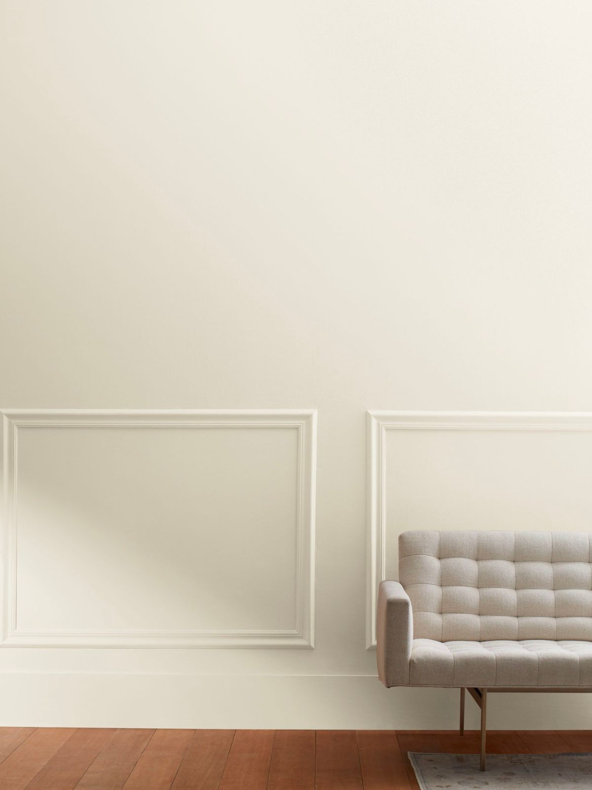
Benjamin Moore Seapearl (961), also known as China White, is a new color to me that I’ve recently fallen in love with. It’s a color that I consider to be both versatile and timeless, and it’s becoming increasingly popular with homeowners and designers alike thanks to its subtle warmth and classic appeal.
Benjamin Moore Seapearl belongs to the off-white color family, offering a subtle blend of beige with a gray base. This mix, commonly referred to as, “greige”, makes Seapearl a popular choice for those seeking a neutral color with a bit more depth and warmth, rather than a stark white, which is increasingly going out of favor.
Related: My favorite greige paint colors.
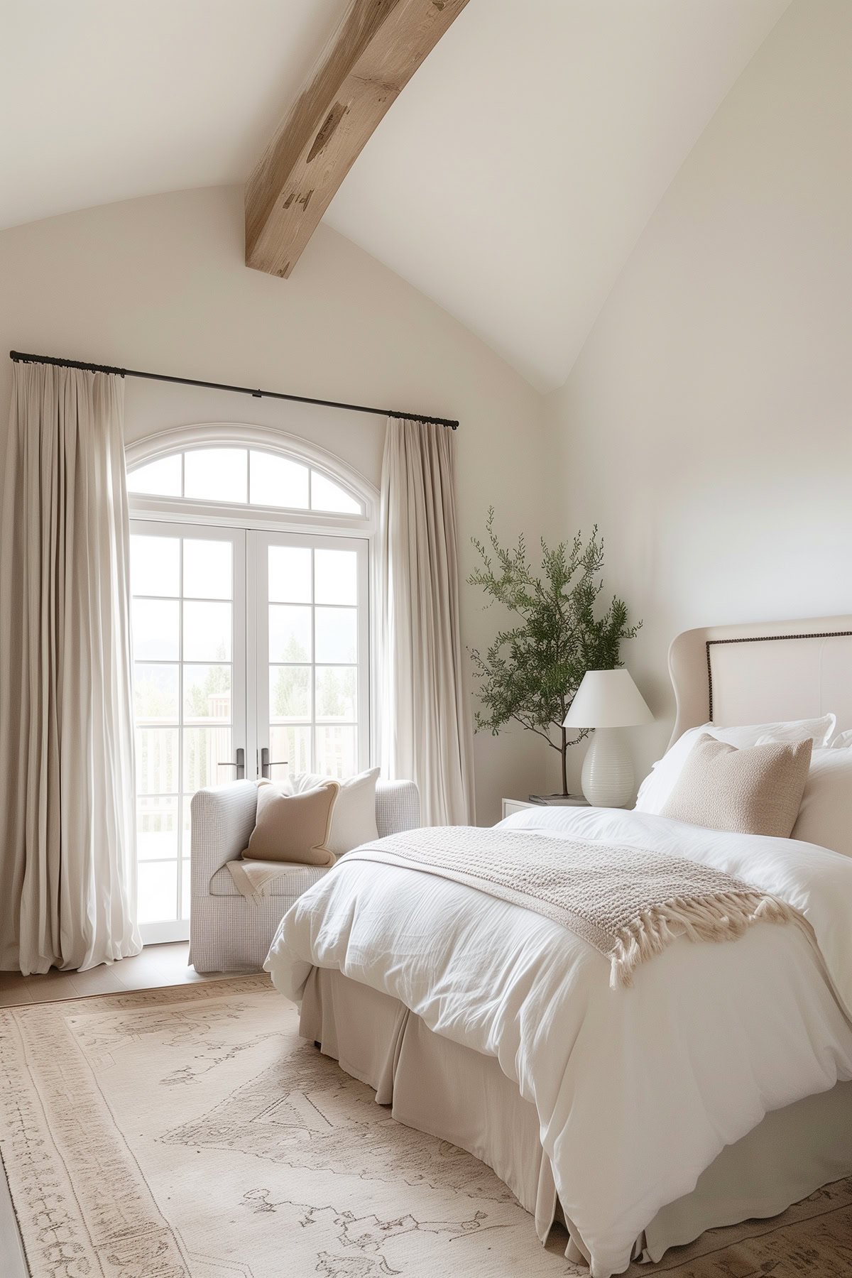
One of the key characteristics of Seapearl is its ability to adapt to various lighting conditions and complement different decor styles. It’s a favorite for creating serene and sophisticated spaces, as it provides a soft, welcoming backdrop.

What Undertones Does it Have?
Unlike many greige paint colors, it generally does not exhibit sneaky undertones such as strong pink, purple, or green undertones. This contributes to its wide appeal and adaptability in various interior settings. Instead, it leans towards a slight cool gray undertone, while still having enough warmth to stop it from looking gray.
What’s the LRV of Seapearl?
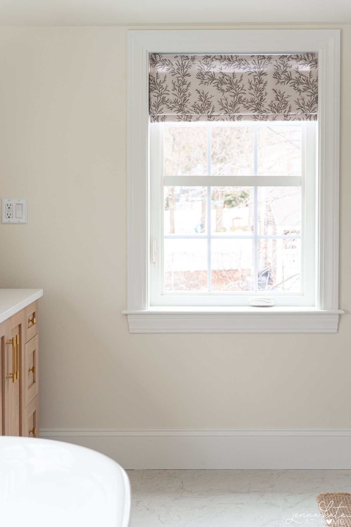
The Light Reflectance Value (LRV) of Seapearl is 77.4. This high LRV indicates that it’s a very light color, reflecting a significant amount of light. This makes it an excellent choice for spaces where you want to maximize brightness and create an airy, open feel.
Paint colors with a high LRV are especially useful in smaller rooms or areas that don’t receive a lot of natural light, as they can help make these spaces feel larger and more inviting. Because of this, Seapearl is a popular choice for north-facing rooms.
In What Rooms Would it Work Best?
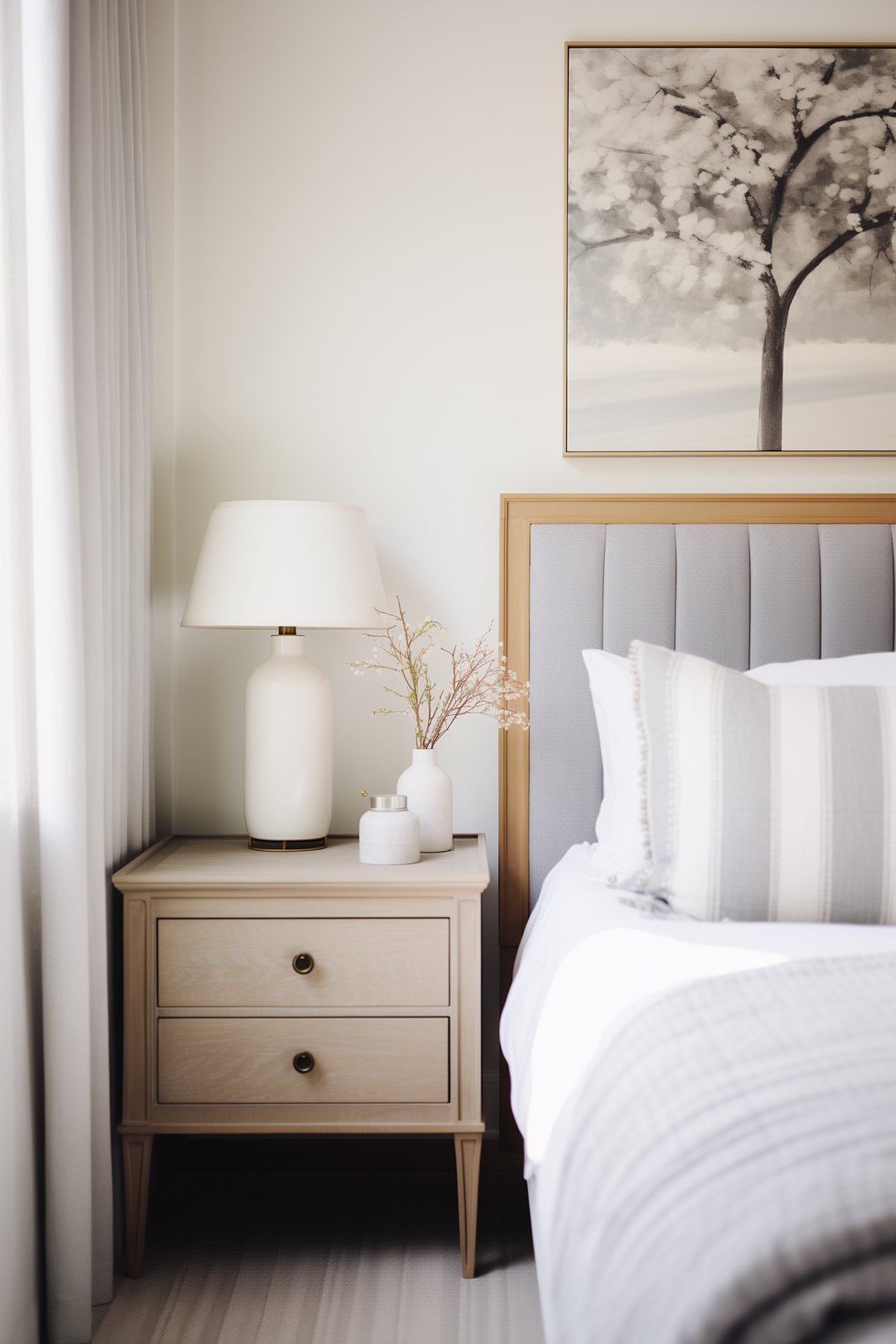
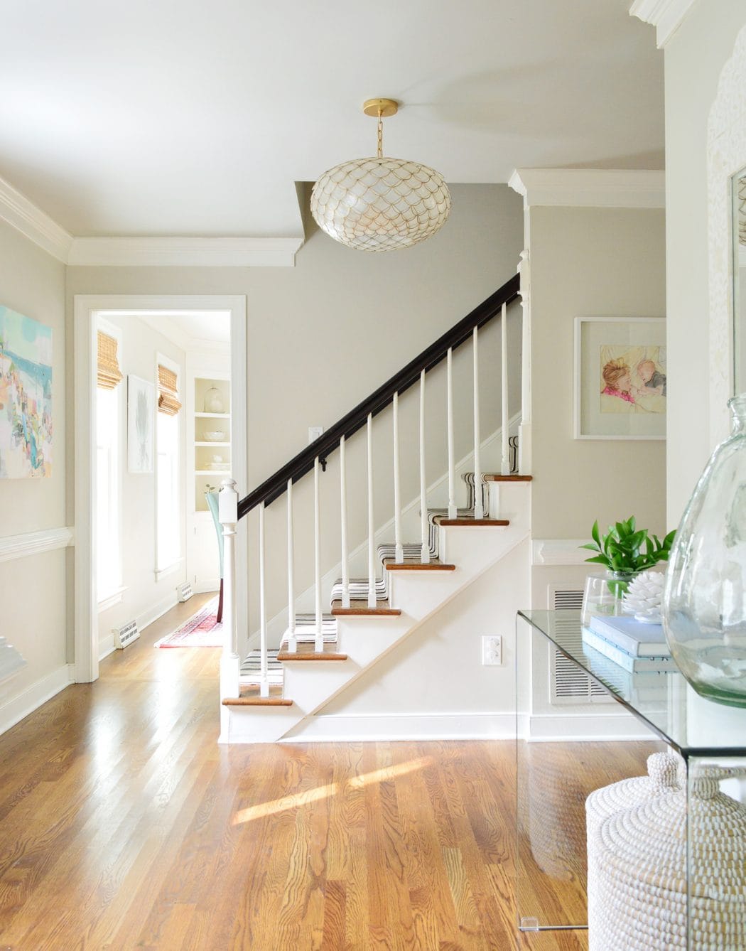
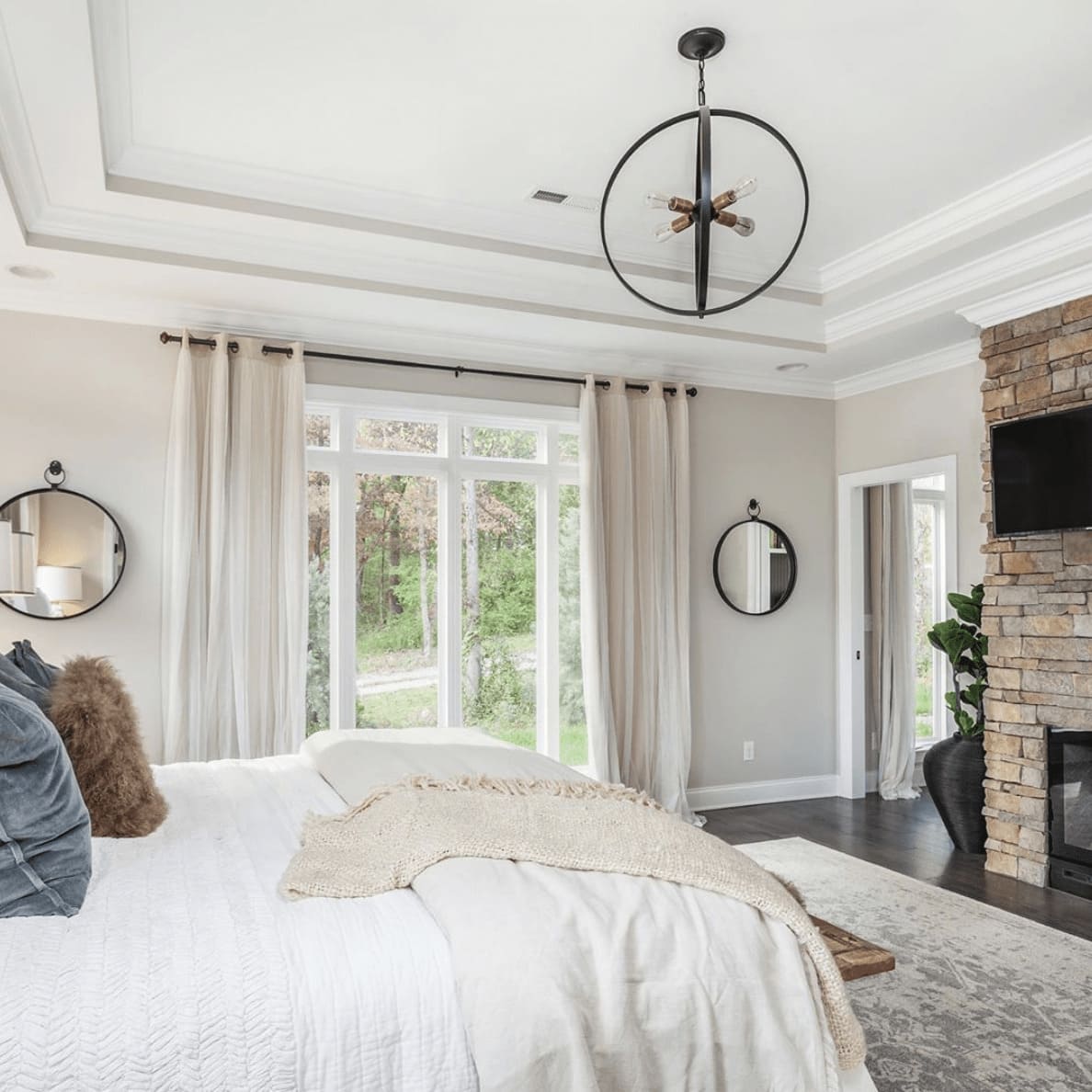
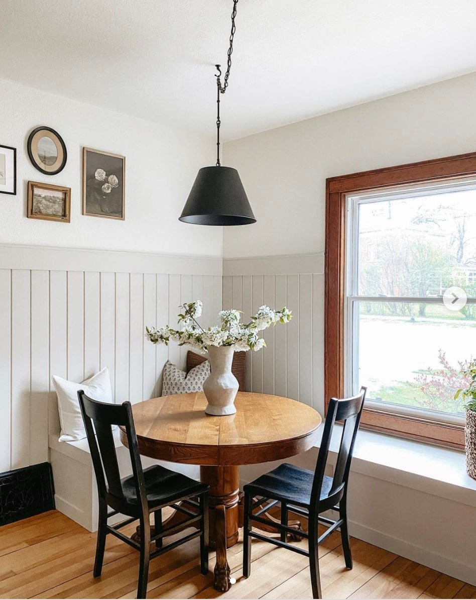
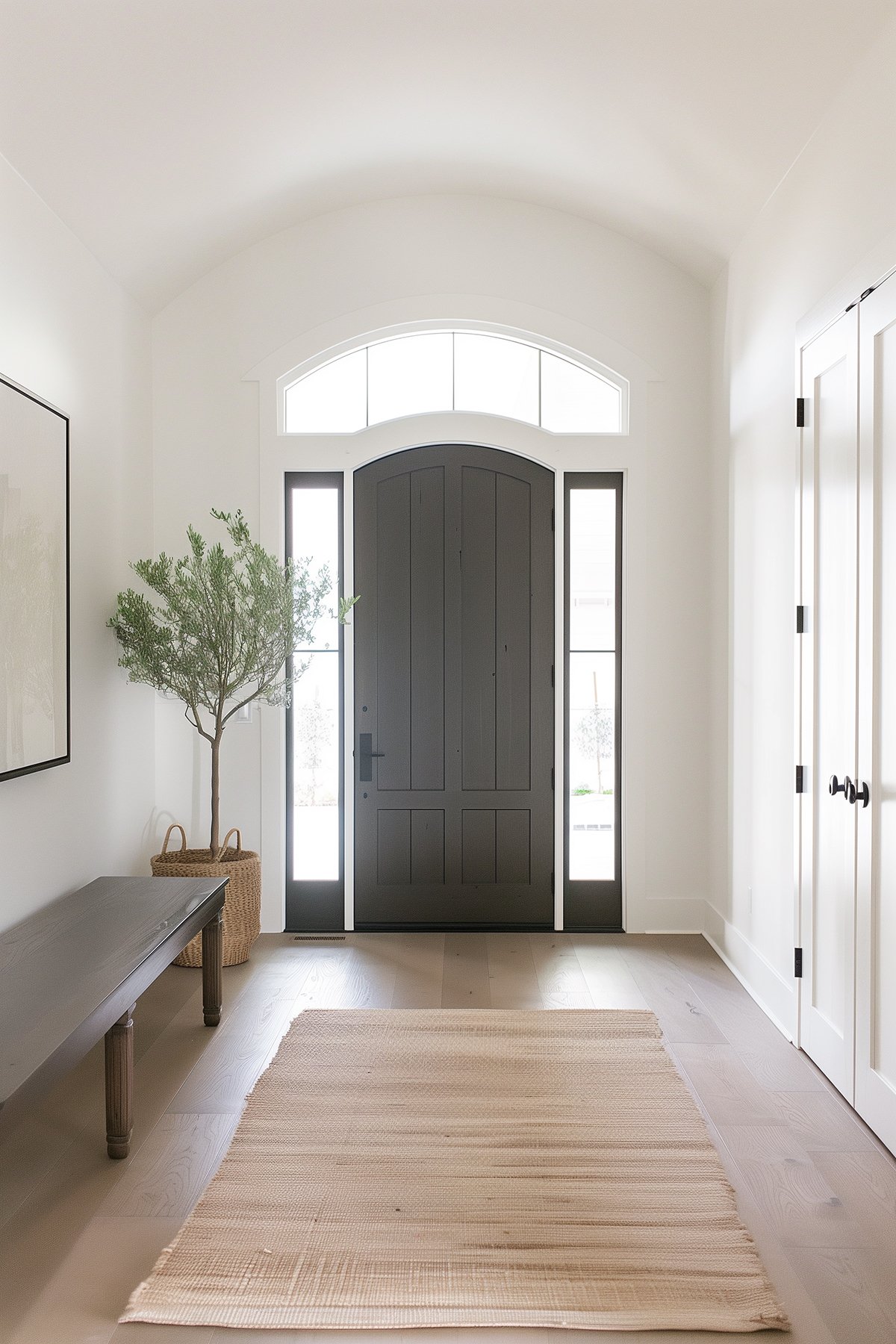
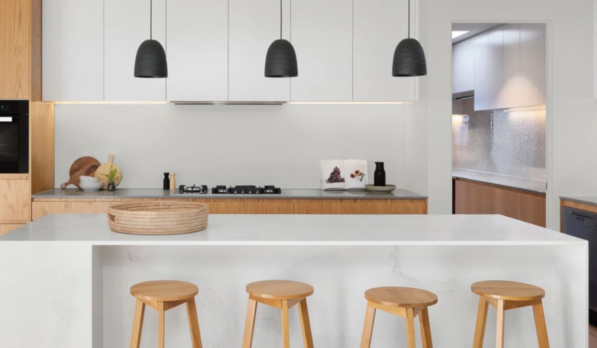
Seapearl is often used in living rooms, bedrooms, kitchen & bathroom areas and beyond for its calm and neutral look. It pairs beautifully with a wide range of colors, from soft neutrals to bolder hues, and works well with various materials and textures. Whether your design style leans traditional, modern or more coastal, BM Seapearl is a great choice for a neutral backdrop.
Seapearl also makes an excellent choice for kitchen cabinets, particularly in open floor plan spaces where continuity is desired between the kitchen, dining room, and pantry.
BM Seapearl Coordinating Colors
There are many different colors you can choose to partner with Seapearl. Try pairing Seapearl with deeper hues for contrast. Blue Nova, as the Color of the Year, stands bold next to Seapearl. The two colors create a modern vibe that’s both inviting and stylish. This combo works well in a home office or dining area. For a softer look, consider pairing Seapearl with sandy tones. Together, they represent a calm, beachy feel that’s just perfect for a bathroom or a cozy reading corner.
Accessories in wood or metal also complement Seapearl well. Picture frames, lamps, and even bookshelves in these materials add warmth. They help to ground the lightness of Seapearl without overwhelming it. By using these pairings, you can achieve a balanced interior that feels timeless.
BM Seapearl Inspired Color Schemes
Seapearl works seamlessly with a range of color palettes because of its neutral base. For a fresh look, consider pairing Seapearl with complementary colors by using different shades of green or blue.
- Subtle Approach: Pair Seapearl with creamy tones like BM Muslin or Jute.They create an airy feel making smaller rooms feel more expansive.
- Contrast: Opt for deeper tones such as Pashmina or Thunder. They draw out depth and create a dynamic duo.
- Coastal Inspiration: Colors like Beach Glass or Palladian Blue highlight Seapearl’s versatility. These remind me of beach days and will provide a peaceful atmosphere in the home.
Benjamin Moore Seapearl vs Benjamin Moore Classic Gray

When comparing Benjamin Moore Seapearl to Classic Gray, most people often find that Seapearl offers a warmer alternative with its subtle beige undertones, while Classic Gray leans towards cool tones.
Benjamin Moore Seapearl vs Benjamin Moore White Dove
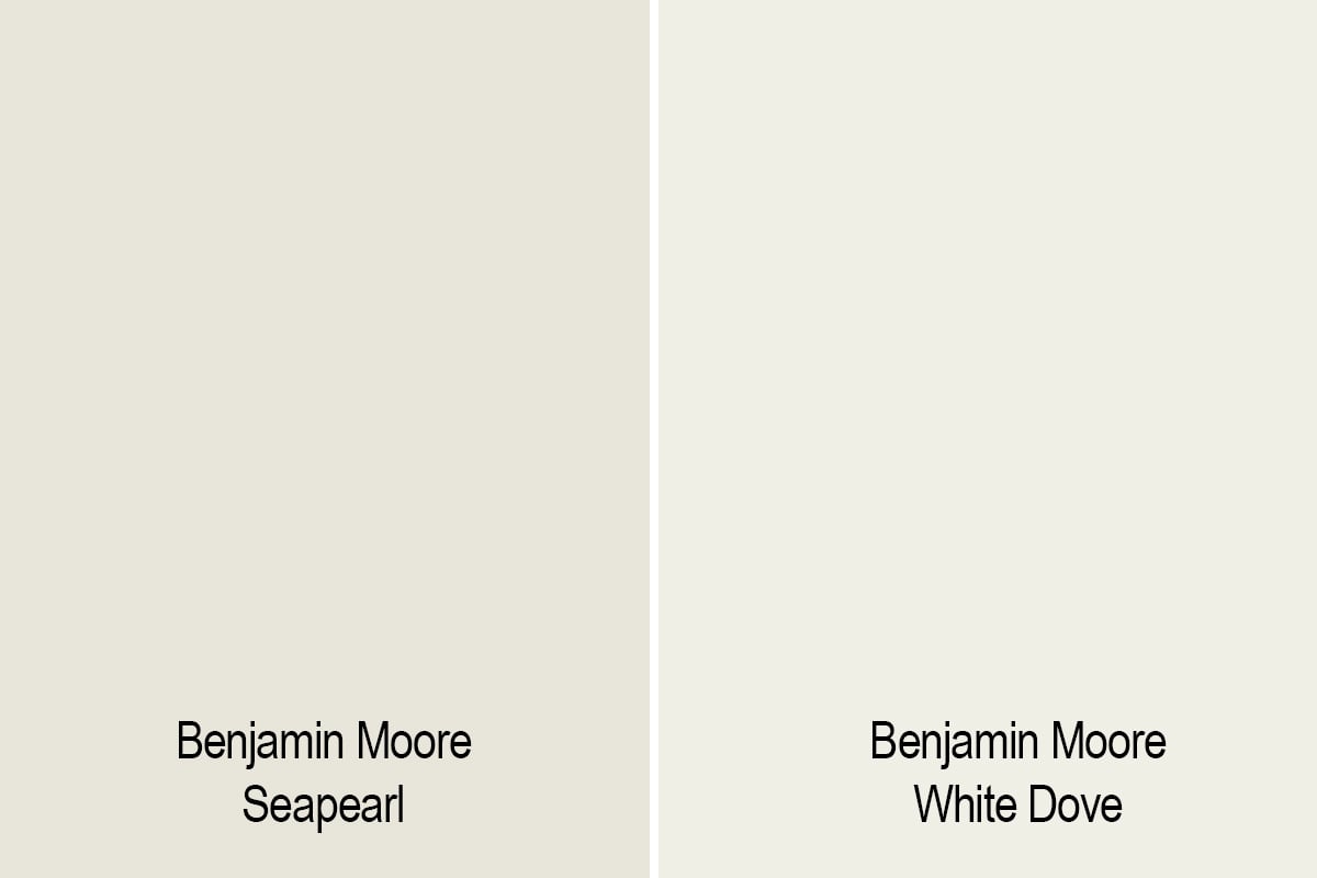
Benjamin Moore White Dove is another popular off-white hue, but unlike Seapearl, it tends to have even warmer undertones. While both colors are versatile and timeless, Seapearl’s subtle blend of gray and beige offers a more subdued backdrop for a variety of design styles.
Benjamin Moore Seapearl vs Benjamin Moore Swiss Coffee
Swiss Coffee is known for its warm tan undertones, which give it a richer, warmer appearance compared to Seapearl. While both colors are excellent choices for creating a welcoming atmosphere, Seapearl’s undertones make it a more suitable option for spaces with low light or north-facing rooms, where a lighter version of gray is desired.
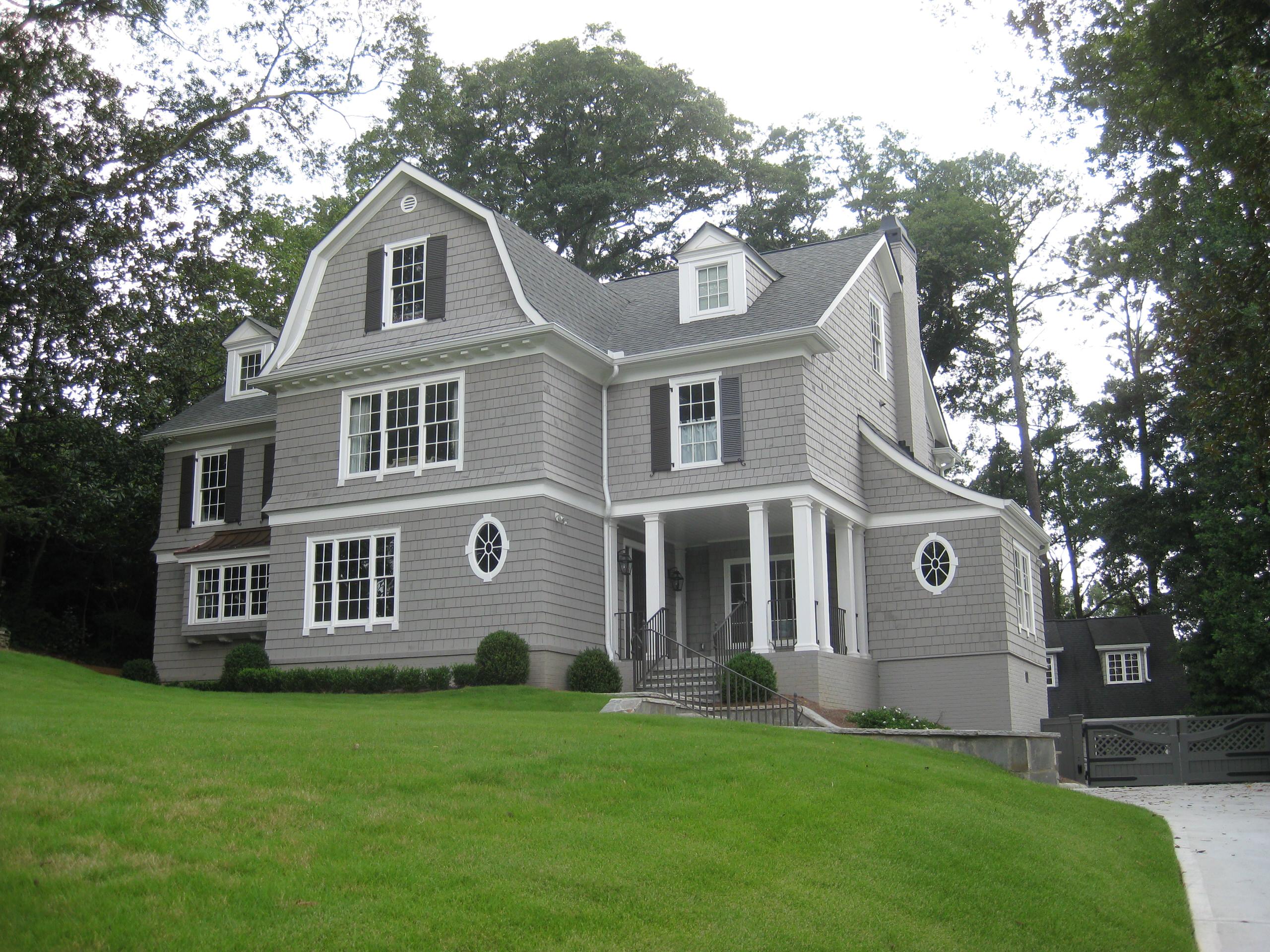
Is it a Good Choice for an Exterior Paint Color?
Benjamin Moore’s Seapearl is primarily chosen for interior use, but it can be equally effective outdoors. Its neutral undertones and ability to adapt to varying lighting conditions make it an appealing choice as an exterior paint color.
I would recommend it as the ideal neutral base for those looking to incorporate vibrant accents like shutters or doors.
When used as the primary color or alongside striking accent colors, Seapearl contributes to a timeless elegance, significantly enhancing the home’s curb appeal.
Final Thoughts
With its versatility, adaptability, and timeless appeal, Benjamin Moore Seapearl is the perfect shade to add freshness and elegance to any space, making it a perfect choice for homeowners and interior designers alike. I’m strongly considering it for one of the rooms in our home’s addition that we are currently building, so stayed tuned!!

Just painted a spare bedroom in Seapearl and I love it. At first it read very beige but as it dried it is the perfect colour, I have bedroom furniture in espresso and it pops off the luminous rich colour of Seapearl. Highly recommend this paint colour.
I appreciated your post very much as this paint shade has intrigued me.
I did notice that on your side by side of Seapearl and Swiss Coffee, the Swiss Coffee swatch is Classic Gray. So it was not good for comparison purposes. Thought you might want to know.
Thank you for your insightful post!
Warm regards,
Marjie
Hi
I am using Seapearl on our kitchen shaker cabinets and want to use a soft baby blue glass subway tile on our backsplash. Going with a quartzite countertop. Haven’t found it yet but it will be soft veining with hues of gray and gold if I can find it. Gold or brighter brass hardware. I’m wondering if you think the blue will look nice or will this clash it’s the Seapearl undertones?