Content may contain affiliate links. When you shop the links, I receive a small commission at no cost to you. Thank you for supporting my small business.
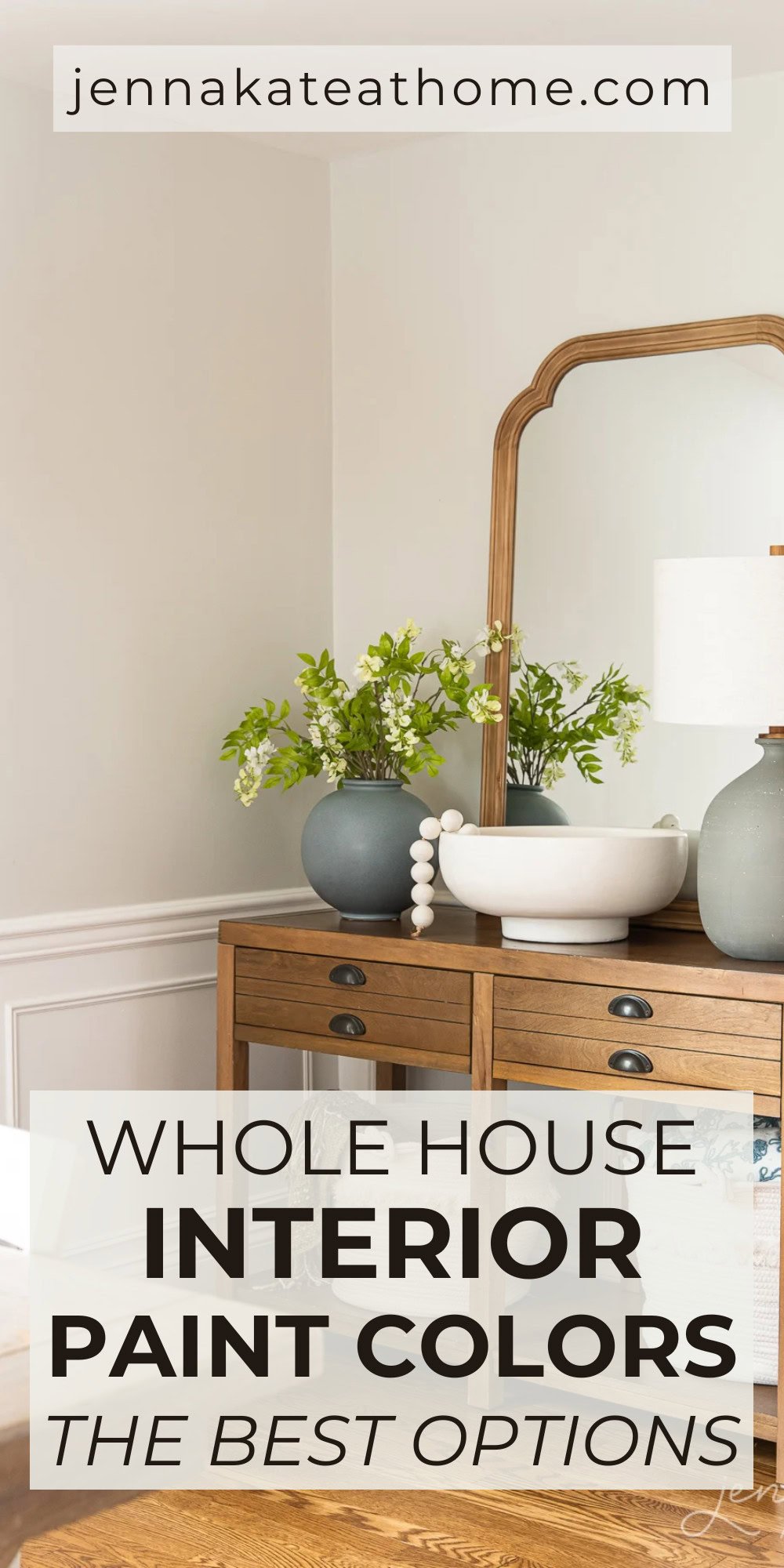
Learn why choosing a whole house paint color can have a dramatic effect on the flow of your home, as well as what are the most popular whole house paint colors.
Choosing just one or two colors for your whole house can seem like a daunting decision. After all, whether you’re DIYing or hiring out, a lot of time and effort will have to be put into the task of painting.
Having gone the whole house paint color route when we moved into our current house, I’ve learned what types of colors work well with a variety of finishes, decorating styles and over all taste.
Conversely, I’ve learned from past mistakes, too. In our first house, I painted every room a different color… raspberry blush in one room and mint green in another, wasn’t a good look!
Setting the scene in your home with the right whole house color palette will mean that the paint color can serve as the perfect backdrop and blank canvas for the other elements in your home to really shine.
Before getting into the nitty gritty of selecting your perfect paint color for your home, take a minute to decide if you want to pick one color for every single space, or if your idea of a whole house paint color is one color for all the open spaces, such as kitchen, dining room and living room, and then a coordinating color palette for the bedroom, bathrooms and other spaces.
While the former is the easier route to go, the latter will still give you that same sense of flow but will add more contrast as you walk room to room.
Test Lighting Before Choosing a Paint Color
If you are painting your home before moving in, you may not quite yet understand how the light affects each individual room in your home. This can become a huge issue down the road if you pick the wrong color.
For instance, if you choose what you think is the perfect warm gray paint color for all the open plan spaces in your home, but only see the paint swatch first thing in the afternoon, you may be not so pleasantly surprised to see that same color looks baby blue first thing in the morning.
Room exposure (whether the room is north, south, east or west facing) can have a dramatic impact on bringing a paint color’s undertones to the fore.
If you can’t be in the house to see how the color changes and reacts throughout the day, it’s important to choose a paint color with as minimal undertones as possible (and that’s where I come in to help you!).
Undertones To Avoid
As a general rule, I usually recommend avoiding strong blue and yellow undertones when choosing a whole house paint color.
Blue can make spaces feel cold and drab, and while a drop of yellow can be a great way to warm up sterile whites, too much is usually not what most people want to see in their perfect paint color.
Don’t get me wrong – some of my favorite paint colors of all time have a strong blue undertone. They just aren’t colors I would rely on to work as a whole house color.
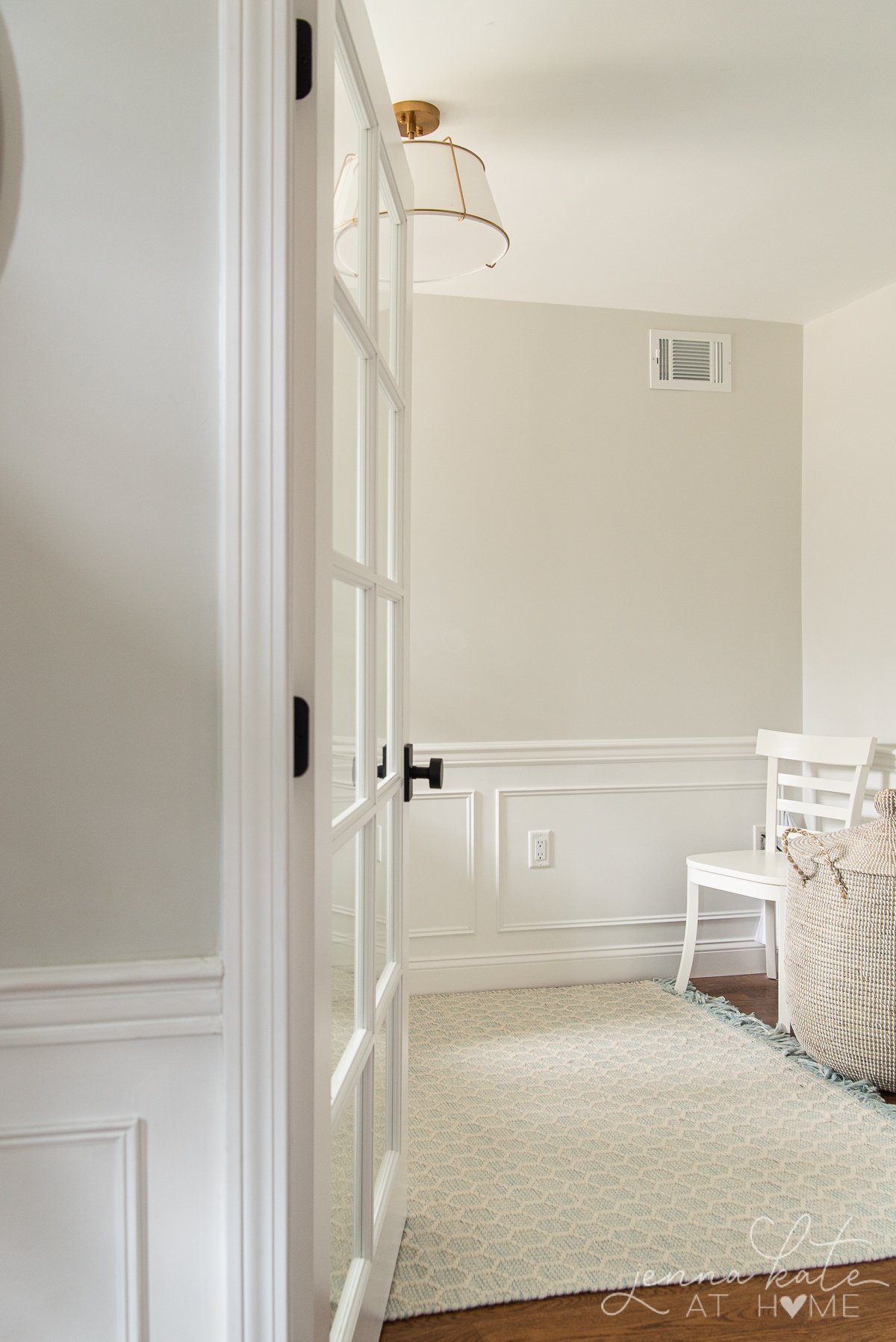
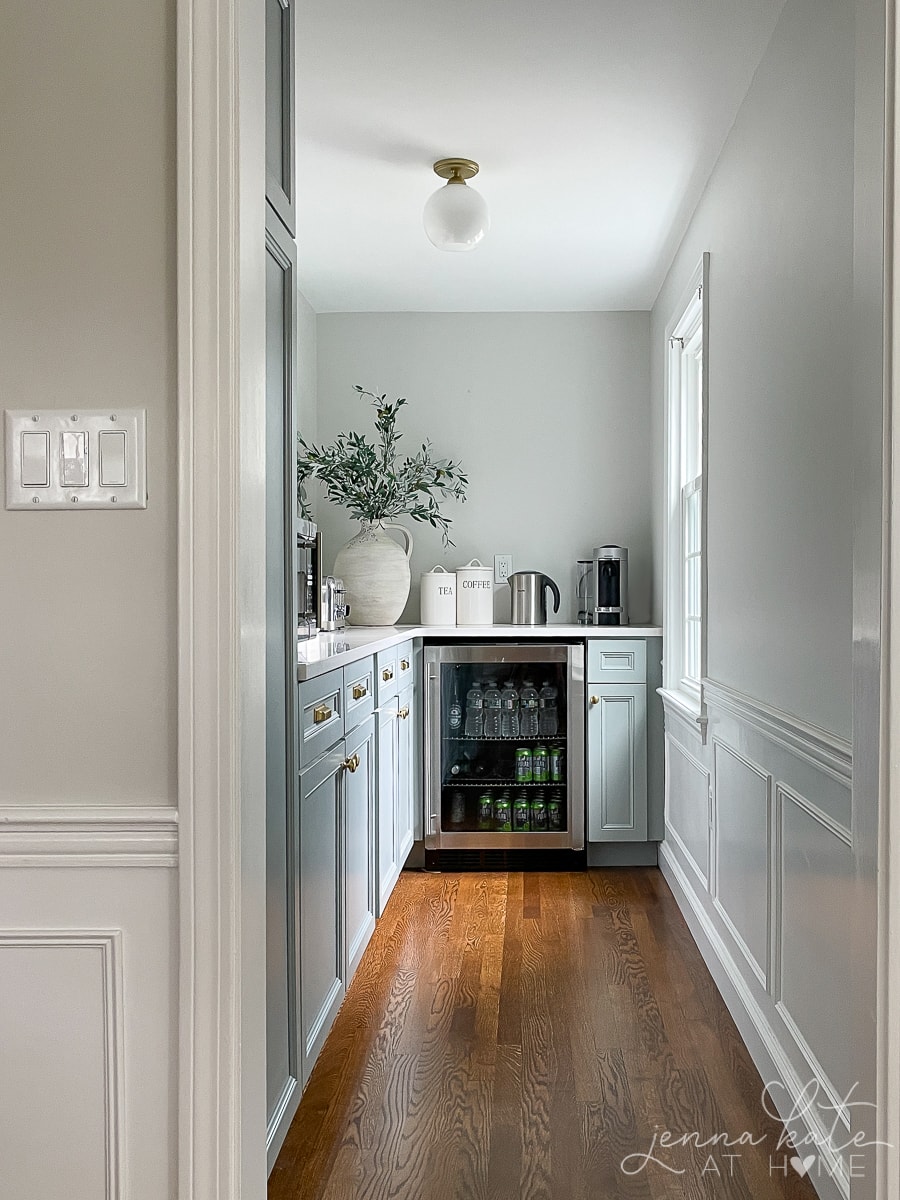
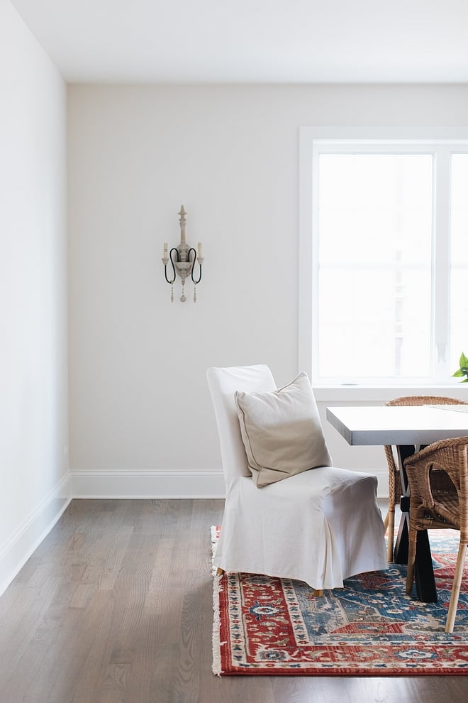
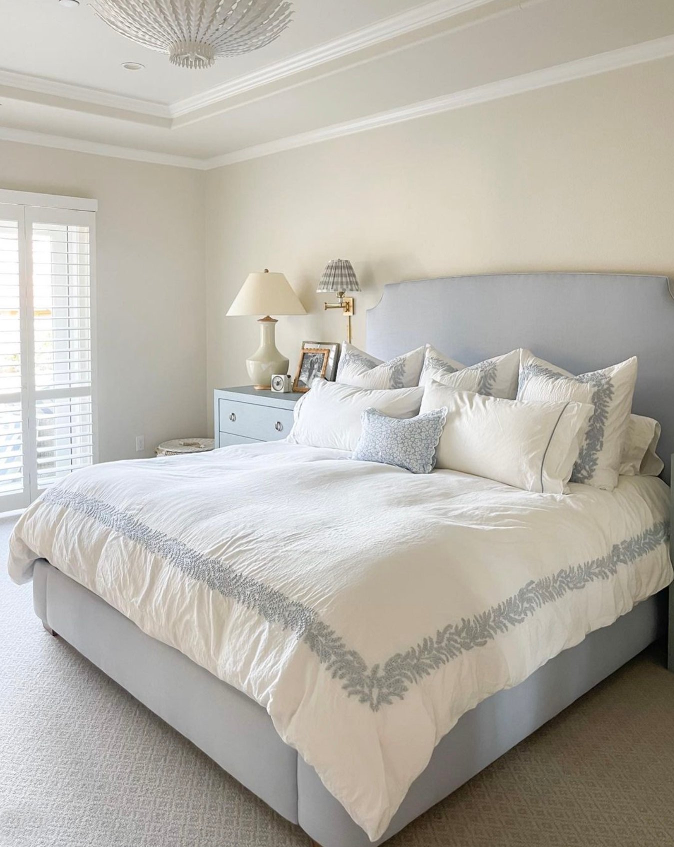
Blue undertoned paints are however perfect for bedrooms, bathrooms and any other space that’s closed behind a door – or where you know exactly how the lighting will affect the color.
Popular Colors For a Whole House
By far the safest colors to choose for a whole house color schemes are neutral paint colors, light earth tones or shades of white.
Both neutrals and whites come with their own set of challenges, of course. Figuring out the dominant undertone is always the main concern.
For this reason, I like to stick with warmer neutrals, and warmer whites.
This way, any cool light will be offset by the warmer tones, and warmer lighting won’t completely wash out the color.
Neutral Colors That Are Great Choices
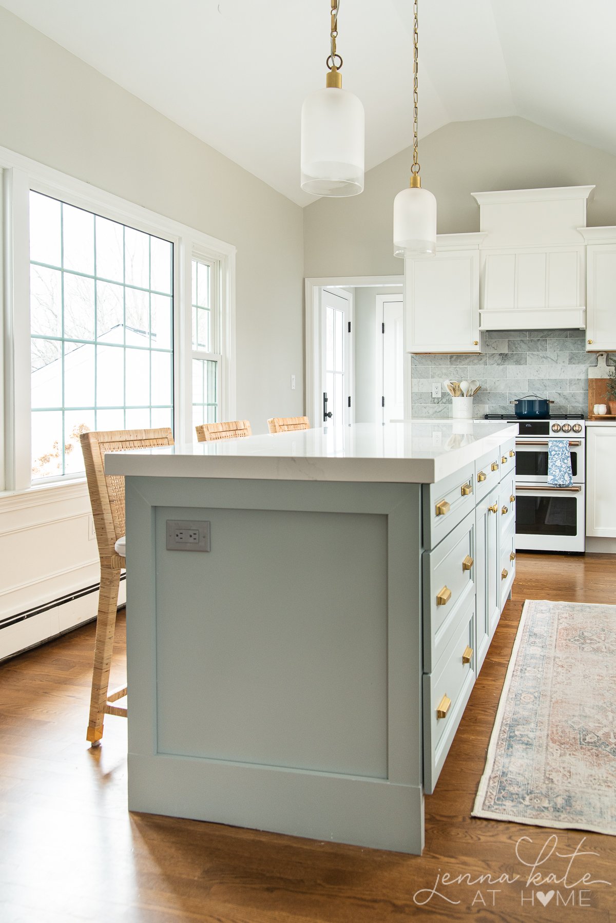
1. Sherwin Williams Repose Gray
This is my all-time favorite paint color because it just works everywhere! My entire main floor was originally painted Repose Gray, and I’ve since repainted and had the color lightened by 50%.
I am beyond obsessed with how light and bright it makes every room feel. It’s the perfect neutral backdrop with just enough warmth that no room ever feels cold.
While Repose Gray technically has a green/taupe undertone, I’ve found it to be barely visible. At full strength, you may see the green pull out of the shadows a bit, but nothing concerning at all.
At half strength (lightened by 50%) those same undertones are what keeps just enough warmth in the color, but no longer become apparent under any lighting conditions (that I’ve at least seen!).
The great thing about Repose Gray works well with a lot of different accent colors and furniture colors. I’ve seen it with light wood and dark wood. Accent colors of beige, blue, green and white look beautiful against it.
Other shades that work well with Repose Gray: Both SW Mindful Gray, SW Chelsea Gray would both make for good contrasting colors on an accent wall next to Repose Gray.
2. Sherwin Williams Agreeable Gray
Agreeable Gray is another incredibly popular greige paint color. It’s similar in tone to Repose Gray, but significantly warmer. I like this color because it can read warmer or cooler depending on the light. Sometimes it looks more gray, other times it’s definitely a greige.
3. Benjamin Moore Paper White
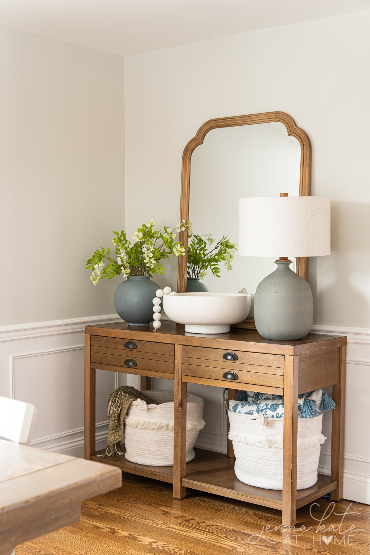
Similar in terms of depth of color to Repose Gray at half strength, Benjamin Moore’s Paper White is my go-to for east and west facing rooms, where you have warm light half the day and cooler light the other half.
Despite the name, Paper White is a very light dove gray with just a hint of green that ensures it never looks cold. Paired with bright white trim, it makes for an excellent whole house color.
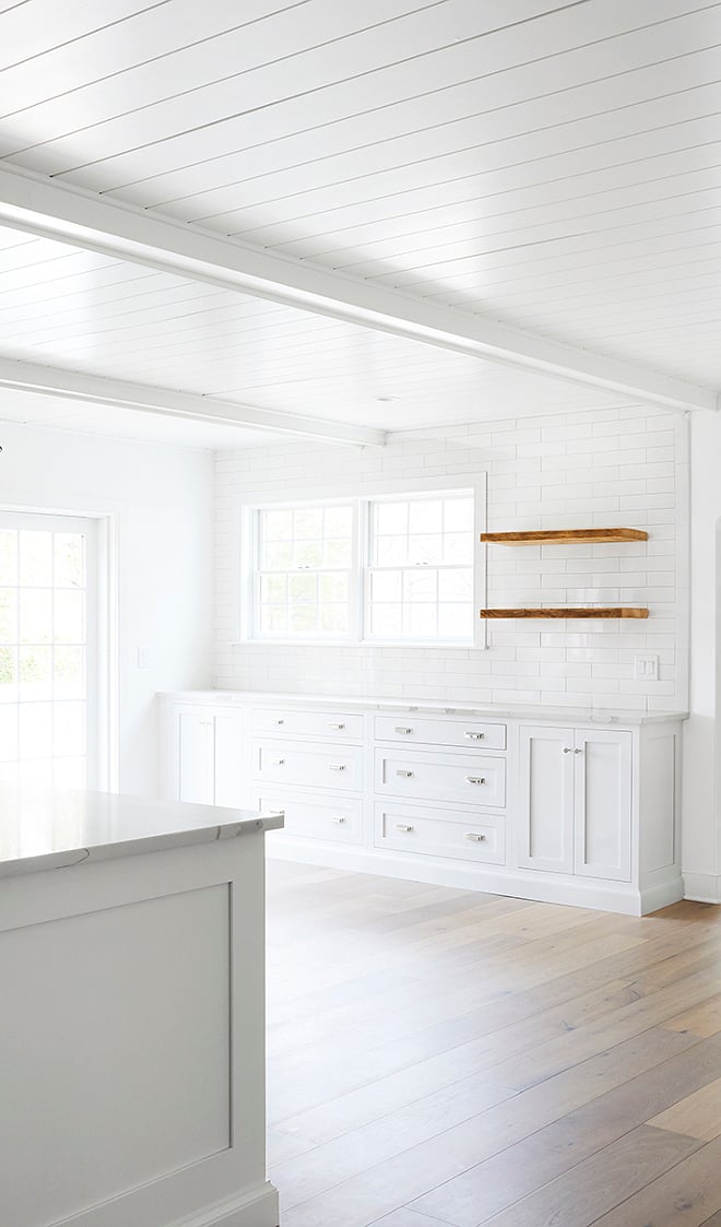
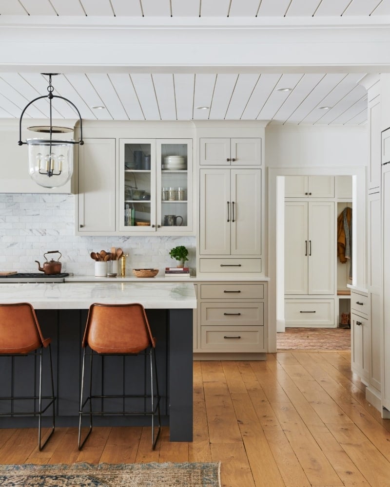
As close in color as it is to the lightened version of Repose Gray, I find that it maintains its light and bright color more in poorly lit rooms. If you remember back to the shadows in my kitchen (pictured above), Paper White will never look that warm or saturated.
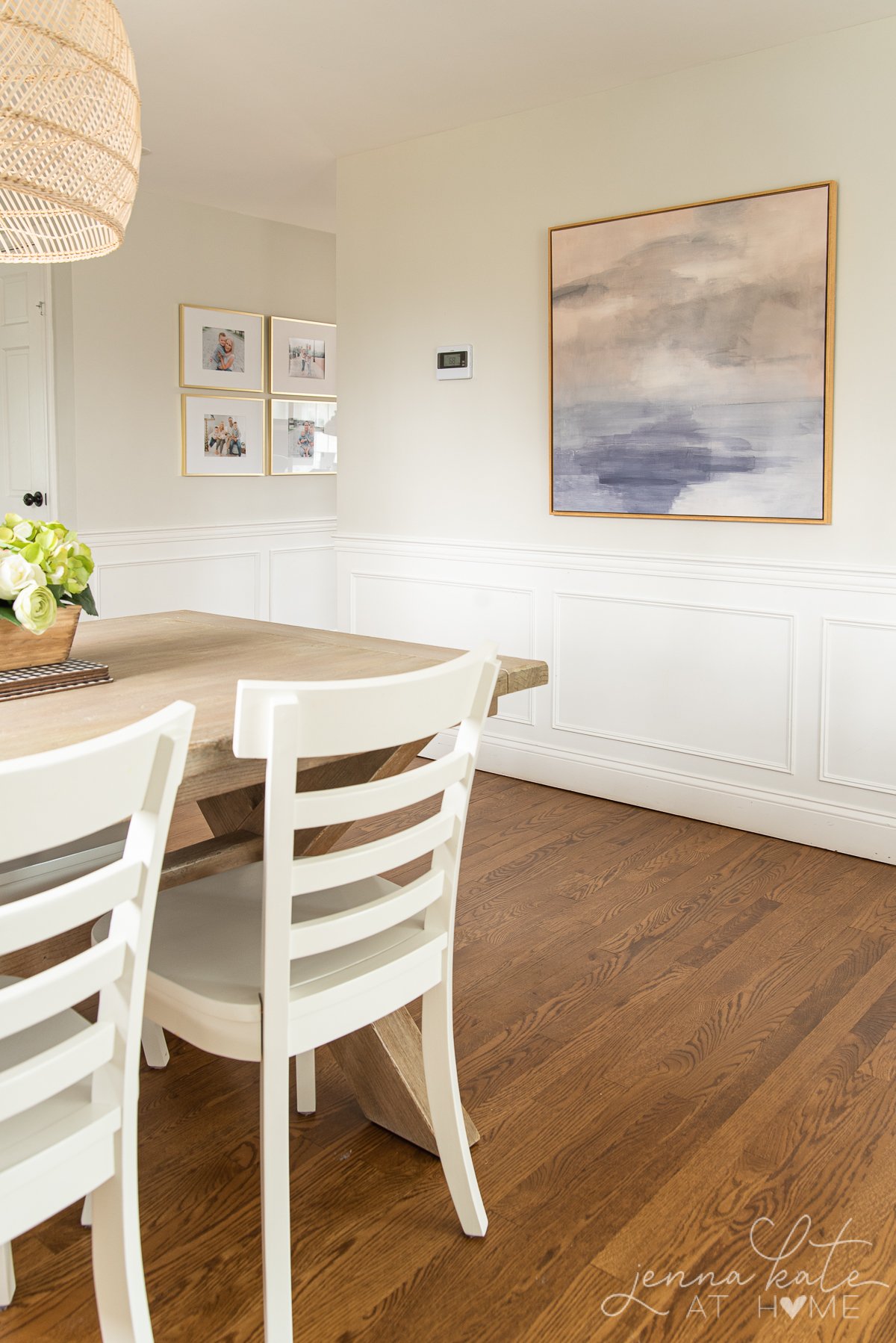
4. Benjamin Moore Classic Gray
If gray is less your style and you want a warmer neutral, Classic Gray is an excellent choice. It’s considerably warmer than the other colors mentioned above, but still has just enough gray to stop it being too warm.
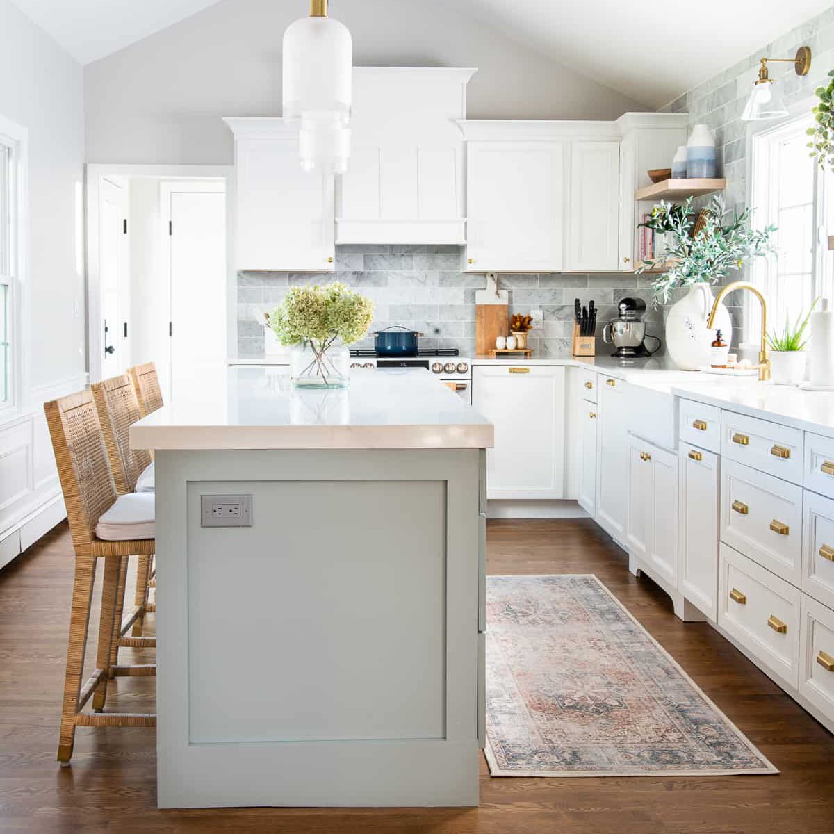
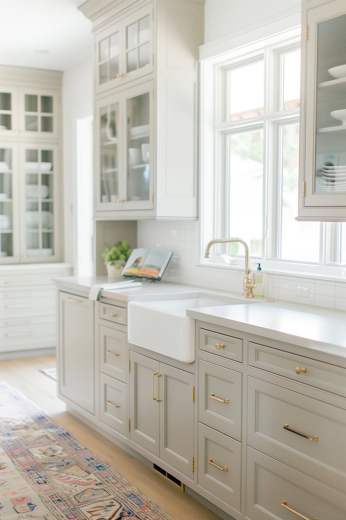
Like Agreeable Gray, Classic Gray can be a bit of a chameleon and look warmer or cooler depending on the available light. In the above picture, you can see how light and bright it is the dining with tons of natural light.
In a lower light room, there will be more saturation to the color.
I personally love this aspect of the color, since it feels like you have different shades when in fact it’s the same paint color the entire time!
White Colors That Are Great Choices
1. Sherwin Williams Pure White
SW Pure White is one of the safest white paint colors out there. It’s a lovely bright white color, with just the tiniest bit of warmth to stop it ever feeling stark.
It works just as well on walls as it does on trim and will give you the appearance of a clean white without having to worry about any funky undertones rearing their ugly heads!
2. Benjamin Moore Chantilly Lace
This is Benjamin Moore’s brightest white, so if you want a really bright crisp white, then Chantilly Lace is the right color for you.
There’s no apparent undertones in this bright white, but it will take on colors from the environment surrounding it. So keep that in mind!
3. Benjamin Moore White Dove
I absolutely adore White Dove as a whole house white. It has a lovely creamy softness to it, and works really well in north facing rooms where white paint can look dull and flat.
If you have other bright whites, White Dove will look considerably creamier next to them, but not in a yellow way, just in a really soft warm way.
4. Sherwin Williams Shoji White
Shoji White has become really popular in the past year, and for good reason. If you can’t decide between a greige or a creamier shade, then Shoji White may be perfect for you.
It has a beautiful warmth to it, but still works as a light and bright color. I can see this becoming an increasingly popular shade this year.
What’s The Right Paint Color For Trim Work?
If you’re sticking with classic white trim, then you’ll want one shade of white for all the trim work, doors, moldings and casings in your home.
If you chose a bright white paint color for your wall (like Pure White or Chantilly Lace) you’re going to want to use that same color for the trim, but in a different sheen. Usually, we do a washable matte sheen or eggshell on walls, and then satin or semi-gloss for all the trim.
Both SW Pure White and BM Chantilly Lace are great white trim colors if you chose a greige or other neutral for your walls, too. Pure White is always a safe bet, as it has a slight warm undertone so it works well with these warmer colors
Chantilly Lace is a brighter white that really adds serious contrast. Other bright whites that are great for trim would be SW Extra White, SW High Reflective White.
If you want a creamier white for your trim then BM White Dove is a beautiful choice.
BM Simply White is also another popular choice, though it has a sneaky yellow undertone so I would only use it in a semi-gloss finish to offset that.
I personally would not use it as a whole-house white because it can look very yellow in certain lighting conditions, most notably artificial light.
But when it works, it really works and is a beautiful warmer white!
If you’re looking for another way to inject some personality into your home, doing contrasting trim is also another idea. Especially when paired with white walls, a warm gray trim can really elevate the look of a home.
Tip
If you’re planning on painting all the walls and trim yourself, read my tips for how to prep walls for best results.
When To Deviate From The Whole House Color Scheme
Don’t be afraid to add an accent wall in another color, or go crazy in a powder room. A powder room in particular in a safe choice when you want to try different color choices, dabble with paint color trends and generally get out of your color comfort zone.
The idea of choosing one color for your whole house is to simplify the process of bringing in other colors, and to make your home feel cohesive and not at all disjointed.
As long as you have an overall cohesive color scheme, adding a pop of color will be a welcome addition and stop your home from feeling like a sea of boring neutral.

Final Thoughts
In 2024, we’ll see more people deviate from the whites and grays that have been popular over the past few years and start to incorporate more warmth into their homes. Those who still favor gray will opt for warmer grays, but shades of greige and tan will continue to become more and more popular.
Don’t Forget…
Don’t forget – no matter what you’ve read or photos you’ve seen online, it’s really important to sample paint colors in your home before committing!
Samplize provides real paint samples that are easy to move around your home, and cheaper than buying a gazillion paint pots! It’s the only way I buy paint samples.
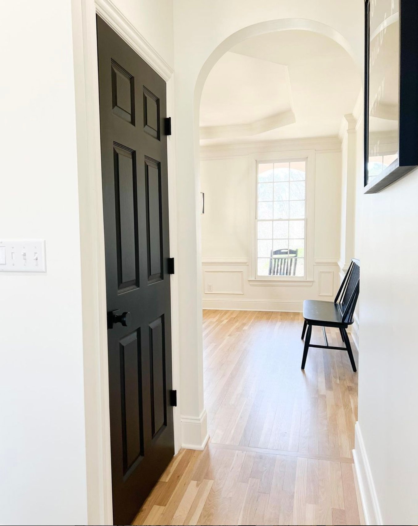
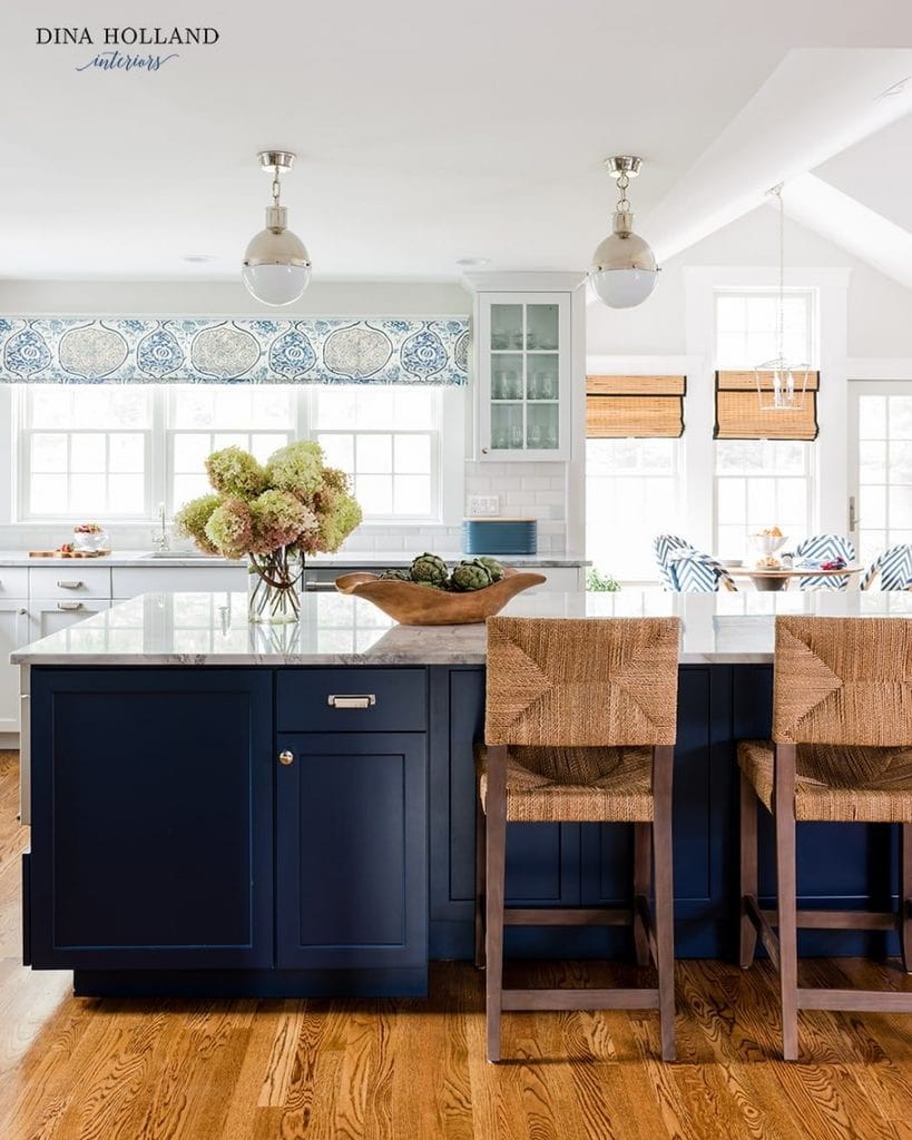
Great post! Wondering your thoughts on a house primarily east/west for windows, white oak floors, tricorne black interior doors, and white trim. Open concept with a gale force/ navy island.
Totally depends on the look you’re going for – but I would do a light warm gray like BM Classic Gray or something like SW Drift of Mist. If you wanted warmer, BM Wind’s Breath or BM White Dove would be nice choices too.
What coordinating colors do you recommend for the bedrooms?