Content may contain affiliate links. When you shop the links, I receive a small commission at no cost to you. Thank you for supporting my small business.
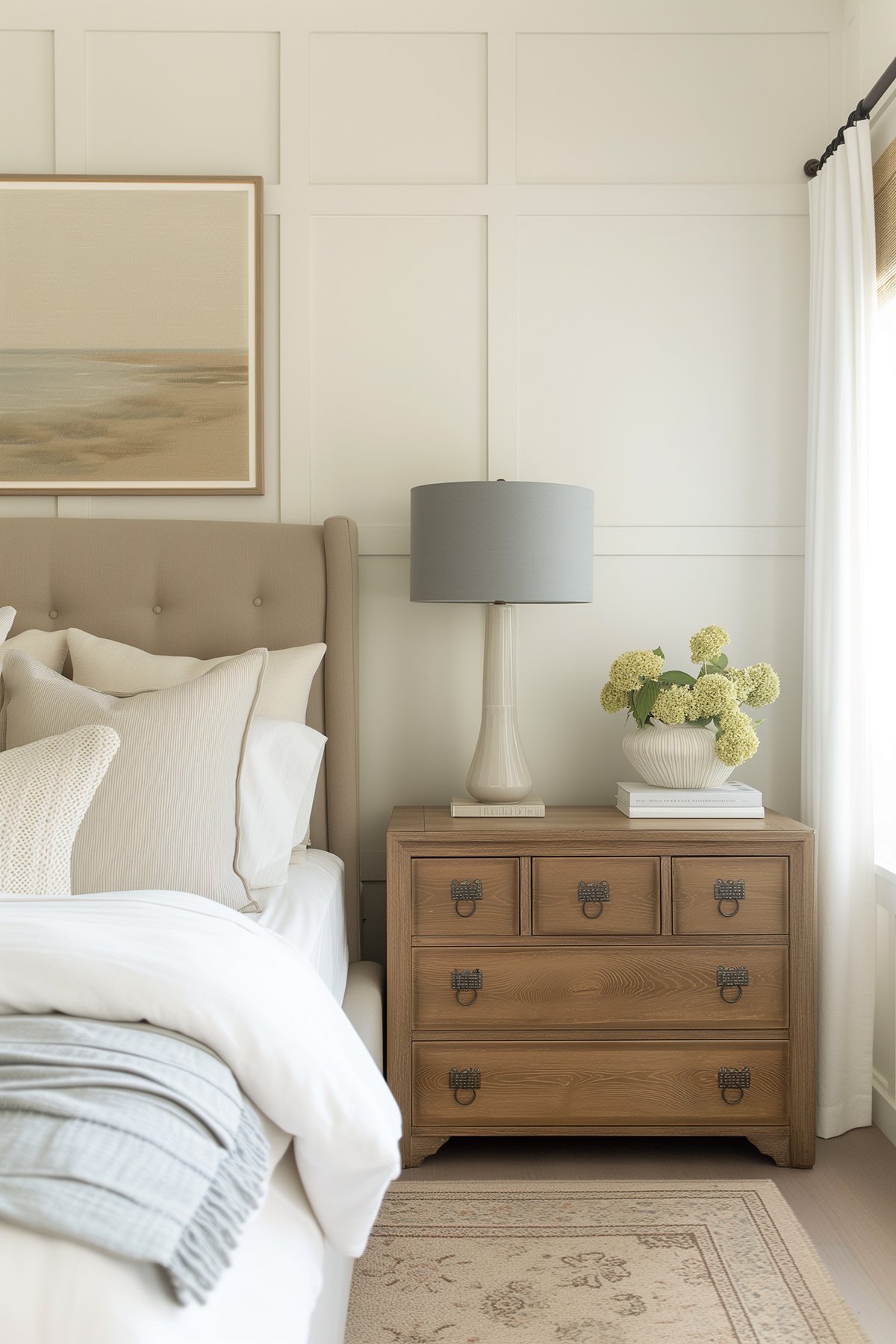
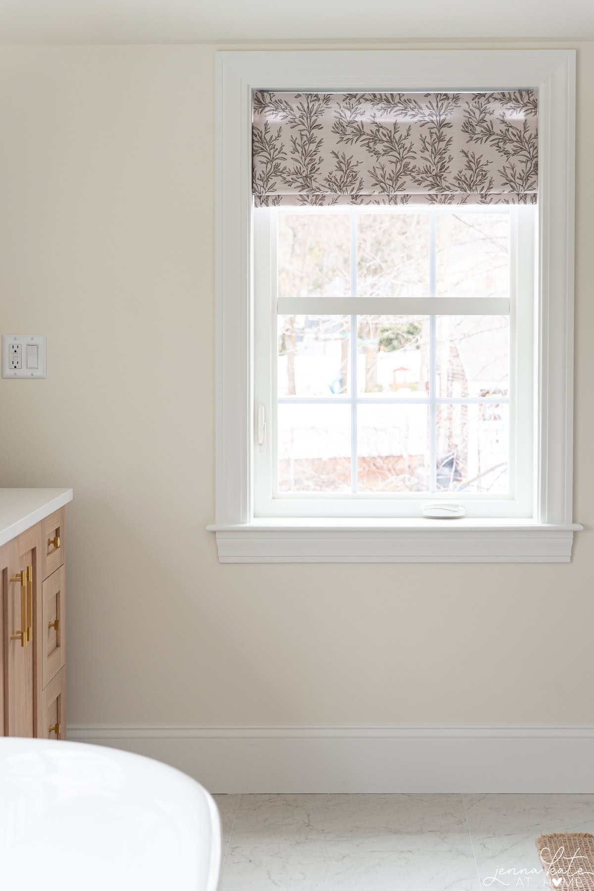
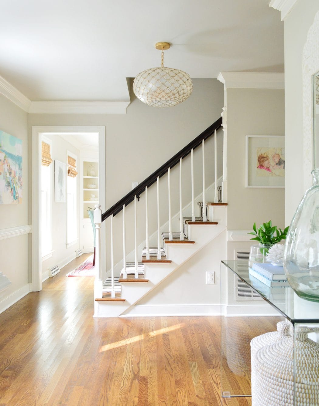
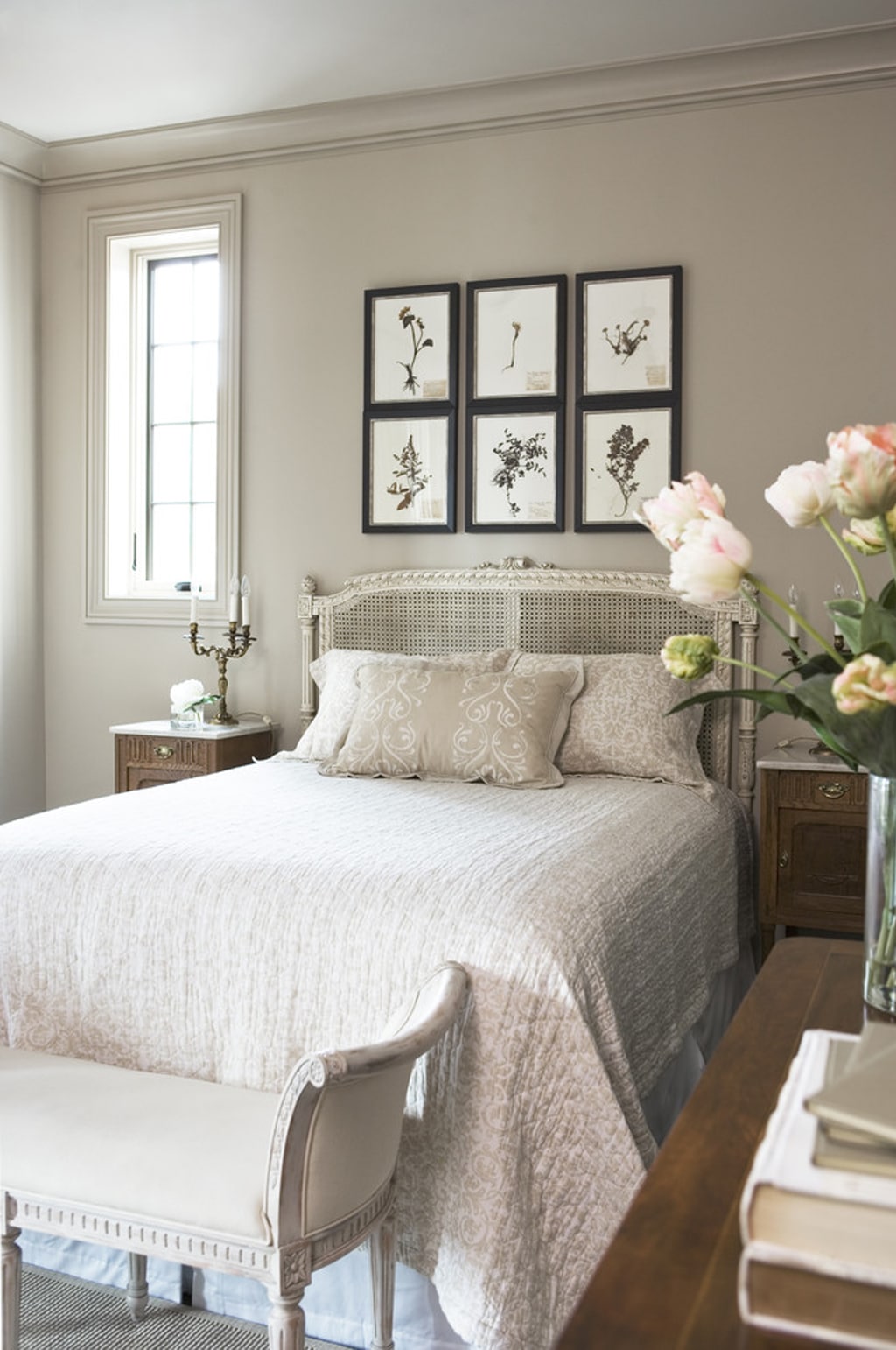
Benjamin Moore Wind’s Breath (OC-24) is a stunning warm neutral that’s quickly becoming a go-to color for its flexibility and easy usability.
The hybrid blend of beige and taupe makes it a popular choice for those seeking a warm neutral without committing too strongly to one specific shade.
What’s The LRV?
The Light Reflectance Value (LRV) of Wind’s Breath is 70, placing it on the higher side of the light range. In brightly lit rooms, it may act more like an off-white, while in super bright conditions, it can wash out.
However, in darker or low-light spaces, its warm neutrality could appear a bit subdued, so it’s advised to enhance such spaces with good interior lighting and pair it with a relatively clean white trim for balance.
What Are The Undertones of Wind’s Breath?
Wind’s Breath can present a very gentle taupe (pink-violet) hint but may also lean slightly towards cream in certain lights. These undertones are incredibly subtle and often not noticeable unless you’re particularly sensitive to color shifts.
Is it a Warm or Cool Color?
Wind’s Breath is definitely a WARM color that tends to hover in a sweet spot where it can adapt to various lighting conditions and design needs.
Where Will Wind’s Breath Look Best?
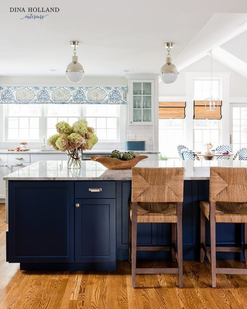
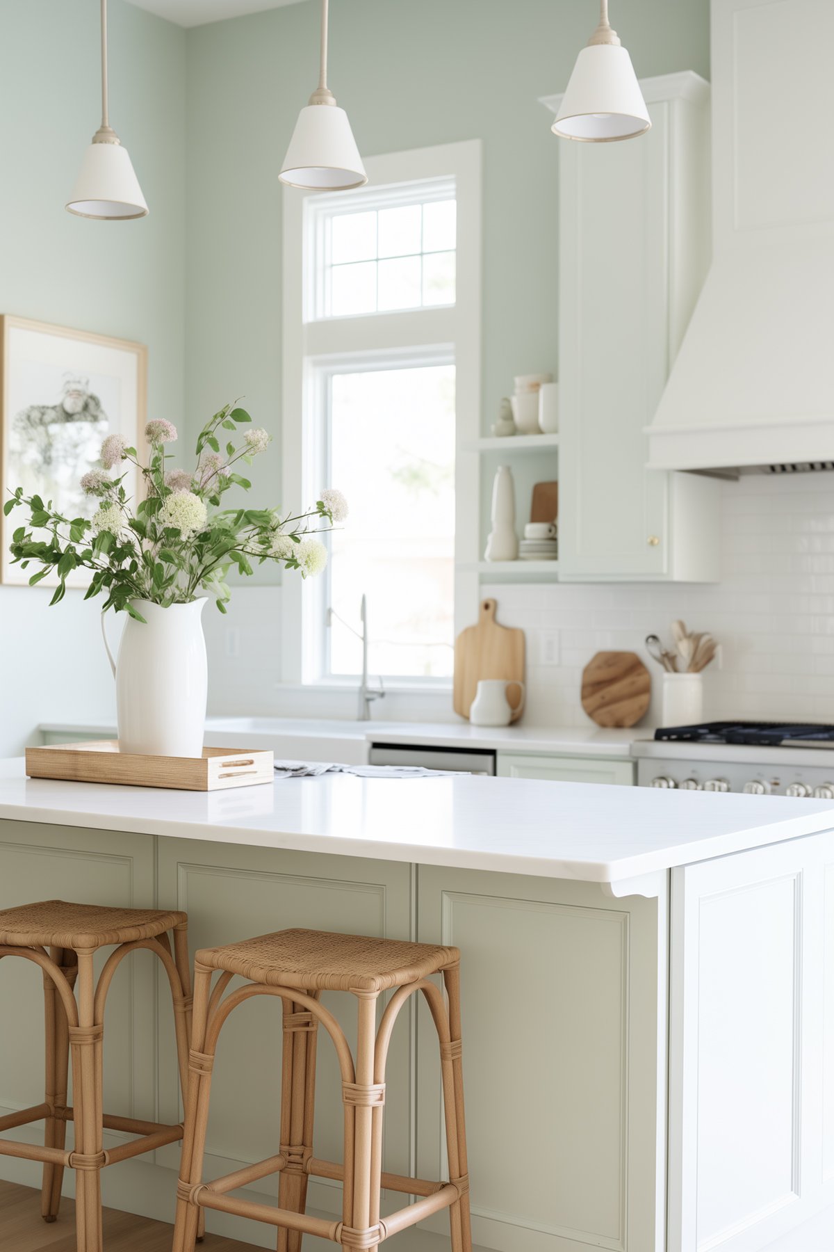
It is best used in living rooms, dining rooms, and on kitchen cabinets, especially in spaces that aren’t overly bright.
For kitchen cabinets, it can be a stylish choice, especially with off-white and light depth cabinet colors being trendy. However, its LRV means that wall colors need to be chosen carefully to achieve the desired contrast.
Is Wind’s Breath a Good Exterior Paint Color?
Wind’s Breath isn’t typically chosen as an exterior paint color, as it tends to lean warmer and could show more of its creamy side outside. I’d recommend sticking to inside walls for this paint color.
How Does Lighting Affect Wind’s Breath?
In north-facing rooms or areas with flat eastern light, Winds Breath leans slightly more towards taupe.
Conversely, in south-facing rooms or with warm afternoon sunshine, it embraces its warmth without looking too golden or creamy.
BM Wind’s Breath Coordinating Colors
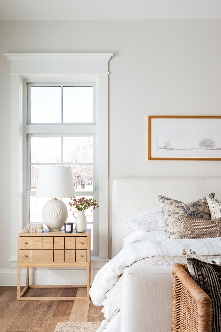
When creating a color palette, Wind’s Breath pairs well with cool grays with blue or blue-green undertones that are darker than Winds Breath. In addition, it looks fantastic with relatively clean and simple whites or muted blue-green blends.
For trim and cabinets colors, Benjamin Moore Chantilly Lace and Sherwin Williams Pure White are good partners for Wind’s Breath. These clean whites complement Winds Breath’s warmth beautifully!
BM Wind’s Breath Similar Colors
For similar colors, you might consider Benjamin Moore Edgecomb Gray, which is just a bit darker and more grounded.
Sherwin Williams Egret White and Benjamin Moore Classic Gray are also close relatives, but each has its unique undertones and depth.
Wind’s Breath vs. Pale Oak
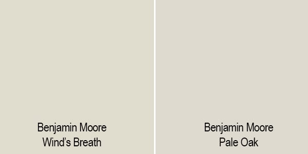
- Color Tone and Undertone:
- Wind’s Breath: A soft beige with a slight gray undertone, appearing more beige in natural light and more gray in artificial light.
- Pale Oak: A warm greige (gray + beige), appearing more gray or beige depending on the lighting.
- Brightness/Light Reflectance Value (LRV):
- Wind’s Breath: Higher LRV, lighter and more reflective, creating a spacious feel.
- Pale Oak: Slightly lower LRV, offering more depth and warmth, yet still airy.
Wind’s Breath vs. White Duck
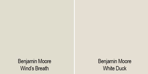
- Color Tone and Undertone:
- Wind’s Breath: A soft beige with gray undertones, varying between beige in natural light and gray in artificial light.
- White Duck: A warm, soft off-white with beige and gray undertones, presenting a balanced neutral that leans neither too warm nor too cool.
- Brightness/Light Reflectance Value (LRV):
- Wind’s Breath: Higher LRV, lighter and more reflective, creating a more open and airy feel.
- White Duck: Also high in LRV, but typically slightly less than Wind’s Breath, offering a warm, inviting, yet still light and airy appearance.
Wind’s Breath vs. Cedar Key
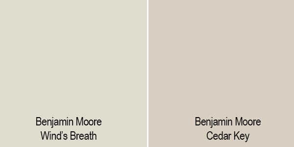
- Color Tone and Undertone:
- Wind’s Breath: A soft beige with gray undertones, shifting between beige in natural light and gray in artificial light.
- Cedar Key: A deeper, warm beige with olive undertones, offering a richer and earthier look.
- Brightness/Light Reflectance Value (LRV):
- Wind’s Breath: Higher LRV, making it lighter and more reflective, ideal for a brighter, more open feel.
- Cedar Key: Lower LRV, resulting in a cozier, more intimate ambiance, suitable for spaces where a more grounded color is desired.
Frequently Asked Questions (FAQs)
While it can pick up very subtle pink-violet undertones, they are generally too subtle to be a significant concern.
Benjamin Moore Chantilly Lace or Sherwin Williams Pure White are excellent choices.
Yes, Winds Breath and BM Edgecomb Gray are compatible and can be used together effectively.
While Wind’s Breath does not have a green undertone, it may reflect some green if there’s a lot outside your window. But otherwise, no it should no appear green.
A warm white paint color like SW Pure White will allow to cabinet color to really shine.
Final Thoughts
Overall, Benjamin Moore Wind’s Breath is a beautiful warm neutral that will work in a variety of spaces and with a variety of color schemes. If you’re tired of the grays of the world but still want a light and airy feel, this may be a great paint color for you!

Could I do winds breath cabinet & Edgecomb gray walls ?
Not a lot of cabinets