Content may contain affiliate links. When you shop the links, I receive a small commission at no cost to you. Thank you for supporting my small business.
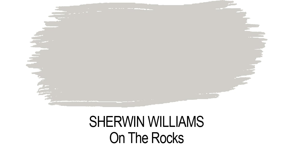
If you are on the hunt for a popular and beautiful light gray paint color, On The Rocks by Sherwin Williams (SW7671) might just be it! This is one of the most popular colors in the gray family, and I can see why!
It’s what everyone is using as their latest inspiration these days, so let’s take a look at why.
What Color is On The Rocks?
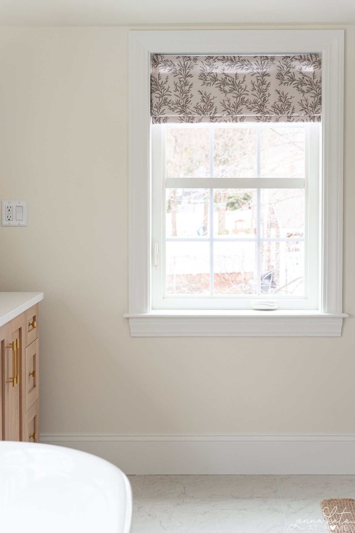
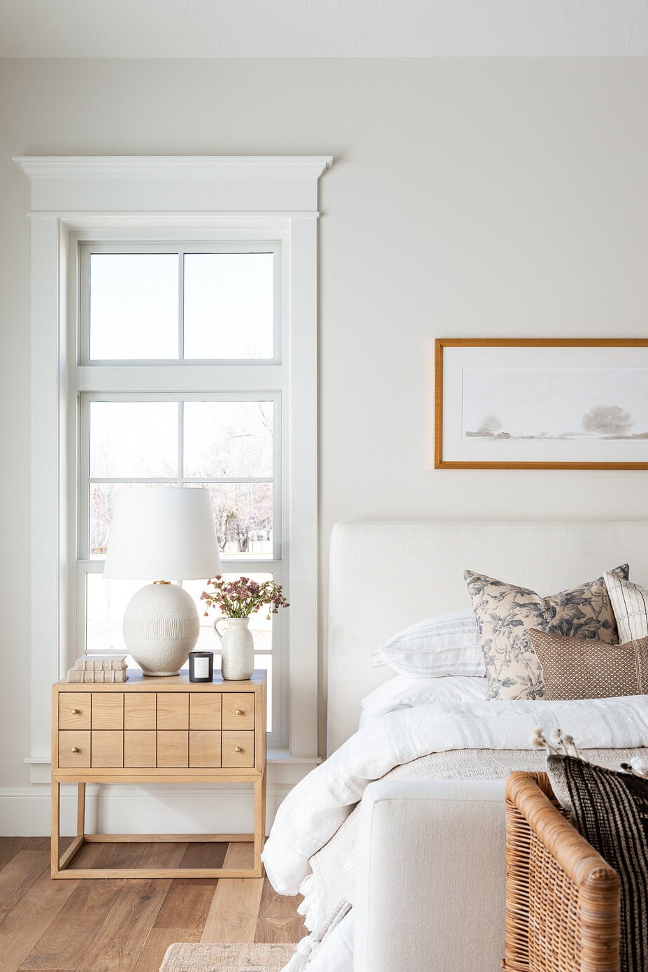
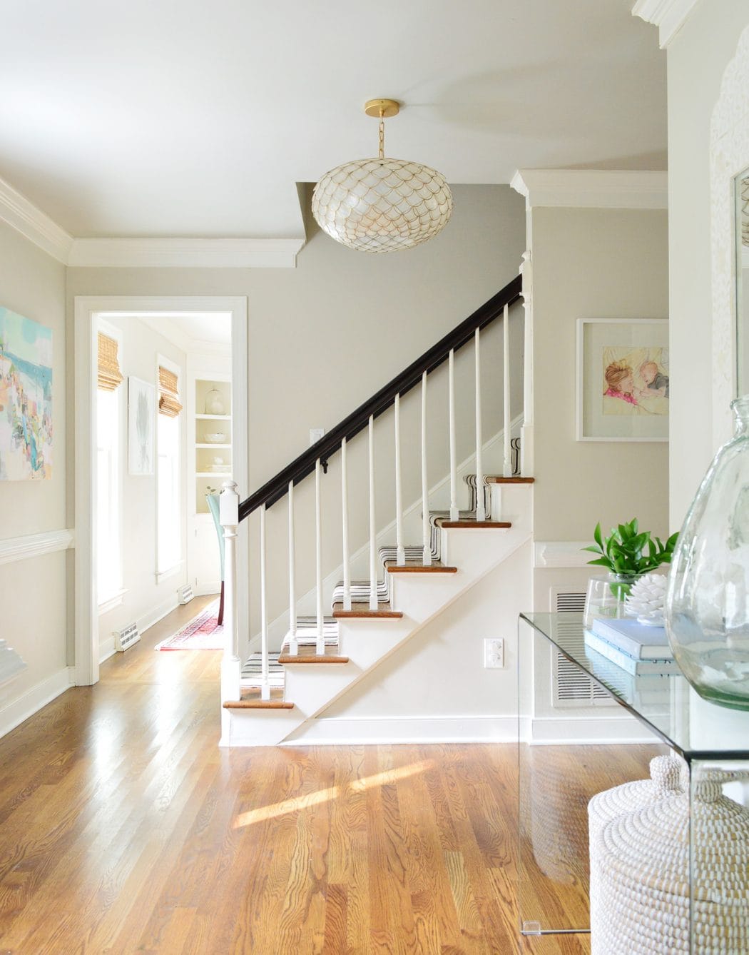
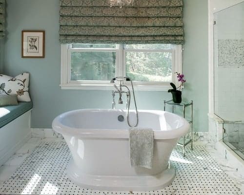
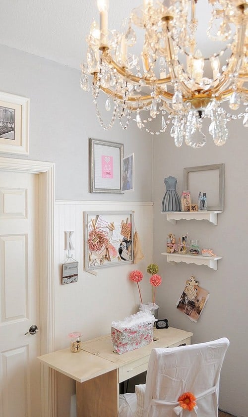
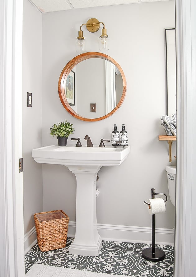
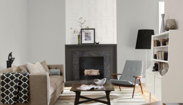
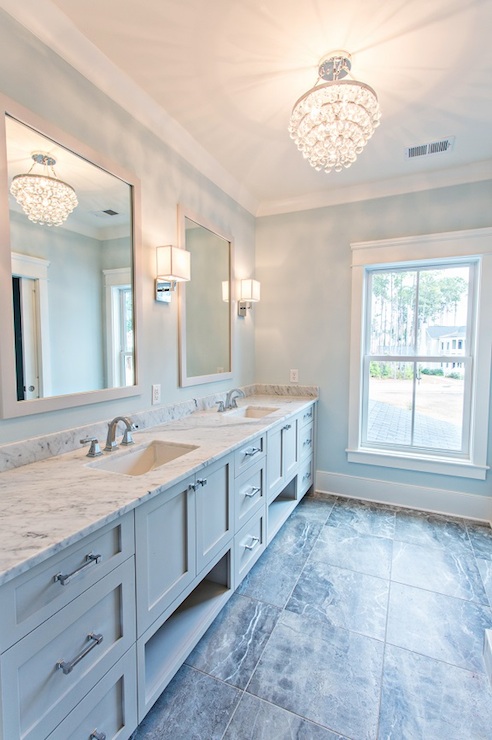
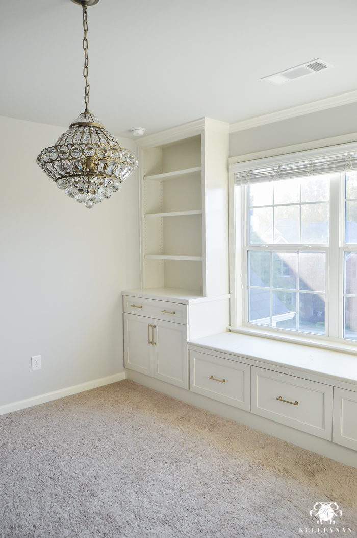
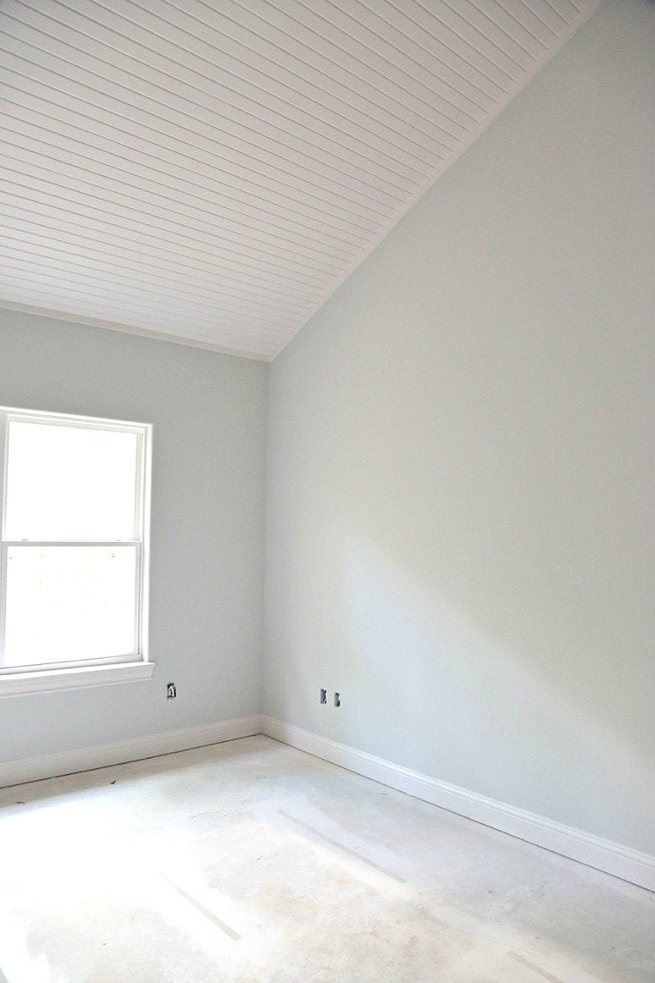
Sherwin Williams On The Rocks is a perfect, warm, versatile, neutral grey paint color. It has slight green and taupe undertones, and it gives off a gray look without feeling cold. On the wall, it reads pretty much a true gray, but remember all grey paint has undertones.
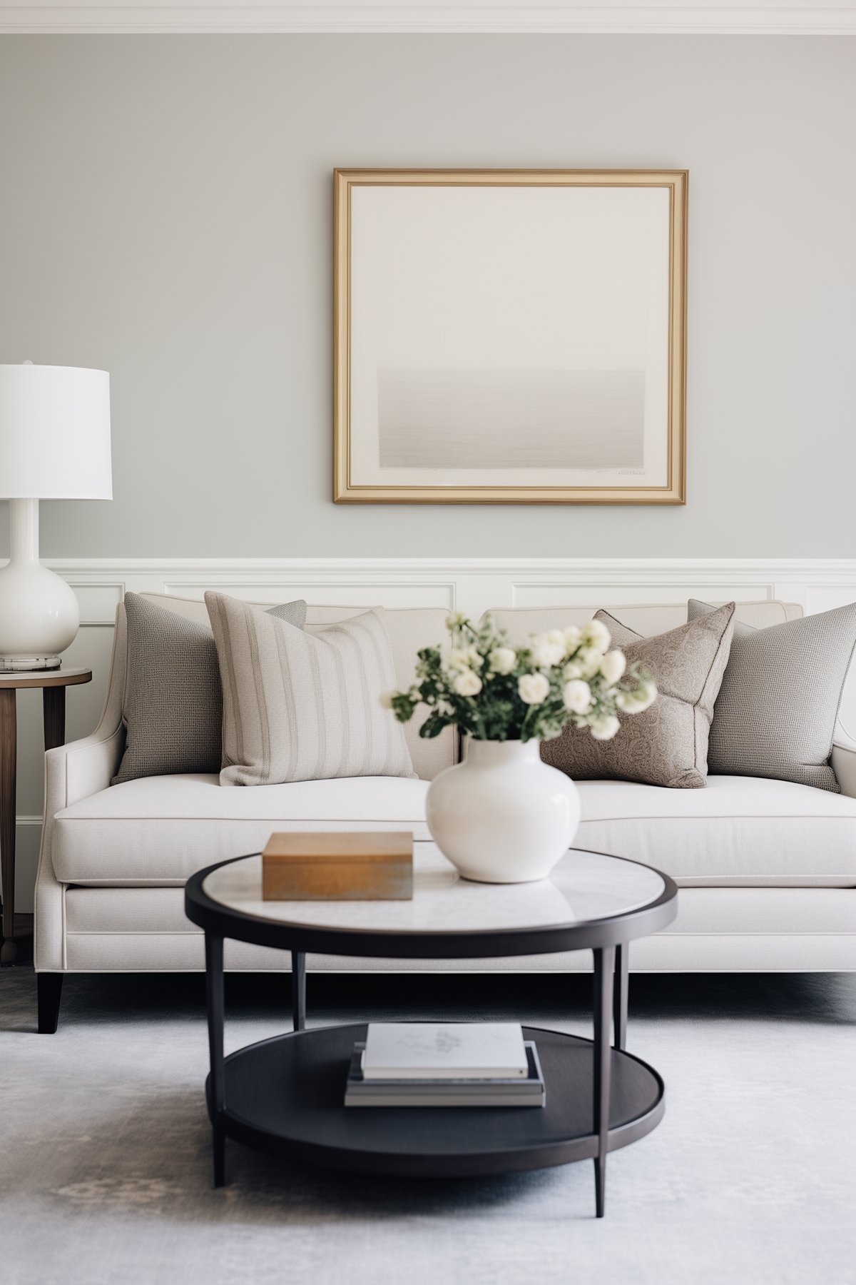
The paint color will work in any room of your home, including the dining room, kitchen, bedrooms and bathrooms.
What is The LRV?
Light Reflectance Value (LRV) is an indicator of the amount of light that is reflected by a color when it is illuminated by a light source. A higher value (closer to 100) means that a color will reflect more light back at you and a lower value (closer to 0) means that a color will appear darker, or absorb more light.
This paint color has an LRV of 62 placing it on the light end of the range, meaning it reflects a fair amount of light.
Is it a Warm or Cool Color?
To me this is a very soft gray, it doesn’t look too warm or cold.
In a room with southern facing light, it can come across a smidge purple or taupe. In a room that has northern facing light, it can give off a colder look with a slight blue hint.
What Are The Undertones?
On The Rocks is a paint color known for its neutral base, but it often shows soft violet or blue undertones, especially in certain lighting conditions. This gives it a subtle depth that can vary depending on the light in the room.
Its mostly neutral look makes it a flexible choice for various decorating styles, allowing it to adapt and complement a wide range of other colors and accents.
If I Have On the Rocks Walls, What White Trim Color Will Look Best?
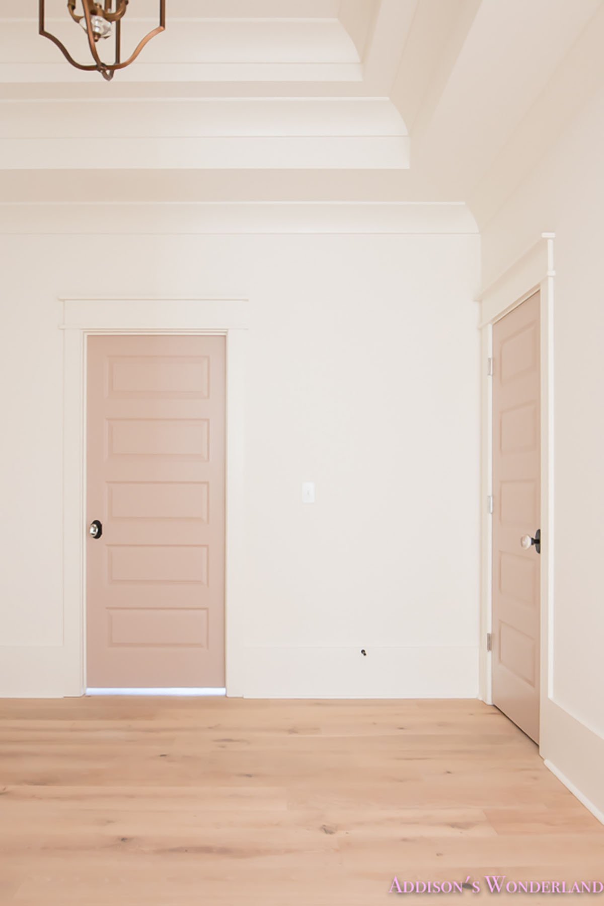
For trim Sherwin Williams Pure White is always a safe bet. It’s a bright white with just a smidge of warmth so it never looks cold. It looks great with all wall colors, but it’s especially the correct choice if the color is warm.
If you want a really bright, crisp white Benjamin Moore Chantilly Lace will really create the perfect amount of contrast between walls and trim. Sherwin Williams High Reflective White is also an excellent choice.
How Does Light Affect This Paint Color?
We know that natural and artificial lighting can play a major role in the true hue of this paint color.
Depending on the time of day Sherwin Williams On The Rocks may come across as a different color. In full sun it will appear much lighter, in a room with less natural light it will come across much darker.
This is one of those colors that will also appear slightly different depending on its surrounding hues. That’s why it’s always so important to purchase paint samples and see how a color looks in your home!
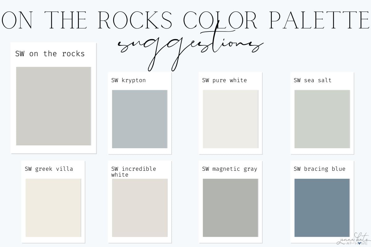
Sherwin Williams On The Rocks Coordinating Colors
Looking for a complimentary color palette? Good coordinating colors are Greek Villa (SW 7551) Almond Rice (SW 9105) and Extra White (SW 7006).
Greek Villa is a very creamy warm white paint color. Almond Roca is medium brown, and Extra White is a very bright and cool white.
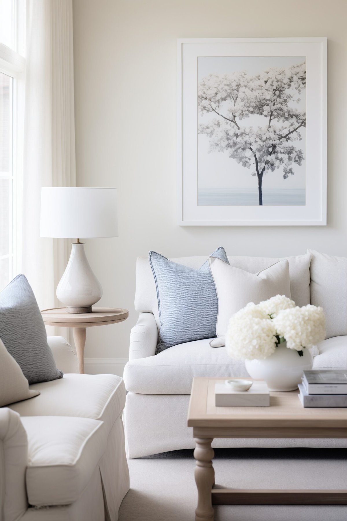
I would recommend pairing it with clean whites, darker grays, greens like Sherwin Williams Sea Salt or even blues.
Sherwin Williams on the Rocks vs Agreeable Gray
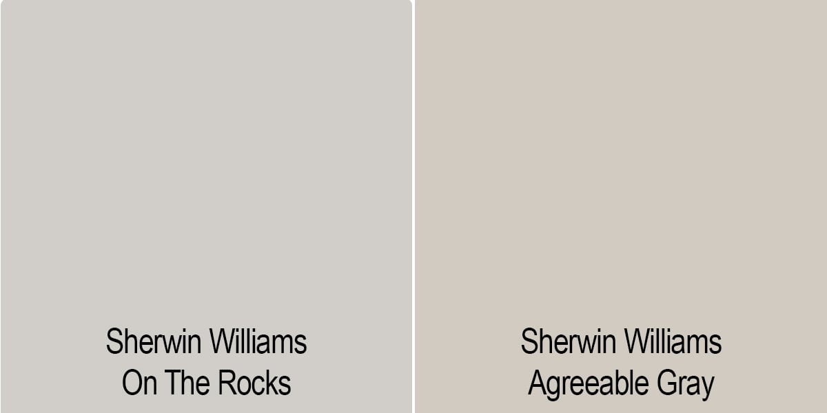
Agreeable Gray is Sherwin William’s most popular paint color. When compared side-to-side you can see a little bit of beige in Agreeable Gray. With this added beige it makes it a more versatile color, and it can come across as quite warm.
If you are looking for a truer gray, then On The Rocks will be a better choice for you. If you’re looking for a more neutral (greige) paint color, Agreeable gray would be your best bet.
Sherwin Williams On the Rocks vs. Repose Gray
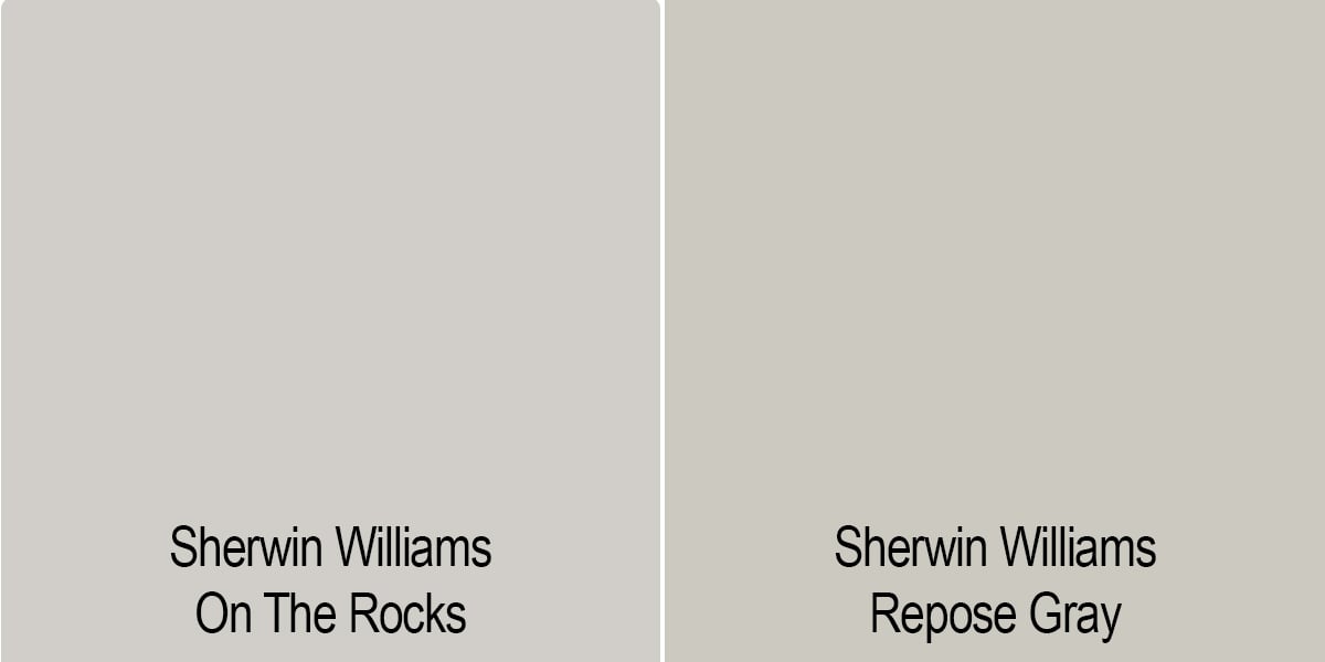
Another top greige paint color by Sherwin Williams is Repose Gray. Greige paint colors are colors that have beige and gray in them. These two colors have very similar depths and LRV’s with Repose gray just a bit darker.
Don’t Forget To Always Use Real Paint Samples!
Don’t forget – no matter what you’ve read or photos you’ve seen online, it’s really important to sample paint colors in your home before committing!
Samplize provides peel and stick paint samples made with real paint, that are easy to move around your home, and cheaper than buying a gazillion paint pots! It’s the only way I buy paint samples.
When it comes to Repose Gray, we would consider it a warm gray with a mixture of green and purple undertones, depending on the light. On The Rocks just has that slight purple undertone, which makes it a little less warm than Repose Gray, closer to being “gray” than a “greige” paint color.
If the light in your home pulls out that taupe/purplish undertone from On The Rocks, getting a sample of Repose Gray might be a good idea. The green may be just enough to counteract the purple and it may work better in your home. These subtle differences often make or break a color!
FAQ’s
Personally, I’d steer clear as chances are you’re going to have a lot of natural light reflecting against it. While it can sit on interior walls pretty effortlessly, on outdoor spaces it can present the violet undertone stronger and become washed out.
If the bricking/accents on your home don’t mind violet, you could always try painting your front door this color for a more minimal approach.
Final Thoughts
Sherwin Williams On The Rocks is a gorgeous, true gray paint color with very subtle undertones. It’s quickly becoming one of my favorite colors!
We love this welcoming and relaxing neutral gray paint color. so if you are looking for a lighter gray paint color, this might just be perfect paint color for your space!