Content may contain affiliate links. When you shop the links, I receive a small commission at no cost to you. Thank you for supporting my small business.
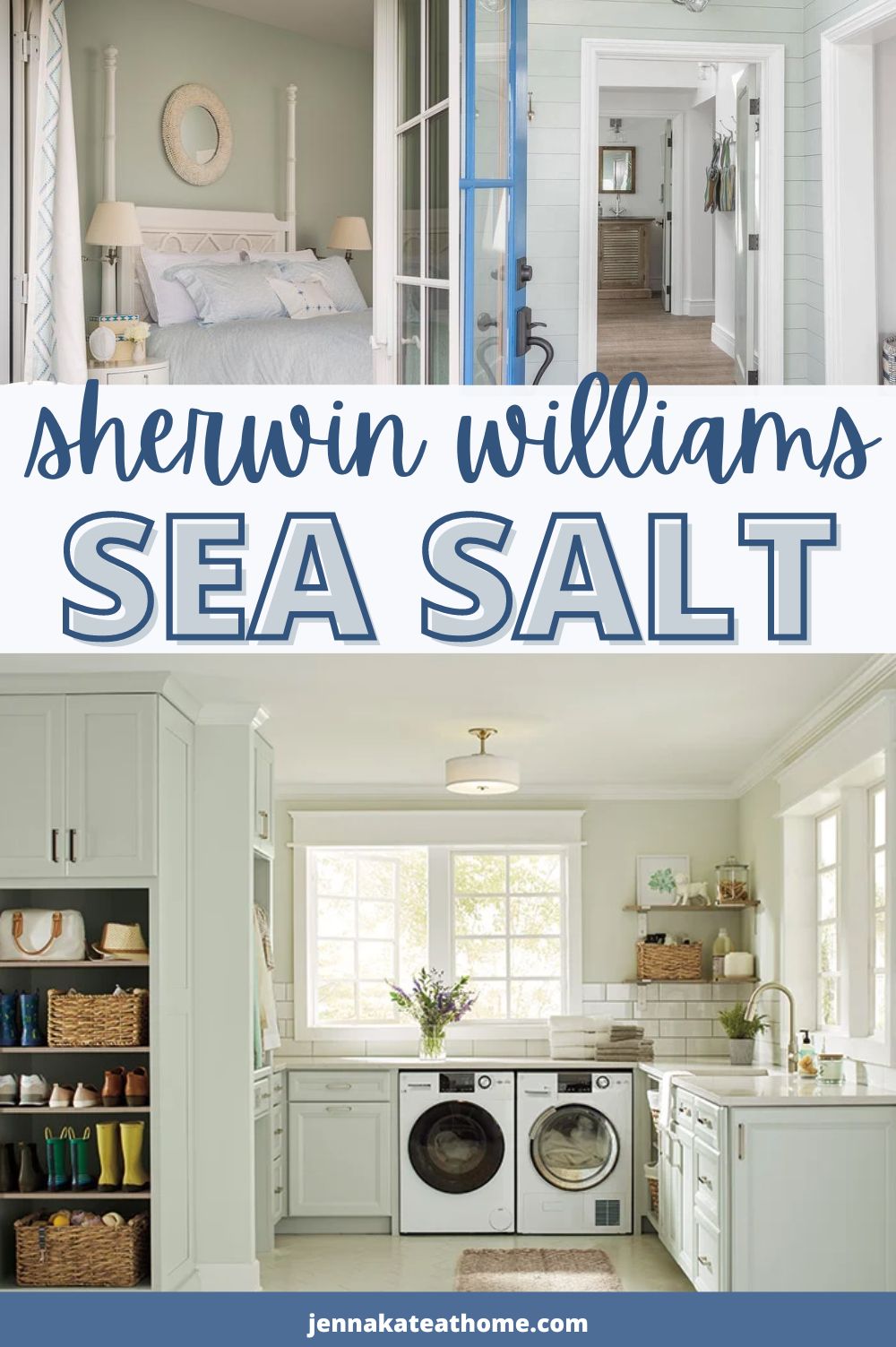
If you’re dreaming of a home that feels calm, serene, and effortlessly coastal, Sherwin Williams Sea Salt (SW 6204) might just be the perfect paint color for you. It’s a soft, muted blend of green, blue, and gray that shifts beautifully depending on lighting, making it a popular choice for bedrooms, bathrooms, and even whole-house palettes.
In this post, I’m sharing everything you need to know about Sea Salt, including real room examples, how it changes in different lighting, where it works best—and when it might not be the right fit.
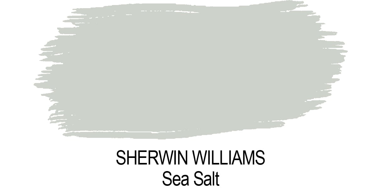
What Color is Sherwin Williams Sea Salt?
Sea Salt is often described as a gray-leaning green that can flash blue depending on lighting. It’s a true chameleon color — in some spaces, it reads more green-gray; in others, more blue-green.
It evokes the calming feeling of a misty sea breeze, making it perfect for coastal-inspired spaces or anyone craving a softer, cooler color palette.
What’s The LRV of Sea Salt?
Sea Salt has a Light Reflectance Value (LRV) of 63, meaning it falls into the lighter range but has enough body to hold its own on walls.
- Higher LRVs (closer to 100) = reflect more light (think bright whites).
- Lower LRVs (closer to 0) = absorb more light (think dark, moody colors).
With an LRV of 63, Sea Salt will help a room feel light and airy without feeling stark or washed out.
Is Sherwin Williams Sea Salt Warm or Cool?
Sea Salt is a cool paint color overall, but it carries just a hint of warmth in certain lights.
It works best in homes that lean into cool palettes—think soft whites, muted grays, navy blues, and weathered wood tones.
How Sea Salt Looks in Different Lighting Conditions
Because of its complex undertones, Sea Salt shifts noticeably based on your room’s lighting:
- North-facing rooms: Can pull more blue-gray, feeling cooler and more muted.
- South-facing rooms: Will feel brighter, lighter, and lean more green.
- East-facing rooms: Soft, muted green in the morning; slightly bluer by evening.
- West-facing rooms: Warm afternoon light brings out Sea Salt’s greener side.
- Rooms with little natural light: May feel darker and more muted—testing is key!
JENNA’s Tip
Always sample Sea Salt in your own space before committing. Grab a reusable peel and stick sample from Samplize so you can see it in different lighting throughout the day!
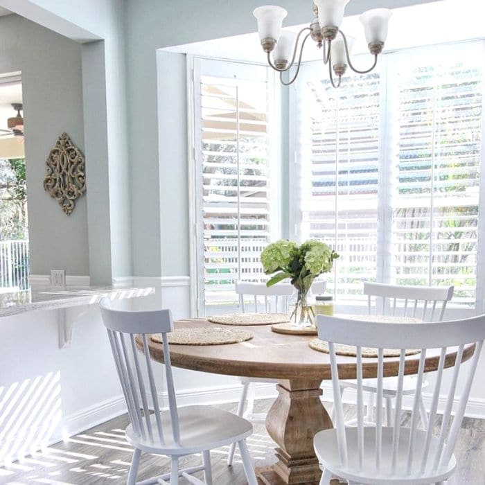
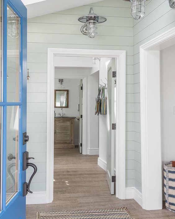
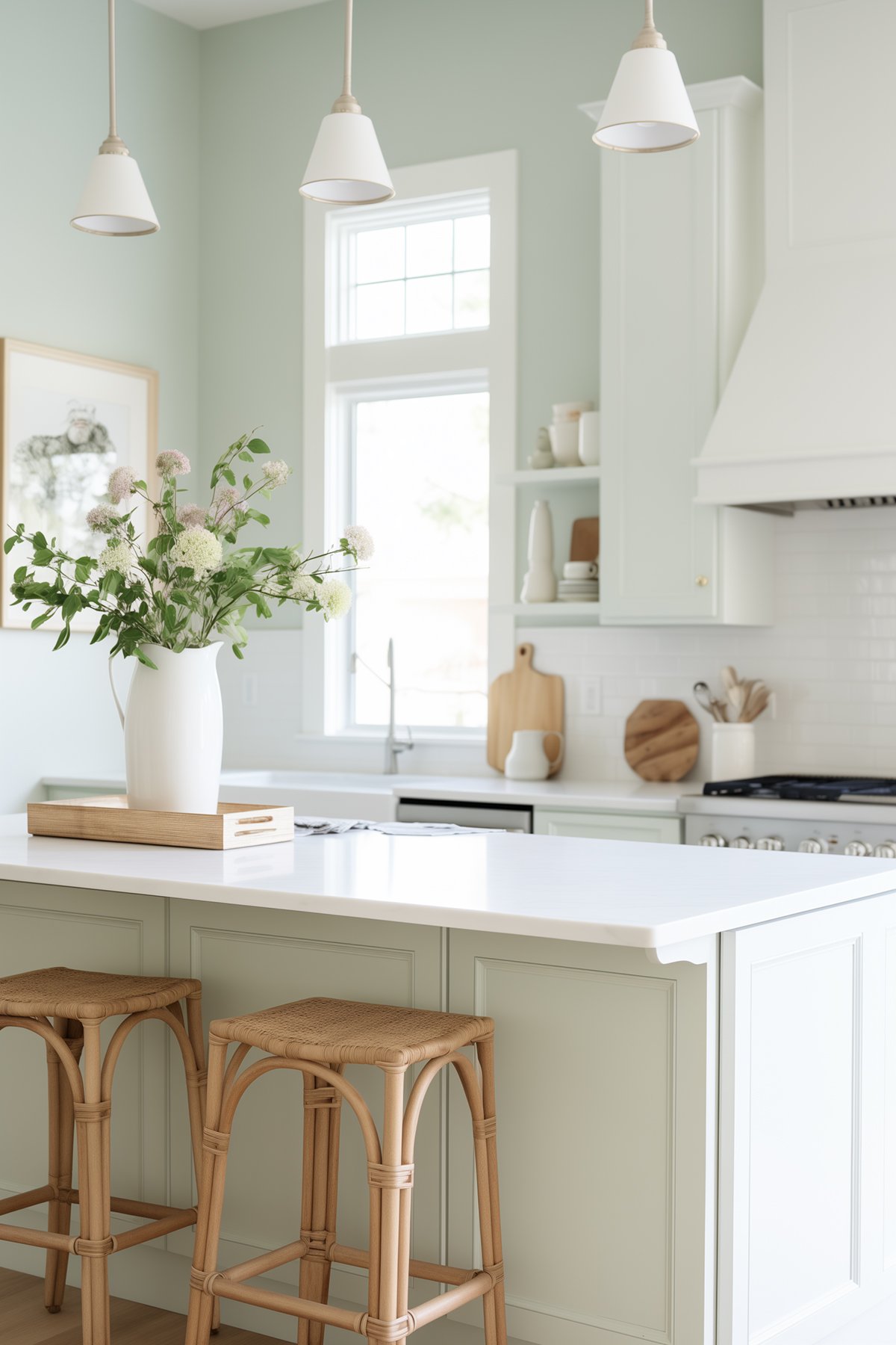
Real Room Examples
In the below pictures, you’ll notice how Sea Salt sometimes looks distinctly gray-green, and other times leans more into the blue.
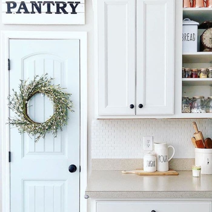
Entryway Painted in Sea Salt
Here, Sea Salt leans beautifully blue thanks to the cool natural lighting.
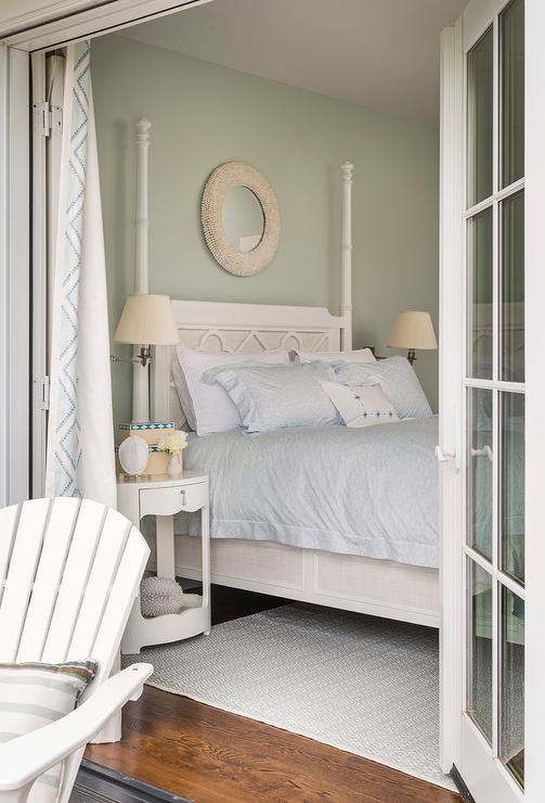
Bedroom Painted in Sea Salt
In this cozy bedroom, you see Sea Salt’s greener, softer side, creating a peaceful and welcoming atmosphere.
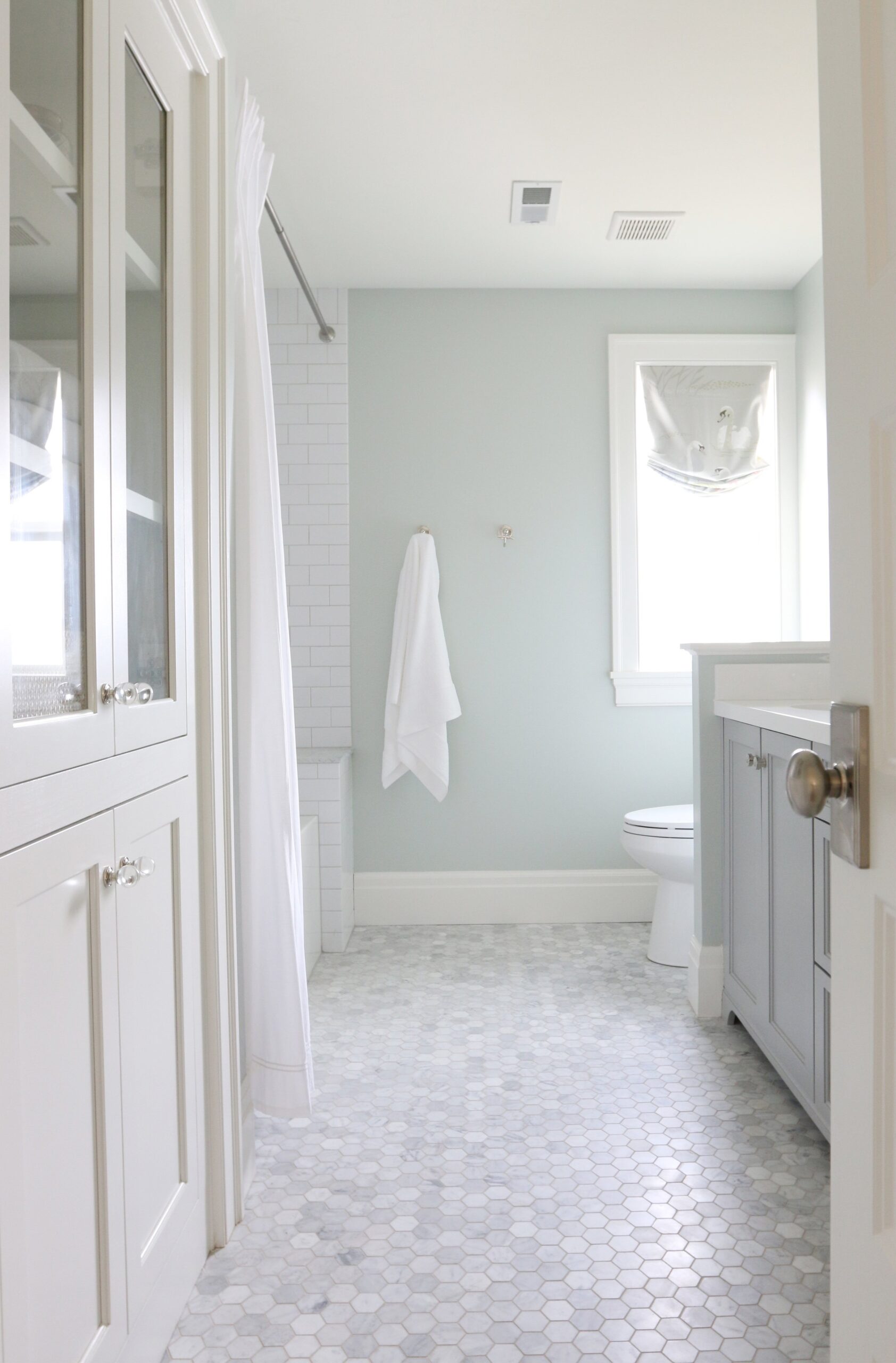
Bathroom Painted in Sea Salt
Even in spaces with limited natural light, Sea Salt still provides a clean, refreshing backdrop—skewing slightly more green.
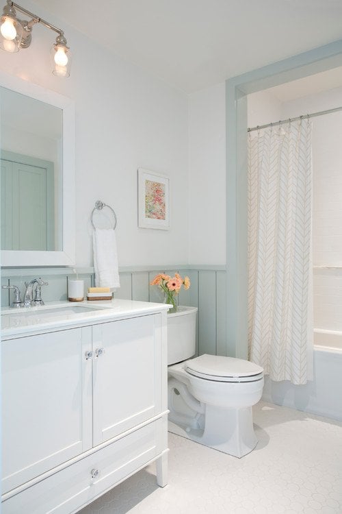
In contrast, the bathroom below has plenty of natural light so you can see more blue coming through.
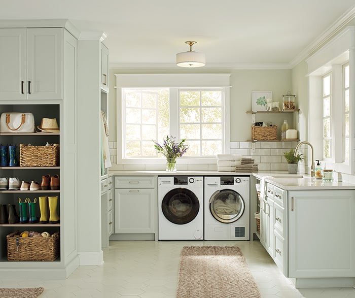
Laundry Room Cabinets in Sea Salt
Using Sea Salt on cabinetry is a gorgeous, unexpected twist that feels coastal yet classic. Perfect for laundry rooms, mudrooms, or bathrooms!
Where Sea Salt Works Best (And How to Use It)
Sea Salt is versatile, but it really shines in:
- Bathrooms: Feels spa-like and refreshing, especially paired with white tile.
- Bedrooms: Creates a restful, serene vibe for better sleep.
- Laundry Rooms & Mudrooms: Adds subtle color without overwhelming the space.
- Open Concept Spaces: As a whole-house neutral with a coastal feel.
- Exteriors: Pairs beautifully with white trim for a beachy cottage look.
When Sherwin Williams Sea Salt Might Not Be the Best Choice
While Sea Salt is beautiful, it’s not for every situation. You might want to skip it if:
- Your trim is very creamy or yellow-based – it can clash.
- You have red or orange-toned wood – Sea Salt can make these undertones pop.
- You want a very blue room — Sea Salt will sometimes feel more green-gray.
- Your room is very dark with minimal light—Sea Salt might lose its airy charm.
Best Trim Colors to Pair with Sea Salt
To really make Sea Salt shine, pair it with a clean white trim:
- Sherwin Williams Pure White (SW 7005): Soft white with a hint of warmth.
- Sherwin Williams Extra White (SW 7006): Bright, crisp, cooler-toned white.
- Benjamin Moore Chantilly Lace: Ultra-bright white if you want a sharp contrast.
Sherwin Williams Sea Salt Color Comparisons
Because Sea Salt is a true chameleon, it’s smart to compare it against a few similar paint colors before making your final choice. Whether you’re leaning toward something a little greener, bluer, or deeper, these side-by-side comparisons will help you see the subtle differences more clearly—and find the perfect fit for your home.
Sea Salt vs. Rainwashed
Sherwin Williams Rainwashed is slightly darker than Sea Salt, with a stronger blue presence.
- Rainwashed leans more toward a soft blue-green.
- Sea Salt reads more green-gray, but can still flash blue depending on the light.
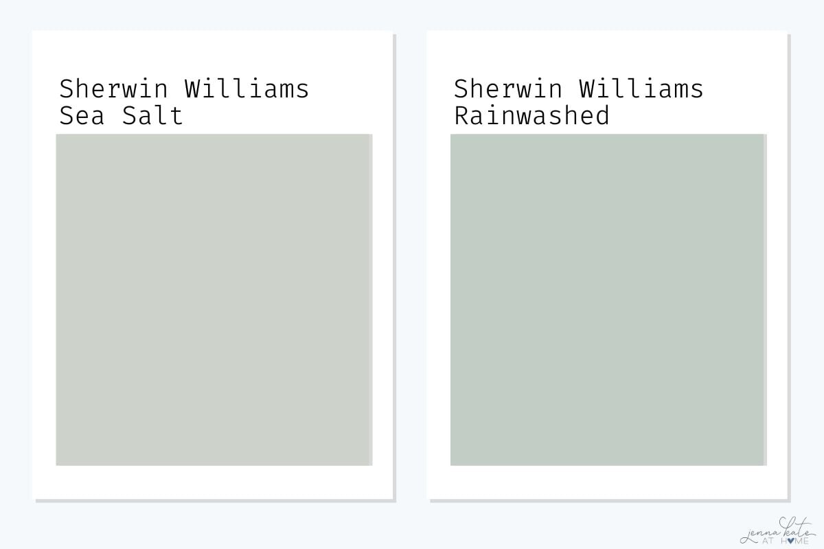
Rainwashed is a great choice if you want a bit more color and a slightly deeper tone.
Sea Salt vs. Silver Strand
Silver Strand is a touch deeper and more muted than Sea Salt, with a stronger gray influence.
- Silver Strand balances blue, green, and gray more evenly.
- Sea Salt stays lighter and fresher, with a softer green vibe.
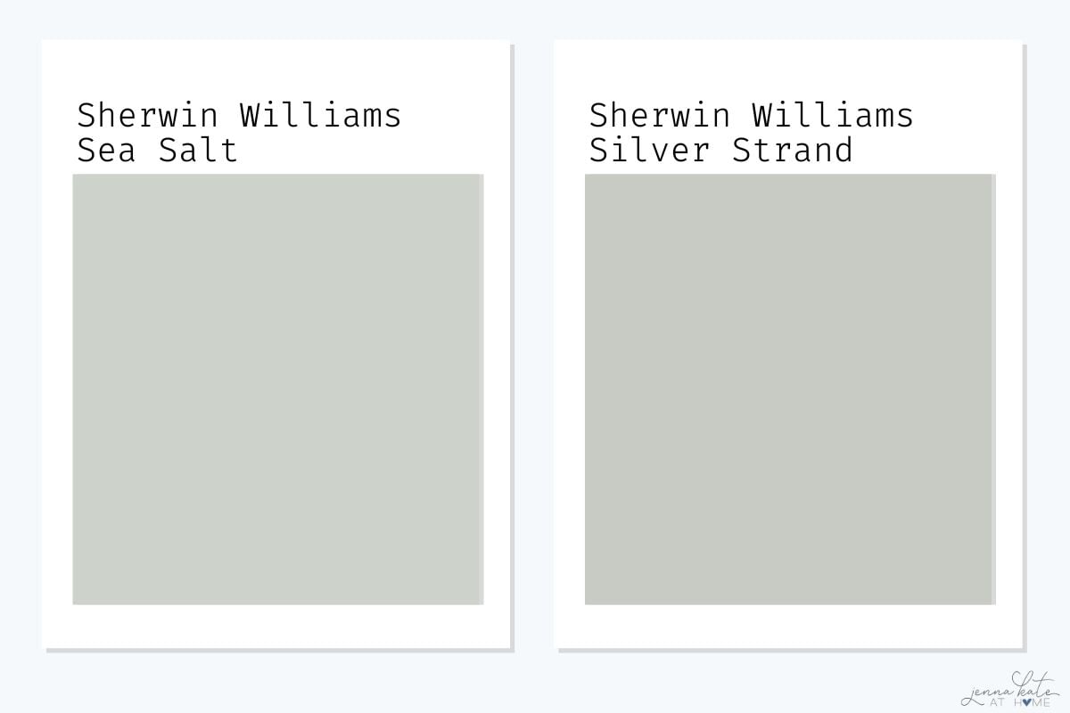
Silver Strand might be a better pick if you want a smokier, slightly moodier version of Sea Salt.
Sea Salt vs. Comfort Gray
Comfort Gray is noticeably deeper and moodier than Sea Salt.
- Comfort Gray has stronger green and gray undertones.
- Sea Salt feels much lighter, airier, and beachier.
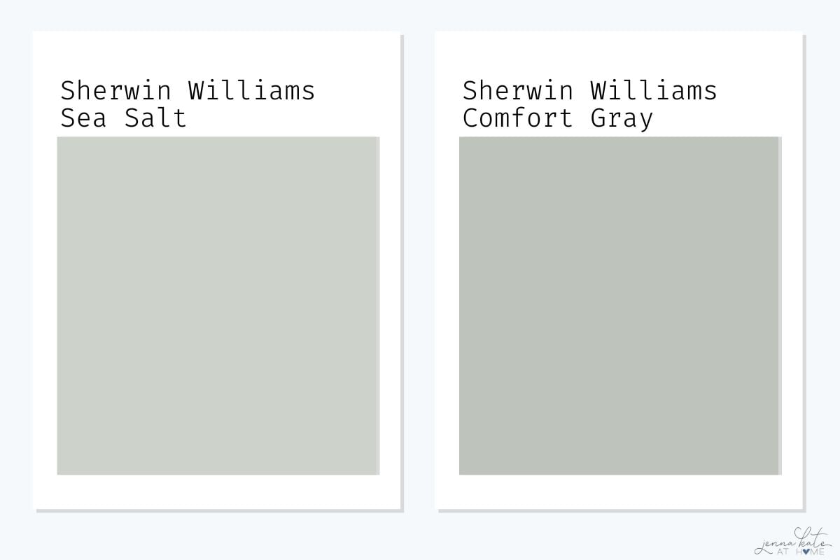
Comfort Gray could work better if you’re looking for a deeper cabinet color or a dramatic, cozy room.
Sea Salt vs. Topsail
Topsail is much lighter and bluer compared to Sea Salt.
- Topsail reads more like a soft, beachy blue with a green undertone.
- Sea Salt feels more grounded, with stronger green-gray presence.
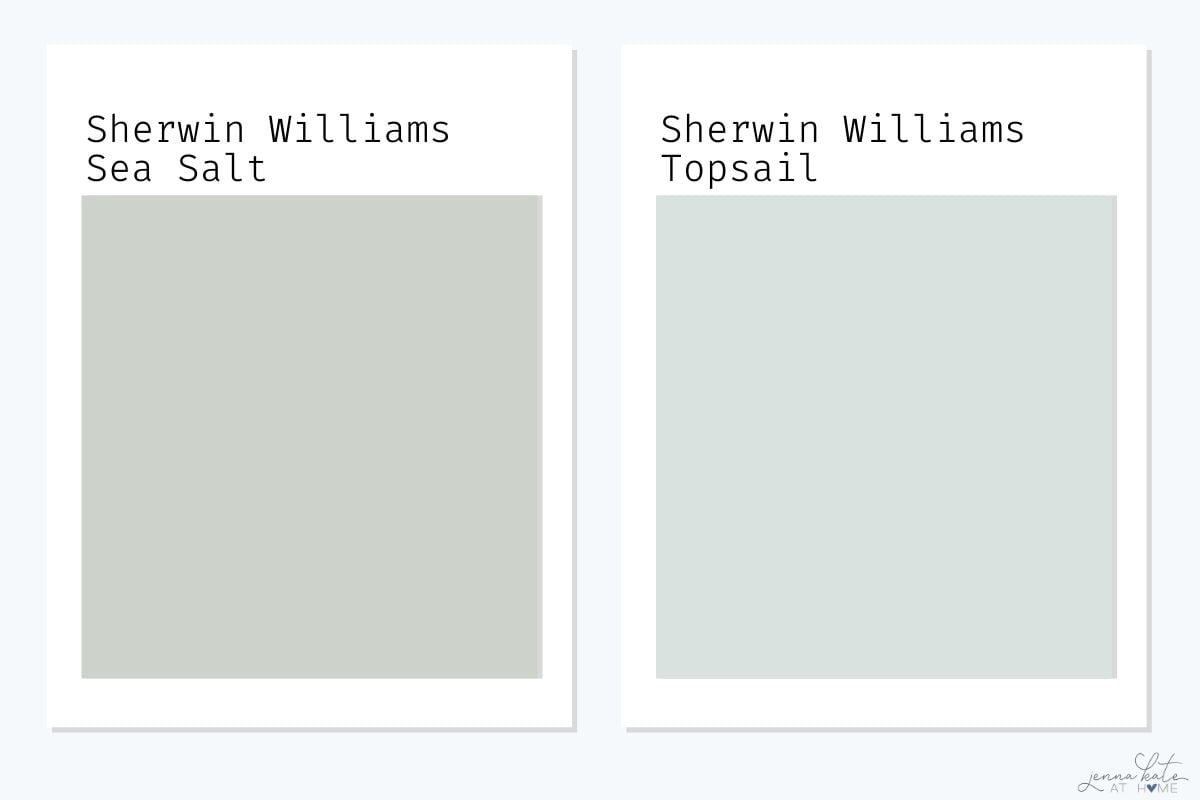
Topsail is a lovely option if you want a very airy, barely-there coastal color.
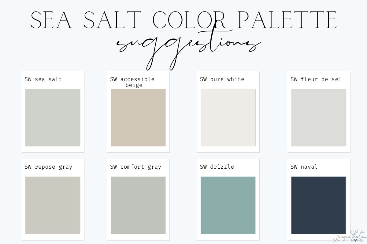
Colors That Coordinate Well with Sea Salt
If you’re building a palette around Sea Salt, try pairing it with:
- SW Fleur de Sel – A soft, muted white with a hint of blue-gray, perfect for a seamless, airy feel.
- SW Accessible Beige – A warm, balanced beige that grounds Sea Salt’s cool tones without overpowering them.
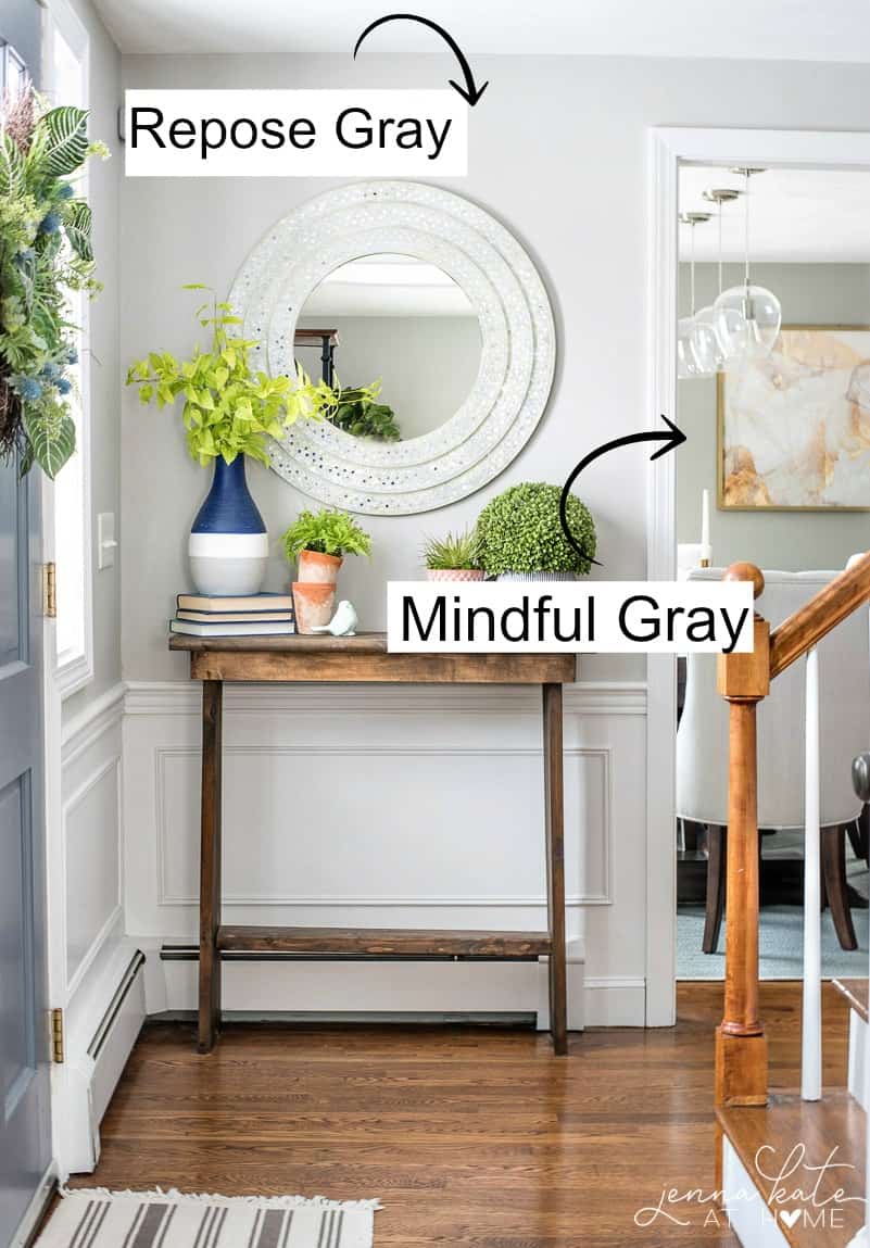
- SW Repose Gray – A soft, warm gray that offers a subtle, sophisticated contrast.
- SW Drizzle – A gorgeous deeper blue-green that brings out Sea Salt’s coastal vibe.
- SW Pure White – A clean, soft white (not too stark!) that beautifully frames Sea Salt on trim and ceilings.
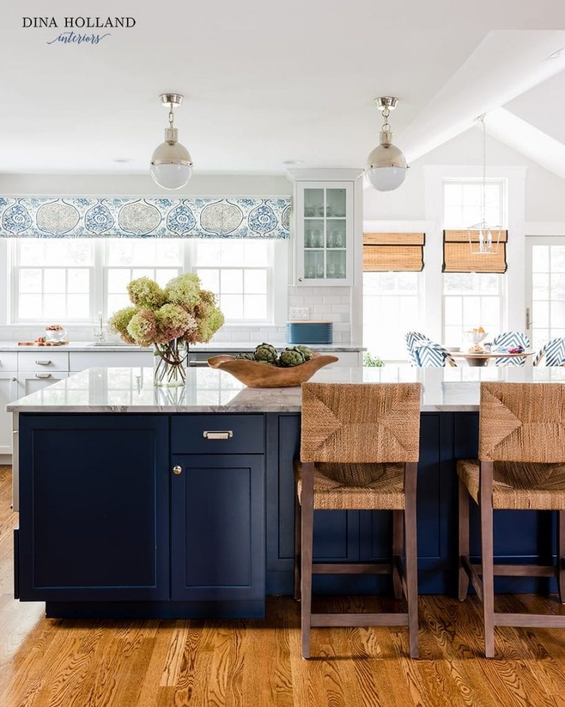
- SW Naval – A classic navy blue that adds bold contrast and makes Sea Salt pop in a coastal palette.
Natural textures like light woods, rattan, and linen also enhance Sea Salt’s beachy, relaxed vibe.
Need help visualizing color schemes? Below you will see how well Sea Salt plays with shades of soft beige, muted blue-green, airy white, and rich navy accents.
If you want a soft neutral backdrop to pair with Sea Salt, Drift of Mist is another beautiful option.
Frequently Asked Questions
Yes, Sea Salt can be a popular choice for exteriors, especially if you are going for a coastal or beachy vibe. Its calm and soothing tones work well with a variety of exterior materials and can be easily complemented by other colors for accents and trim.
Sea Salt is a fantastic whole-house paint color if you’re looking for a beachy vibe, but it also works well in specific rooms such as bedrooms, bathrooms, living rooms, and even kitchens. Its soft and versatile nature allows it to create a calming atmosphere in any space it’s used in.
Yes, it’s possible to have Sherwin Williams Sea Salt lightened by 50%. If you want a lighter version of the color, simply ask your paint supplier to adjust the formula for you. Keep in mind that altering a paint color this way may affect the overall balance of the hues, so it’s a good idea to test a sample on your wall before committing to the final paint job.
There are several bedding colors that can complement Sea Salt beautifully. Some options include crisp white, soft grays, and muted blues or greens. Additionally, you can also try gentle pastel shades like blush pink or light lavender. The key is to choose colors that maintain the calming and soothing atmosphere that Sea Salt creates in your bedroom.
SW Sea Salt wouldn’t be my first choice for a living room paint color. However, that’s not to say it wouldn’t be perfect for your home. If you are leaning into the beach house vibe, it’s really beautiful paired with bright white trim or wainscoting. Also, if you have a lot of honey oak or orange-toned trim, Sea Salt pairs will really make your woodwork stand out (if that’s the look you want!).
Final Thoughts: Should You Use Sherwin Williams Sea Salt?
If you love chameleon paint colors that feel serene, natural, and softly coastal, Sea Salt is absolutely worth considering.
Just be sure to test it carefully in your lighting conditions—and if you’re aiming for a cohesive look, pair it with fresh, clean whites.
Sea Salt remains a top designer favorite for a reason. Whether you’re painting a bathroom, bedroom, laundry room, or creating a whole-house color palette, it delivers calm, effortless beauty.
Ready to try it? Grab a Samplize sample here and see if it’s the perfect fit for your home!


Hello Jenna,
I wanted to begin to refresh the interior of our home beginning with our bookcases which are brown. I really love SW Greek Villa and have thoroughly enjoyed your perspective on coordinating colors because I know painting will continue throughout our home. I have samples of Sea Salt, Agreeable Gray, Pure White, and Reflection. I would like for walls to be Greek Villa and am not sure what to do about the bookcases. Should I go all in and paint them Greek Villa too? Newly Retired from teaching and my family said I needed a project. 😊
Hi,
I was wondering if you would use sea salt for the exterior of a house?
I am looking for something coastal, the windows are black.
I always look forward to your decorating ideas. Thank you so much, your suggestions make it easier for me to decide.