


Content may contain affiliate links. When you shop the links, I receive a small commission at no cost to you. Thank you for supporting my small business.
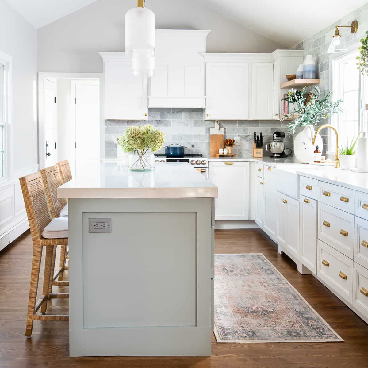
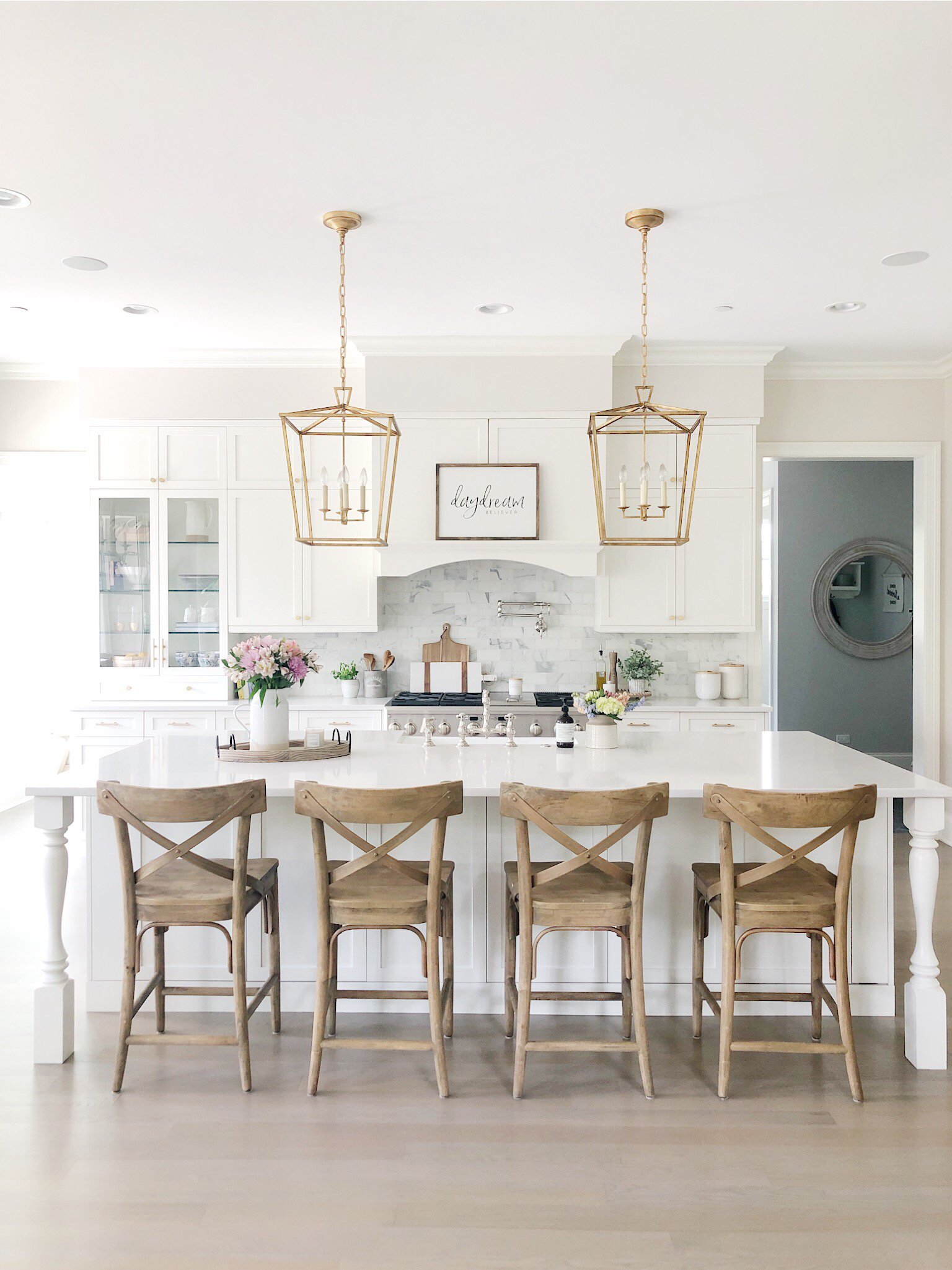
Sherwin Williams Drift of Mist (SW 9166) has become one of my go-to neutral paint colors over the past few years. I first discovered it about six years ago while choosing paint colors for our kitchen remodel. At the time, I loved how it felt light and airy without looking cold or stark.
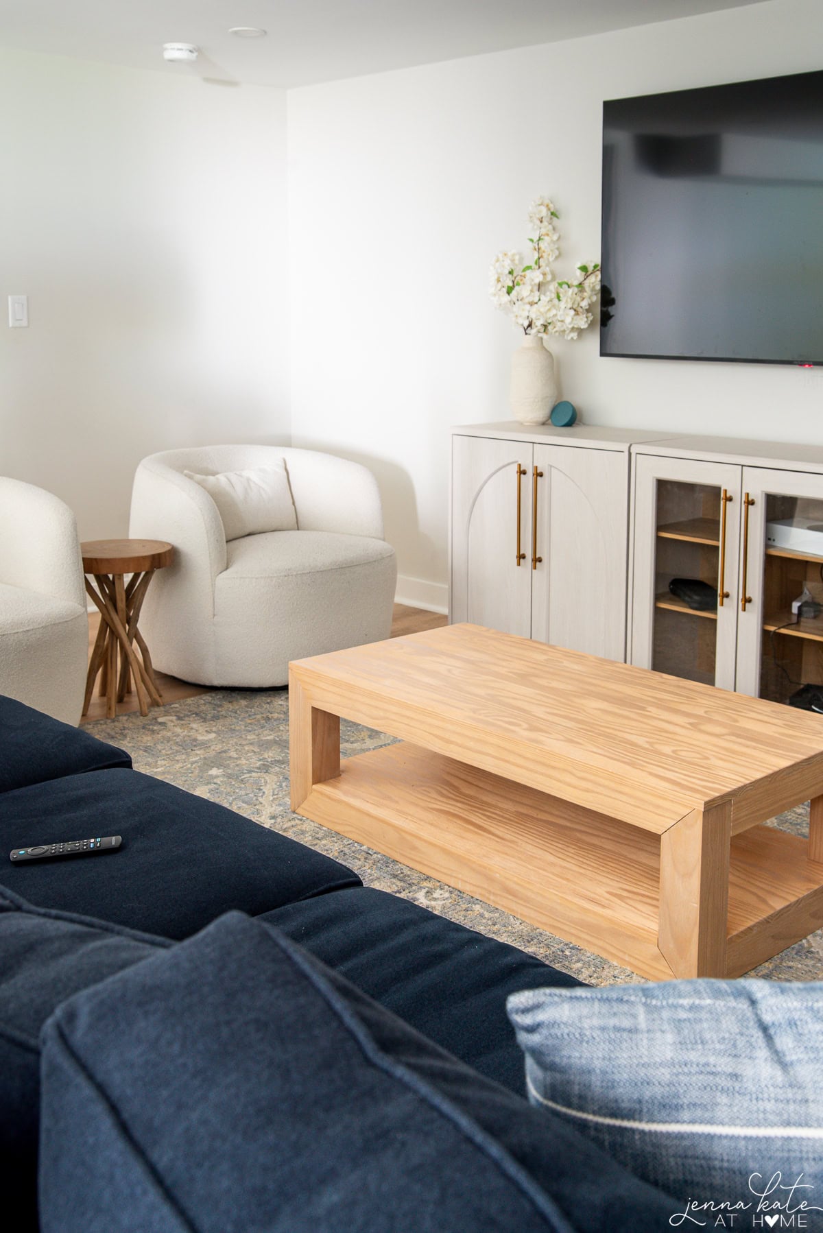
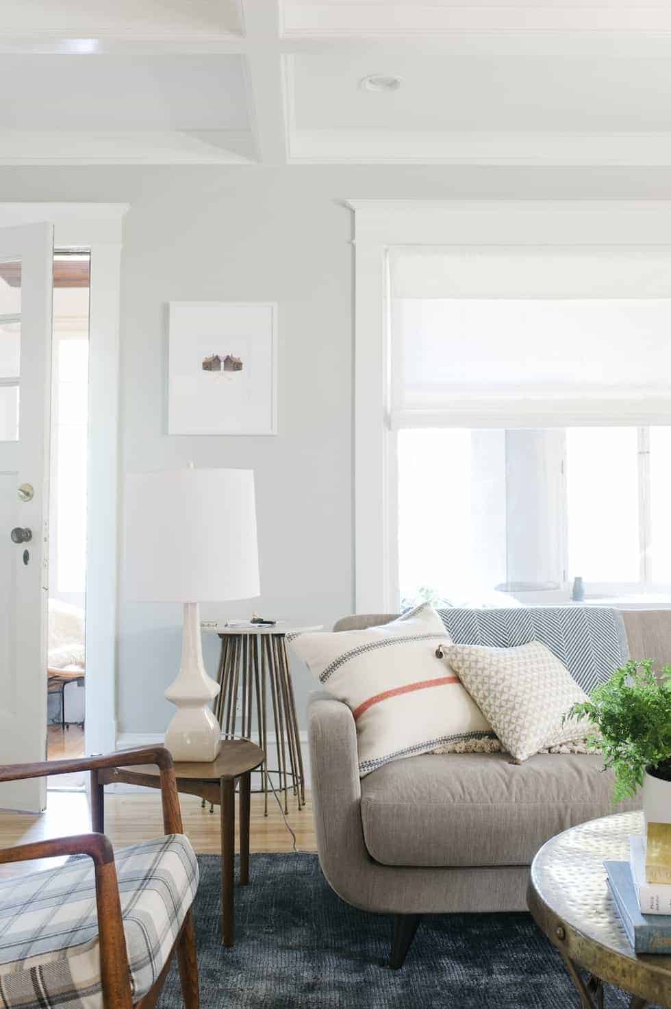
Fast forward a few years when we built our basement addition, and Drift of Mist immediately made my shortlist again. I was after that same fresh, bright look, and once again it was one of the first paint colors I sampled.
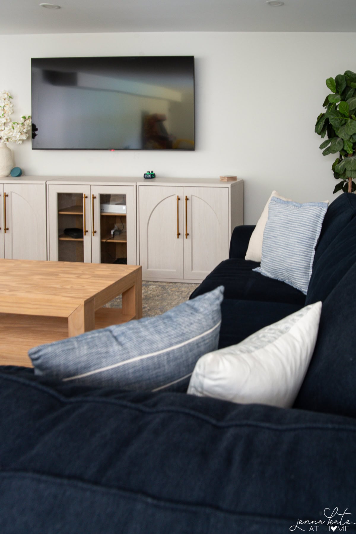
After using it in my own home and recommending it to thousands of readers over the years, I’ve learned exactly where Drift of Mist shines – and a few situations where I’d choose something else. If you’re wondering whether it’s the right paint color for your home, here’s everything you need to know.
Drift of Mist is a Great Choice if:
- You want a light, airy whole-house neutral.
- You love warm whites and natural wood tones.
- Your home doesn’t get a lot of natural light.
- You want something softer than Repose Gray.
What Does Drift of Mist Look Like?
Drift of Mist is one of those paint colors that sits right in the sweet spot between gray and beige. It’s technically a warm greige, but it’s so light that it often reads more like a soft neutral backdrop than a true gray. That’s one of the reasons I find it so easy to decorate with, it works just as well with blues and greens as it does with warmer wood tones and brass finishes.
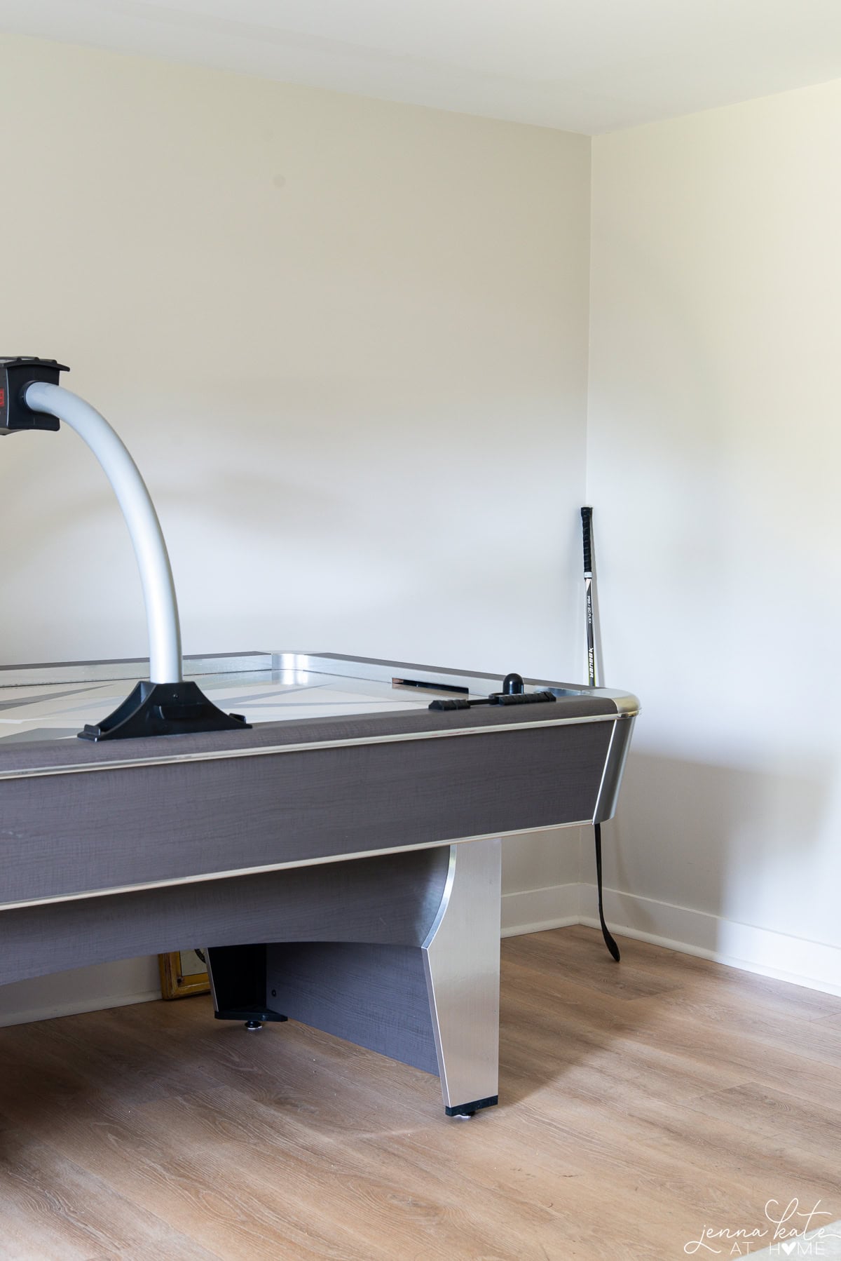
Like many greiges, Drift of Mist has subtle green undertones. If you’re particularly sensitive to green, I’d definitely recommend sampling it before committing.
One thing I’ve learned after living with this color is that those green undertones aren’t consistent from room to room. In my kitchen, the green is much more noticeable, but in our basement addition with softer, indirect light, I hardly see it at all.
To my eye, those green undertones are what keep Drift of Mist from feeling flat or cold – they give it just enough warmth without pushing it into beige territory.
New to paint colors? Learn how to spot the undertones.
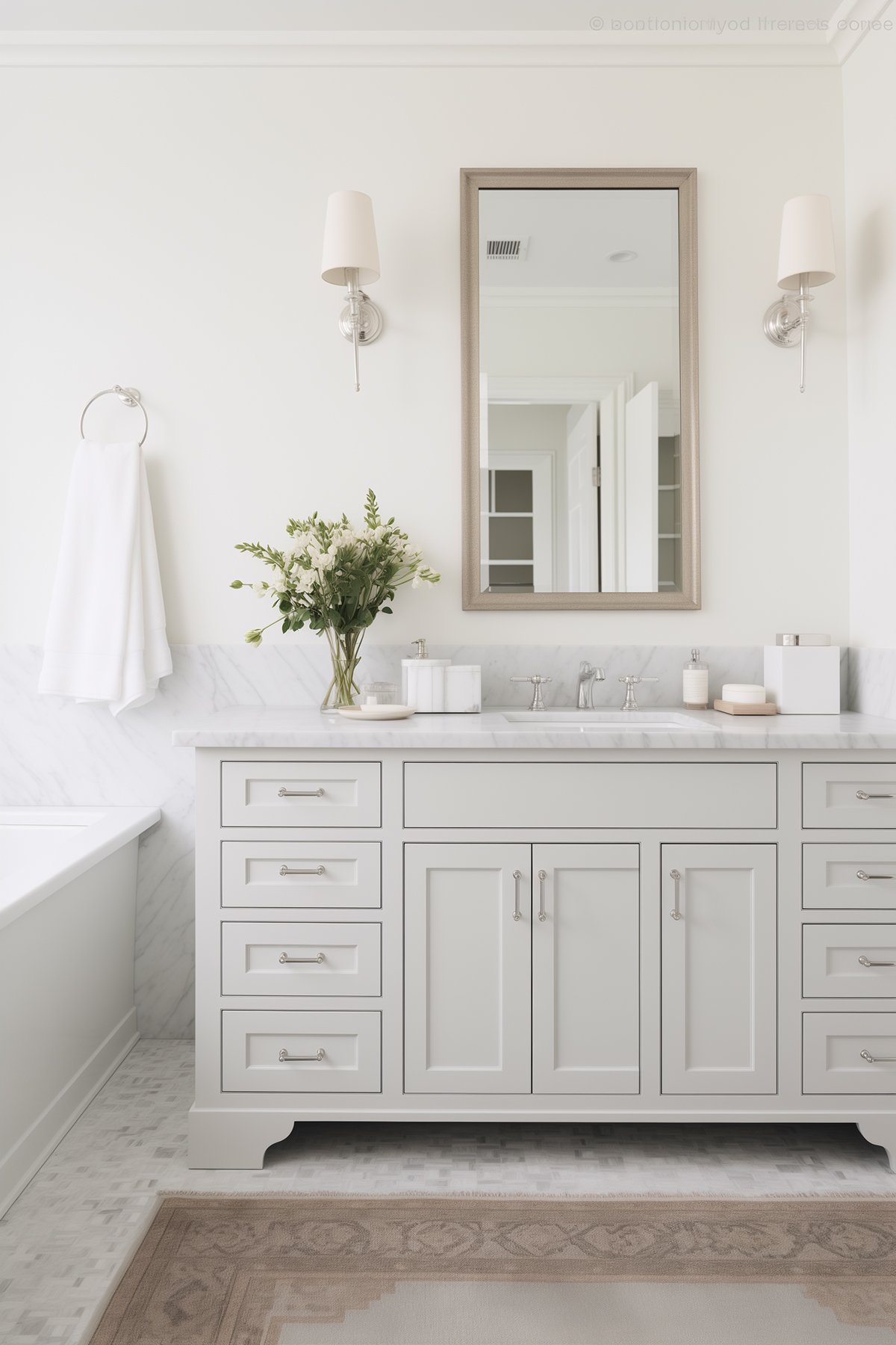
The Light Reflectance Value (LRV) of Drift of Mist is 69, placing it firmly in the light category, making it close to off-white. It’s a soft paint color that can wash out in bright natural light but works well in rooms that get indirect light and need a gentle brightening effect.
If you’re not familiar with LRV, I explain exactly what LRV means and why it matters when choosing paint colors.
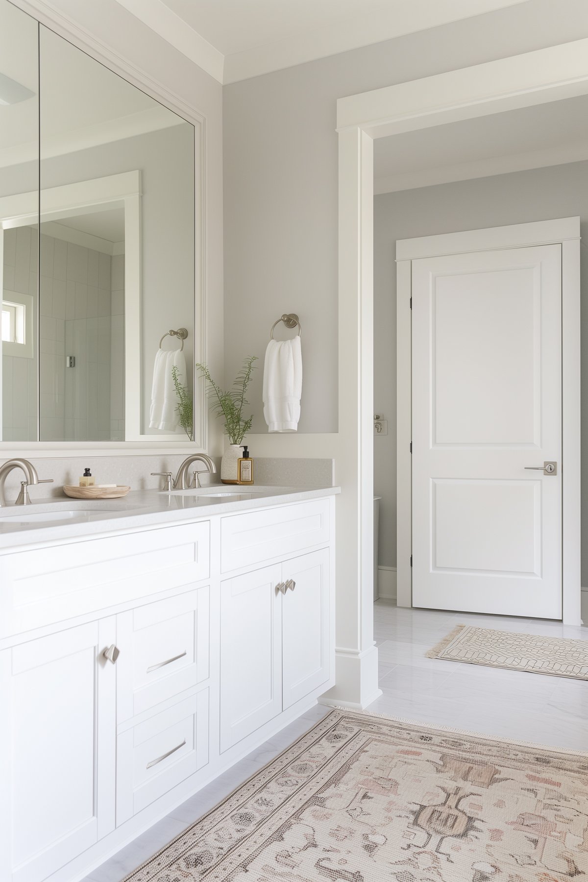
Best Trim Colors for Drift of Mist
Sherwin Williams Pure White
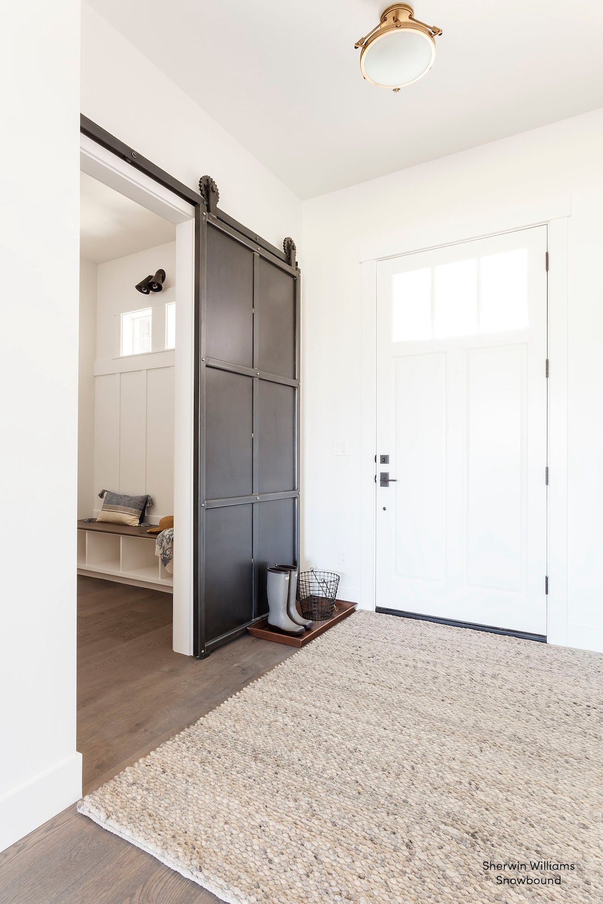
If you’ve read many of my paint color reviews, you’ll know that Pure White is almost always my go-to white for trim. It’s the trim color we’ve used throughout our own home because it’s one of those rare whites that works beautifully with both warm and cool paint colors.
We paired it with Drift of Mist in our family room addition, and I love the combination. Pure White is warm enough that it doesn’t make Drift of Mist feel cold, but it’s still crisp enough to create just the right amount of contrast without looking stark.
Benjamin Moore Chantilly Lace
If you prefer a brighter, cleaner white, Chantilly Lace is another beautiful option. I especially like it in homes with lots of natural light where you want a little more contrast.
How Lighting Affects Drift of Mist
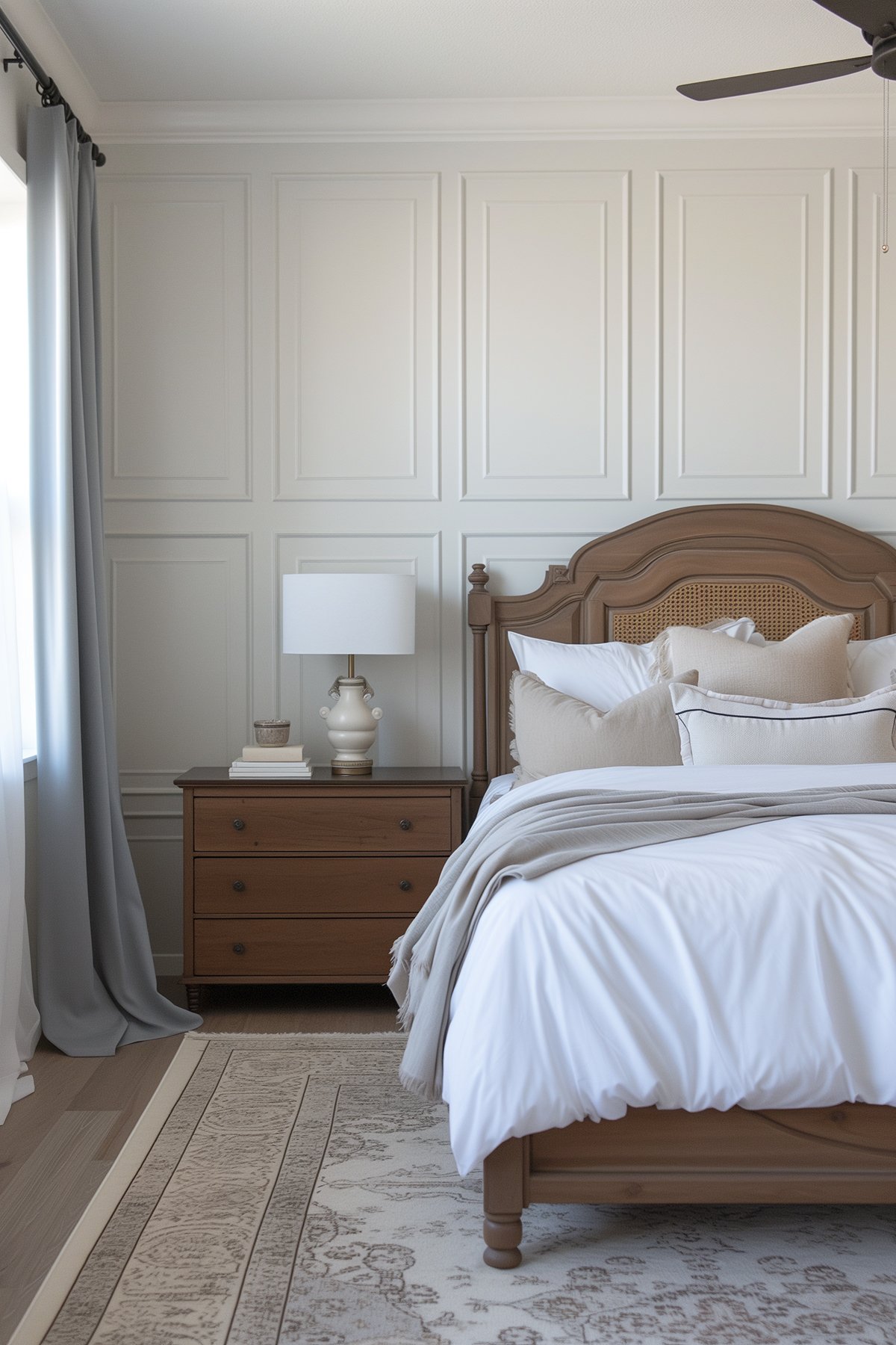
North-Facing Rooms
North-facing rooms tend to bring out the cooler side of Drift of Mist, making it appear a little grayer than you might expect. Even so, it still stays softer and warmer than many light gray paint colors.
South-Facing Rooms
In bright southern light, Drift of Mist really shines. The warmth becomes more noticeable, giving the walls a soft greige appearance without looking beige.
Bright Rooms
Because of its high LRV, Drift of Mist can appear almost off-white in rooms flooded with natural light. If you’re after a very subtle wall color, that’s actually one of the reasons I love it.
Can Drift of Mist Work on the Exterior?
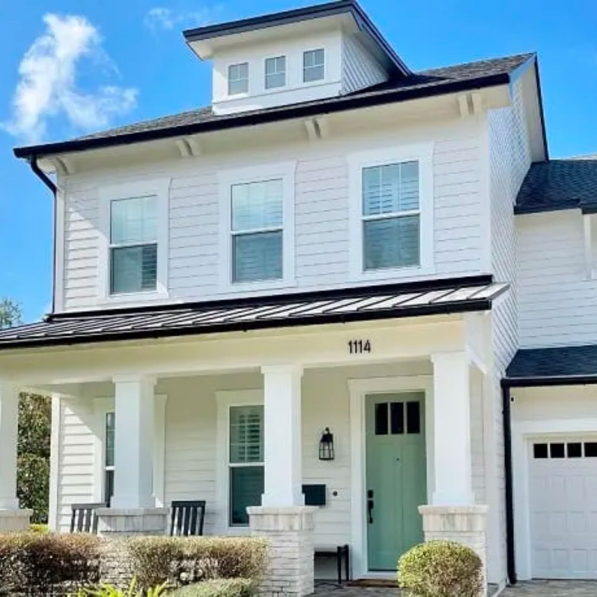
Yes! Drift of Mist can be used outside, but keep in mind that its high LRV means it can appear almost white in full sun.
I especially love it on homes with black shutters, charcoal front doors or natural wood accents. Since it’s such a light paint color, those darker details help define the architecture and keep the exterior from looking washed out.
Can Drift of Mist Work on Kitchen Cabinets?
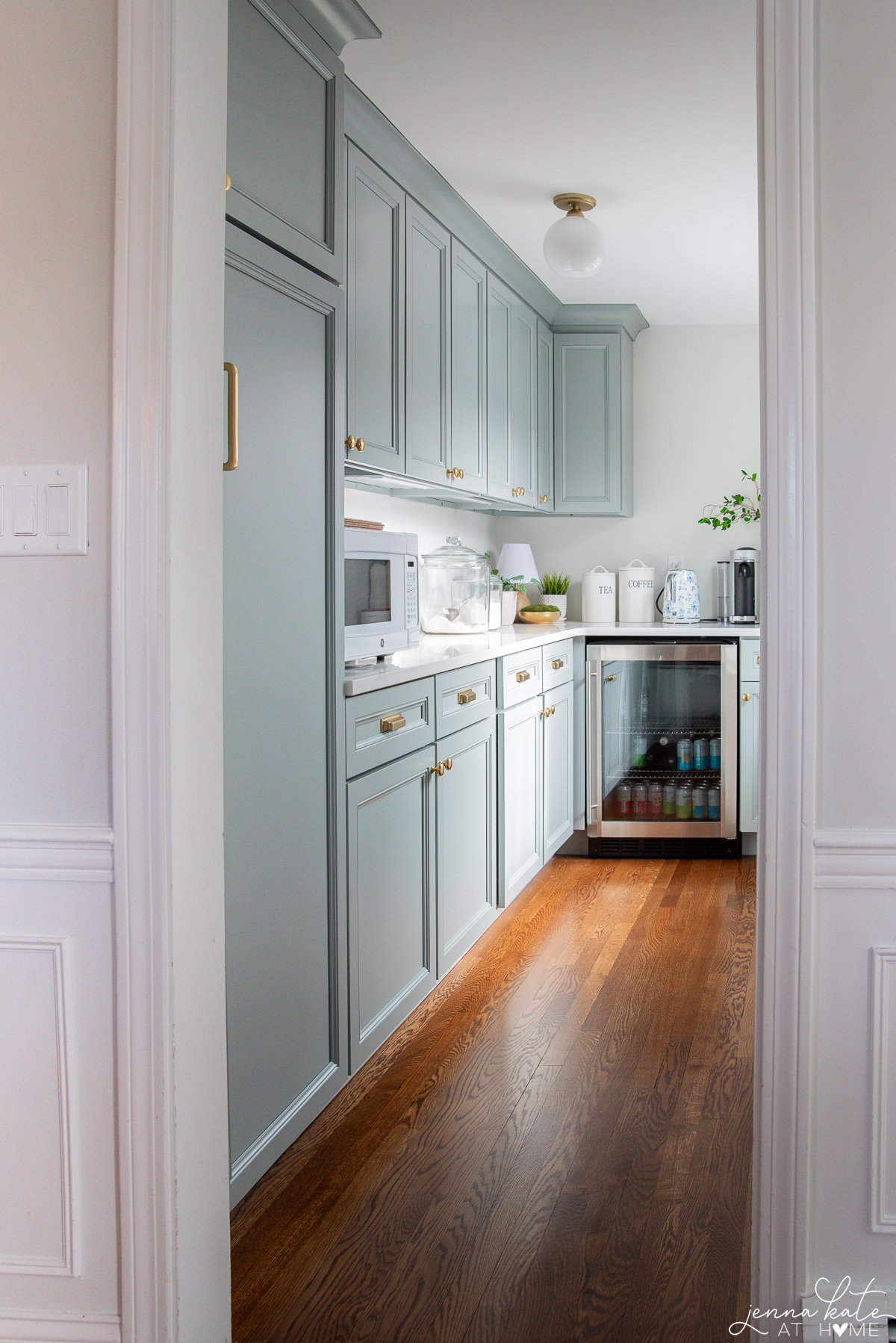
Absolutely! Drift of Mist is a great light neutral for cabinets, especially in kitchens with cool or neutral countertops and backsplashes. Just be sure to test it next to your finishes, as the undertones can shift depending on the lighting and surrounding elements.
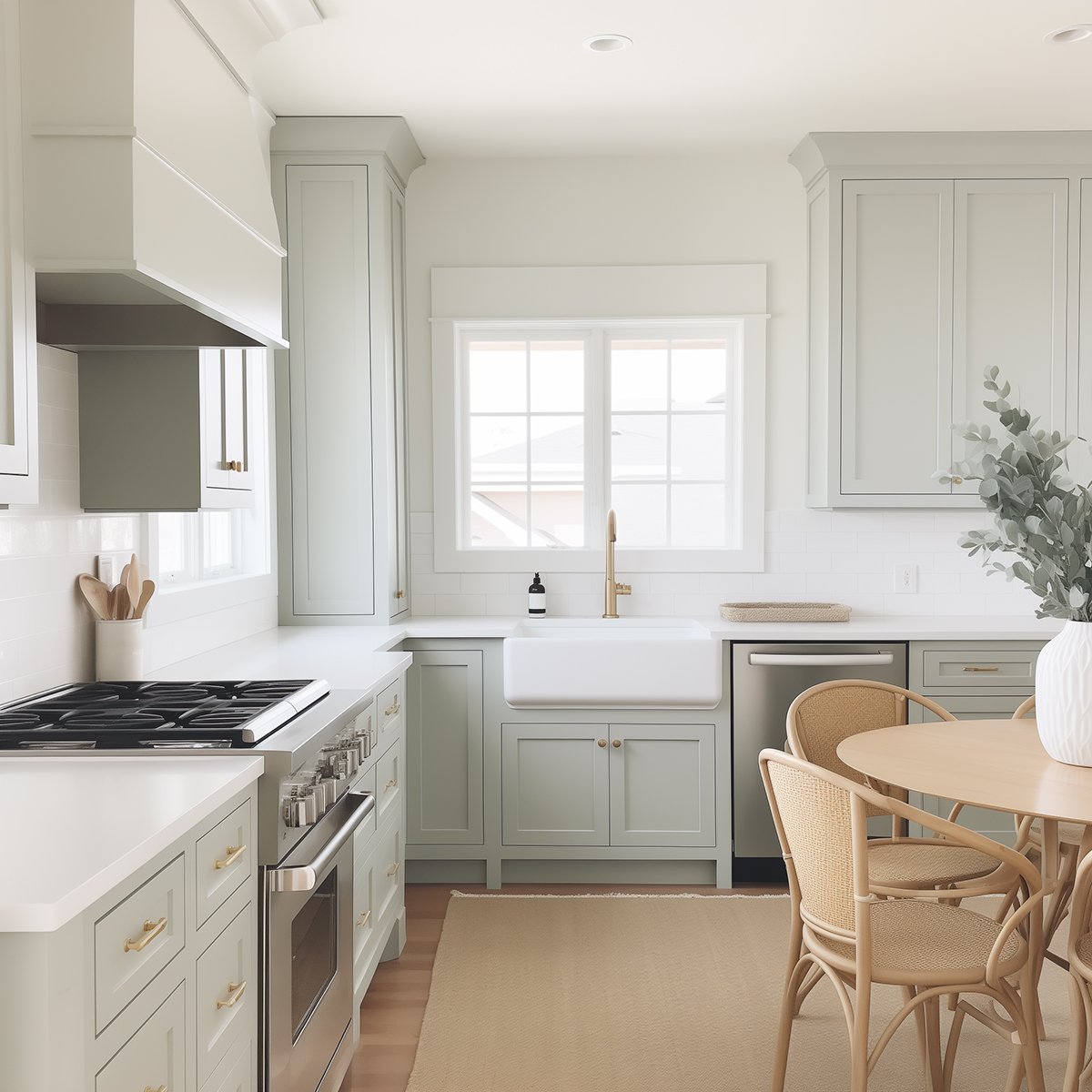
One of my favorite things about Drift of Mist on cabinetry is that it feels lighter than many traditional greiges while still providing enough contrast against white walls and countertops. It’s one of my favorite cabinet colors if you’re after a timeless kitchen that feels light without looking stark.
Drift of Mist Coordinating Colors
One of the reasons I recommend Drift of Mist so often is because it’s incredibly easy to decorate with. It works with just about everything – from crisp whites and coastal blues to deeper grays, earthy greens and warm wood tones.
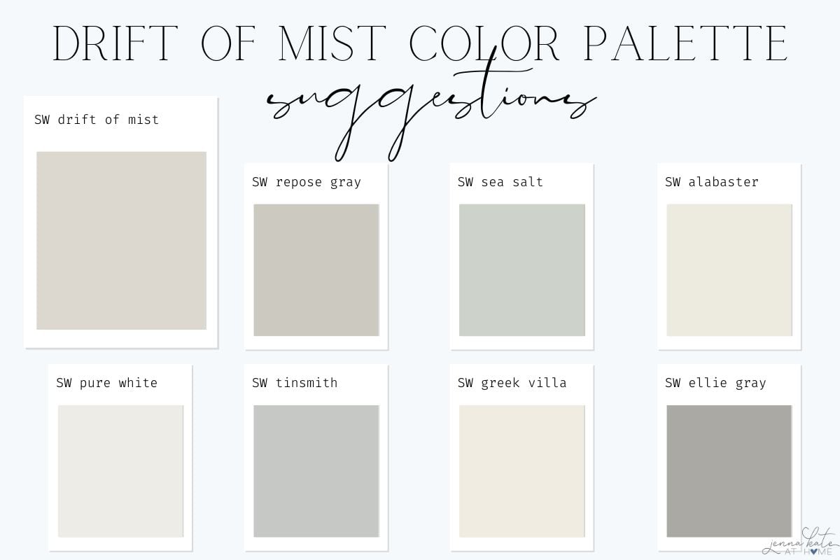
If I were building a whole-house color palette around Drift of Mist, these are the paint colors I’d reach for first:
SW Tinsmith
If you’re looking for a cooler, more contemporary accent color, Tinsmith is a beautiful choice. Its soft blue-gray undertones complement Drift of Mist without overpowering it, making the two colors feel calm and sophisticated together. I especially like this pairing in bedrooms, bathrooms or home offices where you want a light, airy feel.
SW Sea Salt
Sea Salt has always been one of my favorite paint colors, so it’s no surprise that I love it with Drift of Mist. Since both colors have subtle green undertones, they naturally complement each other and create a relaxed, coastal-inspired palette. I especially love using Sea Salt in bathrooms, laundry rooms or guest bedrooms while keeping Drift of Mist in the adjoining spaces.
SW Shoji White
Homes with natural wood tones and woven textures are where Shoji White really shines alongside Drift of Mist. Together they create a warm, layered palette that feels relaxed and timeless.
SW Repose Gray
If you love Drift of Mist but want a little more depth in certain spaces, Repose Gray is a natural choice. Since the two colors share similar undertones, they work beautifully together without feeling mismatched. I like using Repose Gray in spaces where you want a little more contrast or definition while keeping the rest of the home light and cohesive.
SW Alabaster
Alabaster is one of my favorite warm whites to pair with Drift of Mist. It has just enough creaminess to keep the overall palette feeling warm and inviting without looking yellow. If you prefer softer contrast over bright white trim, this is a combination that’s hard to beat.
SW Greek Villa
Greek Villa is another beautiful white to pair with Drift of Mist, especially if you want your trim to blend more seamlessly into the walls. The combination feels light, fresh and welcoming, making it a great choice for whole-house color schemes.
SW Ellie Gray
If I wanted to add a little drama to a room with Drift of Mist walls, Ellie Gray would be one of my first choices. The deeper charcoal-gray creates beautiful contrast while still feeling timeless and sophisticated. I especially like this combination for built-ins, kitchen islands, interior doors or even an accent wall.
SW Pure White
If you want a clean, classic white paint color that’s not stark or cold, then Pure White is the perfect choice. It’s my choice every time for a white trim color, because it works everywhere!
Don’t forget about natural materials.
One of the reasons Drift of Mist is such a versatile neutral is that it pairs beautifully with warm white oak, medium wood tones, black accents, aged brass and woven natural textures. If your decorating style leans modern coastal or modern traditional, these finishes will make Drift of Mist feel even warmer and more inviting.
When NOT to Use Drift of Mist
As much as I love Drift of Mist, no paint color is perfect for every home. Here are a few situations where I’d probably choose something else:
If you want a noticeably deeper greige
Drift of Mist is a very light neutral, so if you’re looking for a paint color with a little more depth and contrast, it may feel too washed out. In that case, I’d look at Repose Gray, Agreeable Gray, or even Gossamer Veil, depending on the amount of warmth you’re after.
If you want a true white
Because Drift of Mist has warm greige undertones, it will never read as a crisp white. In bright rooms, it can appear almost off-white, but if your goal is a clean white backdrop, I’d choose a true white paint color like Pure White or BM Chantilly Lace instead.
If your room has very warm yellow lighting
Lighting has a huge impact on every paint color, and Drift of Mist is no exception. In rooms with lots of warm incandescent lighting or very golden natural light, its warm undertones can become more pronounced than you might expect. That’s why I always recommend sampling it in your own space before committing.
If you’re trying to match creamy beige finishes
If your home has a lot of creamy beige tile, countertops or cabinetry, Drift of Mist can sometimes feel a little too cool by comparison. In those situations, I’d usually reach for a warmer neutral like Accessible Beige or Shoji White, which tend to blend more naturally with those finishes.
With that being said, these are just general guidelines. The same paint color can look completely different from one home to the next, depending on your lighting, flooring and surrounding finishes. I always recommend testing a large sample on multiple walls and looking at it throughout the day before making your final decision.
Color Comparisons
Drift of Mist vs. Gossamer Veil
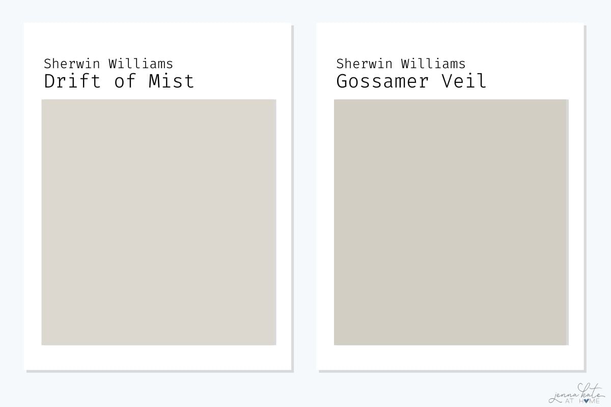
Drift of Mist and Gossamer Veil are both beautiful light greiges, but Gossamer Veil has a little more depth and warmth. With an LRV of 62, it’s noticeably darker than Drift of Mist (LRV 69), giving it a richer, more grounded appearance. If you’re looking for a soft neutral that still provides a bit of contrast against white trim, Gossamer Veil is a great choice.
I tend to recommend Drift of Mist when the goal is a bright, airy whole-house color or for rooms that don’t get a lot of natural light. If you prefer a little more depth without stepping into the darker greige category, Gossamer Veil strikes a beautiful balance.
If I were choosing between the two today, I’d probably sample Drift of Mist first for most homes simply because I love the lighter, fresher look it creates.
Drift of Mist vs. Intense White
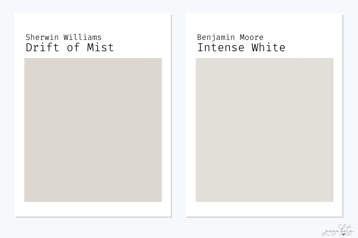
Despite its name, Benjamin Moore Intense White isn’t actually a white paint color. It’s a light greige with subtle green undertones, much like Drift of Mist, but it leans noticeably cooler and grayer overall. Drift of Mist has a softer warmth that makes it feel a little more relaxed and forgiving in a variety of lighting conditions.
If your home has cooler finishes, such as marble, polished nickel or blue-gray accents, Intense White can be a beautiful choice. But if you’re decorating with warm woods, brass hardware and layered neutrals, I find Drift of Mist blends more effortlessly into those spaces.
Personally, I’d reach for Drift of Mist more often because I think it’s the more versatile option for today’s homes.
Drift of Mist vs. Agreeable Gray
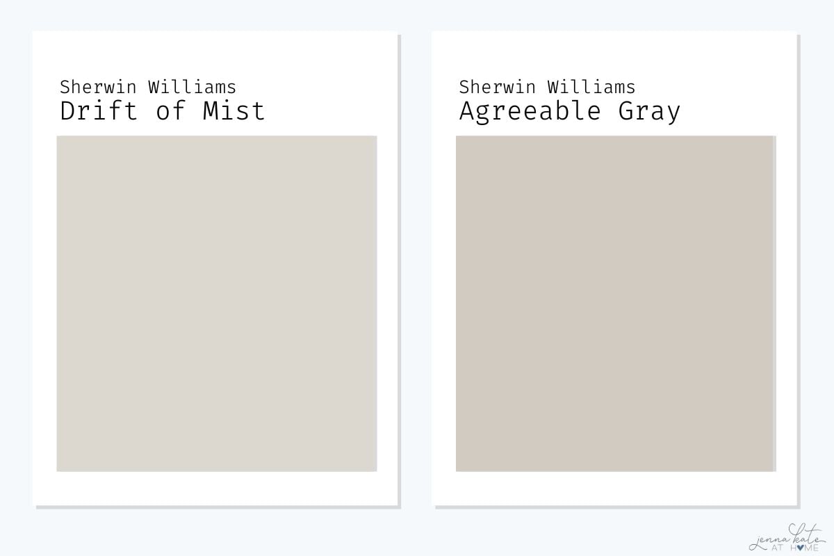
Agreeable Gray and Drift of Mist are two of Sherwin Williams’ most popular neutrals, but they create very different looks. Agreeable Gray is darker, warmer and has stronger taupe undertones, giving it a little more richness and depth. Drift of Mist, on the other hand, feels lighter, softer and more understated.
A few years ago, I probably would have recommended Agreeable Gray more often because I loved the warmth it brought to a room. Today, though, my style has shifted toward lighter, airier interiors, and that’s why I find myself reaching for Drift of Mist much more frequently.
If you’re looking for a paint color that brightens a space while still feeling warm and inviting, Drift of Mist is hard to beat. If you prefer a little more contrast and depth, Agreeable Gray is still a beautiful, timeless choice.
Drift of Mist vs. Repose Gray
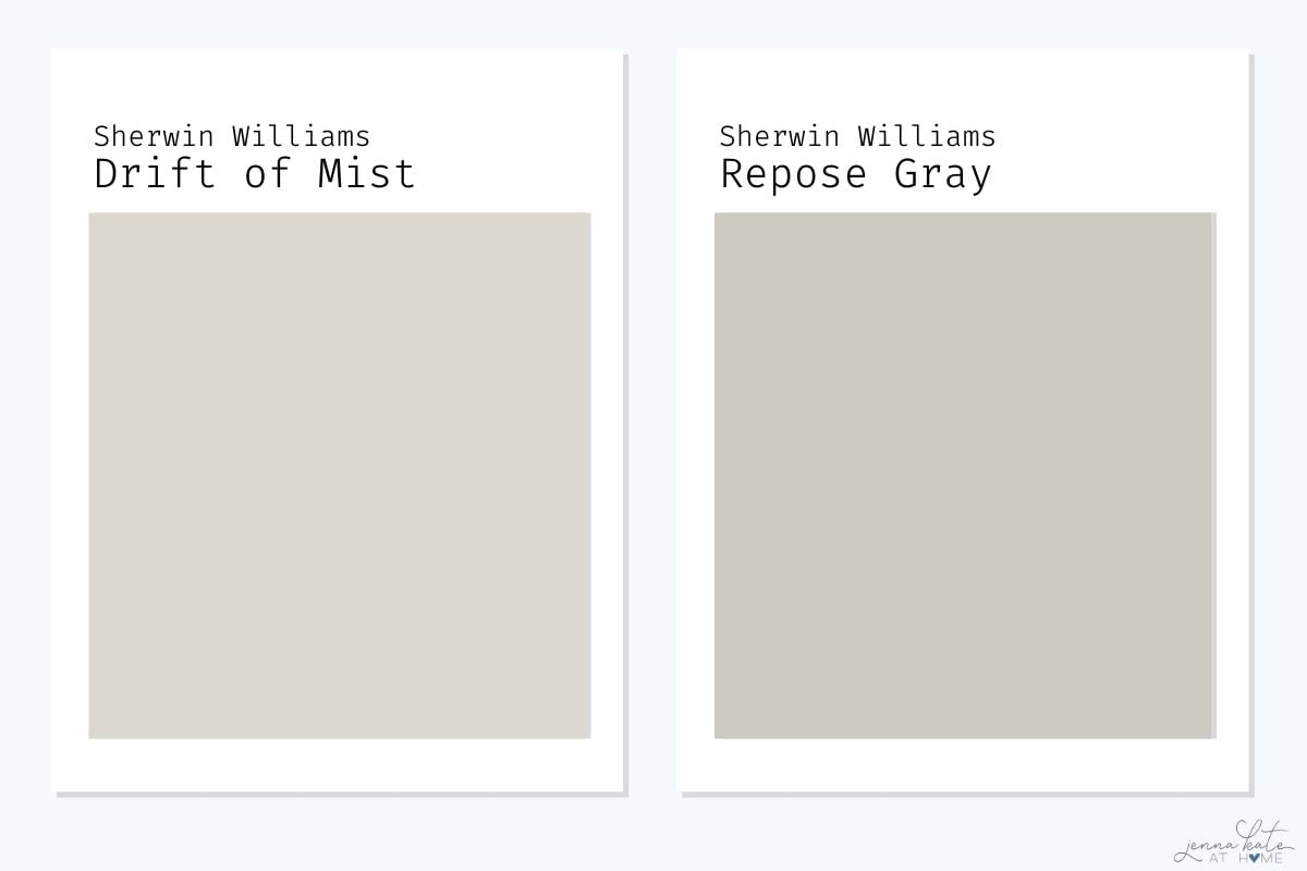
This is probably the comparison I get asked about most, and my answer today is very different than it would have been 10 years ago.
For years, Repose Gray was one of my go-to paint colors. In fact, I had it in several rooms throughout our home because I loved its warmth and versatility. Over time, though, my style has shifted toward lighter, airier interiors, and I’ve gradually replaced almost all of the full-strength Repose Gray with lighter neutrals like Drift of Mist.
That’s not to say Repose Gray isn’t still a beautiful paint color – it absolutely is. If you have a room that’s flooded with natural light or you want a little more contrast against white trim, I still think it’s a fantastic choice.
But for most homes today, I’d sample Drift of Mist first. It’s lighter, brighter and much more forgiving in rooms that don’t get perfect natural light. It gives you that soft, airy feel that’s become so popular without looking stark or washed out.
If you’re trying to decide between the two, Drift of Mist is the one I’d sample first.
Drift of Mist vs. Crushed Ice
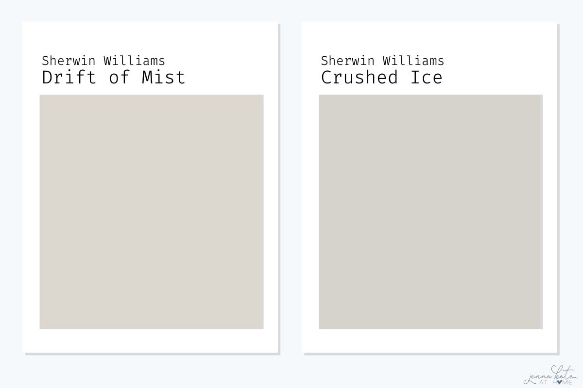
Drift of Mist and Crushed Ice are both light neutral paint colors, but they create very different looks. Crushed Ice leans noticeably cooler and grayer, while Drift of Mist has a softer greige warmth.
About 10 years ago, I probably would have recommended Crushed Ice much more often. Cooler grays were incredibly popular then, and it fit that style perfectly. These days, though, I find it can feel a little too cool for the warm, layered look that so many homeowners are after.
That’s one of the reasons I prefer Drift of Mist today. It still feels light and fresh, but the subtle warmth makes it much easier to pair with white oak floors, brass hardware and the natural textures that have become so popular over the last few years.
If you’re decorating a home with today’s warmer neutrals, Drift of Mist would be my first choice.
Drift of Mist vs. Benjamin Moore Wind’s Breath
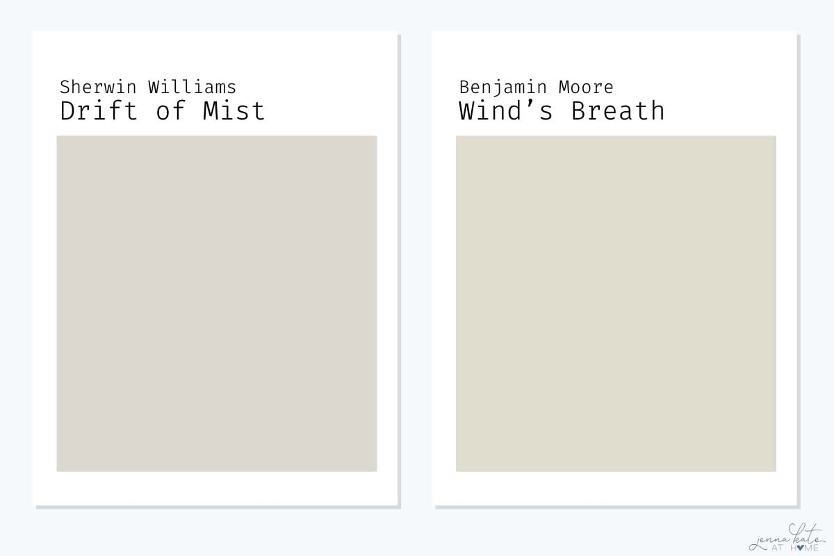
Drift of Mist and Benjamin Moore Wind’s Breath are both beautiful light neutrals, but they create very different moods. Wind’s Breath is noticeably warmer, with more beige and cream in it, while Drift of Mist stays closer to a true greige.
I absolutely love Wind’s Breath, but it’s one paint color I’ve never been able to make work in my own home. Since I tend to decorate with cooler blues, soft grays and crisp whites, it always feels just a little too warm for my style.
One of my friends has Wind’s Breath throughout her home with Benjamin Moore White Dove trim, and it’s absolutely beautiful. The whole house feels soft, warm and inviting. I also think it would look gorgeous with Sherwin Williams Pure White if you prefer a little more contrast.
If you’re after that bright, airy look that’s become so popular over the last few years, I’d still lean toward Drift of Mist. I find it a little easier to decorate with because it works effortlessly alongside cooler neutrals, white oak and brass finishes.
If your style is more traditional or you naturally gravitate toward warmer neutrals, though, Wind’s Breath is definitely worth sampling. It’s a beautiful paint color – I just don’t think it’s the right fit for my own home.
Don’t Forget…
Don’t forget – no matter what you’ve read or photos you’ve seen online, it’s really important to sample paint colors in your home before committing!
Samplize provides real paint samples that are easy to move around your home, and cheaper than buying a gazillion paint pots! It’s the only way I buy paint samples.
Final Thoughts
Would I choose Drift of Mist today? Absolutely.
Looking back, Drift of Mist has become one of those paint colors I reach for again and again. As my style has evolved, I’ve found myself moving away from darker greiges and toward lighter, softer neutrals, and Drift of Mist perfectly reflects that shift.
If someone asked me to recommend one whole-house neutral today, this would be one of the first paint colors I’d mention. Just be sure to sample it in your own home first – you might be surprised how much it changes from room to room.

I want to remodel my master bathroom in blue. What color would you suggest for walls and vanity? I want to use dark blue tile in the shower