Content may contain affiliate links. When you shop the links, I receive a small commission at no cost to you. Thank you for supporting my small business.
Have you ever taken a step back, assessed the decor and colors in your room, and realized that it just looks a little “flat”?
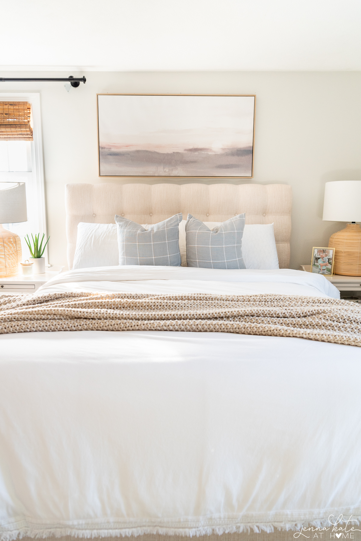
Well that’s what happened to me recently with my bedroom. I’ve never really taken the time to design this room properly. I buy new nightstands, switch up the rugs and bedding every so often…but it just never felt right, because it was missing one important component of a successful design: contrast.
The Basics of Adding Contrast
Contrast refers to the juxtaposition of opposing elements such as colors, textures, shapes, and sizes. When used effectively, these design elements work together to create a visually pleasing design.
By playing with opposites and experimenting with various combinations, you can transform any room from feeling “flat”, boring, and just “off” to a really beautiful design that you love. This use of contrast is a fundamental principle that interior designers often leverage to elevate a space to the next level.
Decorating a new home from scratch? Adding in contrast to each room will be so helpful in the overall final result.
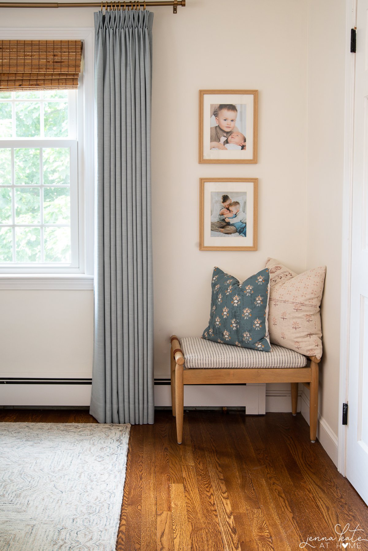
My 2 favorite ways to add contrast to a space are through color contrast and shapes. Many times you will hear people say that every room should have some black. While I don’t believe that’s true (I generally don’t decorate with black) I think that belief comes from the contrast that black brings to the space with it’s dark tones. However, any dark colors will give the same effect, serving as a secret weapon to provide visual interest and create a focal point.
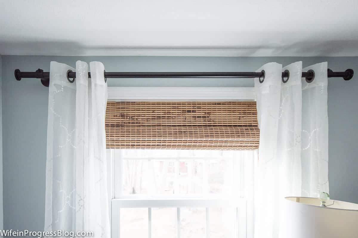
euro pillows // duvet cover // quilt // chunky knit blanket // blue throw pillows // bamboo shades
Bring in Pops of Color
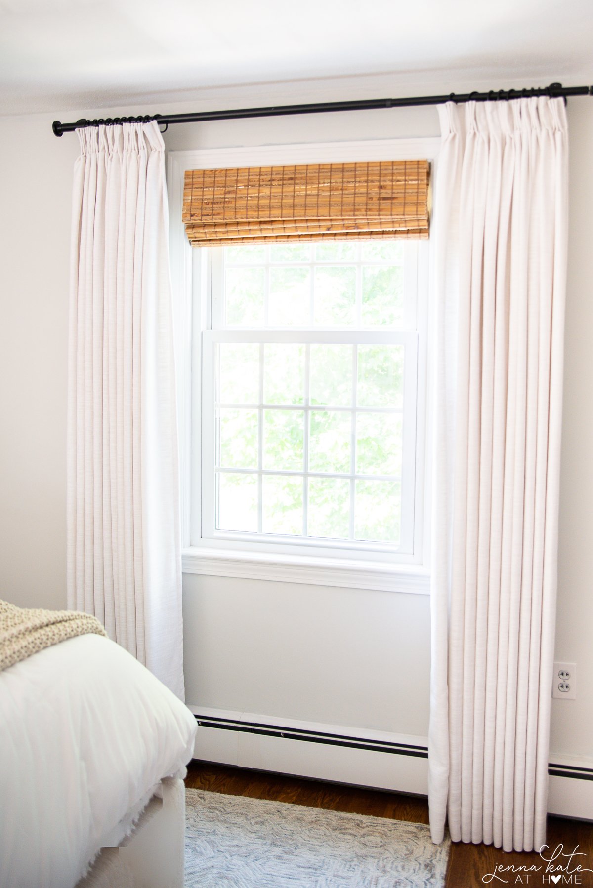
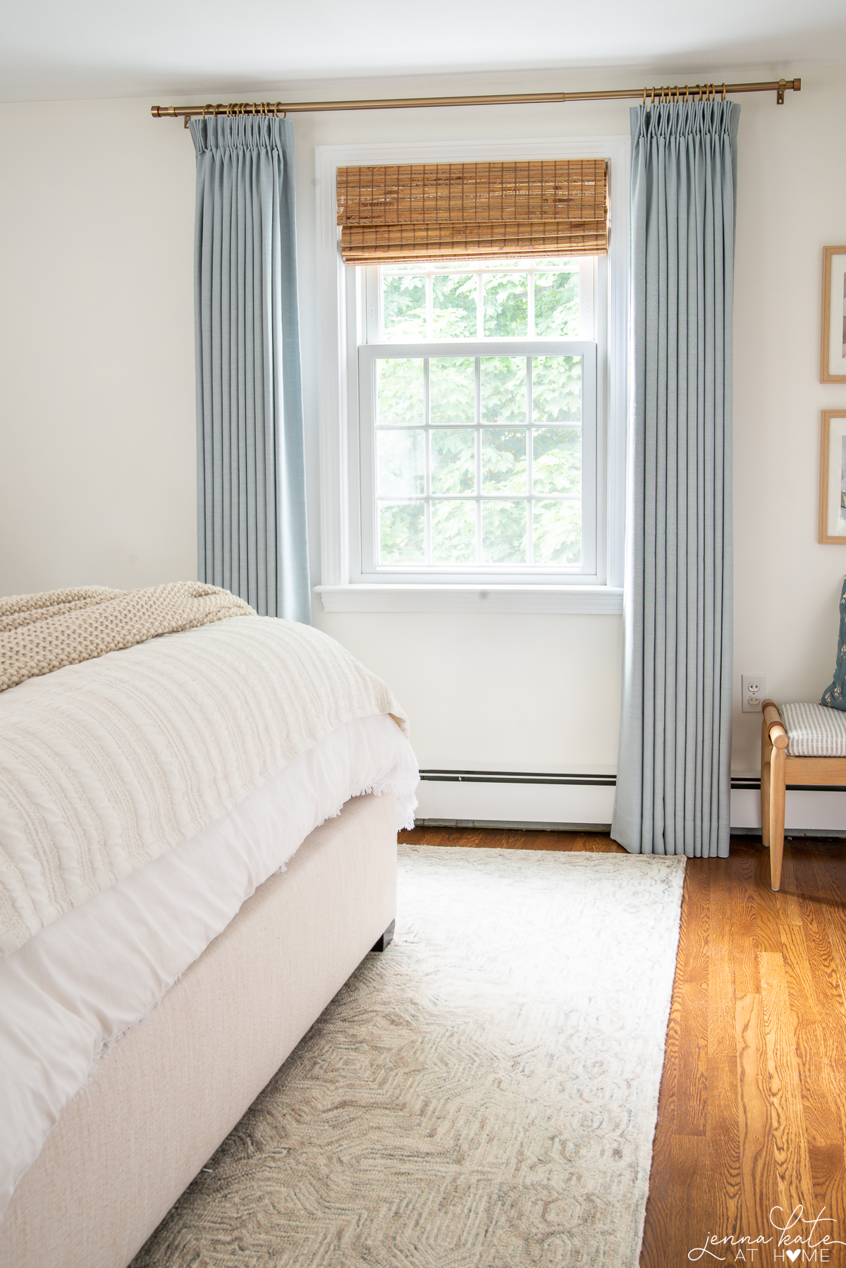
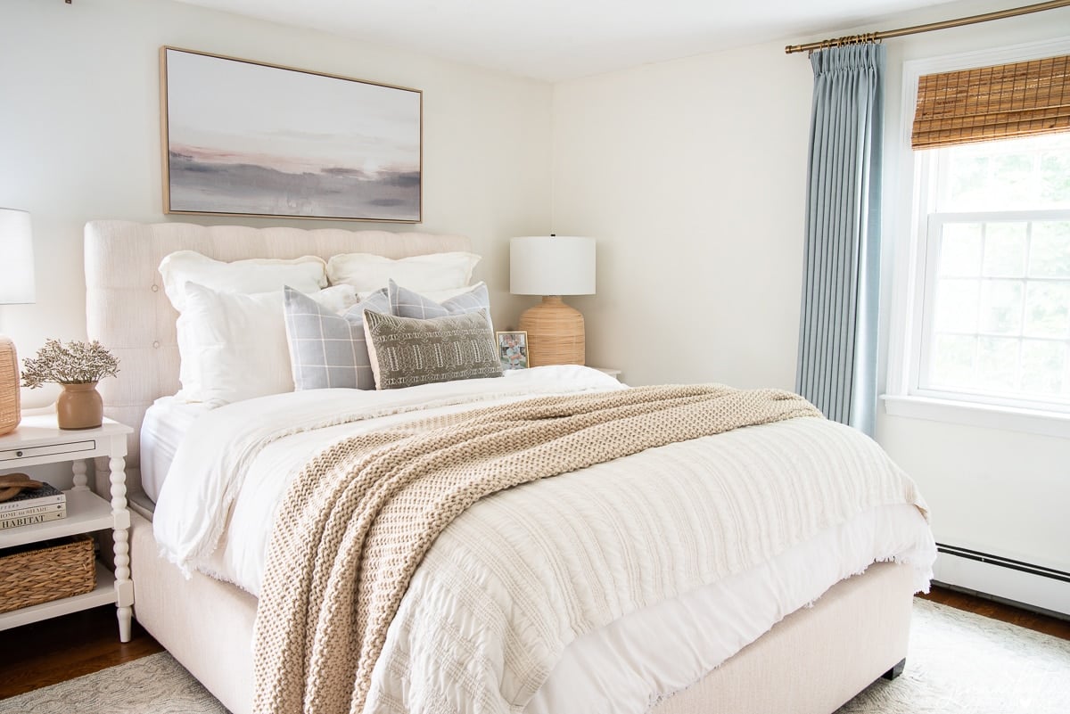
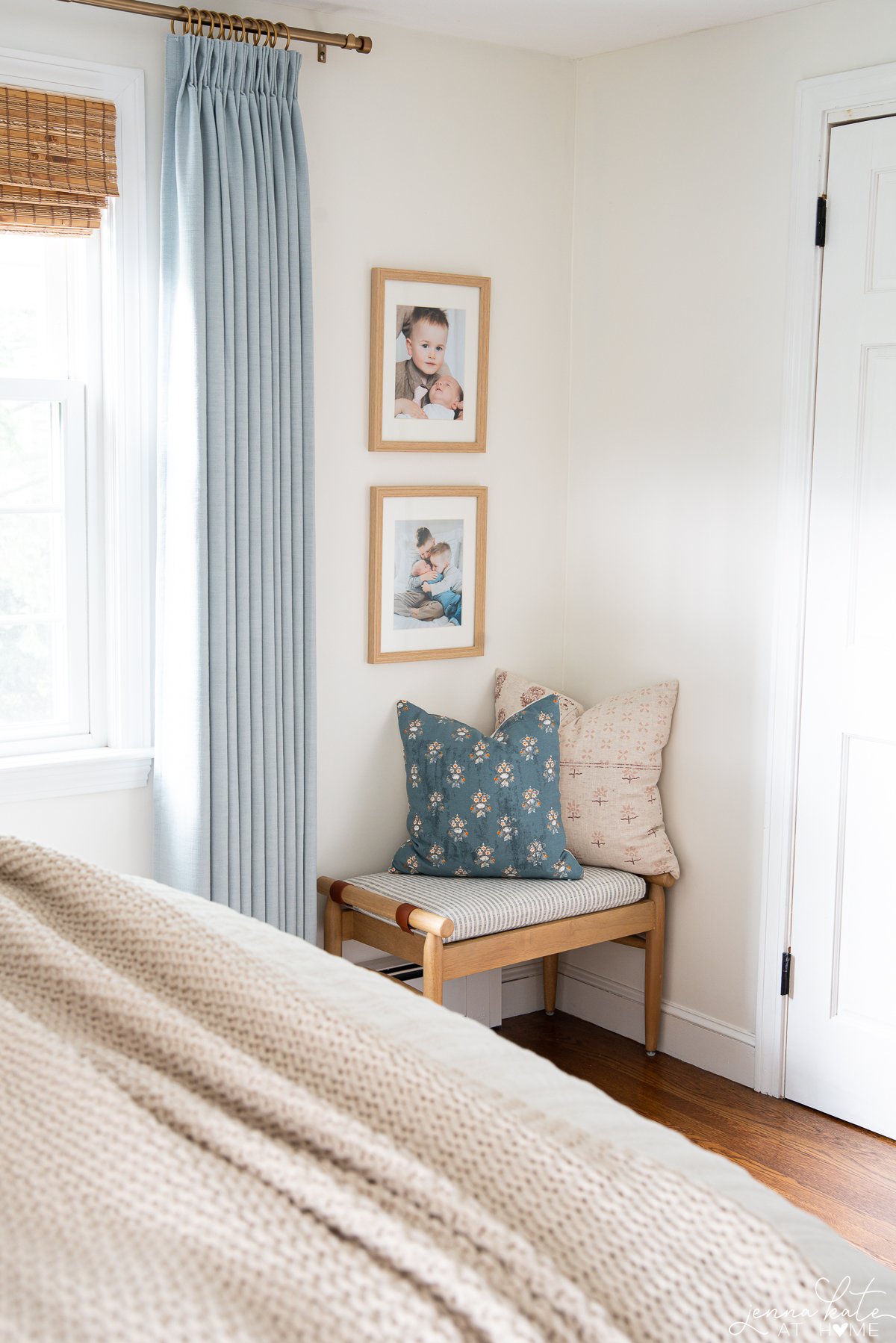
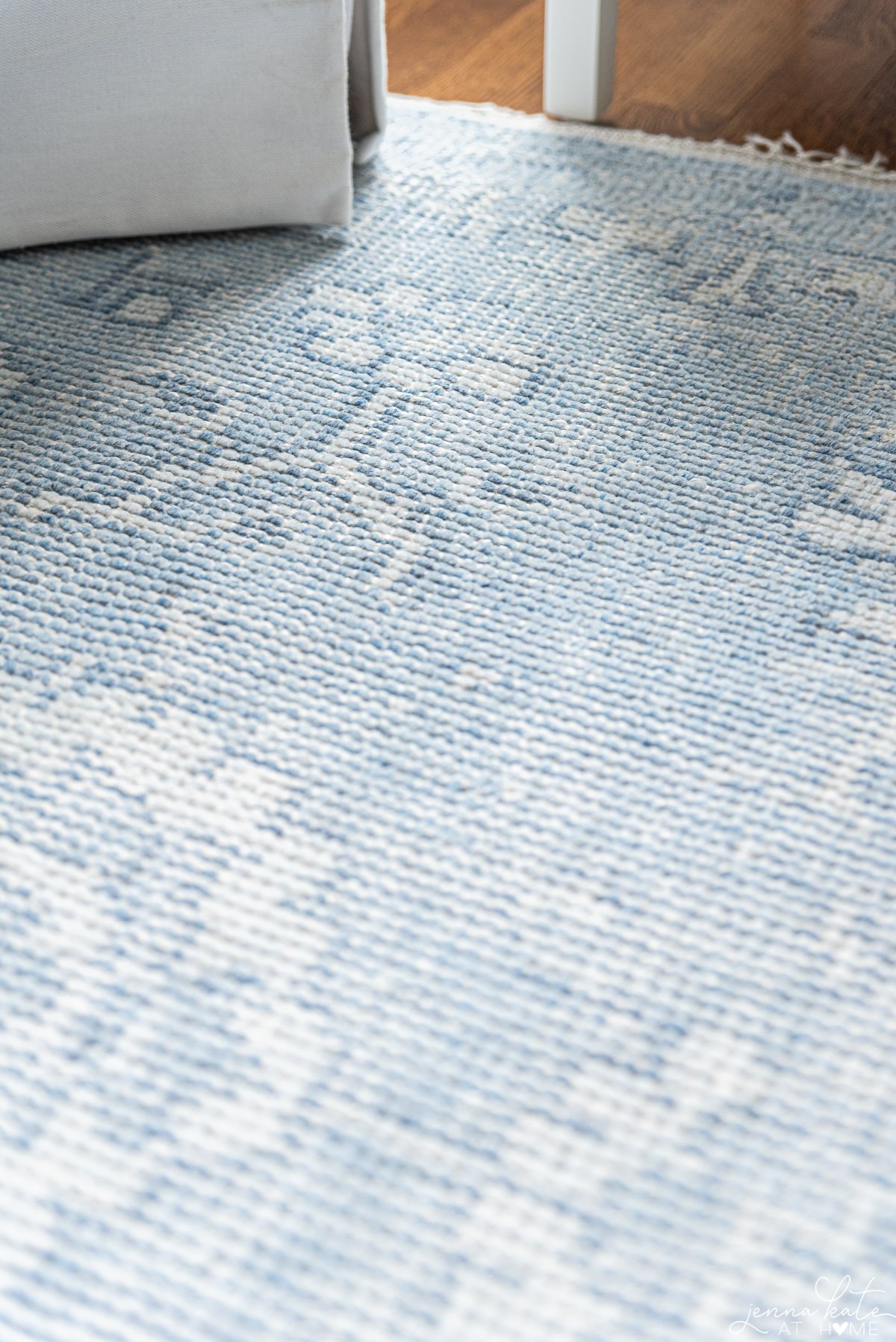
Let me show you a great example of this in my bedroom. In my bedroom, instead of having the entire room in neutral shades – linen headboard, linen designer look for less curtains, white bedding, light colored rug and light gray walls – I brought in a darker shade of blue for the curtains and one throw pillow on the bench in the corner. These complementary colors not only look great together, but add interest to an otherwise very “plain” look.
This key element added contrast almost immediately! Introducing bold colors in close proximity to lighter ones is a foolproof way to create a high-contrast interior that boosts the atmosphere.
Balance Warm and Cool Colors
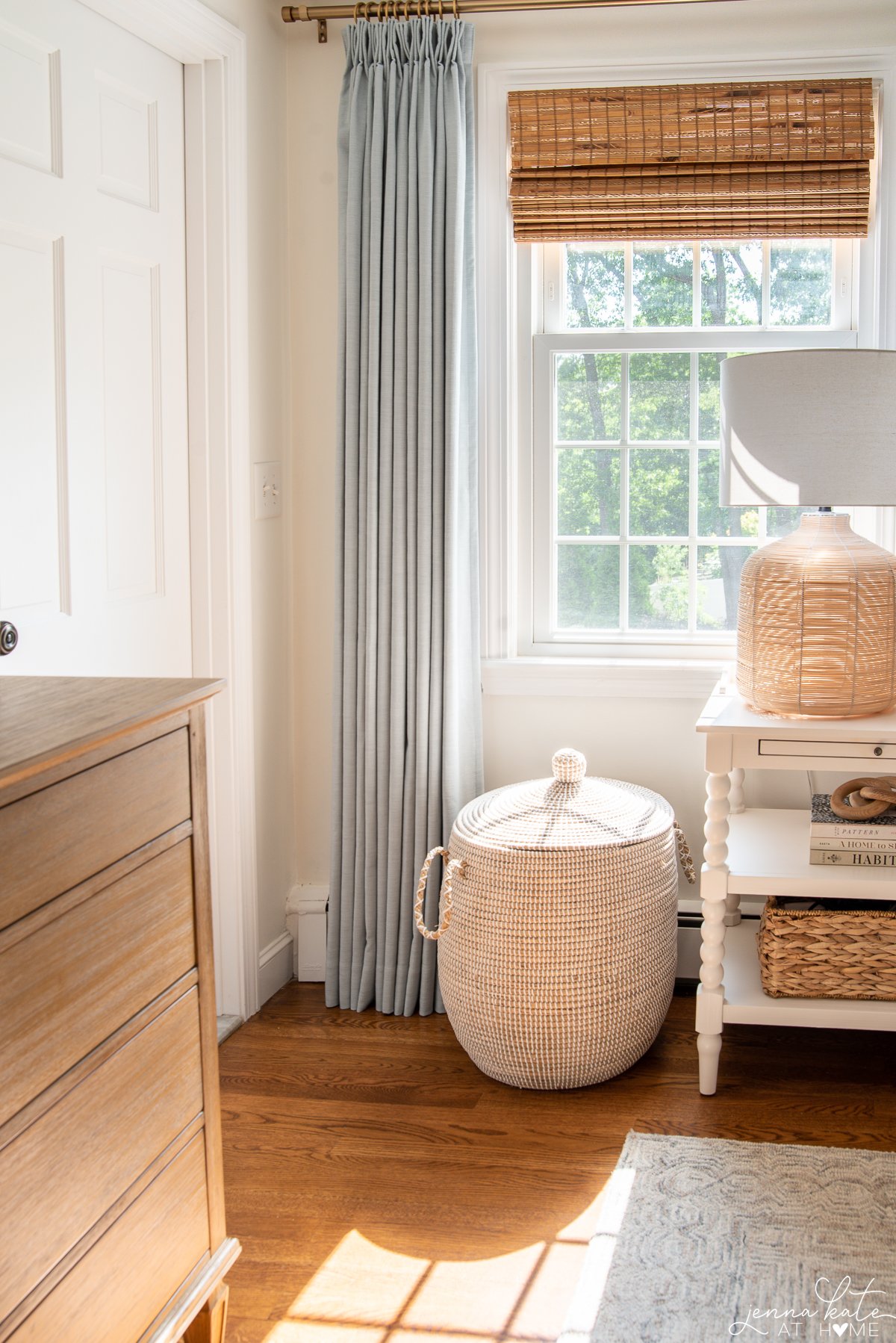
Want to know the secret ingredient to my success with creating contrasting rooms? Over the past few years, I’ve really gravitated towards striking a balance between warm and cool tones, and not just sticking to one or the other when deciding on a paint color or accent tones.
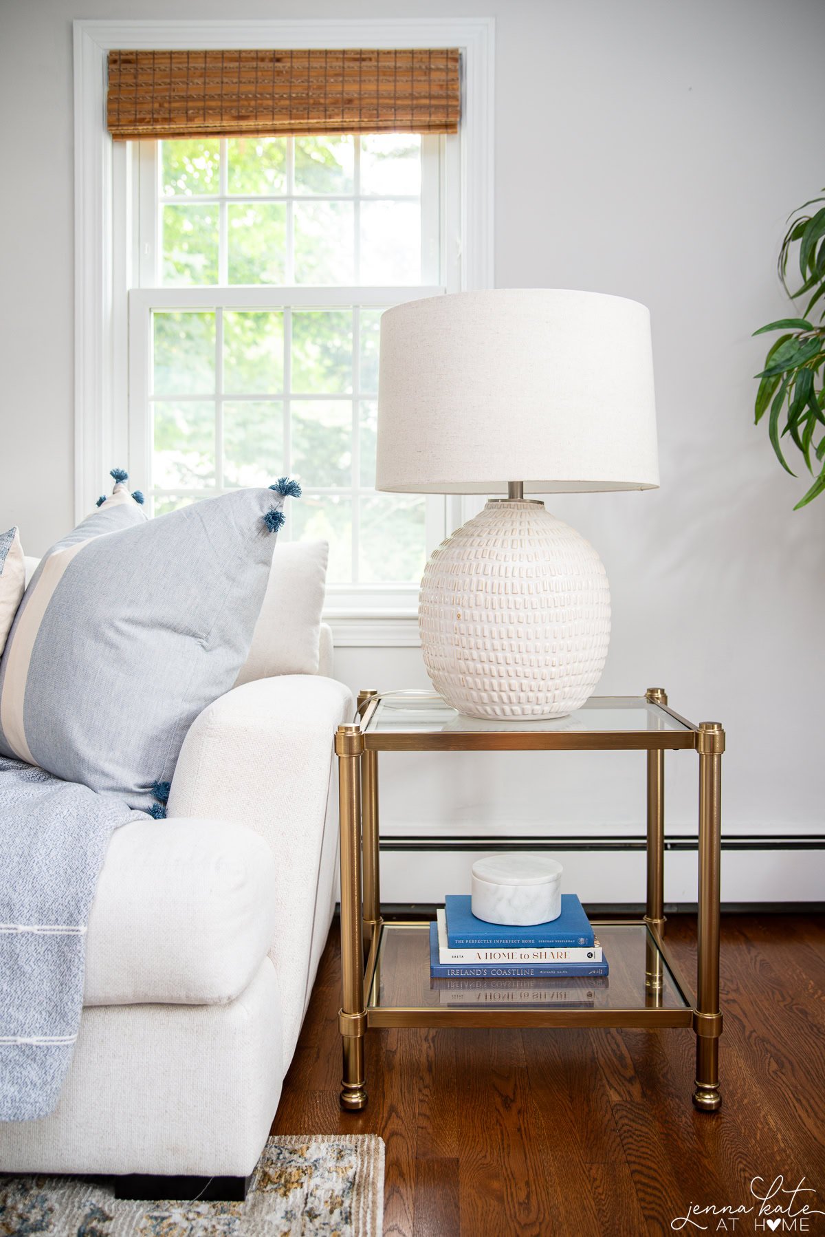
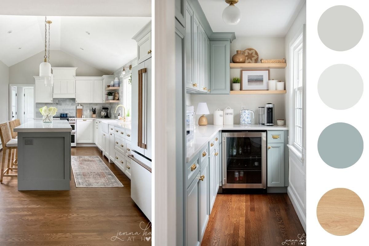
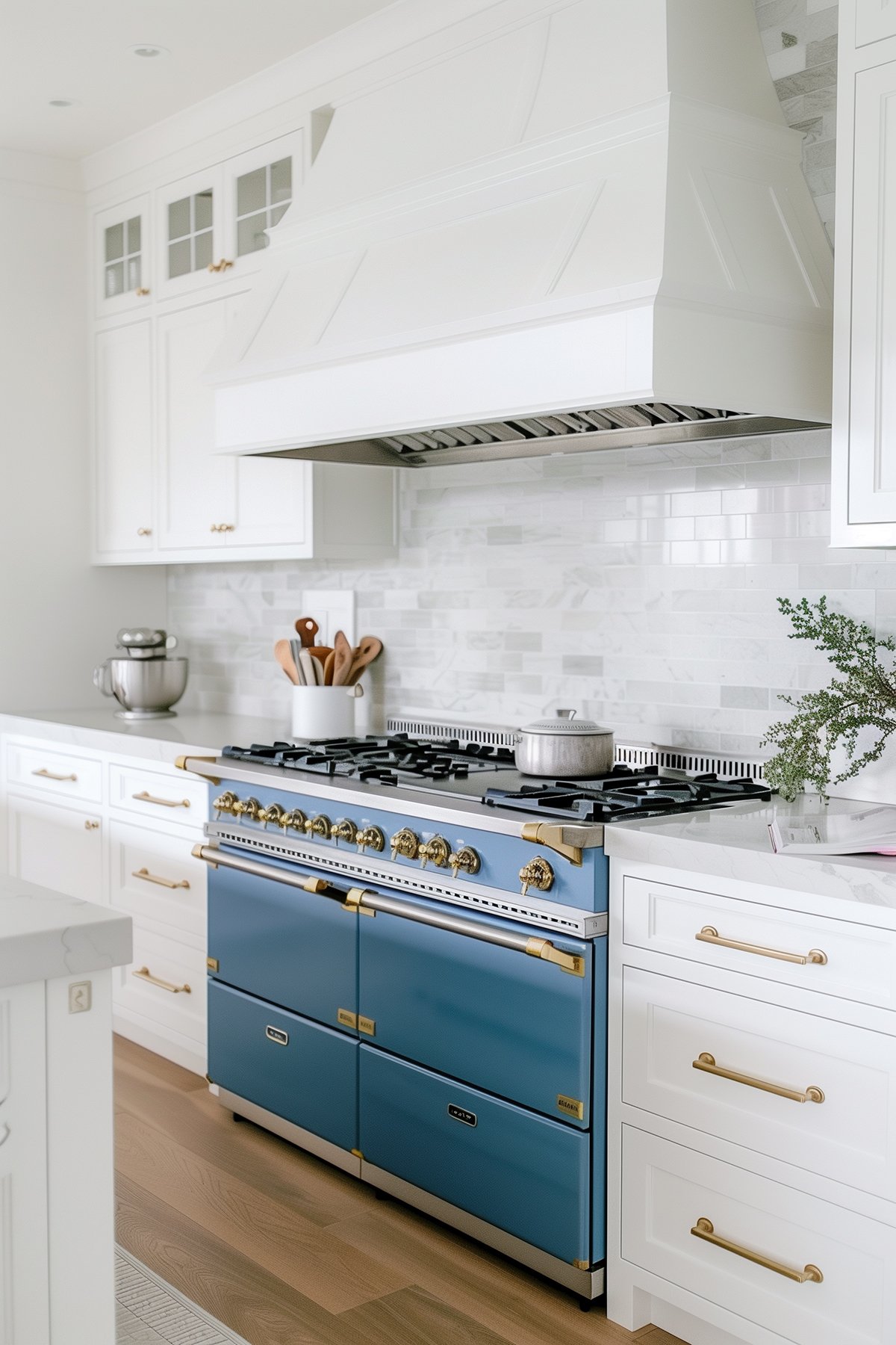
I first did this in my kitchen remodel, and now in this bedroom, you can see how the cooler tones of blue and white are balanced by the warmth of the White Dove walls, warm wood tones, and brass accents. This approach is an easy way to achieve the right balance of light and color contrast, making spaces feel comfortable and welcoming.
Use Opposing Shapes
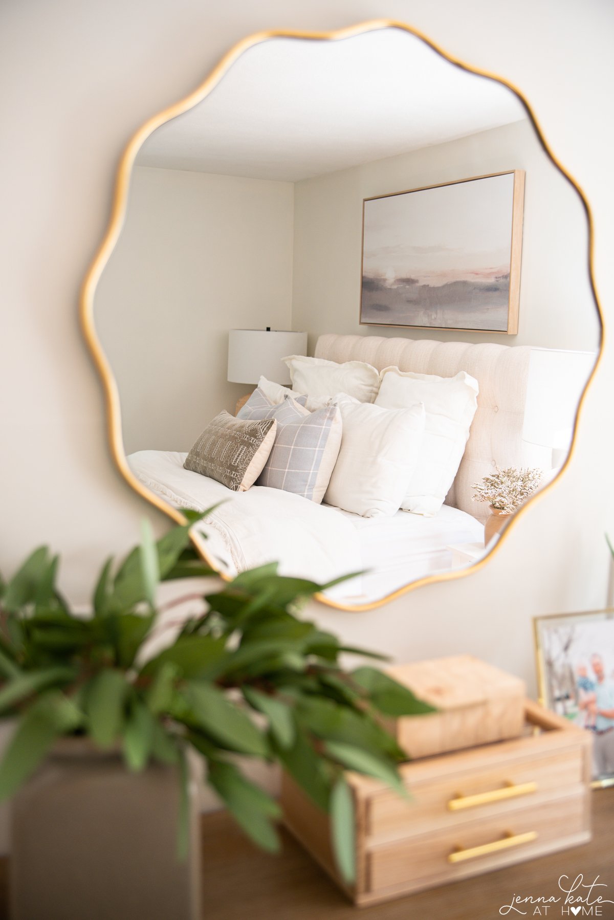
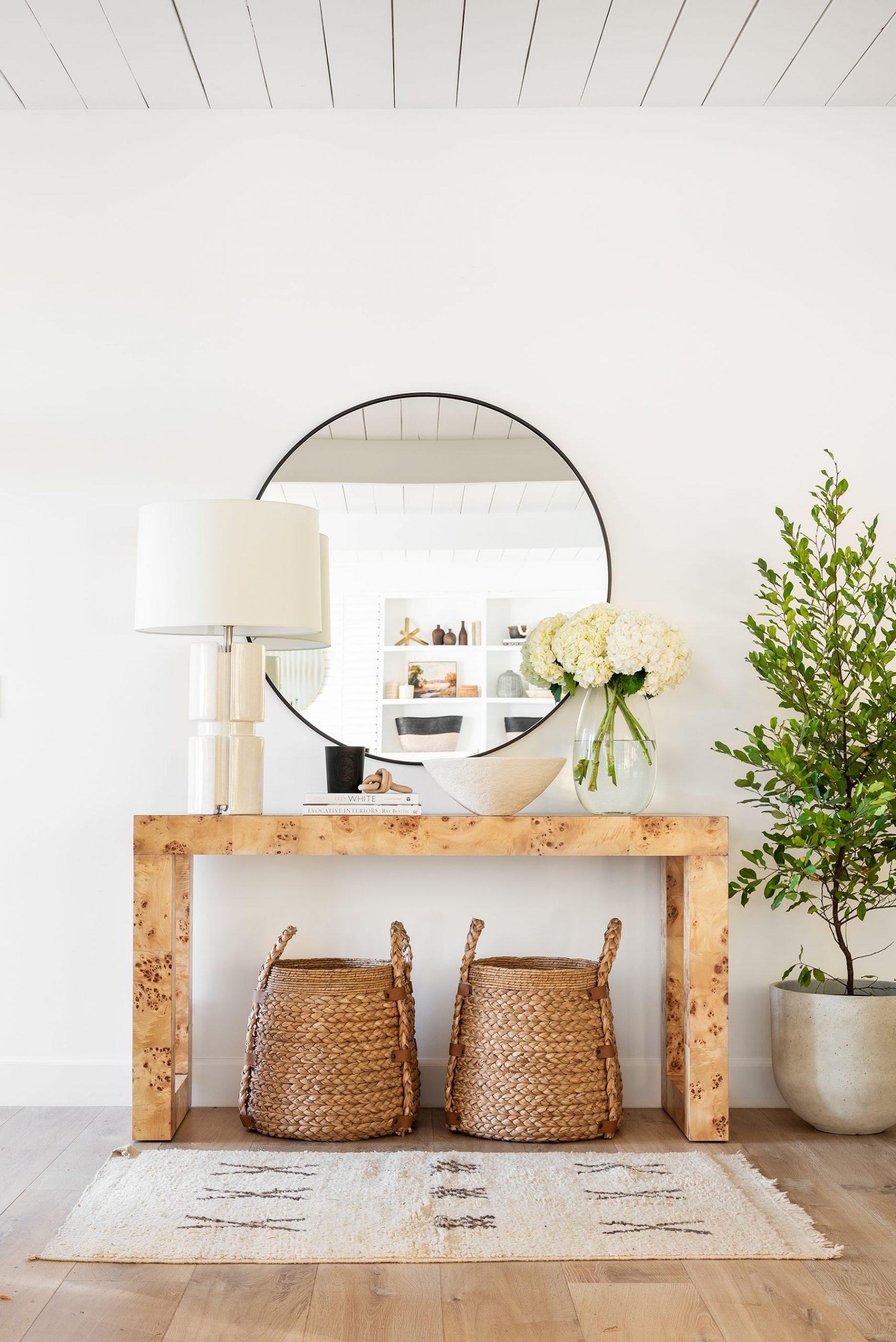
To balance out all the straight lines in the room (the curtains, the dressers, the window shades, etc.) I added a wavy mirror over the dresser. This adds contrast because it’s the opposite shape of what mostly exists in the room. Introducing an element of soft curves against angular furniture significantly enhances the visual appeal. Use this tip in any rooms of your home you find a lot of “squares” or right angles.
I think you’ll be amazed at how good different shapes look together! A great way to do this in rooms is to start with one piece, such as a mirror, wall art, or a frame to slowly bring in the perfect contrast.
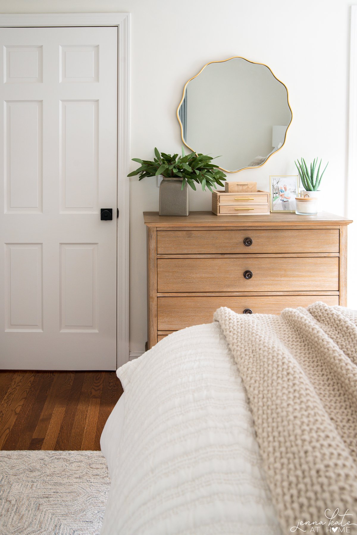
Adding a mirror in a bedroom like this that has poor natural light also has the added benefit of bouncing light around the room, making it appear brighter than it actually is.
I also just adore this mirror as it’s a great dupe for one of my favorite Serena & Lily ones!
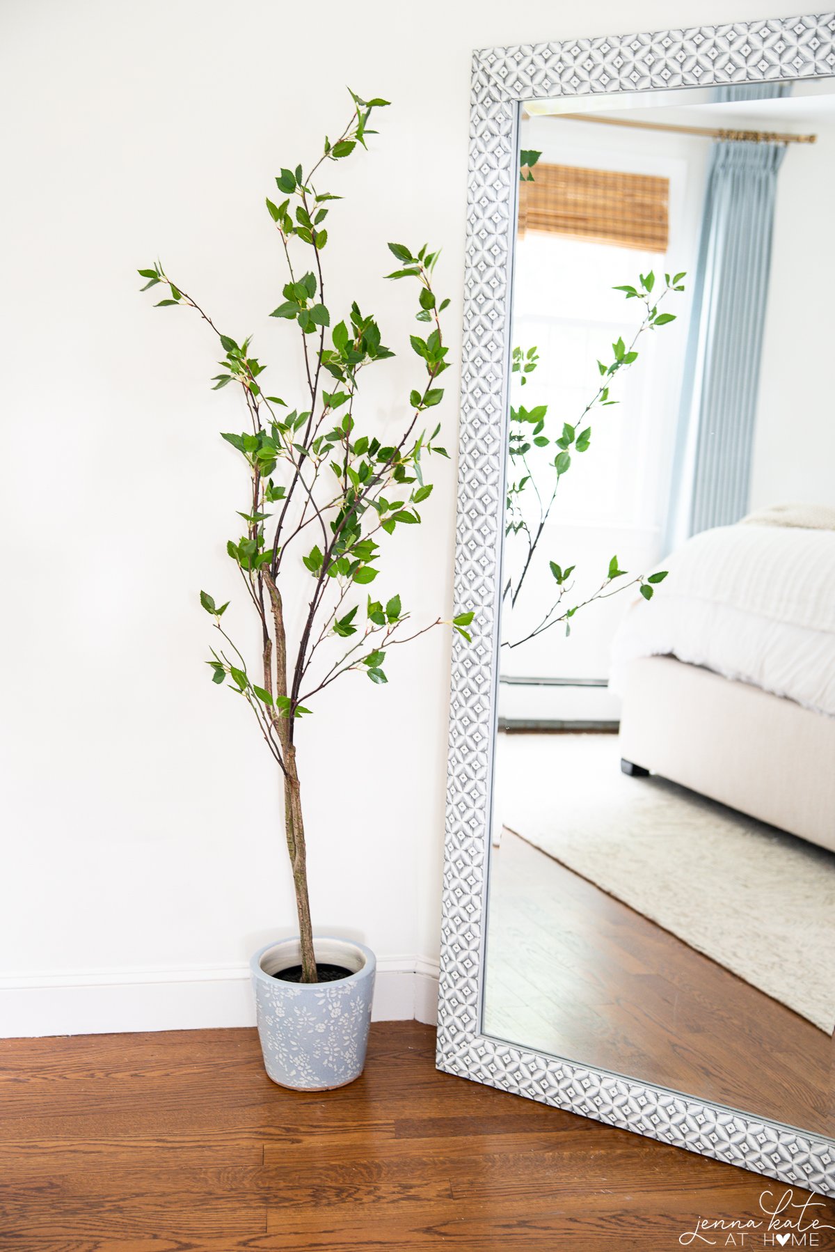
Balance Textures
It’s essential to strike a balance between various textures in your home decor to create an energetic and inviting environment, too.
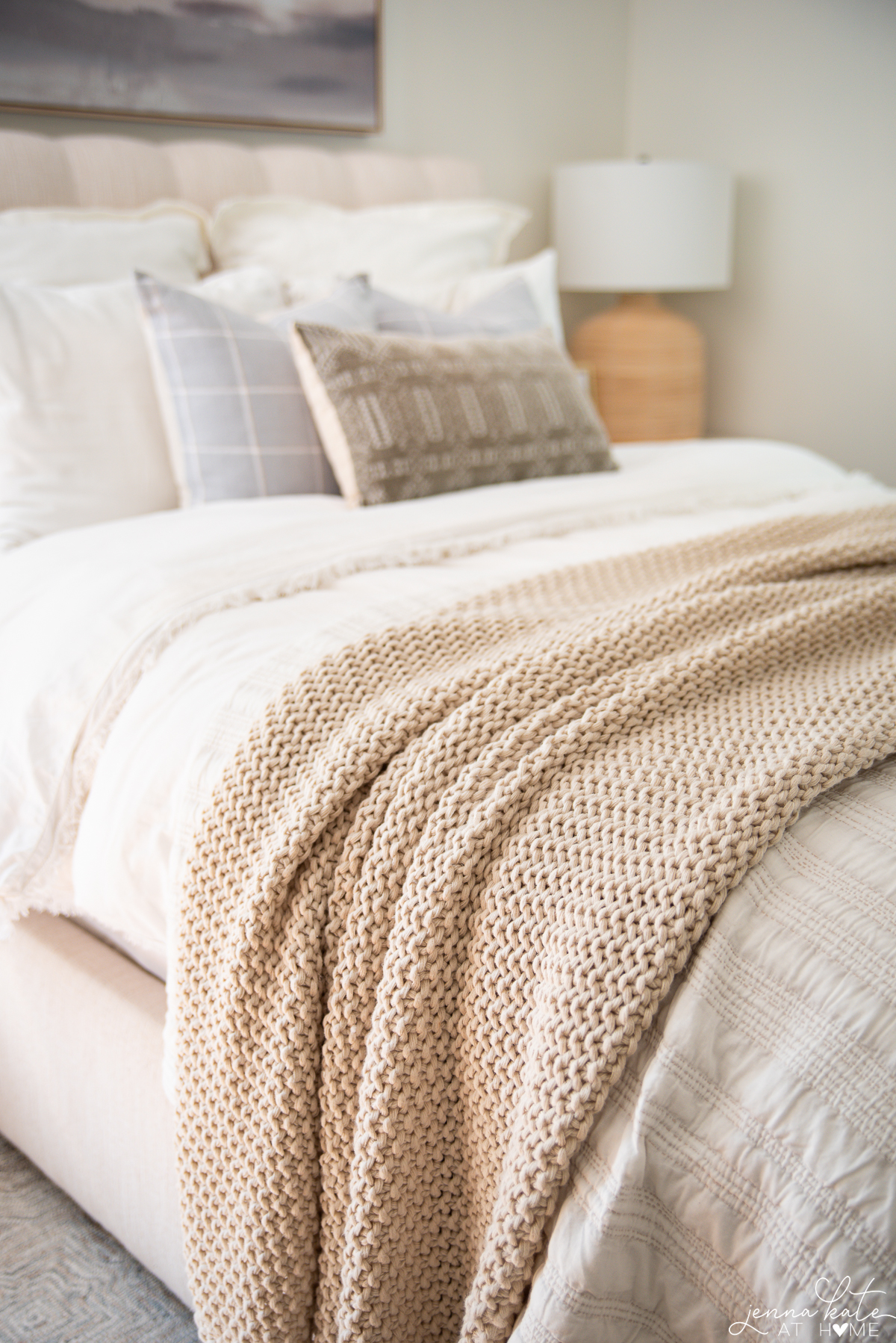
Follow these tips to achieve the perfect balance:
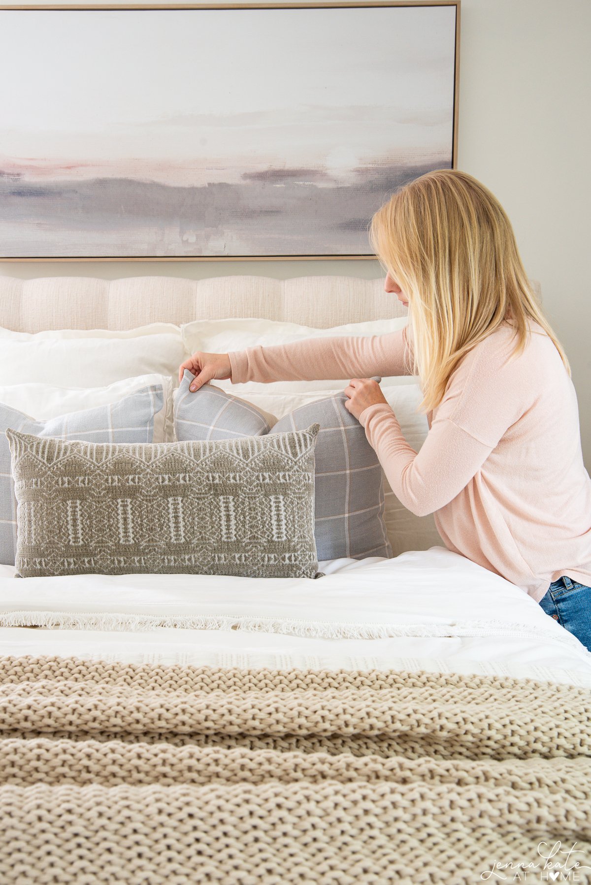
- Mix and match smooth and rough surfaces, such as a cotton duvet color and a knitted blanket, to create an interesting high contrast.
- Combine organic and geometric shapes in furniture and accessories to add depth and character.
- Play with scale and size by incorporating both small and large patterned elements in the room (easy to do with throw pillows and rugs).
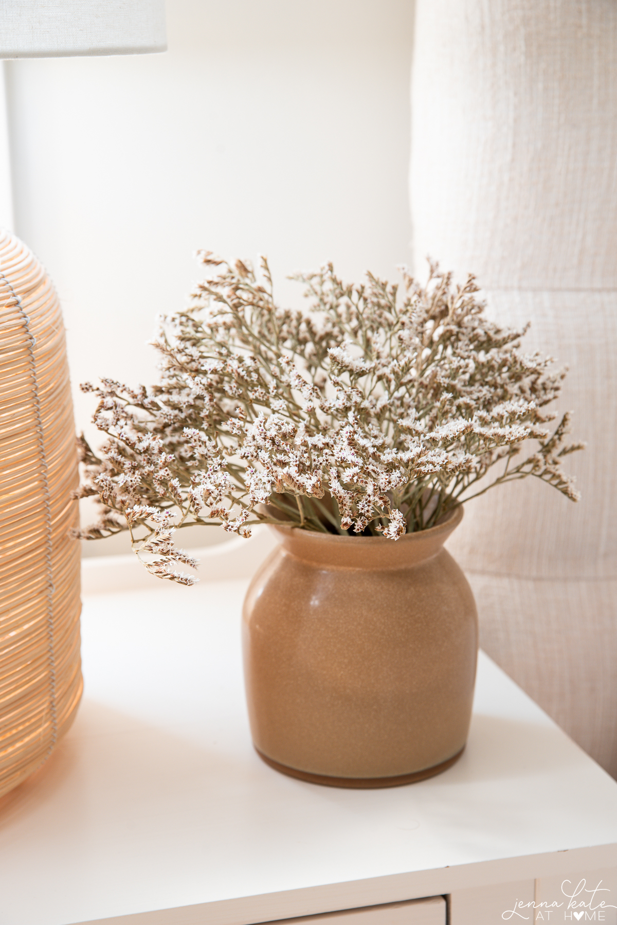
- Bring in natural materials that have organic shapes and texture contrast such as plants.
Symmetry
One thing that has consistently bothered me about this bedroom is the lack of symmetry with the windows. In a perfect world, the wall with the bed would have windows on both sides of the bed. But alas, it does not. I found that having curtains to the left further highlighted this problem.
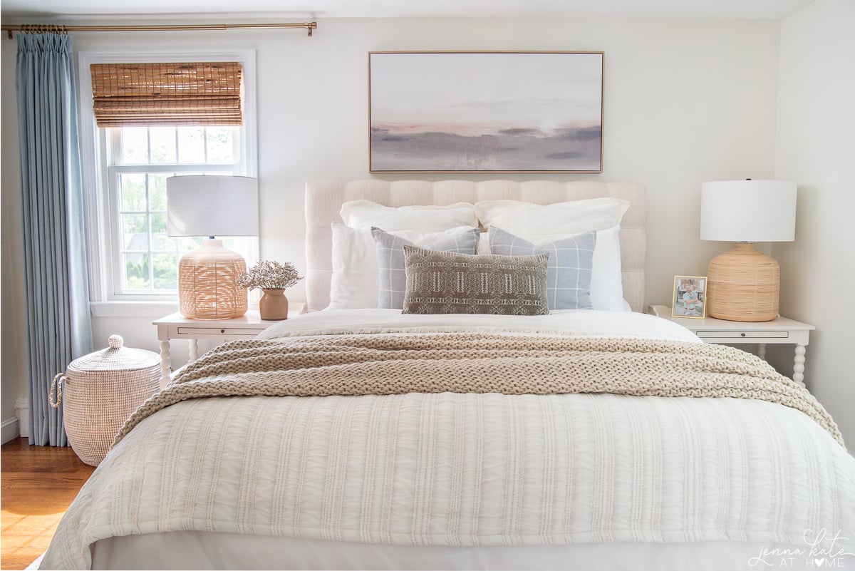
I came up with 2 simple solutions to this problem: remove the curtains entirely (I didn’t want to because I love the softness they bring) or only hang one curtain panel to make the table lamps the symmetrical element on that wall.
This had the added bonus of letting more light in through the west-facing window, making the entire space feel much bigger and brighter. Win-win!
You might can try this tip in your living room if you have a similar window situation.
Final Thoughts
As you explore different ways to add contrast, keep in mind the importance of maintaining a sense of harmony and cohesion. Striking the right balance between contrasting elements is crucial to achieving a sophisticated and well-designed space.
So, whether you opt for a dramatic black and white color scheme or a more subtle mix of analogous colors, don’t be afraid to take some risks and let your personal style shine through.


Hi Jenna. Beautiful room! Could you tell me where you got your bed and the name and color of it, please?
Hi, it’s really old from Raymour & Flanigan and no longer sold.
Jenna, thank you for the great ideas in decorating my master bedroom.
Can you please share with me the name and color color of your wood flooring and company it is made by? We have wood flooring similar and it needs to be replaced as well. I will appreciate any information you can give me.
Hi! It’s 2 inch white oak that can be purchased at any flooring company or large hardware store. It’s stained with Bona Provincial
Great posts with so many wonderful ideas. Gentle decorating can be difficult for those of us who don’t know what we’re doing or have limited resources. Thank you for your guidance.