Content may contain affiliate links. When you shop the links, I receive a small commission at no cost to you. Thank you for supporting my small business.
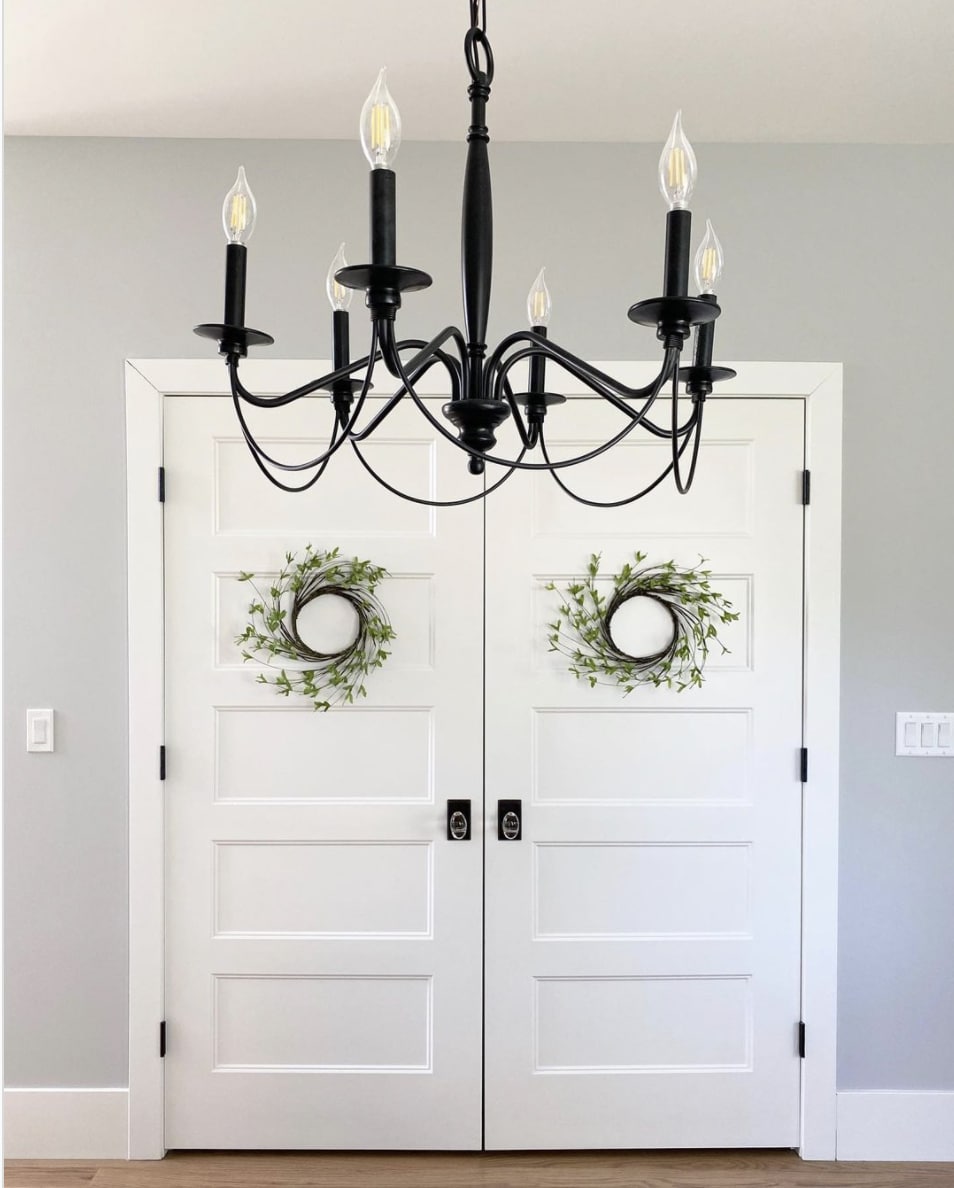
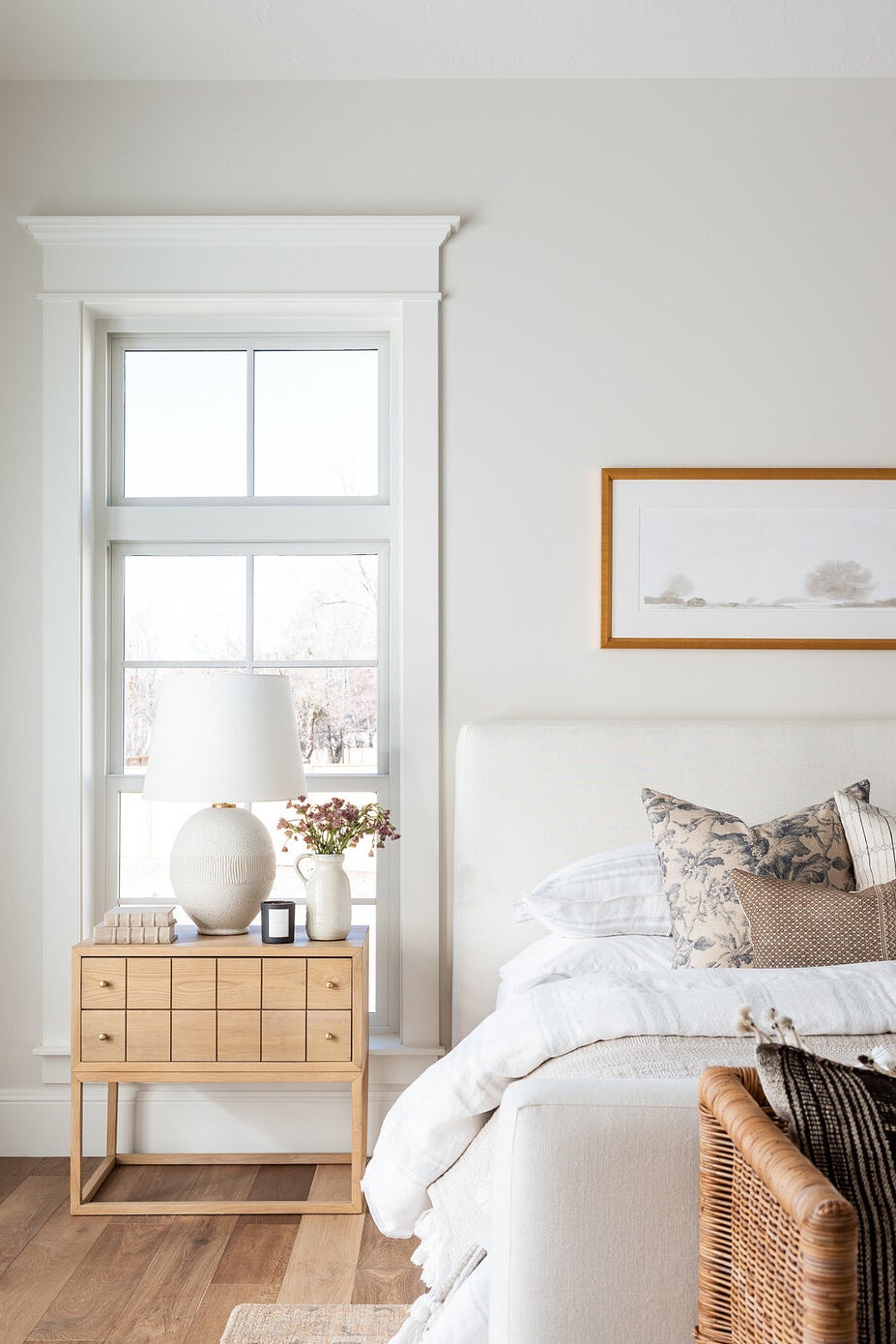
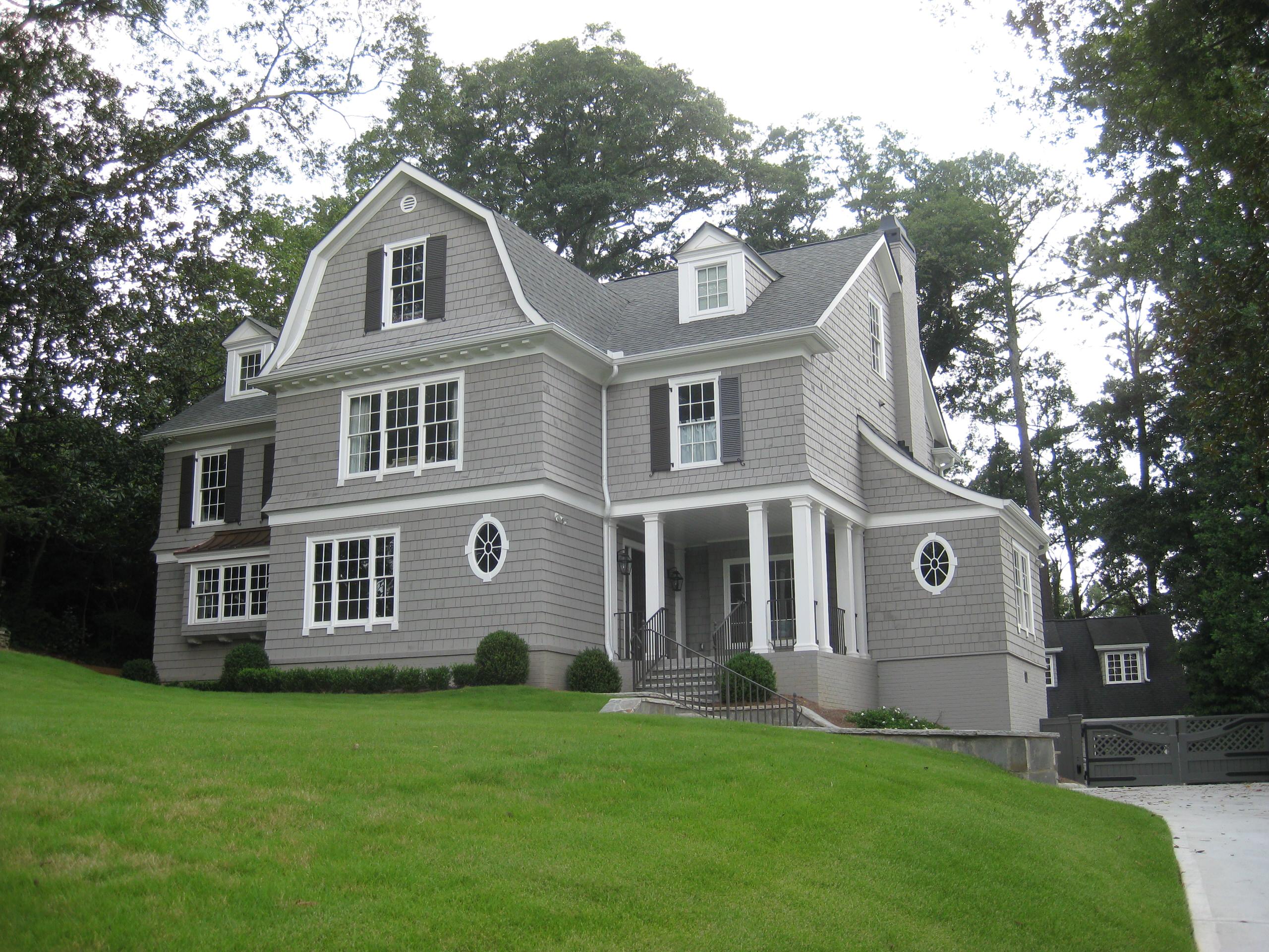
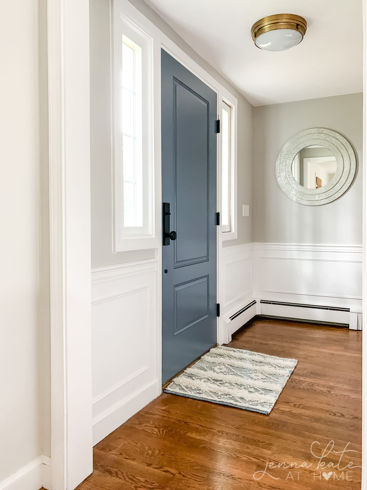
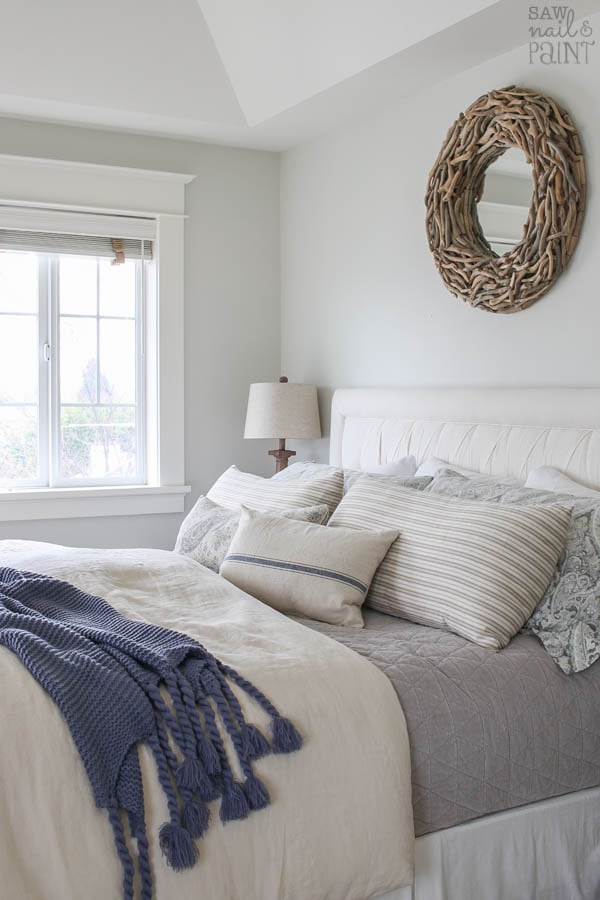
Silver Satin is a warm light gray paint color that’s perfect for obtaining a coastal, airy feel.
Wondering if BM Silver Satin is the right paint color for you? In this article, you’ll learn what color silver satin is and how it can appear in different lighting conditions and areas of the home.
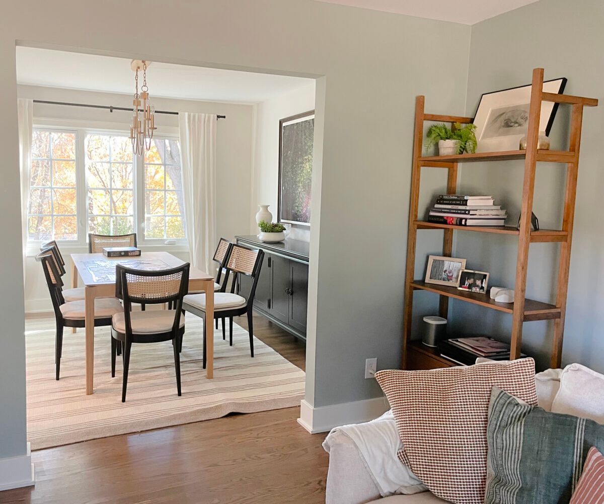
Silver Satin is a warm gray with a sleek look. Not quite as warm as the more popular Classic Gray, but a great choice as a subtle gray-lavender. It shifts slightly depending on the lighting, appearing a smidge cooler in north-facing rooms and warmer in southern or western sunlight.
What’s The LRV?
With an LRV of 74.9, Silver Satin sits near the beginning of the off-white range. In brightly lit rooms, it may wash out a bit.
Light Reflectance Value (LRV) is an indicator of the amount of light that is reflected by a color when it is illuminated by a light source. A higher value (closer to 100) means that a color will reflect more light back at you and a lower value (closer to 0) means that a color will appear darker, or absorb more light.
What Are The Undertones of Silver Satin?
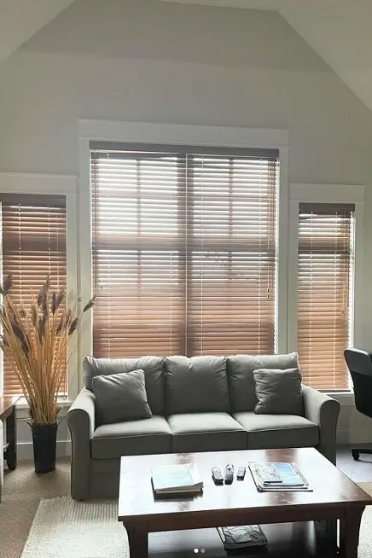
Silver Satin has minor violet undertones when displayed in natural light, which are quite subtle. It’s less prone to picking up a green undertone, maintaining its neutral gray appearance.
Trim Color and Silver Stain
For trim with Silver Satin walls, I recommend Benjamin Moore Chantilly Lace for a clean and classic look. Sherwin Williams Pure White is also another great option.
How Does Light Affect Silver Satin?
In north-facing light, expect Silver Satin to lean towards its cooler gray side. Conversely, in south-facing rooms or warm western afternoon sun, it warms up slightly without veering into beige.
Don’t Forget…
Don’t forget – no matter what you’ve read or photos you’ve seen online, it’s really important to sample paint colors in your home before committing!
Samplize provides real paint samples that are easy to move around your home, and cheaper than buying a gazillion paint pots! It’s the only way I buy paint samples.
BM Silver Satin Coordinating Colors
The best way to pair Benjamin Moore Silver Satin is with grays of similar undertones and those with more depth. For a bit of contrast, blue-green colors coordinate nicely.
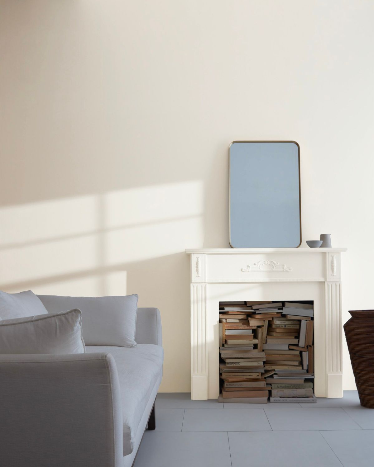
You also can’t go wrong pairing this with simple whites or another neutral paint color. Popular colors include SW Pure White or BM Chantilly Lace. It’s a good idea to avoid going too creamy as it can become muddy looking at that point.
Silver Satin vs. BM Classic Gray
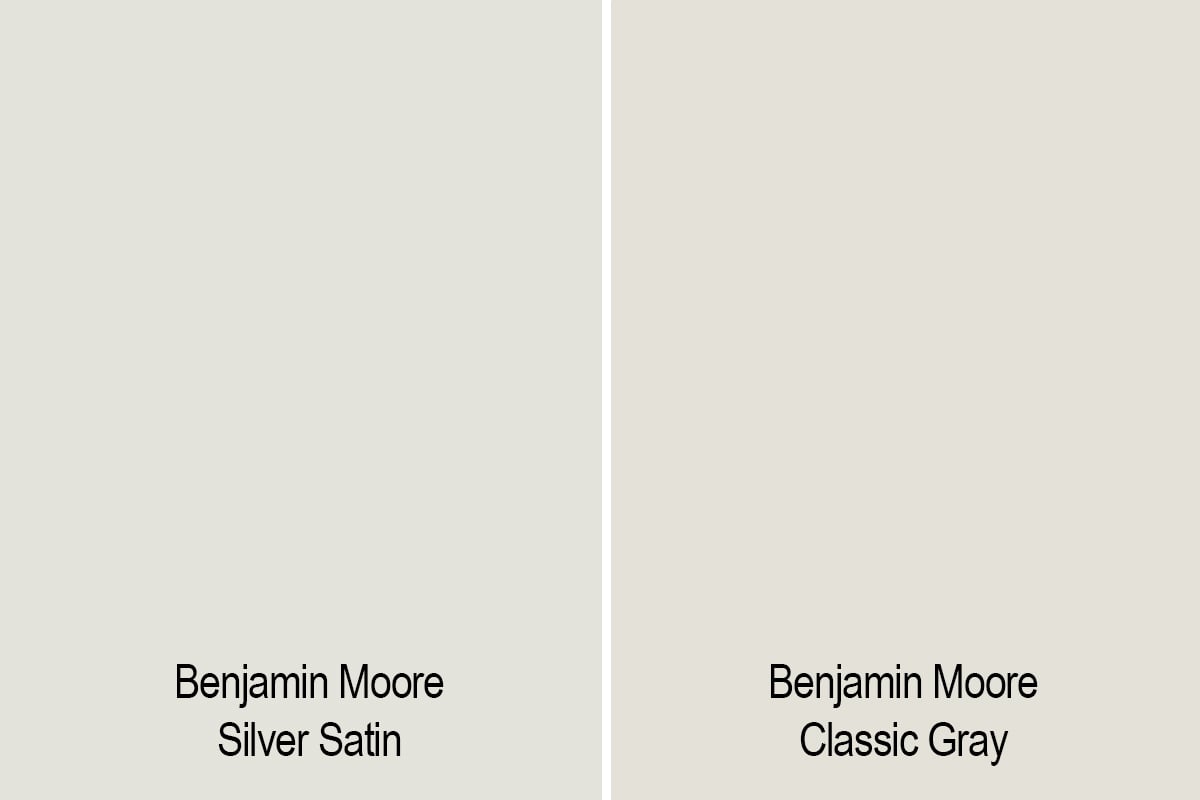
Classic Gray is just slightly darker than Silver Satin, with an LRV of 74.8 versus Silver Satin’s LRV of 76.2. Classic Gray has a warmer undertone whereas Silver Satin is slightly cooler with a lavender-gray undertone.
Silver Satin vs. SW Eider White
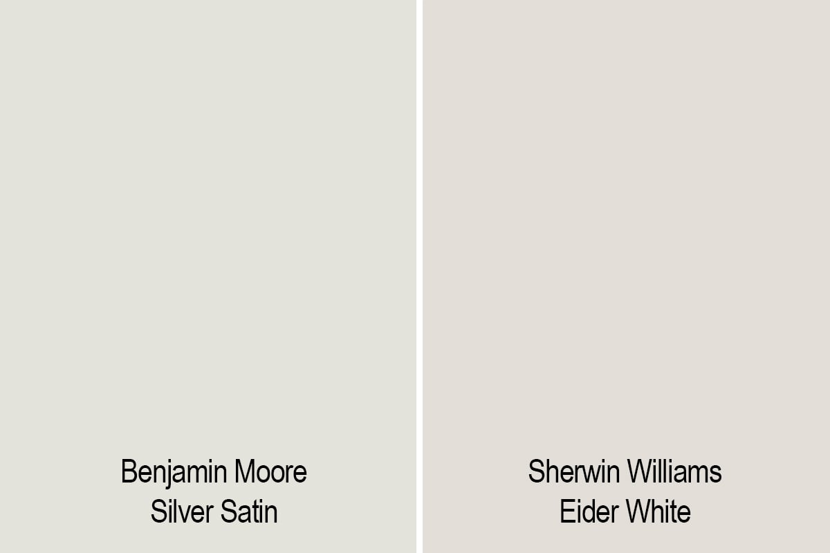
Eider White is a cooler option compared to Silver Satin. It might blend nicer to a color palette utilizing more green and blue.
BM Silver Satin vs. BM Calm
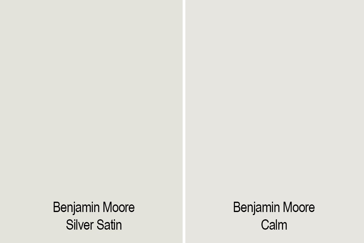
With a slightly higher LRV, Calm offers a similar vibe but with different undertones and is a warmer variation of this light gray.
FAQ’s
No, it is grayish off white with a bit of warmth, but not enough to make it a greige. If a greige color is more your design style, I’d suggest different shades such as Edgecomb Gray or Accessible Beige.
You can also see all my other favorite greige paint colors.
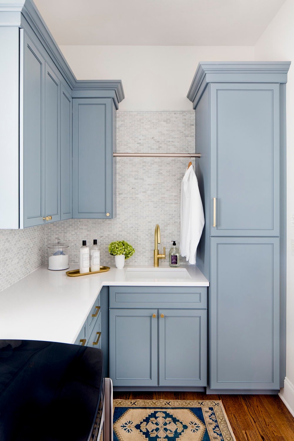
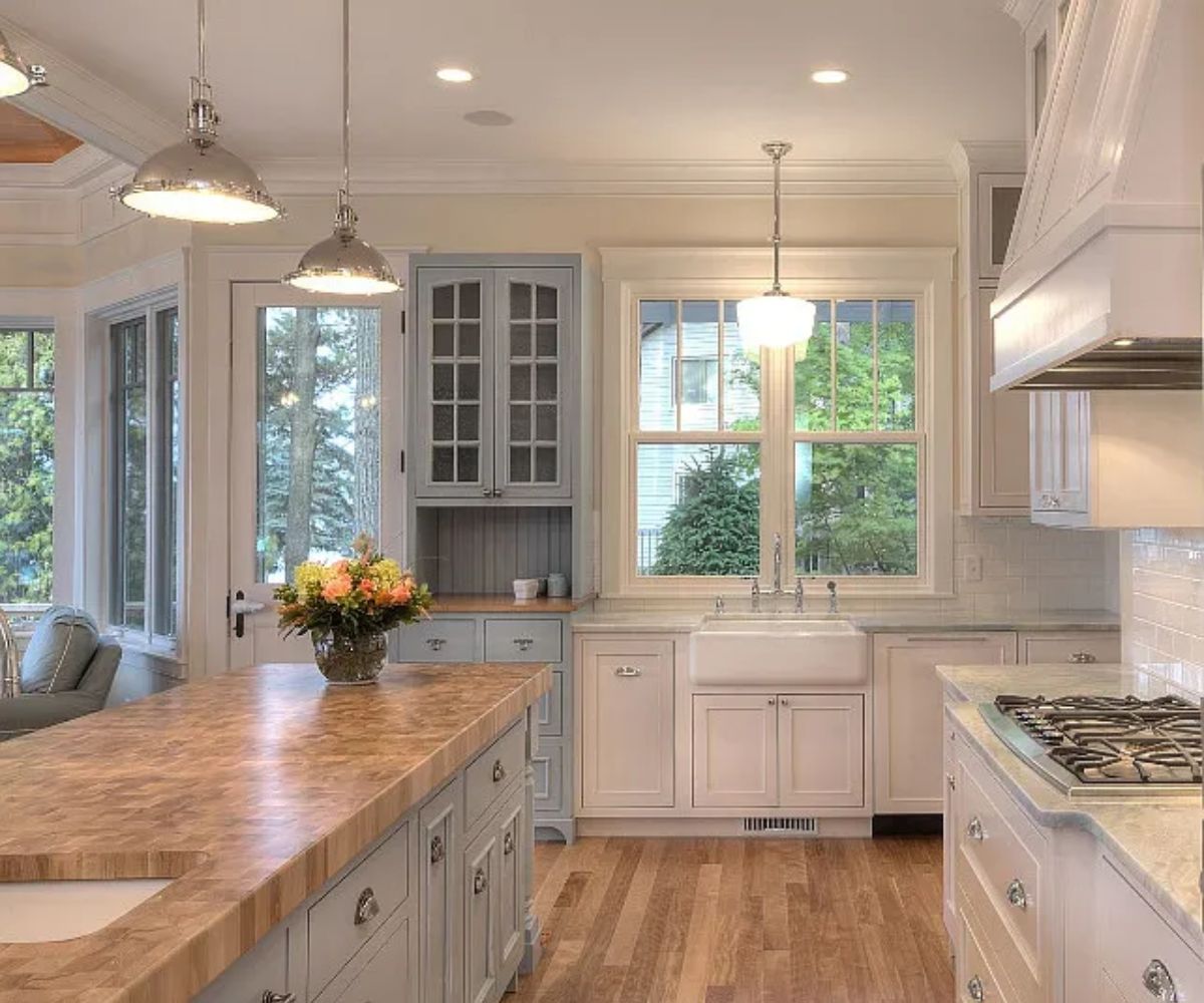
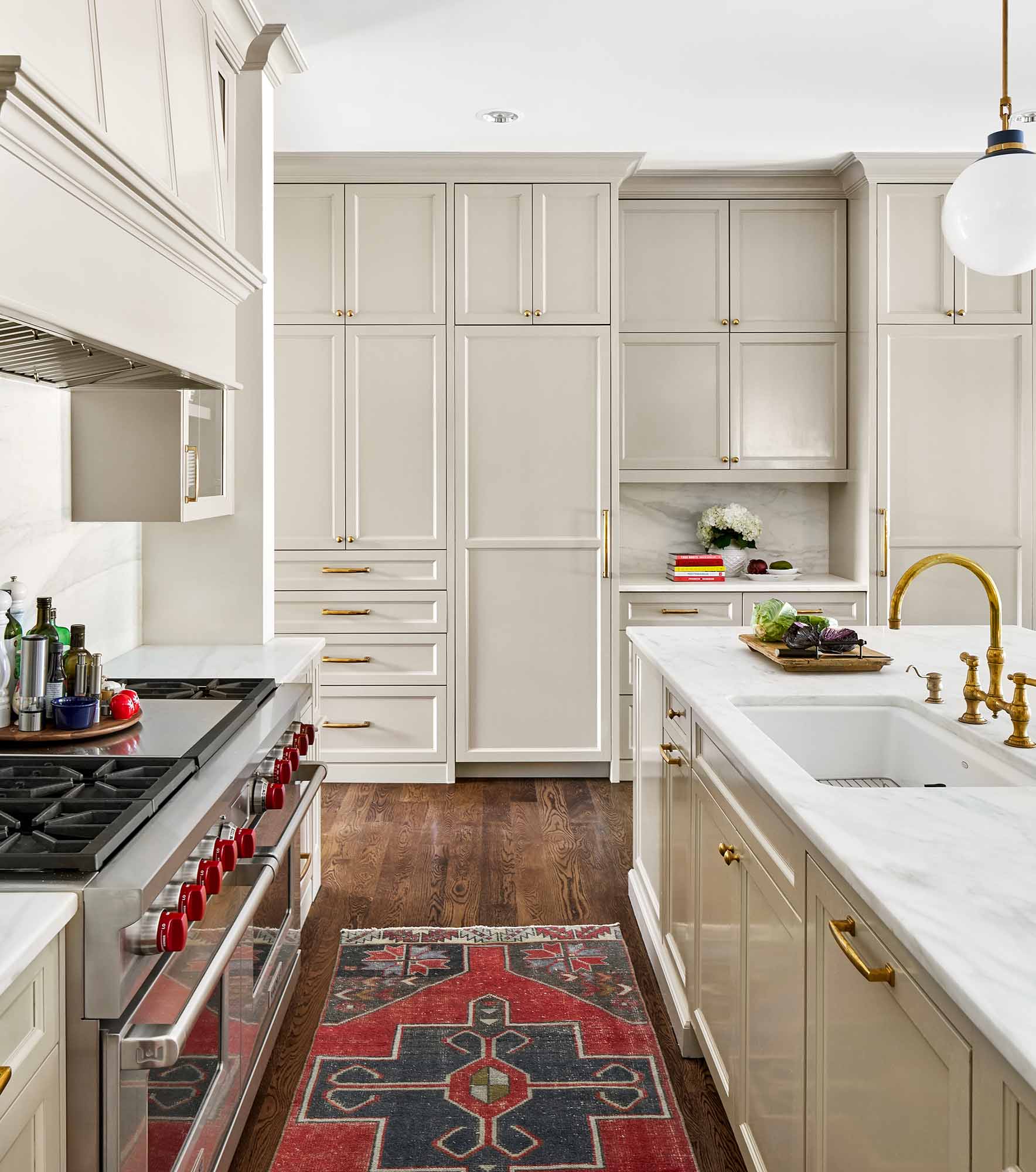
Personally, I’m not the biggest fan of Silver Satin on kitchen cabinets simple because it doesn’t have enough depth.
If you’re really looking for something very subtle and your walls are white, it may work. I would either stick with white cabinets or use something with a little more saturation.
Final Thoughts
Benjamin Moore’s Silver Satin is a very subtle warm gray that offers flexibility and a serene backdrop. Whatever your design style, chances are it will work. If you find white white too white, then this subtle paint color may be exactly what you need.
Its ability to adapt to different lighting conditions and pair with a range of complementary colors makes it a versatile choice for creating a light and inviting space.

