Content may contain affiliate links. When you shop the links, I receive a small commission at no cost to you. Thank you for supporting my small business.
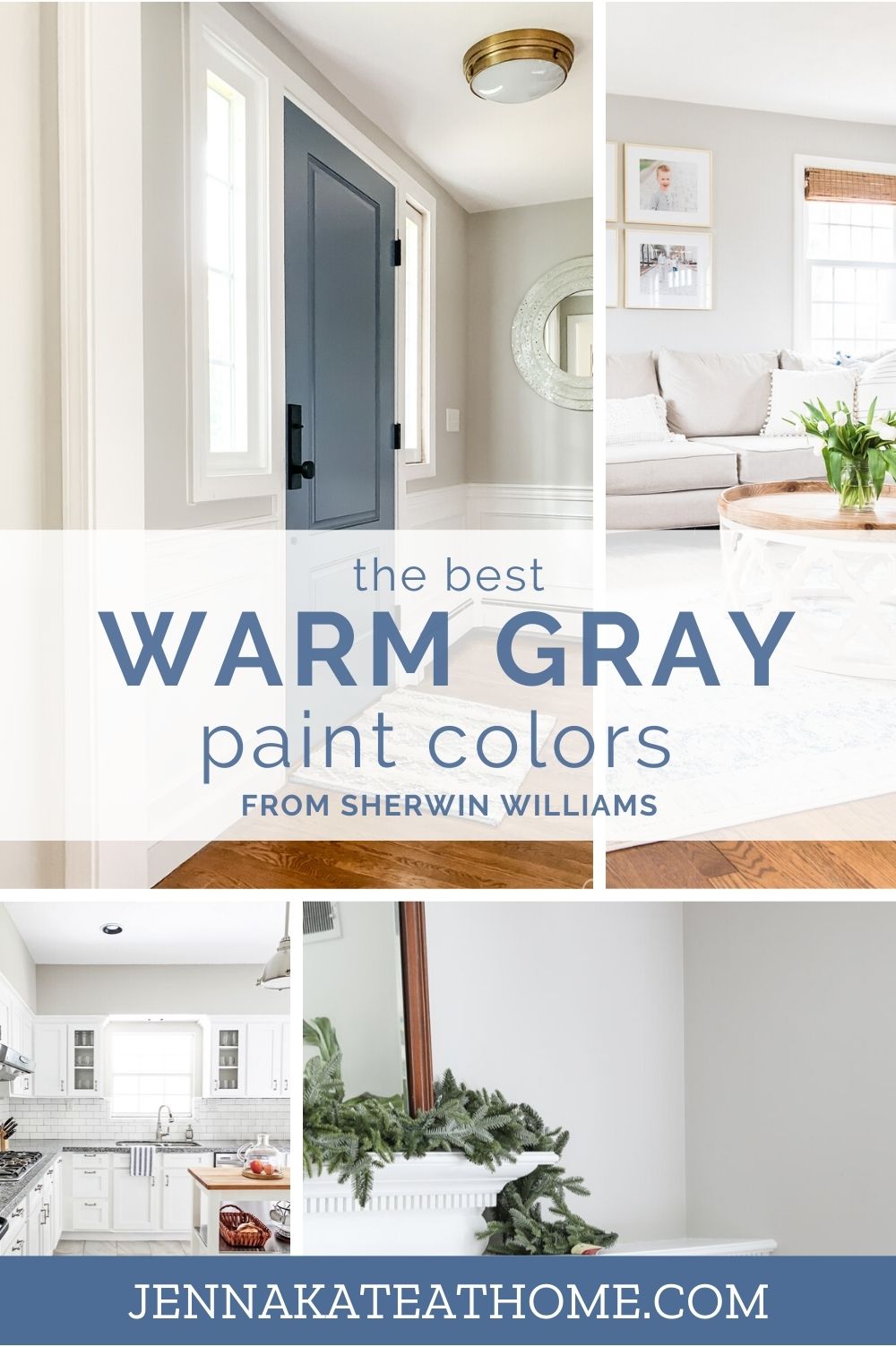
The best warm gray paint colors from Sherwin Williams that will give you that fresh, modern look without making your room feel cold.
What is a Warm Gray?
The term “warm gray” is a funny term, since you may never think to put the two together.
Since many gray paint colors can feel cold because of their blue or purple undertones, a gray paint color that has beige, yellow or red undertone is a “warm gray”.
These warm gray paint colors are becoming much more popular than cooler grays. In fact, they are some of the best paint colors to choose when planning to sell your home.
Wondering if you can you mix warm and cool colors together? Absolutely! Some of these warm grays actually pair beautifully with cooler colors.
Is Warm Gray the Same as Greige?
No. While similar, a warm gray does not have enough beige in it to be a greige. Some paint colors are borderline, though!
A warm gray still reads as a gray when its on your wall. Greige colors look decidedly beige. Put them next to each other and you’ll instantly be able to see the difference.
If you want your room to feel warm, then a warm gray may not be what you are looking for. Sure, it will be warmer than a blue toned gray but it will still look gray!
The Different Grays – A Visual Comparison
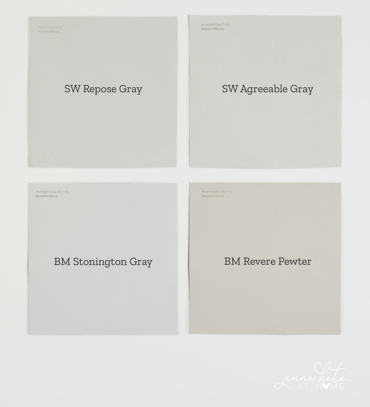
blue-toned gray; greige
This photo shows clearly the differences in tone between the 4 different types of colors:
- Top Left – Warm gray: Sherwin Williams Repose Gray
- Top Right – Warm gray that’s also sometimes a greige: Sherwin Williams Agreeable Gray
- Bottom Left – Blue-toned gray: Benjamin Moore Stonington Gray
- Bottom Right – Greige: Benjamin Moore Revere Pewter.
Clearly, you can see how much grayer Repose Gray is than Agreeable Gray, which is an equally popular color. It really depends on the look you want. If you very much want a gray on your wall that doesn’t look or feel cold, Repose Gray is the winner ever time.
Looking directly below, BM Stonington Gray is a medium gray with a blue undertone. When Repose Gray and Stonington Gray are side by side, it’s clear that Repose Gray has a lot more warmth to it, and this explains why it doesn’t come across as cold in a room.
If you want more warmth than that, I suggest using Agreeable Gray. It’s going to look grayer in cooler light and become a “greige” in warm south facing rooms, but it’s popular for a reason.
Comparing Agreeable Gray to Revere Pewter, you can see how it could fit into both the warm gray and greige categories, since it clearly has some grey in it. Conversely, Revere Pewter has a solid beige undertone and would never be mistaken for a basic gray.
What Are the Best Warm Grays and When it Comes to Paint Colors?
Now that you understand what a warm gray paint color is, let’s delve into the 3 that I personally recommend.
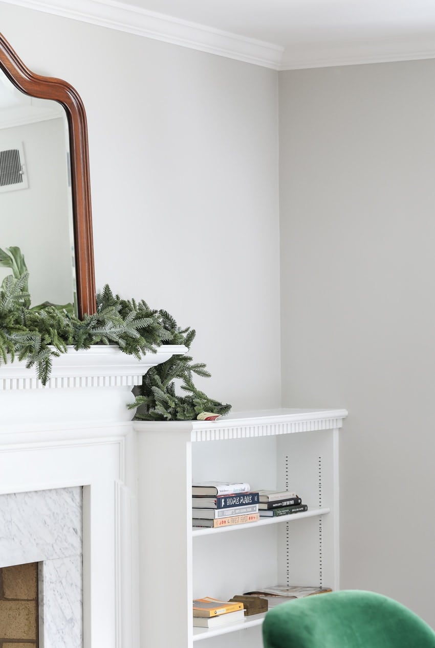
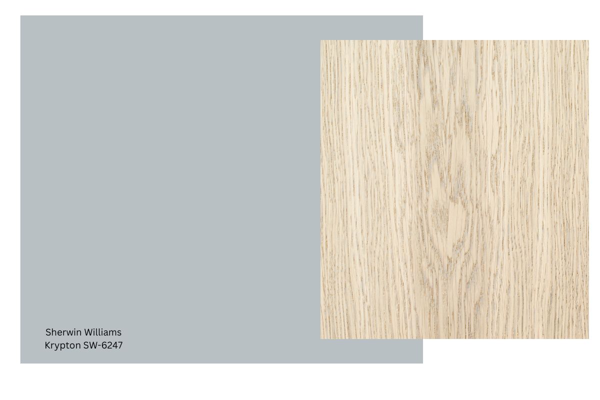
Sherwin Williams Repose Gray SW 7015
If you want a paint color that’s clearly gray but doesn’t feel cold and doesn’t shift blue, then Repose Gray is a winner.
When I did e-design, my clients loved it and I love it. In fact, it was the most popular color that I recommended. I’ve personally used it throughout my house, both at full strength and at half strength.
It looks amazing with medium to darker hardwood floors and when paired with crisp white trim. I’ve yet to see a space with it doesn’t work!
Depending on your light, it can pick up slightly cooler undertones. In a room with a lot of bright, cool light it will look decidedly grayer than in a south-facing room with a lot of warm light.
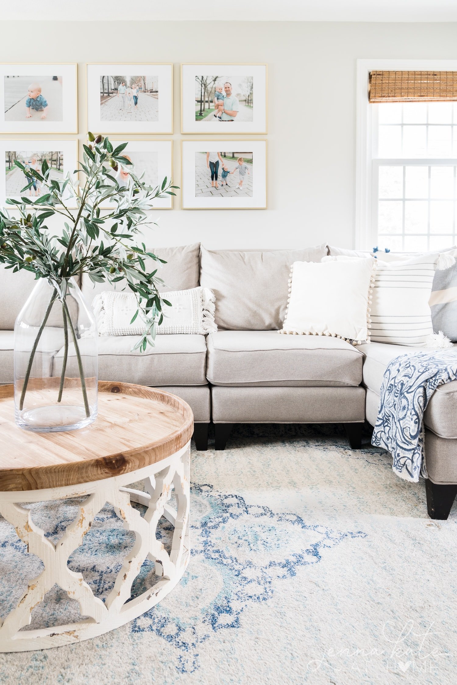
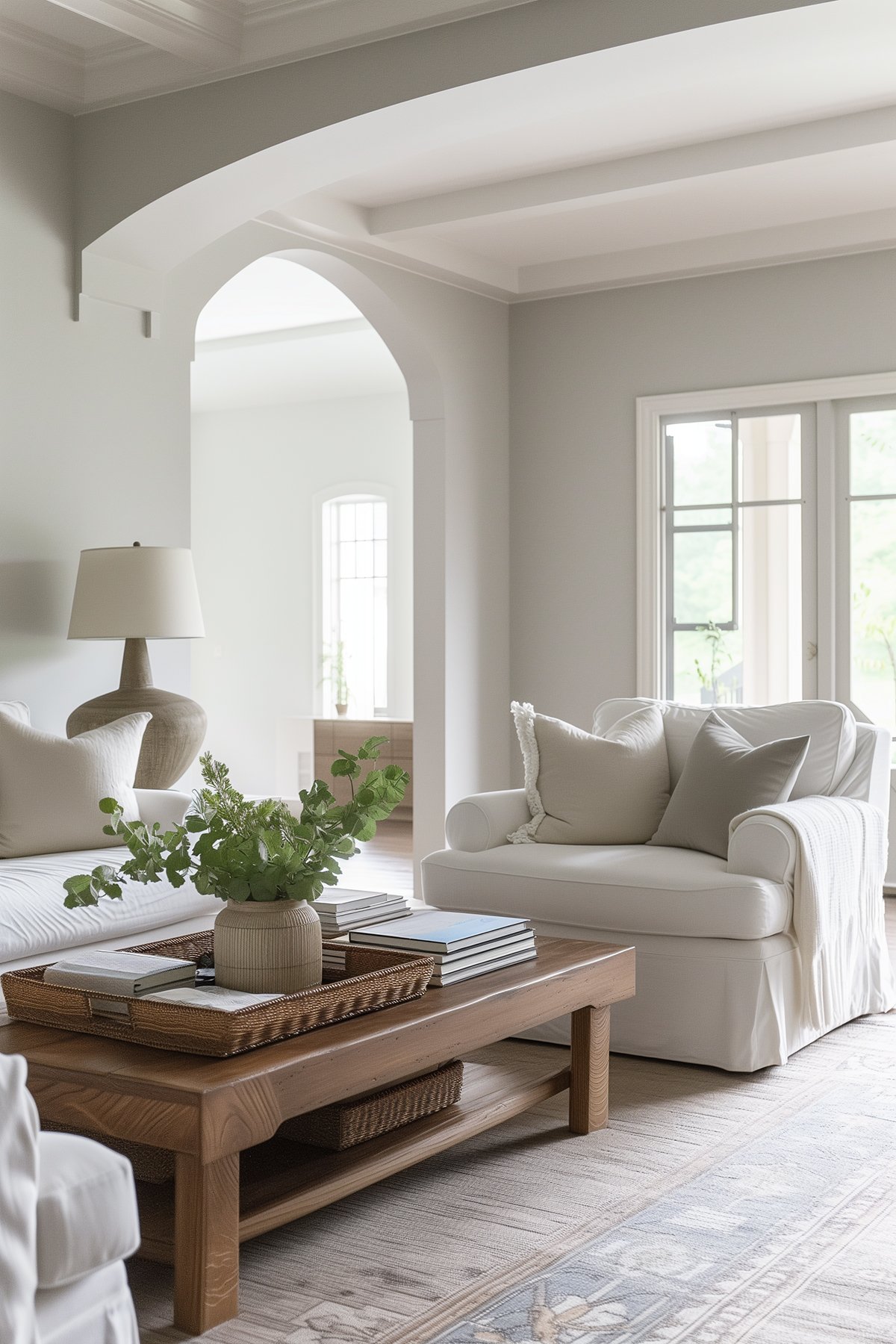
and the room on the left that’s cut off, is Repose Gray at half strength
In darker spaces (basements and hallways) you may spot a slight green undertone. You may be able to notice it on the wall with the mirror (above). My clients have also seen a slight purple undertone.
But don’t let that scare you! These undertones are very minimal and the average joe won’t ever pick up on them unless someone like me points them out to you!
Sherwin Williams Agreeable Gray SW 7029
Agreeable Gray is a beautiful choice when looking for a warm gray or greige paint color because it has virtually no unwanted undertones.
It’s a bit of a funny color in that sometimes it’s a warm gray – in rooms with cooler northern light or lower light spaces, and in south facing rooms the warm sunlights brings out the beige undertone enough that it becomes a greige.
It’s a light – medium toned gray. It has just enough color so it doesn’t take over the room, yet still has enough contrast against white trim that we all really like.
It’s a great choice if you’re undecided about a grey or greige as it skirts the line between both. Along with Repose Gray, it’s one of the best selling Sherwin Williams paint colors.
Sherwin Williams Colonnade Gray SW 7641
A lovely warm gray that really pops against white trim. It’s got a creaminess to it without being too warm – and it still maintains just enough gray.
Like all the warm grays, the warmth is more exaggerated when the room naturally has more warm light, and conversely, you’ll see more of the gray in a darker room or a room with a northern exposure.
I love this color in dark rooms, though, it really lightens and brightens the space and the warmth in it ensure that the gray never feels cold.
Final Thoughts
No matter which color you end up choosing, please test them out in your home before committing. There’s nothing worse than spending a whole afternoon painting only to realize the color doesn’t work in your home.
So many factors play into whether a color with work – the lighting in your room, existing furniture and fixtures and even what’s outside the window!
Narrow your choice down to a couple of paint colors, buy sample pots (or use a service like Samplize) and pay attention to how the color looks against your furniture, on different walls and at different times of the day.
If this post doesn’t have you set on a warm gray color, check out my other posts on The Best Gray Paint Colors for Your Home and the The Best Greige Paint Colors For 2020. Something else might pique your interest.
These Sherwin Williams Warm Gray Paint Colors are no doubt my favorites, and my 3 go-to colors. But if you have another favorite, I’d love to know! Drop me a line in the comments :-)
Don’t Forget To Always Use Real Paint Samples!
Don’t forget – no matter what you’ve read or photos you’ve seen online, it’s really important to sample paint colors in your home before committing!
Samplize provides peel and stick paint samples made with real paint, that are easy to move around your home, and cheaper than buying a gazillion paint pots! It’s the only way I buy paint samples.
I have my bedroom in Sherwin Williams relaxed khaki. Does the master bath necessarily have to remain the same color. I am looking at the agreeable gray for walls in bath. My vanity cabinets are a darker brown with reddish tones. I also intend ta change floor covering as what I have is too gold. Should I stick with darker color like cabinets for floor or look for something that has some gray tones? the vanity is going to be white quartz.
Definitely does not need to be the same color, but should be cohesive.
Hello,
Love the warm greys. We have a craftsmen house and are looking for 3 colors. One for the top half which are cedar shingles, bottom half is clapboard and then the trim and porch floor. Any suggestions? So far we picked Peppercorn for top, Repose Gray or Light French Gray for bottom and Alabaster for trim.
I am looking for a very light grey exterior paint for my Charleston style stucco townhome. What would you recommend? I want it to be light, airy, beachy and sophisticated feel. The house has white trim and white corner squares.
BM Gray Owl is a lovely light gray!
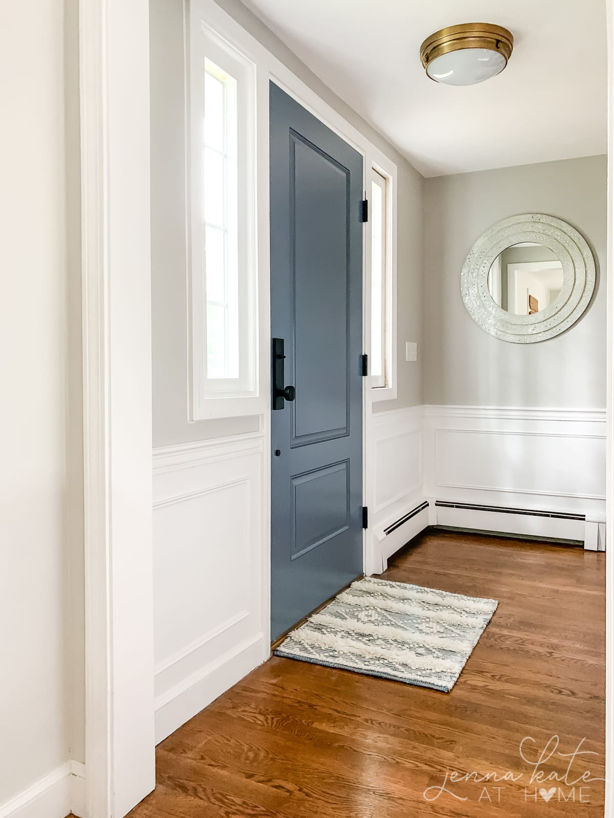
That color on the door is gorgeous, love it. How close is the mineral gray to the factory color?
Hi Jessica – it’s not quite as blue. I’m going to bring a swatch of the door color to SW and see if they can get a more accurate color match for me.
Hi! Did you ever find out the color of the door? Were they able to match it at SW?
Hi! Yes, it color matched to BM Britannia Blue
What colour is your ceilings and trim? And is it a warm or cool white?
Ceilings are a standard off the shelf white ceiling paint. Our trim is SW Pure White which is a pretty neutral white – has some warmth and a bit of gray to cool it down. It works well with both warm and cool colors.
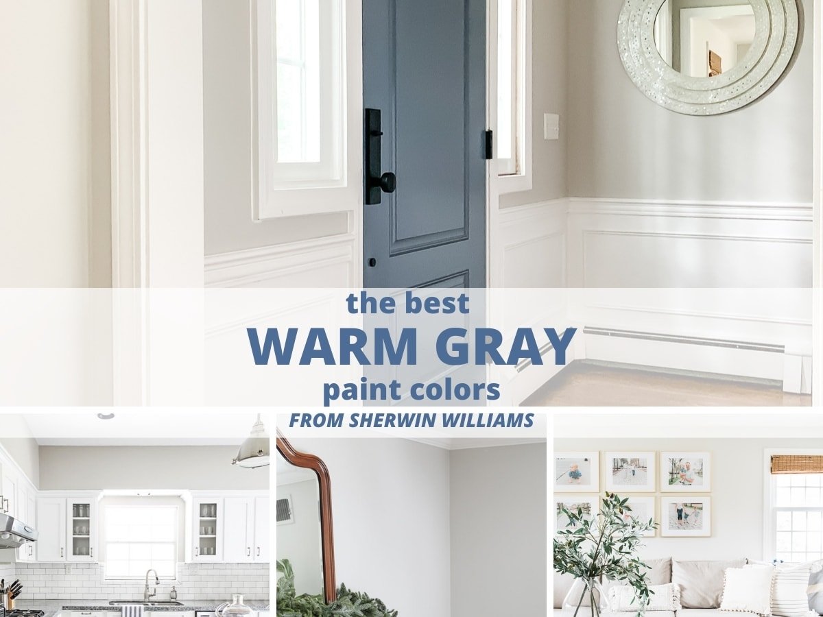
What is the paint color on the front door in the photo above (repose gray walls)?
Hi Jennifer – it’s a factory finish, unfortunately. Our old door was SW Serious Gray (which looks amazing with Repose Gray). The closet color to this factory finish would be SW Mineral Gray
Agreed the door is beautiful, I would lii look ve to paint my island that color