Content may contain affiliate links. When you shop the links, I receive a small commission at no cost to you. Thank you for supporting my small business.
Make the most of current home décor color trends to create the vibrant, modern spaces you’ll love to live in.
Color is deeply personal. While you may subscribe to practices like feng shui that tie specific colors to a desired ambience, or you might have a background in art that gives you some mastery over the color wheel, the truth is that we’re drawn to certain colors for different reasons, some of which are biologically ingrained, and others that are entirely personal in nature.
When it comes to incorporating color trends in your home, there are a few things you need to consider.
First, you have to weigh the potential longevity of trends – whether they’re timeless or just a passing fad. This will give you clues as to the best ways to include them in your home décor colors (with long-lasting paint or furnishings, or via easy-to-replace accessories, for example).
From there, you must consider how you connect to colors emotionally and whether they reflect your personal style sensibilities.
Here are just a few timely tips and tricks for incorporating trending colors in home décor:
Comparing Home Decor Color Trends
The thing you have to remember when perusing trending color palettes is that they’re designed to act as a guide. Talented designers create trending palettes to show homeowners what is possible.
If you fall in love with a palette, there’s no reason not to use it in your home, but they’re meant to provide inspiration, not necessarily serve as the authority on precise color and interior design choices.
Most paint companies release new palettes annually, with schemes that account for current trends and incorporate what they forecast to be trending in the coming year, often based on consumer feedback and other design fields.
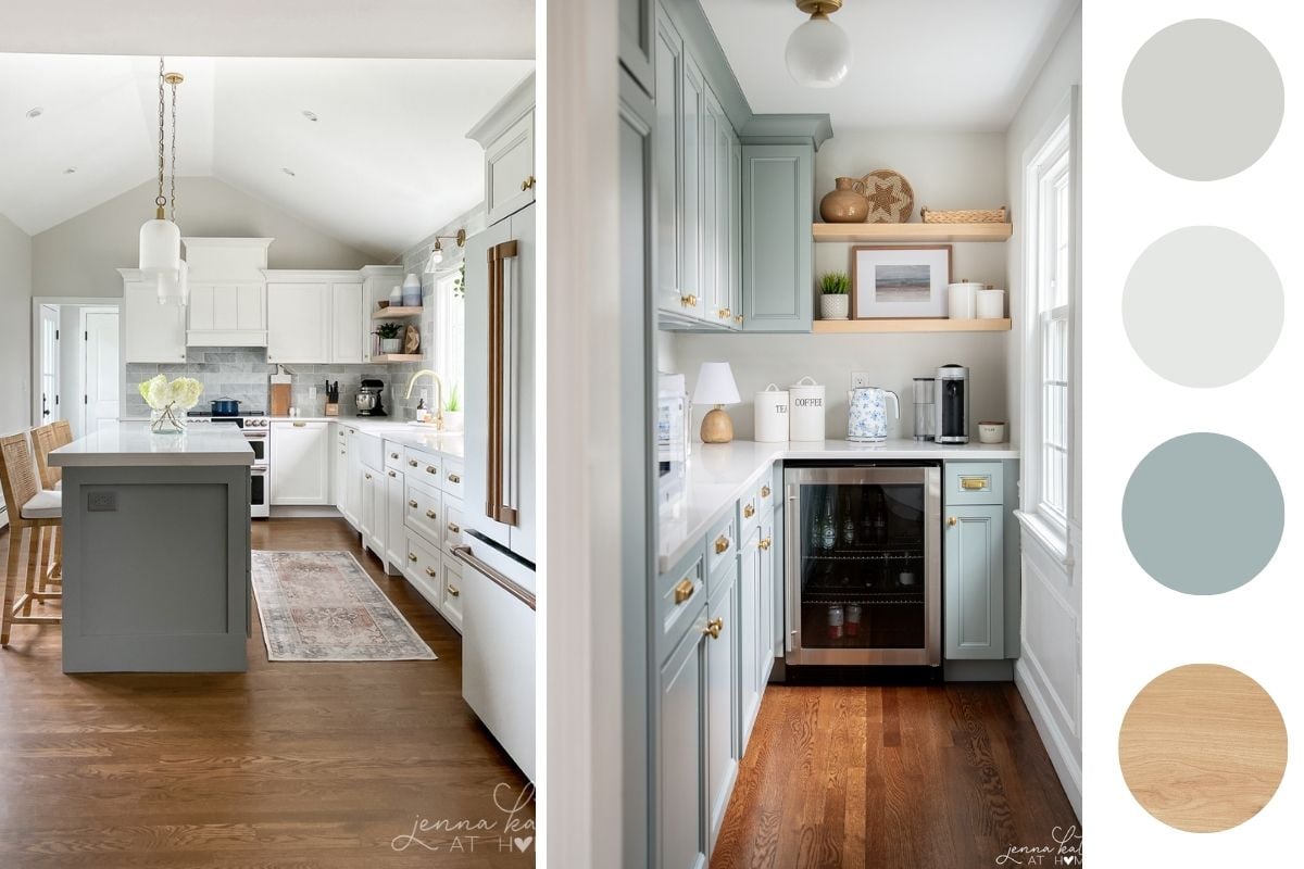
For example, the cool grays that dominated the last decade as the “it” neutral are currently skewing warmer, with greiges (a combination of gray and beige) gaining popularity. Many homeowners who have tired of cool palettes but don’t necessary want to rely on outdated beige tones are finding a happy medium with these warmer greige tones.
The other thing to consider about trending paint palettes is that they include home décor colors that have some lasting appeal. Not everyone wants to repaint every year when new color trends emerge, so palettes are carefully coordinated with shades that will remain attractive for at least a few years.
In other words, you may want to at least be cognizant that using a saturated accent color as your main wall color instead of the recommended mid or light tone could impact relative longevity of appeal.
Don’t forget, the sheen of paint can impact the overall appearance, as well. While picking a sheen is often a practical matter, it can also be used to add visual interest, say if you want white trim to stand out against white walls.
Incorporating Modern Color and Interior Design into Your Home
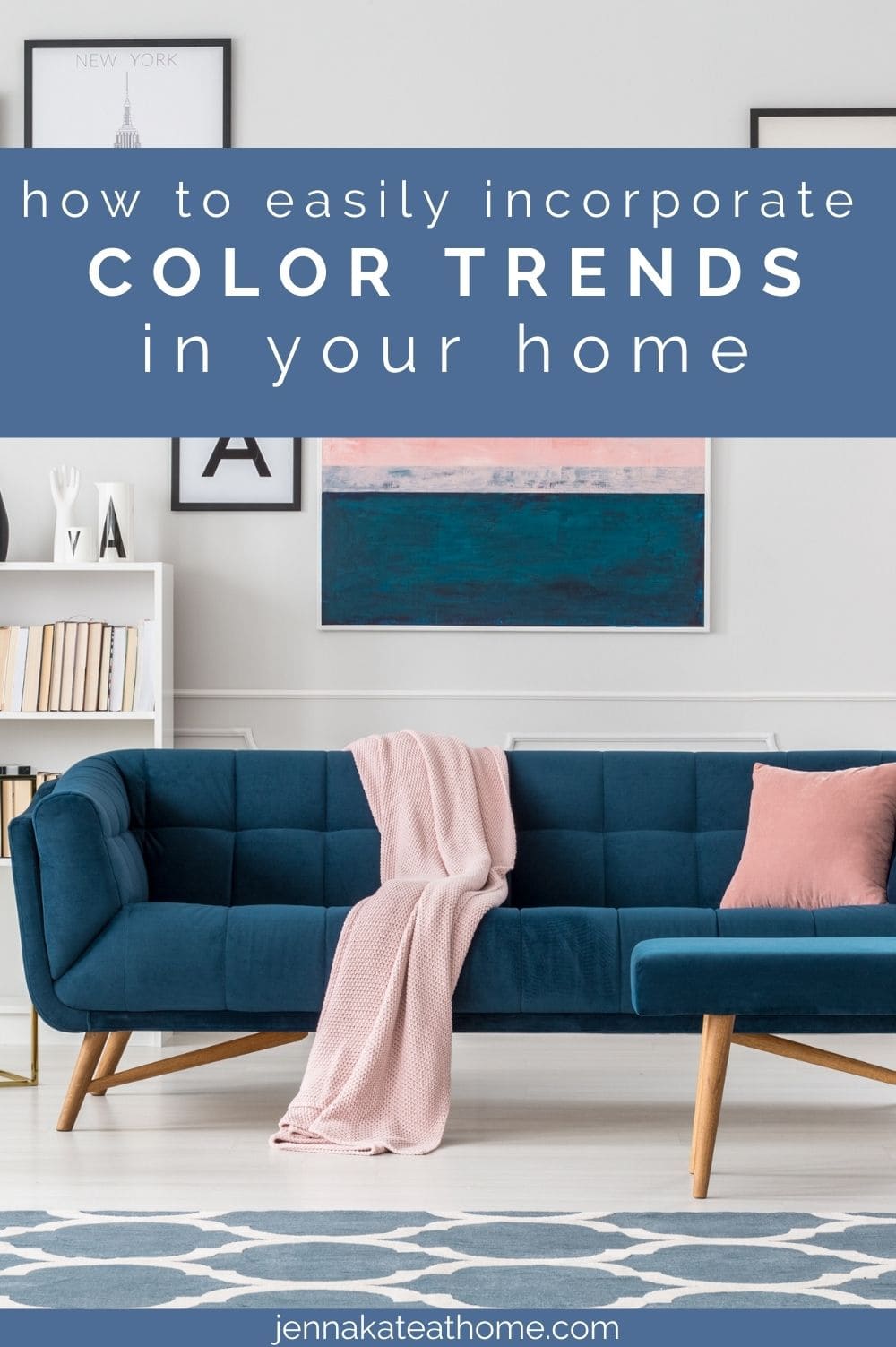
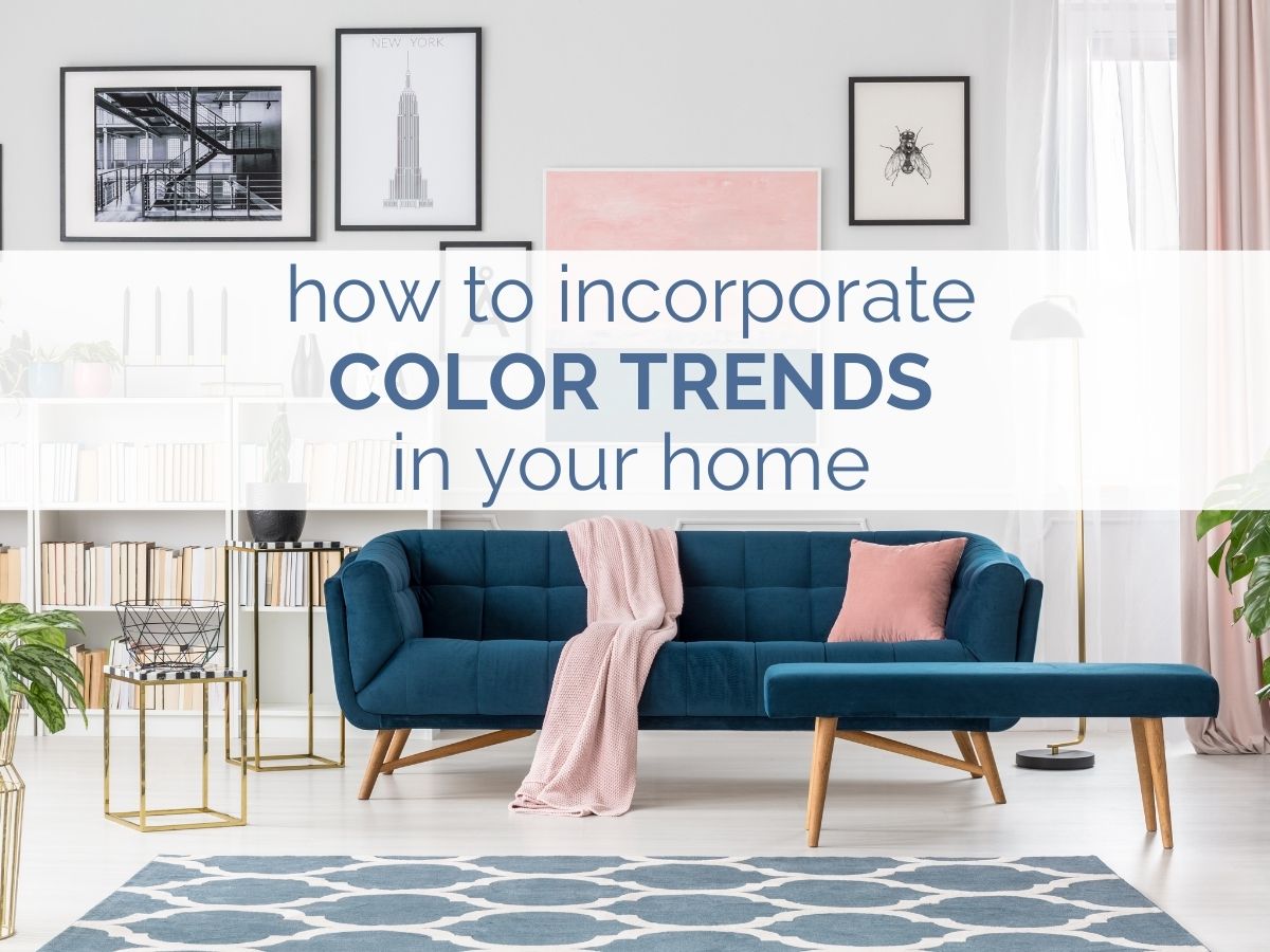
Once you start perusing trending colors in home décor, you’re likely to discover that you lean toward certain palettes. You may prefer warm or cool hues, or you might gravitate toward specific colors like reds, blues, greens, or purples. You might like saturated jewel tones, or find that pale pastels hold greater appeal.
Regardless of your personal preference, there are simple ways to incorporate the of-the-moment colors you love into your design without fear.
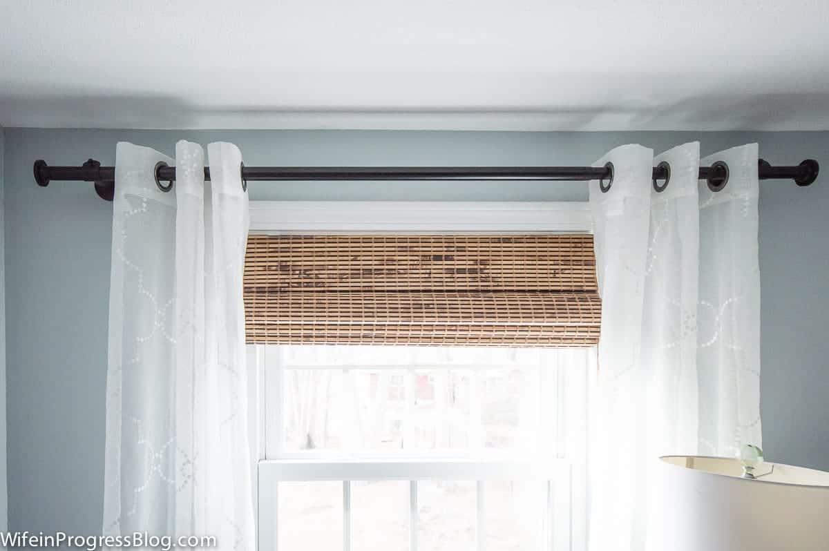
Neutrals
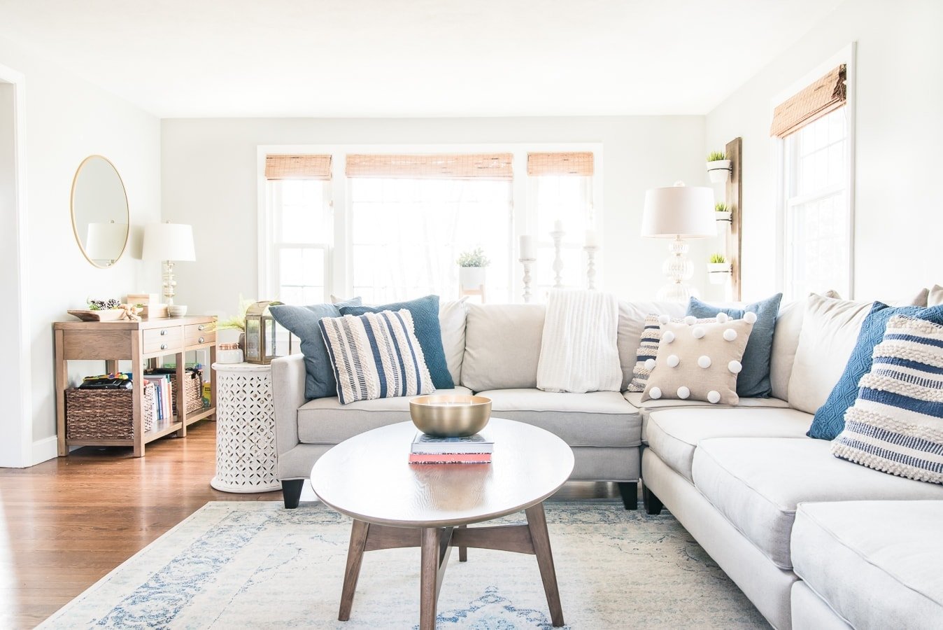
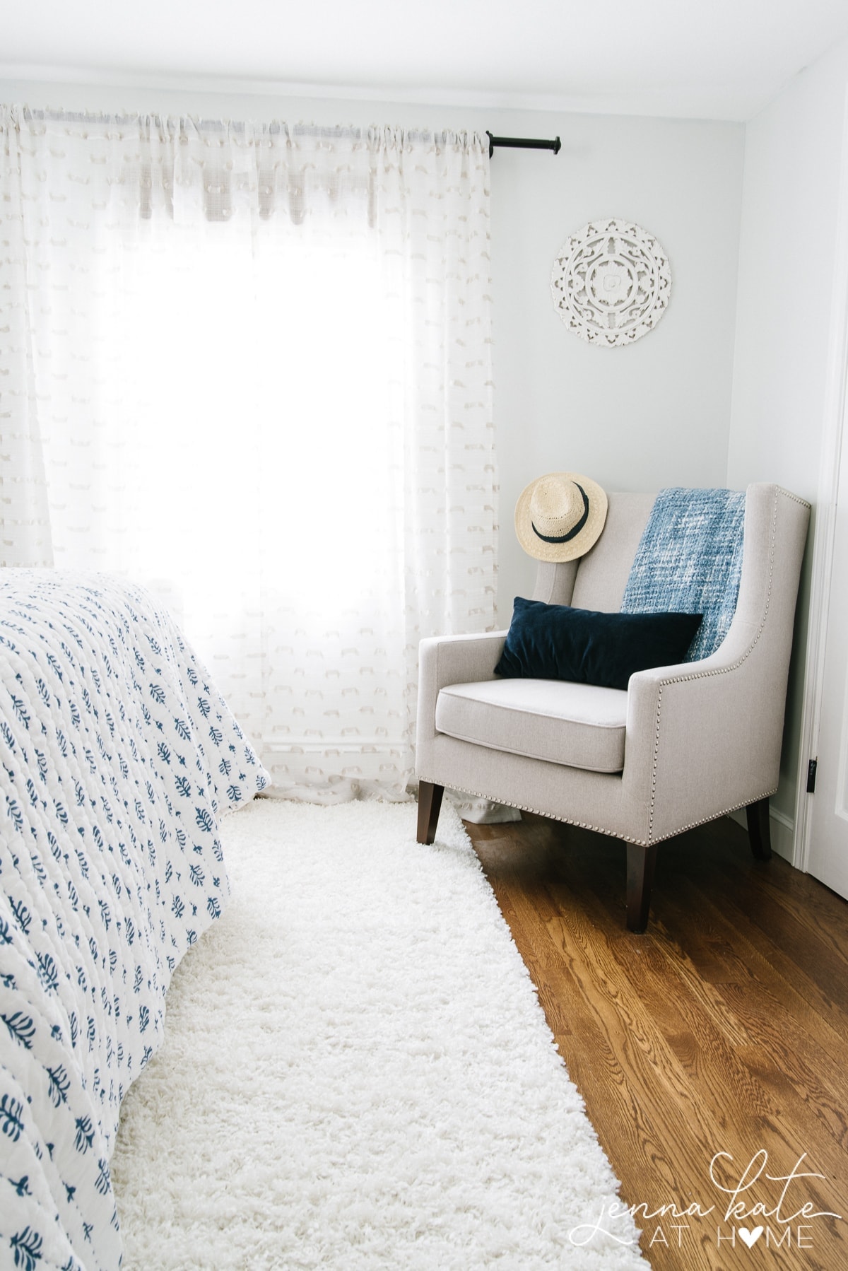
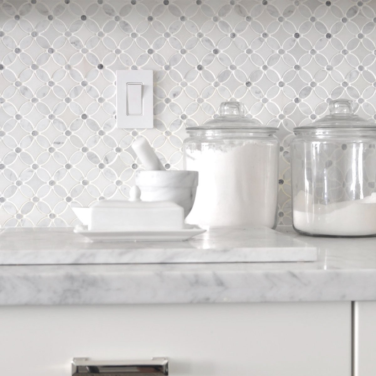
Neutrals are a safe choice because they go with everything, they’re generally non-offensive, and when it comes to resale, they present a blank canvas that lets prospective buyers more easily picture the potential in the space. As a result, it’s easy to use neutrals throughout the home.
They’re a great option for the majority of wall space, especially if you’re not keen to repaint frequently as color trends change and/or you have a lot of bright, bold furniture, artwork, and accessories you want to display.
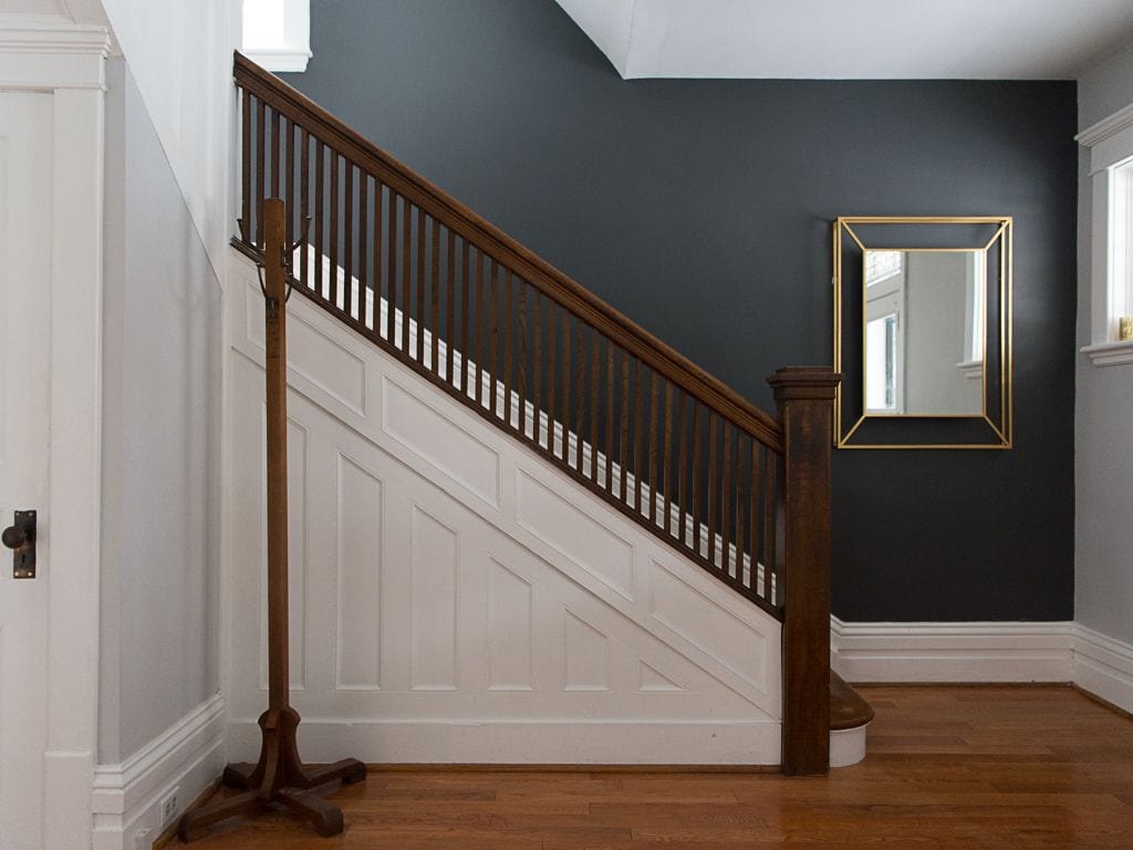
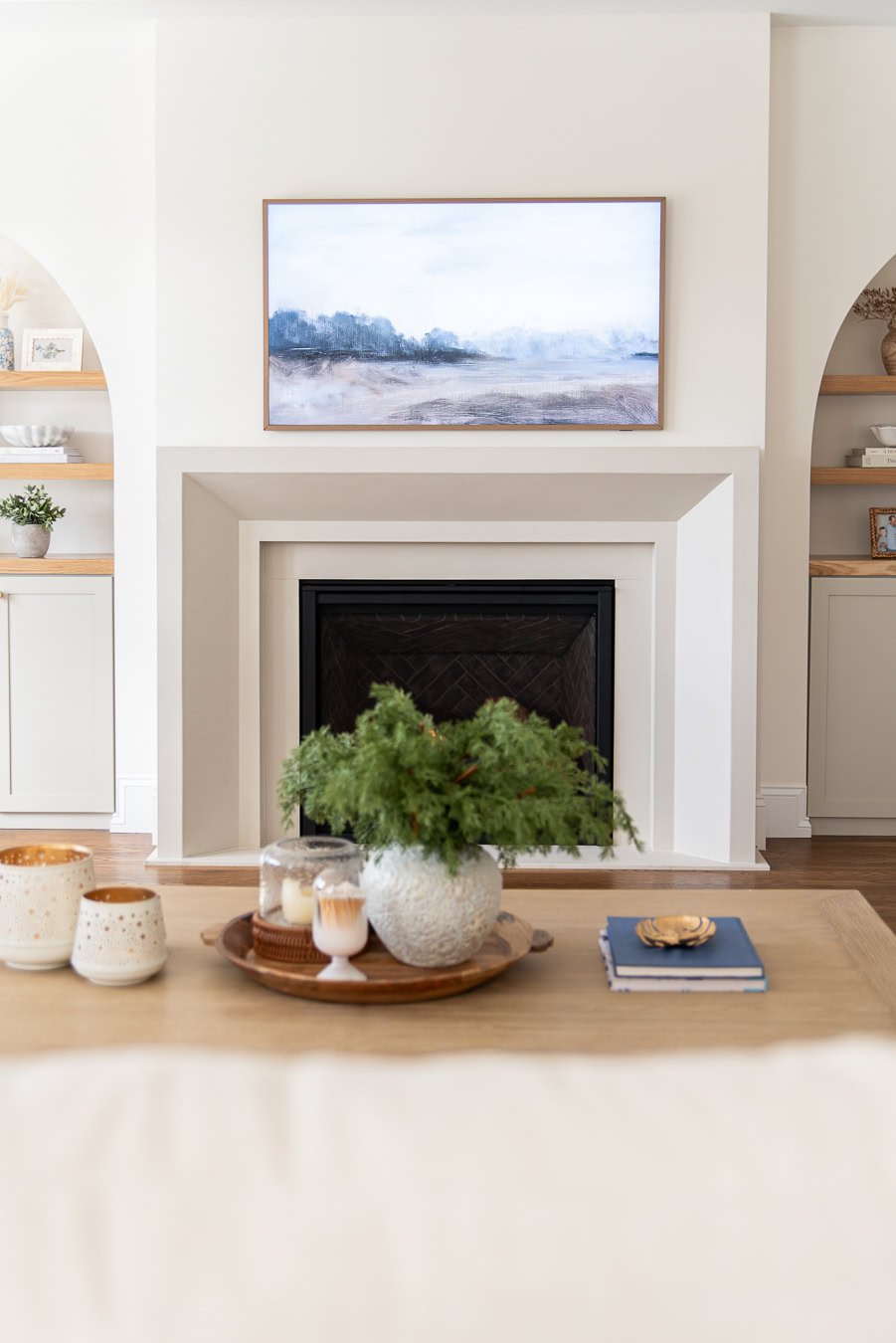
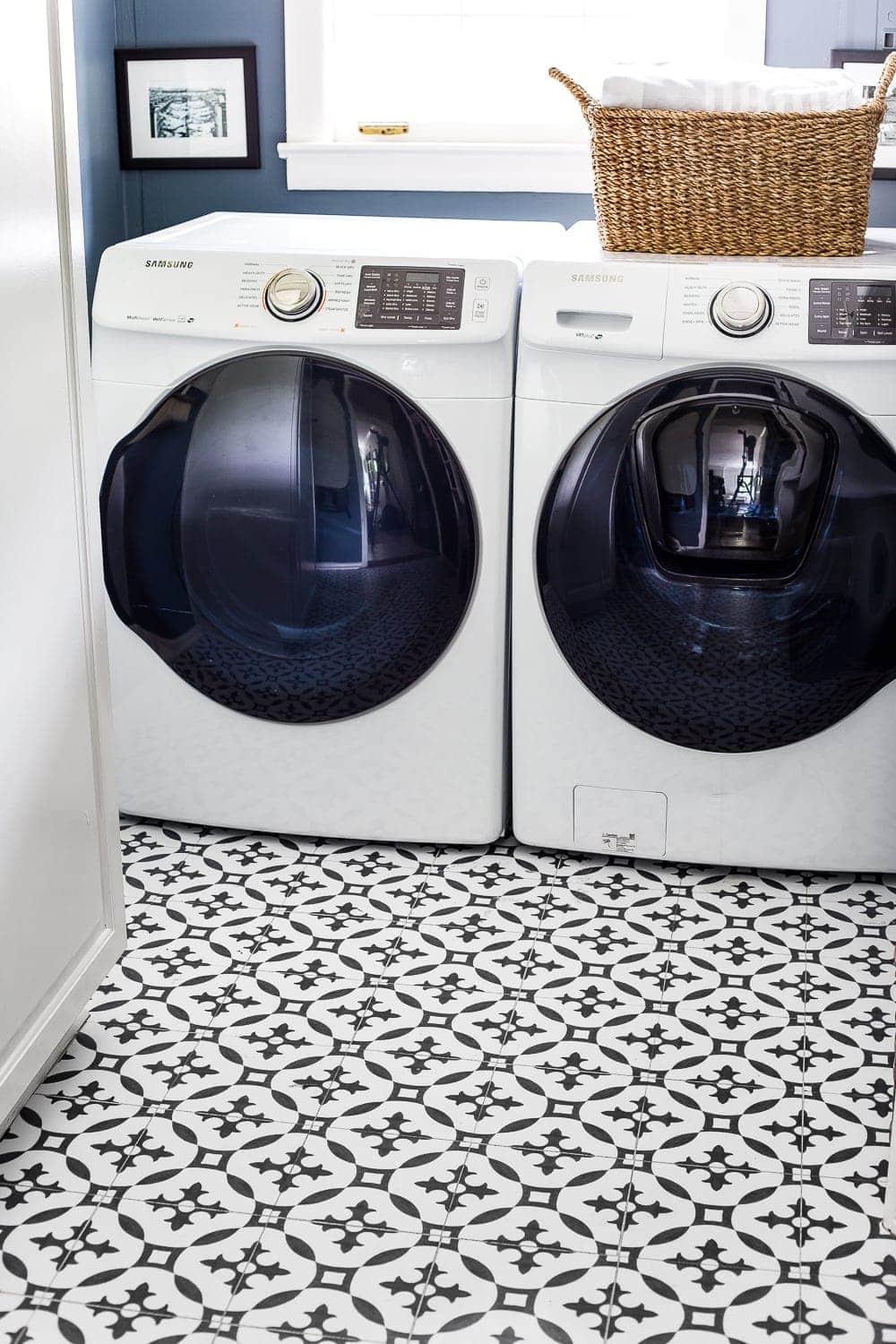
Even more saturated neutrals, like blues and grays can act as a suitable backdrop for your household décor.
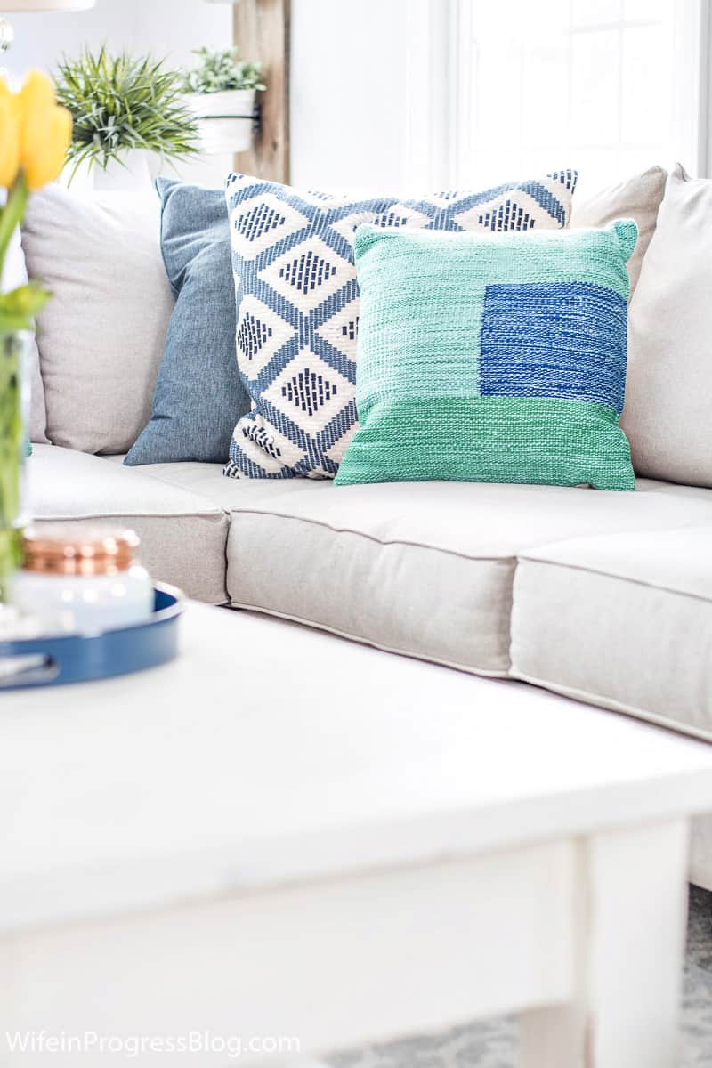
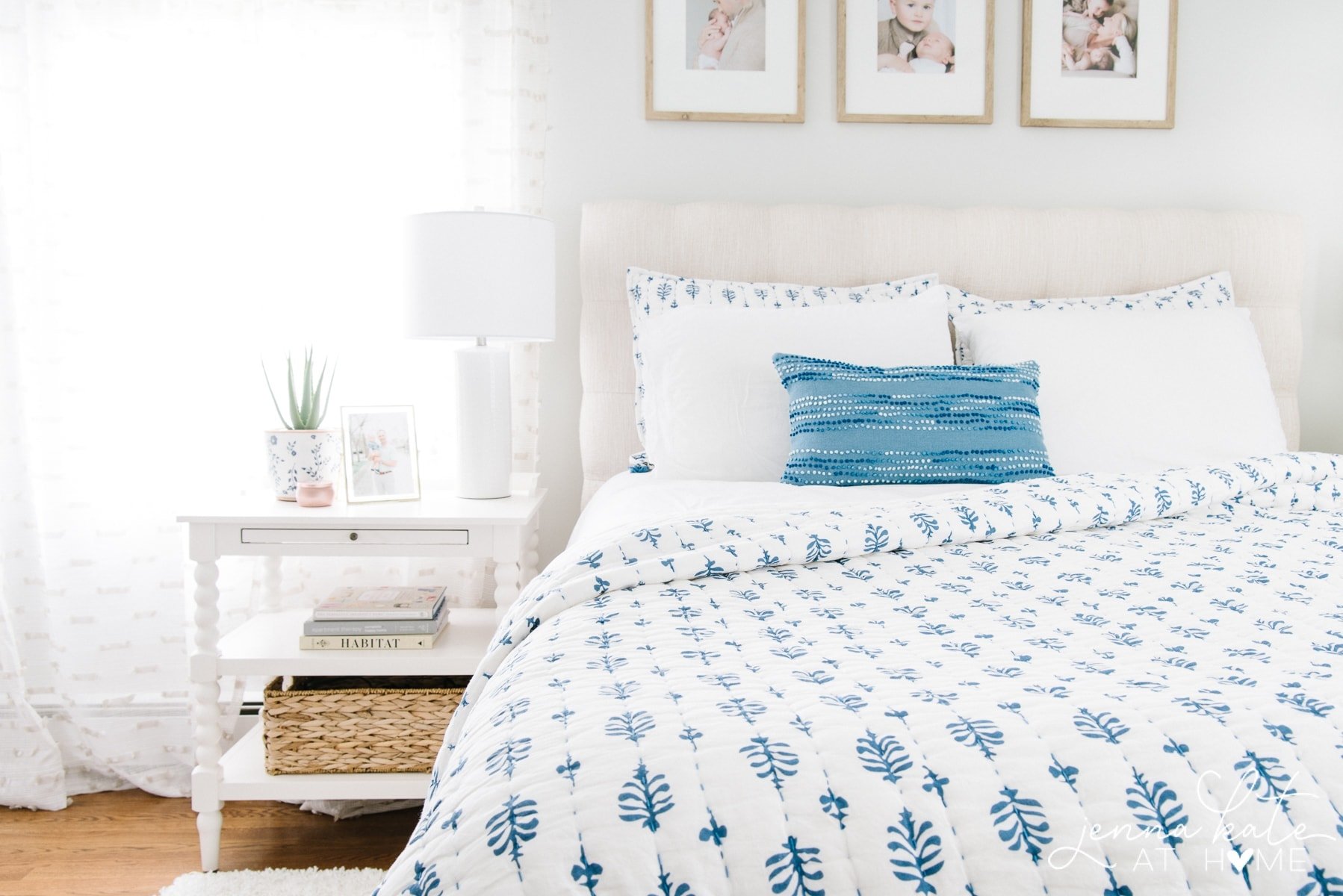
Starting with a neutral base on walls makes it much easier to incorporate new and different colors into your home decor. Simply by switching out pillows, mixing and matching patterns to add interest and layered in throw blankets or a rug, you can transform the entire color palette of a room from soft and passive, to bold and vibrant.
Simply by switching out pillows, throw blankets or a rug, you can transform the entire color palette of a room from soft and passive, to bold and vibrant.
Bold Colors
This is where you can have some fun with color and interior design, but you also need to be somewhat cautious. It’s all too easy to go overboard when you start adding too many bright, saturated colors to your space.
If you want to experiment, there are ways to do it without too much commitment. For example, adding an accent wall is an excellent way to try out a bold color in a bedroom or family room with minimal effort and expense.
It creates a focal point and if you end up hating it, or you’re over it in a year or two, it’s easy enough to push the furniture to the other side of the room and quickly repaint just one wall.
You can also skip the paint and experiment with bright or deeply saturated hues through accessories like rugs, drapes, lamps/lighting fixtures, pillows and throw blankets, artwork, and even furnishings that are relatively easy to replace.
Consider choosing one core color to use throughout your home to create a more cohesive design and avoid a mish-mash of brights that could become overwhelming.
When you maintain a neutral base, it’s easy to change out your core color and accents as trends change.
One great option is pillow covers in bold hues. If you tire of them or color trends shift dramatically, you can strip them off and replace them at relatively little expense.
Monochromatic Schemes
If you’re hesitant to go too crazy with color, you can create major impact, without major drama, by choosing a monochromatic palette. Whether you go with neutrals or more colorful options, choosing saturated, mid, and light tones in the same color family allows you to add visual interest and differentiate zones within rooms.
The upside is an effortlessly cohesive design that adds understated appeal and a professional vibe to your interior.
Emotion and Home Décor Color Trends
There’s no denying that home décor colors can elicit emotion. Adding hot pink, tangerine, or zesty yellow to an office can stimulate joy and creativity, while soothing blues, greens and grays can lend your bedroom a truly relaxing vibe.
Choosing the home décor color trends that are right for you starts with comparing trending palettes, considering where to infuse trending colors in your design, and considering how certain colors make you feel, or alternately, the ambience and emotion you hope to create in your space.
You never want to choose a palette just because it features trending colors in home decor. Make sure it speaks to you on a personal level, or you’re likely to end up longing for a change sooner rather than later.


Great series Jenna! Very informative and helpful. THANK YOU!
Thank you, Lilly! I’m so happy you found it helpful!