Content may contain affiliate links. When you shop the links, I receive a small commission at no cost to you. Thank you for supporting my small business.
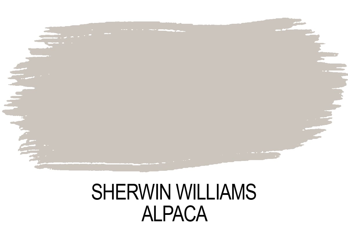
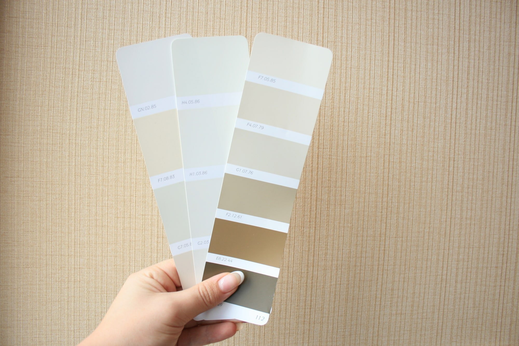
Sherwin Williams Alpaca (SW 7022) is a warm greige paint color that lives right between gray and taupe. It’s soft, subtle, and sophisticated, but also a little tricky. With shifting undertones that can lean brown, taupe, or even violet, Alpaca is a true chameleon.
If you’re considering Sherwin Williams Alpaca for your walls, trim, or exterior, this review covers everything: undertones, lighting, best uses, comparisons, and real-life examples
What Color is Sherwin Williams Alpaca?
Alpaca is often described as a greige with taupe leanings. It’s warmer than a traditional gray, but not as beige as many other greiges. Depending on light and surroundings, it may look:
- Gray with warmth in cooler light
- Taupe with violet undertones in warmer or mixed light
- Neutral and soft when paired with the right finishes
This complexity is what makes Alpaca appealing, but also why it can be challenging.
Alpaca’s Undertones
Alpaca is not a flat, simple gray. Its undertones are what set it apart:
- Taupe-brown undertones in bright, warm light
- Violet undertones that appear in low light or with certain furnishings
- Occasionally, a pinkish cast – especially on exteriors
This makes Alpaca a love-it-or-leave-it shade. If you’re sensitive to purple undertones, this may not be your perfect neutral.
What’s The LRV?
Alpaca has an LRV (Light Reflectance Value) of 57.
That places it in the light-medium range: bright enough to keep a space feeling airy, but with enough body to contrast against white trim.
How Lighting Affects Alpaca
Lighting is everything with Alpaca.
- North-facing rooms: Alpaca looks cooler, more gray, and slightly muted.
- South-facing rooms: Expect more taupe warmth and violet undertones to show through.
- East-facing rooms: Warmer in the morning, grayer in the afternoon.
- West-facing rooms: Cooler during the day, then shifts warm and taupe by sunset.
Tip: Always test Alpaca with large paint samples on multiple walls. It will not look the same at every hour of the day.
Best Trim Colors for Alpaca
Alpaca pairs beautifully with clean whites. Try:
- Sherwin Williams Pure White (SW 7005): A crisp, modern white that highlights Alpaca’s softness.
- Sherwin Williams Alabaster (SW 7008): A warmer, creamy white for a softer, more traditional look.
Tip: Avoid yellow-based creams, which can clash with Alpaca’s violet undertones.
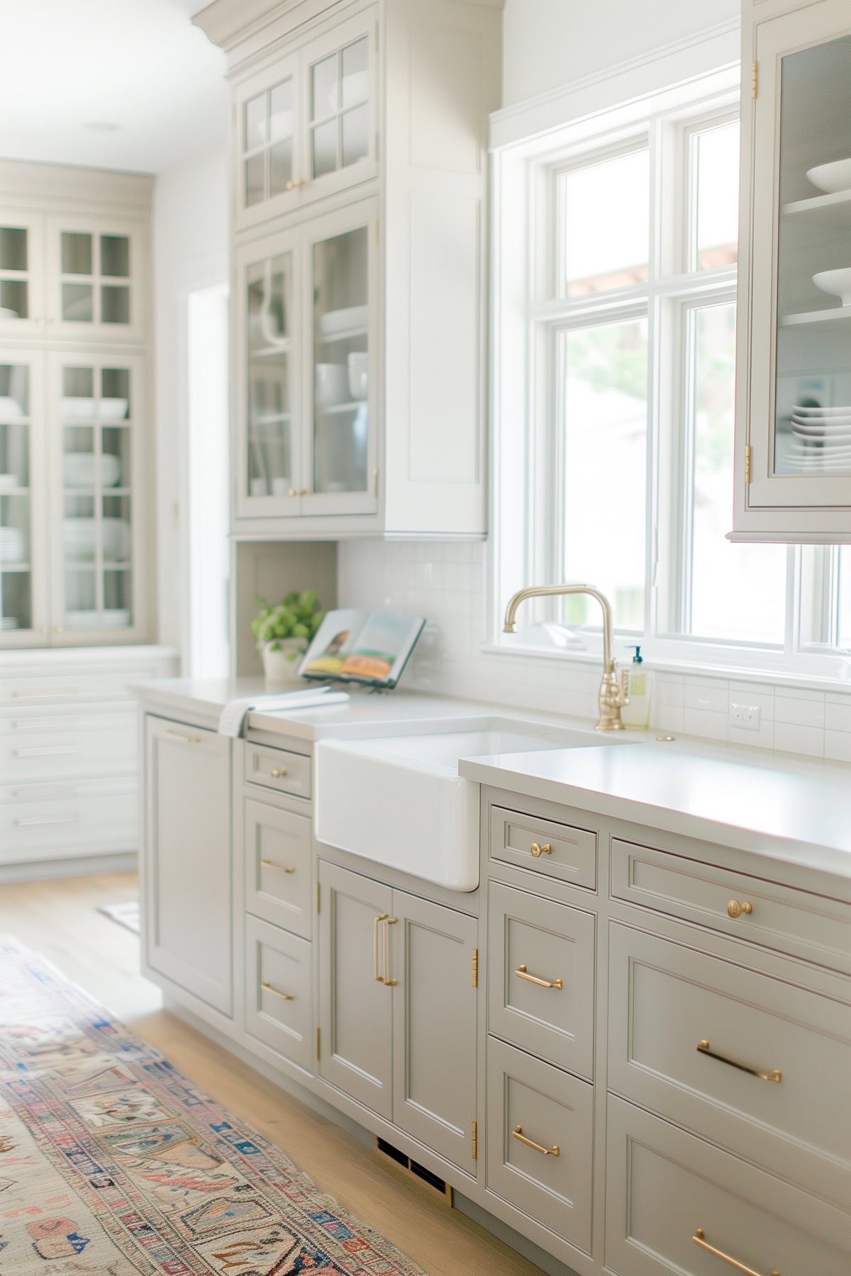
Where to Use Alpaca
Best Rooms for Alpaca:
- Bedrooms and nurseries (soft and calming)
- Bathrooms with natural light
- Dining rooms and living rooms with wood tones
- Kitchen cabinetry paired with clean whites or darker accents
Avoid Alpaca If:
- You have cream or yellow undertones in your trim or finishes
- You dislike purple undertones
- You want a completely neutral, “undertone-free” paint color (this doesn’t actually exist, but there are colors with less strong undertones!).
Alpaca for Exteriors
Alpaca is a risky exterior color. While it may appear beige on a paint chip, outdoors it often flashes purple or pink, especially in direct sunlight.
Exterior alternatives to try instead:
- BM Thunder (AF-685): A deeper greige that resists undertone shifts.
- SW Requisite Gray (SW 7023): Similar undertones but deeper and more stable outside.
- SW Jogging Path (SW 7638): A greige that leans more beige than violet.
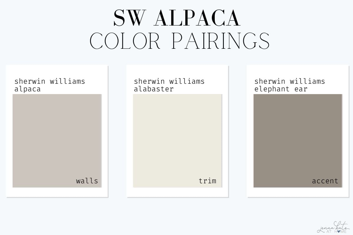
Color Pairing Palettes for Alpaca
Here are some simple palettes to make Alpaca shine:
1. Soft & Warm
- Walls: SW Alpaca
- Trim: SW Alabaster
- Doors/cabinetry/accents: SW Elephant Ear
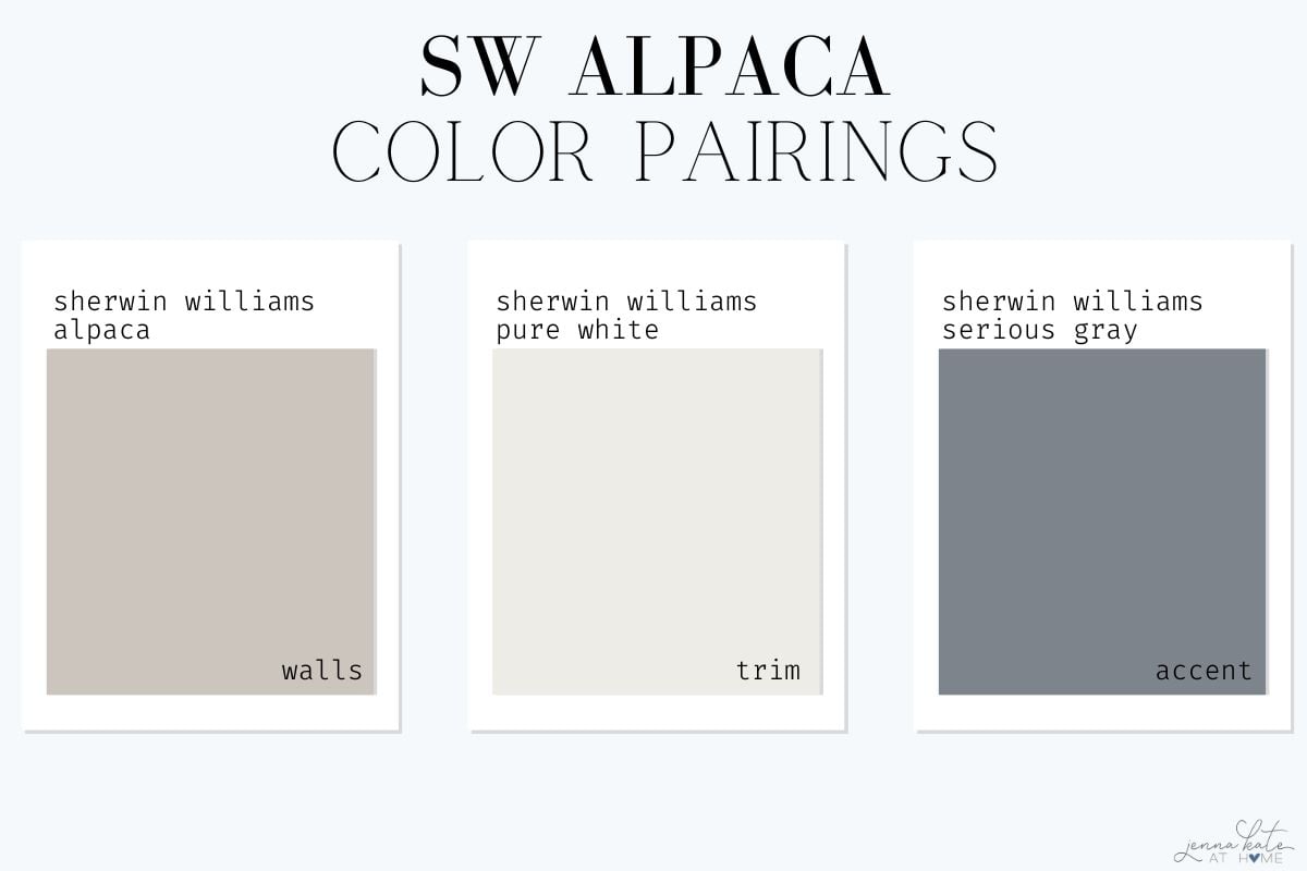
2. Crisp & Modern
- Walls: SW Alpaca
- Trim: SW Pure White
- Doors/cabinetry/accents: SW Tricorn Black
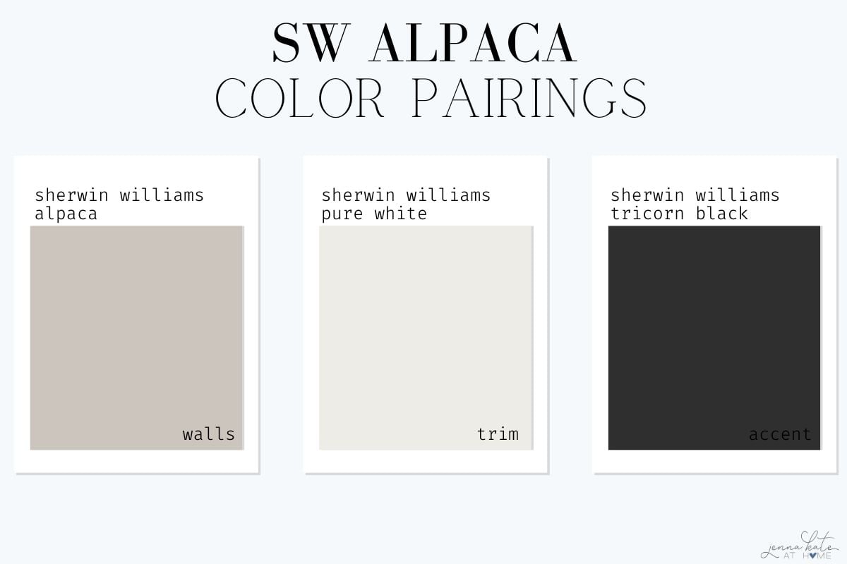
3. Cozy & Muted
- Walls: SW Alpaca
- Trim: SW Pure White
- Doors/cabinetry/accents: SW Serious Gray
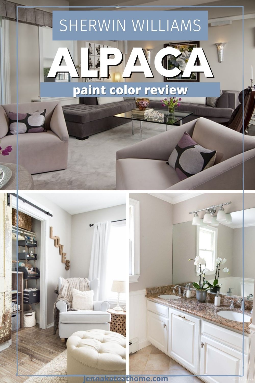
Real Room Examples
Here are some examples of Alpaca in different spaces so you can get an idea of how it looks. Most neutral paint colors can be used in a wide array of spaces.
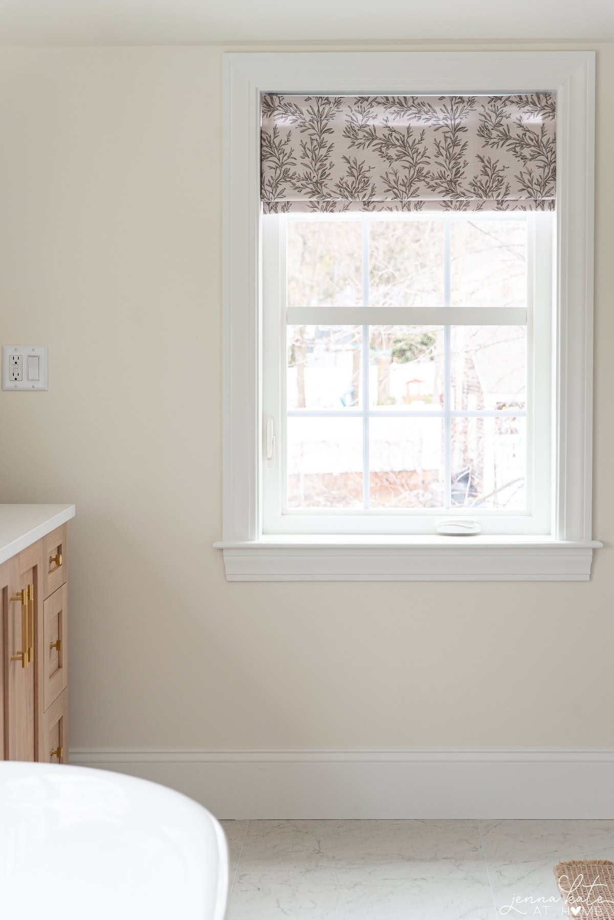
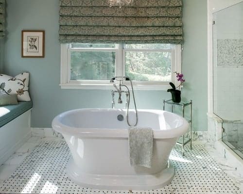
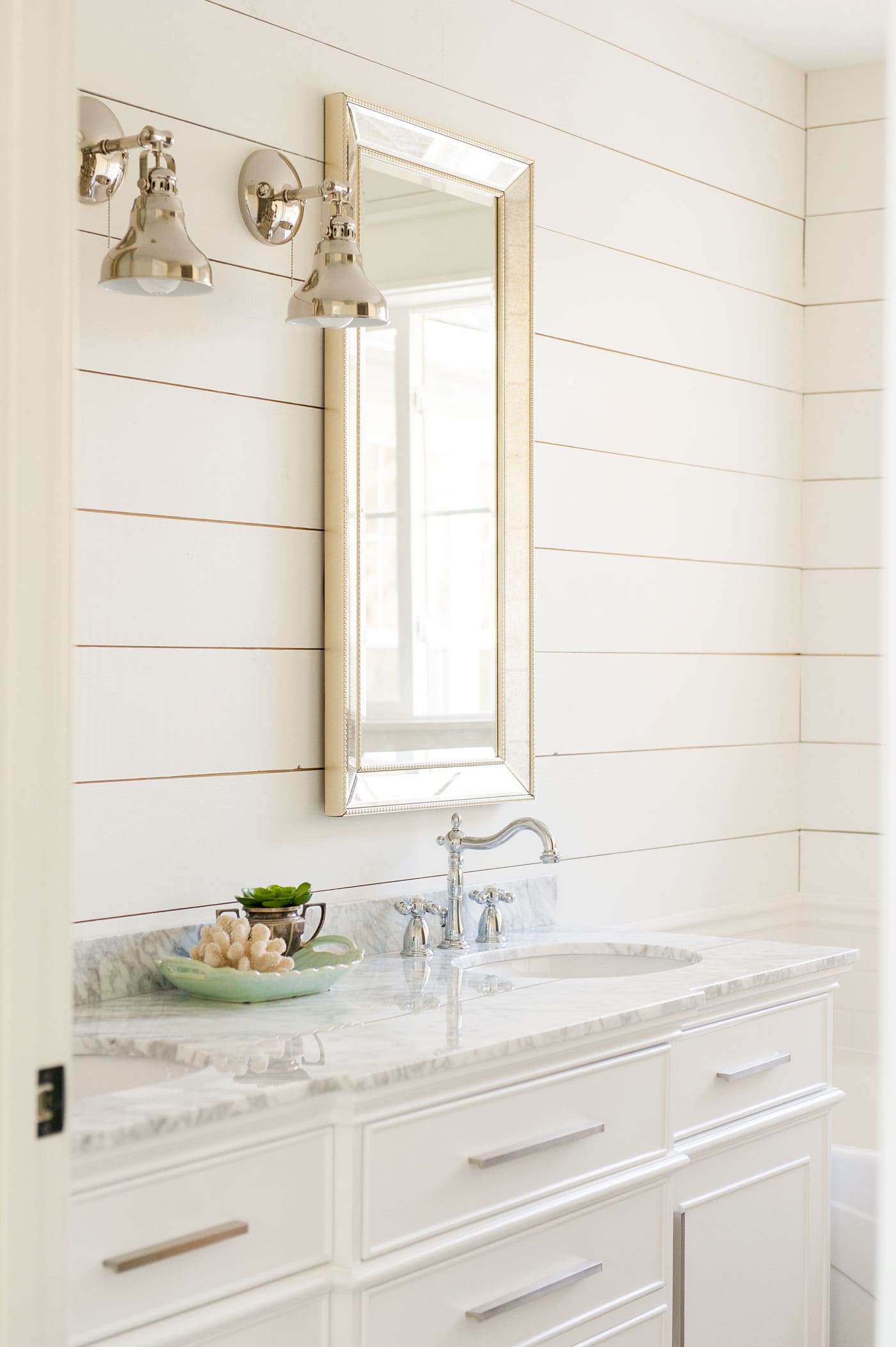
Bathroom
In this bathroom, Alpaca adds warmth against the natural wood tones while still keeping the space feeling soft and neutral.
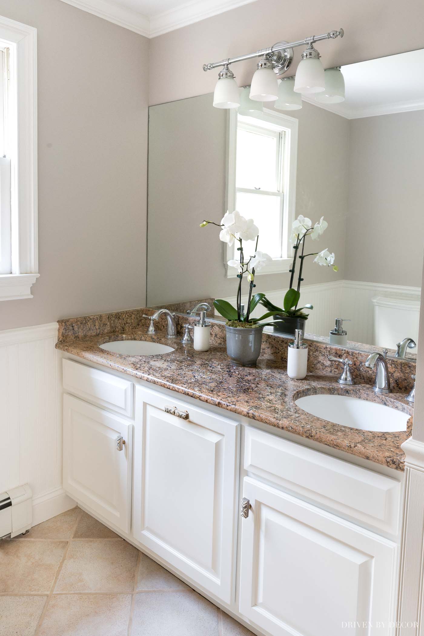
The violet undertones are visible but balanced by crisp white trim, which keeps the overall look fresh and not too heavy.
It’s a good example of how Alpaca can complement earthy finishes without looking dull or muddy.
Nursery
Here, Alpaca reads as a warm gray thanks to the abundance of natural light.
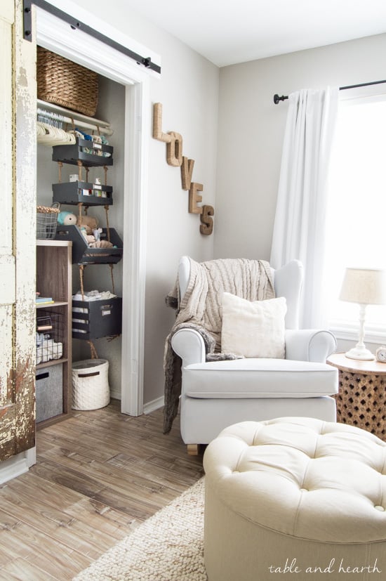
The brightness softens the undertones, making the room feel calm, airy, and inviting – perfect for a nursery.
This shows how Alpaca can shift toward a more neutral gray when the lighting is just right, especially in rooms where you want a peaceful, gentle vibe.
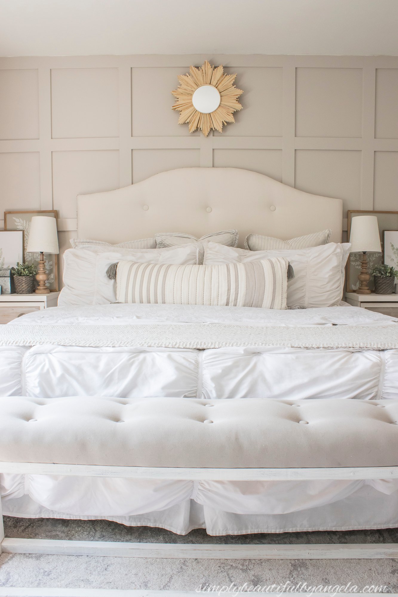
Living Room
In this living room, Alpaca takes on a deeper, more taupe appearance with its violet undertones showing through.
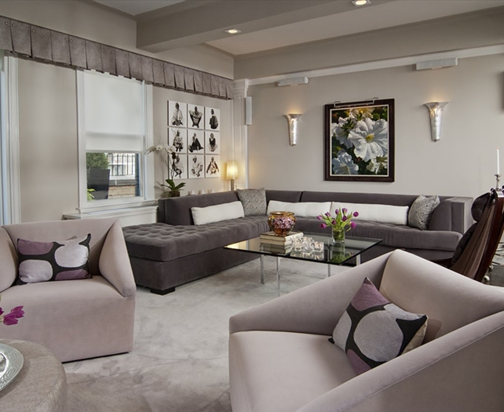
The darker furnishings and violet accents amplify those undertones, creating a cozy, moody effect.
This is a great example of how Alpaca interacts with decor – if your furniture has purple, taupe, or cool undertones, Alpaca will echo them and create a harmonious look.
Real Room Tips for Using Alpaca
- Use in a room with lots of natural light if you want Alpaca to read as a softer, airy gray.
- Expect violet undertones to show more in darker rooms or when paired with taupe and purple furnishings.
- Balance with crisp white trim to keep the color looking clean and not muddy.
- Pair with warm wood tones (like walnut or medium oak) to highlight Alpaca’s cozy side.
- Avoid cream or yellow finishes, which can clash with its undertones and make it look off.
Always sample Alpaca on multiple walls. Its chameleon nature means it won’t look the same in every corner of a room.
Alpaca vs. Other Popular Greiges
Alpaca vs. Agreeable Gray
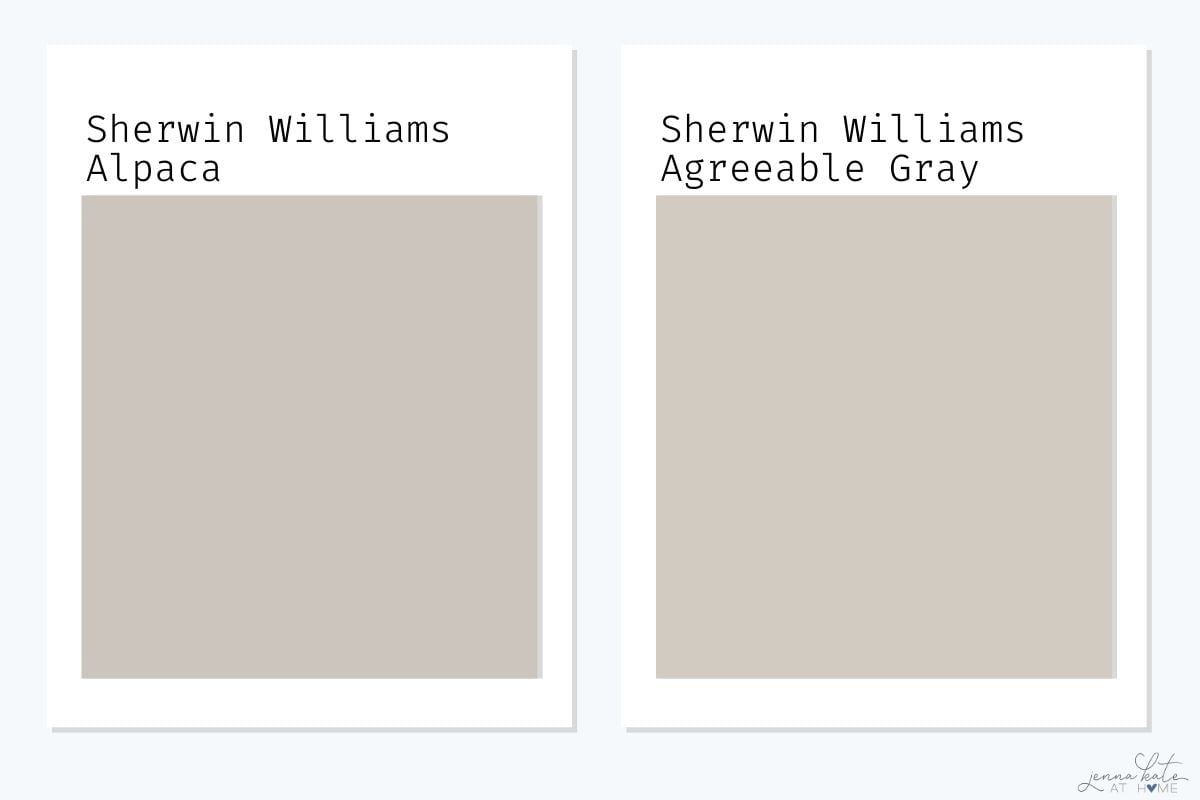
Agreeable Gray is one of Sherwin Williams’ most popular neutrals, and it’s easy to see why. With an LRV of 60, it’s slightly lighter and brighter than Alpaca.
The biggest difference comes in undertones – Agreeable Gray leans softer and more beige, while Alpaca shows stronger taupe-violet undertones.
Quick Take: Choose Agreeable Gray if you want a safer, flexible whole-home neutral. Choose Alpaca if you’re after a cozier look with more depth and personality.
Alpaca vs. Drift of Mist
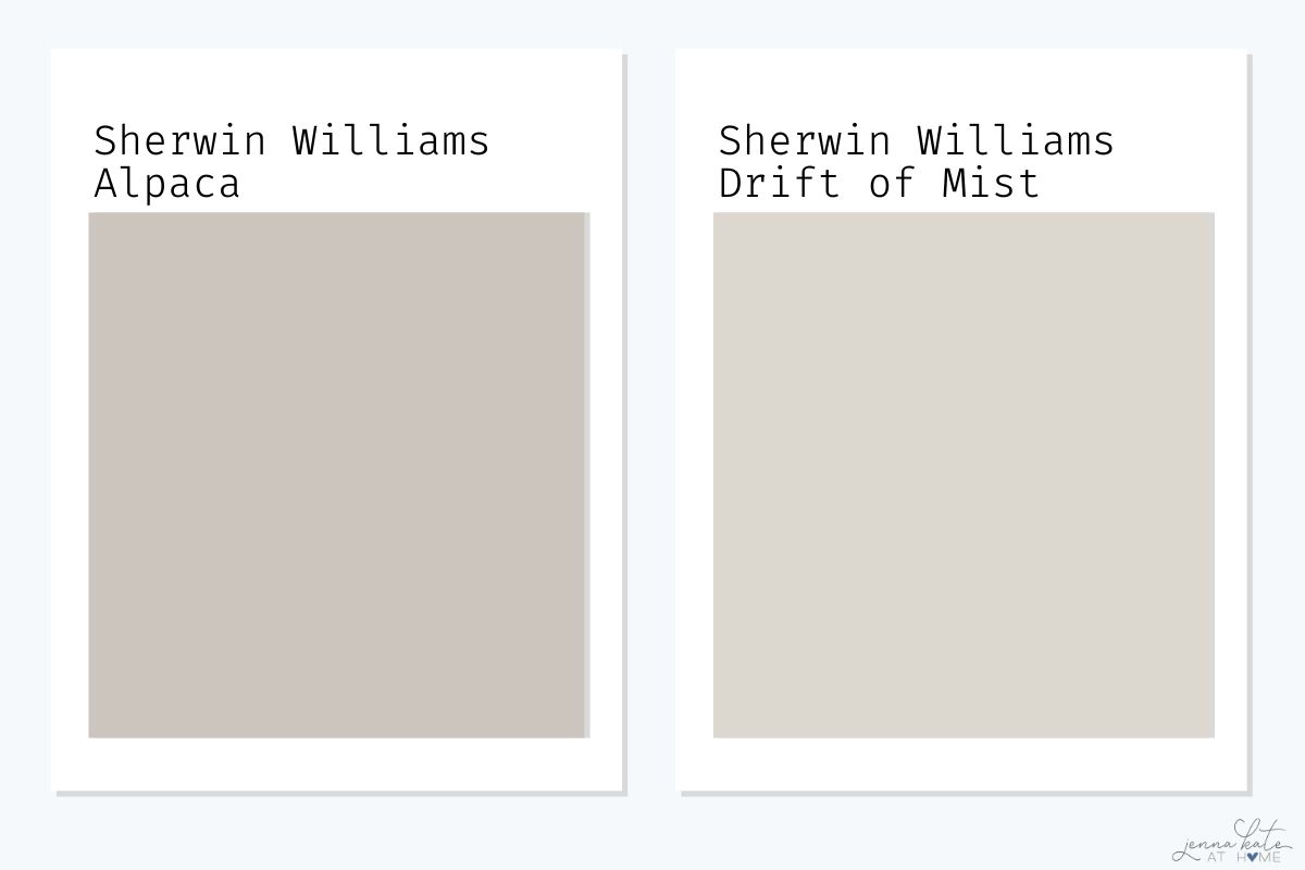
Drift of Mist is a much lighter greige with an LRV of 69, making it brighter and airier than Alpaca.
While Alpaca leans taupe with violet undertones, Drift of Mist reads more as a warm gray and stays more consistent across different lighting.
Quick Take: Choose Drift of Mist if you want a bright, airy greige with fewer undertone surprises. Choose Alpaca if you want a slightly moodier, taupe-leaning gray.
Alpaca vs. Pale Oak
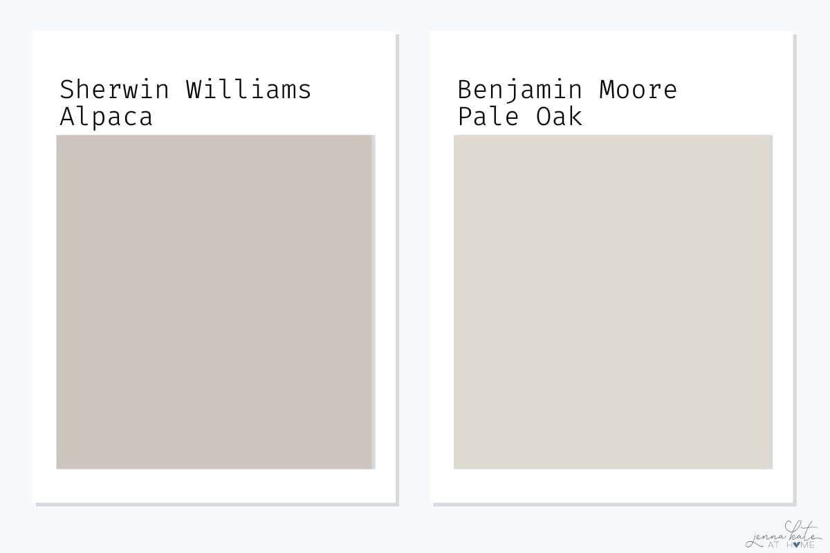
Benjamin Moore’s Pale Oak is often compared to Alpaca because it’s also a warm greige. However, Pale Oak has a higher LRV of 70, which means it’s lighter and feels closer to an off-white in some spaces.
Pale Oak is warmer and creamier, while Alpaca feels a touch moodier with stronger taupe-violet undertones.
Quick Take: Choose Pale Oak if you want a soft, creamy greige that can read off-white. Choose Alpaca if you prefer a richer, moodier look with stronger taupe-violet undertones.
Alpaca vs. Repose Gray
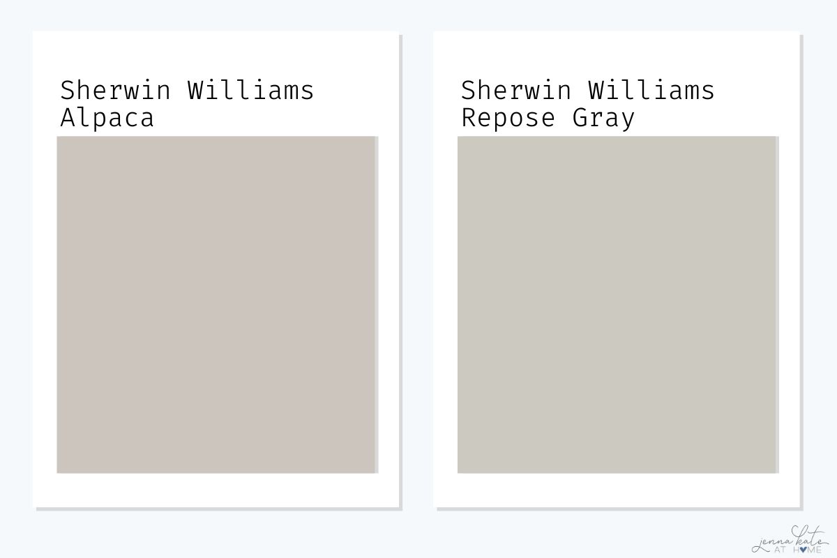
Sherwin Williams Repose Gray is another popular greige, but compared to Alpaca it leans slightly cooler with subtle green undertones and just the smallest hint of purple.
With an LRV of 58, it’s just a touch lighter than Alpaca, though they are very close in depth. While Alpaca feels warmer and more taupe, Repose Gray offers a more balanced and versatile look that works in a wide variety of spaces.
If you’re worried about Alpaca’s purple undertones, Repose Gray may be the safer choice.
Quick Take: Choose Repose Gray if you want a balanced, versatile greige with subtle green undertones. Choose Alpaca if you’d rather have a warmer, taupe-inspired neutral with more character.
Don’t Forget…
Don’t forget – no matter what you’ve read or photos you’ve seen online, it’s really important to sample paint colors in your home before committing!
Samplize provides real paint samples that are easy to move around your home, and cheaper than buying a gazillion paint pots! It’s the only way I buy paint samples.
Pros & Cons of Sherwin Williams Alpaca
Pros:
- Soft, cozy greige that feels elegant and warm
- Works beautifully with wood tones and crisp whites
- Adds subtle depth without overwhelming a space
Cons:
- Violet undertones can appear unexpectedly
- Risky choice for exteriors
- Can clash with creamy or yellow-based finishes
Frequently Asked Questions
Alpaca is a greige with taupe-violet undertones. It leans warmer than a true gray but isn’t as beige as many greiges.
n certain lighting (especially south-facing rooms or exteriors), Alpaca’s violet undertones can be noticeable. If you’re sensitive to pink or purple, sample carefully before committing.
For a crisp, modern look, pair Alpaca with Sherwin Williams Pure White. For a softer, traditional feel, use Sherwin Williams Alabaster. Avoid yellow-based creams, which can clash.
Alpaca can be risky outside, since sunlight may bring out unexpected purple or pink undertones. Safer alternatives include SW Requisite Gray, SW Jogging Path, or BM Thunder.
If you like Alpaca but want options, try Sherwin Williams Agreeable Gray (safer greige), Drift of Mist (lighter, brighter), Pale Oak (creamier), or Repose Gray (cooler with green undertones).
Final Thoughts
Sherwin Williams Alpaca is a beautiful but complex greige. In the right room, it feels cozy, sophisticated, and timeless. But because of its violet undertones, it’s not a one-size-fits-all neutral.
Always sample Alpaca before committing. Samplize peel & stick paint samples let you test the color on your own walls with zero mess.
If you love a soft greige with character, Alpaca could be the perfect fit. If you need something safer and more versatile, check out Agreeable Gray or Drift of Mist instead.


I have SW Alpaca painted on my kitchen cabinets with SW Alabaster walls. It is a West facing room but also gets East light all day. At different angles it reads a bit too purple and other angles it’s perfect. I currently have four glass front cabinets with SW Studio Mauve on the bread board back wall. I think this might be contributing to the Violet undertones. Do you think painting the bead board background SW Billiard Green would help combat all the purple? Any other decor suggestions to help neutralize the Violet undertones?
This post is so helpful. I have an office/library/waiting area that it all Alpaca. I need the space lightened up and a designer suggested Silver Fox to use, but I feel like that is so close. I was thinking Agreeable Gray would be better because it is lighter than Alpaca, but after your post I’m convinced it won’t be light enough. Any recommendations for something a couple of shades lighter than Alpaca?
If you like the color but it’s not light enough, try getting it lightened by 50% at the paint store.
I’m thinking of painting a masterbedroom and bathroom in Alpaca. My floors will be Lifeproof vinyl planking from Home Depot in the Alexandria Oak color. My bathroom cabinets will be by Kitchenmaid in the Lagoon color. I am going for a beachy feel with blues and tan/beige colors. My bedroom set is an antique white by Ashley. I’m curious of your thoughts to using Alpaca for the wall color. There will not be a windows in the bathroom and 2 windows in bedroom but with room darkening curtains.
We have honey oak molding throughout and Alpaca looks AMAZING with it.
We have the 90’s honey oak EVERYTHING.
Our kitchen cabinets, base boards, stairwell railings…
I am working on a plan to redecorate and want to embrace the honey oak. Would this color work? I read your other article about the colors that work best for Honey Oak. I am loving the Salamander for our dining room to add that sexy pop of color. I want to complement the rest of the home but keep it a little more calmer.
Thoughts?
In theory – yes….but I wouldn’t use it as a whole house wall color unless you’re fine with that slightly pinkish/taupe undertone which may pop up in certain rooms.