Content may contain affiliate links. When you shop the links, I receive a small commission at no cost to you. Thank you for supporting my small business.
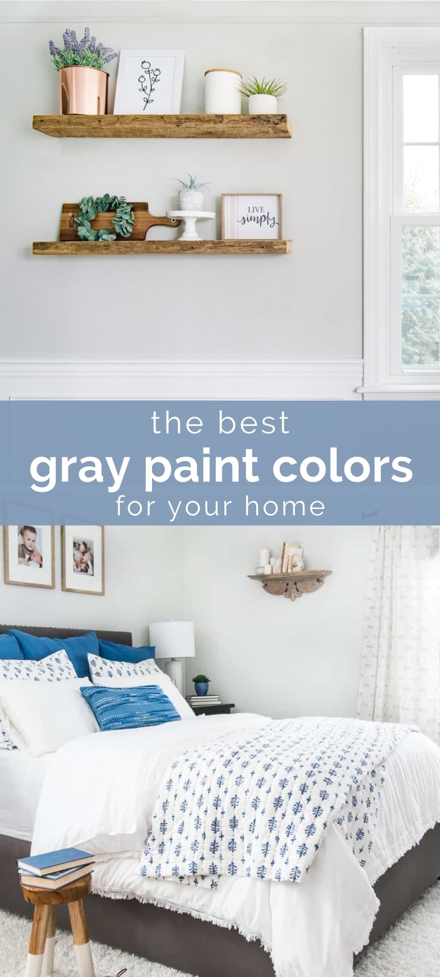
Are you looking for the best gray paint colors for your home? Whether you’re looking for a whole-house color, just to paint one room such as a living room or bedroom or even the perfect gray for your bathroom vanity, you’ll find the perfect shade for you in this post.

Gray as a favorite interior paint color is not going anywhere, despite what interior designers may tell you. However, these days, people are favoring slightly warmer shades of gray over the cooler shades of past.
Whether you’re looking for a light shade to make your room feel bigger, a medium color with more color saturation or a deep and moody dark gray to add drama and contrast, these modern shades of gray are popular for good reason.
There’s so many shades of gray to choose from, that picking one can be a challenge. Pair that with the fact that every shade of gray has some undertone (purple, blue, green, yellow, brown, etc.) and you could potentially have a real challenge on your hands!
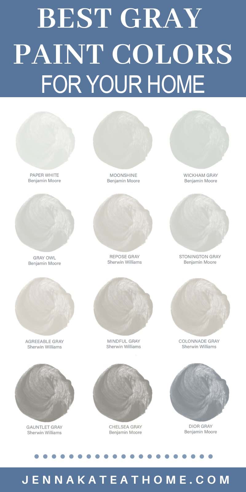
I’m sharing my all-time favorite shades of gray in light, medium and dark tones to help you narrow down your search. I’m also sharing photos of these colors in real homes to help you get an idea of what they look like.
But remember – different lighting can drastically alter the appearance of any paint color, especially gray. Cool, north-facing light might bring out an unexpected blue undertone or warm afternoon light might suddenly make your perfect gray look slightly pink.
So, narrow down your favorites, pick up some samples from the paint store. Paint them on each wall in your room (or on some poster board that can easily be moved around) and watch the color and whether or not is changes as the such transitions throughout the day.
Light Gray Paint Colors
If you want a barely-there gray that’s sometimes verging on white, then these clean, crisp light gray colors will be the perfect choice for your living room, bedroom, bathroom or whole house color scheme.
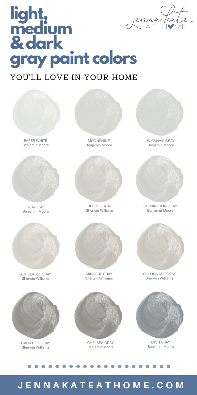
1. Benjamin Moore Paper White
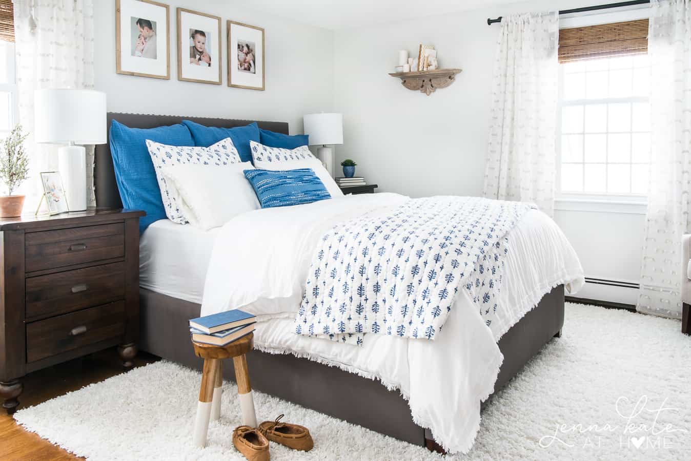
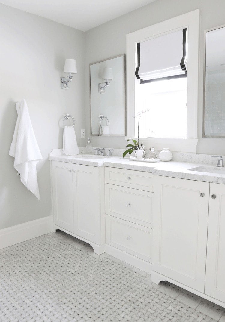
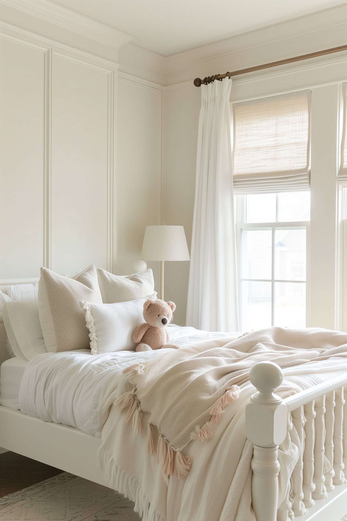
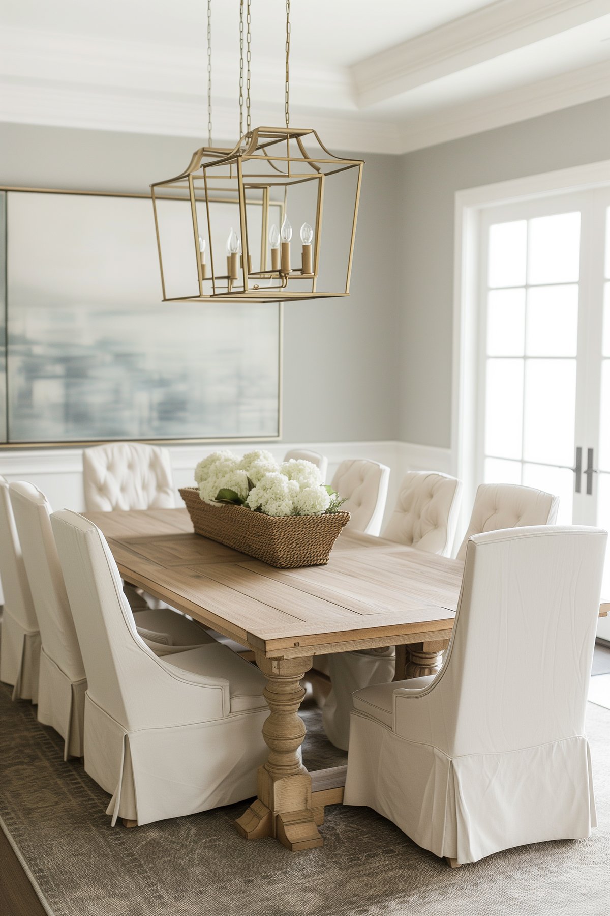
BM Paper White is my personal favorite, barely-there gray. I’ve used it in our main bathroom, master bedroom and even our dining room. It works wonderfully to brighten up a space without making it feel cold.
2. Benjamin Moore Moonshine
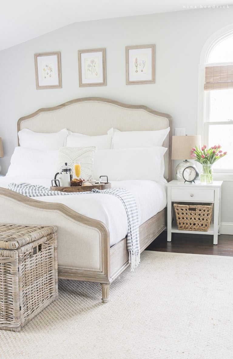
BM Moonshine has a little more saturation to it than Paper White.
It can have a subtle green undertone that can also swing blue in certain lights.
This color works great in a room that doesn’t get a ton of light as the color can look a bit washed out in a really bright room, however it’s best suited to a room with warmer light (west facing or south facing) as the cool undertones can look a bit chilly in an east-facing or north-facing room.
3. Benjamin Moore Wickham Gray
4. Sherwin Williams Passive
If you’re looking for a cooler toned, gray that stays looking gray, then Passive is a good choice.
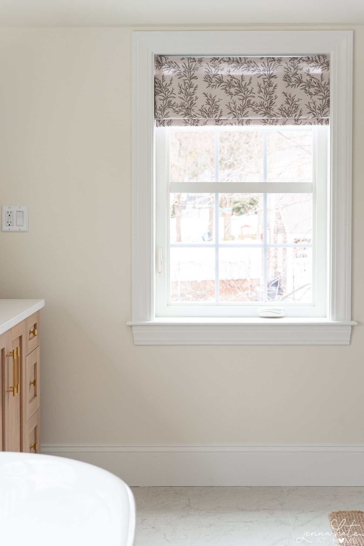
5. Benjamin Moore Edgecomb Gray
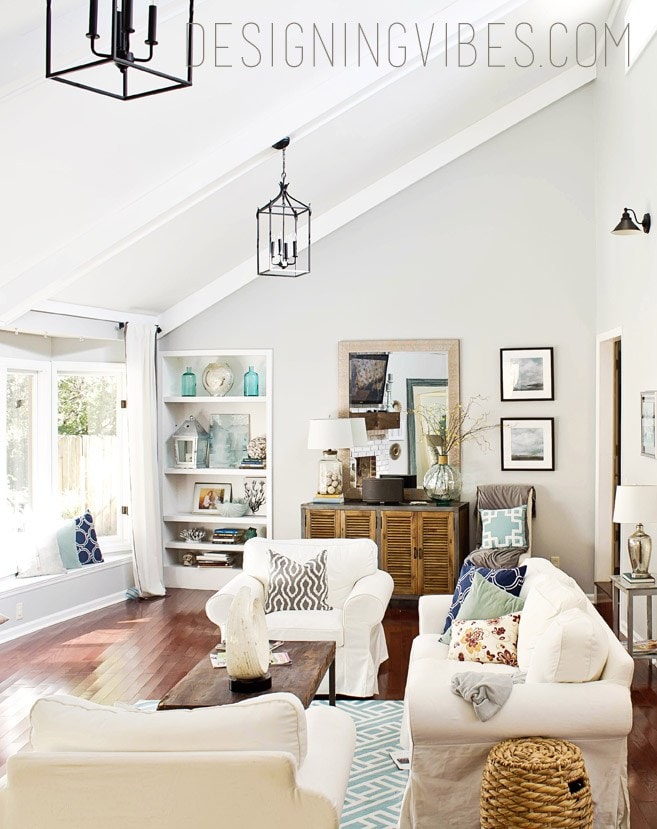
While BM Edgecomb Gray is more a greige paint color (gray & beige), it’s an incredibly popular choice because it works so well under many different lighting conditions.
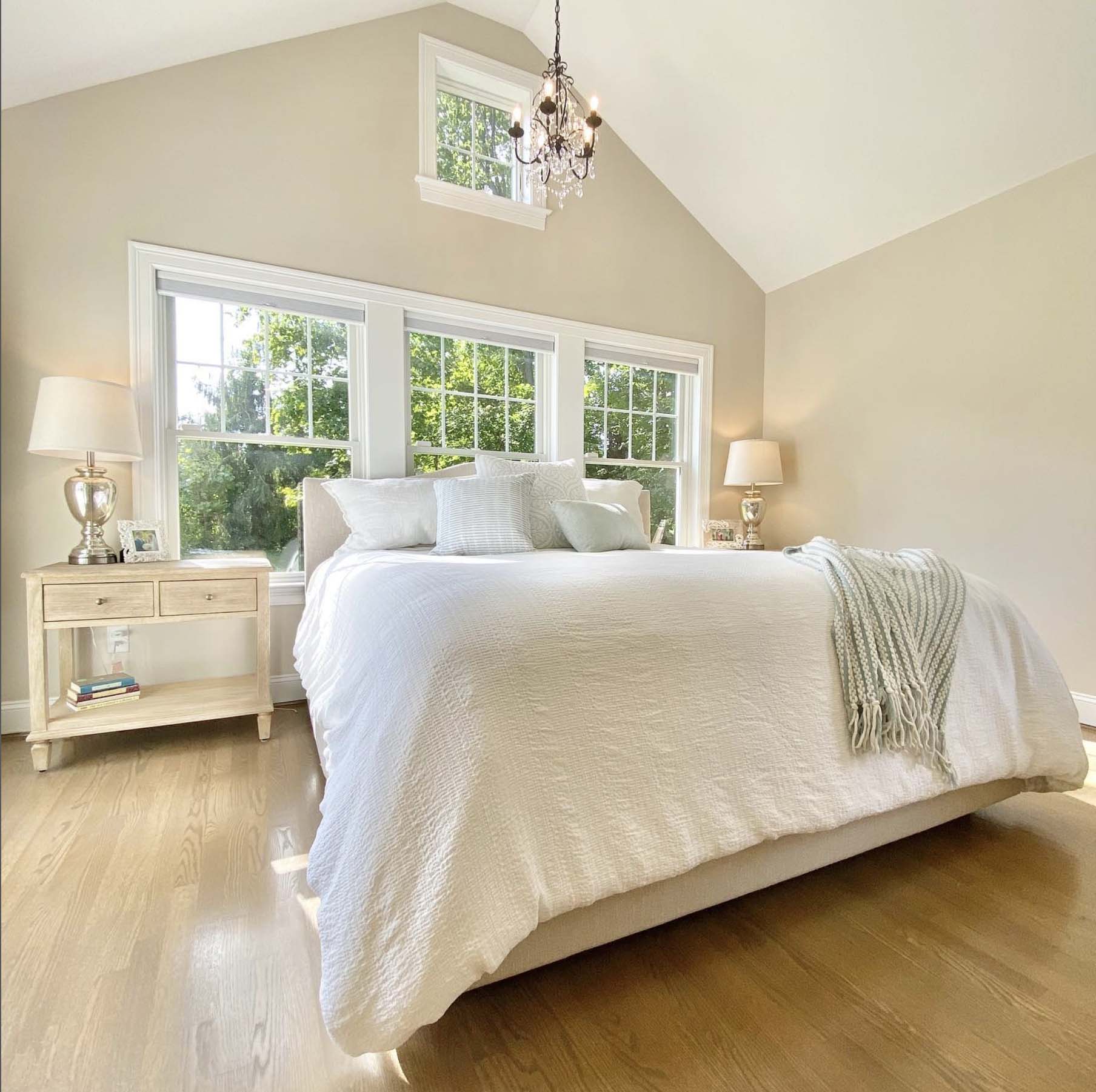
If you’re looking for a color that has some of that gray but never feels cold, then you’ll love Edgecomb Gray!
6. Benjamin Moore Classic Gray
If you think BM Edgecomb Gray is too warm, and yet the others are still a little too cool, then Benjamin Moore Classic Gray is the color you need.
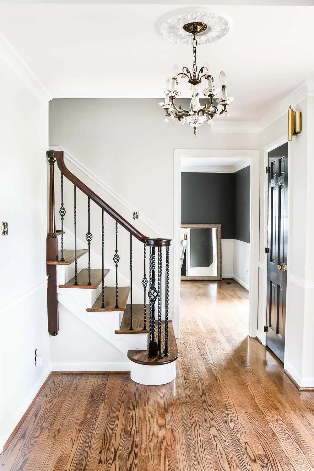
Classic Gray marries all the best qualities of a pale gray paint color with the perfect amount of warmth so that it still looks gray but never feels cold. Because Classic Gray falls into the off-white category, even if you don’t get a lot of natural light this color will look nice and bright.
Medium Gray Paint Colors
7. Sherwin Williams Repose Gray
If you are looking to a light – medium-toned gray that’s almost the perfect neutral gray but with just a hint of warmth, then SW Repose Gray will be for you.
It has slight green undertones, but don’t let that scare you off as they help to warm up the color.
You really need to study it to every see those come up. This color won’t necessarily make your room feel bigger and brighter if that’s what you’re aiming for, but it’s a really great whole house color that I find works anywhere.
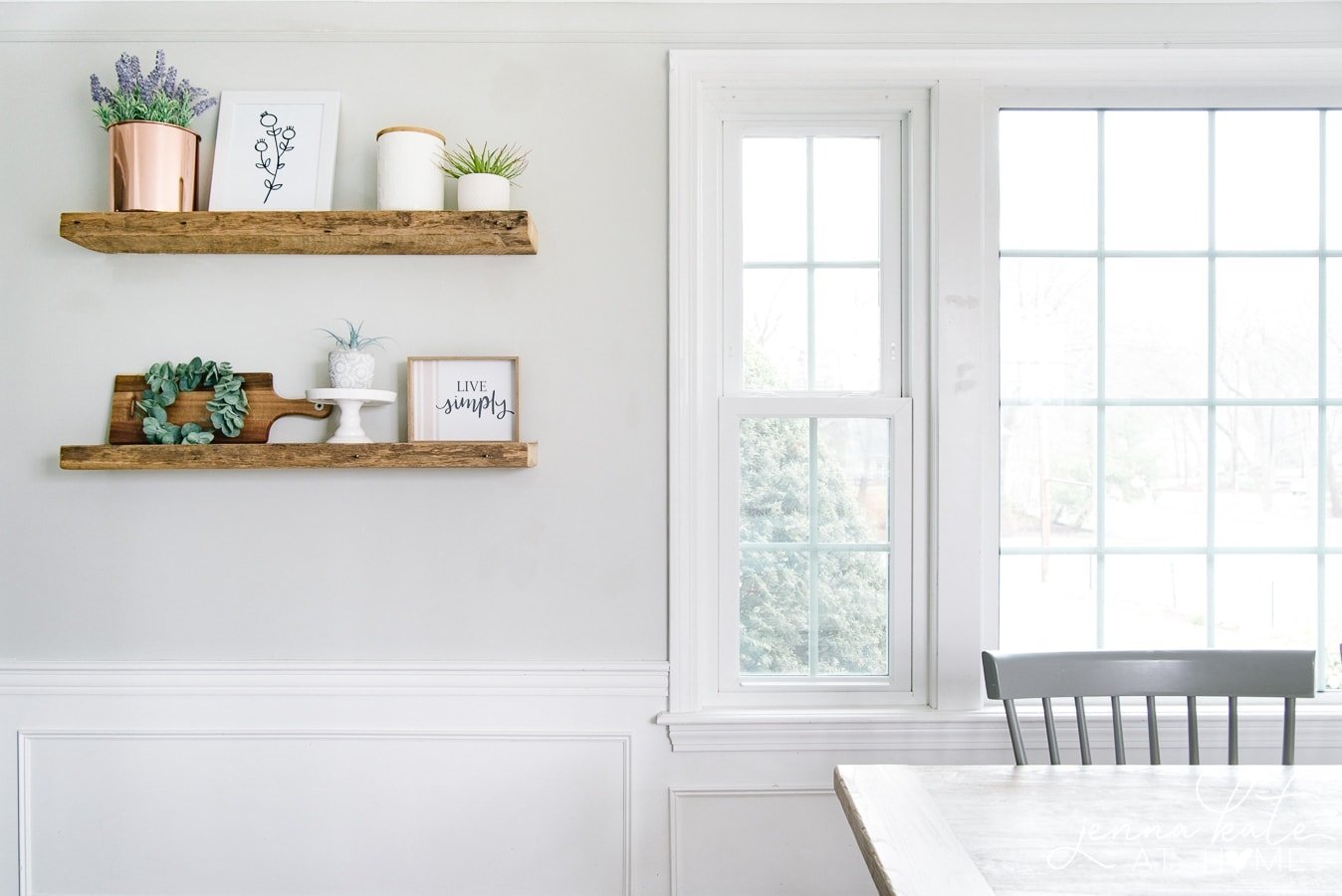
8. Benjamin Moore Stonington Gray
In the right room, Benjamin Moore’s Stonington Gray is exactly what you want when you think of a medium gray. However, in cool light it can look very blue, so beware.
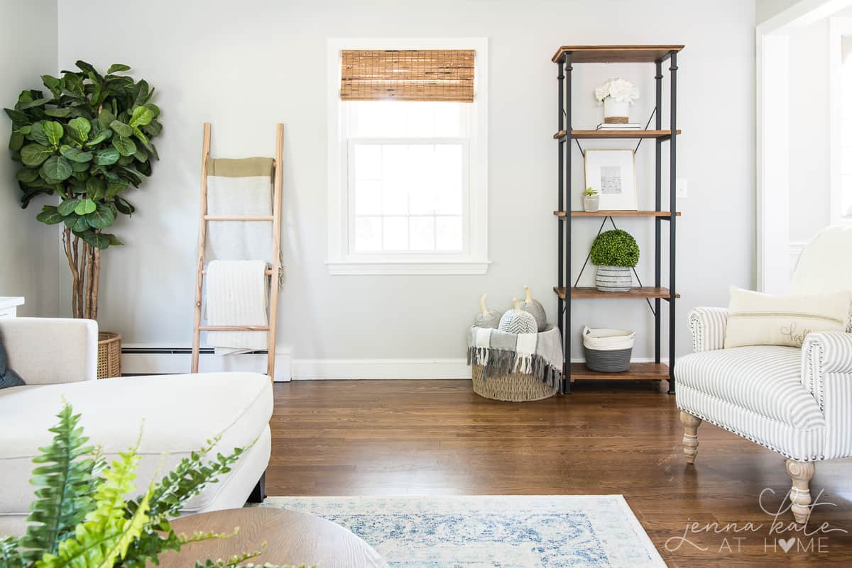
9. Sherwin Williams Agreeable Gray
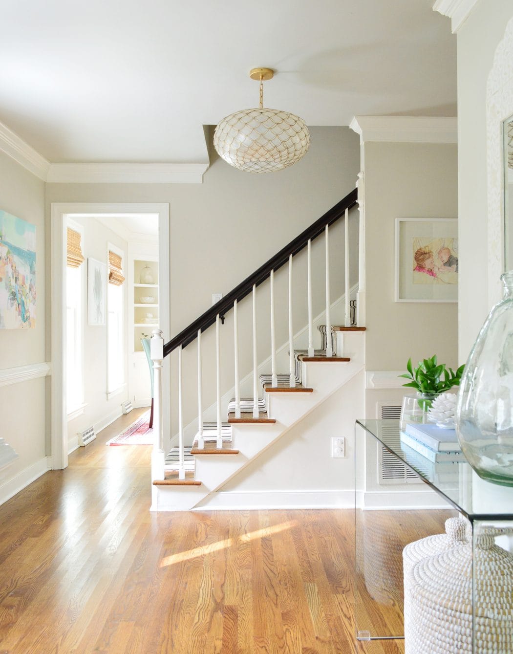
SW Agreeable Gray is a very popular color – and for good reason. It’s a beautiful medium toned gray with a lovely warm greige undertone.
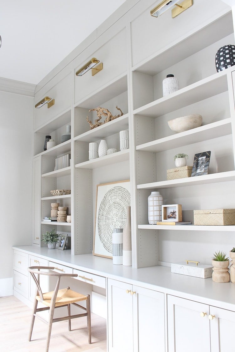
This means it will work in almost any space and never feel cold. It’s a proven winner for resale value too, as it appeals to so many buyers.
10. Benjamin Moore Gray Owl
A nice and relatively light gray color, BM Gray Owl, has a tendency to lean towards green or blue.
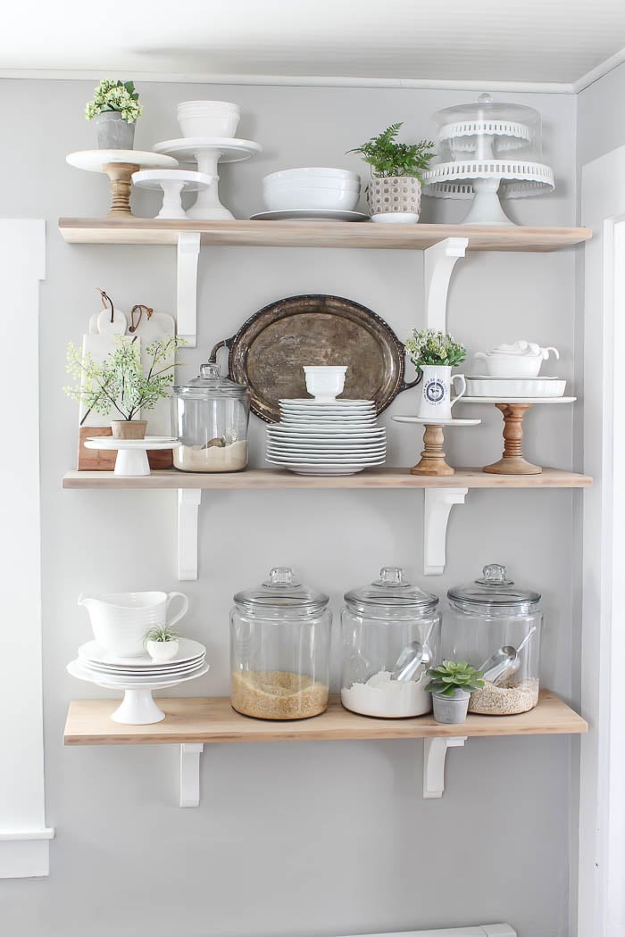
In the right space, it’s quite the perfect gray but I definitely recommend testing this one throughout the day to see how it reacts in your space.
11. Sherwin Williams Colonnade Gray
If you are looking for a considerably warmer gray, that’s starting to lean more towards being a “greige” than a true gray, then Colonnade Gray is perfect.
It’s on the lighter end of the medium toned scale and has a wonderful creaminess to it that lightens and brightens any space.
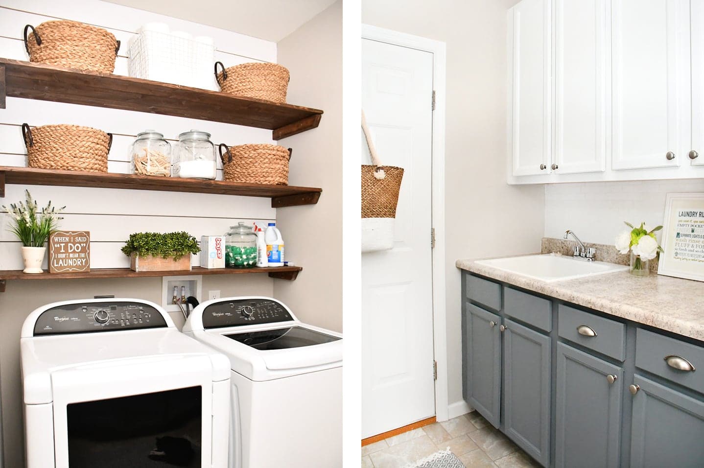
12. Sherwin Williams Mindful Gray
One color darker on the color card from Repose Gray, Mindful Gray shows how these colors definitely can have a taupey undertone or even a touch of green.
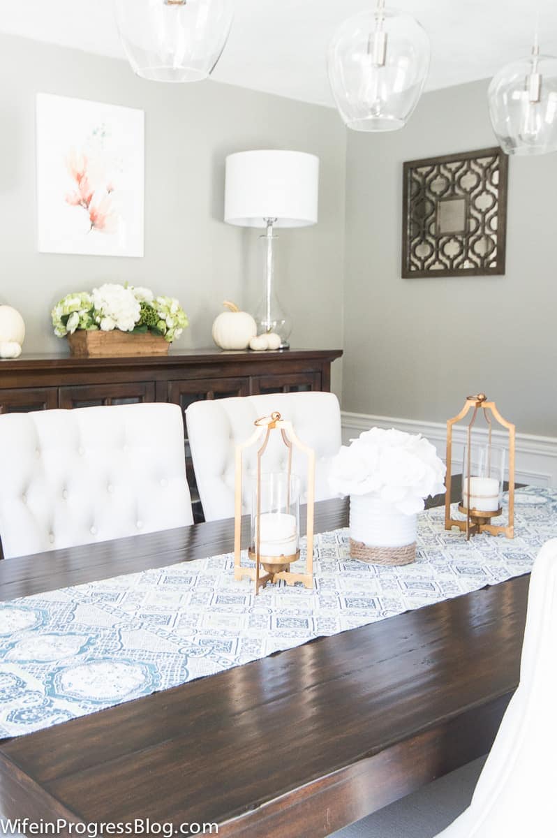
In my former dining room (above), it looked decidedly greenish when the light shifted to the other side of the house. It’s a great medium gray in a light-filled space, it’s just not great in darker rooms.
Dark Gray Paint Colors
A darker shade of gray can make a big impact! Whether you’re painting an entire room, doing an accent wall, half and half or just looking for a kitchen island or bathroom vanity color, these dark gray paint colors are stunners!
13. Benjamin Moore Dior Gray
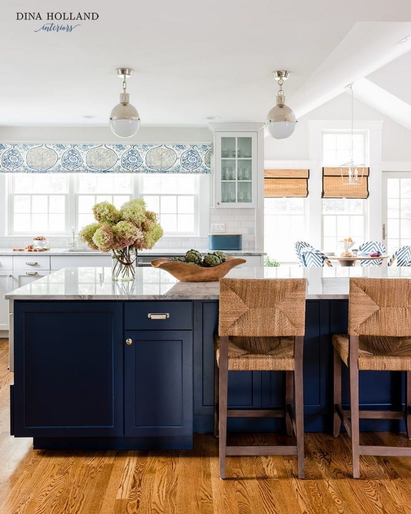
Dior Gray definitely leans into the blue side of things, but it’s a beautifully saturated dark gray that adds drama and dimension wherever it’s used. It’s quite similar to one of my all-time favorite grays, SW Serious Gray.
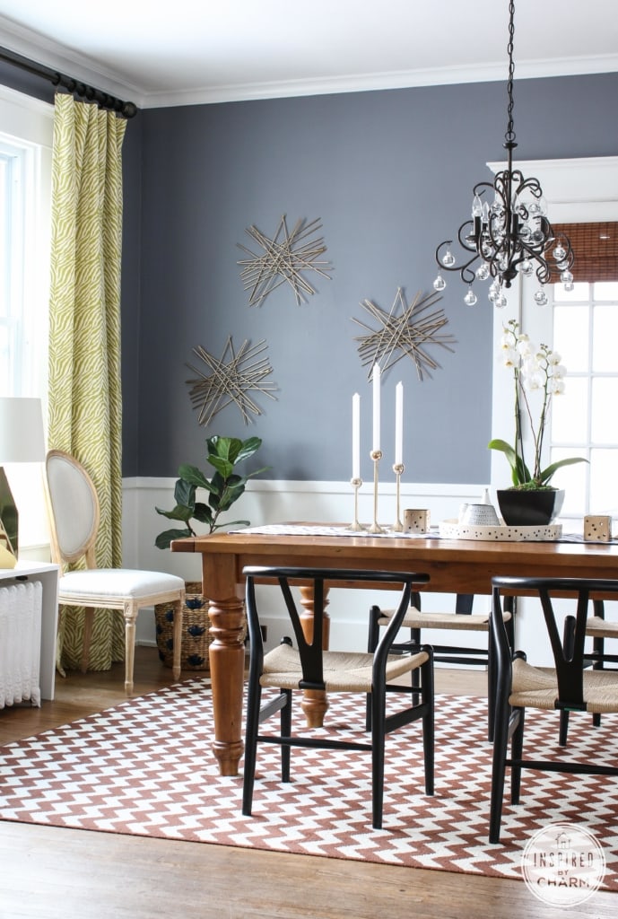
14. Sherwin Williams Gauntlet Gray
Gauntlet Gray is a dark charcoal gray paint color with slightly warm undertones.
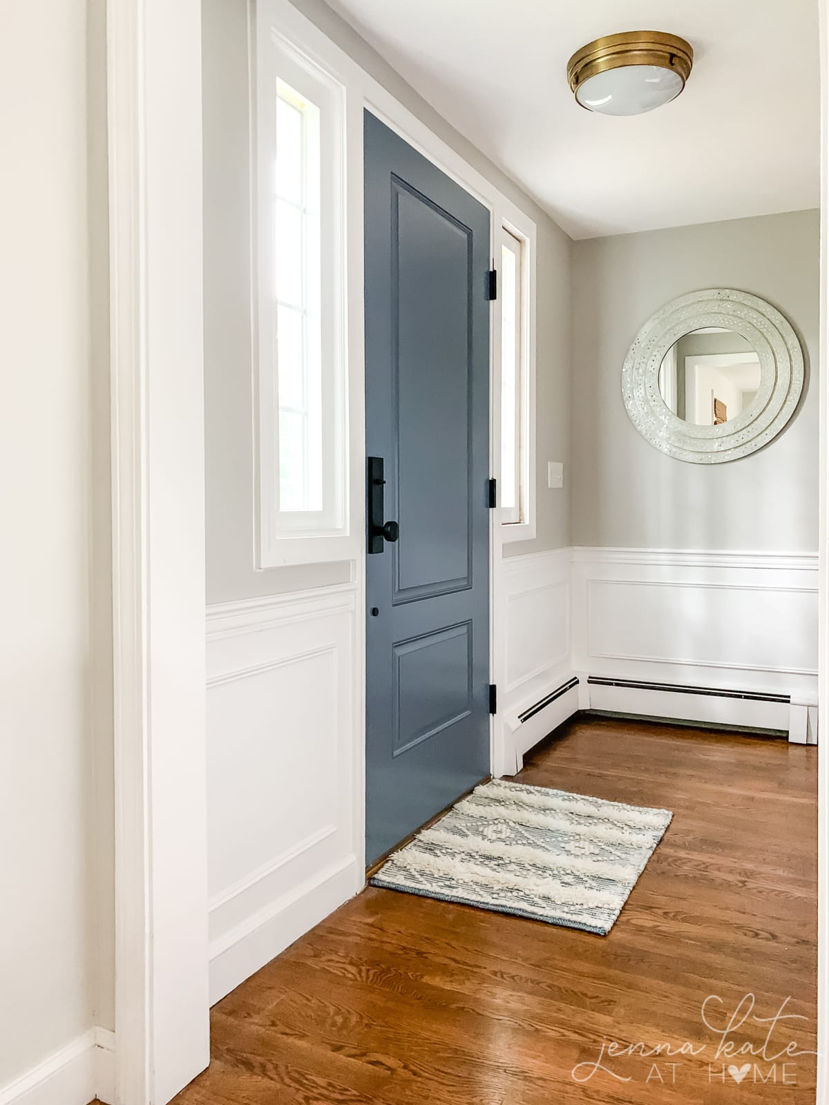
It works wonderfully for dark cabinets or even an accent wall. Use it on the upper half of wainscoting with crisp white underneath for real dramatic effect.
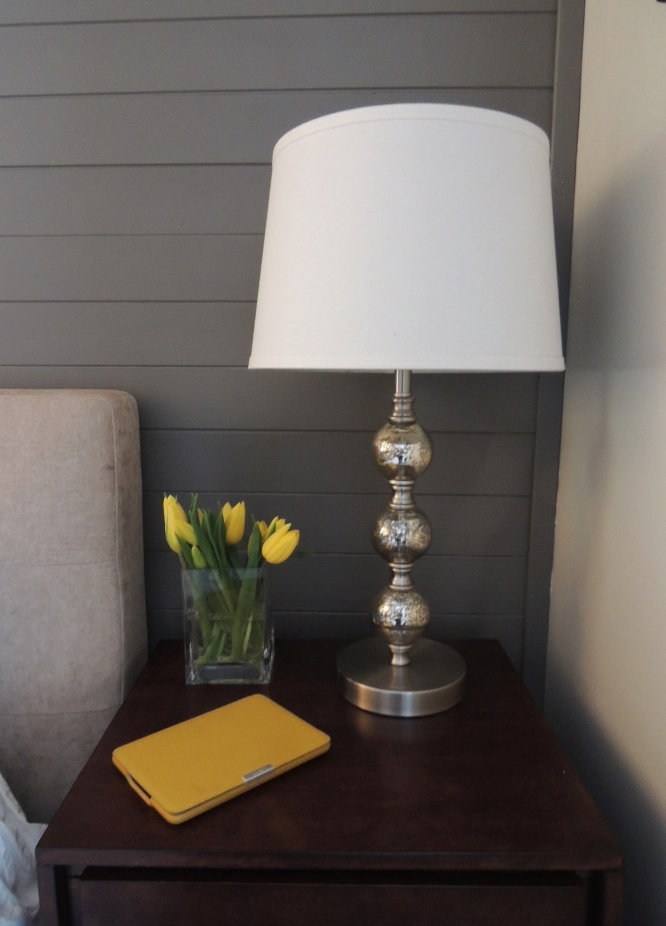
15. Benjamin Moore Chelsea Gray
Another crazy popular charcoal gray color, it works great for doors, cabinets, and even entire walls.
I’ve seen it on exteriors, paired with lots of white detailing and it looks stunning, too!
What White Trim Should I Use With Gray Walls?
The white paint color you choose for trim depends on whether you’re choosing a cool undertoned gray (blue undertones) or a warm undertoned gray.
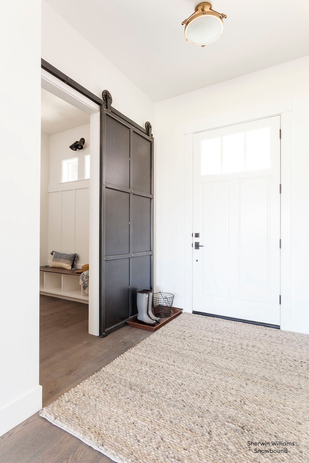
Cool grays work well with a bright crisp white like BM Chantilly Lace, SW Extra White or SW High Reflective White.
Warm grays are less fussy, and look great with neutral whites such as BM Chantilly Lace or SW High Reflective White but also work amazingly well with whites that are slightly warmer such as SW Pure White, BM Simply White or BM White Dove.
Don’t Forget To Always Use Real Paint Samples!
Don’t forget – no matter what you’ve read or photos you’ve seen online, it’s really important to sample paint colors in your home before committing!
Samplize provides peel and stick paint samples made with real paint, that are easy to move around your home, and cheaper than buying a gazillion paint pots! It’s the only way I buy paint samples.
More Paint Color Posts
- Sherwin Williams Worldly Gray
- The Best Green Paint Colors
- The Best Paint Colors For Trim
- The Best Blue-Gray Paint Colors
- Paint Colors That Go With Honey Oak


Hi Jenna
Great info! Who knew picking the right paint colors were so stressful! I have a open floor plan and plan on painting all my trims and doors SW Pure White in a Satin Sheen.
For my living room and kitchin area, I am trying to decide between SW Agreeable Gray or Repose Gray. My wood peices are a dark wood, charcoal dark but my couches are a like a gray ivory color. I am using pops of blue for contract but lots of neurtrals.
For my office however, my office furnitue is black. I was thinking of using SW Gauntlet Gray or BM Chelsea Gray for a nice contract.
We get lots of light in our home but also on a cloudy day, it can get very dark.
Good plan?
Thank you!
Pegah
Hi – this sounds like a question for my Ask a Decorator service. Please check it out and I’d be happy to help you!
Hi Jenna, love your blog and sharing! Our whole house is white – Valspar Bistro White. We want to paint the interior doors and trims in gray, warmer tone Preferably. But couldn’t decide which shade of gray should use. Repose gray or Dorian gray? Or darker? What’s your recommendation? Thanks so much!
Dorian Gray will be too dark…I’ve seen Repose Gray on doors and trim many times and it looks amazing! I’ve also seen BM Stone Hearth used which is q good bit warmer but looks stunning!
Thank you for the advice On Dorian Gray! I was a bit worried that repose gray might be too light And look too similar to the white wall… might need to go up 1 shade like the Mindful Gray, I’ve ordered the sample, will try them out… it’s been quite stressful…
Repose Gray is definitely not too light. We have it throughout our house and it’s definitely a medium shade of gray, with lots of contrast between white trim. I’ve seen it on doors many times and it’s beautiful. Be careful with Mindful Gray, as it has a tendency to look green
Great reminder on Mindful Gray – thank you so much Jenna!! Just 1 last question: how do you compare Agreeable Gray vs Repose Gray? I read in your post about Agreeable Gray having a warmer tone and the best resell friendly gray, would you recommend Agreeable Gray on door/trims? Thank you for all of your advice!
Agreeable Gray is considerably warmer – it is a “greige” unlike Repose, which is considered a warm gray. It would also be a great trim/door color and is less likely to have any funky undertones…but will definitely be more beige.
Hello,
My master bedroom faces West, and I do get daytime natural light. I’m fighting over either Stonington Gray or Coventry Gray. I want our room to be fresh and cozy. We have Espresso furniture.
Please help me decide.
Thanks
Hi Janice – Coventry Gray is a lot dark than Stonington and I think it will make your room quite dark and heavy. If those are your top choices, I would pick Stonington Gray. My bedroom is also west facing and we have used BM Paper White and love it but it’s a very very light shade of gray (but looks wonderful with espresso furniture!) and gives a nice light and fresh look.