Content may contain affiliate links. When you shop the links, I receive a small commission at no cost to you. Thank you for supporting my small business.
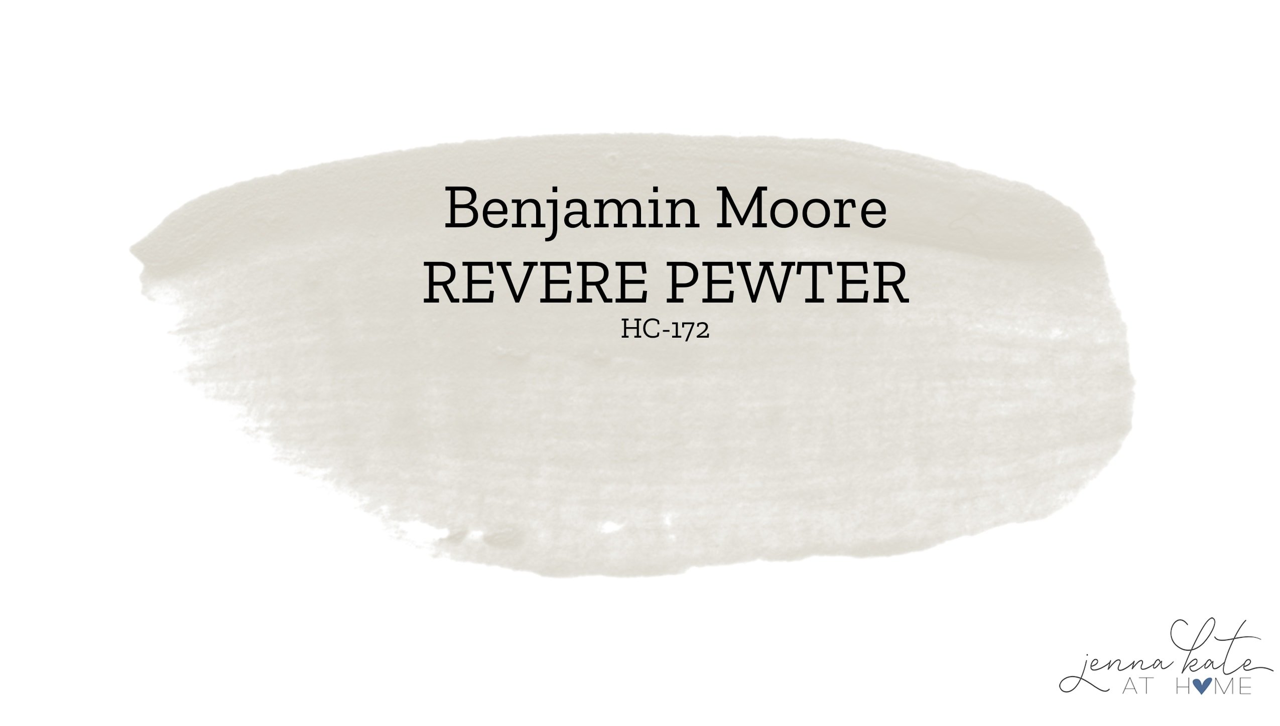
No doubt you have heard of Benjamin Moore Revere Pewter. It is undoubtedly one of the best greige paint colors. With its light to medium gray depth with warm undertones, it’s considered a timeless and classic paint color that works with any style of decor.
Is BM Revere Pewter Gray or Beige?
Revere Pewter is considered one of the original popular greige colors. Greige means that is a mixture of both gray and beige. It falls in the light-medium range of paint colors lending it to a great depth of color.
If you are looking for a clean, fresh, crisp gray then Revere Pewter is not for you. But one of these gray paint colors may be.
What is BM Revere Pewter’s Undertone?
Revere Pewter has an earthy, warm undertone. Sometimes it can veer a little muddy, especially in darker rooms, because of its green undertone. Paired with a lot of dark furniture, it can look very beige.
As a wall color, it works best in bright, open spaces with a lot of natural light or lighter-colored furnishings, where it’s other undertone – blue – will make it look much closer to a gray, with none of the muddy, flat undertones that it can take on in the darker spaces.
I’ve only once ever seen it look like a “real” gray, and it was in a room with windows on all three walls, i.e. it had multiple exposures. More often than not, the beige and green (and maybe even more of a taupe) will be more likely to pop through.
Grays are undoubtedly tricky colors anyway. I’ve never met a gray that didn’t have some undertone. So be sure to sample the color on multiple walls and pay attention to it throughout the day. It may look perfect in morning light but you may hate how it looks with warm afternoon light on it.
What is the LRV of BM Revere Pewter?
Revere Pewter’s LRV is a 55, making it just about the middle of the scale, meaning it won’t reflect or absorb too much light.
As a reminder, LRV or Light Reflectance Value is the amount of light reflected from a surface when it is illuminated with a light source. A higher value (closer to 100) means the color will reflect more light back, while a lower value (closer to 0) means the color will absorb more light, thus appearing darker.
Is Revere Pewter Still Popular in 2025?
Revere Pewter is not nearly as popular as it was several years ago. At one point, it was the go-to greige paint color for walls. However, it is becoming more and more popular as a cabinet color (I’m considering it right now for our new builts ins!).
Fresh, bright spaces are very popular right now and a lot of the time Revere Pewter does not give that feeling when applied to a wall. It’s also one of those sneaky colors that has quite a few undertones and can change color depending on the time of the day and furnishings in the room.
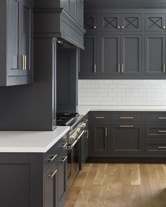
BM Revere Pewter vs Sherwin Williams Agreeable Gray
SW Agreeable Gray tends to stay true to its greige color, being one of the purest forms of gray + beige, unlike Revere Pewter which has a tendency to pull quite muddy in some spaces. Agreeable Gray is also a slightly lighter color.
If I had to pick one of the two, I would choose Agreeable Gray since it doesn’t have that muddy green/beige undertone.
Revere Pewter vs Sherwin Williams Accessible Beige
From first looks, they do appear to be similar, but if you placed them side by side you will see they are not the same color.
While they both carry slight green undertones, SW Accessible Beige is more warm-toned and has a slightly higher LRV at 58.
Accessible Beige also leans more towards a beige color with gray undertones. All that aside, they are both great choices if you’re looking for a greige paint color
What Colors Compliment Revere Pewter?
Revere Pewter is extremely versatile in terms of colors that go well with it, but choosing them depends on the look you are going for and what undertones you want to embrace or avoid.
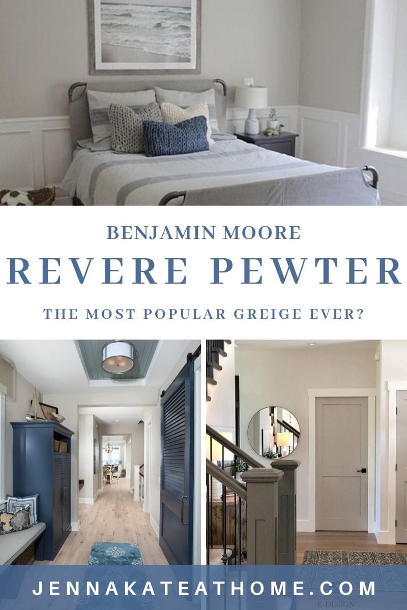
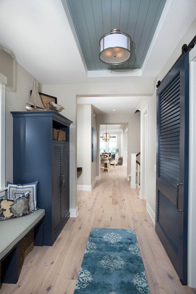
I personally love it paired with blues, in particular navy. The contrast is stunning and the blue helps to offset some of the muddy beige tones that I don’t always love. Add in some bright white trim, and you’ve got a match made in heaven.
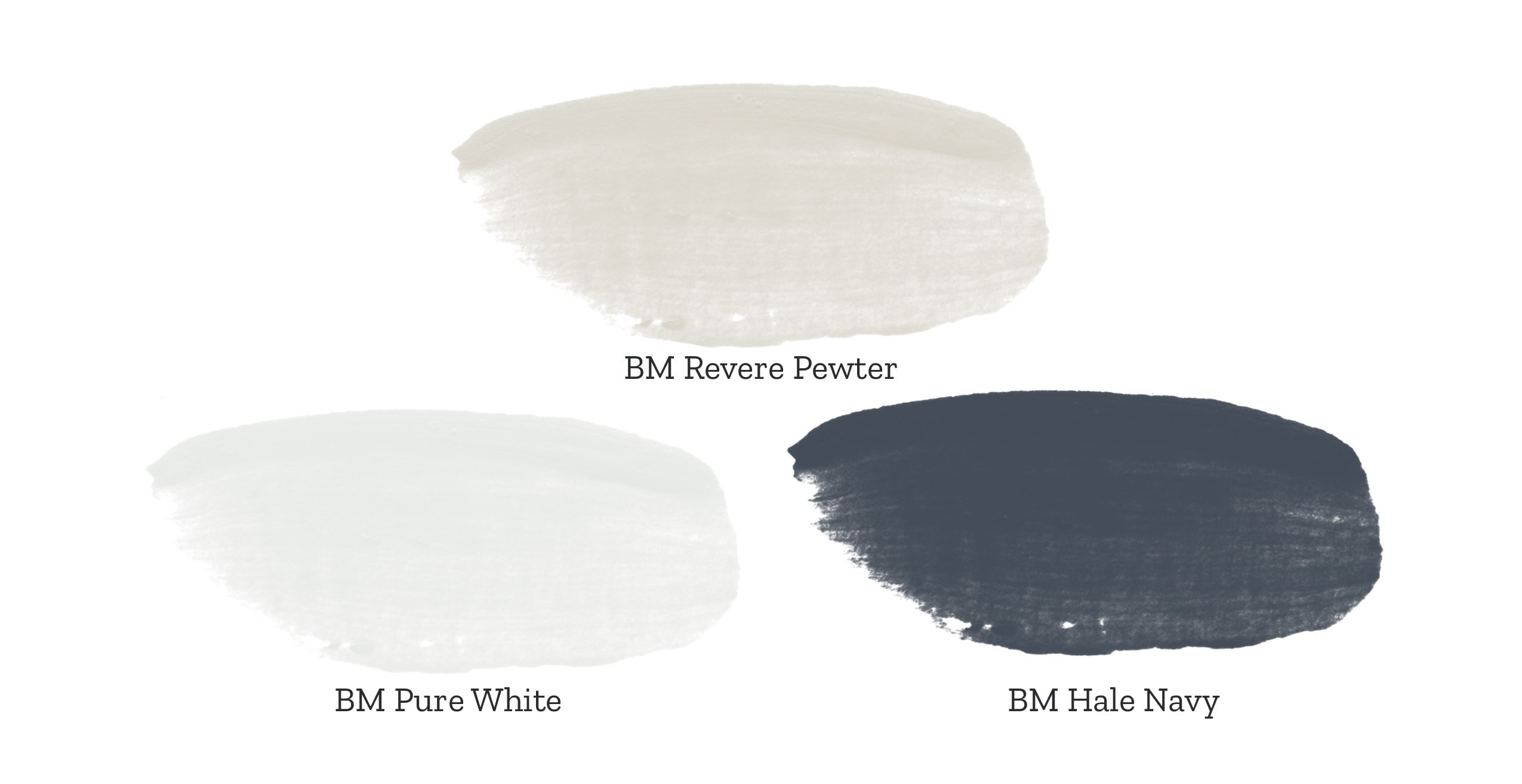
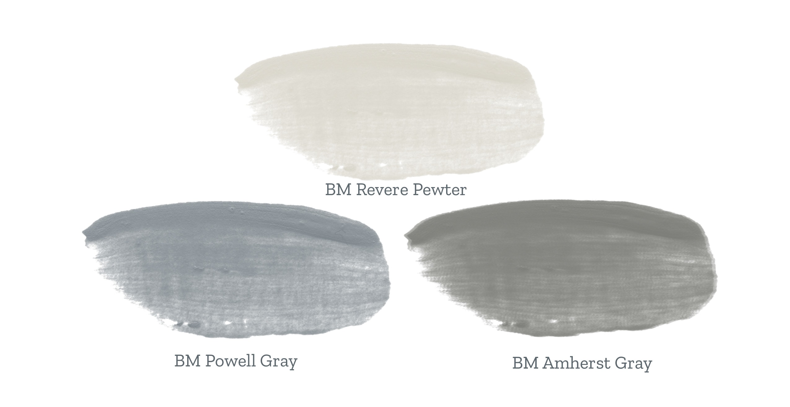
Looking for a more neutral color or a traditional look? Pairing it with creams and whites is a winner, while opting for an accent wall in a color like Amherst Gray or Powell Gray (or SW Serious Gray, my fave!) creates contrast while sticking to the same color family for a unifying look.
Loving how it sounds so far? Let’s take a look at how it looks in rooms in real homes!
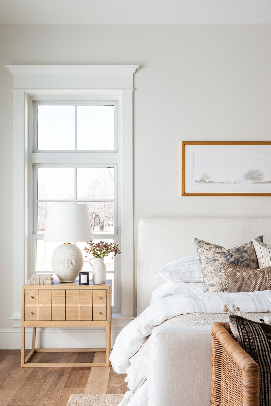
Bedrooms
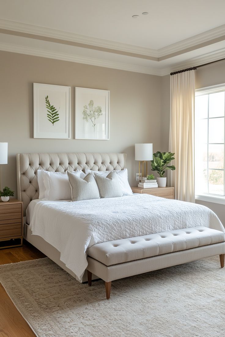
In the bedroom above, you can see how Revere Pewter looks much closer to a crisp warm gray. It is light and bright – exactly what the modern homeowner is looking for in paint color these days.
Because of the light furniture, crisp white trim, and light-colored furnishings, the muddy green and beige undertones have been virtually eliminated
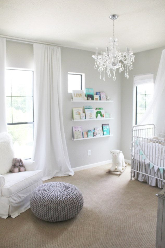
This nursery, with so much bright light, shows how gray Revere Pewter can give look with the right light. Paired with the white curtains and chair, it really looks like the perfect gray paint color
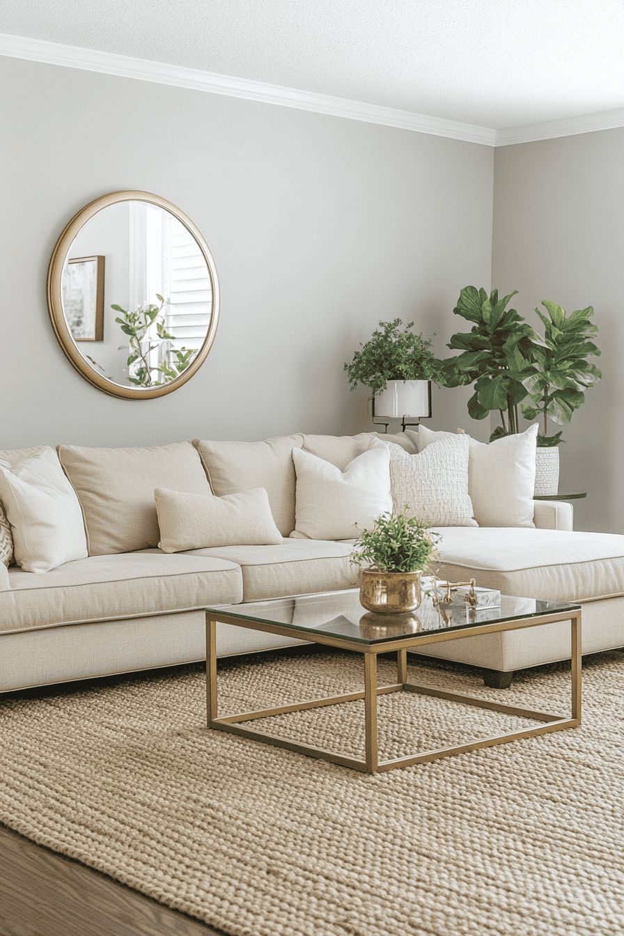
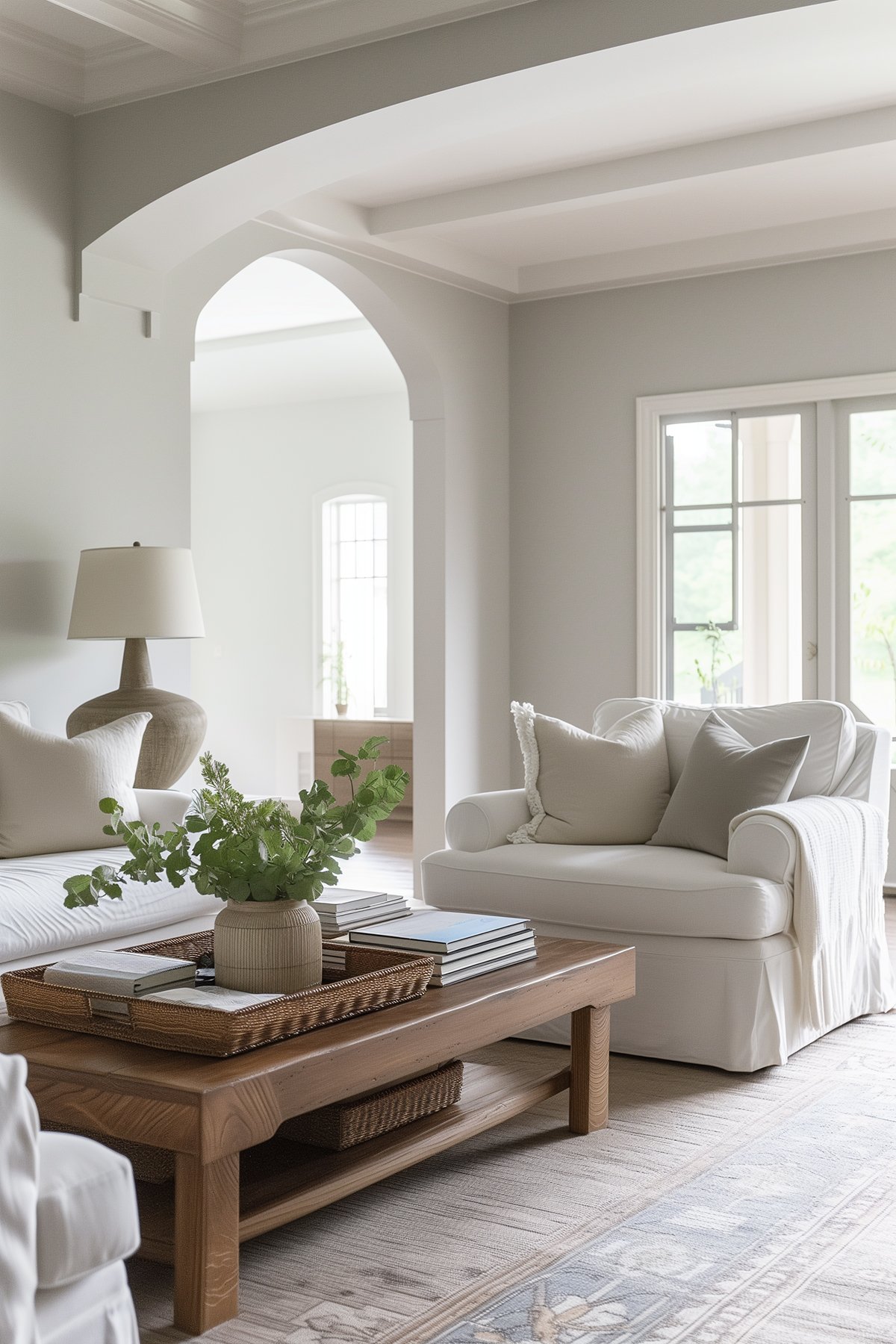
Living Rooms and Dining Rooms
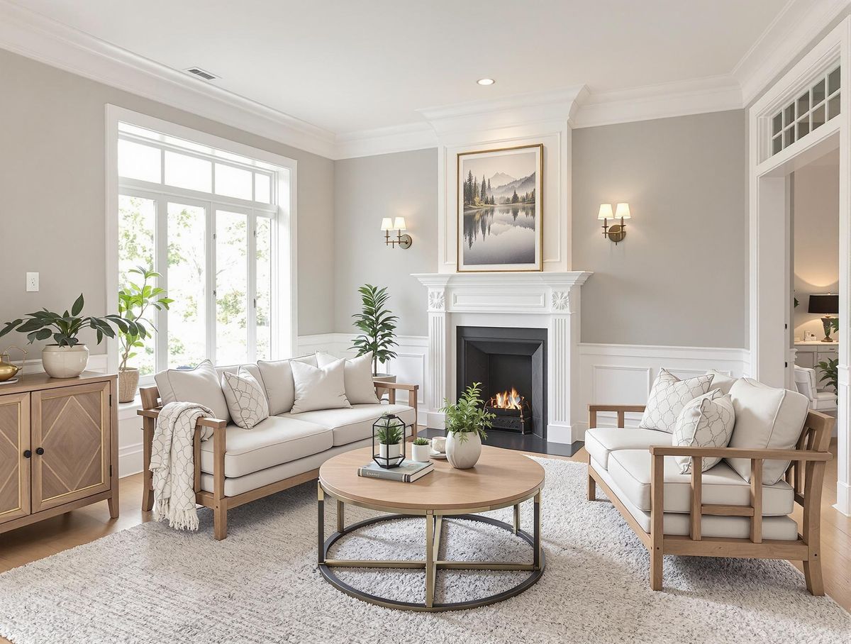
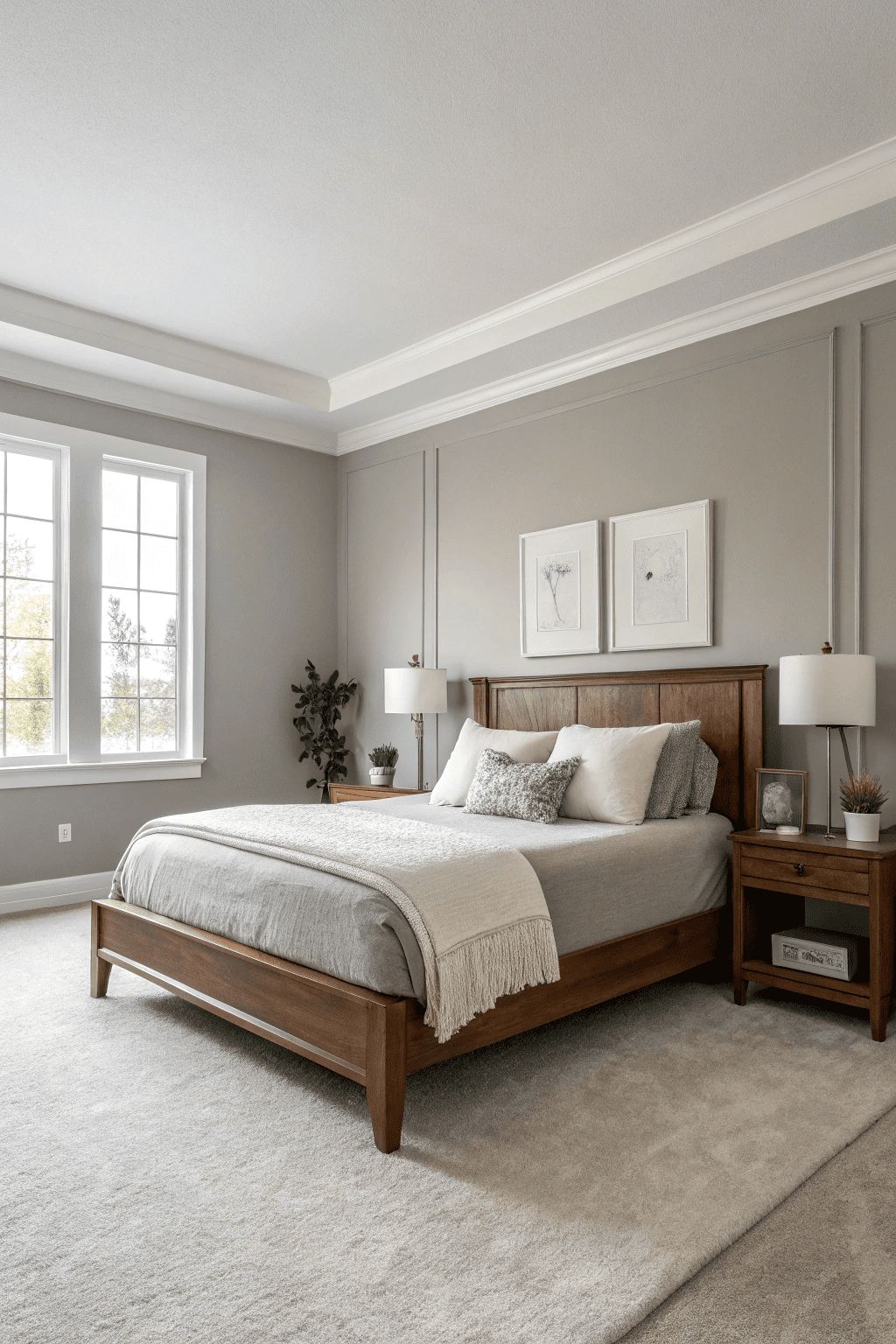
In both of the above living rooms, you can see Revere Pewter probably at its warmest. With warm light streaming in, lots of warm wood tones, cream-colored sofa and chair, as well as the brick fireplace, all the warm undertones of the paint color are pulled out.
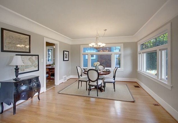
Despite some dark furniture pieces in this room, the thick white crown molding, lighter-colored floors, and abundance of natural light make the walls feel much cooler in color. The black accents in this space actually help to stop it from feeling warm, unlike brown-toned woods that highlight the warm undertones.
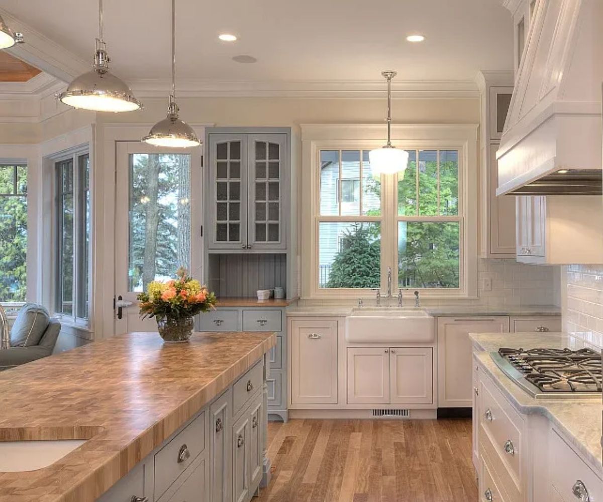
Kitchens
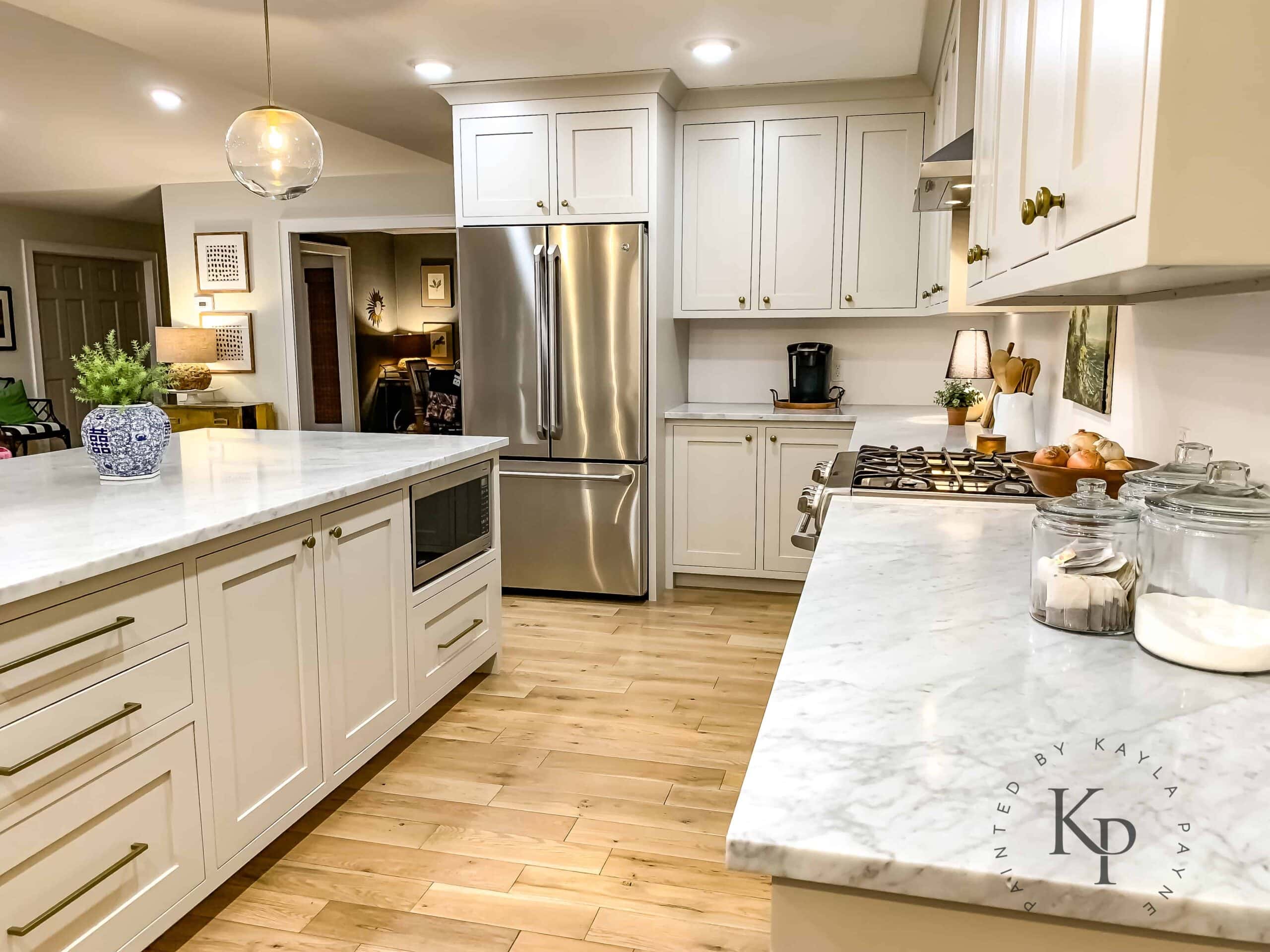
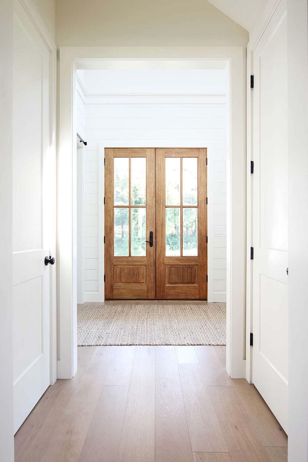
If you’re reading this, you’re probably considering Revere Pewter for walls in your home or maybe even your exterior. My absolute favorite use of this color, however, is for cabinets and interior doors. It’s really quite stunning and gives a fresh look to your home!
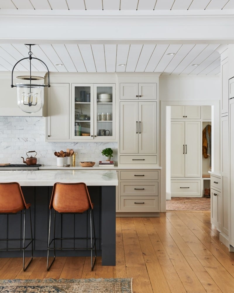
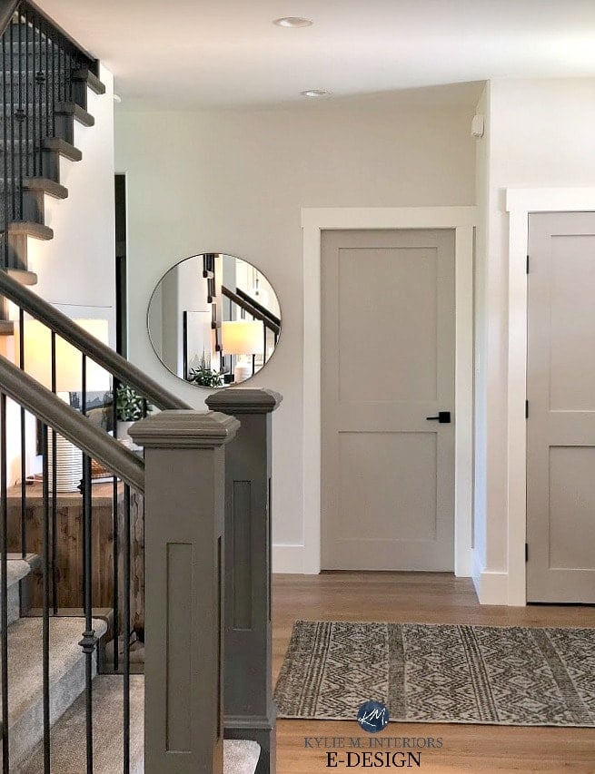
I’ve always been a bright white trim and doors kinda gal…but these Revere Pewter doors with white trim details from Kylie M. Interiors make me swoon. How about you? I think it gives a new dimension of beauty!
What Color Cabinets With Revere Pewter Walls?
Because this color is so versatile you have many options when it comes to cabinet color if you decide to paint your walls Revere Pewter. A great option would be Chelsea Gray because they have a similar undertone. Alternatively, you can go lighter with White Dove.
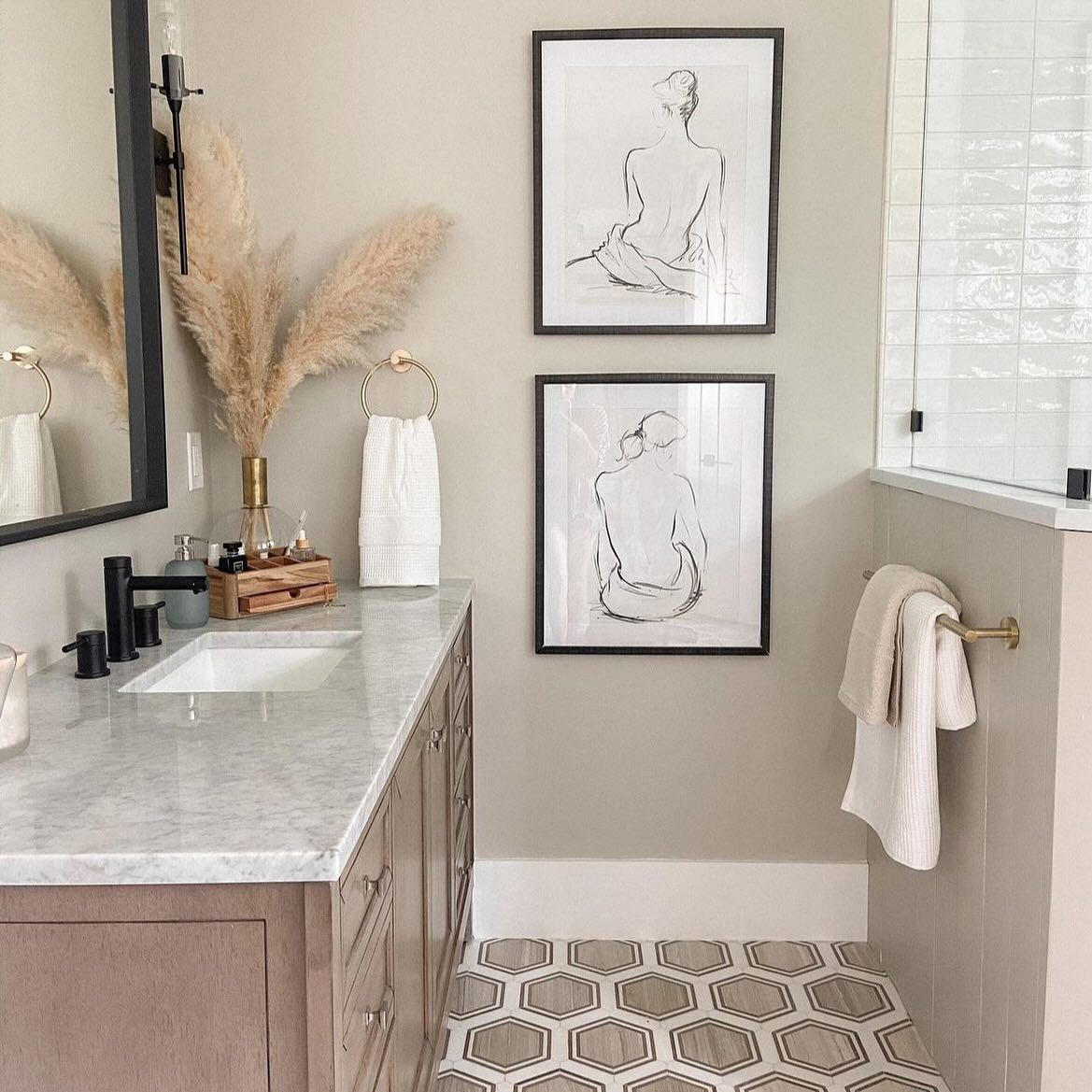
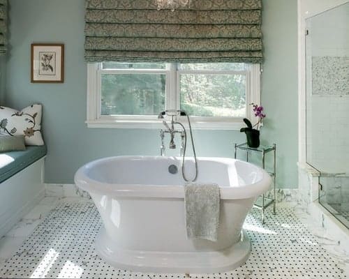
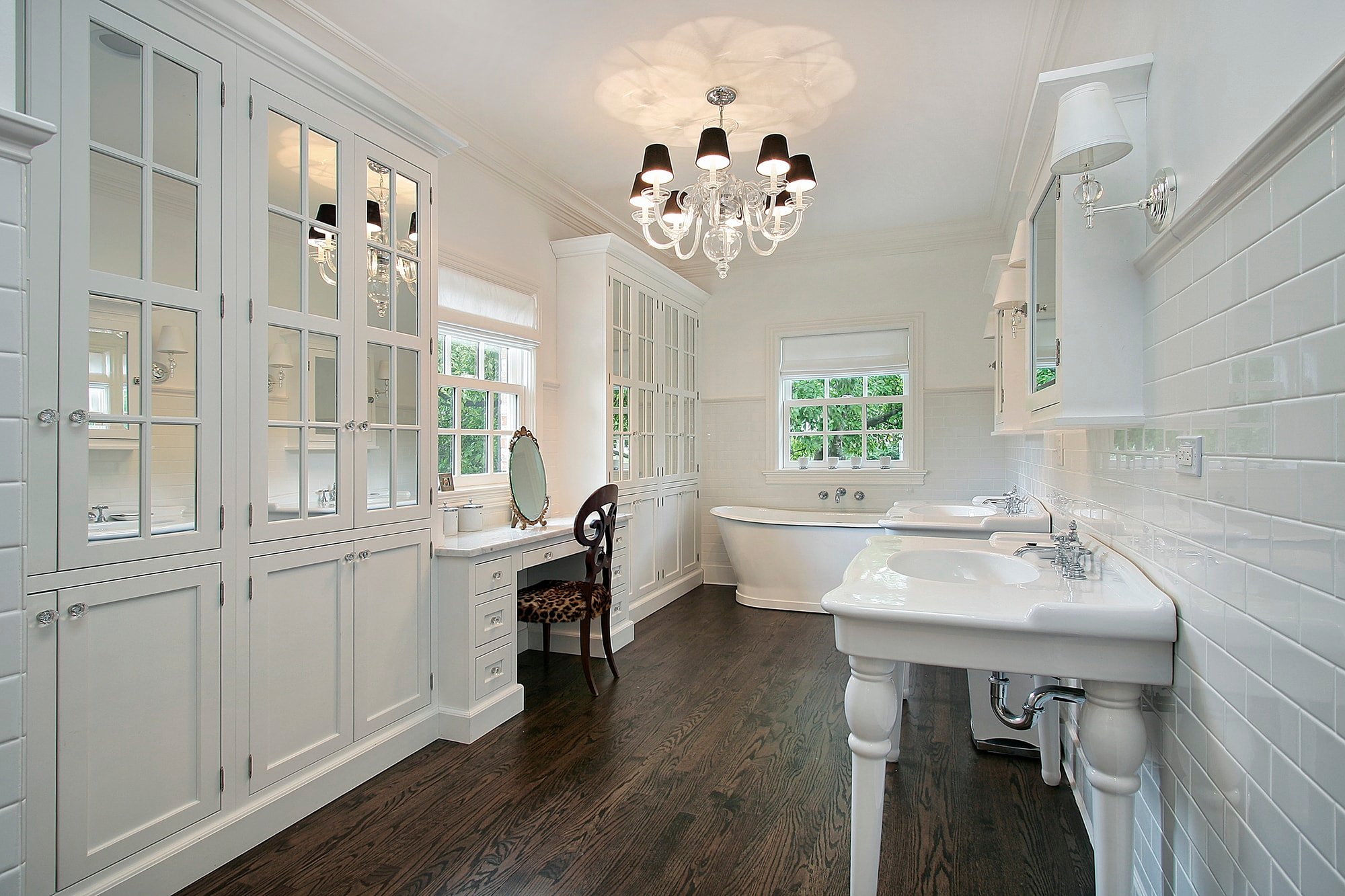
Bathrooms
This bathroom shows how Benjamin Moore’s Revere Pewter pairs with dark wood furniture. While the dark wood emphasizes some of the green undertones of the paint, the black accents do a nice job of balancing it all out and stopping it from feeling too dark
Below, you can see how dark and muddy it can look when in a darker space.
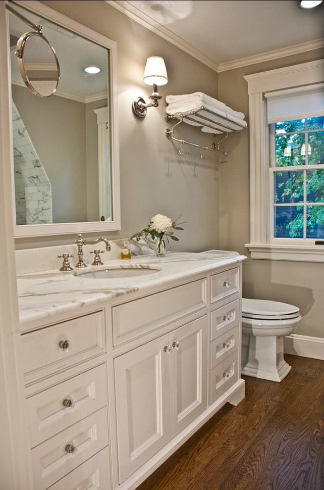
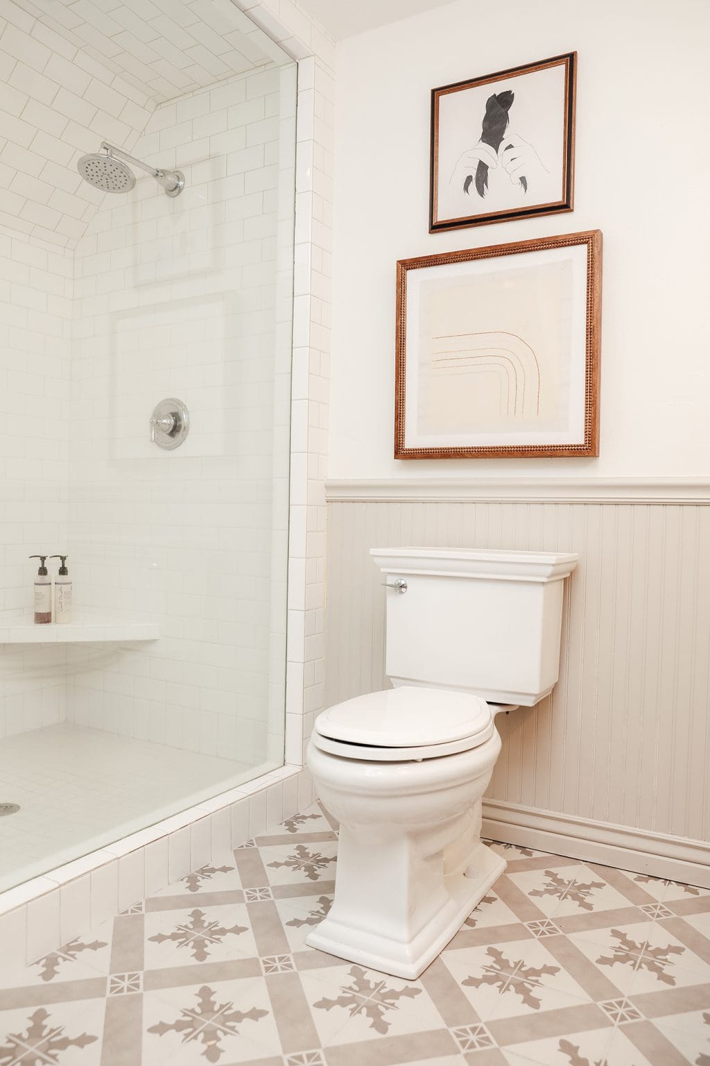
Similar to the kitchen cabinets and doors I mentioned previously, I think it works particularly well on the beadboard in this bathroom paired with the warm pattern tile, and white accents for beautiful results. So warm yet fresh, right?
What White Trim Color to Use With Revere Pewter
Now that you’ve seen how it looks in real spaces, you may be wondering what white trim color will work best.
I don’t recommend having a different white trim paint in every room of your home. Generally speaking, all your trim should be painted the same shade of white. But, if you’re starting from scratch or you’re dealing with one specific room where your current white paint doesn’t look right, feel free to switch it up.
Like I already mentioned, Revere Pewter looks great paired with so many different colors. But what is the best white trim color for Revere Pewter? The top 3 trim paint colors that go with Revere Pewter are:
- Benjamin Moore Decorator’s White – slight gray undertone
- Benjamin Moore Simply White – yellow undertones
- Or a bright white like BM Chantilly Lace.
Choosing the best trim color depends on what else is going on in the room and the rest of your house. You don’t want to start painting the trim in one room a completely different shade of white than everything else throughout your home, especially if the floor plan is mostly open.
Don’t Forget…
Don’t forget – no matter what you’ve read or photos you’ve seen online, it’s really important to sample paint colors in your home before committing!
Samplize provides real paint samples that are easy to move around your home, and cheaper than buying a gazillion paint pots! It’s the only way I buy paint samples.
So…is Revere Pewter the Right Color for You?
I hope you found this post helpful! If you’ve decided that this paint color might be the perfect color for you, be sure to get paint samples first to test it on your walls (or on some poster board) and pay attention to it throughout the day as the sun shifts. The light in your home changes throughout the day from cool to warm (or vice versa) and can greatly affect how the color will look on your wall.
Don’t forget to see how it looks in both natural light and artificial lighting, too – especially if you’re planning on painting a darker room where the lights will be turned on a lot!

Thank you so much for your Kolor blog. I’m renovating my house for the first time and I love reading what you do. There’s a picture above where the door is painted in Revere pewter- there’s a staircase in a circular round mirror with a thin black trim to the left of the door. What color are the walls painted? And what color is the trim in that picture? That is exactly the look I’m going with. If you don’t mind sharing, I would love to pair this right the first time. Thank you so much.
I sampled (on walls) every gray on the planet.. SW,BM, behr…. i settled on Repose Gray and painted my entire home with it. I hated it.. VERY green undertone, in every room and in every light. Big regrets ;(
Now i am looking for a gray to match my iron ore colored LVT floors and ceiling.. and Repose Gray keeps coming up.. any other ideas? ty!