Content may contain affiliate links. When you shop the links, I receive a small commission at no cost to you. Thank you for supporting my small business.
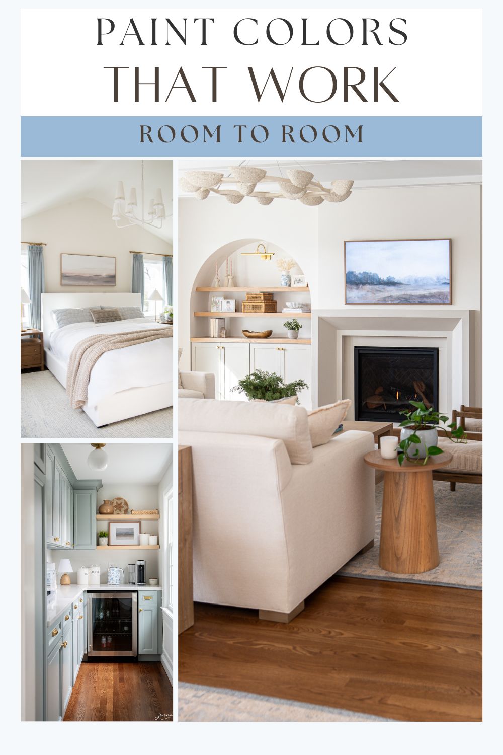
Choosing paint colors for your home can feel overwhelming—especially when you’re trying to make everything feel cohesive without painting every room the exact same color. Whether you’re building from scratch, remodeling a single space, or just tired of rooms that feel disconnected, a well-planned whole house color palette can completely change the look and feel of your home.
In this guide, I’ll walk you through exactly how to build a color scheme that flows room to room, looks polished (but not matchy-matchy), and actually works with what you already have.
The 6-Color Formula for a Cohesive Home
Most professionally designed homes follow a 5–6 color rule. That doesn’t mean only using six colors total—it means choosing six intentional, repeating tones that create consistency throughout your space.
| Role | Description + Example |
|---|---|
| 1 Main Neutral | Wall color used throughout (e.g. Alabaster) |
| 1 Secondary Neutral | Darker tone for cabinetry or built-ins |
| 1 White or Cream | For trim, ceilings, cabinetry (e.g. Pure White) |
| 1 Accent Color | For accessories, pillows, rugs, art |
| 1–2 Supporting Colors | Muted tones that add variety and flow |
TIP: Repetition is what makes this work. Your accent color in one room can become the wall color in another.
Start With What You Have
Before picking any paint colors, take a look at the fixed elements in your home:
- What color are your floors—are they warm-toned oak or cool-toned gray?
- Do your kitchen counters or bathroom tile have pink, yellow, green, or blue undertones?
- Are your cabinets staying put?
Your goal is to complement these undertones—not fight them. Even the most beautiful paint color will look off if it clashes with your finishes.
Tip: Hold your paint swatches right next to your floor or tile to see if they pull out any unexpected undertones
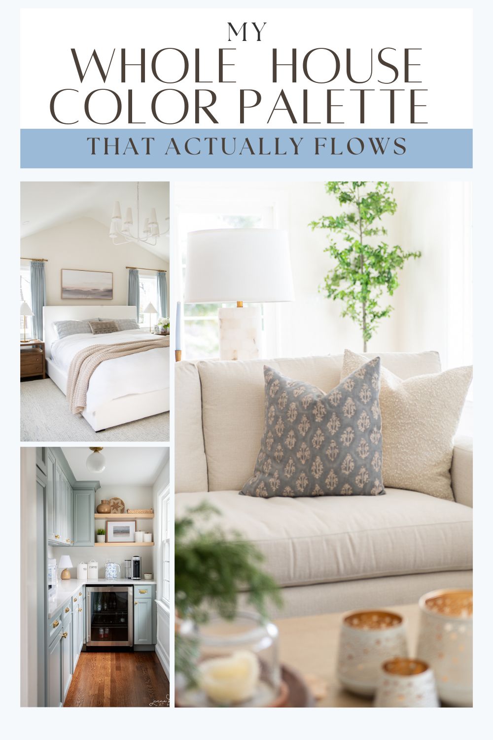
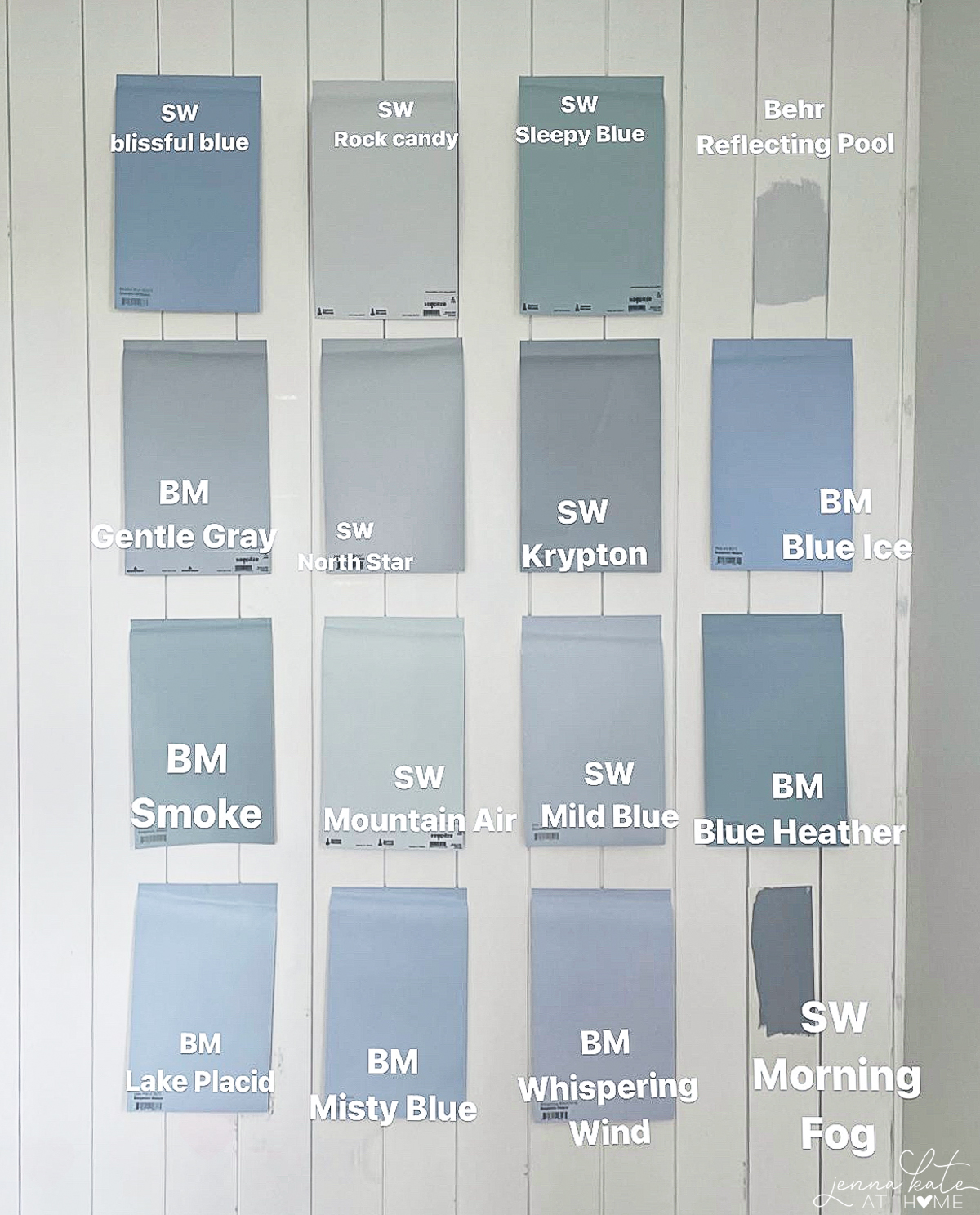
My Whole House Color Palette
| Area | Paint Color | Type |
|---|---|---|
| Kitchen, Dining, Living | SW Repose Gray (50% lighter) | Main Neutral |
| Family Room | BM White Dove | Main Neutral |
| Basement TV Room | SW Drift of Mist | Main Neutral |
| Upstairs Bedrooms | BM Swiss Coffee | Main Neutral |
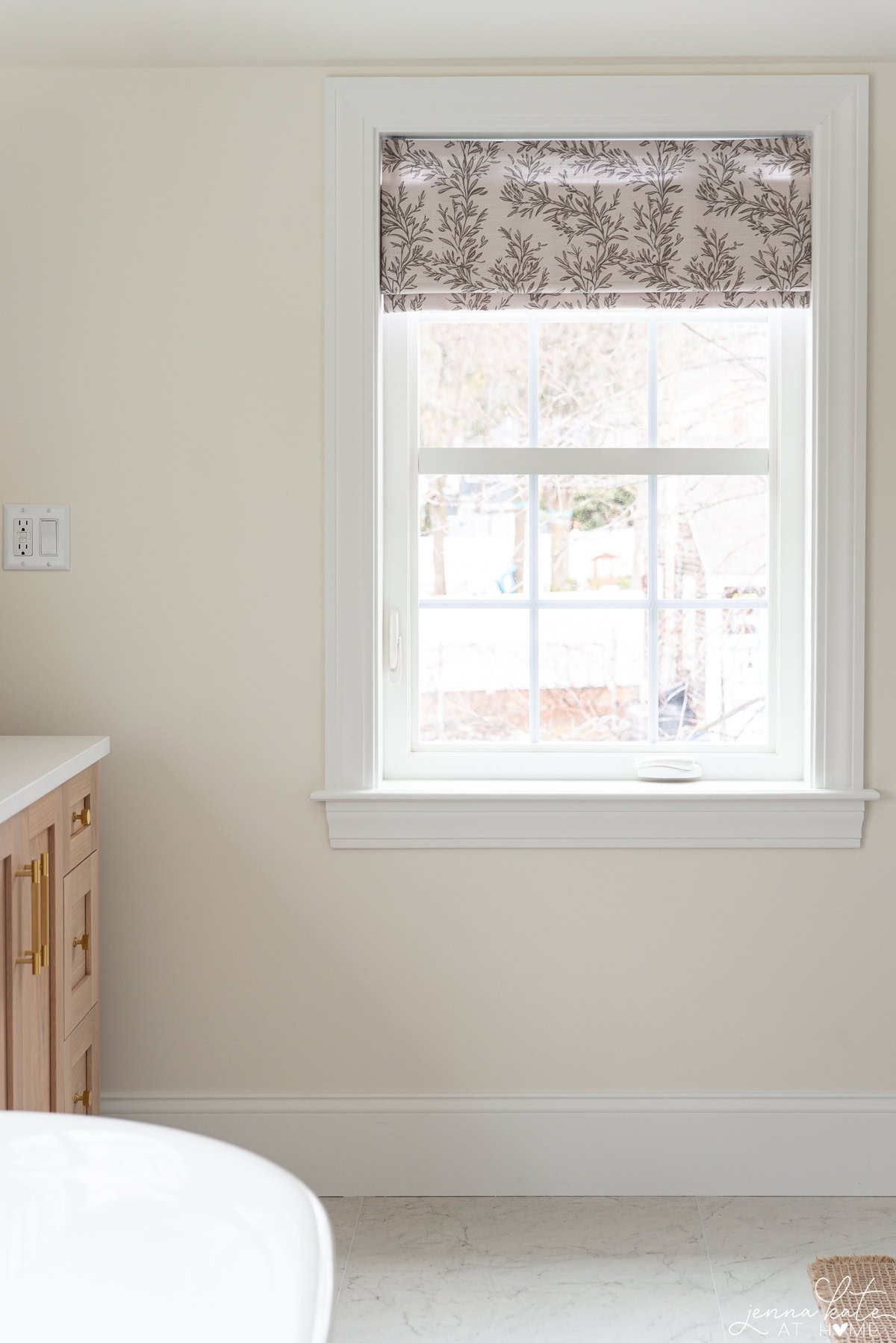
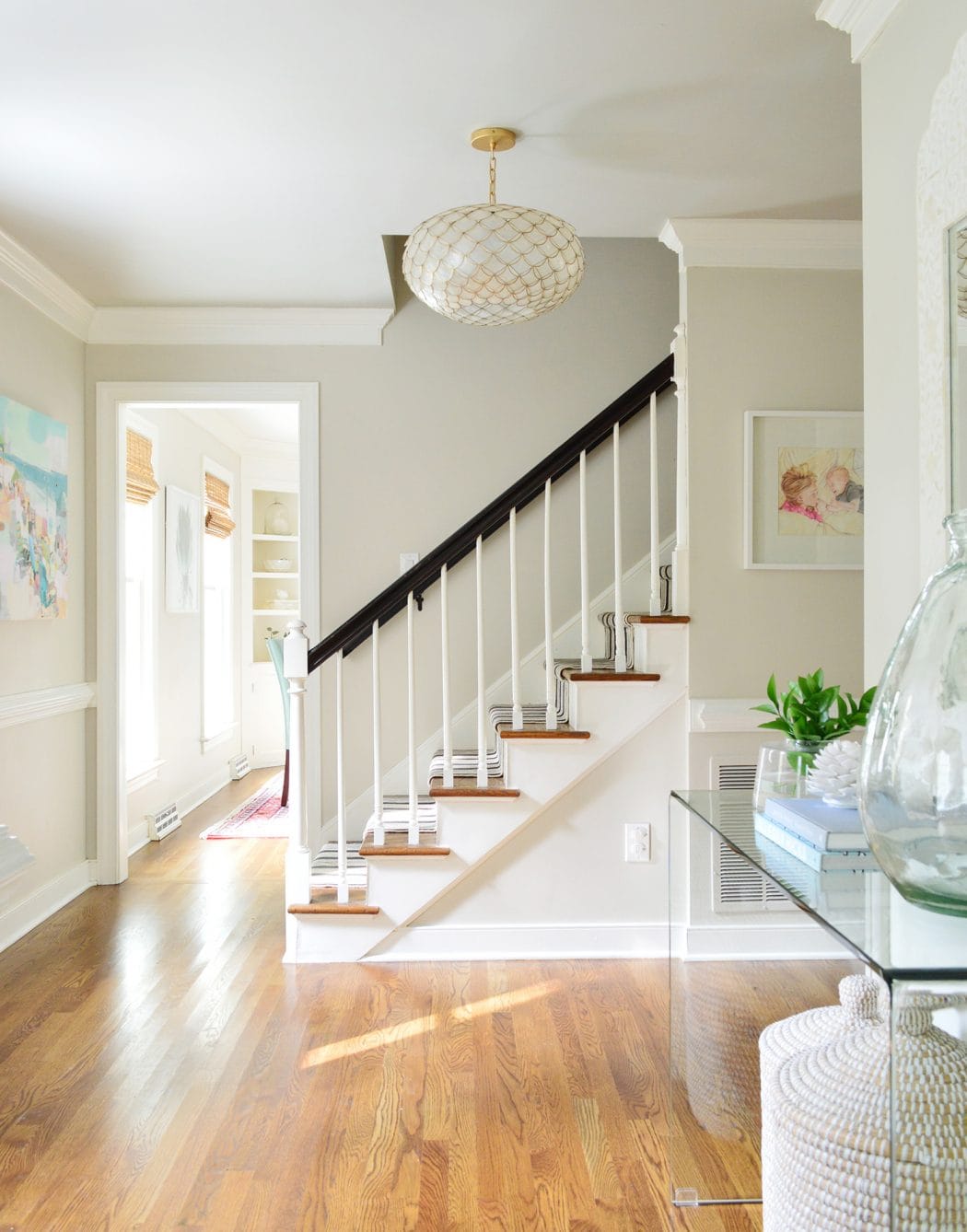
| Trim & Ceilings | SW Pure White | White/Cream |
| Kitchen Island & Pantry Cabinets | BM Boothbay Gray | Secondary Neutral |
| Front Door Interior | BM Britannia Blue | Supporting Color |
| Throughout Decor | Blue (all shades) + Brass tones | Supporting Accents |
These colors work together because they’re all light and airy, with a warm undertone and a touch of softness—nothing too stark or too cool. Even though Swiss Coffee doesn’t have the gray undertone found in the others, its placement upstairs adds warmth and keeps the palette feeling layered and natural.
You don’t need to use one single paint color to create a cohesive whole house palette—you just need colors that speak the same tonal language.
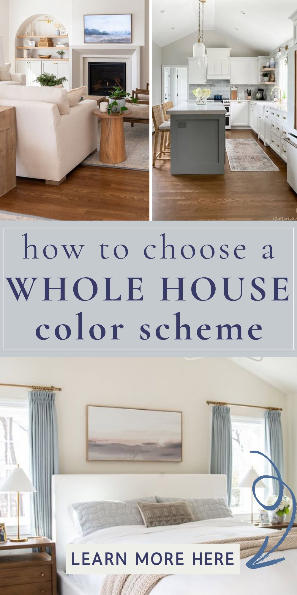
Real Home Example: How My Whole House Palette Comes to Life
Here’s a peek into how this palette actually plays out room by room:
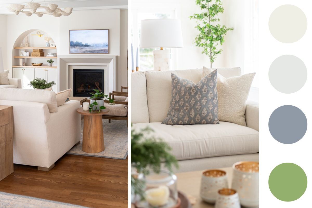
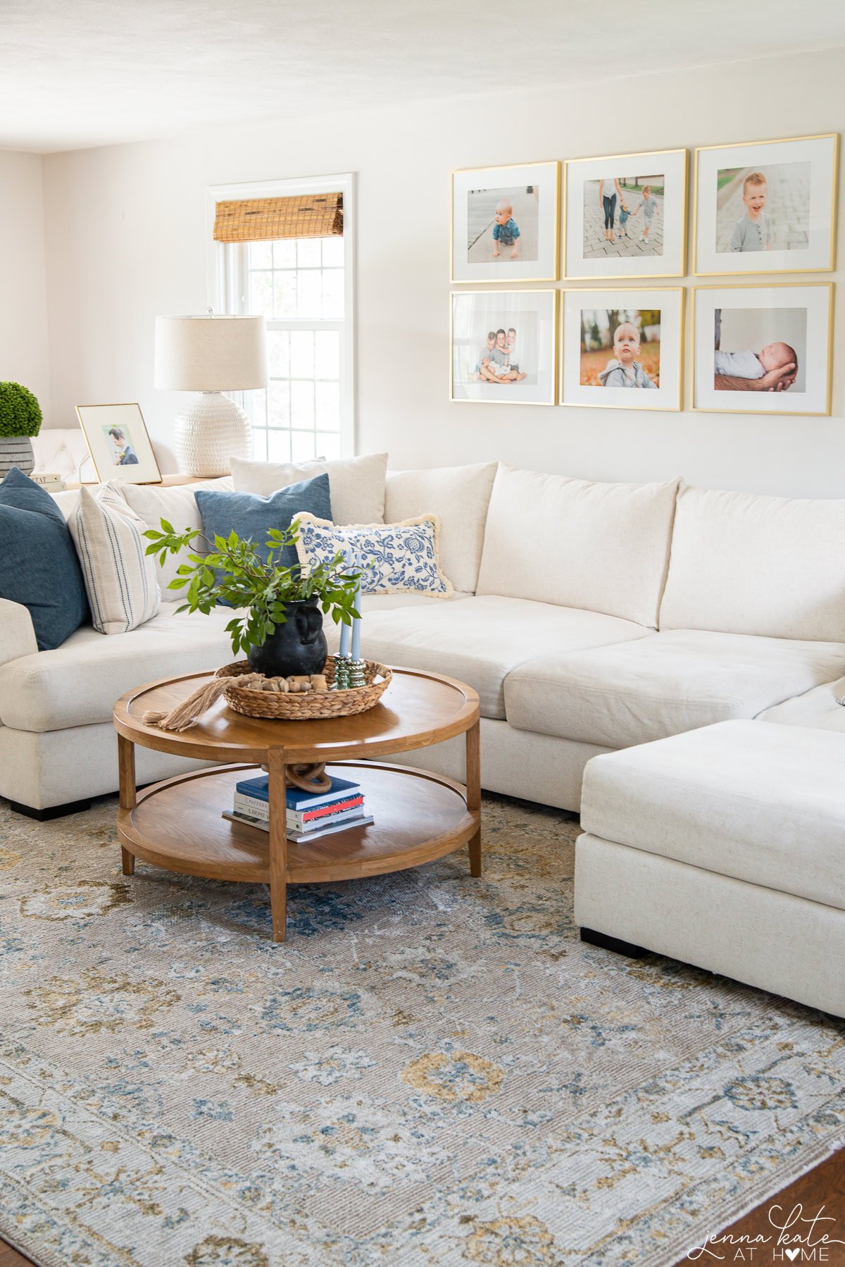
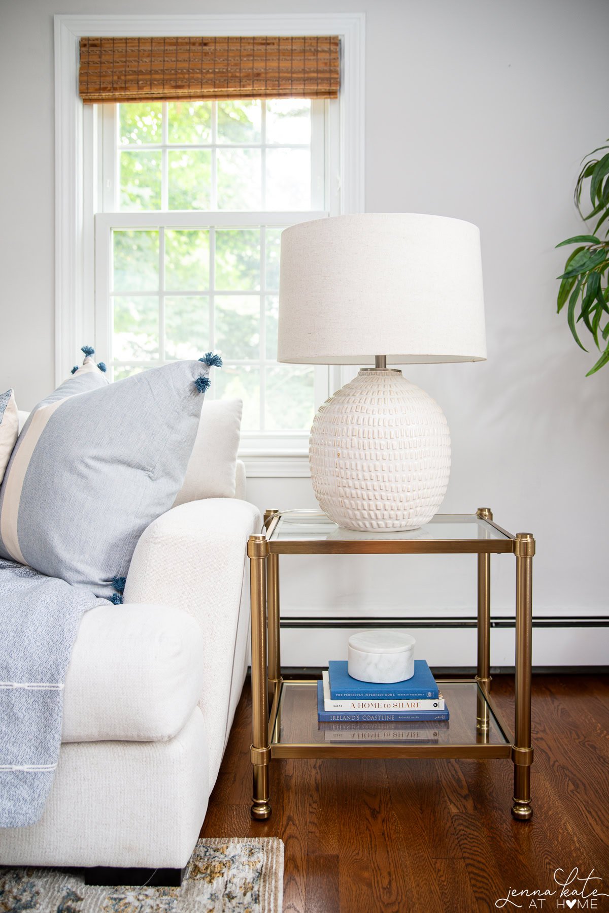
Family Room
Walls: BM White Dove
Trim: SW Pure White
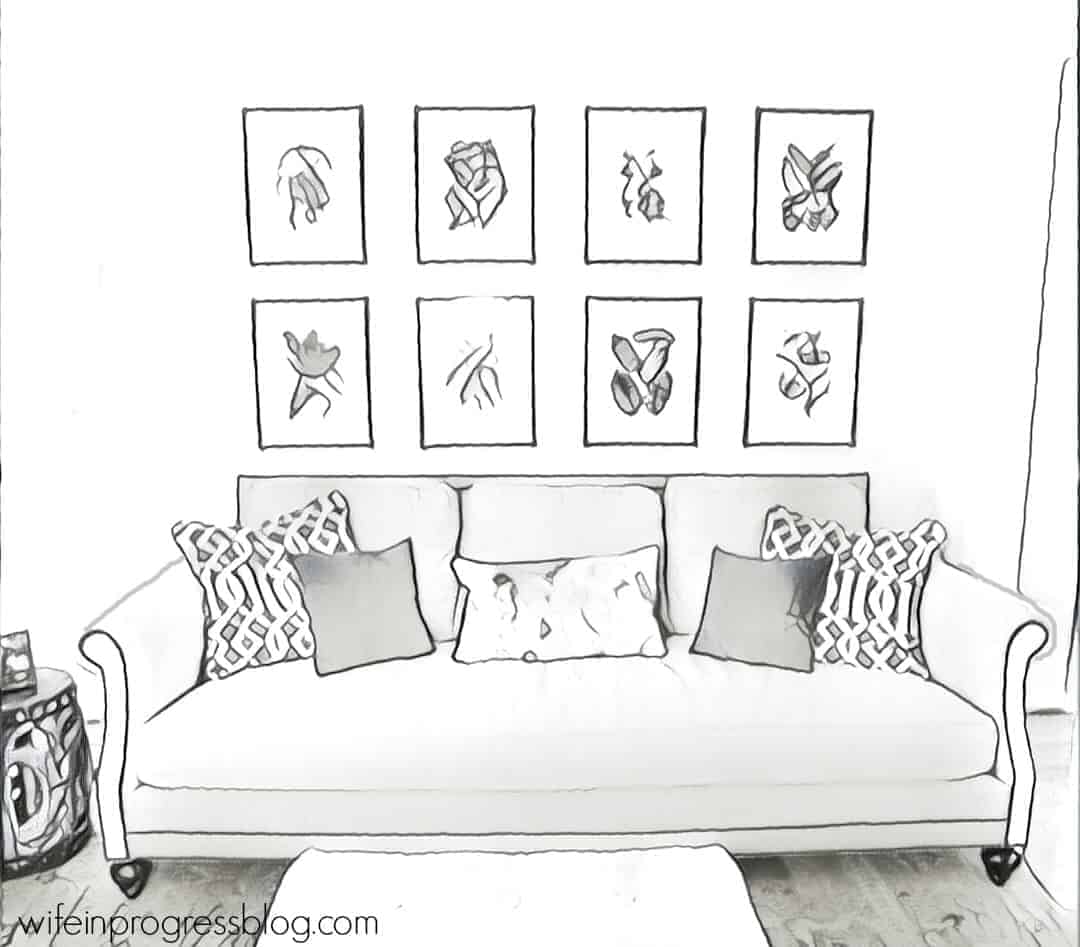
Layered with soft greens, smoky blues, mixed wood tones, and brass accents, this room feels both cozy and fresh.
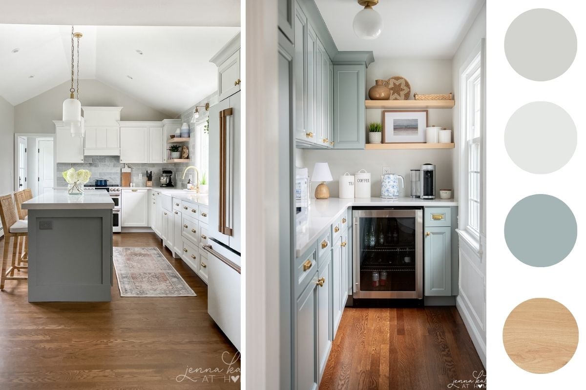
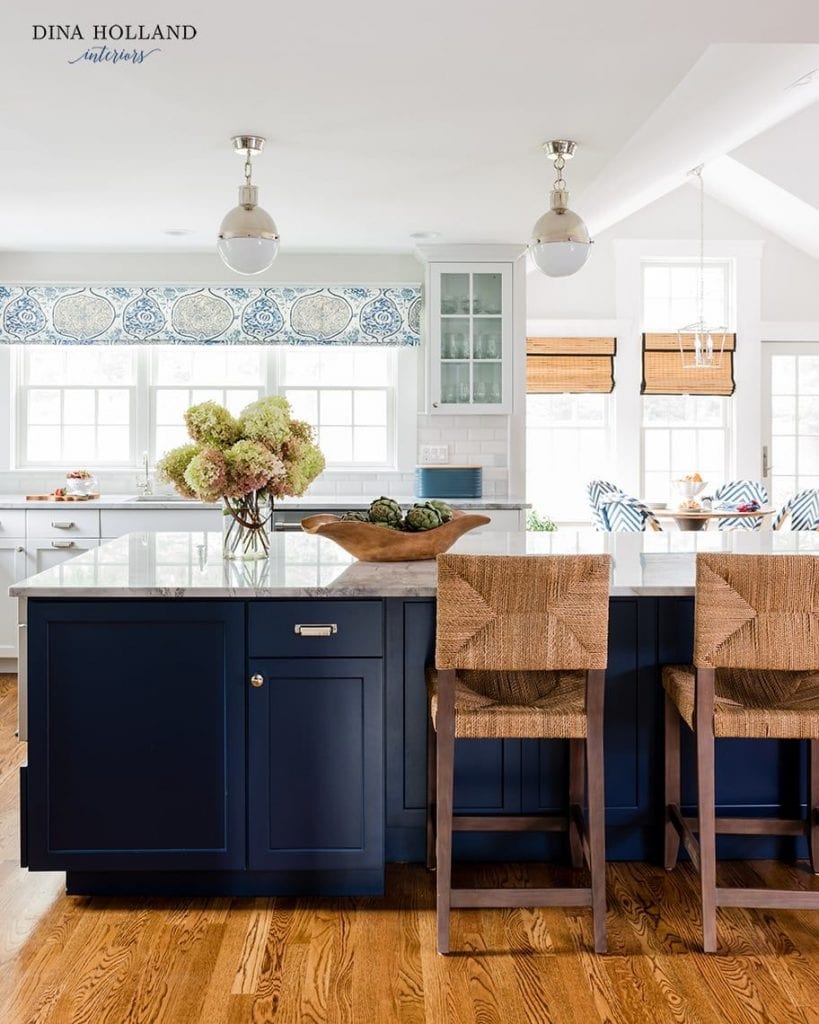
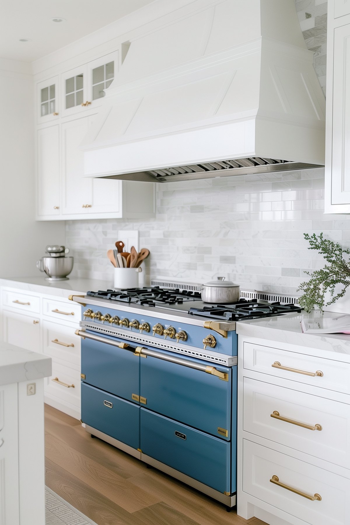
Kitchen
Walls: SW Repose Gray (50% lighter)
Cabinetry: BM Simply White & BM Boothbay Gray
This space balances warm wood floors and brass hardware with cool gray-blues to create a calm, clean look.
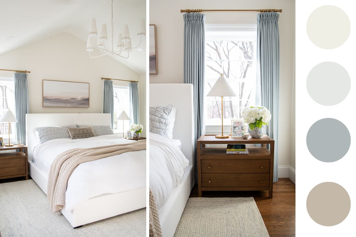
Primary Bedroom
Walls: BM Swiss Coffee
Trim: SW Pure White
Paired with soft white bedding, natural textures, and dusty blue drapes for a serene and airy retreat.
My 5 Year Old Son’s Bedroom
Walls: SW Pure White
Trim: SW Pure White
This room is slightly more vibrant, but still fits the whole home palette with soft whites, warm wood, and layers of blue in the bedding, wallpaper and art.

As you can see, I didn’t rely on just one wall color to create a cohesive home. Instead, I built a palette of complementary tones with similar warmth and softness—and repeated those hues through walls, trim, furnishings, and accents.
Each room feels distinct but still connected through color, texture, and tone.
Sample Whole House Color Palettes to Inspire You
Not sure where to start? These curated palettes are perfect jumping-off points based on different design styles.
Modern Coastal Color Palette

Colors included:
- Walls: SW Alabaster, SW Accessible Beige, SW Drift of Mist and SW Incredible White
- Trim: SW Pure White
- Cabinet/Island: SW Needlepoint Navy
- Accent Color: BM Powder Blue
- Supporting Color: SW Sea Salt
This palette is light and breezy with just enough contrast. Warm neutrals like Alabaster and Accessible Beige keep the look cozy, while soft greens and blues add a subtle coastal touch.
Warm and Earthy Color Palette
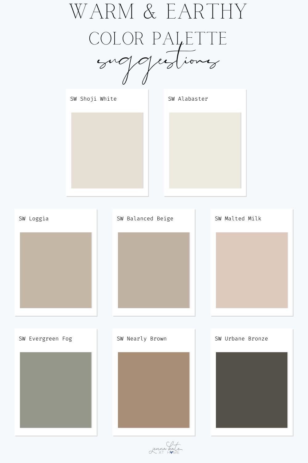
Colors included:
- Walls: SW Shoji White, SW Loggia, SW Balanced Beige, SW Malted Milk
- Trim: SW Alabaster
- Cabinet/Island: SW Urbane Bronze
- Accent Color: SW Nearly Brown
- Supporting Neutral: SW Evergreen Fog
Perfect for homes with lots of natural materials, this palette brings warmth and depth without feeling heavy. Shoji White and Alabaster balance out the richness of Urbane Bronze and Loggia.
Modern High Contrast Color Palette
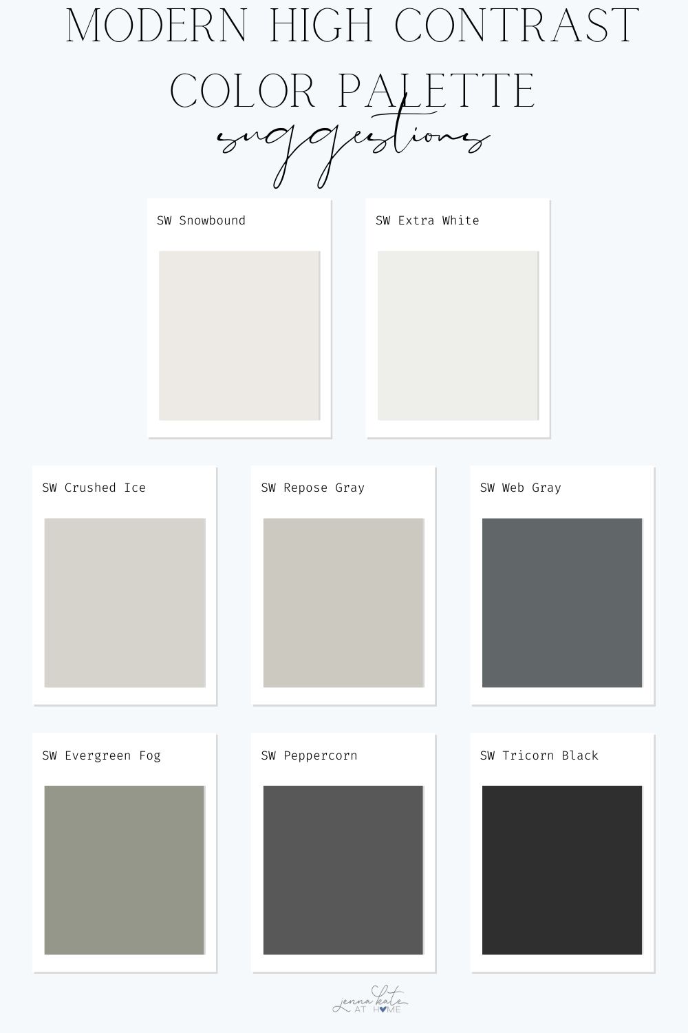
Colors included:
- Walls: SW Snowbound or SW Crushed Ice, SW Repose Gray
- Trim: SW Extra White
- Interior Doors: SW Tricorn Black
- Cabinets/Island: SW Peppercorn
- Accent Color: SW Evergreen Fog or SW Web Gray
If you love clean lines and bold contrast, this palette brings drama in a refined, livable way. Crisp whites and soft grays keep things from feeling too stark, while black and green tones add depth and edge.
How to Transition Between Colors Room to Room
You don’t need to use the same color in every room—but you do want the colors to work together. Some easy ways to keep transitions feeling intentional:
- Use the same trim and ceiling color throughout the home
- Let one color be a wall color in one room and an accent in another
- Stick to a consistent undertone family (warm, cool, or neutral)
- Use architectural features (doorways, beams, arches) as natural color break points
When It’s Okay to Break the Palette
Color rules are helpful—but there’s no laws!
It’s okay to:
- Add a bold wallpaper in a powder room
- Let kids’ rooms reflect their personalities
- Use a deeper color in a cozy den
Just make sure your main living spaces feel cohesive—the rest can be the “fun chapters” in your home’s color story.
Tips for Pulling It All Together
- Use matte or eggshell sheens for soft, livable walls
- Repeat your contrast color in small doses (doors, accessories, etc.)
- Layer in natural textures to warm up neutrals
- Always sample paint in your actual lighting at different times of day
- If you’re stuck, start with a rug, fabric, or piece of art you love
When Not to Use a Color
Even popular shades like Iron Ore or Sea Salt have their limits. Avoid colors that:
- Clash with fixed finishes (flooring, counters, tile)
- Feel too dark in windowless rooms
- Look good online but pull the wrong undertone in your space
- Don’t repeat elsewhere in your palette
Final Thoughts
A whole house color palette isn’t about picking six random paint colors. It’s about crafting a story through color, texture, and tone. Start with what you already love, lean into your home’s natural undertones, and let your palette evolve over time.
Still not sure where to start? Use one of the sample palettes above as a jumping-off point – or take a peek around your home and build from what’s already working.
And if you try any of these ideas, tag me on Instagram @jennakateathome – I’d love to see how you bring your palette to life.

I’m so glad that I’ve found you and your Beginners Guide to Decorating. We’re building a house and I’m so nervous about picking out paint colors. I’m hoping you have some guidance to flooring as well.
Can I ask what is the color of your neutral? We are doing a new build and so I am starting from scratch. I am having white kitchen cabinets is all that is set. I also love blue
Hi! My walls are SW Repose Gray lightened by 50%
Hi I love the color you chose. I want to do 3 rooms the same color. What sheen should I get and with the base white I see extra white, high reflective white, deep base, ultadeep base and agreeable grey. I doing the same color as your Repose Grey. Thank you
I believe it’s extra white base but you don’t need to worry about that, the store chooses the base depending on the color. For walls I do eggshell or matte and for trim I do satin or semigloss.
I love your ideas and I will use them in my home.I have move to Florida so I’m decorating in Coastal.
Do you have a blog addressing an older home with Honey oak everywhere? Don’t want to paint the kitchen cabinets but trying to figure color schemes to modernize the look of the house. I do like the blues and greys
Hi!!yes! Just search for honey oak and it should come up.
Jenna, I so enjoy your blog and all of your content. I’m an experienced interior designer in Florida (www.Homefrosting.com) and still pick up so many new tips from you. Thank you for all of your inspiring work.
Karen
That’s such a compliment, Karen! Thank you so much!
With the Repose at 50% can I do it with all White Dove as it is already painted the White Dove. Too much for me to do over. In searching colors everyone seems to like the White Dove. I’ve looked for a very long time. It gotten so I see so many Whites on trim that I’m thinking my White Dove seems dingy. Need reassurance. At my late years it is important to get right. I had thought all White Dove for a while but do like your Repose 50%. Hope it looks the creamy than gray.
..
Yes, you can definitely pair it with White Dove which will bring out more of the warmth. Definitely sample it in your home first, though, before committing!
Your explanation of how a color scheme can be used effectively with both paint and furniture was really easy to understand, so I appreciate that. I’ve been meaning to turn my house from a modern-looking one to a house that’s more natural and relaxing, and I had wondered what could be a great start to that project. Picking out colors and using them with the color scheme guide you have could really help me out, so I’ll hire a professional painter in the area that can assist me with this.
https://www.titanpainting.com/services