Content may contain affiliate links. When you shop the links, I receive a small commission at no cost to you. Thank you for supporting my small business.
Looking for a bold, moody paint color that isn’t quite black—but still makes a statement? Sherwin Williams Iron Ore (SW 7069) might be exactly what you’re after. This deep charcoal gray brings dramatic contrast and timeless sophistication to any space, whether you’re painting a kitchen island, built-ins, or even the entire exterior of your home.
In this post, I’m breaking down exactly how Iron Ore looks in real spaces, how it compares to similar shades, what undertones to watch for, and how to know if it’s the right black paint color for your project.
SW Iron Ore: At A Glance
- Type: Soft black / deep charcoal gray
- LRV: 6 – very dark, nearly black
- Undertones: Cool charcoal with subtle green in some lighting
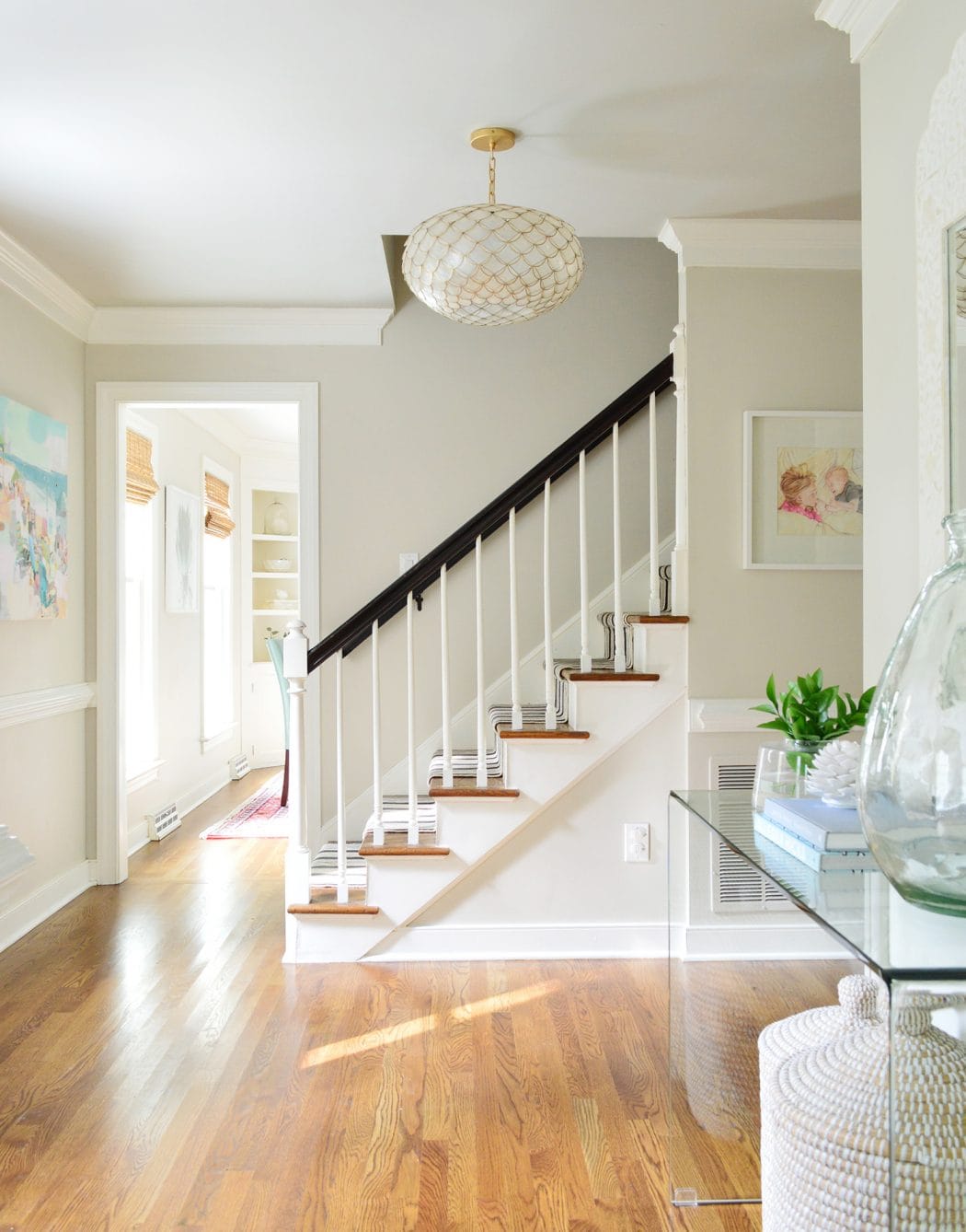
- Best For: Exteriors, kitchen islands, doors, built-ins, accent walls
- Pairs Well With: Pure White, Alabaster, wood tones, muted greens/blues
- Similar to: Tricorn Black, Wrought Iron, Black Fox, Soot, Urbane Bronze
Iron Ore Undertones: What You’ll Notice
Iron Ore is a soft black with cool charcoal undertones and—depending on lighting—a subtle green cast. It’s not obvious, but in full sun or on exteriors, that green can peek through, especially with a satin finish.
Iron Ore LRV: How Dark is it?
Iron Ore has a Light Reflectance Value (LRV) of 6, which means it’s very dark and absorbs most of the light that hits it. In most spaces, it will appear nearly black—especially at night or in rooms with limited natural light.
In brighter spaces, however, Iron Ore softens a bit and shows more of its charcoal gray base. It never feels light or washed out, but it can feel more dimensional during the day. That’s part of what makes it so versatile—it shifts just enough to stay interesting without ever feeling harsh.
Is Iron Ore Warm or Cool?
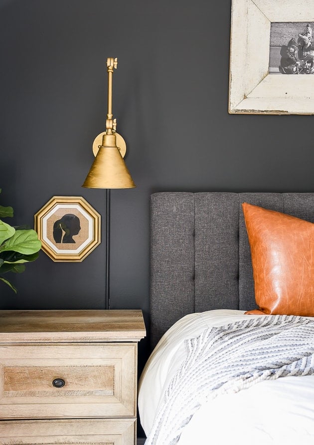
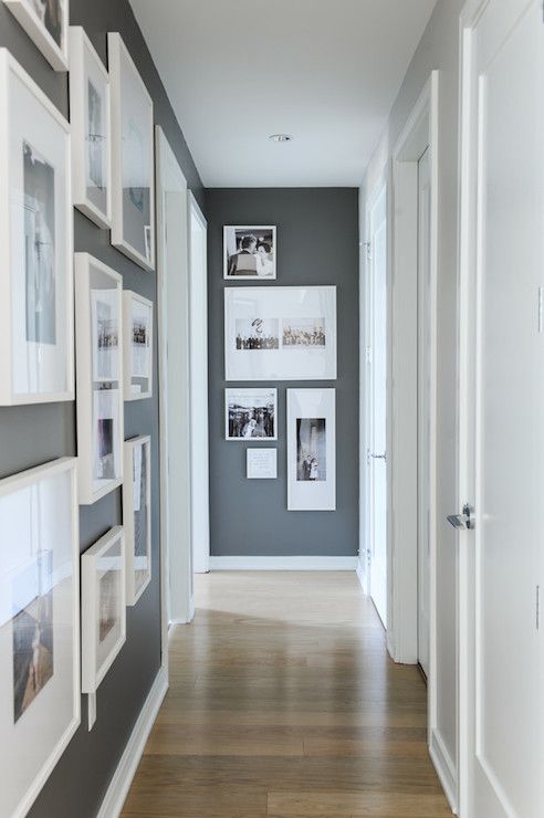
Iron Ore also has charcoal or gray undertones, but in a warm-toned way. This means it is not a stark black and gives off a sense of depth and richness, making it an excellent choice for accent walls, cabinets, and doors.
Its warm, soft black appearance can also look like a dark charcoal or gray, further adding to your design possibilities.
In well-lit rooms, Iron Ore can soften a bit, looking more like a smoky, deep gray. However, in low-light conditions or evening lighting, it can appear nearly black. The cool undertones keep it feeling fresh and modern, without becoming overly stark or industrial.
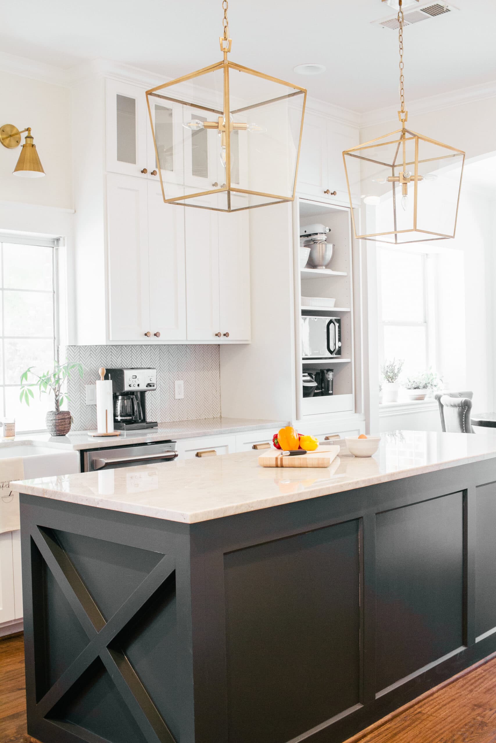
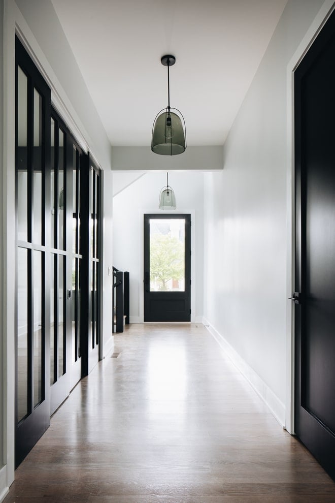
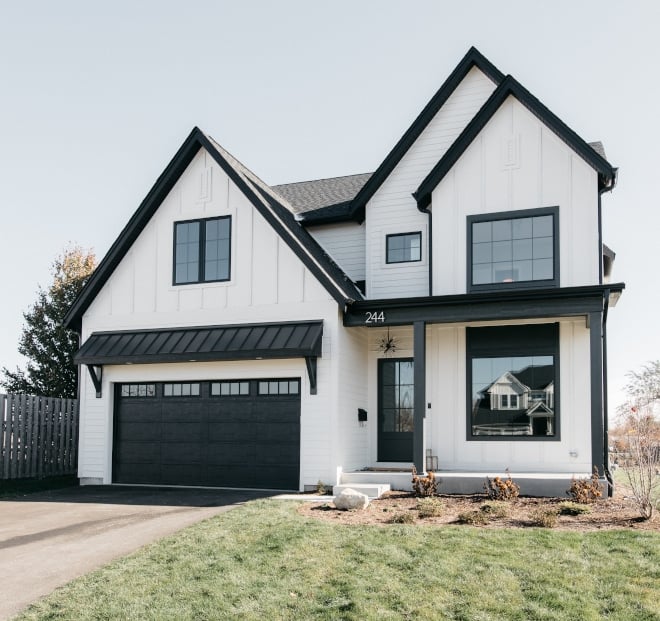
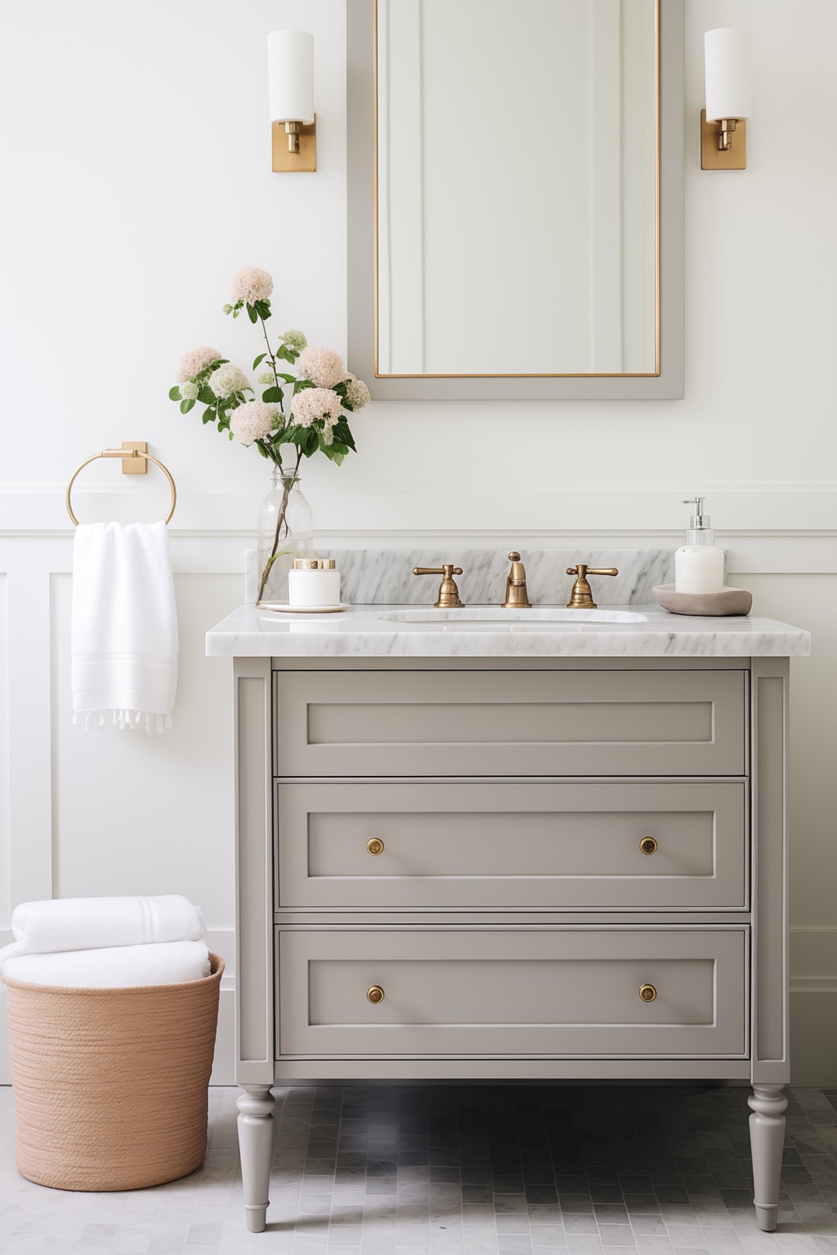
Places To Use Sherwin Williams Iron Ore
Iron Ore is a versatile color that works in both bold, high-contrast spaces and cozy, moody nooks. Here’s where it shines:
- Exterior Siding or Brick
Adds modern curb appeal and bold contrast—especially paired with white trim or wood tones. - Interior Doors or Trim
A stylish way to break up white walls without going full dark on an entire room. - Kitchen Islands or Built-Ins
Creates instant depth and interest when paired with lighter cabinets or countertops. - Fireplace Mantels or Accent Walls
Adds a grounded, cozy feel—especially in living rooms with layered textures. - Bathrooms or Powder Rooms
Great for a high-impact look in smaller spaces. Try it on the vanity or even the ceiling.
Best White Trim Colors to Pair With Iron Ore
- Greek Villa (SW 7551) – creamy and traditional
- Pure White (SW 7005) – crisp contrast
- Alabaster (SW 7008) – soft and warm
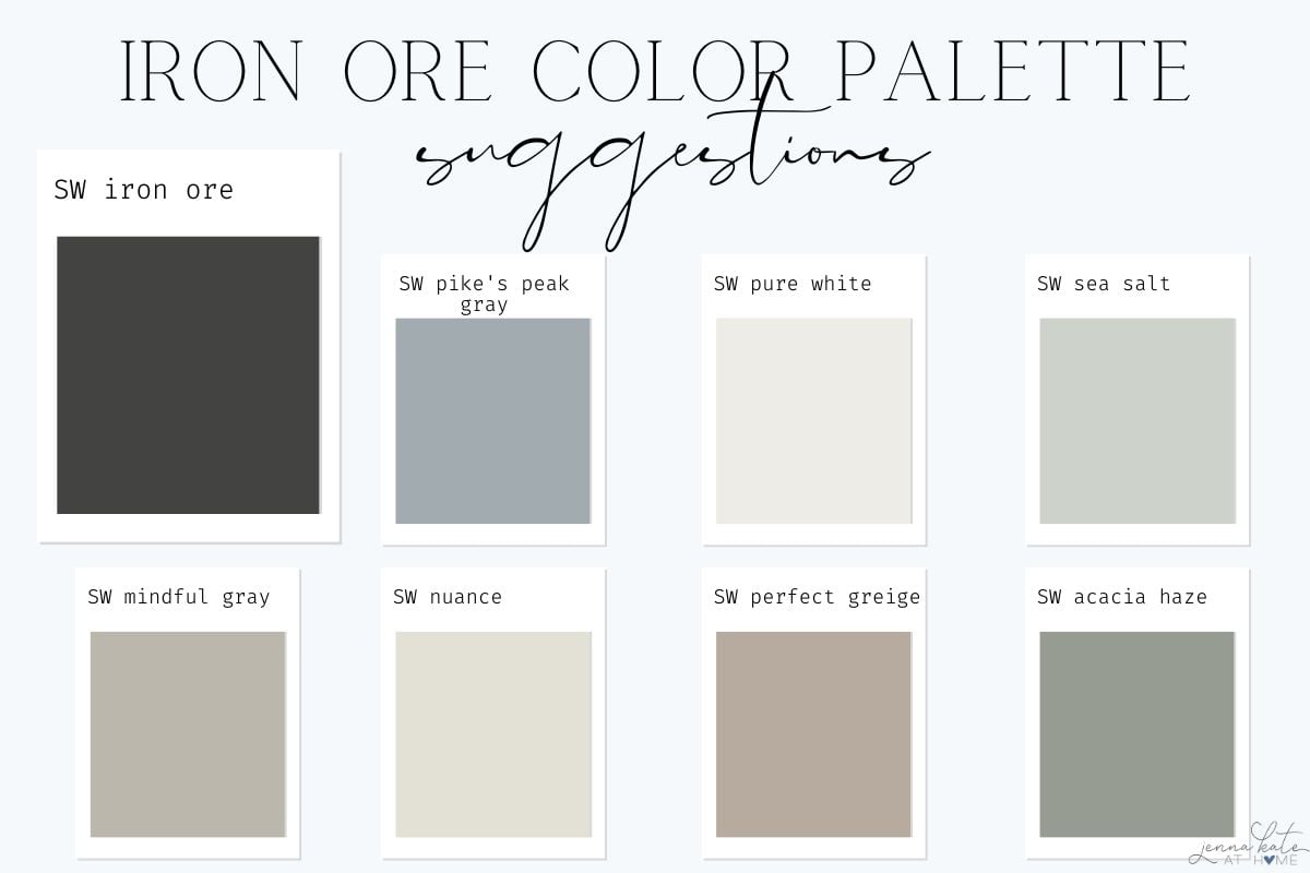
Colors That Go Well With Iron Ore
Because Iron Ore is so dark and saturated, it pairs best with lighter, softer tones that offer contrast. Here are some go-to coordinating colors:
- Wood Tones – Natural wood, brass, or matte black fixtures all help balance the boldness of Iron Ore and bring warmth into the room.
- Whites – Try Sherwin-Williams Pure White for a clean, crisp look or Alabaster for a slightly warmer contrast.
- Grays & Greiges – Lighter neutrals like Agreeable Gray, Repose Gray, or Mindful Gray all complement Iron Ore without competing.
- Muted Colors – Earthy greens (Acacia Haze), stormy blues (Pike’s Peak Gray), and even soft aquas (Sea Salt) work well because they echo the natural tones within Iron Ore.
Iron Ore Versus Other Black Paint Colors
Iron ore vs Tricorn Black (SW 6258)
Tricorn Black is a true, saturated black with no noticeable undertones. Its LRV is just 3—making it darker than Iron Ore and significantly more intense.
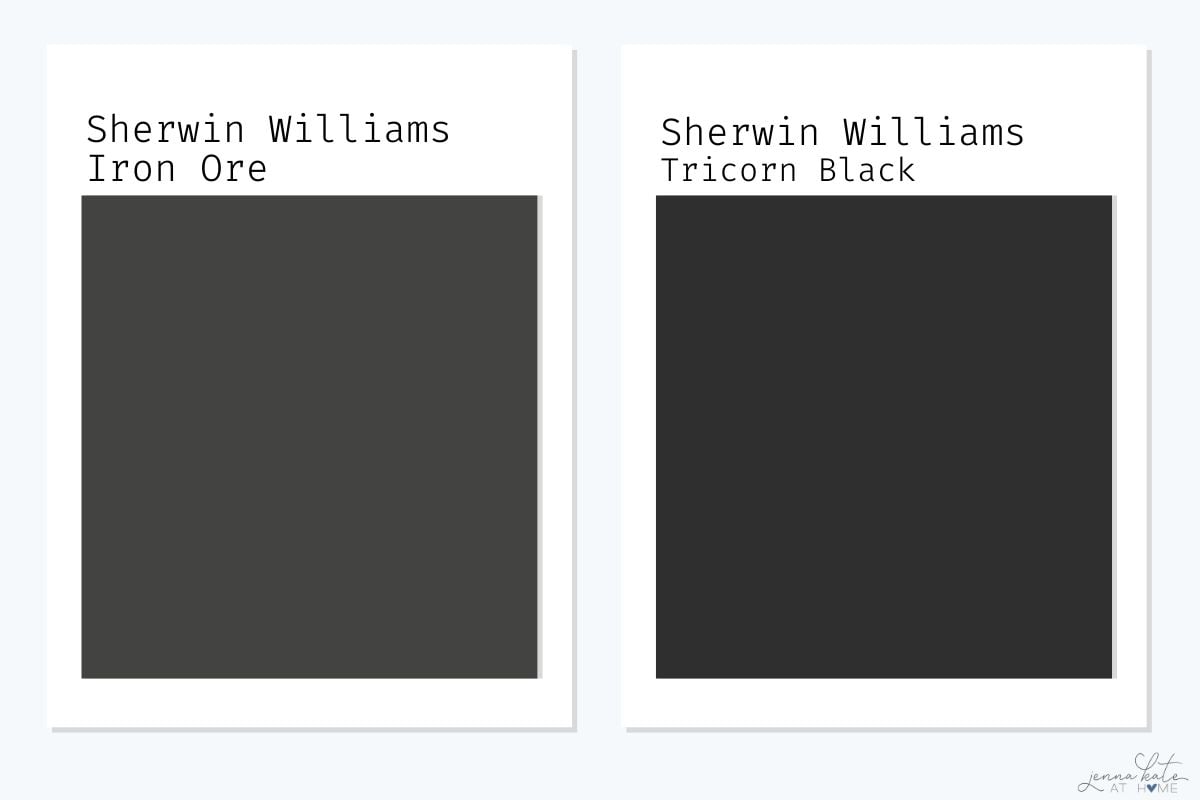
If you want the deepest, boldest black possible, Tricorn Black delivers. But if you want a slightly softened, more livable look, Iron Ore is the better choice.It feels modern without the starkness of jet black.
Iron Ore vs Benjamin Moore Wrought Iron (2124-10)
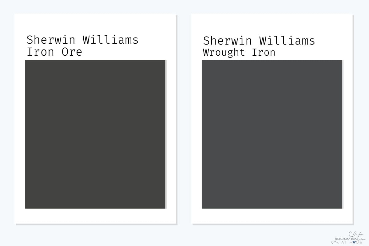
- Wrought Iron is a close cousin to Iron Ore in terms of depth, with an LRV of around 6.16.
- The main difference is in the undertones—Wrought Iron leans slightly blue, while Iron Ore leans more neutral with a hint of green.
- If you’re aiming for a sleek, cooler-toned look, Wrought Iron might be the better fit. For a more grounded, neutral charcoal, Iron Ore wins out.
Iron Ore vs Black Fox (SW 7020)
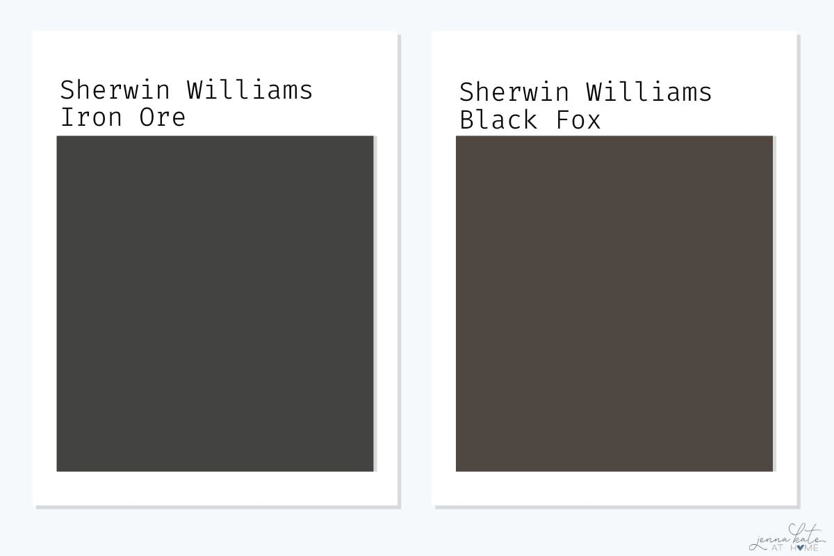
- Black Fox is warmer and earthier than Iron Ore, with brown undertones that give it a taupe-black appearance. With an LRV of 7, it’s just a bit lighter than Iron Ore.
- If you have a lot of warm tones in your space—like beige, tan, or red oak—Black Fox might blend more seamlessly.
- Iron Ore, by contrast, adds cooler contrast and a more modern feel.
4. Iron Ore vs Benjamin Moore Soot (2129-20)
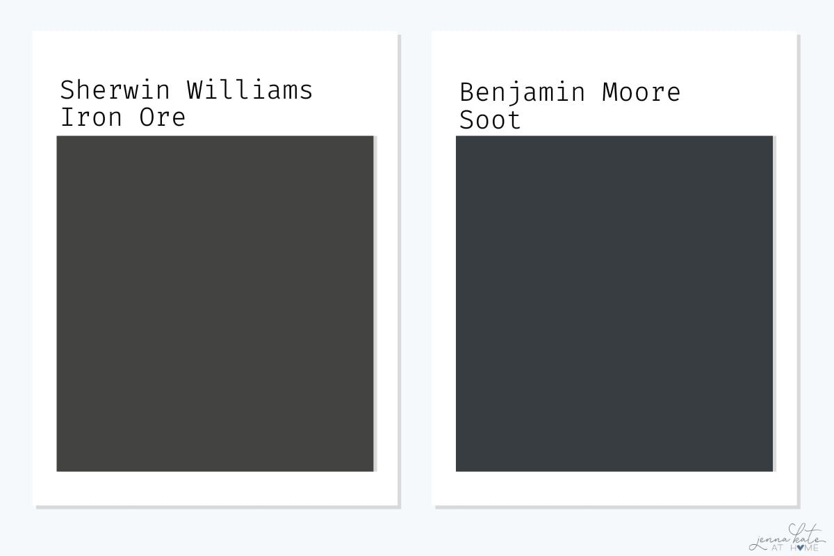
- Soot is a dramatic, cool-toned charcoal that leans blue—almost like a blackened navy in the right light.
- Its LRV is 4.17, so it’s a touch darker than Iron Ore.
- If you want something moody and atmospheric with a blue undertone, Soot could be a great fit.
- Iron Ore, on the other hand, is more versatile and neutral across a wider range of styles and lighting.
Iron Ore Urbane Bronze (SW 7048)
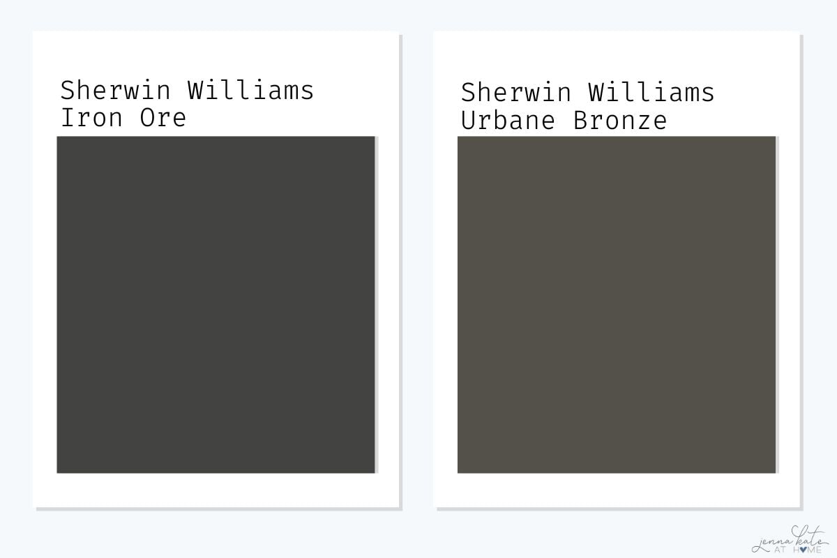
- Urbane Bronze is a much warmer color with brown and bronze undertones. With an LRV of 8, it’s noticeably lighter than Iron Ore.
- While Iron Ore feels modern and edgy, Urbane Bronze feels earthy and organic.
- Choose Urbane Bronze if you want to warm up a space and lean into natural elements like wood, rattan, or stone.
- Choose Iron Ore if you want sharper contrast and a cooler, more modern vibe.
Tips For Decorating With Dark Paint
Thinking about using Iron Ore (or any deep paint color)? Here are a few tips to get the best result:
- Stick to matte or satin sheens to avoid too much shine—especially on walls. Satin works well for cabinetry or trim.
- Balance it with texture—wood, woven decor, and soft fabrics all help keep dark colors from feeling flat or heavy.
- Layer your lighting so the space doesn’t feel dark. Use a mix of ambient, task, and accent lighting.
- Don’t skip sampling. Dark colors can shift dramatically in different light—try peel-and-stick samples and check at various times of day.
Don’t Forget To Always Use Real Paint Samples!
Don’t forget – no matter what you’ve read or photos you’ve seen online, it’s really important to sample paint colors in your home before committing!
Samplize provides peel and stick paint samples made with real paint, that are easy to move around your home, and cheaper than buying a gazillion paint pots! It’s the only way I buy paint samples.
When Not To Use Iron Ore
While Iron Ore is versatile, there are a few situations where it might not be the best fit:
- Small rooms with no natural light—it can feel too heavy or flat.
- North-facing rooms—cool lighting can amplify the green undertone.
- Homes already using lots of cool-toned grays—it can look muddy next to blue-based neutrals.
Frequently Asked Questions
Not necessarily. In well-lit spaces, Iron Ore reads as a rich charcoal and adds beautiful contrast. In darker rooms, it can feel more like true black—so sampling is key.
Pure White (SW 7005) offers crisp contrast, while Alabaster (SW 7008) or Greek Villa (SW 7551) give a warmer, softer feel.
They’re similar in depth, but Wrought Iron has blue undertones while Iron Ore leans more green or neutral.
Final Thoughts
Sherwin-Williams Iron Ore has become a designer favorite for a reason—it’s dramatic without being harsh, moody without feeling cold, and versatile enough to work with both modern and traditional styles. Whether you’re using it to highlight built-ins, transform a kitchen island, or add curb appeal to your home’s exterior, it’s a color that makes a statement.
Still not sure if Iron Ore is right for your space? Try a peel-and-stick sample and see how it behaves in your lighting. And if you’ve already used it—I’d love to see it! Tag me @jennakateathome or share your project in the comments below.
would you recommend using Iron Ore and Snowbound together on kitchen cabinets? Don’t want cream or yellow (gray undertones) on cabinets or stark white.
Wondering if I painted this on the outside of a house what should the skirting color be. A grey of some sort but which one? Please help.