Content may contain affiliate links. When you shop the links, I receive a small commission at no cost to you. Thank you for supporting my small business.
Are you looking for the best cool white paint colors for your trim, cabinets, or walls? These popular shades of white are the choice of many interior designers when it comes to getting an ultra-bright look in your home.

White paint colors are so popular because they offer a clean, modern, and sophisticated look to any space. They provide a fresh canvas to highlight other design elements such as furniture, art, or architectural features. You can even try mixing warm and cool colors!
Cool whites are also versatile and can complement a wide range of design styles, from minimalistic to contemporary. They are especially popular in rooms that receive a lot of natural light, such as living rooms, dining rooms, and kitchens. However, they can work in any room
A Caveat About White Paint Colors
White interior paint is a highly reflective color because it reflects most of the light that hits it, rather than absorbing it like darker colors. When light hits a white wall, it bounces back into the room, illuminating the space and making it feel brighter and more spacious.
This reflective quality is what makes white paint so popular for interior design, as it can make a room feel lighter, airier, and more open.
In addition to reflecting light, white paint can also take cues from its environment and reflect back the colors that are present in the room. This is known as color bouncing or color reflection.
For example, if a room has a blue couch, the white walls in the room may take on a subtle blue tone as the color reflects off the surfaces.
Similarly, if a room has a lot of natural wood or warm-toned furniture, the white walls may appear slightly warmer and creamier in color. Even ff you have a window with a lot of grass or trees outside, those greens may reflect onto your wall.
This ability to reflect back the colors in a room can make choosing the right shade of white difficult, as you will really have to pay attention to how it looks on different walls during different times of the day.
Today I’m focusing on the most popular white paint colors for interior walls with cool undertones from Benjamin Moore and Sherwin Williams. If after reading this you decide that cool white is not your cup of tea, be sure to read about my favorite warm white paint colors.
The Best Cool White Paint Colors
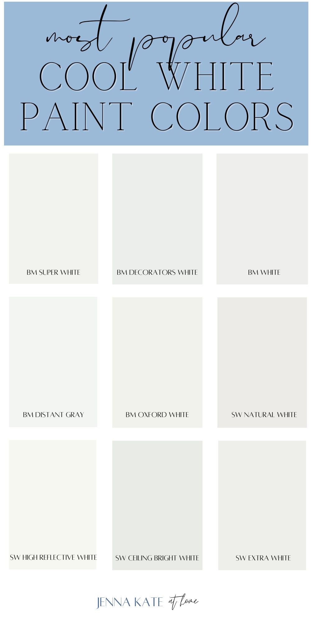
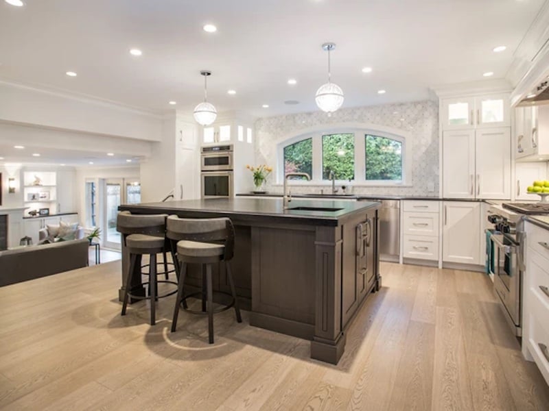
1. Benjamin Moore Super White
LRV: 87
Undertone: neutral cool
If you’re looking for WHITE, this Super White is white. Very white. It has an LRV of 87, it’s very high on the scale of bright whites. Perfect for that bright, crisp, modern look, with only subtle cool undertones, Benjamin Moore Super White is a great option to give older homes a fresh feel.
Although it’s extremely white, it is a cool white that become more obvious in north-facing rooms, but will also look a little warmer in south-facing rooms. With a very high LRV you won’t see much of the undertones but it will shift under certain environments.
Because of its slight coolness, Benjamin Moore Super White pairs well with blues and grays. And if you’re looking for an all-over white look from your walls, trim, and ceiling, be sure to use different sheens.
If you decide to paint your walls Super White, then your trim should also be Super White but in a higher sheen (satin or semi-gloss).
2. Benjamin Moore Decorator’s White
LRV: 84.6
Undertone: cool with a drop of gray and smidge of yellow
One of the best-selling white paints is perfect for trim, doors, moldings, and wainscoting. Benjamin Moore Decorator’s White is a cool white with a drop of gray and just a smidge of yellow to warm it up. The slight gray undertones in this paint color keep it from being too white and bright, while the yellow gives it a bit of softness.
The LRV of Decorator’s White is 84.6, putting it firmly in the soft white category and certainly not one of the brightest whites.
It’s a great trim color for any wall color because it won’t come off stark and cold. However, if you pair it next to a bright white like Sherwin Williams Extra White, you can start to see that gray become apparent, making it look a little dingy.
Decorator’s White works great as a whole house trim color as long as it’s not paired next to any whiter whites. It comes across as a traditional bright white, but with just a bit of softness. It’s worked well in my home in the cooler light on the east and west sides of our home as well as the sunnier exposures (we have since repainted everything SW Pure White for a warmer look).
And if you’re looking to use it on both the walls and trim, be sure to use a different sheens. I suggest using matte or eggshell on the walls and satin or semi-gloss for the trim.
This paint color review of Decorator’s White dives into more detail which may be helpful if you’re still on the fence.
3. Benjamin Moore White
LRV: 83.5
Undertone: neutral cool
If you’re looking for that classic and clean white feel for your home than Benjamin Moore White (OC-151) is your go-to white paint color. It’s definitely an all-purpose color that creates a fresh canvas in any room.
If your rooms have strong yellow sunlight coming in, you won’t have to worry about Benjamin Moore White pulling out any yellows or creams, as it’s cool undertones keep it that bright white you’re looking for.
This cool white works wonderfully on walls, trim, cabinets, and ceilings. If you want an all white look, use all BM White with different sheens to help create dimension throughout your space. And just like Decorator’s White, it won’t come off too stark and cold.
4. Benjamin Moore Distant Gray
LRV: 88
Undertone: soft gray
Despite its name, Distant Gray shows no signs of gray, rather, it is very similar to Super White. It will give your space a crisp, clean, look without feeling dingy or too cold. This cool white also creates a fresh look to your exterior for a beautiful great first impression.
Bring Distant Gray to life by pairing it with dark woods and natural materials for a cozy home space. In natural light, it comes off clean and crisp, while exposed to artificial or low light space it becomes elegant and inviting.
5. Benjamin Moore Oxford White
LRV: 86.69
Undertone:
Benjamin Moore’s Oxford White (CC-30) is a classic, crisp white known for its neutral base, which makes it extremely versatile for a variety of spaces and design aesthetics.
It strikes a balance between warm and cool tones, allowing it to adapt seamlessly to different lighting conditions without leaning too heavily into any specific undertone.
This adaptability makes Oxford White a popular choice for trim, ceilings, and walls alike.
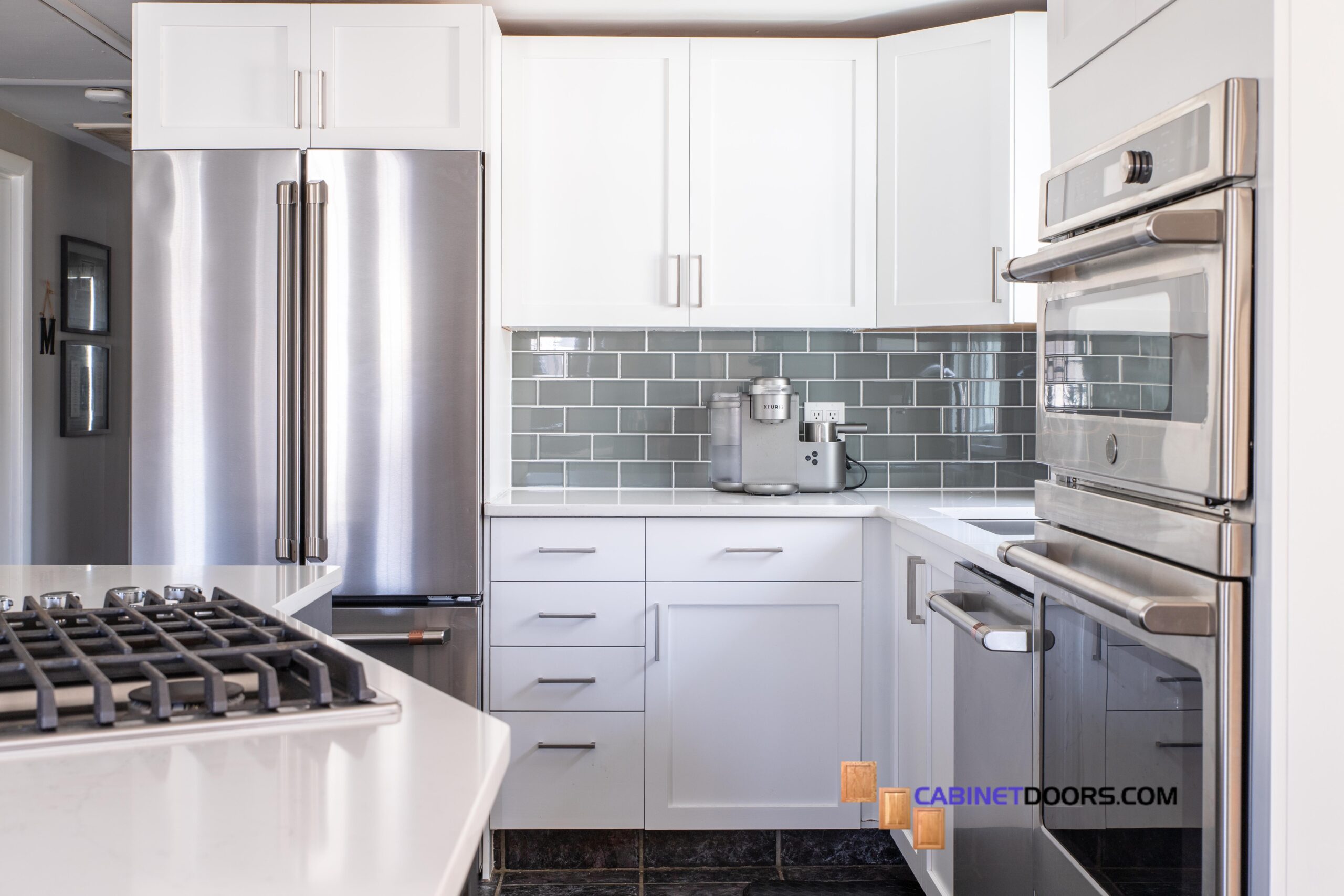
6. Sherwin Williams Extra White
LRV: 86
Undertone: slightly blue
As the name suggests, Extra White is one of Sherwin Williams’ brightest whites. It is one of my favorite whites for a bright, crisp white. It’s the perfect white paint color for trim, doors and cabinets.
With an LRV of 86, Sherwin Williams claims that it is their “brightest white”, which is not technically true as Highly Reflective White with an of LRV of 93 is brighter (but not available at all Sherwin Williams locations).
With its cool undertone, Extra White pairs well with blues and greens. Just be aware that in cooler light situations (like Northern exposure or Eastern exposure) you may notice a slight blue undertone.
Need more in-depth info about this color? Read my full paint color review of Extra White to help decide if its right for your home.
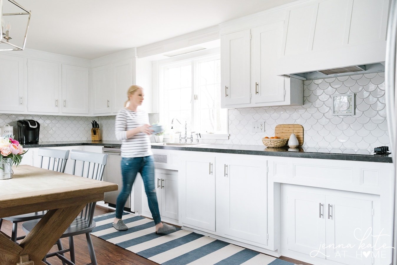
7. Sherwin Williams Natural White
LRV: 83
Undertone: neutral cool
If you’re looking for a more muted down cool white, Sherwin Williams Natural White is a great option. With an LRV of 83, it’s a slightly softer white than some of its counterparts. Its neutral characteristics make it the perfect choice for trim in your home.
Sherwin Williams Natural White creates a timeless look when used on kitchen cabinets. Alternatively, get the perfect fresh farmhouse feel by painting your shiplap walls or wainscoting. Be sure to keep your furniture and surrounding decor simple and not too colorful, as Natural White will easily pick up these colors.
This cool white pairs well with other cool colors and doesn’t play well with warmer colors, which is helpful to remember when deciding on your whole house color scheme. If you’re looking for all white walls and trim, I’d recommend using a truer white paint for your trim color.
8. Sherwin Williams High Reflective White
LRV: 94
Undertone: neutral
High Reflective White is Sherwin Williams’ whitest white. With a light reflectance value of 94, it’s very close to being a pure white.
High Reflective White has no discernible undertones so technically isn’t really a cool white, but one that falls in the neutral category.
While this particular white paint color is technically used as a base to create other white paint colors, it works just great on its own as an all over paint color.
If you’re looking to paint the walls, trim, and ceiling white, I would recommend going all out with High Reflective White but choosing different sheens.
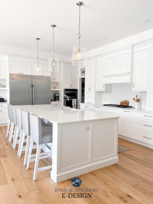
With so many great options if you’re looking for that bright white kitchen, Sherwin Williams High Reflective White makes a beautiful color choice for cabinets, too.
Looking for a similar color but want Benjamin Moore? Chantilly Lace is another excellent choice for a more neutral bright white.
9. Sherwin Williams Ceiling Bright White
LRV: 83
Undertone: blue
This cool white with blue undertones pairs beautifully with blue gray paint colors. It creates a calming and clean look that will brighten up your space.
Used primarily as the white that goes on the ceiling, it is an ultra bright white with a cool undertone. Personally, I would only use it as a ceiling color but it has certainly been used on walls and trim, too.
How to Choose The Right White Paint For Your Home
Choosing between a cool white and a warm white paint color depends on several factors including the desired mood, the direction of natural light, and the existing elements in a space. Here’s why you might choose a cool white over a warm white:
1. To Complement Modern and Minimalist Aesthetics
Cool whites, often characterized by hints of blue, green, or gray undertones, pair well with modern, minimalist interiors. These colors can accentuate clean lines and the sleek finishes that are typical of contemporary design, creating a crisp, refreshing look.
2. Balancing Warm Light
The natural warmth of the light in south-facing rooms can sometimes feel too intense or create a space that feels overly warm. A cool white paint can help neutralize this by introducing a refreshing balance, ensuring the room doesn’t become too saturated with warm tones.
On the other hand, a cool white may look gray and dingy in a room that receives northern light, as this light tends to have a gray cast. A neutral or slightly warmer white may be preferable to stop the room from feeling too cold.
3. To Provide a Neutral Backdrop for Bold Accents
If you’re looking to create a space with vibrant colors or bold patterns, cool white walls can serve as a neutral backdrop that doesn’t compete with these elements. The cool undertones can help to subtly balance out intense colors, allowing for a harmonious design.
4. Complementing Cool-Toned Materials
In spaces with cool-toned materials like marble, stainless steel, or slate, cool white paint can harmonize the design. It enhances the natural beauty of these materials without introducing a color clash that warmer whites might cause.
5. Mood and Psychological Effects
Cool whites are often associated with a sense of cleanliness, order, and tranquility. They can create a calm and serene atmosphere, making them suitable for bedrooms, bathrooms, and spaces designed for relaxation.
FAQ’s
Color matching between brands is not always 100% accurate, because their base colors are different. However, I regularly do it with more saturated colors and have good success with it.
However, that is NOT the case for white paints. Please do not get a Sherwin Williams white color matched at Benjamin Moore or vice versa. You will be disappointed! There is so little pigment added to a base white to get the white color that any variation in the base color will produce an entirely different shade of white.
By default, this panel is concealed and appears when the user clicks on the section title. Input relevant information about its title using paragraphs or bullet points. Accordions can enhance the user experience when utilized effectively. They allow users to choose what they want to read and disregard the rest. Accordions are often utilized for frequently asked questions (FAQs).
By default, this panel is concealed and appears when the user clicks on the section title. Input relevant information about its title using paragraphs or bullet points. Accordions can enhance the user experience when utilized effectively. They allow users to choose what they want to read and disregard the rest. Accordions are often utilized for frequently asked questions (FAQs).
Ready To Sample?
Ready to sample these colors in your own home? Purchase all these cool white colors in one easy bundle of peel-and-stick REAL paint samples, delivered overnight from Samplize.
Final Thoughts
Before making your final decision on which white paint color is right for you, it’s really important to test them in your space. For white paint colors, it’s important to test them next to each other so that the undertones become apparent. This is the easiest way to see those subtle undertones between the different whites and find the right white paint for your home.
Don’t waste money buying a gazillion paint sample pots, do what I do and use peel-and-stick samples that are made with REAL paint! Not only are they reusable, but they are cheaper than traditional paint samples and fit nicely into a drawer when you’re done!

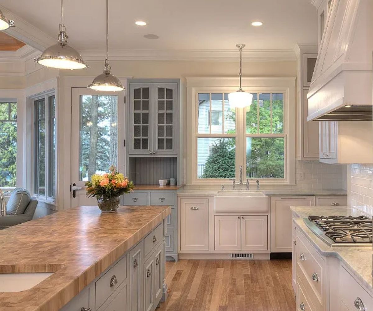
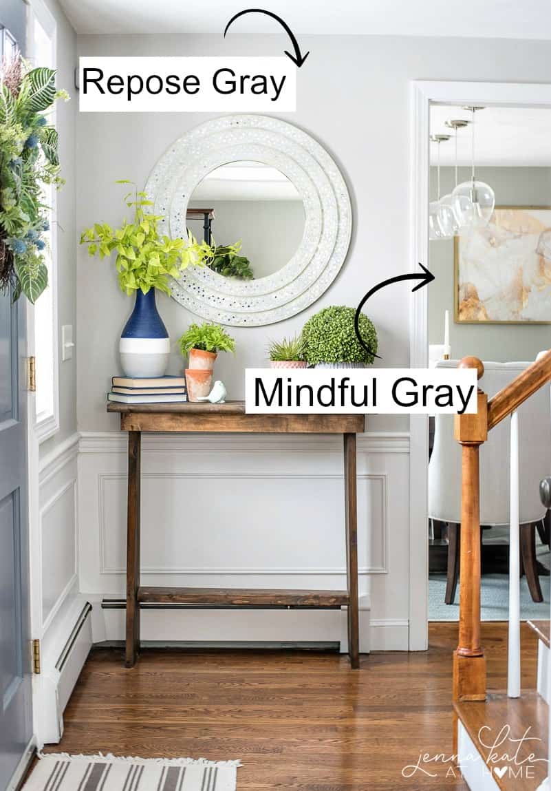
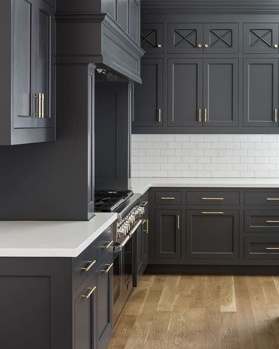
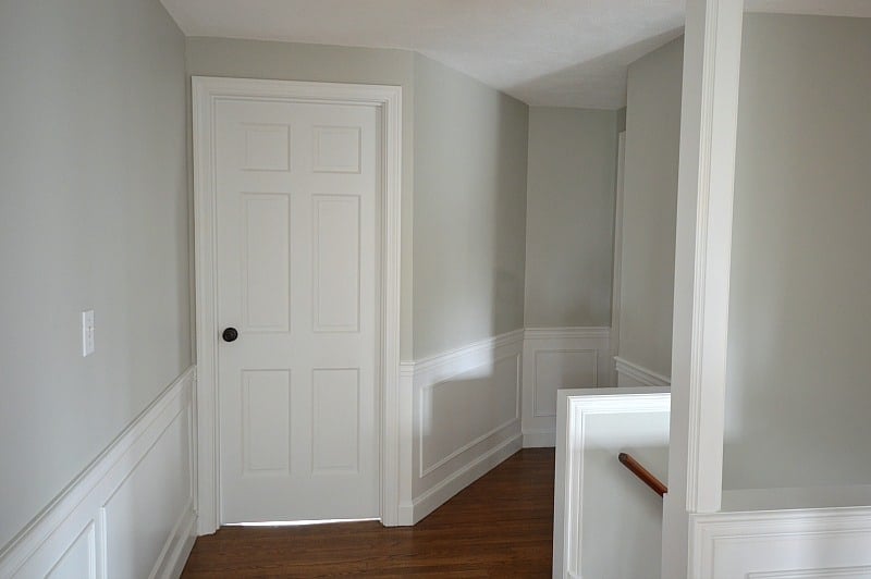
What is the light gray on the walls in picture 2? Thanks!