Content may contain affiliate links. When you shop the links, I receive a small commission at no cost to you. Thank you for supporting my small business.
No perfect paint color exists. And that’s OK.
Because while lighting, flooring, trim, and even your windows can completely shift the way a color looks, some paint colors just work more often than not. This guide isn’t about “no-fail” — it’s about high-success neutrals that hold up across different exposures and styles.
I’ve tested every color below in real-life homes (mine included!) and broken them down by tone, exposure, and where they shine best.
Why Neutrals Are Still the Most Popular Paint Choice
Neutral paint colors are timeless for a reason. Whether your style is traditional, modern, coastal, or transitional, a well-chosen neutral lets your furniture, decor, and personality shine. They’re also the most versatile choice if you plan to change things up seasonally or over time.
How Lighting Affects Paint Color (And Why It Matters)
Paint color is never static. Here’s what you can expect by exposure:
- North-facing rooms: Cooler light brings out blue and gray undertones. Use warmer neutrals to balance it.
- South-facing rooms: Warm, golden light softens and brightens most colors. Many neutrals appear lighter here.
- East-facing rooms: Cooler, shadowed in the afternoon. Neutrals may read more blue or gray.
- West-facing rooms: Warm afternoon light can make neutrals look golden or peachy.
jenna’s Tip
Always test paint on multiple walls and at different times of day. Don’t rely on just a paint chip or a single swatch.
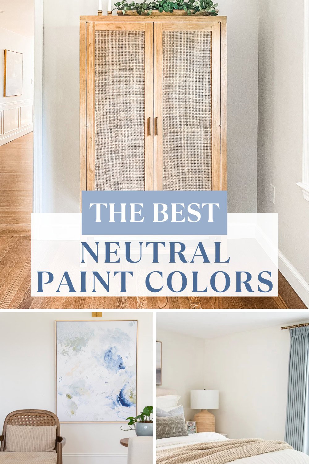
My Favorite Go-To Neutral Paint Colors in 2026
These are the shades I reach for again and again, and they’ve proven themselves in real homes.
1. Benjamin Moore White Dove (OC-17)
A soft, warm white that’s not too creamy, not too stark. It works on walls, trim, and cabinets. Beautiful in traditional and transitional homes.
- LRV: 85.38
- Best in: Any exposure, especially rooms with cooler elements like marble or blue/gray tones
- Trim pairing: Itself (in semi-gloss) or BM Chantilly Lace for contrast
- Pairs well with: Classic Gray, Hale Navy, Balboa Mist
- Bonus tip: White Dove warms up spaces that feel too cold. Its drop of gray makes it especially helpful in balancing cooler lighting or finishes.
You can read my full Benjamin Moore White Dove paint review for greater detail.
2. Benjamin Moore Classic Gray (OC-23)
A graceful greige that sits comfortably between warm and cool. Subtle and soft, it’s perfect when you want just a whisper of color on the wall.
- LRV: 74.78
- Best in: Hallways, bedrooms, bathrooms, or whole-home color schemes
- Trim pairing: BM Chantilly Lace or White Dove
- Pairs well with: Hale Navy, Balboa Mist, Pale Oak
- Bonus tip: Classic Gray is ideal in homes with lots of natural light—it provides contrast without drama.
Want to learn more? Read my Classic Gray paint review for more photos and details.
3. Benjamin Moore Swiss Coffee (OC-45)
A warm white with a touch more richness than White Dove. Some call it creamy; others call it soft and cozy. Avoid pairing it with cooler whites—it’s best with warm wood tones, brass, and beige.
- LRV: 83.93
- Best in: Bedrooms, living rooms, or traditional homes with warm wood tones
- Trim pairing: BM Chantilly Lace or lighten Swiss Coffee itself by 75% for contrast
- Pairs well with: Edgecomb Gray, Revere Pewter, Soft Fern
- Bonus tip: Swiss Coffee reads beautifully against medium oak floors. Avoid pairing with cool whites—it can make it look dingy.
We recently used Swiss Coffee in our new addition and I love it! See it in our home in my Swiss Coffee paint review.
4. Benjamin Moore Wind’s Breath (OC-24)
A soft, warm off-white with just a kiss of gray. Slightly darker than Classic Gray and perfect for spaces that feel too washed out in bright whites.
- LRV: 69.59
- Best in: Open-concept spaces, transitional homes, or paired with white oak
- Trim pairing: BM White Dove or Simply White
- Pairs well with: Revere Pewter, Boothbay Gray, Chantilly Lace
- Bonus tip: Wind’s Breath is great in homes where beige feels too dated and gray feels too cold.
Think it might be the right neutral for you? Learn more in my Wind’s Breath paint color review.
5. Benjamin Moore Seapearl (OC-19)
Seapearl is a light warm greige that borders on creamy white. It’s elegant and clean, but with more warmth than a true white. This is not a cool gray—it’s a warm, sophisticated alternative to beige.
- LRV: 77.95
- Best in: Open-concept spaces, transitional homes, cabinetry, exteriors
- Trim pairing: BM Simply White, BM White Dove or SW Pure White
- Pairs well with: Boothbay Gray, Revere Pewter, Edgecomb Gray
- Bonus tip: Seapearl is a great alternative to stark white cabinetry. It gives you a softer, warmer look without feeling beige.
I used this color recently for the first time and it’s so beautiful. Get more detail about it and whether it’s right for your home in my BM Seapearl paint review.
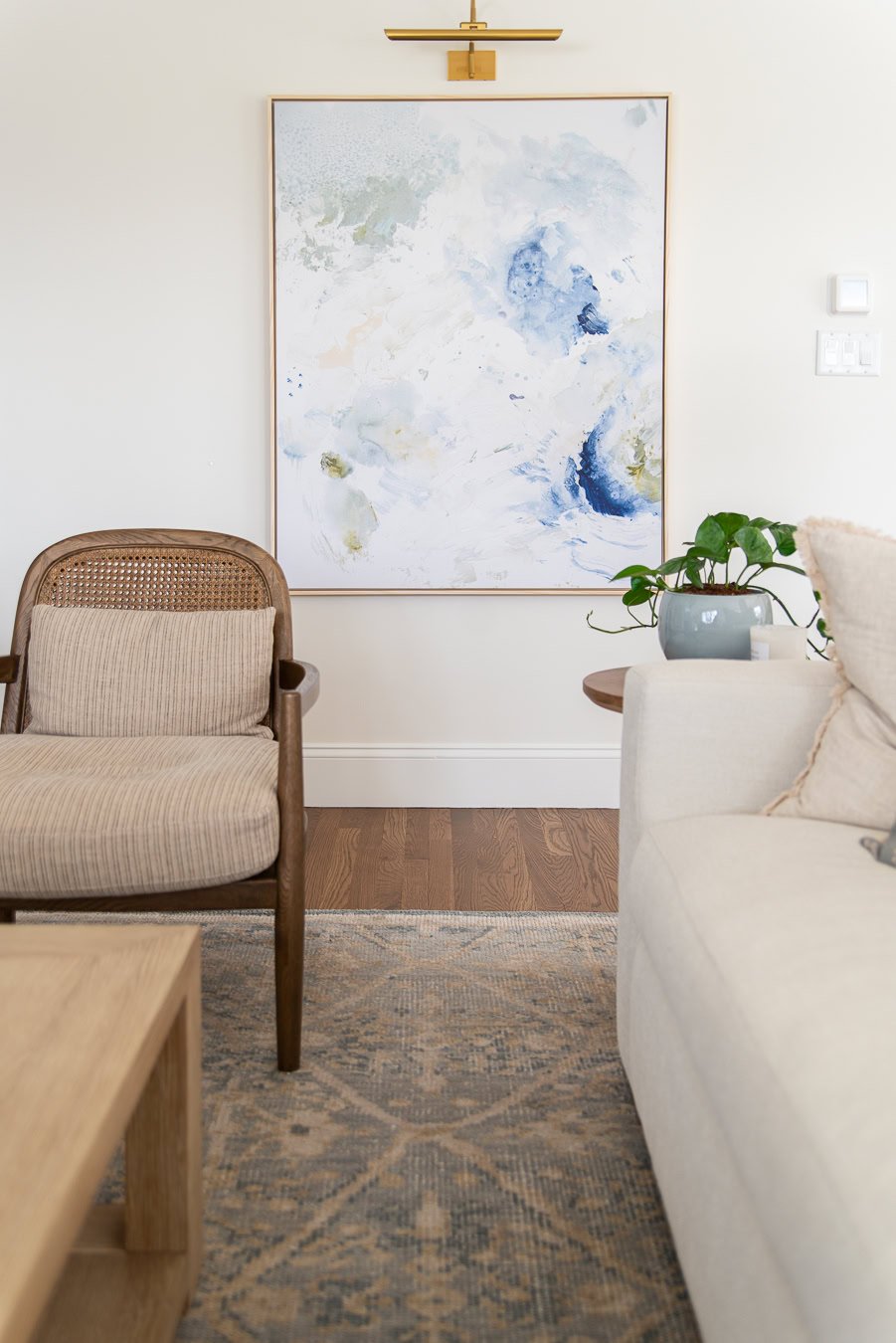
6. Sherwin Williams Drift of Mist (SW 9166)
A subtle light greige that reads as a soft warm gray in most spaces. More modern than beige, but still warm enough to feel inviting. It has a touch of green, but it rarely shows up prominently.
- LRV: 69
- Best in: South or west-facing rooms, or anywhere you want a lighter-than-Repose-Gray look
- Trim pairing: SW Pure White or Extra White
- Pairs well with: Iron Ore, Evergreen Fog, BM White Dove
- Bonus tip: If Repose Gray or Agreeable Gray are too dark or heavy, Drift of Mist is the perfect airy alternative.
I have this color in my kids’ basement TV room and it’s so light and airy! Read my Drift of Mist review to get more detail on whether it’s right for your space.
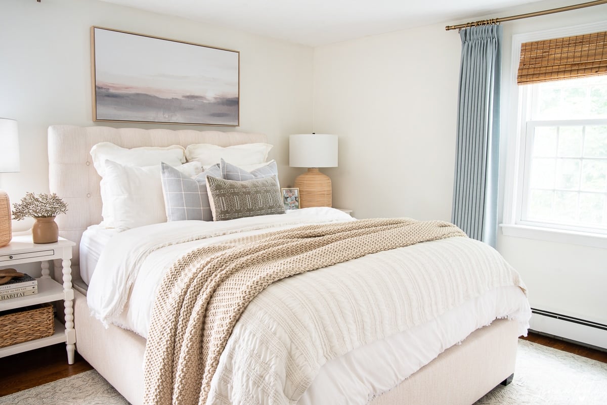
7. Sherwin Williams Repose Gray (SW 7015) – Lightened by 50%
Repose Gray on its own is a bit deeper and cooler. Lightened by 50%, it becomes the perfect light greige: modern, versatile, and just warm enough.
- LRV: ~70 (lightened version)
- Best in: Entire homes, entryways, bedrooms, or open concept spaces
- Trim pairing: SW Pure White or BM Chantilly Lace
- Pairs well with: Naval, BM Hale Navy, Sea Salt, Simply White
- Bonus tip: Lightening Repose Gray by 50% softens its cool undertone and makes it work in more lighting conditions, especially darker spaces.
I’ve used this color extensively throughout my home and love it. Read all about Repose Gray and see if it’s right for you.
Frequently Asked Questions
Benjamin Moore White Dove and Classic Gray are both incredibly versatile. They work across lighting conditions and design styles, which is why they’re ever popular favorites.
Yes—but sample it in each room first. Lighting and fixed elements (like flooring or countertops) can shift how a color reads dramatically.
Look for warm whites or greiges like White Dove, Swiss Coffee, or Sea Pearl to balance cool light and prevent the space from feeling flat.
Final Thoughts
There’s no “no-fail” neutral, but there are colors that work with more elements, in more homes, than others. That’s what makes these shades my go-to picks for 2026.
Don’t just trust the paint chip—sample them on your walls. Watch how they look morning, noon, and night. Hold them up to your floors, your tile, your fabrics. That’s how you find the perfect neutral… for YOU.
Looking for more paint color help? Check out the rest of my paint color reviews and follow me on Instagram @jennakateathome for more real-life color inspiration.

Any chance you know what flooring/color is pictured with Drift of Mist color?
I don’t – but it looks like french oak.
Hi Jenna, I’m thinking about using BM dove wing for my master bedroom. Can you tell me anything about this color. It’s about 12×14 with a cathedral ceiling. Three large windows two are side by side and one in a small sitting area (which I didn’t include in the dimensions) and a large moon window above the two windows. Everything is covered with off white light filtering pleated shades. My bedroom furniture is a natural oak contemporary set with soft gold handles by Restoration Hardware. My floor is a medium brown wood oak color. I’m a little nervous but it looks like a pretty color. My room is west facing. The other color I was considering is BM white dove. Can you please give me your thoughts. Thank you.
Hi
Love your suggestions. I have BM beach grass in adjoining living and hall, could I do a white in kitchen to lighten up the room? Would it Brighten up the kitchen full of medium stained cabinets?
Thanks