


Content may contain affiliate links. When you shop the links, I receive a small commission at no cost to you. Thank you for supporting my small business.
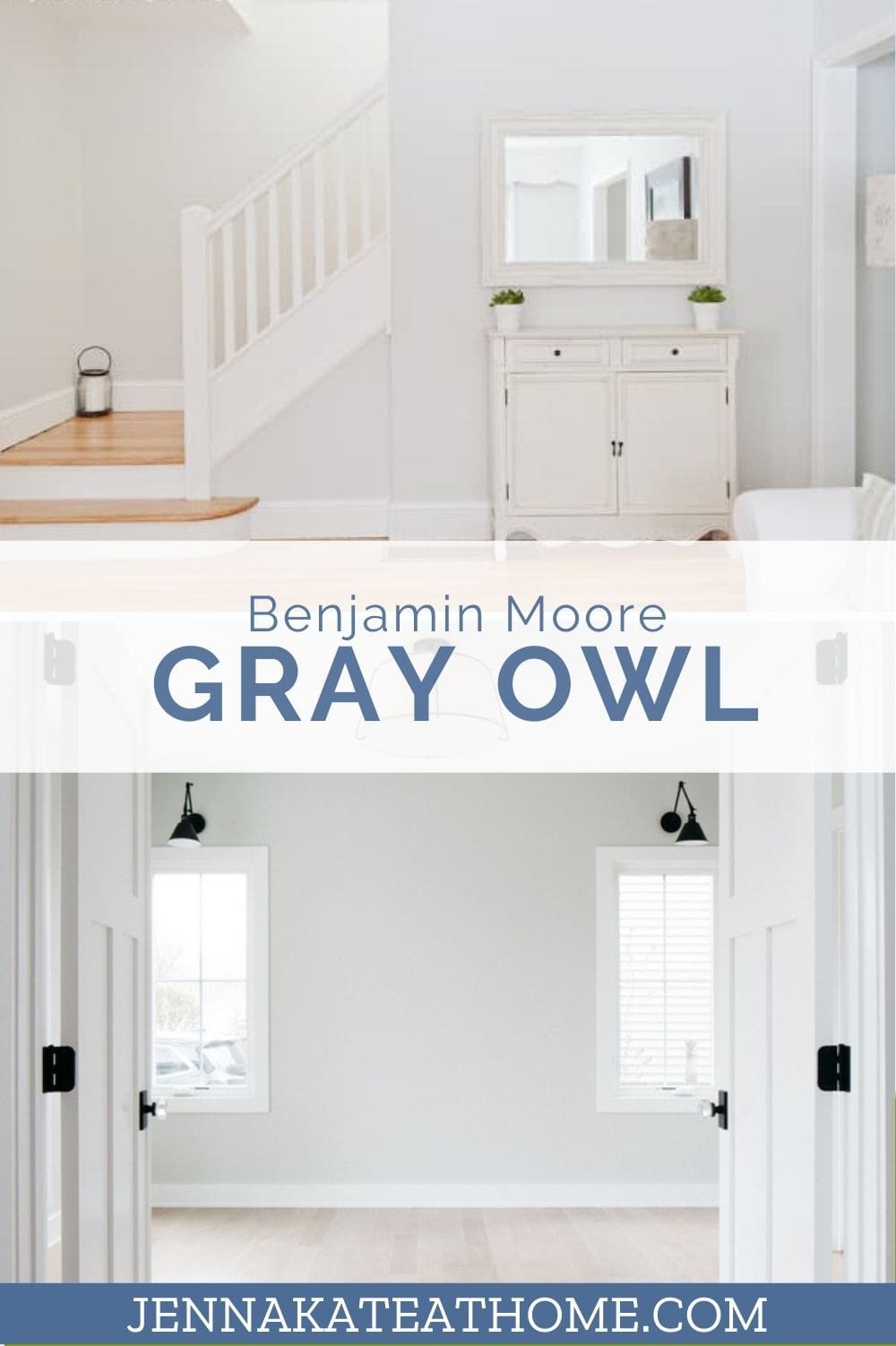
If you’ve ever stood in front of a wall of gray paint swatches, feeling completely overwhelmed by undertones and lighting questions, you’re not alone. And if you’re here, you’ve probably narrowed your search to one of the most popular grays out there: Benjamin Moore Gray Owl (OC-52 or 2137-60).
This post goes beyond the typical “undertones and LRV” talk. I’ll help you understand exactly what to expect with Gray Owl in different lighting conditions, compare it to similar colors, show you how to pair it with trim and other finishes—and give you real-life insights that will help you avoid paint regret.
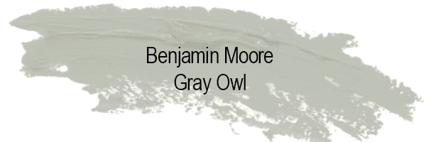
What Kind of Color Is Gray Owl?
Gray Owl is a light gray with soft blue-green undertones. While technically a cool gray, its chameleon nature means it can look warmer or cooler depending on the light and nearby finishes. That makes it incredibly versatile—but also tricky if you don’t test it first.
Quick Snapshot:
- Type: Cool gray
- Undertones: Blue-green (can lean more blue or green depending on lighting)
- LRV: 65.77
- Best For: Walls, cabinets, trim, exteriors
- Style Fit: Transitional, modern coastal, contemporary, soft farmhouse
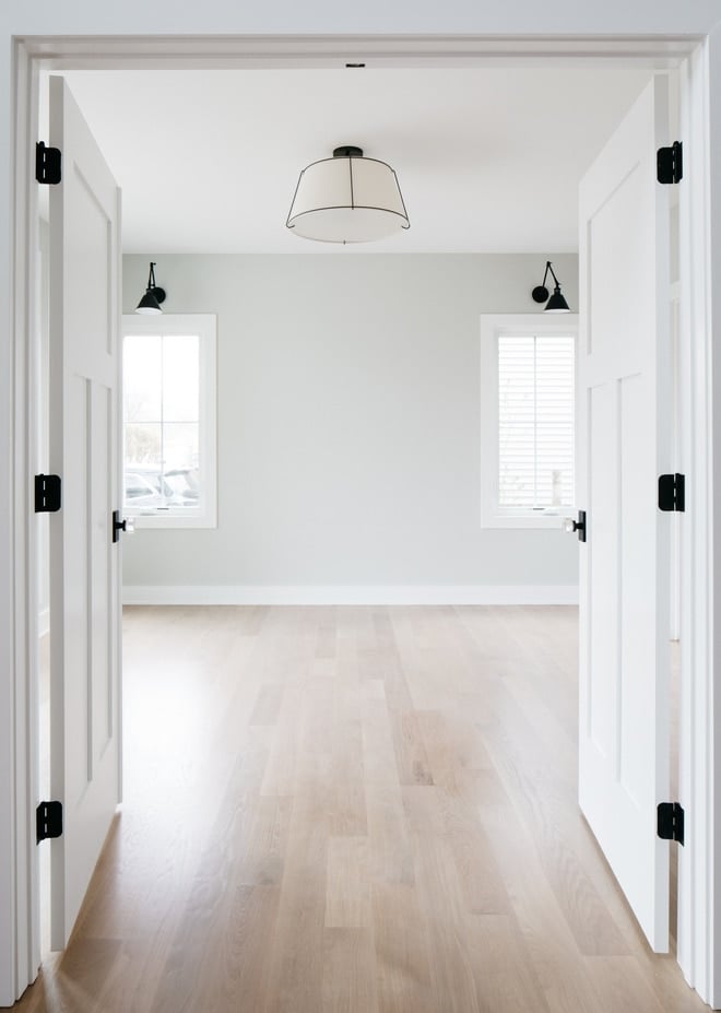
What Makes Gray Owl So Popular?
- It’s light and airy without being sterile.
- It works with both warm and cool palettes.
- It’s adaptable in a wide range of lighting conditions.
- It’s designer-approved but not overused.
How Does Lighting Affect Gray Owl?
Lighting plays a HUGE role in how Gray Owl reads in your space. Here’s what to expect:
- North-facing rooms: The cool natural light brings out Gray Owl’s blue undertones, making it appear more icy or crisp.
- South-facing rooms: Warm light can make Gray Owl feel more balanced and even slightly warmer.
- East-facing rooms: Expect blue undertones in the afternoon.
- West-facing rooms: The color may lean green earlier in the day and warm up as golden light floods in late afternoon.
What Trim Color Looks Best with Gray Owl?
Choose a crisp, clean white to create contrast and enhance Gray Owl’s undertones:
- Benjamin Moore Chantilly Lace (OC-65): Brightest white, adds sharp contrast
- Benjamin Moore Simply White (OC-117): A touch warmer, good for cozy spaces
- Benjamin Moore Cloud White (OC-130): Soft and creamy, works well with light wood tones
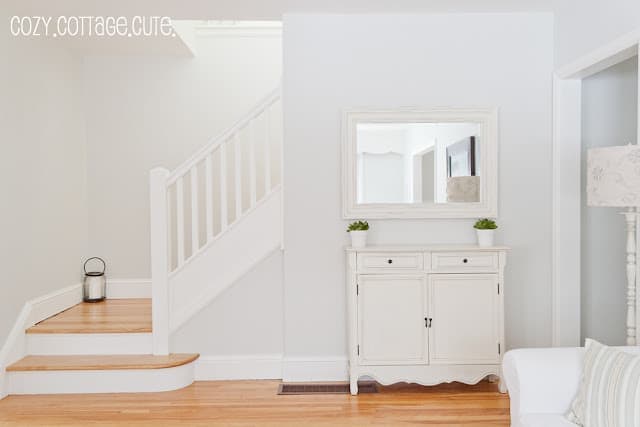
Gray Owl Compared to Other Popular Gray Paints
Let’s clear up the confusion. Here’s how Gray Owl stacks up to other top grays:
| Paint Color | Undertone | LRV | Notes |
|---|---|---|---|
| Gray Owl | Blue-green | 65.77 | Very versatile, chameleon-like |
| Stonington Gray | Blue | 59.36 | Slightly darker and cooler |
| Classic Gray | Warm beige | 74 | Much lighter, soft and warm |
| Revere Pewter | Warm greige | 55.51 | Cozy, more beige than gray |
| Wickham Gray | Blue | 68.94 | Cooler and crisper than Gray Owl |
| Collingwood | Purple-beige | 62 | Warmer with a rosy tone |
| Repose Gray (SW) | Green-beige | 58 | Warmer and more neutral |
| Agreeable Gray (SW) | Beige-greige | 60 | Warmer and much more beige |
Now let’s take a closer look at each comparison, with swatches and real-world tips.
Gray Owl vs Stonington Gray
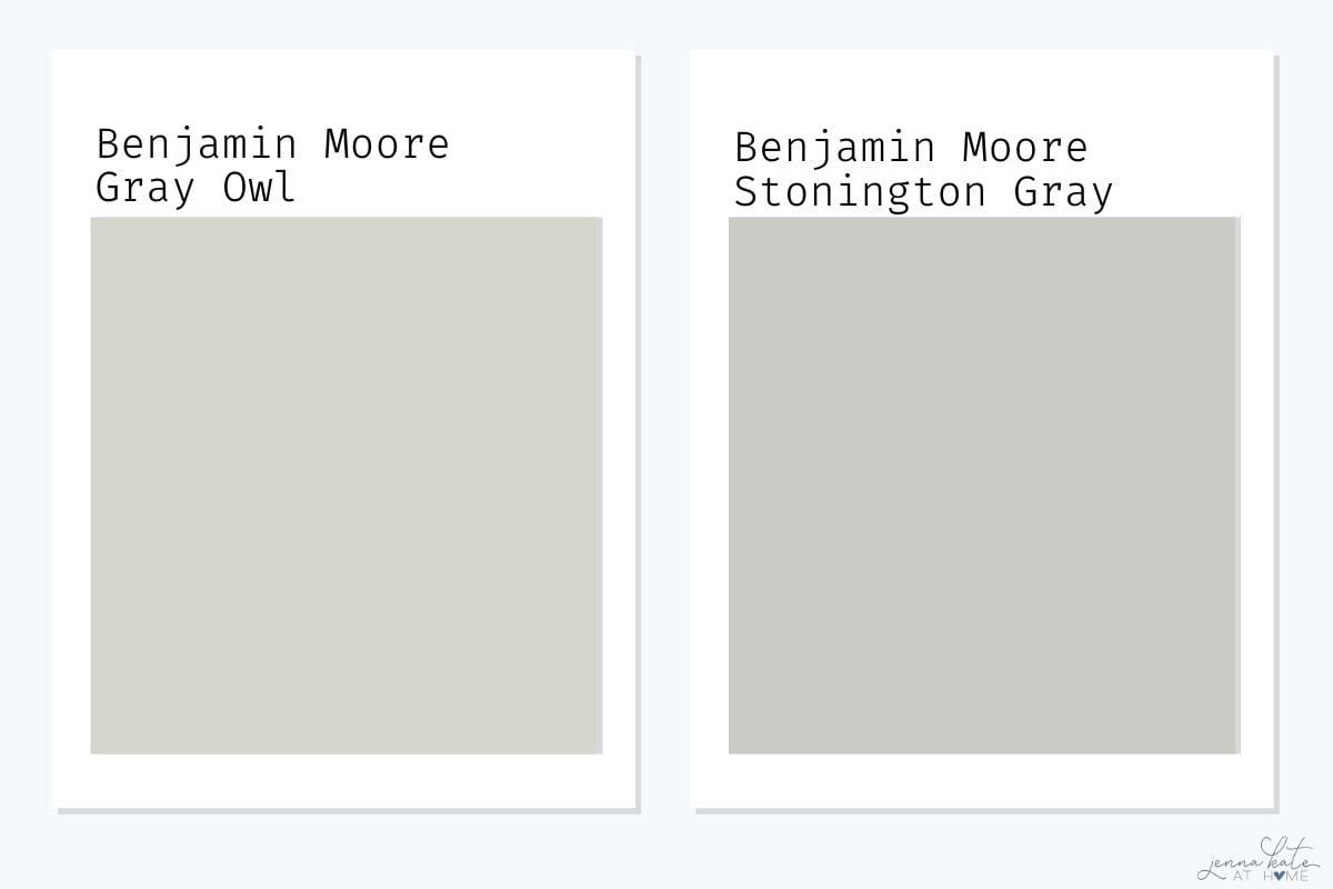
Gray Owl is lighter and softer than Stonington Gray, which leans more stormy and blue—especially in cooler light. If you want a casual, beachy gray, Gray Owl is the better choice. For a moodier, more saturated look, go with Stonington Gray.
Best pick if you want a soft, less moody gray: Gray Owl
Gray Owl vs Classic Gray
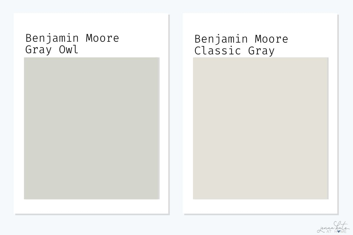
These two are very different. Classic Gray is much lighter and warmer, with subtle violet-pink undertones that never appear in Gray Owl. Use Classic Gray if you want a barely-there warm neutral; choose Gray Owl if you want something more defined, crisp, and cool.
Best pick if you want a clean, modern gray: Gray Owl
Gray Owl vs Revere Pewter
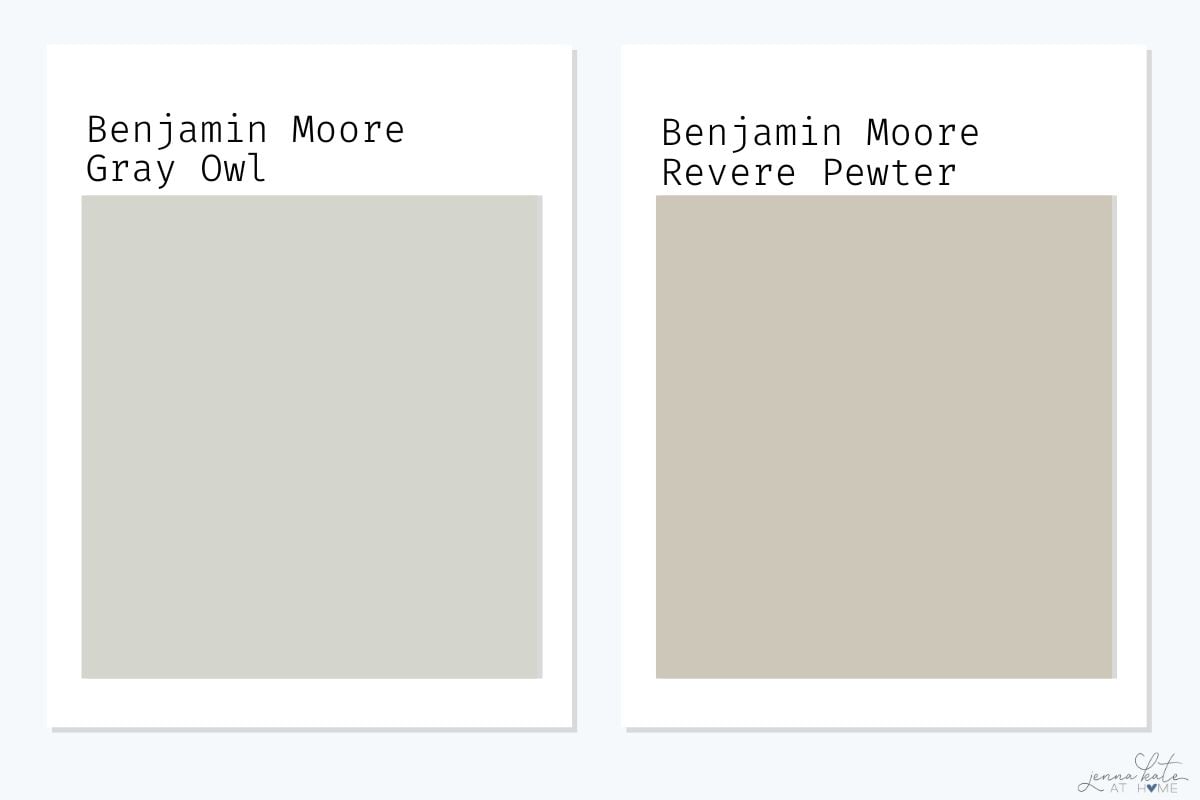
Revere Pewter is darker and warmer, falling into greige territory with noticeable beige and green undertones. It’s great for traditional homes or spaces with warm flooring. Gray Owl reads much fresher and brighter, ideal for modern or coastal aesthetics.
Best pick if your space needs brightness: Gray Owl
Best pick for cozy and warm spaces: Revere Pewter
Gray Owl vs Collingwood
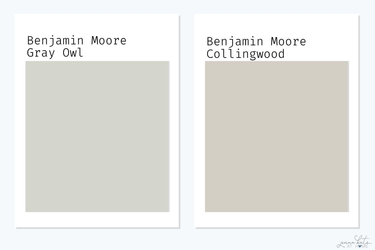
Collingwood has a warmer, rosy undertone that gives it a sophisticated, taupe-like quality. In contrast, Gray Owl stays crisper and cooler. If you’re worried about pink or purple tones showing up, stick with Gray Owl.
➡️ Best pick for a more neutral gray: Gray Owl
➡️ Best pick for warm, elegant tones: Collingwood
Gray Owl vs Wickham Gray
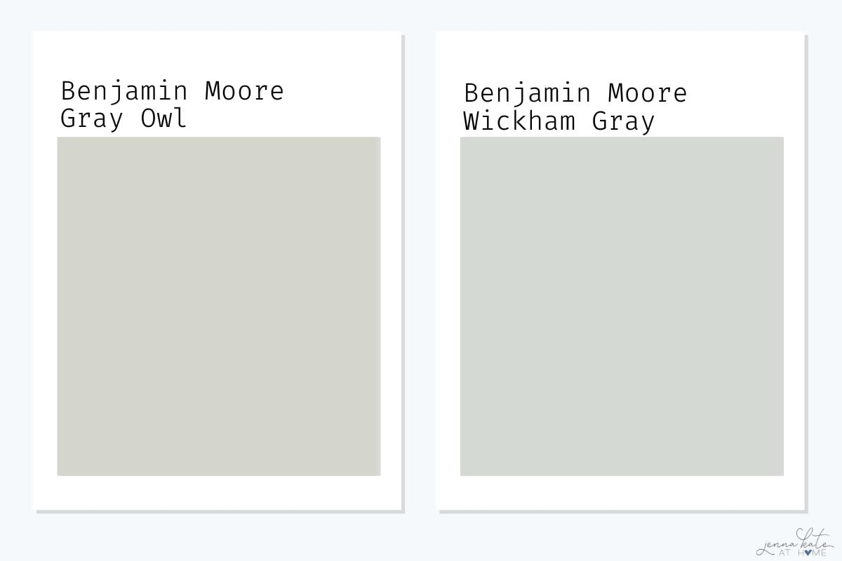
These two are similar in depth, but Wickham Gray leans more distinctly blue. It feels cooler and more coastal, while Gray Owl balances its blue-green undertones with a softer gray appearance overall.
Best pick for a subtle, adaptable gray: Gray Owl
Best pick for a spa-like, cool-toned space: Wickham Gray
Gray Owl vs Sherwin Williams Repose Gray
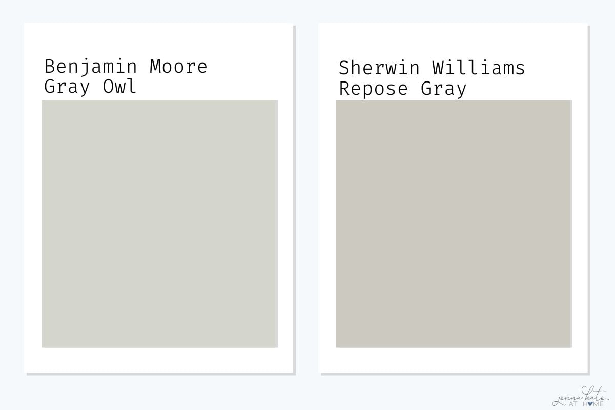
Repose Gray is warmer and slightly darker, with a soft greige quality. It’s one of Sherwin-Williams’ most popular neutrals because of how balanced it is. Gray Owl leans more cool and crisp, and will show more color shift depending on lighting.
Best pick for a neutral backdrop with warmth: Repose Gray
Best pick for a brighter, cooler gray: Gray Owl
Gray Owl vs Agreeable Gray
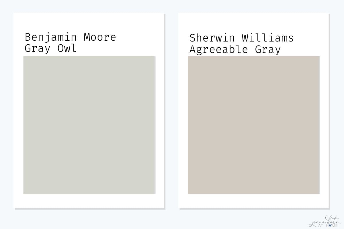
Agreeable Gray is a true greige, and much warmer than Gray Owl. It’s incredibly flexible for whole-house use. If your space has warm wood tones, Agreeable Gray will blend beautifully. Gray Owl can feel too cool in some of those same settings.
Best pick for warmth and flexibility: Agreeable Gray
Best pick for modern, coastal style: Gray Owl
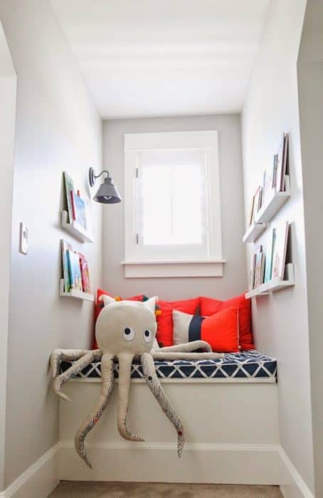
Where Can You Use Benjamin Moore Gray Owl?
Walls: Living rooms, hallways, bedrooms, bathrooms
Trim or Molding: If paired with white walls (yes, reverse can work!)
Cabinets: Looks clean and modern with white or marble countertops
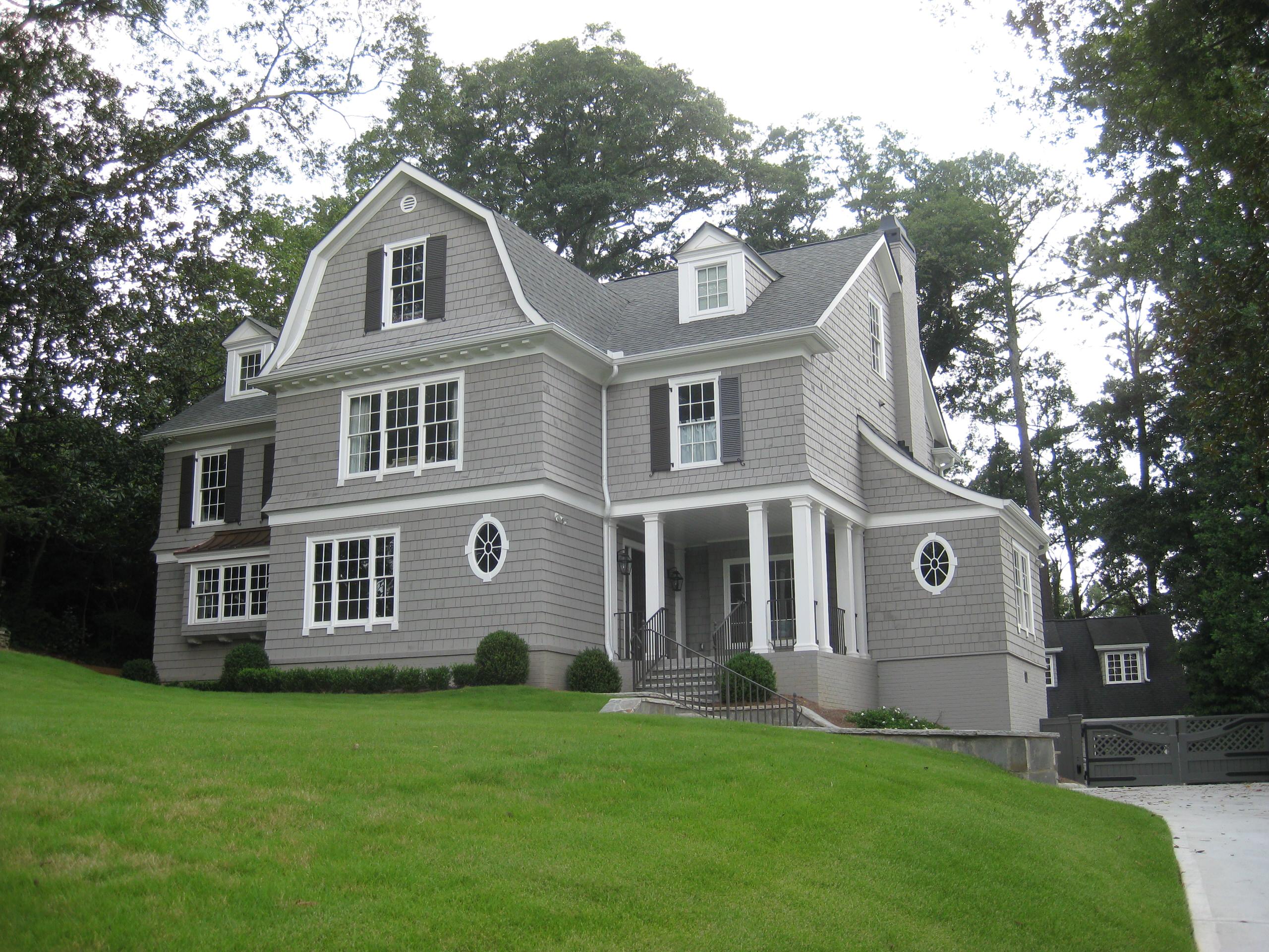
Exterior: Use it on siding or shutters—but beware of south-facing fade
What Colors Pair Well With Gray Owl?
These tried-and-true pairings work beautifully:
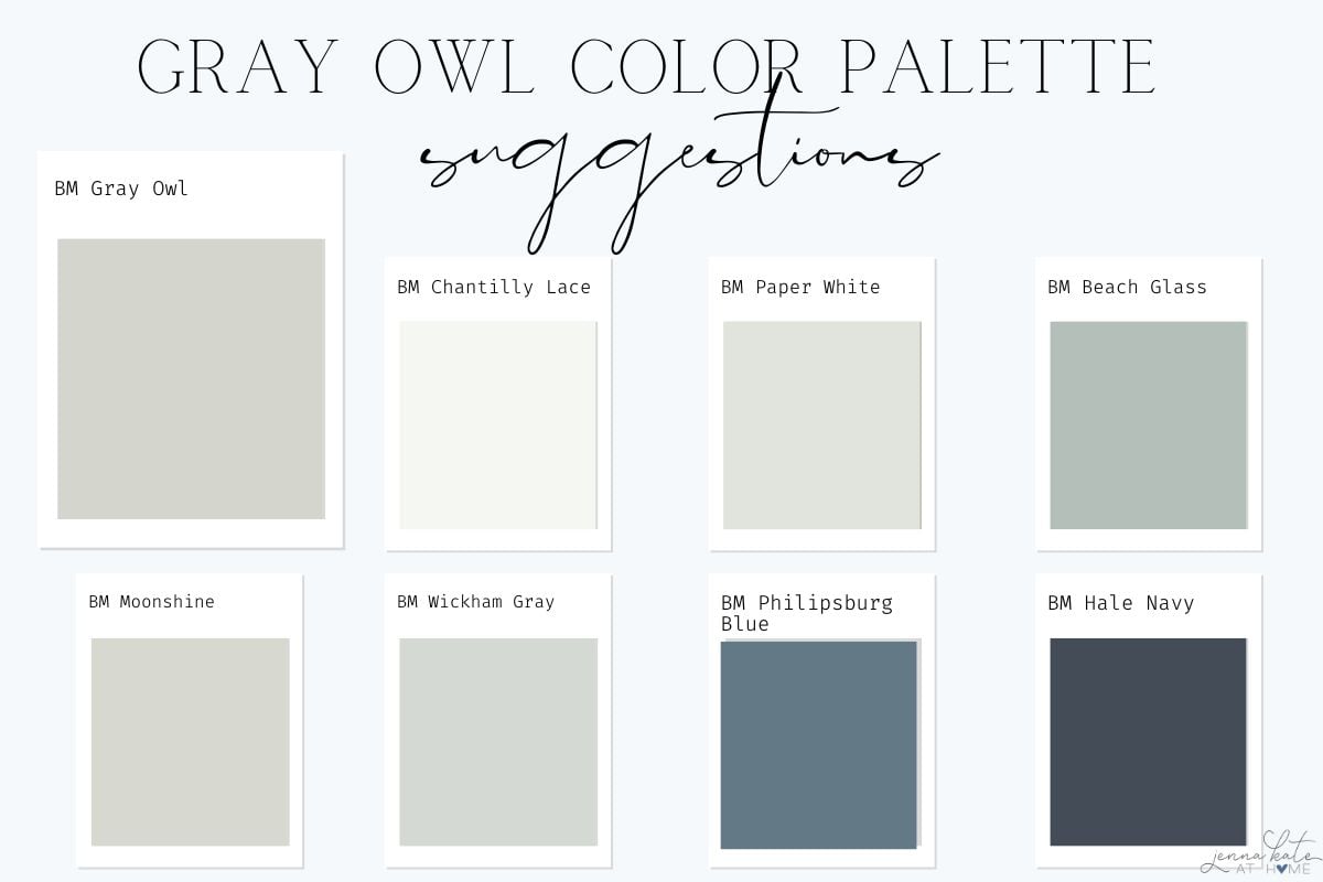
White Trim:
- Chantilly Lace (OC-65)
- Simply White (OC-117)
- Cloud White (OC-130)
Accent Colors
Benjamin Moore Gray Owl is incredibly versatile, thanks to its soft blue-green undertone. But the colors you pair with it can dramatically shift how it reads—cooler, warmer, more coastal, or even moody. Whether you’re looking to create contrast, harmony, or just a little visual interest, here are my favorite accent colors that work beautifully with Gray Owl:
- Paper White (Benjamin Moore OC-55): A whisper-soft, clean white that’s a touch warmer than Gray Owl but keeps the palette feeling airy and fresh. Beautiful for ceilings, trim, or adjacent walls.
- Moonshine (Benjamin Moore OC-56): A cool, silvery gray that leans more neutral and a bit crisper than Gray Owl. This pairing creates a layered tonal look that feels serene and sophisticated.
- Beach Glass (Benjamin Moore 1564): This soft, coastal green adds a hint of tranquility and looks stunning when used in bedrooms, bathrooms, or any space where you want to evoke calm.
- Wickham Gray (Benjamin Moore HC-171): Cooler and a touch more blue than Gray Owl, Wickham Gray creates a subtle contrast—great for open-concept spaces or an accent wall that doesn’t overpower.
- Philipsburg Blue (Benjamin Moore HC-159): Want to go bold? This rich, traditional blue adds striking contrast and draws out the cool undertones in Gray Owl, perfect for a moody dining room or lower kitchen cabinets.
- Hale Navy (Benjamin Moore HC-154): This classic deep navy brings drama and depth to a Gray Owl palette. It’s an ideal choice for accent furniture, cabinetry, or even a striking front door if Gray Owl is used on the exterior.
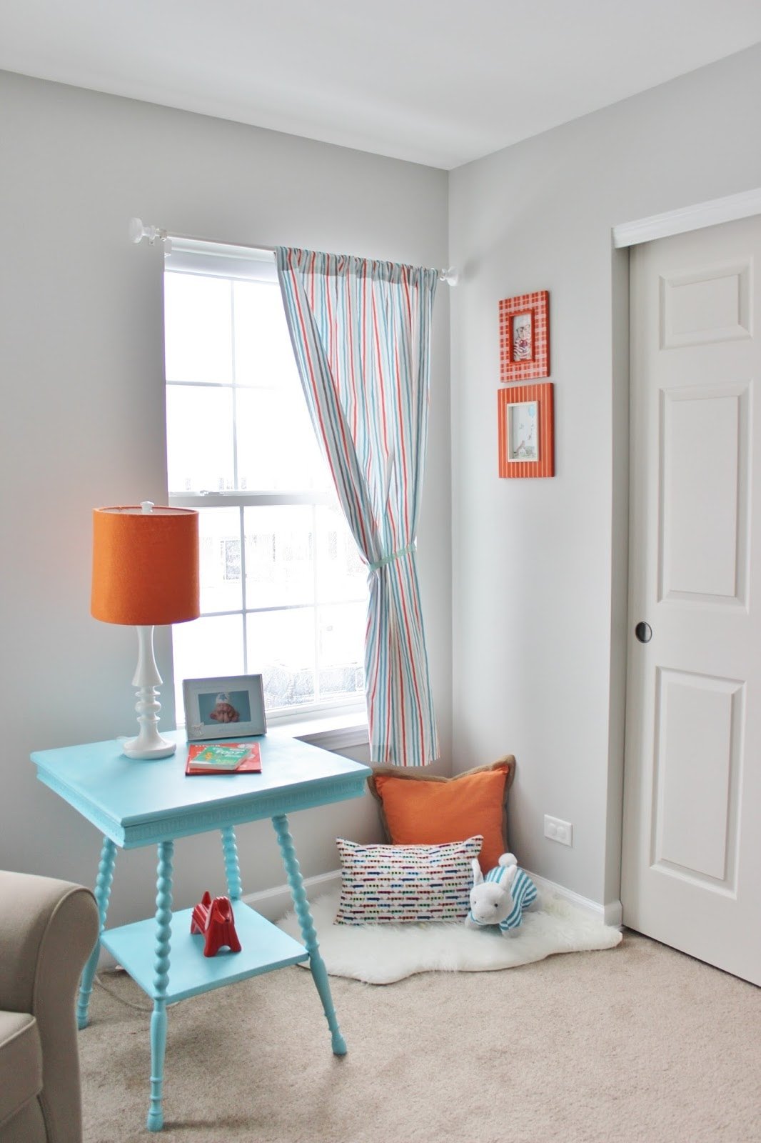
Gray Owl Palettes by Interior Style
If you’re trying to figure out how Gray Owl fits into your design vision, here are some designer-inspired palettes to guide your choices:
Transitional Elegance
- Walls: Gray Owl (OC-52)
- Trim: Chantilly Lace
- Accent Color: Hale Navy (cabinetry or furniture)
- Hardware/Finishes: Brushed nickel or unlacquered brass
- Materials: Marble, medium-tone wood flooring
This combo balances warmth and coolness beautifully, and works in homes with both traditional and modern elements.
Modern Coastal
- Walls: Gray Owl at 75%
- Trim: Simply White
- Accent Colors: Beach Glass (1564), Wickham Gray
- Hardware/Finishes: Polished nickel, matte black
- Materials: Rattan, white oak, honed marble
Light, fresh, and full of movement—this is perfect for open concept homes or any space with good natural light.
Soft Farmhouse
- Walls: Gray Owl full strength
- Trim: Cloud White
- Accent Colors: Paper White (ceiling), Philipsburg Blue (island or cabinet)
- Hardware/Finishes: Oil-rubbed bronze, antique brass
- Materials: Butcher block, white subway tile, shiplap
This palette is calm and cozy while still feeling clean and current. Use textures to amp up the warmth!
Is Gray Owl Still in Style?
Absolutely. While trends have shifted toward warmer greiges, Gray Owl holds its place as a cool-toned staple. It feels fresh, clean, and modern when paired with the right materials—especially light wood, black accents, and white trim.
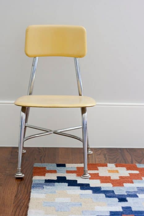
Should You Lighten Gray Owl?
Benjamin Moore Gray Owl has an LRV of 65.77, making it a light gray—but depending on your lighting, it may still feel darker than you’d like. That’s why many designers (and homeowners!) opt to lighten it by 25% or 50%. Here’s what you need to know:
Why Lighten Gray Owl?
✔️ To reduce cool undertones
In darker rooms or north-facing spaces, Gray Owl’s blue-green undertones can feel pronounced. Lightening the formula can tone that down without losing the soft gray character.
✔️ To brighten a dim space
If you love Gray Owl but your room doesn’t get much natural light, a 50% lighter mix can help keep things airy and fresh.
✔️ To soften the contrast
In open concept homes, lightening Gray Owl can help it flow more seamlessly with white trim and warmer surrounding tones.
How to Ask for It:
At any Benjamin Moore store, you can simply say:
“I’d like Gray Owl at 50% strength.”
The paint is custom-tinted with less pigment but the same base—so the undertones stay consistent, just softer.
Pro Tip: Ask for a sample of both full strength and 50% to test side-by-side in your space before committing.
Don’t Forget…
Don’t forget – no matter what you’ve read or photos you’ve seen online, it’s really important to sample paint colors in your home before committing!
Samplize provides real paint samples that are easy to move around your home, and cheaper than buying a gazillion paint pots! It’s the only way I buy paint samples.
Frequently Asked Questions
In certain light, yes. Especially in north-facing rooms or next to cool-toned elements. Always sample first.
It can work—but if your room is very dim, consider lightening it by 50% or using a brighter gray like BM Classic Gray or Paper White.
Yes! It looks especially good with white quartz counters, brushed nickel or brass hardware, and a white tile backsplash.
Look at BM Coventry Gray (HC-169) for a similar tone with more depth.
Final Thoughts
If you want a clean, soft gray that doesn’t feel cold or sterile, Gray Owl is an excellent choice. It’s flexible enough to use in almost any room and elegant enough to anchor a whole-house palette.
But remember—it’s a shapeshifter. Sample it first. Check it next to your floors, countertops, and trim. Watch it morning, noon, and night. It’s only “perfect” when it’s perfect for your home.
💡 Still not sure? Start by testing it in a smaller space like a bathroom, or use it at 50% strength in a hallway to ease into it.
If you’ve used Gray Owl in your home—or you’re still debating—drop a comment below! I’d love to hear how it turned out.
And if you share your project, tag me on Instagram @jennakateathome so I can see how it looks in real life!

I am using owl gray for our entrywa way/grand enterence ans up the stairwell. We have an open floor plans and it runs into the kitchen. Im looking for a good contrasting gray color-lighter but wisp grap is too white. A y suggestions. Revere pewter is seen from another room.
Hi Melissa,
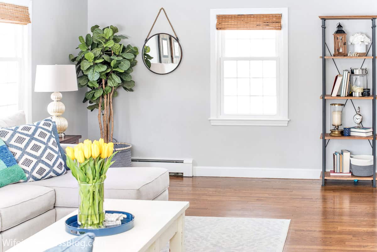
We just painted our entire first floor in different shades of gray. We used repose gray (a warm gray) and contrasted it with mindful gray (one shade darker) in our dining room. We also used Stonington Gray which is similar to Owl Gray but with slightly more blue. Since you used Revere Pewter which is more greige than gray, you might want to stick with the warmer colors. Both Repose Gray & Mindful gray are beautiful. The lightest color on that color card is Elder White, which might be too light. I would certainly give those a shot,though! We’ve been very pleased with them in our home.
I LOVE gray owl! Our living room/stairwell/hall is painted gray owl and it’s perfect! I went through literally 8 or 9 samples searching for the perfect gray. It does have blue/green undertones, but that is what I was going for. It’s gorgeous!
I’m so glad you like it! It’s definitely one of my favorites, along with my new bestie – Repose Gray :-)
I just painted my living room in Gray Owl and there are times I see blue undertones, and then there are times I see green under tones. Depends on the light and accessories in the room. Its a versatile color.
I just had the main part of the house painted with Gray Owl, and although I can see gray times or in places, I see green tones. A very faint/pale green — not quite sea foam. (Now that is showing my age) And honestly after 27 samples, Gray Owl is the one that wasn’t too dark or too light, not too much purple or too beige, it has been difficult and now to have the green. The answer is it has only been a few hours, but I think it is a color I can live with. But now I have to find the right accent color to go with it, for painting one wall in the dining room and alcove with the bookcases. Suggestions?
What a bummer! I was in a house last week that had gray owl and it really was the perfect gray with no visible undertones. I guess it just depends on your light and what surrounds it! I’m glad you are embracing the green undertones! Do you have white trim to help off set some of those tones?
We actually just painted our nursery Gray owl. I was so excited about it – when I sampled it on our walls there were no undertones. Seemed like it would be the perfect gray! Unfortunately once the entire room was painted, it definitely had blue undertones. At some points of the day it almost looks baby blue. Not the look I was after at all. I have read now on other blogs online that Gray Owl can take on a blue undertone depending on the lighting and exposure in your room. I know gray is a tricky color, but I am not sure where to go from here. I’ve done a ton of research on gray paints, and it seems like you just don’t know what you are going to really get until the whole room is painted!
Jessica – so sorry to hear that! Grays are notorious for having undertones and it really does depend on your light. We have Natural Gray by Behr in two rooms of our house – the kitchen and nursery. At times, the kitchen has a purple undertone but the nursery ALWAYS looks a true gray. It’s so strange! I did notice that once we painted all the trim in the kitchen white that it helped with the undertone situation. Wood tones definitely seem to bring out the purple more.
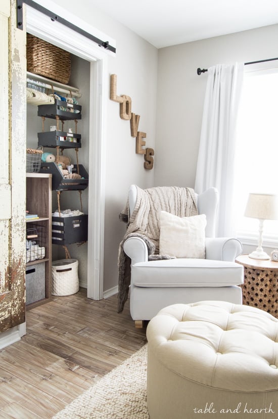
Are you really unhappy with the blue tone? I love the gray we have in our house…maybe it would be worth getting a sample and see if it works in your light? You can see it in our nursery here.
Let me know if you ever find the perfect color! It might help to paint a large piece of posterboard and move it to different spots in your room to help figure out the lighting situation, too!
I am currently using Palladian Blue that is a designer gray by Benjamin Moore that I picked since it goes well with wood tones. I’m happy to see that Owl gray looks good with wood as well. Of all the photos that Gray Owl lightened by 50% is stunning and I like the bedroom a lot too.