Content may contain affiliate links. When you shop the links, I receive a small commission at no cost to you. Thank you for supporting my small business.
Looking for the perfect green paint color? Whether you’re after a moody forest green, a soft sage, or something warm and inviting for your kitchen cabinets, this guide will help you find the best green shade for your space.
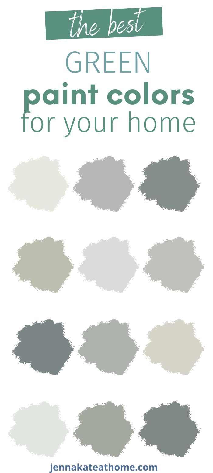
Green paint is incredibly versatile — it can be bold or soothing, dramatic or subtle. I’ve researched the most-loved green paint colors by designers and homeowners, gathered real-room examples, and included helpful context like undertones, LRV, and where each color shines best.
From tried-and-true favorites to underrated gems, this list includes a range of greens that work beautifully across different styles, lighting, and surfaces.
Why Green is So Popular Right Now
Green feels grounding and fresh at the same time. It brings the outdoors in, adds depth, and can act as either a neutral or a bold design statement.
The trick? Picking the right tone for your light, fixed elements, and overall style.
Best Green Paint Colors for Kitchen Cabinets
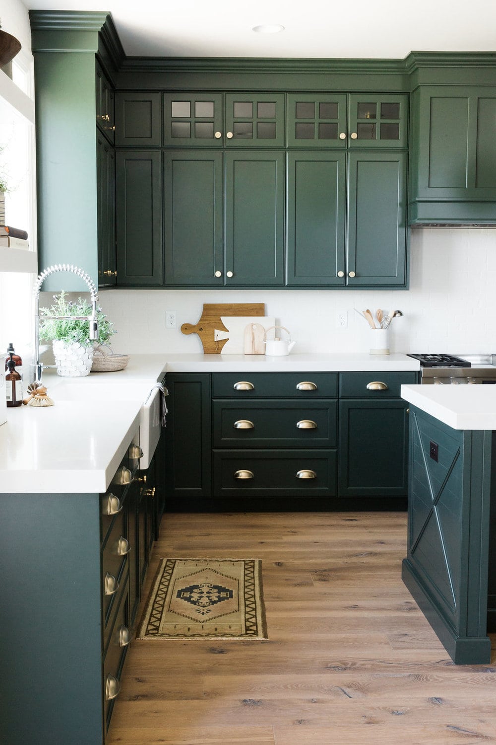
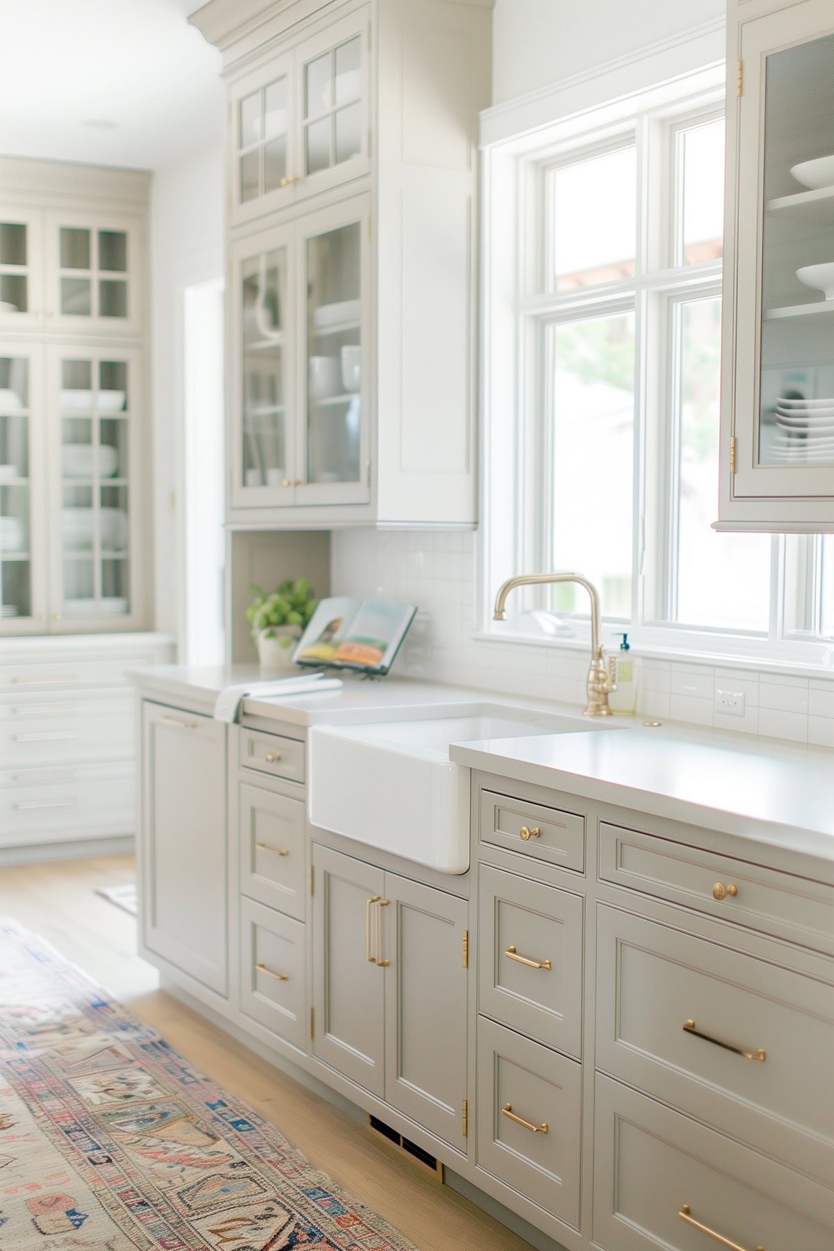
1. Sherwin Williams Pewter Green
- Best in: Kitchens, laundry rooms, offices
- LRV: 12
- Pairs well with: Marble, brass, warm wood tones
- Great for: Cabinets, accent walls, built-ins
- Bonus tip: Test it near your lighting — it can lean blue in certain conditions.
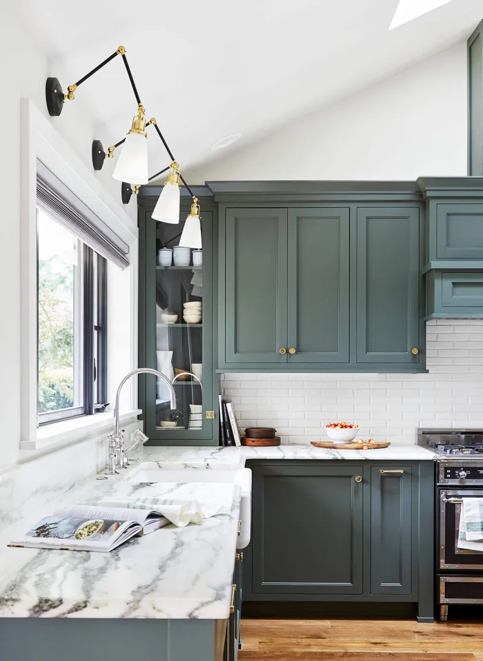
Pewter Green is an excellent choice for kitchen cabinets. In this photo I love how it’s paired with marble countertops. This green can lean a bit blue (look at the bottom left of the photo) depending on the lighting so definitely one to test before committing.
2. Benjamin Moore Backwoods
Best in: Kitchens, living rooms, mudrooms
LRV: 13.76
Pairs well with: White Dove, matte black, deep oak finishes
Great for: Cabinets, millwork, moody walls
Bonus tip: Use a satin or semi-gloss finish on cabinetry for a rich, elegant feel.
Backwoods offers a fresher appearance among dark green paint colors, working well alongside Benjamin Moore White Dove for a striking board and batten wall treatment or on kitchen cabinets.
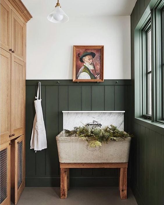
3. Dunn Edwards Black Spruce
Best in: Kitchens, pantries, mudrooms
LRV: 16
Pairs well with: Brass hardware, marble, crisp white
Great for: Cabinets and built-ins
Bonus tip: Though not from BM or SW, Black Spruce is a showstopper worth color-matching in a preferred brand if needed.
I don’t usually feature Dunn Edwards paint colors, but I couldn’t pass up the opportunity to showcase these green kitchen cabinets.
Black Spruce makes a bold statement on these kitchen cabinets, proving to be the perfect green hue against warm brass cabinet hardware and clean white countertops and backsplash.
Best Warm Green Paint Colors
1. Sherwin Williams Clary Sage
Best in: Kitchens, mudrooms, bedrooms
LRV: 41
Pairs well with: Creamy whites, oak, aged brass
Great for: Cabinets, walls, or even front doors
Bonus tip: Clary Sage is especially flattering in homes with lots of warm wood tones.
A warm sage green with a hint of yellow undertone. Soft, timeless, and versatile.
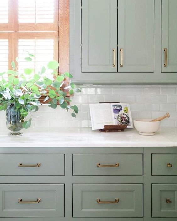
2. Sherwin Williams Retreat
Best in: Bathrooms, kitchens, built-ins
LRV: 21
Pairs well with: Warm brass, white quartz, earthy neutrals
Great for: Islands, lower cabinets, or bedroom walls
Bonus tip: Adds depth without overwhelming small spaces.
SW Retreat is a slightly grayed-out sage green that adds a modern look to any space, making it a popular choice for lower cabinets or a kitchen island, especially when paired with gold accents and pure whites.
3. Sherwin Williams Olive Grove
Best in: Powder rooms, dens, accent walls
LRV: 13
Pairs well with: Creamy trim, rattan, black accents
Great for: Fireplaces, moody accent walls
Bonus tip: Gorgeous with vintage or antique furnishings.
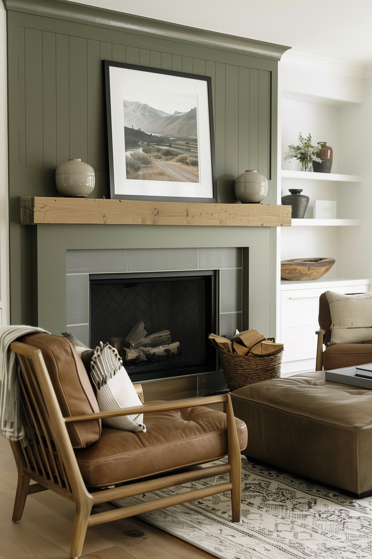
Olive Grove, an almost “army green” color, adds warm green vibes to any small space, making a great choice for a fireplace and the perfect color selection for a bold statement.
4. Benjamin Moore Tate Olive
Best in: Bathrooms, studies, entryways
LRV: 20.66
Pairs well with: Black countertops, deep wood tones
Great for: Vanities, doors, or masculine interiors
Bonus tip: Looks especially striking in rooms with natural stone or metal accents.
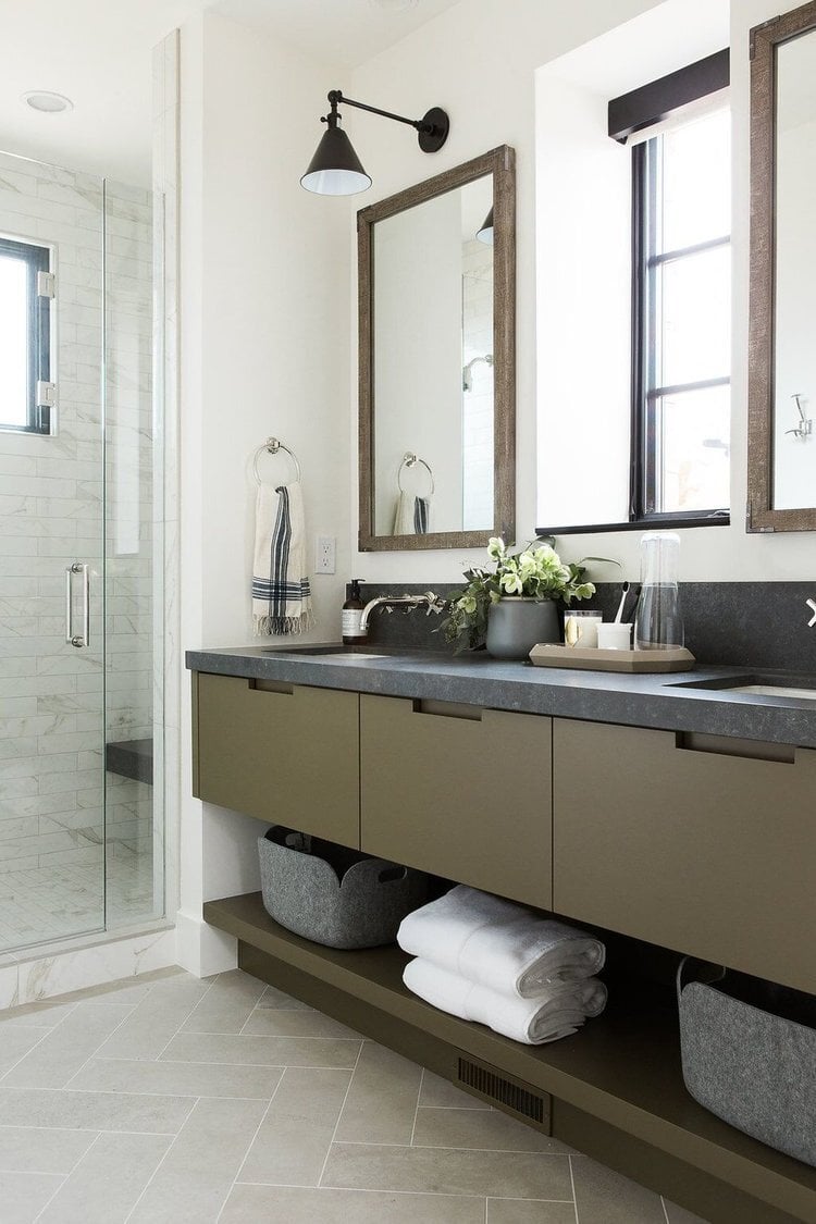
BM Tate Olive, an olive green that offers a unique and masculine touch, is stunning against black countertops and dark wood mirrors, highlighting the versatility of different shades of green in creating sophisticated and personalized spaces.
5. Sherwin Williams Evergreen Fog
Best in: Bedrooms, bathrooms, hallways
LRV: 30
Pairs well with: Soft whites, light wood, muted brass
Great for: Calming wall color or whole-home use
Bonus tip: Great way to dip into green without fully committing to bold color.
SW Evergreen Fog was the Sherwin Williams 2022 Color of The Year. It’s on the lighter end of the dark green scale, with a gray undertone.
If the darker colors are too dark for you and you’re looking for something softer, this sage green tone is a great choice! It works with a variety of color schemes and wood times, ensuring it will look great no matter where you use it.
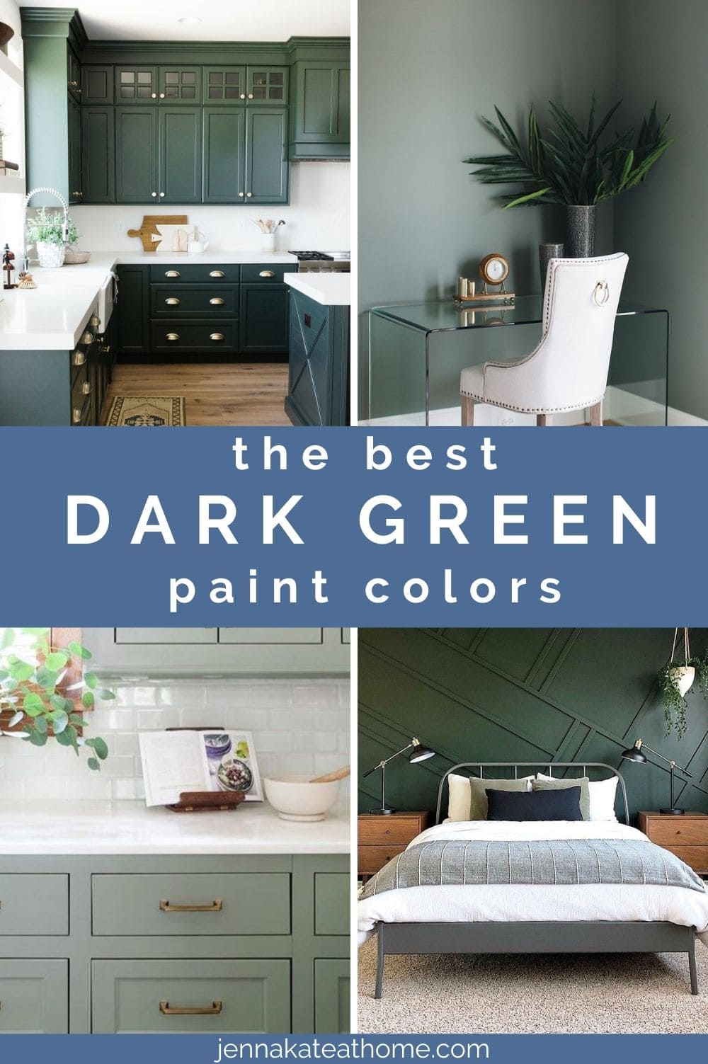
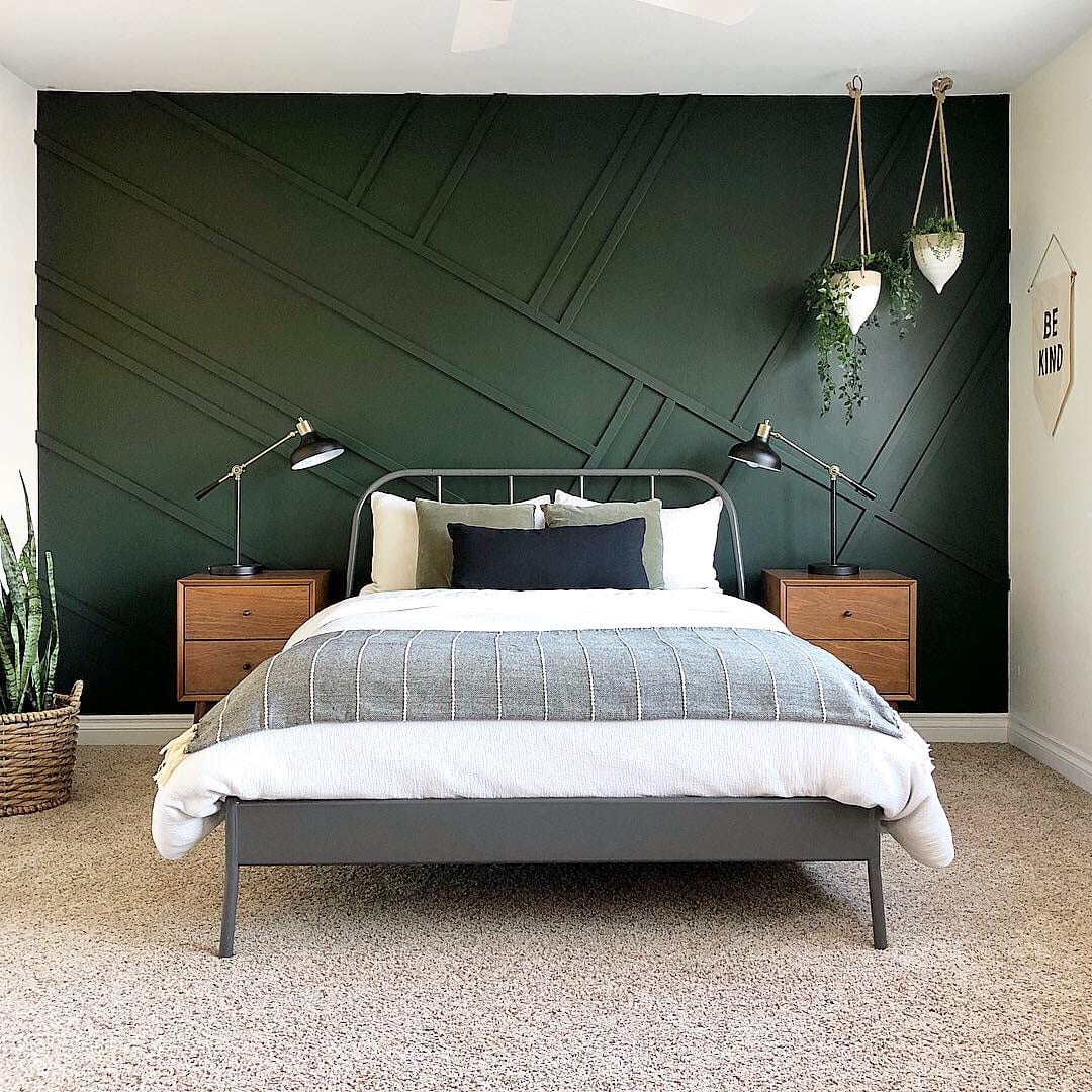
Best Dark Green Paint Colors
6. Benjamin Moore Essex Green
Best in: Libraries, powder rooms, entryways
LRV: 6.39
Pairs well with: Leather, dark woods, antique brass
Great for: Accent walls, trim, front doors
Bonus tip: Pairs beautifully with rich textures like velvet or tweed.
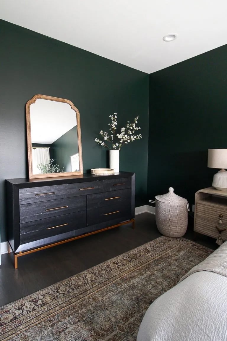
Loved for its jewel-tone, royalty vibes, Essex Green is a deep green that feels elegant and is completely at home with ornate mahogany woodwork, showcasing the rich color and sophisticated backdrop it provides.
7. Benjamin Moore Salamander
Best in: Bathrooms, vanities, statement furniture
LRV: 4.84
Pairs well with: Gold fixtures, marble, white oak
Great for: High-drama spaces, cabinetry
Bonus tip: Use it where you want serious mood — this is near-black with a twist.
Salamander, the darkest of the greens featured, is a moody green that complements honey oak furniture, trim, and doors, adding drama and moody vibes to any space.
Its almost black undertones make it a perfect color for those looking to create a sophisticated backdrop.
8. Benjamin Moore Chimichurri
Best in: Kitchens, dining rooms, living rooms
LRV: 8.95
Pairs well with: Brass, walnut, white marble or quartz
Great for: Lower cabinets, millwork, walls
Bonus tip: Despite its richness, it doesn’t feel heavy in well-lit spaces.
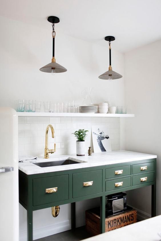
How amazing does this green paint look with the brass faucet and hardware? Lots of light makes this paint color really pop but don’t be afraid to use it in darker rooms, too.
9. Benjamin Moore Rainy Afternoon
Best in: Bedrooms, studies, offices
LRV: 16.52
Pairs well with: Pale neutrals, charcoal, linen
Great for: Cozy rooms, layered traditional spaces
Bonus tip: Has a chameleon quality — in some light it reads green, in others gray or even blue.
Rainy Afternoon is a very dark color with a subtle green that can appear almost gray or blue depending on the lighting, embodying rainy afternoon vibes and adding a moody vibe to any space, making it one of the best dark green paint colors for a variety of settings.
Don’t Forget To Always Use Real Paint Samples!
Don’t forget – no matter what you’ve read or photos you’ve seen online, it’s really important to sample paint colors in your home before committing!
Samplize provides peel and stick paint samples made with real paint, that are easy to move around your home, and cheaper than buying a gazillion paint pots! It’s the only way I buy paint samples.
Coordinating Color Palettes for Green Paint
Pairing green with the right supporting tones makes all the difference. Here are some ideas:
- Creamy whites (BM White Dove, SW Alabaster): Soften bold greens and add warmth.
- Black accents (SW Tricorn Black, BM Onyx): Add contrast and a modern edge.
- Warm wood tones: Elevate olive and sage hues, especially in farmhouse or transitional styles.
- Brass + aged metals: Highlight deep greens like Salamander or Essex Green beautifully.
- Stone and marble: Create a high-end look when paired with Pewter Green, Chimichurri, or Evergreen Fog.
Frequently Asked Questions
Sherwin Williams Evergreen Fog and Benjamin Moore Backwoods are both standout favorites right now thanks to their versatility and softness.
Pewter Green, Backwoods, and Tate Olive are top contenders—rich, timeless, and flexible across different hardware and counters.
Not if you choose the right undertone! Sage greens (like Clary Sage) work as a neutral, while dark greens (like Salamander) pair beautifully with brass, wood, and crisp whites.
Final Thoughts
Hopefully, you’ve found your perfect shade of green paint for your next project. Whether you’re leaning toward a warm sage, a deep forest hue, or something in between, there’s a green that will fit your style and space.
Just remember to test before committing — green paint can shift dramatically depending on light, surrounding colors, and even the time of day.
Looking for more paint inspiration? Check out:
Sherwin Williams Evergreen Fog Review
The Best Neutral Paint Colors for 2025
Benjamin Moore White Dove Review
Jen – I recently repainted my kitchen with BM Brookside Moss. I love it.
Kim
Glidden has a green with a gray undertone that is also a unicorn color. On the paint chip it is boring and unimpressive. What makes it a great color is how it reacts to light. During the day under natural light it is can be moody but no amount of light washes it out, it holds its color, but always stays true, never any shifting to yellow or blue. At night under artificial light it is lighter and pure. With a LRV of 34,it is light enough to be modern and lends itself well to any size space. Lighting affects the color in brightness but it always stays true. Makes a great color to use on an island, lower cabinets, and accent walls, but is versatile enough to use on walls. Pairs well with Repose Gray and other grays and white, looks lovely with creams and rich yellows and contrasts well with rustic oranges and fall colors. Makes a statement when mixed with the basics of black and white as accent colors. The color is Monsoon Green (10GY 36/096) by Glidden, I know, not what you think, but its a really great color. Its hard to find a true green gray that can perform like this one, stays neutral and swifts brightness without losing its hue. Goes with almost everything, the Glidden site says to pair it with violets and purples, never gone that route.
Thanks for sharing! I don’t have any experience with Glidden paint but this sounds like a great color!
We painted our living room (and are halfway done with our music/fireplace room) in Sherwin Williams Honeydew. Its a beautiful light bright sage-ish green and plays beautifully off our orginal 1906 woodfloors and all the knotty pine trim and ceilings and fireplace (though it might be a prominent grain old oak or maple just stained to match the pine). It also matches the Toile curtains I made years ago that we have in the living room (with matching sheers in both rooms).
Thanks for sharing, Jen! I’ll have to look into that one, it sounds lovely!