Content may contain affiliate links. When you shop the links, I receive a small commission at no cost to you. Thank you for supporting my small business.
Looking for a warm, inviting neutral that doesn’t scream “2005 builder beige”? Sherwin Williams Accessible Beige (SW 7036) might be the perfect greige for your home. With its soft undertones and incredible versatility, Accessible Beige offers just enough warmth without feeling dated or too yellow—making it a timeless choice that still feels modern.
In this guide, I’ll walk you through everything you need to know: its undertones, LRV, where it works best (and where it doesn’t), and how it compares to similar paint colors like Revere Pewter.

Accessible Beige at a Glance
- Pairs Well With: Warm whites, earthy greens, soft grays, warm wood tones
- Paint Code: SW 7036
- LRV: 58
- Undertones: Warm beige with soft gray and green undertones
- Finish Type: Interior/Exterior
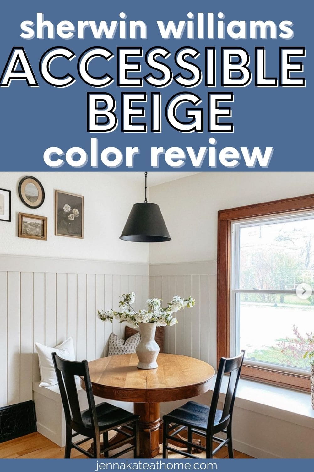
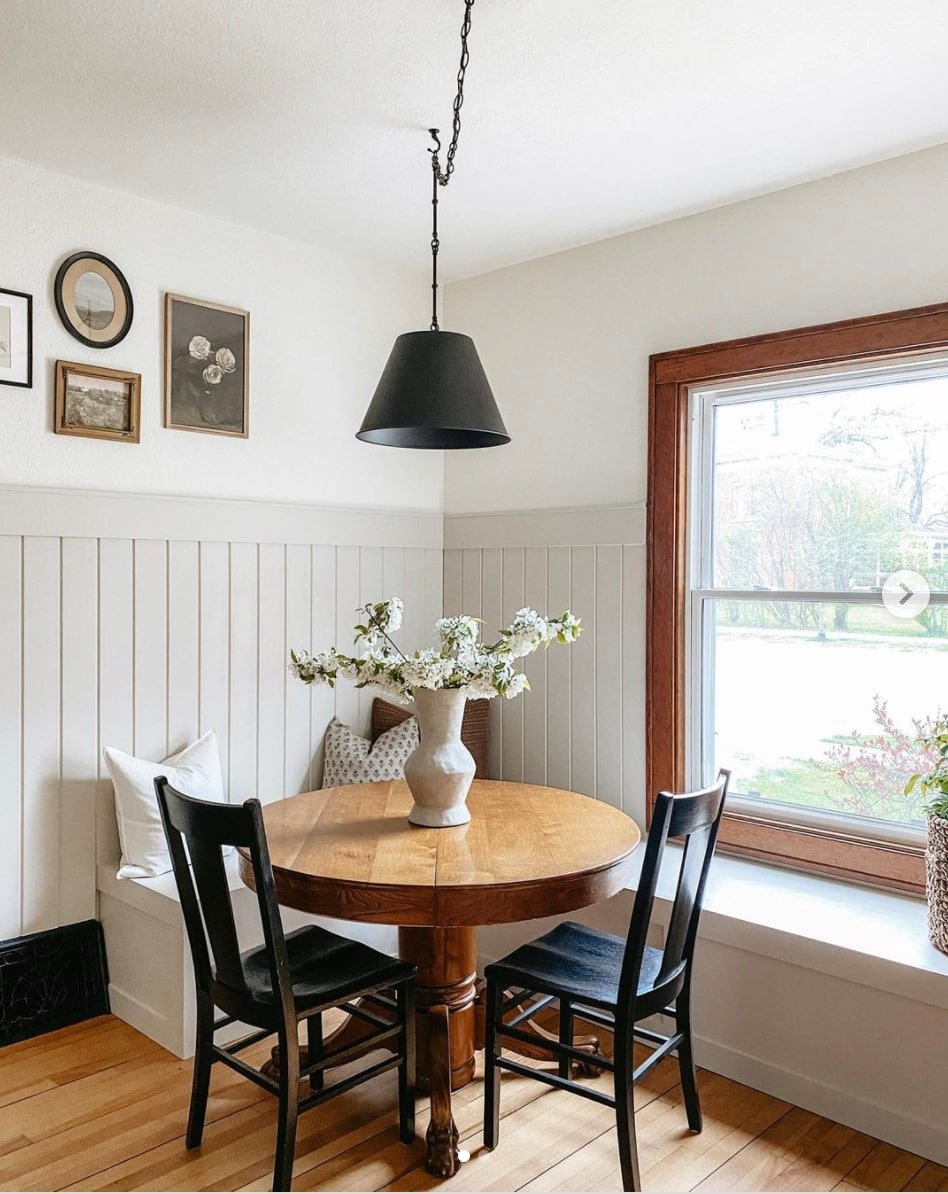
- Best For: Living rooms, bedrooms, kitchens, cabinetry, trim
What Color Is Accessible Beige?
Sherwin Williams Accessible Beige is technically a “greige”—a blend of gray and beige—but it leans more beige than gray. It’s a soft, muted neutral that adds warmth to a space without veering into yellow or tan territory. If you’re looking for a paint color that feels cozy, calming, and refined, this one deserves a closer look.
Unlike traditional beige, which can look flat or dated, Accessible Beige is softened by a subtle gray base and a whisper of green undertone. It has a grounded, earthy feel that works well in a wide range of homes and design styles.
RELATED: The Best Greige Paint Colors
Accessible Beige Undertones: Warm, But Subtle
Accessible Beige is a warm beige with soft gray and subtle green undertones, but in certain lighting—especially low, artificial, or indirect light—you may also notice a taupe (pink) undertone peeking through.
If you’re sensitive to pink or taupe hues, it’s important to sample this color in multiple rooms and lighting conditions before committing. While many people find the warmth cozy and neutral, others (especially those with cool-toned furnishings or lighting) may find the pink cast more noticeable than expected.
What is the LRV of Accessible Beige?
Accessible Beige has a Light Reflectance Value (LRV) of 58, making it a light-medium paint color. It reflects a fair amount of light, but it’s not as bright as a true off-white.
This LRV means it won’t feel stark in a room, but it also won’t absorb too much light like darker beiges or taupes might. It’s a safe middle ground—especially if you want a neutral that has some presence but doesn’t overpower.
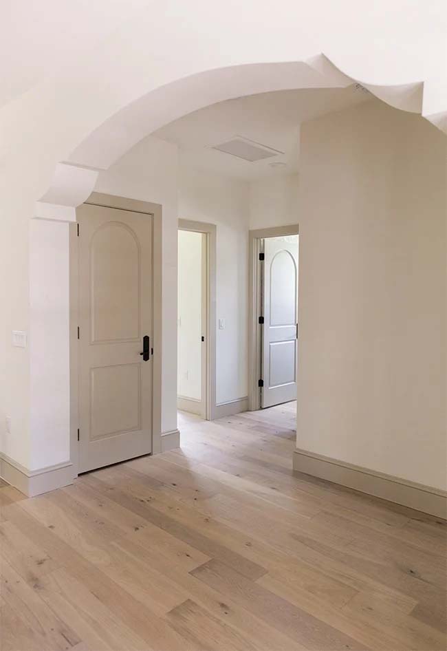
Where Does Accessible Beige Work Best?
Accessible Beige is one of those rare colors that can truly be used throughout the home. That said, it shines best in these spaces:
Best Rooms for Accessible Beige
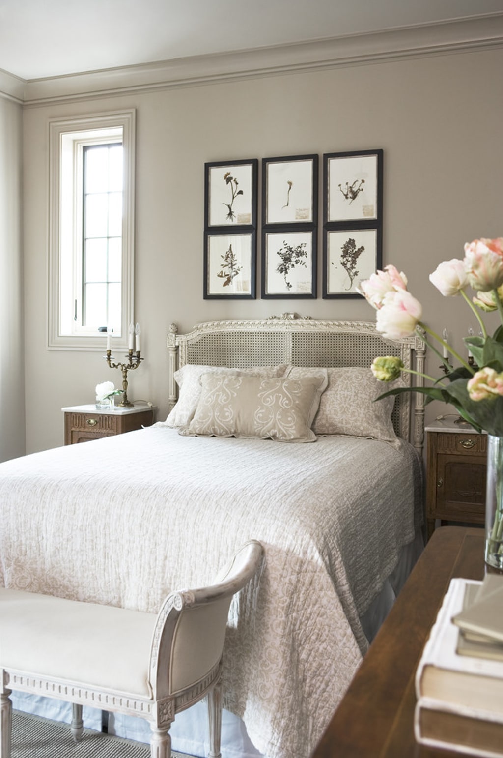
- Living Rooms & Family Rooms: Warm, welcoming, and easy to decorate around.
- Bedrooms: Adds softness without being too dark or heavy.
- Dining Rooms: Beautiful with traditional or rustic decor.
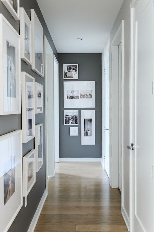
- Hallways & Entryways: Neutral and easy to layer with art and decor.
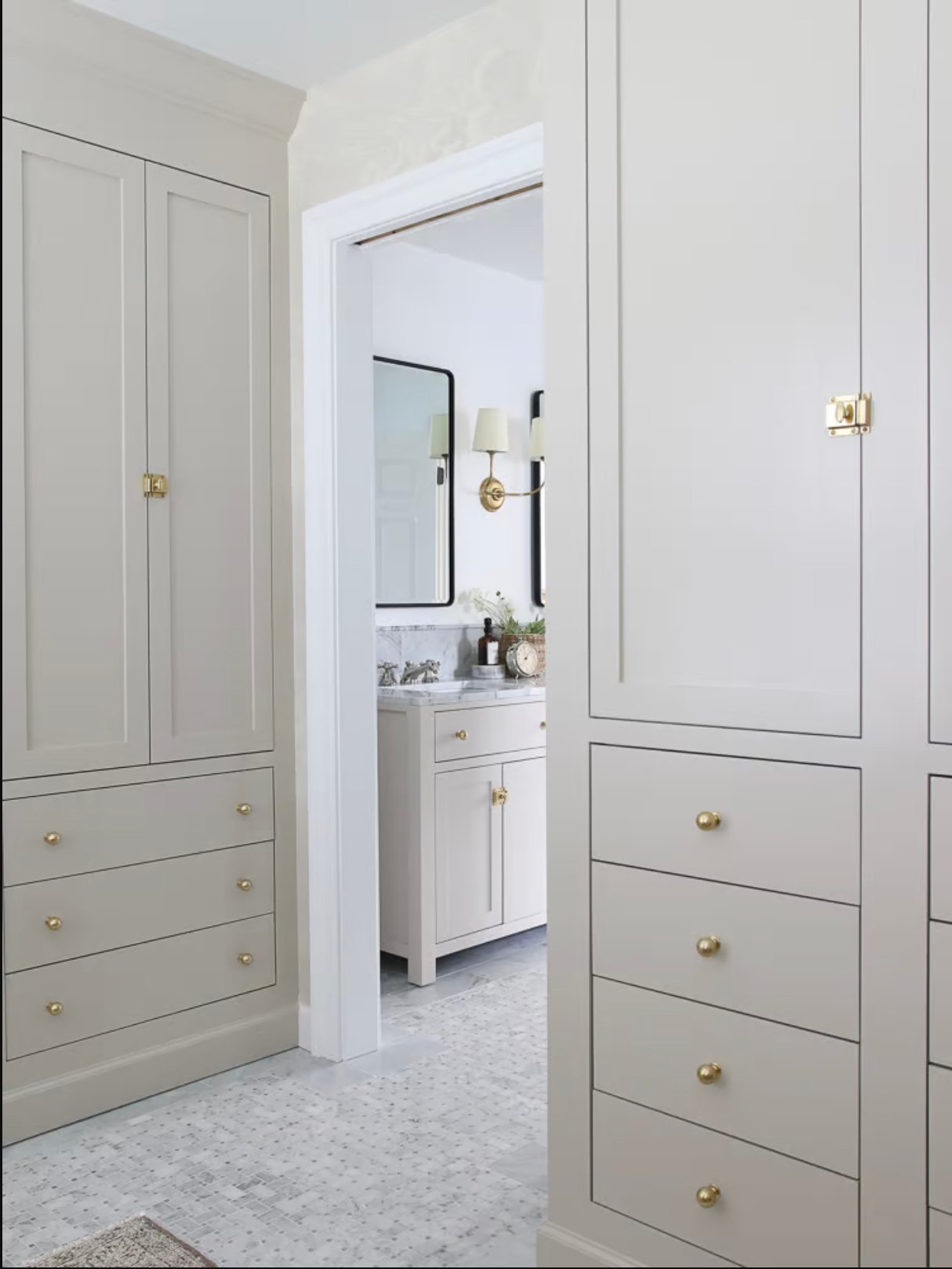
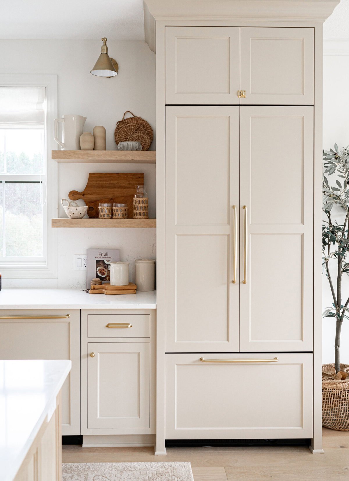
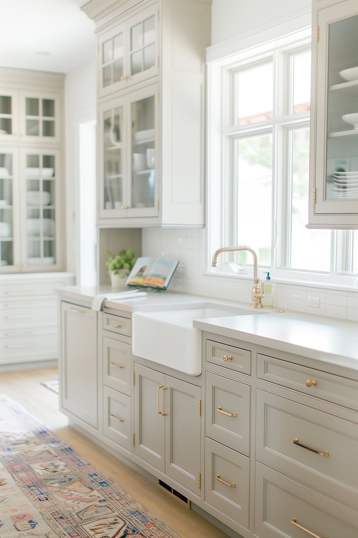
- Cabinetry or Trim: Looks stunning against white walls for contrast.
RELATED: The best paint colors that go with honey oak (hint: Accessible Beige is one of them!).
When NOT to Use Accessible Beige
- Ultra-modern or minimalist spaces: Might not provide the crisp contrast you’re looking for.
- Cool, north-facing rooms: Can feel a little muddy or drab.
- Paired with icy whites or cool blues: May clash or feel outdated.
Don’t Forget…
Don’t forget – no matter what you’ve read or photos you’ve seen online, it’s really important to sample paint colors in your home before committing!
Samplize provides real paint samples that are easy to move around your home, and cheaper than buying a gazillion paint pots! It’s the only way I buy paint samples.
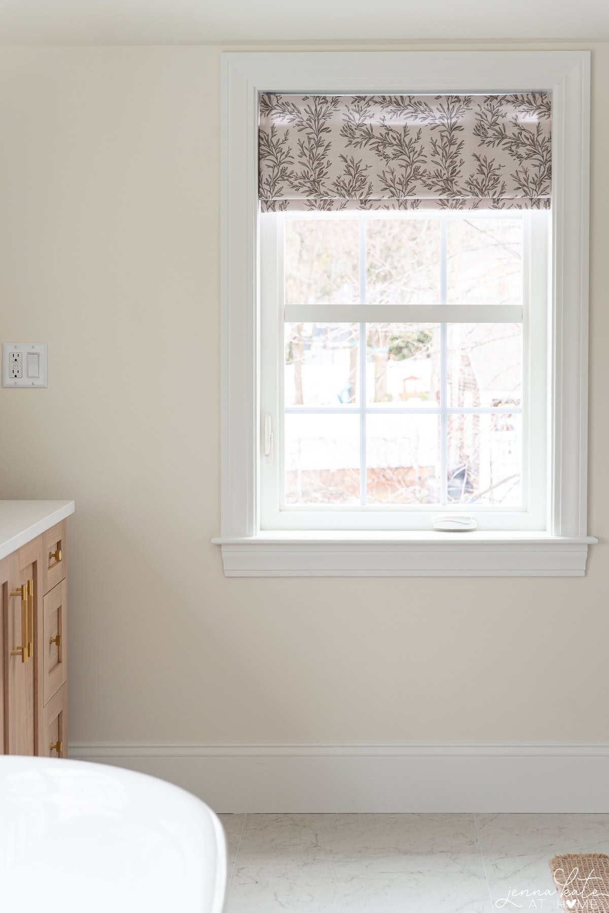
How Lighting Affects Accessible Beige
Lighting is everything when it comes to this color.
- North-facing rooms: Tends to pull grayer and may reveal a faint greenish undertone.
- South-facing rooms: Brings out the warm beige, making the color feel lighter and brighter.
- East-facing rooms: Can shift throughout the day, looking beige in the morning and more neutral in the afternoon.
- West-facing rooms: Glows warmly in the afternoon sun and reads beige with a touch of golden warmth.
TIP: If you’re using it in a room without much natural light, add plenty of warm lighting (think soft white bulbs) to avoid the color falling flat.
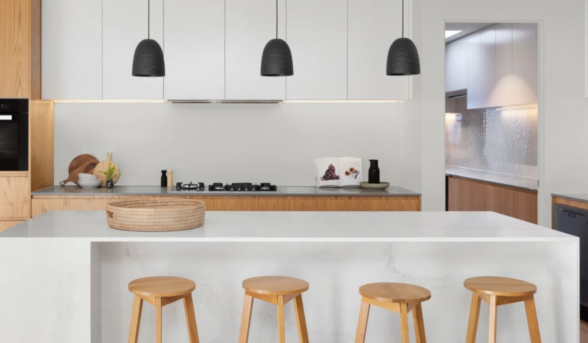
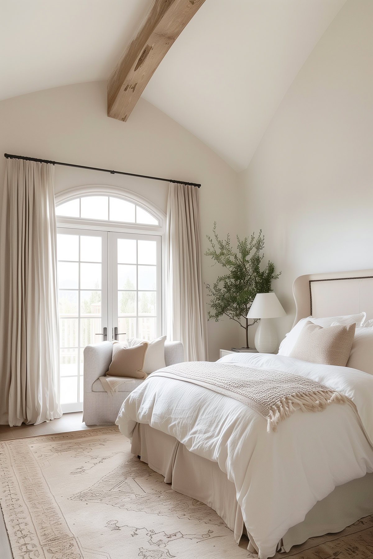
Accessible Beige In Real Rooms
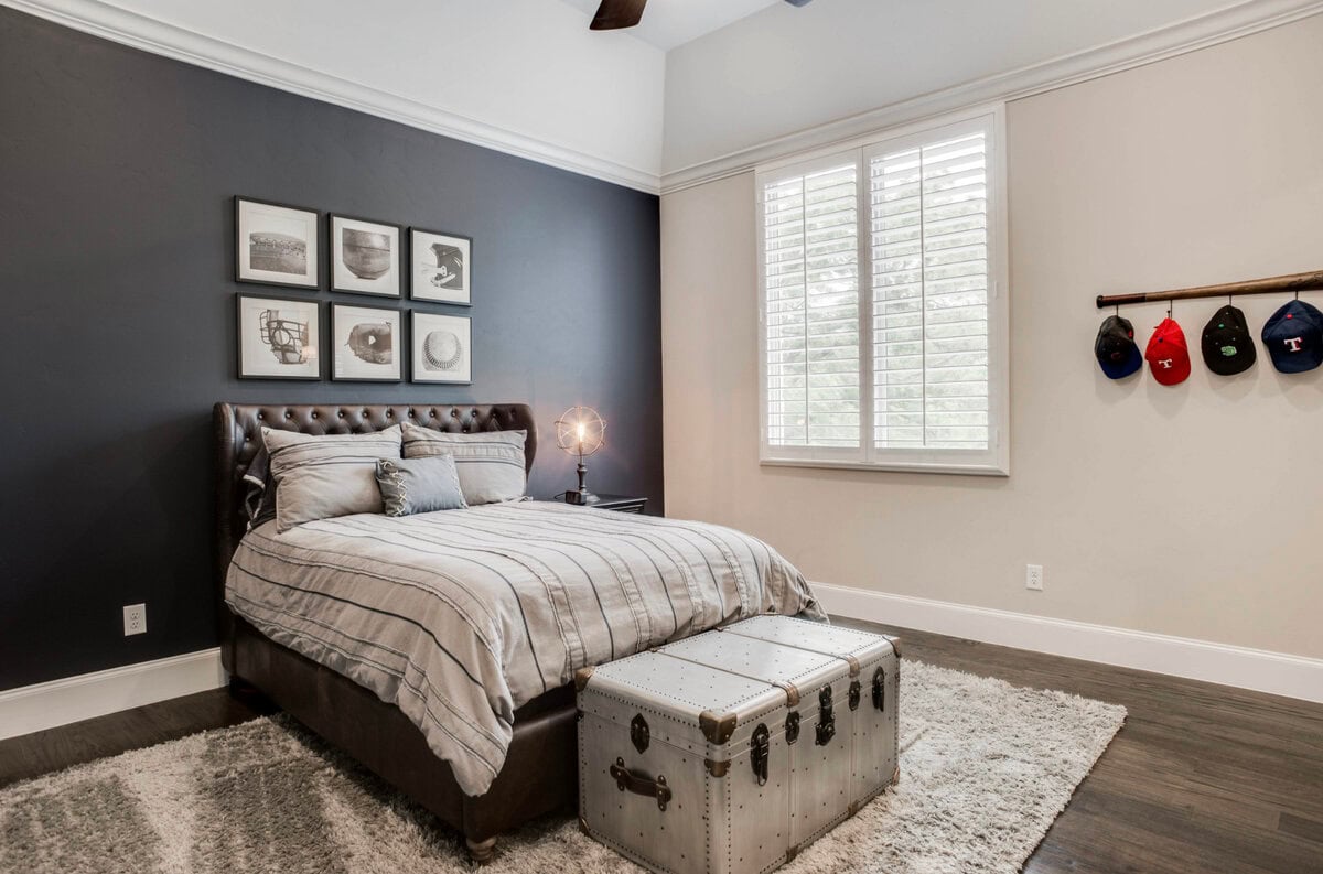
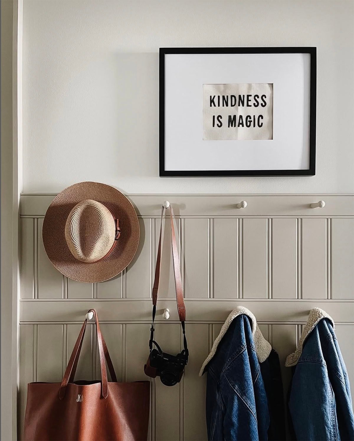
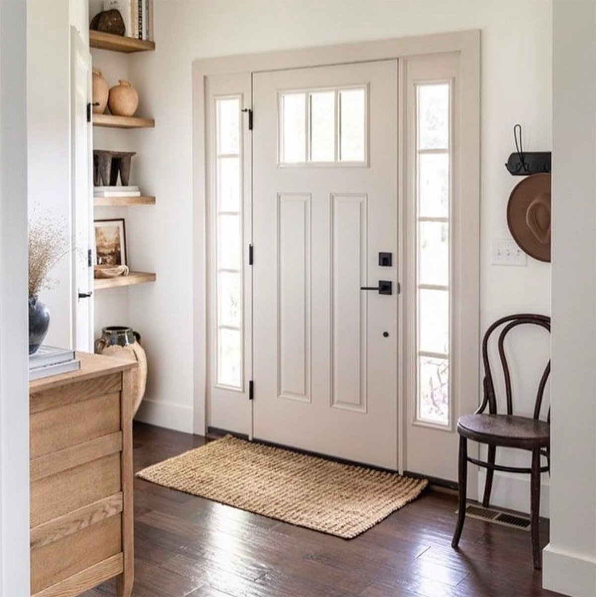
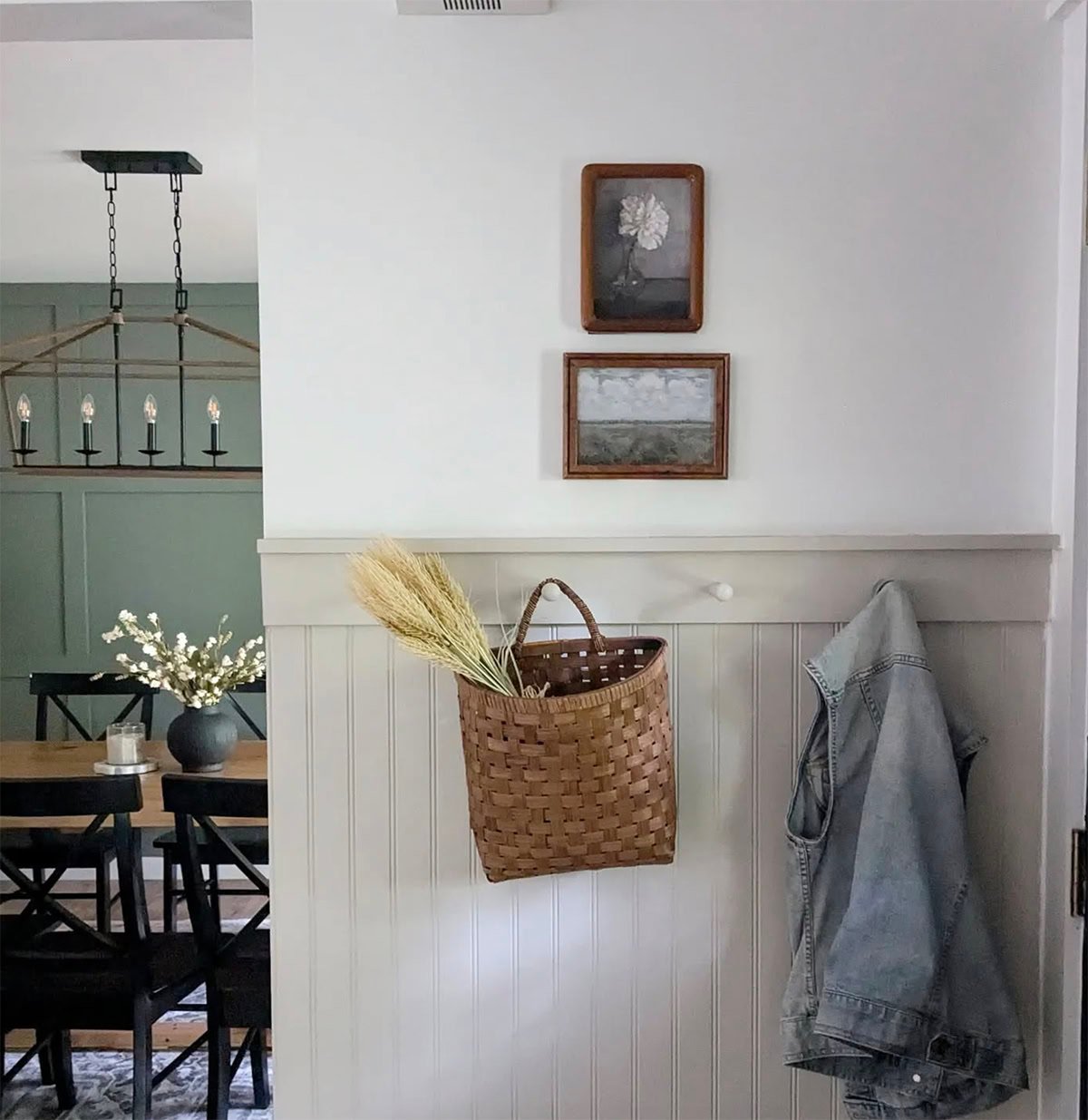
It does sure seem like Accessible Beige is most popular on beadboard and board & batten!
Who Should Use Accessible Beige?
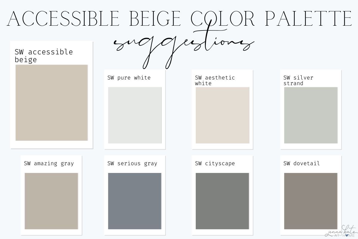
Accessible Beige Coordinating Colors
Accessible Beige works beautifully with a curated mix of soft whites, greens, and muted grays. Here are some of my favorite pairings:
Best White Trim Colors
- SW Pure White (SW 7005): My go-to trim color—crisp but soft.
- SW Alabaster (SW 7008): A creamy white for a cozy, tonal look.
- SW High Reflective White (SW 7757): Bright white for a clean contrast.
Accent & Coordinating Colors
- SW Aesthetic White (7035) – A warm off-white for adjacent rooms.
- SW Silver Strand (7057) – A soft green-gray that complements its earthy undertone.
- SW Amazing Gray (7044) – Slightly deeper greige for a layered monochrome palette.
- SW Cityscape or Dovetail – Darker grays to add drama.
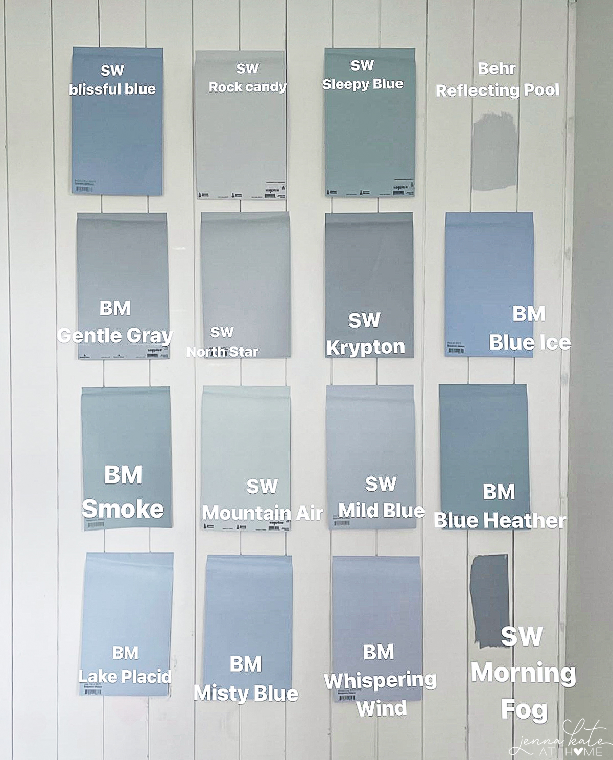
Accessible Beige vs. Other Popular Paint Colors
Let’s see how Accessible Beige stacks up against a few other favorite neutrals:
| Paint Color | LRV | Undertones | Feels Like | Best For |
|---|---|---|---|---|
| Accessible Beige (SW 7036) | 58 | Beige w/ gray, green, slight taupe | Warm, earthy, muted | Transitional, cozy spaces |
| Agreeable Gray (SW 7029) | 60 | Warm gray w/ taupe | Lighter, more neutral | Whole-home use |
| Revere Pewter (BM HC-172 | 55.5 | Greige w/ green | Cooler, slightly muddy | Traditional, cooler rooms |
| Edgecomb Gray (BM HC-173) | 63 | Soft greige | Airy, fresh | Light-filled rooms |
| Balanced Beige (SW 7037) | 46 | Beige w/ brown | Deeper, richer warmth | Accent walls, dramatic contrast |
Accessible Beige vs BM Revere Pewter
Both Accessible Beige and Benjamin Moore Revere Pewter have green undertones. However, looking at the side-by-side comparison of the two colors below, you can clearly see that Accessible Beige definitely leans warmer than Revere Pewter which is a slightly cooler shade.
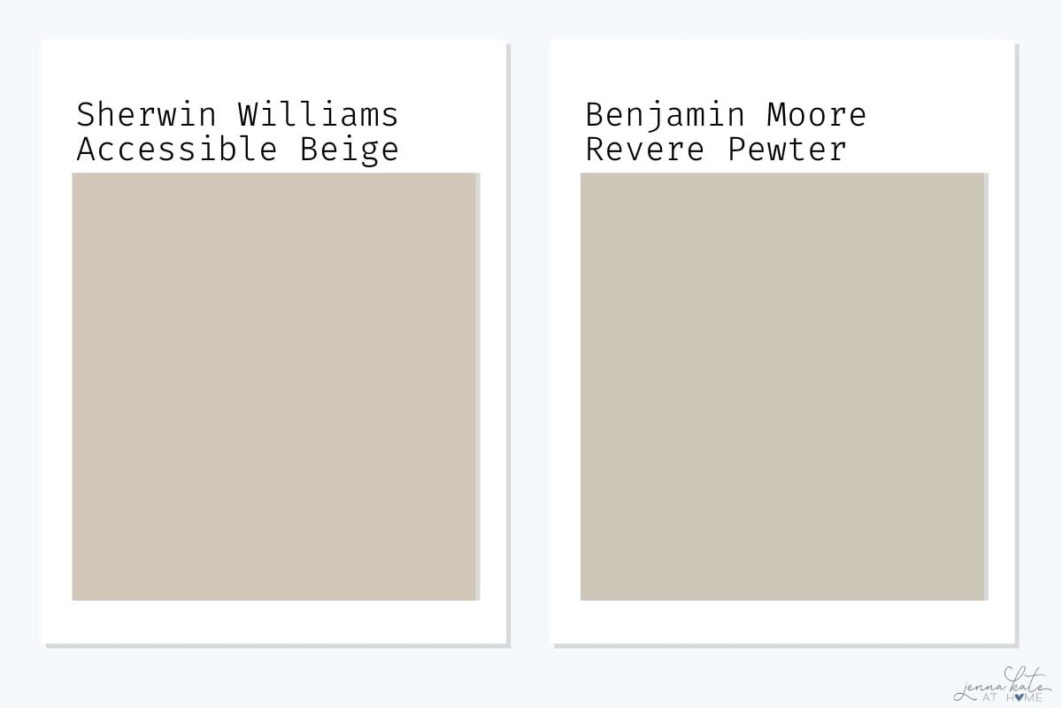
Of course, this should all be compared in relation to the textiles and colors of the room you are planning on painting. When deciding on the right color, remember, Accessible Beige tends to enjoy being paired with more earthy warm tones whilst Revere Pewter tends to favor being paired with cooler gray tones.
See my full Revere Pewter Paint Review for a deep dive into this popular paint color.
Accessible Gray vs Edgecomb Gray
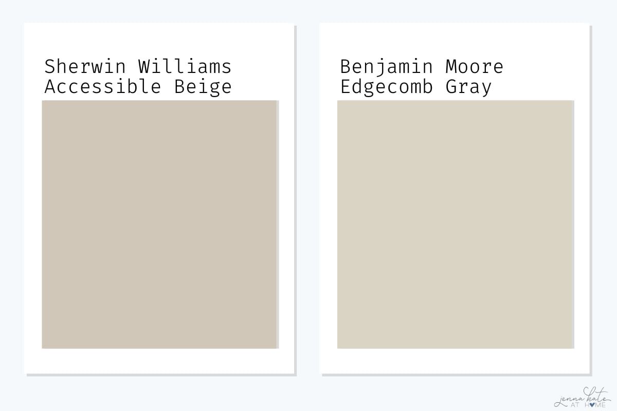
Edgecomb Gray is lighter and leans more gray with soft green undertones, while Accessible Beige is warmer, deeper, and can show taupe (pink) in certain lighting.
Key takeaway: Edgecomb Gray is a safer pick if you’re avoiding pink tones and want a fresher greige.
See my full Edgecomb Gray Paint Review for a more lots more about this popular paint color.
Acessible Beige vs Agreeable Gray
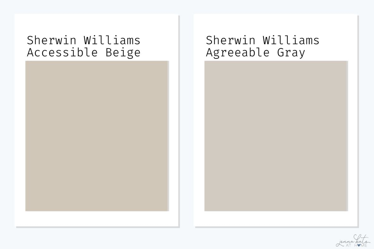
Agreeable Gray is a greige with stronger gray undertones and a slightly cooler overall feel, while Accessible Beige leans more beige, with noticeable warmth and a slightly lower LRV (darker).
Key takeaway: Choose Agreeable Gray for a more versatile greige that works in both warm and cool palettes.
See my full Agreeable Gray paint review for a deep dive into this popular greige.
Accessible Beige vs Balanced Beige
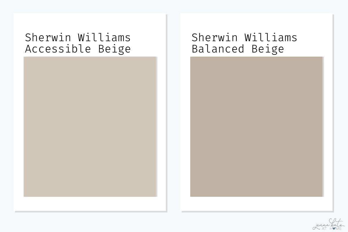
Balanced Beige is darker and more saturated, with a deeper brown tone, while Accessible Beige is lighter and feels more flexible for open concept homes.
Key takeaway: Use Balanced Beige for drama, and Accessible Beige for softness.
Trim, Doors & Cabinets in Accessible Beige
Accessible Beige isn’t just for walls—it works beautifully on trim and cabinetry, too. If you’re looking to follow the contrast trim trend, try:
- White walls + Accessible Beige trim for a warm, elevated look
- Accessible Beige cabinets paired with creamy white walls and wood floors
- Accessible Beige interior doors for subtle contrast
It feels softer and more natural than stark gray or bold black, making it ideal for transitional and traditional homes.
Frequently Asked Questions
Yes! While it’s not the trendiest beige on the market, its soft warmth and versatility make it a favorite for homeowners who want a color that’s modern but not cold.
Yes, but they’re subtle. In certain lighting, especially cool northern light, the green undertone may peek through. It’s not dominant but worth noting.
Accessible Beige is warm. It leans more beige than gray, with just enough gray to tone down the warmth.
Avoid cool, icy whites and vibrant blues or purples. They tend to clash with Accessible Beige’s earthy undertone.
Yes—occasionally. While Accessible Beige is most known for its beige and gray base with a hint of green, in certain lighting, it can lean slightly pink or taupe, especially in rooms with cool or dim lighting. If you’re sensitive to this, test it carefully before using it on large walls.
Final Thoughts: Is Accessible Beige Right for Your Home?
Accessible Beige may not be the boldest or most modern paint color, but that’s exactly why it works. It’s timeless, cozy, and easy to decorate around. If you love warm neutrals with a hint of softness—and want something a little fresher than traditional beige—Accessible Beige is worth testing in your space.
Test it with a peel-and-stick sample before committing
Pair it with warm whites, muted greens, or dark grays
Avoid pairing with cool or crisp whites to prevent clashing
Order a peel-and-stick sample of Accessible Beige from Samplize to test it in your lighting. It’s the easiest way to avoid undertone surprises.

I painted most of my house Accessible Beige last year. Very pretty but I felt it was too dark in my very small living room. I repainted that room Natural Tan (less black in the formula) and really like it.