Content may contain affiliate links. When you shop the links, I receive a small commission at no cost to you. Thank you for supporting my small business.
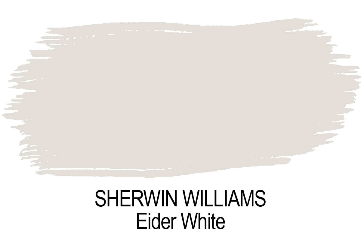
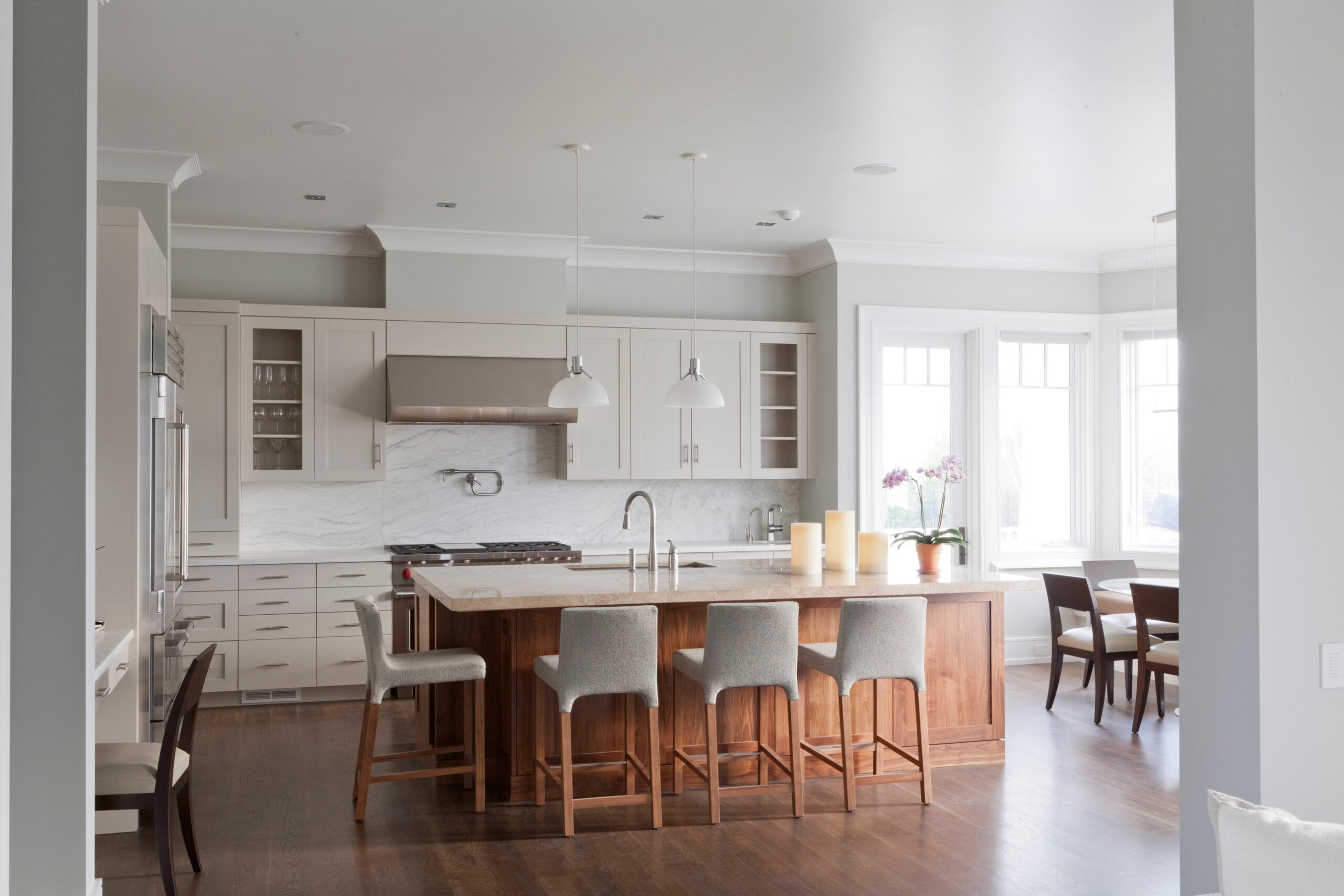
At first glance, Sherwin Williams Eider White (SW 7014) looks like it should be a soft, airy off-white—perfect for light-filled rooms or a clean, neutral palette. And as someone who loves its darker cousin, Repose Gray, I really thought I’d found another go-to shade.
But after testing it myself, I realized Eider White’s taupe-pink undertones made it a no-go in my home—and possibly yours too, depending on your style and lighting.
Of course, not everyone is going to be as sensitive to that pinkish undertone as I am, but if you generally prefer a balanced color palette of warm grays, whites, blues and greens (which is how I decorate), I don’t think this will be the right color for you.
The taupe (pinkish/purple) undertone becomes especially noticeable when placed next to Repose Gray walls, where the green undertone stands out more.
So what color exactly is Eider White—and why does it behave so differently from room to room? Let’s take a closer look.
Sherwin Williams Eider White (SW 7014) at a Glance
- LRV: 73
- Undertones: Taupe with a hint of pink/purple
- Finish: Interior/Exterior
- Pairs Well With: Pure White, Iron Ore, Mindful Gray, Evergreen Fog
- Best For: Light-filled rooms, subtle contrast in modern spaces
- Vibe: Soft, complex, sophisticated—but potentially tricky
Eider White Might Be Right for You If…
- You love a soft, slightly complex neutral
- Your room gets warm southern light
- You enjoy a mix of warm grays and taupes
You Might Want to Skip It If…
- You’re sensitive to pink or purple undertones (me!)
- You want a true greige or clean white
- Your home has lots of cool lighting or blue/gray finishes
What is The LRV of SW Eider White?
Sherwin Williams Eider White has an LRV of 73, putting it firmly in the white to off-white family.
Is Eider White a Warm or Cool Color?
It may be difficult to tell because of its sometimes tricky undertones, but Sherwin Williams Eider White is slightly warm color.

Where Can You Use Eider White?
It’s suitable for just about any room—bedrooms, living rooms, bathrooms, and even dining spaces.

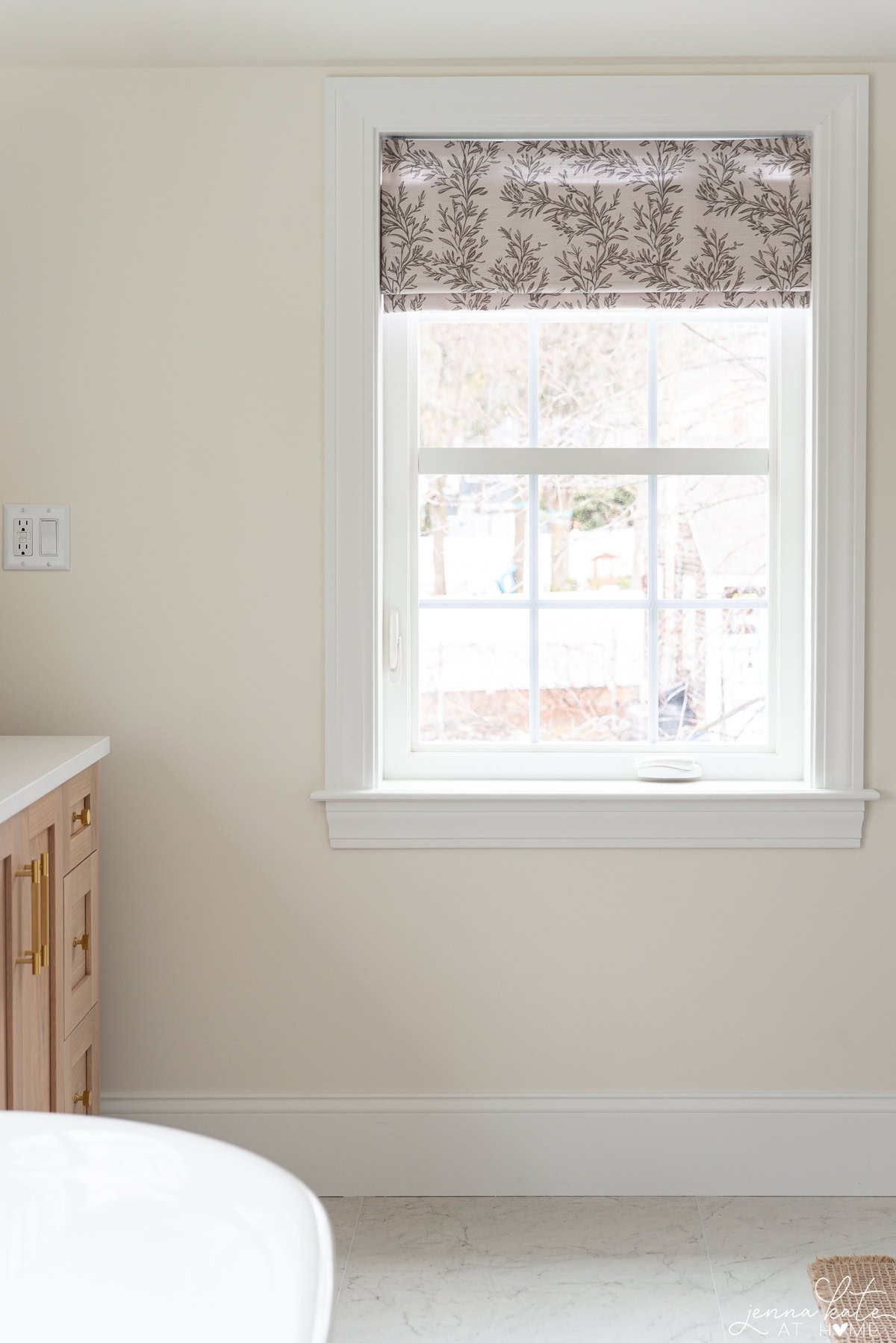
How Does Light Affect Eider White?
I mentioned this already, but since the way light falls on this paint color can really change the appearance quite significantly, it’s worth saying again. If you paint a room with this color with lots of natural light and windows facing south, the color might look less strong and more like a very light greige.
On the other hand, if the room is usually dark or has shadows because of trees or other things outside, the color might seem warmer and you might notice a pinkish hint more.
Is Eider White a Good Exterior Paint Color?
Eider White can be used as an exterior color, but whether it’s a good choice depends on a few things. It’s a light, neutral shade, which means it won’t absorb as much heat as darker colors. This can be beneficial in warmer climates.
However, Eider White has that taupe undertone that might become more noticeable in different lighting conditions, appearing more gray or having a faint pink hue.
Before choosing it for an exterior, it’s a good idea to test how the color looks throughout the day as the lighting changes. This will help you see if it fits the look you want for your home’s exterior.
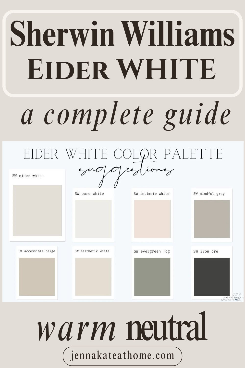
Best Coordinating Colors for Eider White
Eider White goes well with many colors. Dark grays make it stand out more, while crisp whites can make your space look brighter and cleaner. For coordinating colors, I like to stick with warmer tones with either a green or taupe undertone.
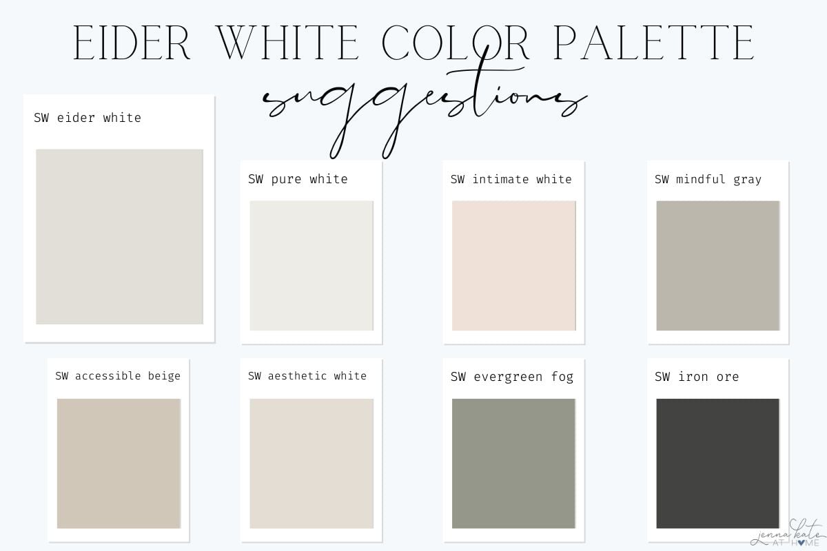
These colors are:
- SW Pure White (trim)
- SW Intimate White
- SW Mindful Gray
- SW Accessible Beige
- SW Aesthetic White
- SW Evergreen Fog
- SW Iron Ore
If I Have Eider White Walls, What White Trim Color Will Look Best?
A white color is always a safe bet for trim. Since Sherwin Williams Eider White is a warmer paint color, I would consider Pure White as a trim color as it has a soft warmth to it that works well with warmer paint colors.
Another excellent choice for Eider White is Sherwin Williams High Reflective White.
Sherwin Williams Eider White vs. Sherwin Williams Alabaster
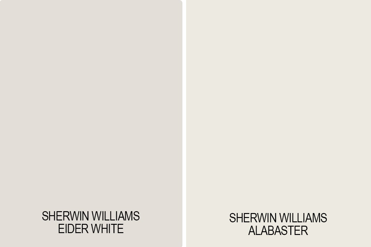
Alabaster is a unique combination of warm and cool that works in virtually every environment. It works easily in all lighting situations.
In contrast, Sherwin Williams Eider White is a tricky color that can be difficult to match and is not as versatile as Alabaster.
Alabaster is more of a creamy white, while Eider White is a taupe-grayish white.
Eider White vs. Incredible White
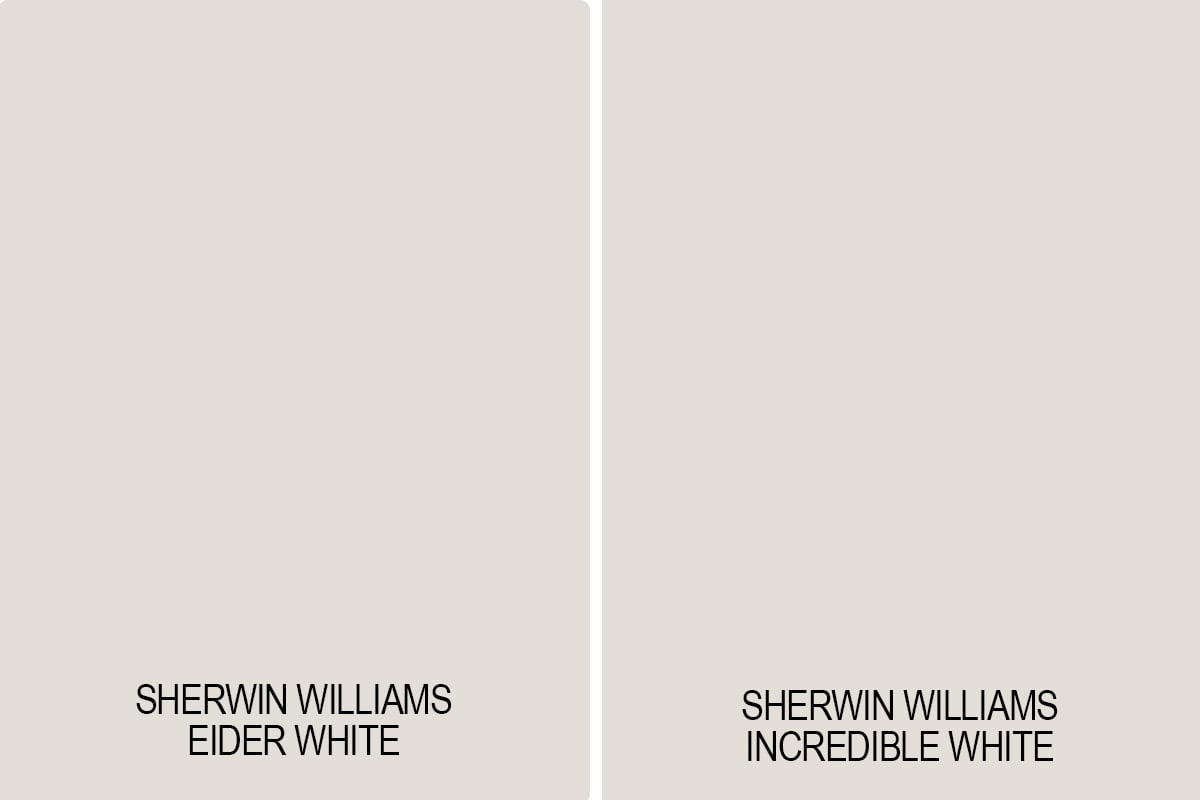
Sherwin Williams Incredible White has a comparable LRV to Eider White at 74 which means it’s also very light, but it has warmer undertones. Both of these colors are part of the Living Well collection which are colors curated specifically by Sherwin Williams to create a sense of warmth and coziness.
Eider White and Incredible White are pretty similar. They’re right next to one another on the paint strip. The most significant notable difference is that Incredible White is warmer than Eider White, and the pink undertone is not as pronounced.
Eider White vs. Crushed Ice
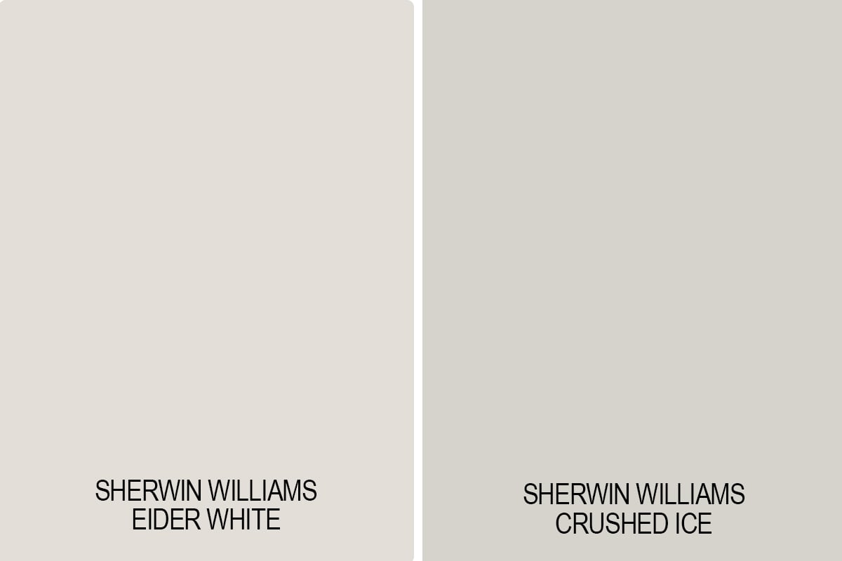
Sherwin Williams Crushed Ice is very similar in its undertones and versatility to Sherwin Williams Repose Gray, which is a favorite color of mine.
Eider White and Crushed Ice look very similar on paint swatches, but Crushed Ice leans slightly warmer, with a hint of green, and is more pigmented than Sherwin Williams Eider White.
Eider White vs. Agreeable Gray
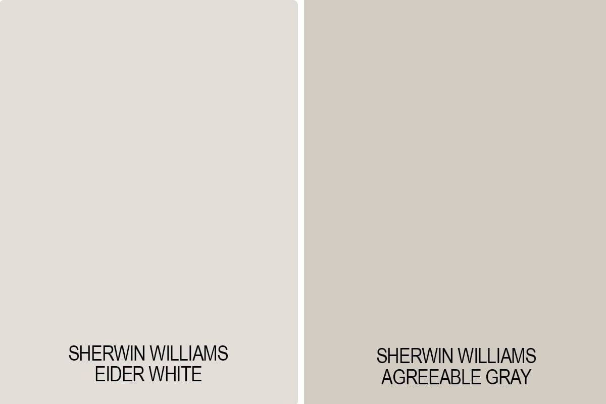
Agreeable Grey is more of a true greige, which means its undertones are both beige and grey. It is a great neutral warm paint color, but both Agreeable Gray and Eider White will heavily depend on how much natural lighting is available in the spaces in which it’s used.
Agreeable Gray is considerably darker than Eider White. If you’re looking for more color saturation, then Agreeable Gray is a better choice.
Eider White vs. Aesthetic White
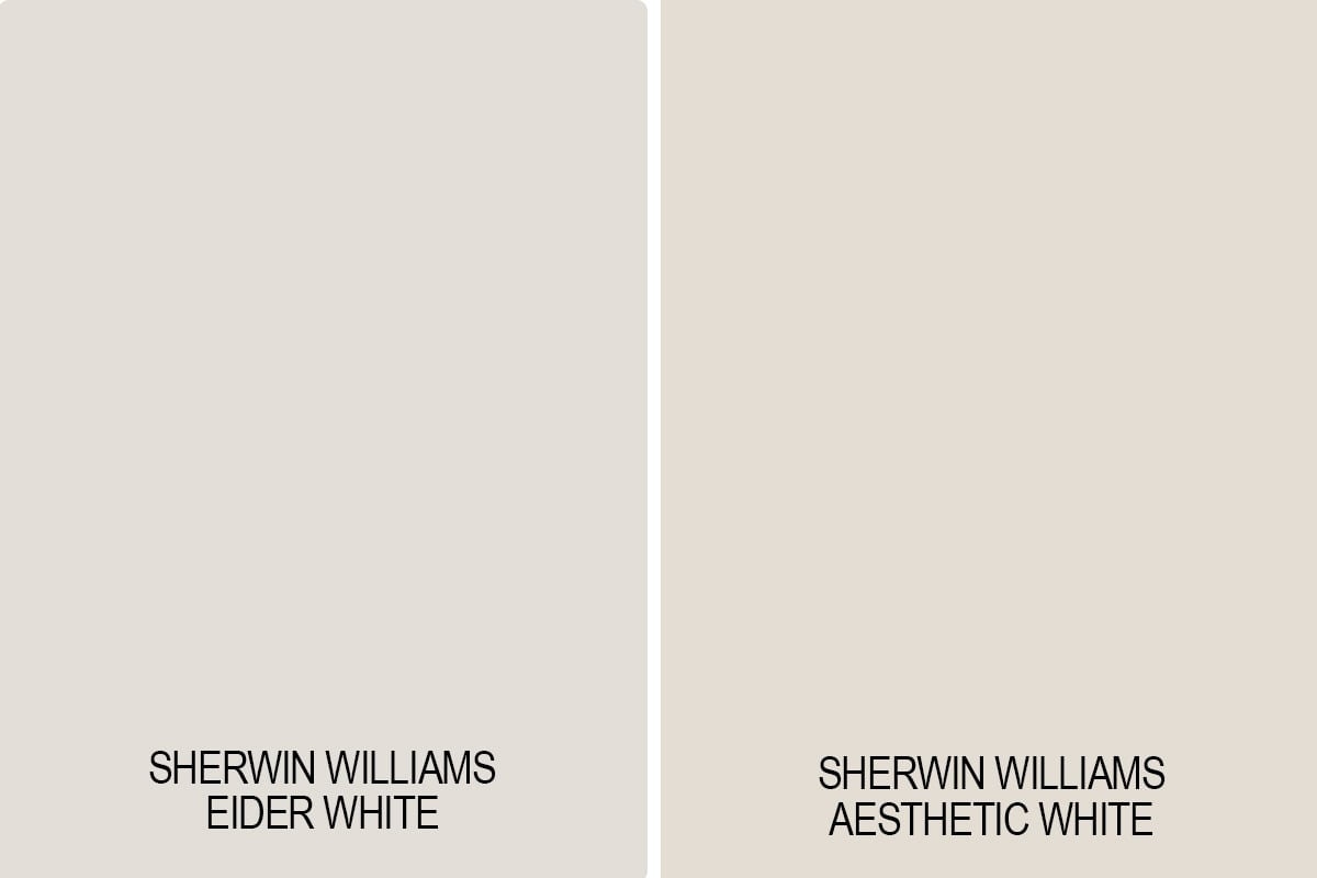
Aesthetic White is a warmer paint color than Eider White and would more easily fit into the greige category.
Eider White vs. Oyster White
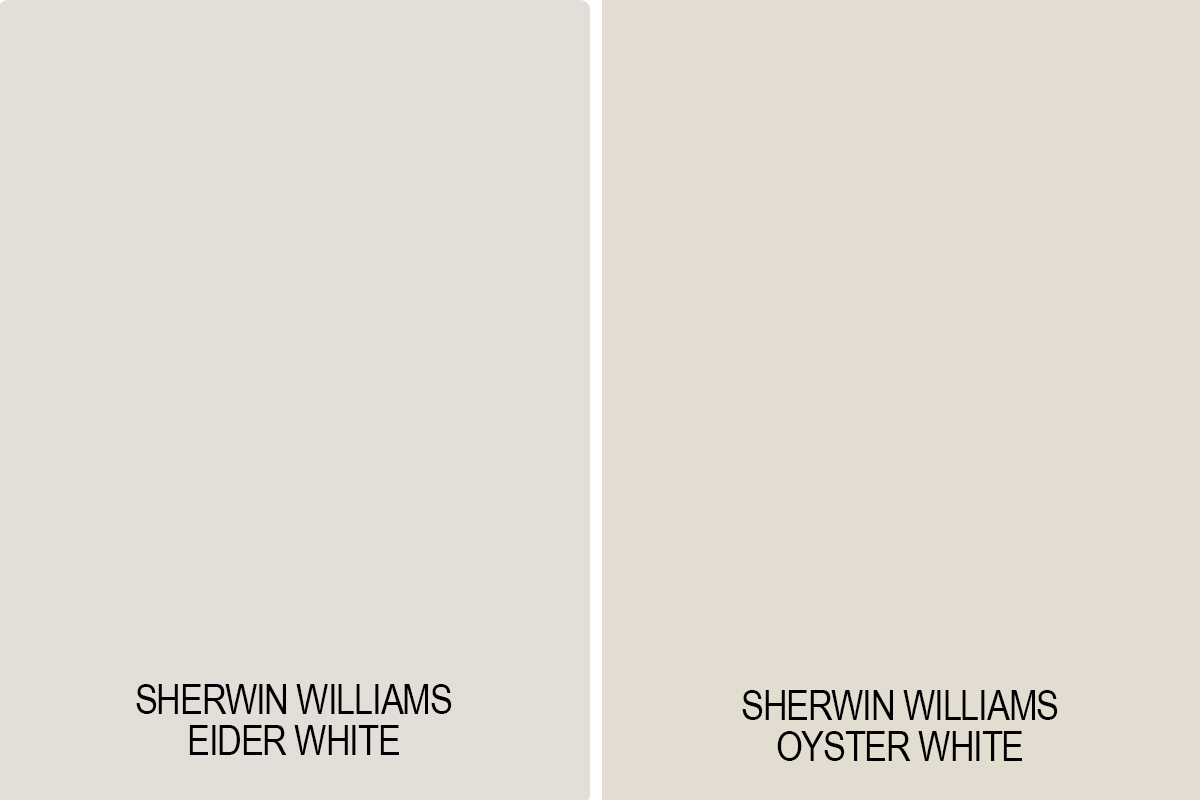
Despite its name, Sherwin Williams Oyster White is a greige and not an off-white paint color. It can be either warm or cool depending on the other colors it’s paired with.
Oyster White is slightly darker than Eider White but similar in its warmth creaminess. However, Oyster White does not have that slightly pinkish/taupey undertone making it an easier color to work with in your home.
Don’t Forget To Always Use Real Paint Samples!
Don’t forget – no matter what you’ve read or photos you’ve seen online, it’s really important to sample paint colors in your home before committing!
Samplize provides peel and stick paint samples made with real paint, that are easy to move around your home, and cheaper than buying a gazillion paint pots! It’s the only way I buy paint samples.
Final Thoughts
Sherwin Williams Eider White is a nuanced paint color that can be stunning in the right setting—but tricky in the wrong one. If you’re sensitive to undertones or prefer cooler, crisper whites and greiges, it may not be the best fit. But if you’re decorating with warm taupes and don’t mind a hint of pink or purple, it might be worth sampling. As always, test thoroughly and compare it in different lighting before committing.
Have you tried Eider White in your home? I’d love to hear how it worked for you—especially if you found a way to make those undertones shine!