Content may contain affiliate links. When you shop the links, I receive a small commission at no cost to you. Thank you for supporting my small business.
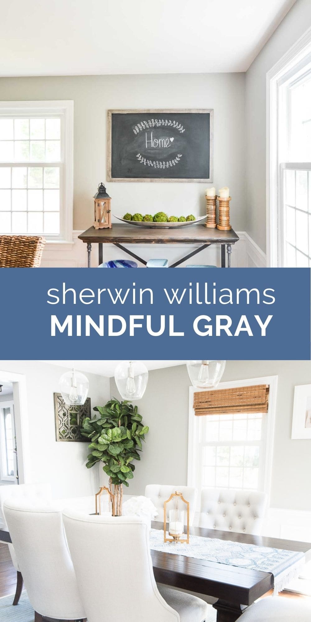
Oh Mindful Gray. Quite a popular choice for those looking for a mid-tone gray, but it’s definitely not one of my favorites and I’m here to tell you why!

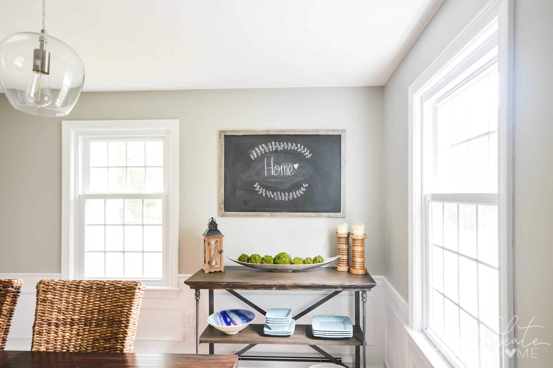
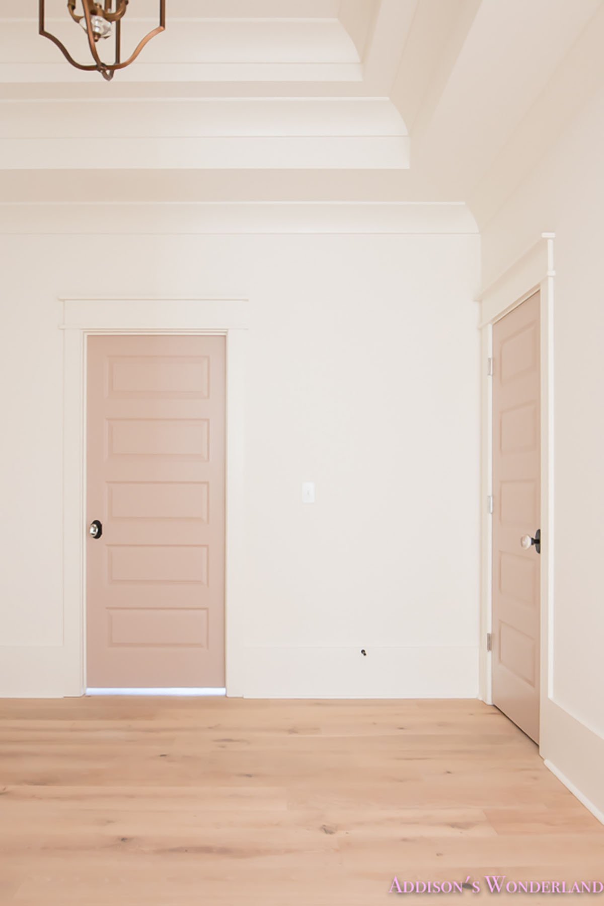
When we moved into our home in 2015, we painted many of the rooms either Sherwin Williams Repose Gray or Benjamin Moore Stonington Gray. For some extra contrast and drama, I decided to go a bit darker in the dining room with Sherwin Williams Mindful Gray, which is just one shade darker than Repose Gray which you can see in the hallway.
Back in 2015, I didn’t know nearly as much about paint colors, room exposure and undertones as I do now. If I had understood all this things better, Mindful Gray would not have been a color I chose for this east-facing room with mostly dark wood furniture.
What are the Undertones of SW Mindful Gray?
Mindful Gray (SW 7016) is a warm mid-tone gray paint color with green, taupe and purple undertones. Depending on the light and the furniture in the room, the undertones may be more or less obvious.
In a room dark room with not a lot of natural light, or a room with a lot of dark furniture, the green will become more apparent.
If you are using this paint color in a light-filled room, it will certainly look more like a warm gray.
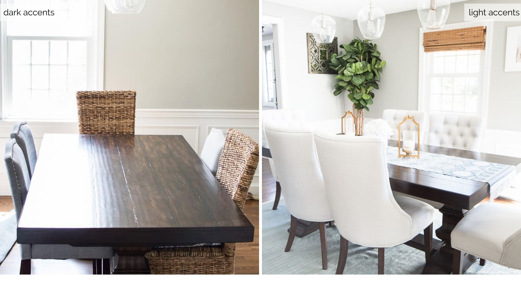
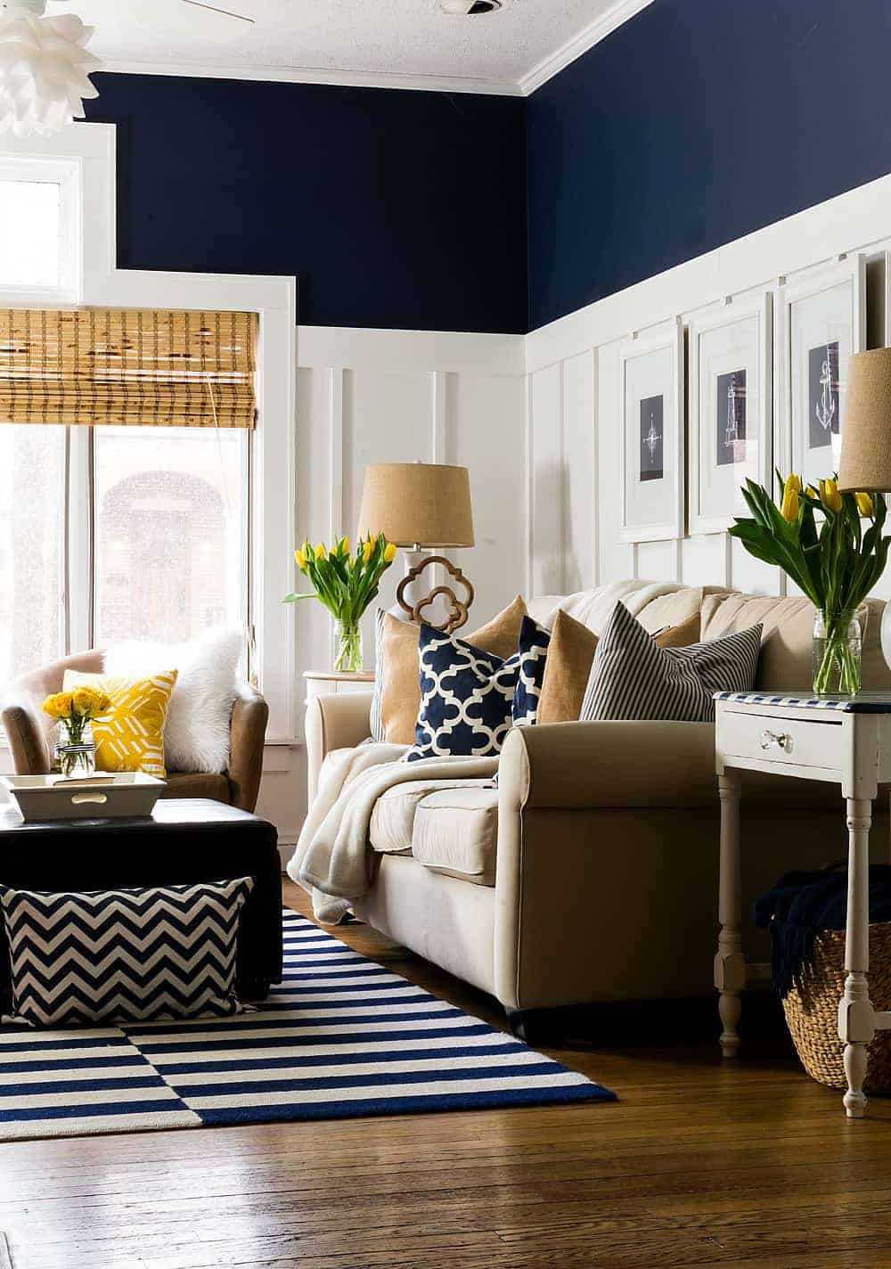
The above photo demonstrates my point. This is the same room painted Mindful Gray. On the left, all the furniture is brown and it clearly brings out a green undertone on the back wall. On the right side of the photo, the chairs have been switched out for lighter ones, and a light colored rug has been added, which has eliminated the green undertone from the actual color.
These photos were also taken at different times of the day, from a room that is east-facing: so it gets nice morning light, but’s dark all afternoon. The darker photo was taken late in the day, while the brighter version was taken in the morning. Again, highlighting the importance of light when deciding on a paint color.
Look closely at this photo. The left side of the image is clearly darker, and the green undertone is apparent. Whereas in the top right hand side, it’s getting lovely natural light and looks closer to a neutral gray.
RELATED: The Best Paint Colors For Dark Rooms
Not only understanding undertones, but how they can be highlighted or reduced based on your furnishings (or even what’s outside the window) is important when selecting a paint color.
I’ve had many people tell me that Mindful Gray has no undertones, that it’s the perfect saturated warm gray, but it’s simply not true for every situation.
What’s the LRV of Mindful Gray?
LRV in paint colors stands for Light Reflectance Value, and it measures the percentage of light that a color reflects.
The LRV of Mindful Gray is 48 making it a medium in depth paint color. Because of this light reflective value, if you are planning to paint this color in a darker room without lots of light, it can be a challenge.
SW Mindful Gray vs SW Repose Gray
If you are considering these two paint colors for your home, again, please consider your furnishings and other nearby colors.
Lots of wood tones will bring out a strong green undertone in Mindful Gray but less so in Repose Gray. This photo is a great example as you can actually see both shades in the two rooms poking through.

I would consider Mindful Gray as a medium-tone gray while Repose Gray is a medium to light gray with a warm undertone.
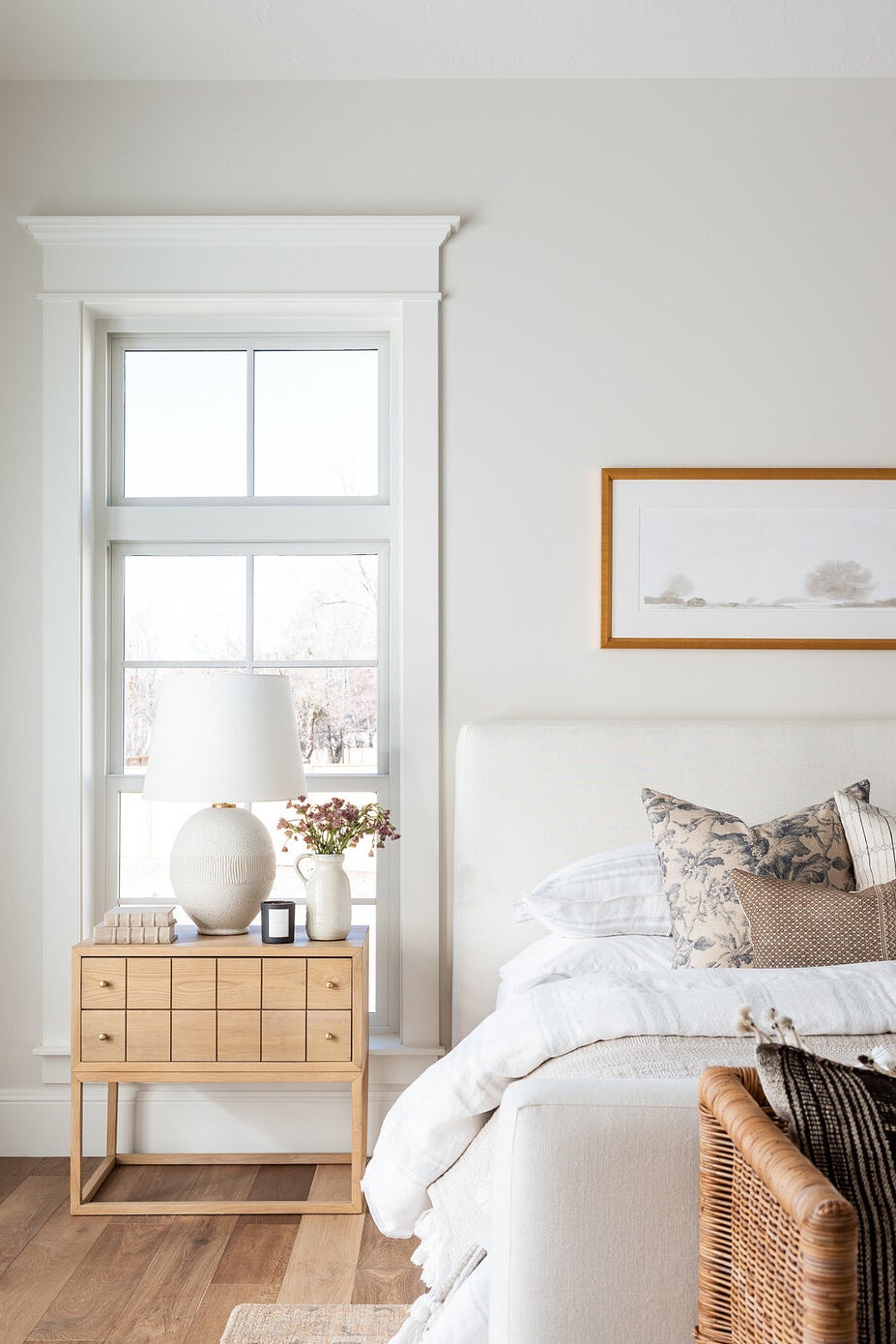
Repose Gray is actually my all-time favorite gray because it never feels cold, even in a room with a lot of cool white and cold light. While we have only used Mindful Gray in our dining room, our kitchen, entryway and landing are all painted Repose Gray.
Update: In an effort to get away from all the grays that we loved back in the early 2000’s, I’ve since repainted much of my house in Repose Gray lightened by 50%. It gives that light and airy look, but has eliminated most (if not all) unwanted undertones, too.
SW Mindful Gray vs SW Agreeable Gray
If you are looking for a gray that’s got about the same depth as Mindful Gray but without so much of the green undertone, Sherwin Williams’ Agreeable Gray might be a better bet for you.
It’s a bit warmer than Mindful Gray, and can switch between being a “warm gray” or “greige” depending on the light. Besides that, it doesn’t have any funky undertones that you might be wary of, so it’s a great whole-house choice.
What’s the Best White Trim Color if my Walls are Mindful Gray?
Sherwin Williams Pure White works really nicely with Mindful Gray and it’s what we have throughout our house. Sherwin Williams Extra White also works!
Is Mindful Gray a Good Exterior Paint Color?
Yes! Although it’s not commonly used, it can still be a gorgeous color for home exteriors. Please note that on most exteriors it appears even warmer than indoors.
If you want to dabble with using this as an exterior color without doing your entire house, doing the shutters is a great option. Garage doors or the front door are also options!
Can I Use Mindful Gray for my Kitchen Cabinets?
Again, yes. Mindful Gray has been used on many kitchen cabinets and looks great. Personally, I’d select a crisp white for the walls if using this on your cabinets. The contrast between the gray color and bright, clean white will be gorgeous!
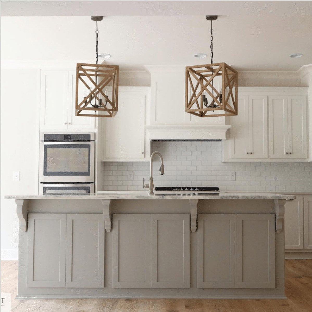
Especially if you have lots of windows and natural light in your kitchen Mindful Gray is a great choice. If your kitchen is on the dimmer side, I would probably skip this paint color for the cabinets, and maybe just use it on the island.
SW Mindful Gray Coordinating Colors
The good news is Mindful Gray has so much depth that you can use a huge variety of coordinating popular colors with it!
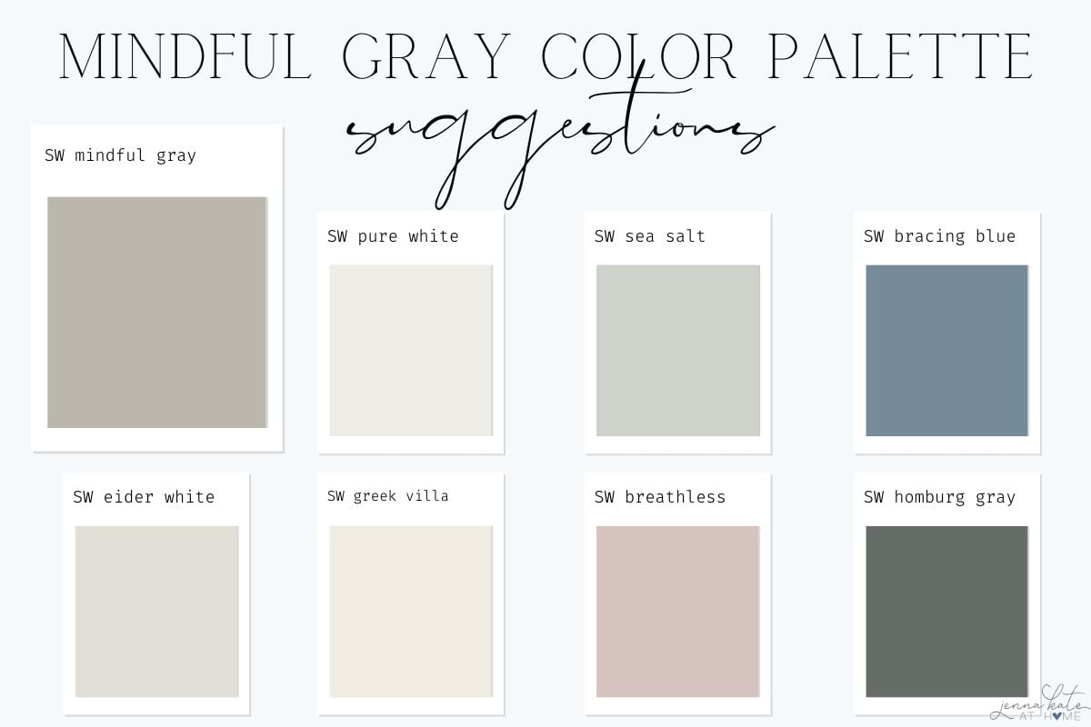
Sherwin Williams Pure White has been a popular pairing for years but some lighter greige colors have actually be making an appearance next to Mindful Gray lately as a charming duo. Just make sure you choose one several shades lighter.
The colors I’m choosing that coordinate nicely with Mindful Gray are:
- SW Pure White (trim or walls)
- SW Sea Salt
- SW Bracing Blue
- SW Eider White
- SW Greek Villa
- SW Breathless
- SW Homburg Gray
When Not to Use Mindful Gray
Personally, I do not love Mindful Gray in darker spaces. If your room is east-facing, you will find that the paint color looks beautiful in morning light but a bit dark and muddy in the afternoon. Vice versa will apply in a western-exposure room, and north-facing rooms may feel a bit too dark throughout the day.
If your room benefits from multiple exposures, or primarily warm light, you really see how beautiful this paint color can be.
In the end, we repainted our east facing dining room in a much lighter color, Benjamin Moore Paper White, which has completely lightened and brightened the space, no matter what time of day it is.
Don’t Forget To Always Use Real Paint Samples!
Don’t forget – no matter what you’ve read or photos you’ve seen online, it’s really important to sample paint colors in your home before committing!
Samplize provides peel and stick paint samples made with real paint, that are easy to move around your home, and cheaper than buying a gazillion paint pots! It’s the only way I buy paint samples.
Final Thoughts
Hopefully if you’ve been struggling to figure out if Sherwin Williams Mindful Gray is for you then this post will have been of some help to you! Remember to consider the possibility of a green undertone showing up a little bit if you are pairing with dark wood furnishings. By keeping the trim a bright white, and most of the surrounding furnishings lighter, you should be able to diminish most of that green.
If, on the other hand, you’re dealing with a light-filled room, you should not have any issues at all, and Mindful Gray will appear as the great color it is! Let this lovely warm gray shine.

Hi Jenna,
I am doing a complete 1st floor renovation of living room and kitchen/dining area. The kitchen faces the east and afternoon sun comes through the dining room window located on the south side. There is also a sliding glass door that faces the east. This is all one room with a peninsula dividing both areas. The cabinetry in the kitchen is going to be white, with walnut flooring, stainless steel appliances and white trim. The counter top is white granite with gray veining, although the island will have a walnut top. The living room will also have the walnut flooring. The living room has one window that faces the south and the 2 front windows that face the west. I am leaning towards using Repose Gray on all walls (Silverpointe might also be a contender). What do you think? Additionally, there is a powder room off the kitchen that has no windows. The flooring will be a gray tile. Not sure what to use for wall color here. Should it be lighter? Lastly, I will also be having the stairway leading upstairs painted where there is a rather sizable landing area with bookshelves (no windows), not sure what to do here for a gray. I appreciate your input….all these grays are driving me crazy. Thank you!
Specific decorating questions will no longer be answered in the comments section. Please direct your question to our Decorating Facebook Group. Thank you!
I would like to use a gray color in my living room, dining room/kitchen, hall, master bedroom and master bath. None of these areas receive much natural light. I have only two windows in each with white wooden plantation shutters on all. There is a cathedral ceiling in the living room. I have tiles floors that are combination of light and dark beige/tan/sand/ medium gray. Grout is color of wet sand. Is there a gray that won’t make the rooms look even darker?
Thanks for your time.
Nancy Smith
Aiken, SC
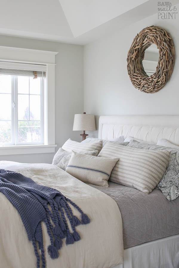
Hi Nancy, in the darker rooms in my home, I always opt for BM Paper White. It’s a very very light dove gray and instantly brightens a space while still looking gray.
I’m remodeling a bathroom and thinking of painting the cabinets either repose gray or mindful. would Ben Moore paperwhite be a good choice for the walls?, with crisp white trim? Or maybe agreeable gray for cabinets?
I would probably go with the darker colors mindful or agreeable for the cabinets for more contrast but Paperwhite with white trim would be perfect on the walls
Hi Jenna,
We are planning Repose Gray in our open living space with kitchen in it and we have Gray cabinets.
Could you please tell if these 2 go well.
Thanks !!
I am trying to get away from all the beige in my house. I have a brown sectional couch, which I will need to keep. Would mindful gray or repose gray go better with the gray couch?
We are thinking of painting our house Repose grey in the bedrooms and bathrooms and mindful grey in our family room and kitchen and a home depot Greige for an accent wall for a darker contrast. We will be painting our kitchen cabinets a grey color and we are struggling with that color. we don’t want too much blue undertones. we picked a SW galveston but it is too close to the Mindful grey. and another one is Dunn Edwards Steiglitz. Can you recommend colors please.
Hi Jocelyne. It’s hard to tell without seeing the space. With gray walls in your kitchen, gray cabinets would not be my first choice as that will be a lot of gray. If you are definitely set on gray cabinets though, I would make sure there’s enough contrast. You’re not going to want anything close to Repose Gray…you’ll want either an almost white gray (like Paper White, maybe even lightened a smidge) or something significantly darker like BM Amherst Gray.
I came across this post via Pinterest while looking for others thoughts on Mindful Gray. I painted our living room in MG based off of everyone saying it was a beautiful midtoned neutral. Ever since I painted it all I can see is the green undertones in the evening. 😬 Our LR is North East facing with a lot of midtoned wood pieces (mcm wood color) and a cognac leather couch. It has more windows on the East side. It looks perfect in the morning, but by afternoon it’s a dark green muddy mess. I’m glad to finally find someone else who sees this, too!!!
I’m currently trying to find the perfect color to repaint it, but MG has made me leary and I second guess everything. 😅 But, now at least I feel validated in the green undertones I kept seeing in MG! 😂 I’ve decided to lighten it up a lot with an off white with greige undertones. I have a cognac leather couch and mid toned greige/gray curtains I’d love to keep. So, I think a white with a greige undertone will marry them well. Thoughts?
Haha yes it can be REALLY green and muddy! Try A few samples: I recommend SW repose gray or repose gray lightened by 50%. It’s my absolute favorite paint color and works everywhere. Another great choice is BM paper white