Content may contain affiliate links. When you shop the links, I receive a small commission at no cost to you. Thank you for supporting my small business.
Looking for a warm gray that works in every room, complements almost any style, and never feels too cold? Sherwin Williams Agreeable Gray (SW 7029) is one of the most versatile greige paint colors available—even a decade after its rise to fame.
Whether you’re painting a single room or looking for a cohesive whole-house color, this balanced blend of gray and beige is still a solid choice. In this guide, you’ll learn about its undertones, how it compares to other popular grays, and when it may (or may not) be the best pick for your space.
Agreeable Gray at a Glance
- Works With: White trim, wood tones, blue/green accents
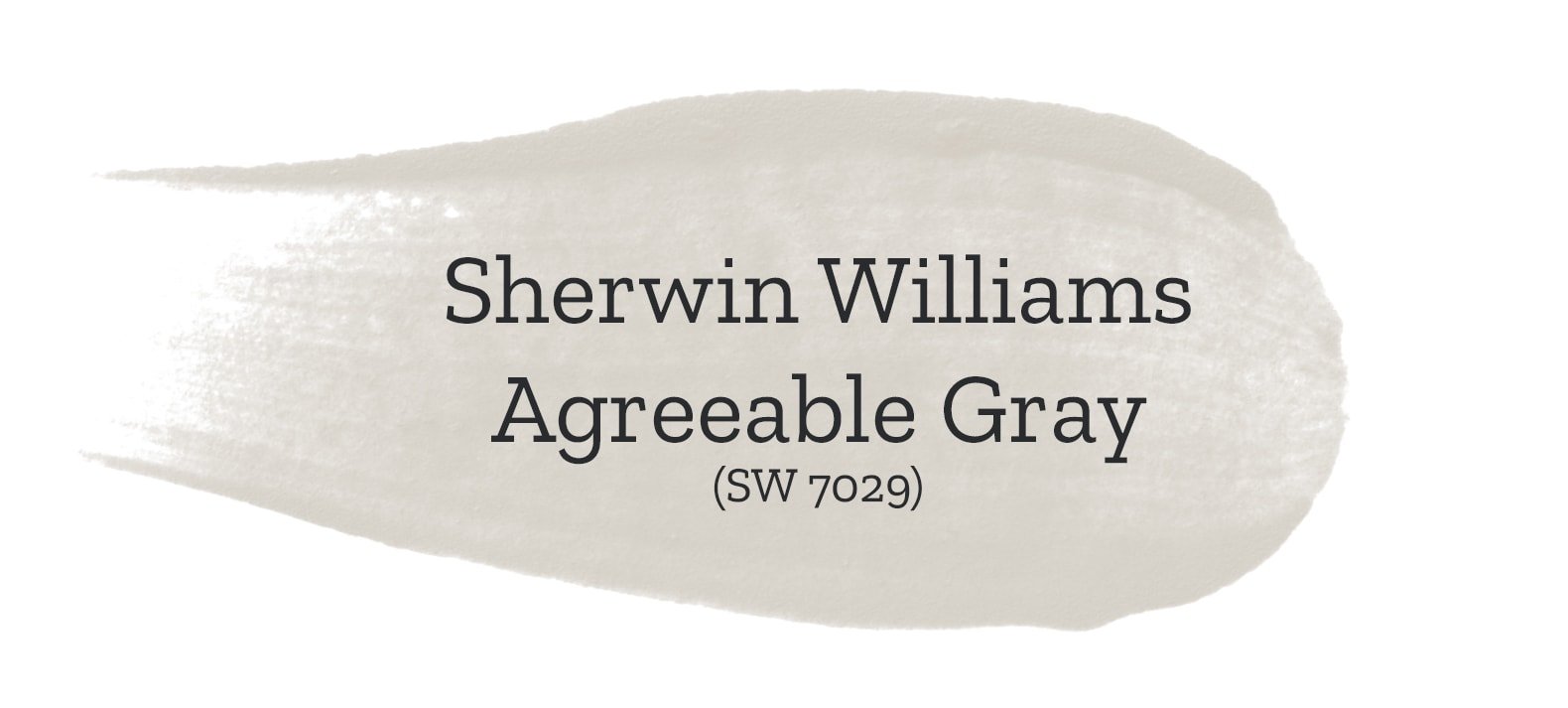
- Paint Code: SW 7029
- LRV: 60
- Undertones: Warm beige/taupe
- Type: Greige (gray + beige)
- Best For: Whole-home color, trim contrast, walls
Agreeable Gray Undertones: Warm or Cool?
Agreeable Gray has soft beige undertones that give it a warm, welcoming feel. In bright, warm natural light, it leans more beige. In darker or north-facing rooms, the gray becomes more prominent. That flexibility is part of what has made it such a beloved color.
In some lighting, you might notice a subtle green or even a slight violet shift—especially in rooms with indirect or mixed lighting. These shifts are soft, but if you’re sensitive to undertones, it’s important to test the color first. What makes Agreeable Gray so special is that these shifts are typically neutralized by surrounding colors and natural light.
Is Agreeable Gray Still in Style Today?
While crisp whites and moody tones have dominated recent trends, Agreeable Gray is still popular among homeowners who want a cozy yet neutral backdrop. It’s not the trendiest color anymore, but its versatility keeps it relevant—especially for resale value or whole-house cohesion.
If you want something warm and easygoing, without going full beige, this color still works beautifully.
Agreeable Gray LRV Explained
Agreeable Gray has an LRV of 60, which places it in the mid-light range. It reflects a moderate amount of light—enough to keep rooms feeling open, without being stark or overly bright.
This makes it ideal for:
- Rooms with moderate natural light
- Hallways and living areas where you want warmth without heaviness
- Basement or north-facing rooms (though it can lean grayer here)
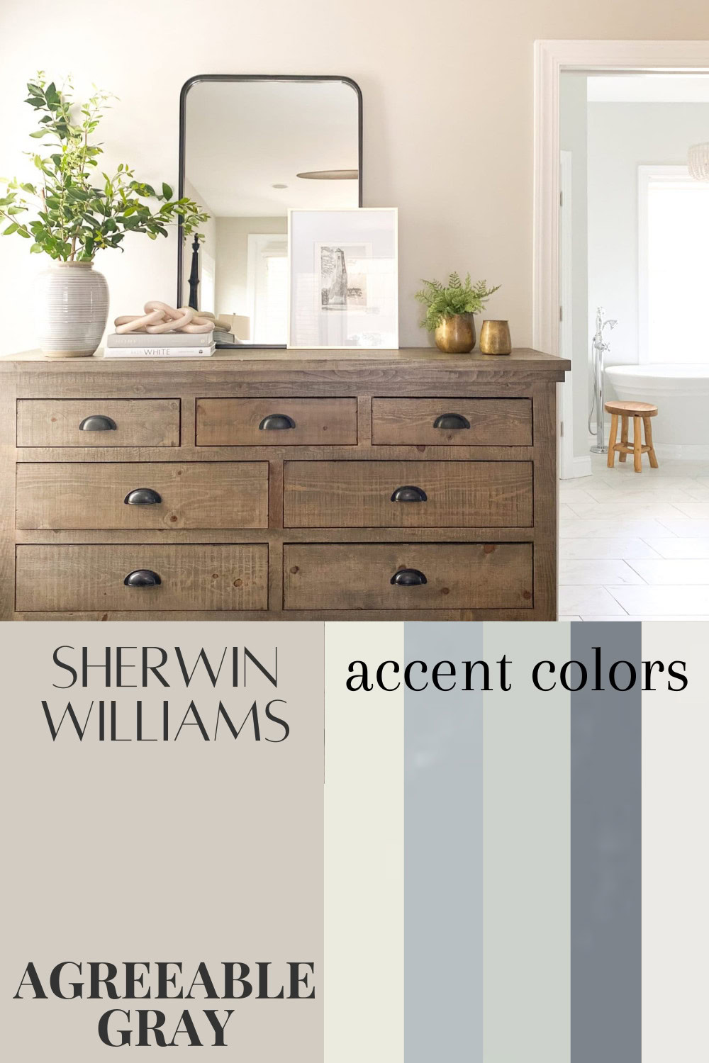
Coordinating Colors for Agreeable Gray
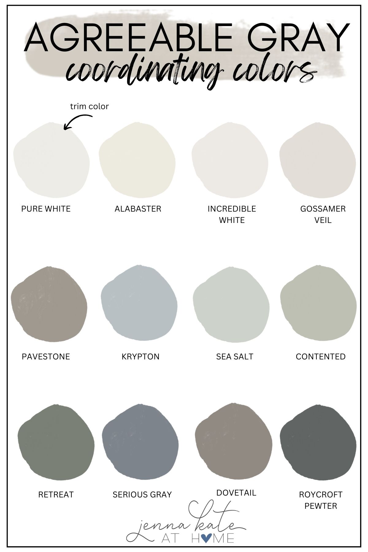
Agreeable Gray works well with both warm and cool accent colors. Here are some of the best coordinating paint colors:
Neutral Trim or Wall Pairings:
- SW Pure White – Bright but soft white for trim
- SW Alabaster – Warm creamy white for adjacent walls
- SW Gossamer Veil – Light greige with slightly less warmth
Accent Colors:
- SW Sea Salt – for a coastal feel
- SW Contented – green with gray undertone
- SW Krypton – crisp, blue-gray
- SW Pavestone or Dovetail – deeper warm grays
- SW Roycroft Pewter – rich gray-blue
RELATED: The most popular Sherwin Williams Warm Gray Paint Colors.
Trim Colors That Pair Well with Agreeable Gray
Agreeable Gray pairs well with clean white trim that enhances its warmth.
- Sherwin Williams Pure White (SW 7005): My top recommendation! Slightly warm but still crisp.
- Sherwin Williams High Reflective White (SW 7757): A brighter, neutral white that gives higher contrast.
- Benjamin Moore White Dove: Soft white with a creamy undertone that complements Agreeable Gray’s warmth.
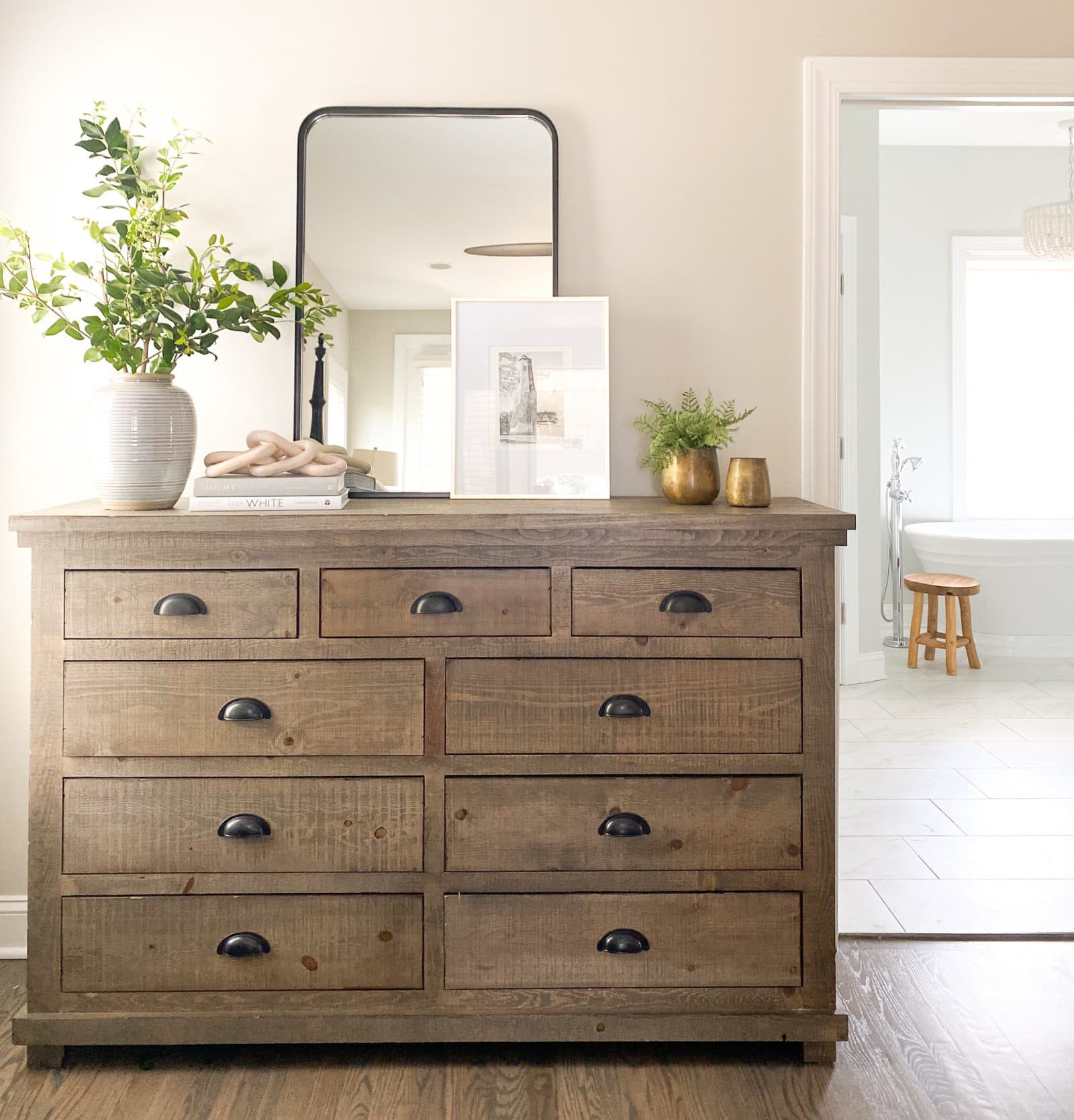
Agreeable Gray in Real Rooms: Photos & Inspiration
One of the reasons Agreeable Gray has become a staple paint color is how well it works in real-life homes. Here’s a look at how it transforms different rooms:
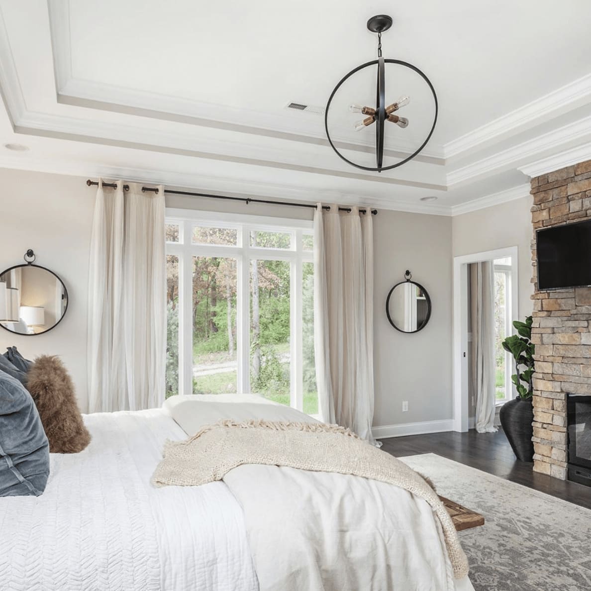
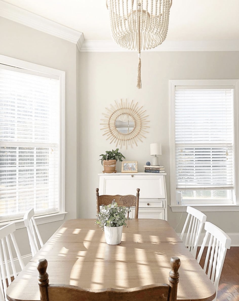
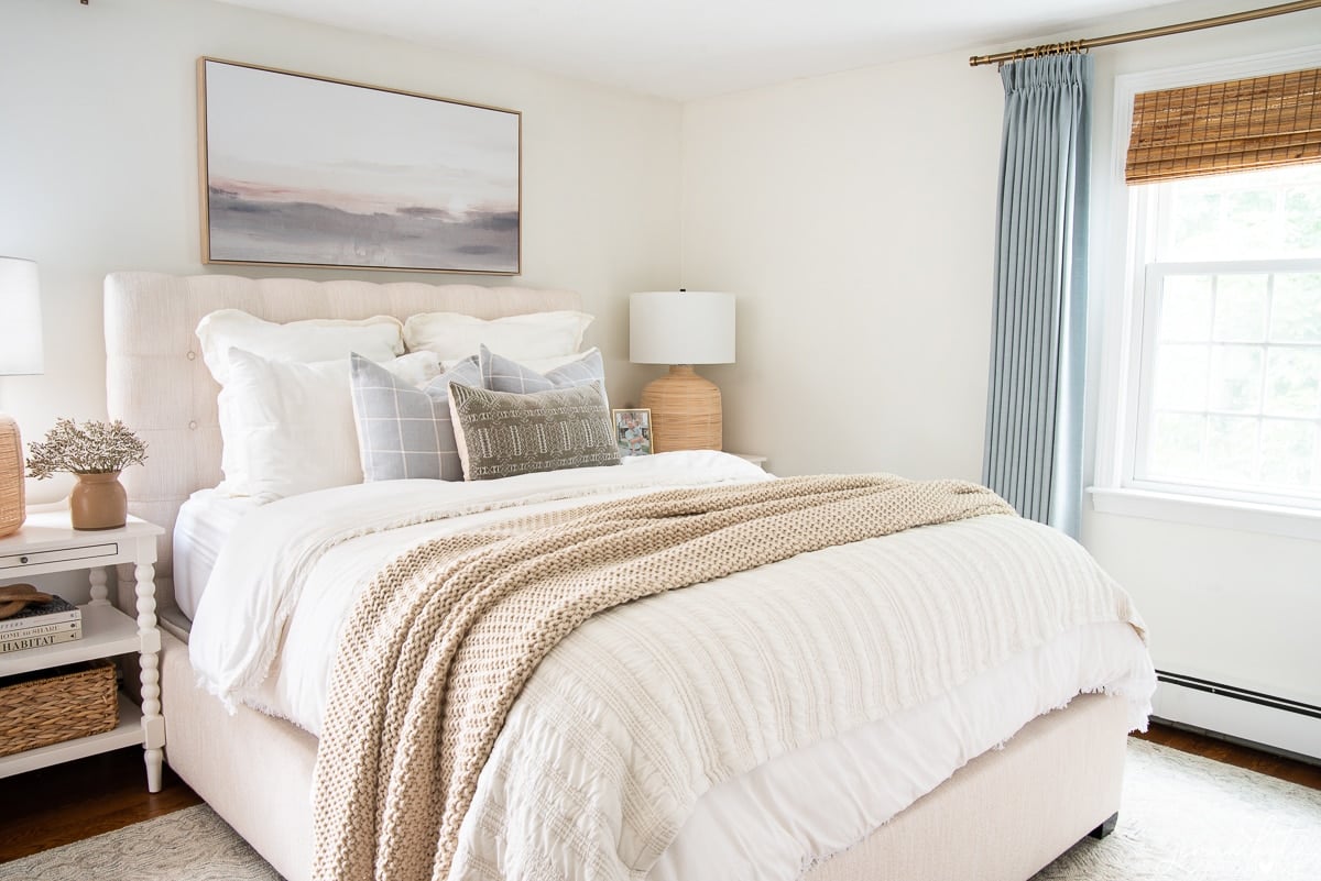
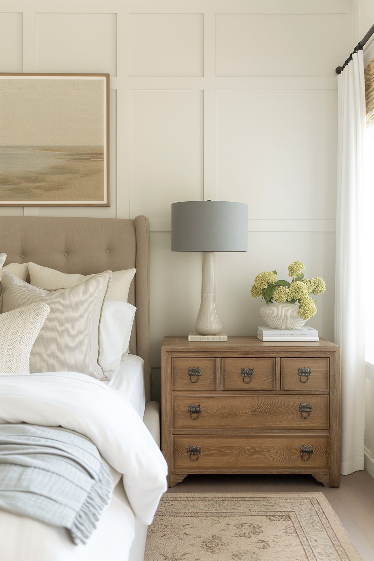
Bedrooms
In rooms with good natural light, Agreeable Gray looks warm and cozy. Paired with white bedding and subtle accent colors, it sets the tone for a peaceful retreat.
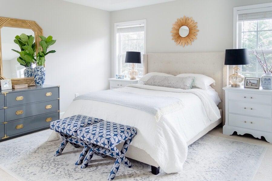
In this master bedroom, the brick, dark hardwood floors and peach colored curtains help to bring the warmer tones out of the paint color.
Shadowed bottom right corner shows cooler gray undertones
This nursery from Living Letter Home perfectly demonstrates the undertones of Agreeable Gray. In the bright, warm light you can see it at its warmest while in the shadow you can see how much grayer it looks.
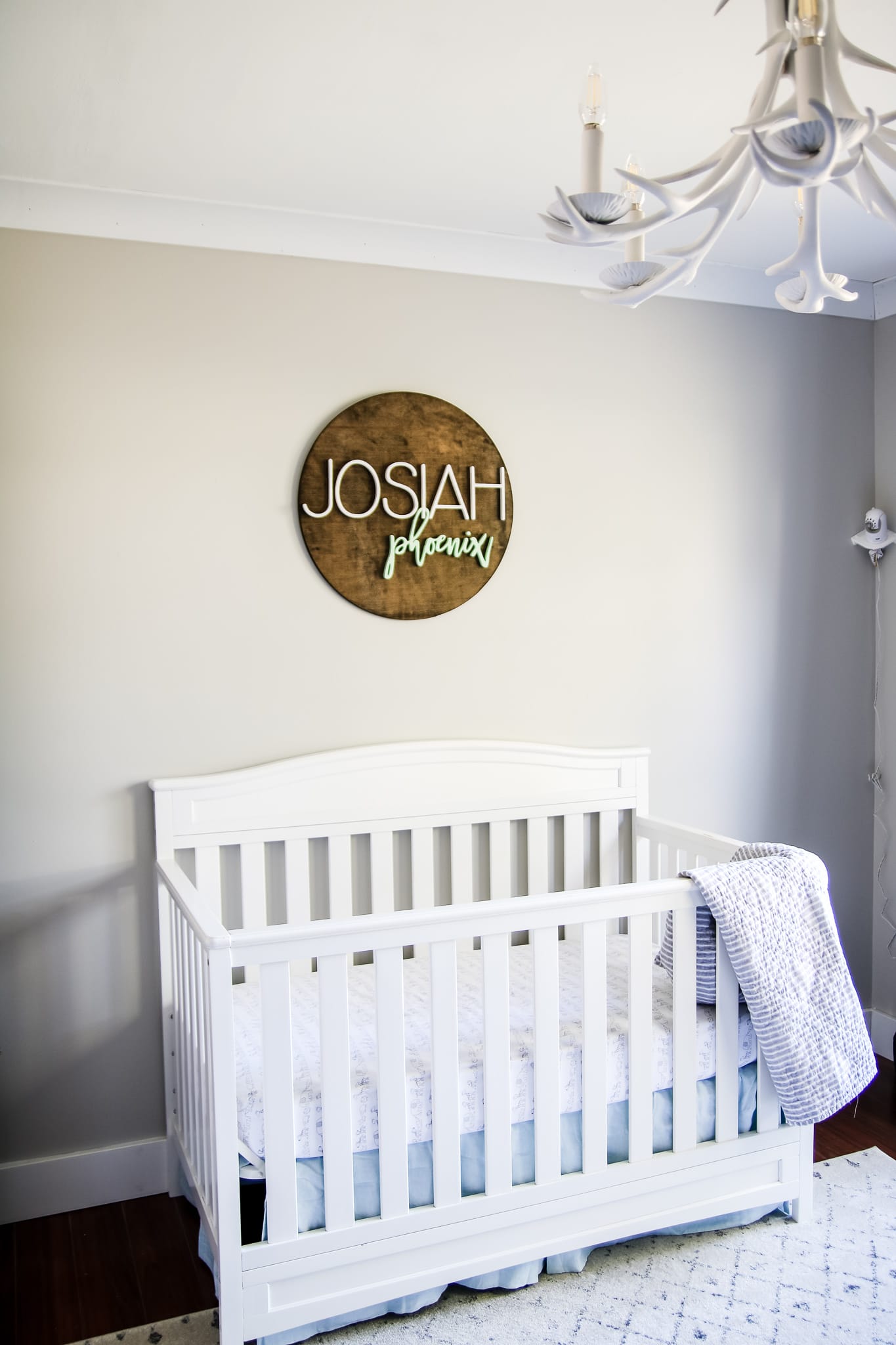
Shadowed corner shows cooler gray undertones
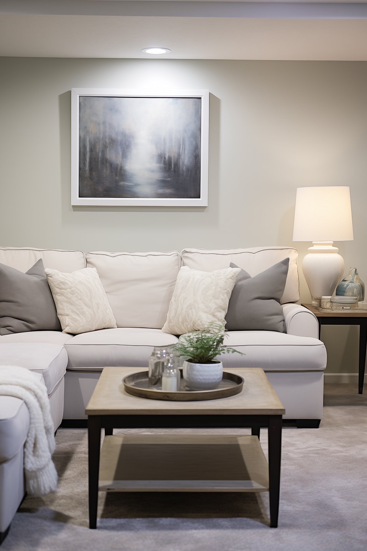
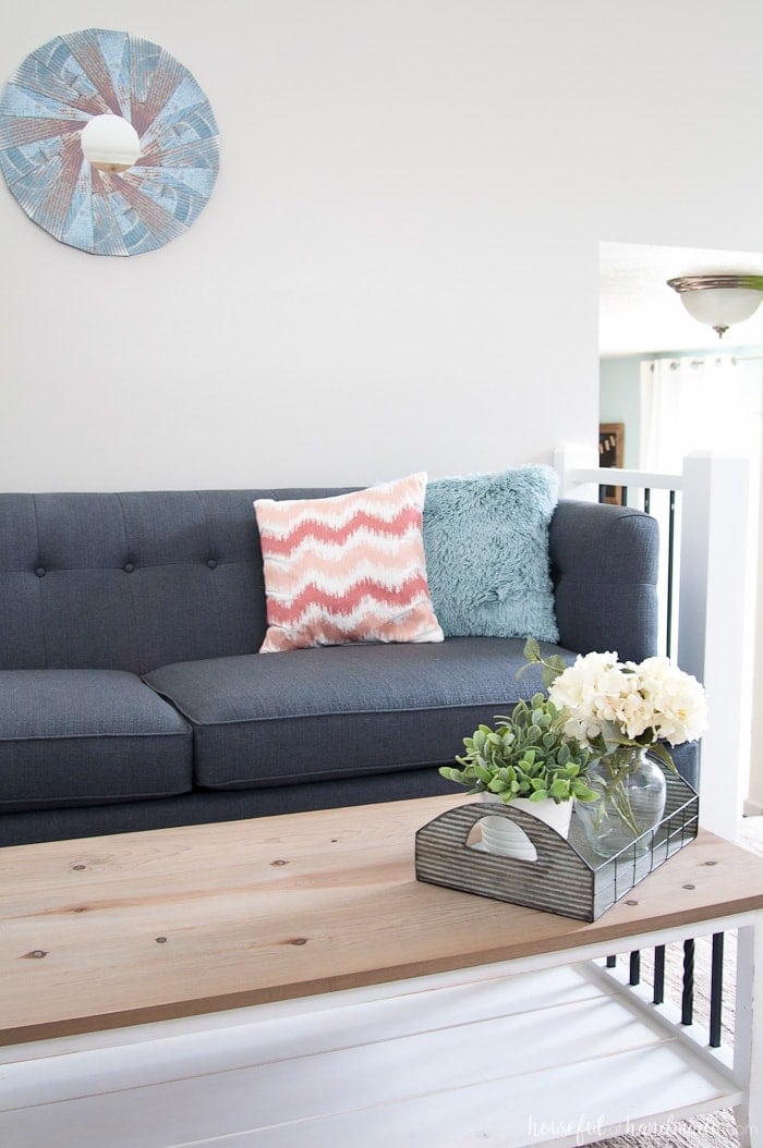
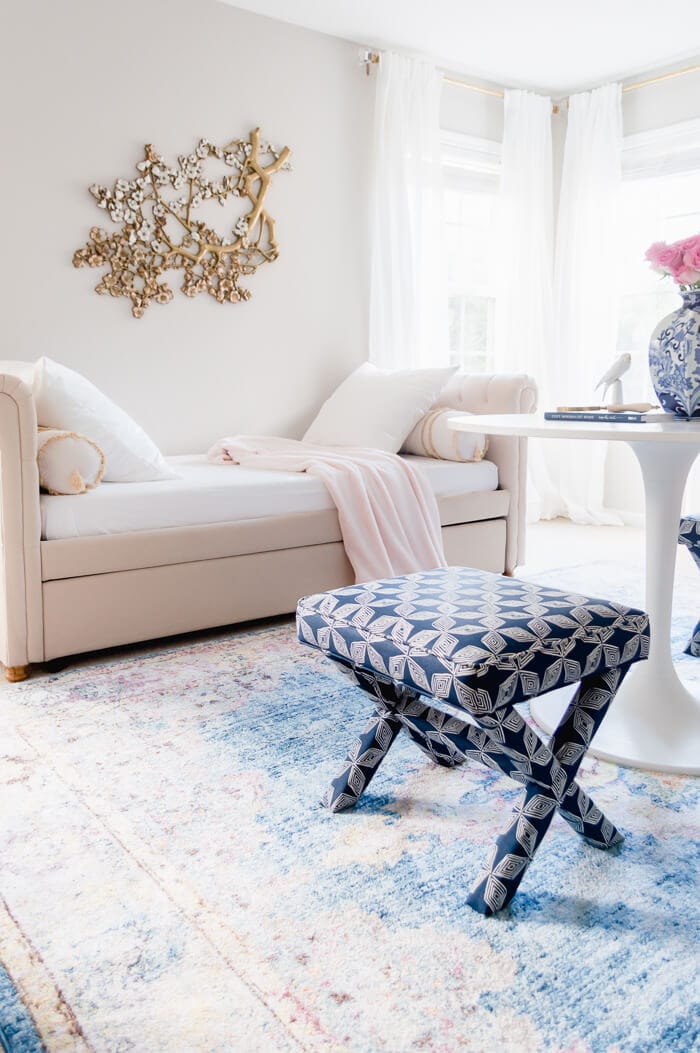
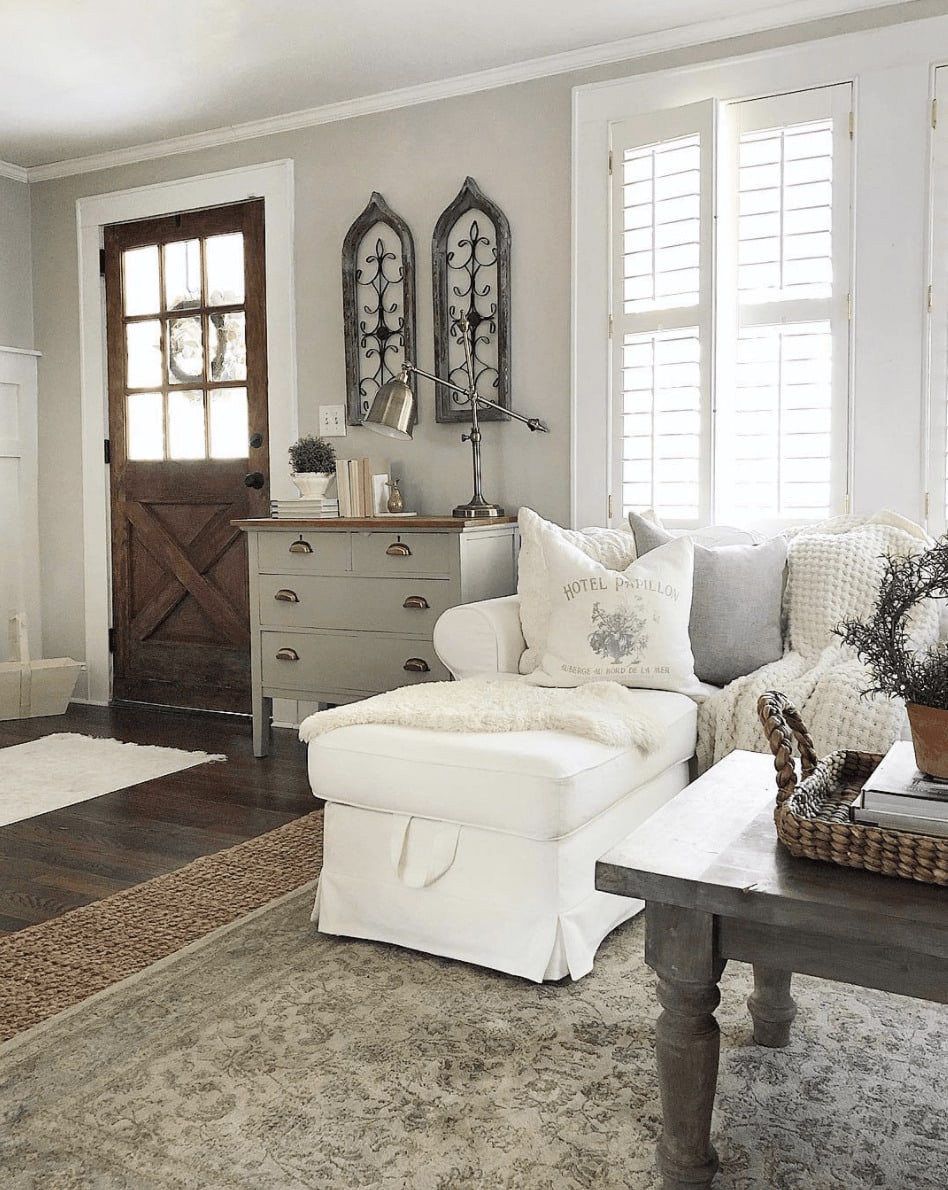
Living Rooms
Agreeable Gray brings balance and warmth to open-concept spaces. It works equally well with light wood tones or darker furniture.
Entryways
This neutral tone is ideal for entryways where lighting can shift throughout the day.

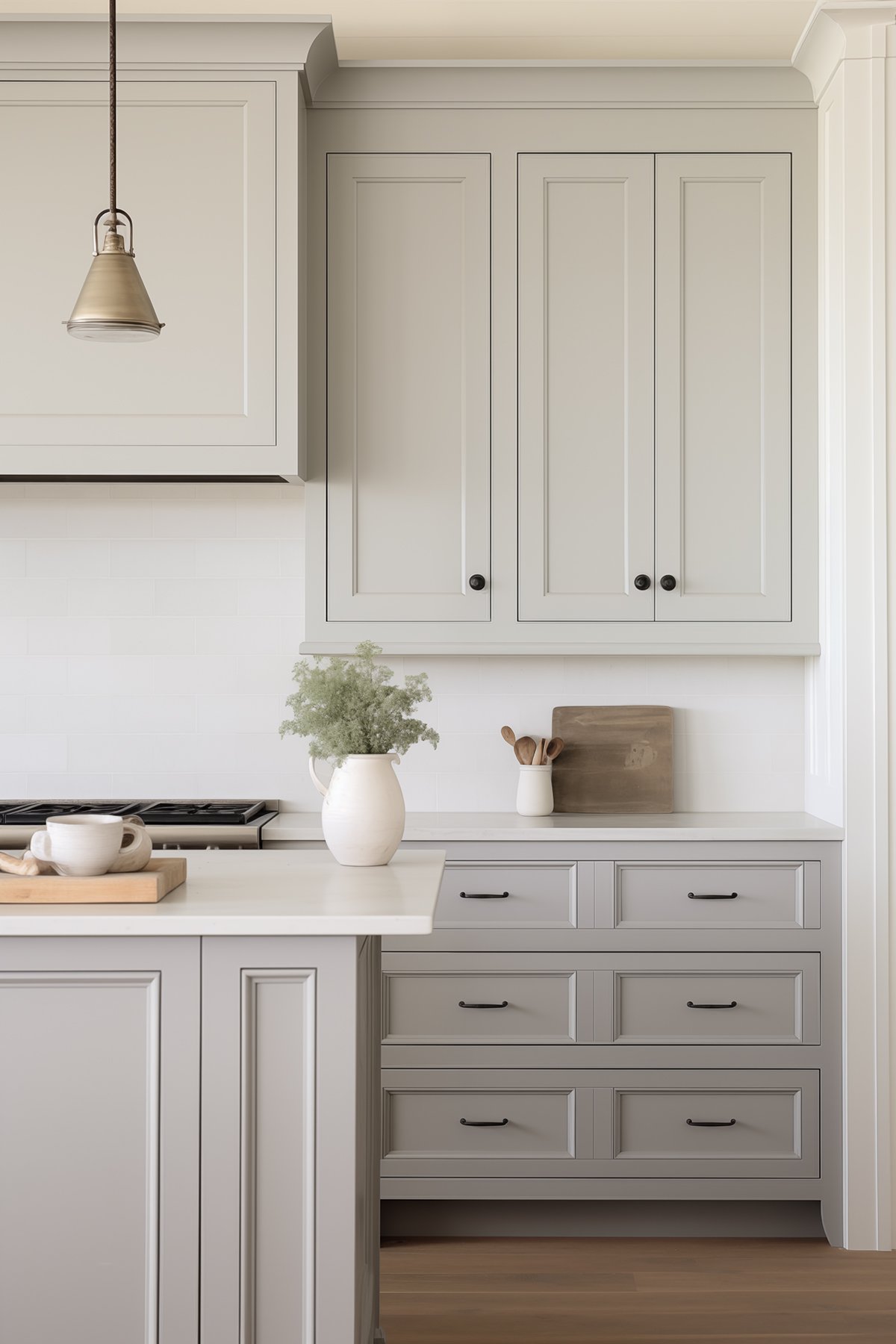
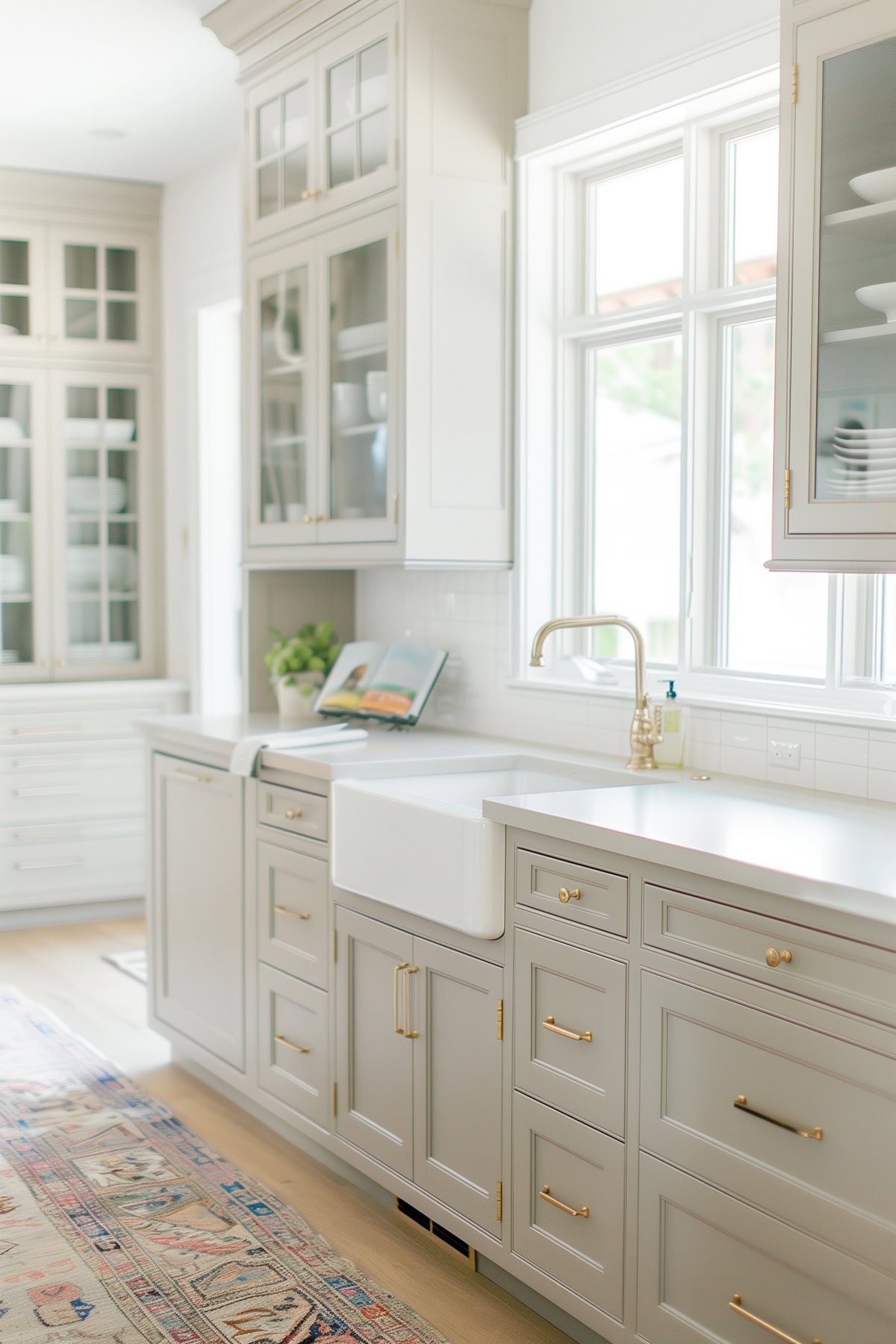
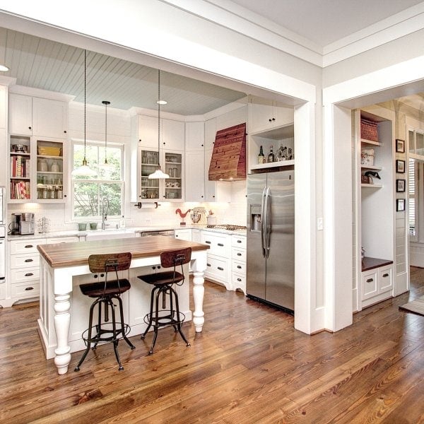
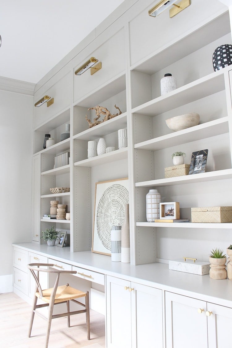
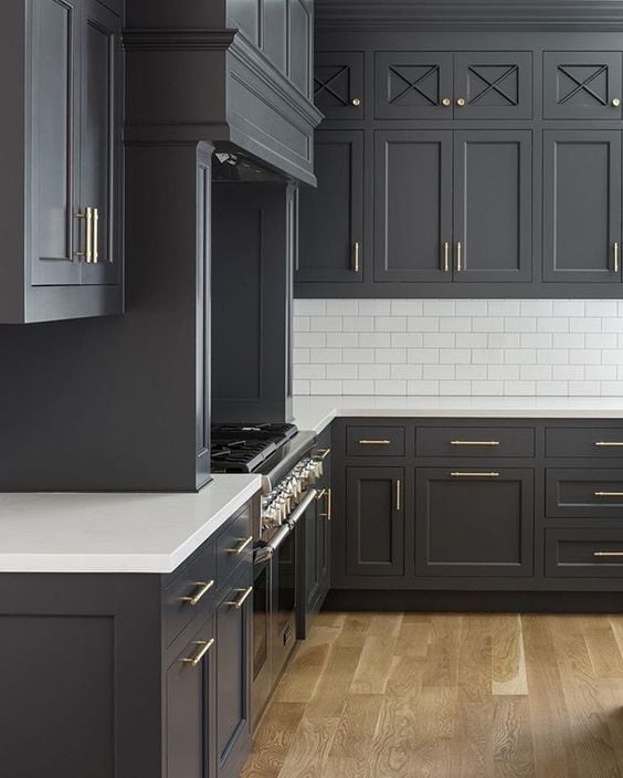
Kitchens and Dining Rooms
From cabinets to walls, Agreeable Gray is a smart choice for adding color while maintaining neutrality. It works beautifully with both white and stained wood cabinetry.
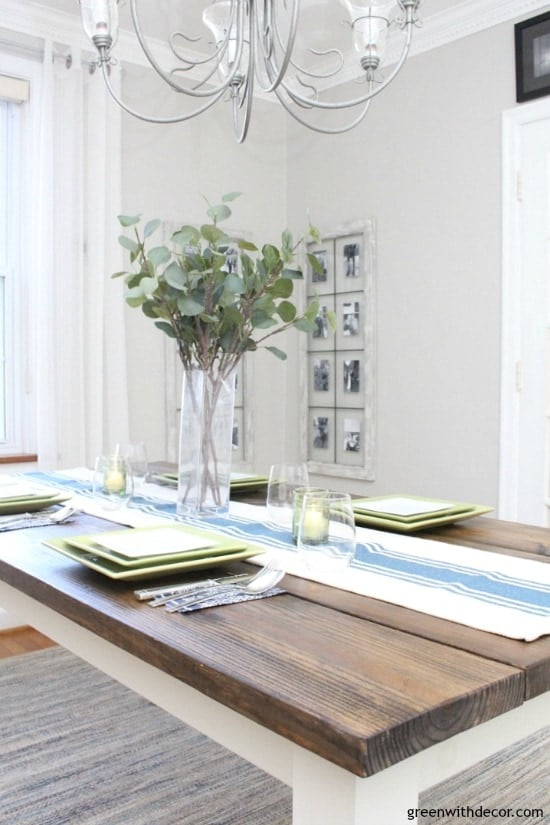
Can’t you just feel the warm sunshine pouring into this space? Paired with the wooden table and warm morning light, this dining room shows Agreeable Gray’s beautiful warm beige undertones.
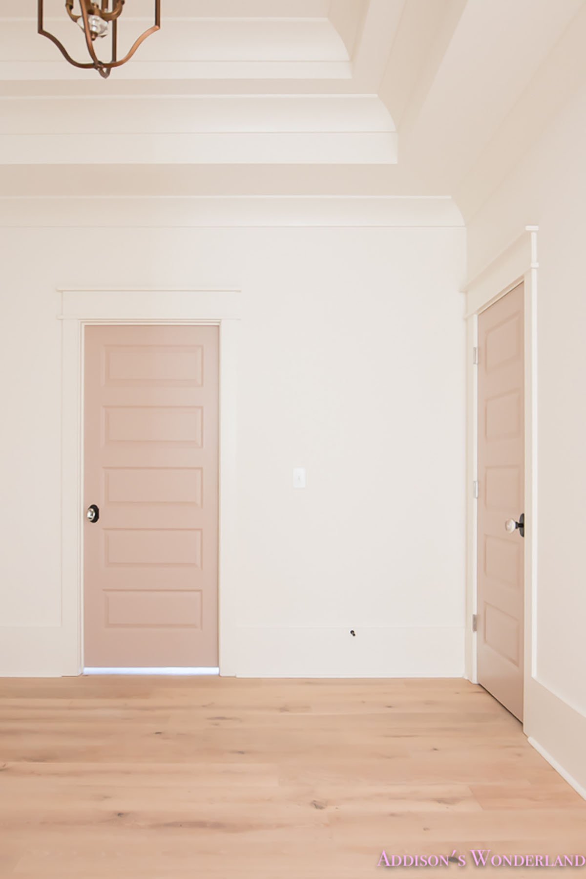
Cabinets and Doors
Painting interior doors or cabinetry in Agreeable Gray is a subtle but impactful way to add warmth and depth.

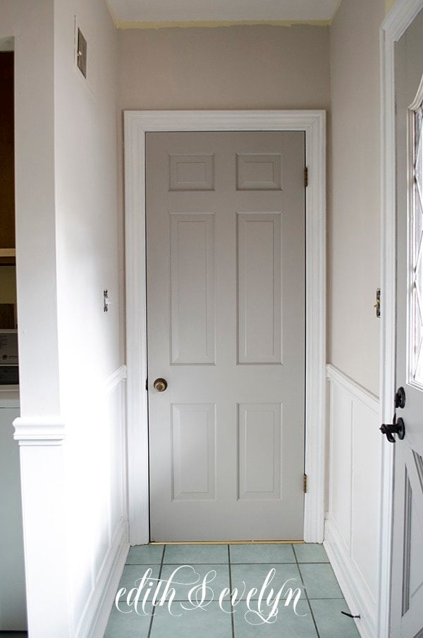
I’m really loving the trend of painting cabinets, doors and even trim warmer gray shades like this. It adds instant warmth and elegance to a space and it’s an easy way to give you home an entirely new look on a budget.
When Not to Use Agreeable Gray
While Agreeable Gray is incredibly versatile, it’s not the perfect fit for every room or design style. Here are a few situations where it might not be the best option:
- North-Facing Rooms with Little Natural Light: Agreeable Gray can lean grayer (and even a little muddy) in these conditions, making the space feel dull or flat.
- Learn more about choosing paint colors for north-facing rooms.
- Rooms with Cool Lighting: Cool LED bulbs or blue-toned artificial lighting can pull the gray undertones forward and make it feel more sterile than cozy.
- Ultra-Modern or Minimalist Designs: If you’re going for a crisp, high-contrast modern aesthetic with sharp blacks and whites, a cooler, cleaner gray like SW On The Rocks or SW Passive may be a better choice.
- Next to Cool Whites: Agreeable Gray can clash when paired with icy whites like SW Extra White or Chantilly Lace, making it look dingy.
Don’t Forget To Always Use Real Paint Samples!
Don’t forget – no matter what you’ve read or photos you’ve seen online, it’s really important to sample paint colors in your home before committing!
Samplize provides peel and stick paint samples made with real paint, that are easy to move around your home, and cheaper than buying a gazillion paint pots! It’s the only way I buy paint samples.
Agreeable Gray vs. Other Popular Paint Colors
SW Agreeable Gray vs BM Revere Pewter
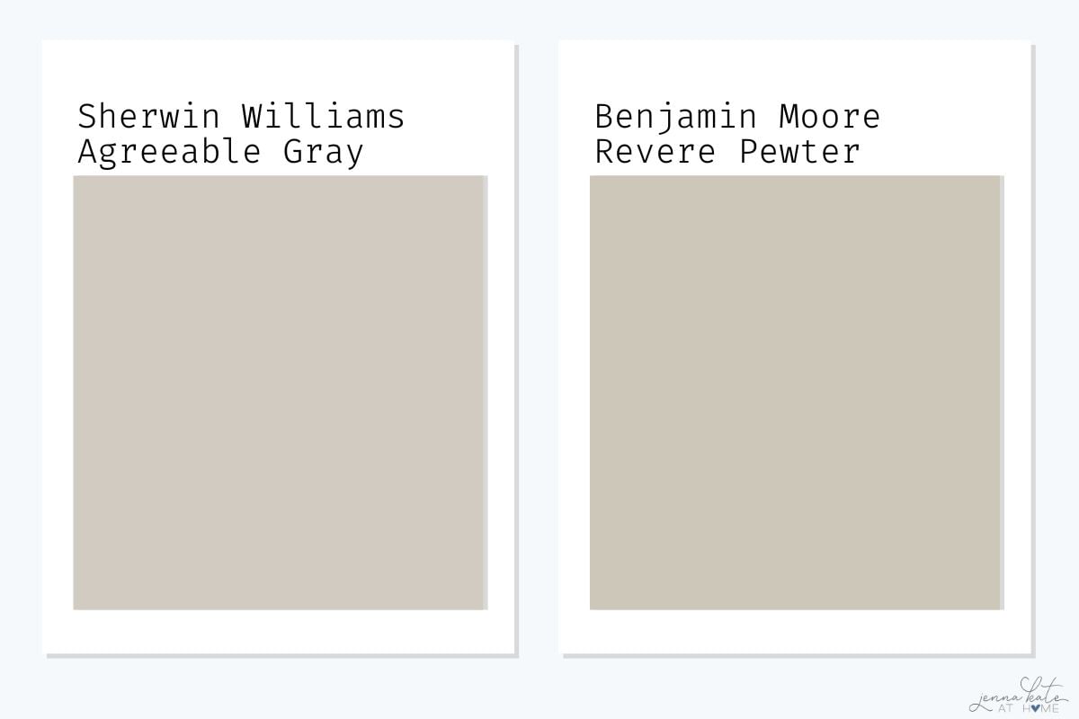
| Feature | Agreeable Gray (SW 7029) | Revere Pewter (BM HC-172) |
|---|---|---|
| LRV | 60 | 55.5 |
| Undertones | Beige/Taupe | Greige with green |
| Feels Like | Light, warm, neutral | Slightly darker, earthy |
| Best For | Modern neutral palettes | Traditional, cozy spaces |
Key Takeaway: Agreeable Gray is lighter and more neutral, while Revere Pewter can read a bit muddier or green depending on the lighting.
Agreeable Gray vs Repose Gray
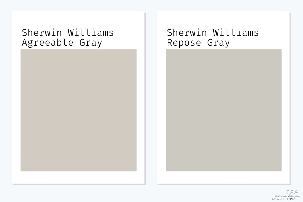
| Feature | Agreeable Gray | Repose Gray |
| LRV | 60 | 58 |
| Undertones | Warm beige | Blue/violet |
| Best For | Warm-neutral spaces | Cooler, modern spaces |
Key Takeaway: Repose Gray leans cooler and crisper; Agreeable Gray is warmer and more adaptable.
Agreeable Gray vs On The Rocks
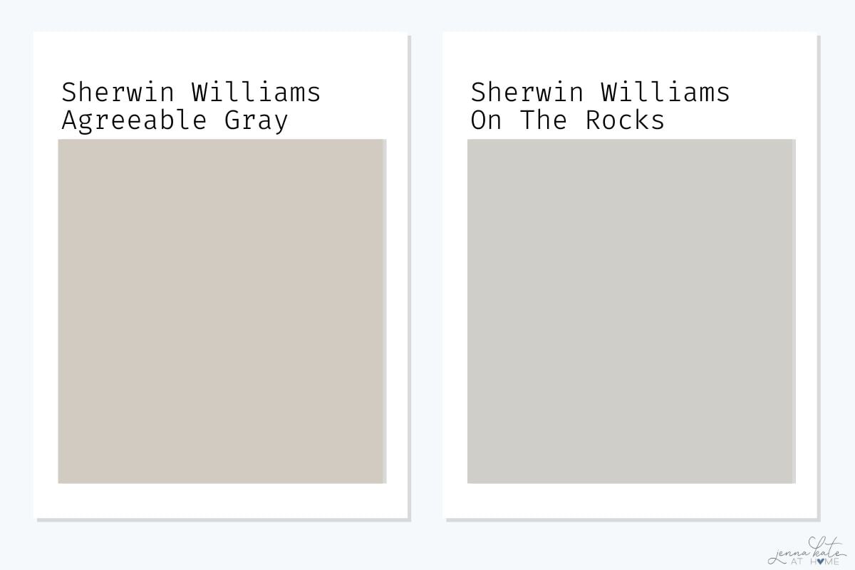
| Feature | Agreeable Gray | On The Rocks |
| LRV | 60 | 62 |
| Undertones | Warm beige | Cool blue-gray |
| Best For | Cozy neutrals | Light, clean look |
Key Takeaway: On The Rocks is lighter and cooler. Agreeable Gray is warmer and more versatile across multiple design styles.
Agreeable Gray vs Drift of Mist
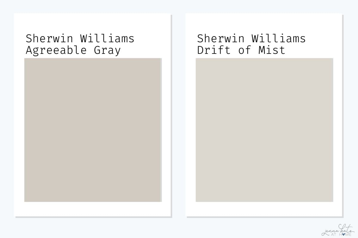
| Feature | Agreeable Gray (SW 7029) | Drift of Mist (SW 9166) |
|---|---|---|
| LRV | 60 | 69 |
| Undertones | Warm beige/taupe | Warm gray with subtle green undertones |
| Feels Like | Cozy, soft greige | Light and airy, slightly cooler |
| Best For | Cozy neutral backdrops, whole-home color | Bright, open spaces or modern interiors |
| Pairing Tip | Works well with soft whites and blues | Pairs beautifully with creamy whites and natural wood tones as well as blues and greens. |
Key Takeaway: Agreeable Gray is deeper and warmer, making it ideal for spaces where you want cozy, versatile warmth. Drift of Mist is lighter and leans slightly cooler, better for brightening up low-light spaces or keeping things feeling crisp and airy.
Pros & Cons of Agreeable Gray
✔ Pros:
- Neutral and versatile
- Warm but not yellow
- Works with most design styles
- Great for whole-house use
✘ Cons:
- Can look flat or muddy in low light
- May feel dated compared to newer creamy whites
- Might be too warm for ultra-modern designs
What Are Some Similar Paint Colors to Agreeable Gray?
If you’re looking for similar colors that are not an exact match, here are some paint colors to try:
- Benjamin Moore Rodeo
- Behr Toasty Gray
- Valspar Villa Gray
- Sherwin Williams Wordly Gray
- Sherwin Williams Gossamer Veil
- Sherwin Williams Colonnade Gray
Frequently Asked Questions About Sherwin Williams Agreeable Gray
Yes! While it may not be the trendiest color of the year, Agreeable Gray remains a popular choice for homeowners who want a warm, versatile neutral. It works especially well for whole-house color schemes and resale value.
Agreeable Gray has warm beige or taupe undertones. In some lighting, you may see subtle shifts toward green or violet, but these are typically very soft and neutralized by surrounding colors.
It’s a true greige—right between gray and beige. In warm light, it leans beige; in cooler light, it can look a bit more gray.
It can, but be aware that it may look grayer or slightly muddy in rooms with low or cool light. Sampling it first is a must.
SW Pure White is a favorite—it’s soft but still crisp. For more contrast, use SW High Reflective White. BM White Dove also works well if you want a slightly creamier look.
So, is Agreeable Gray the right color for your home?
If you’re looking for a reliable, versatile neutral that leans warm without being beige, Sherwin Williams Agreeable Gray is an excellent choice. It’s ideal for anyone seeking a greige color that plays nicely with both warm and cool accent colors.
- It’s not trendy, but it’s timeless.
- It won’t clash with your trim or flooring.
- It adapts beautifully to real-life spaces.

So helpful, Jenna…thanks! I love both Agreeable Gray and Repose Gray. We recently used SW Pure White in a bathroom. It’s a great, neutral white without being stark.
Thanks again! Becky