Content may contain affiliate links. When you shop the links, I receive a small commission at no cost to you. Thank you for supporting my small business.

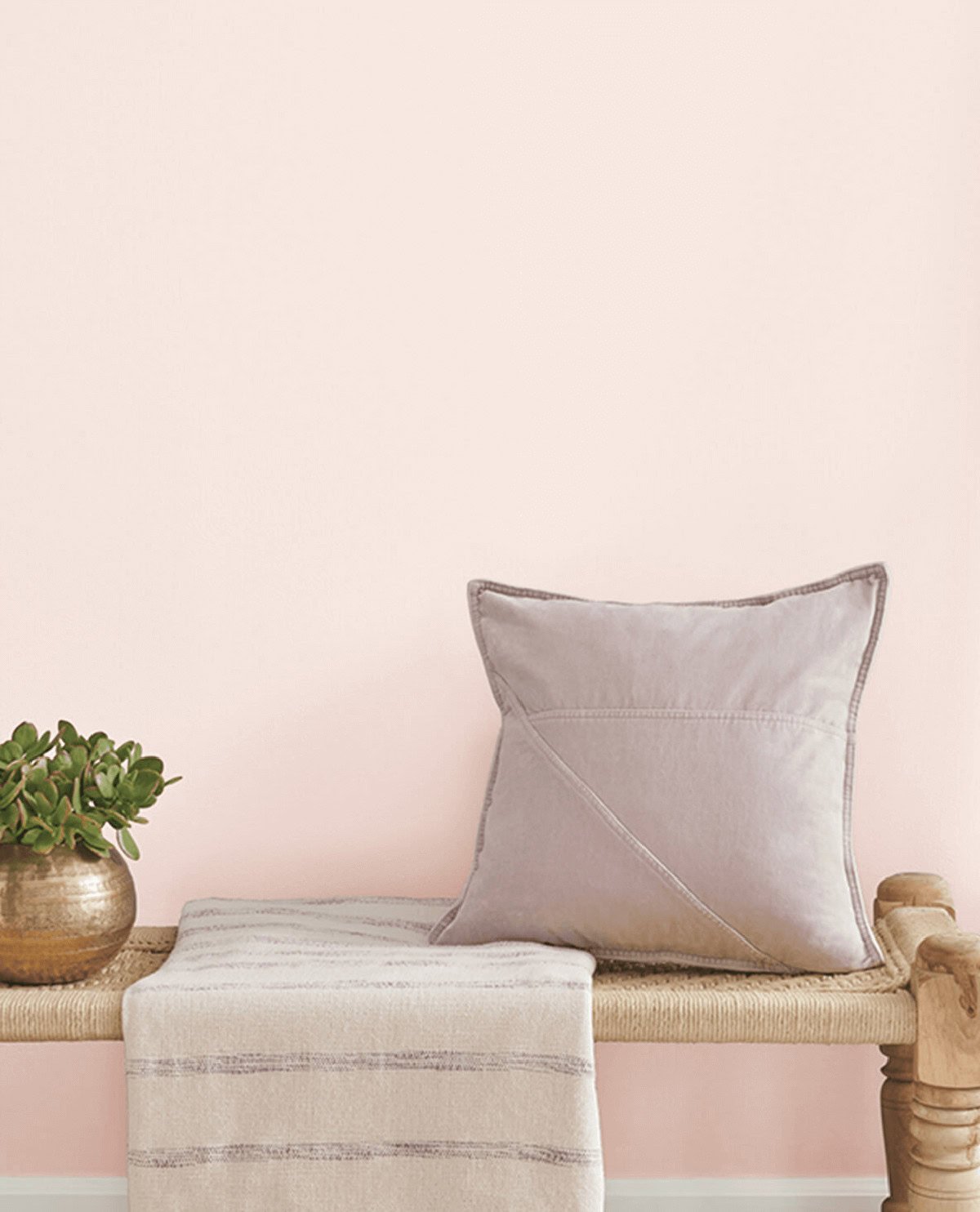
Blush pink is a versatile and timeless color that can transform any room. While shades of pink are typically thought of as paint colors reserved for nurseries and little girls’ bedrooms, there are so many different shades that are perfect for adding touches of romance and calm to any room of your home, including bedrooms, bathrooms and even living rooms.
I’ve gathered 15 of the prettiest blush pink paint colors from soft hues to deeper tones, fitting a variety of design styles and color preferences. I know you’ll find one that’s perfect for your space!
1. Sherwin Williams Cosmetic Blush
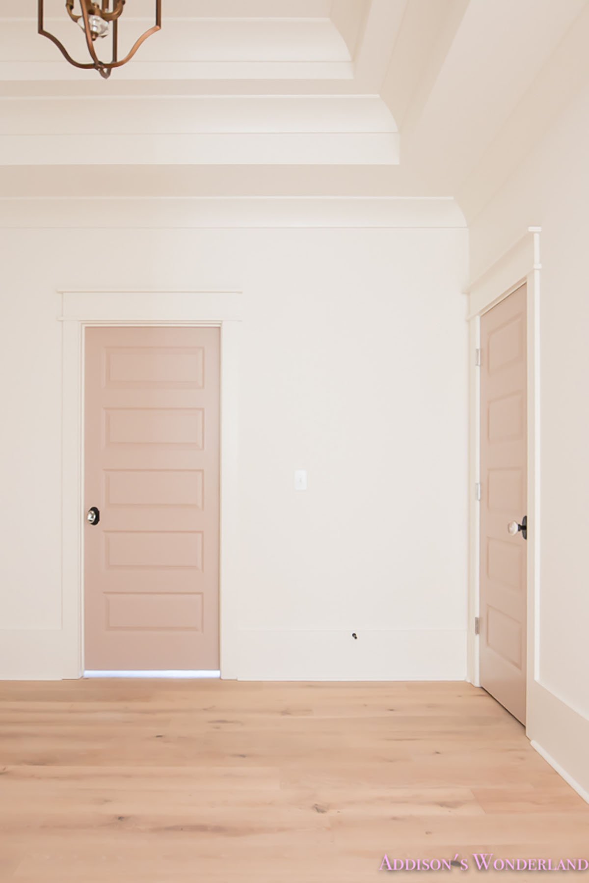
Sherwin Williams Cosmetic Blush (SW 6616) is a stronger pink with hints of coral. It is a very lively warm color that pairs well with neutrals and whites. It has an LRV of 83, putting it in the lower end of the white paint colors. However, it does not read white on walls at all.
Cosmetic Blush’s high LRV makes it a reflective color that’s good for brightening up a room without overpowering it.
This blush shade a perfect color for playrooms and nurseries or even an accent wall to create a focal point. Whites and greys will help balance the color out.
To coordinate colors with Sherwin Williams Cosmetic Blush (SW 6616), a soft and subtle pink, you’ll want to choose a white, mid-tone, and dark color that enhance its gentle charm. Here are my recommendations:
White:
Sherwin Williams Alabaster (SW 7008): Alabaster is a warm, soft white that pairs beautifully with the warmth of Cosmetic Blush. It’s perfect for trim, ceilings, and other architectural features, providing a subtle and elegant backdrop.
Mid-tone:
Sherwin Williams White Dogwood (SW 6315): White Dogwood is a muted, blush-toned pink that complements Cosmetic Blush without overwhelming it. It works well for adjacent walls, furniture, or accents, creating a seamless and harmonious transition. I talk more about this color below.
Dark:
Sherwin Williams Urbane Bronze (SW 7048): Urbane Bronze is a rich, dark bronze with warm undertones that add depth and sophistication to the palette. It provides a striking contrast to the softness of Cosmetic Blush, making it ideal for statement pieces, feature walls, or cabinetry.
2. Sherwin Williams White Dogwood
Sherwin Williams White Dogwood (SW 6315) is a popular off-white paint color with warm undertones of pink. With an LRV of 75, it reflects a lot of light so it can easily brighten up a space.
The soft pink tones of this paint color are inviting and cozy, working well in many rooms and not limiting it to just nurseries and little girl’s rooms.
Here are my suggestions for a white, mid-tone, and dark paint color to coordinate with Dogwood:
White:
Sherwin Williams Extra White (SW 7006)
Extra White is a bright, clean white that pairs well with the warmth of Dogwood, providing a crisp and fresh contrast.
Mid-Tone:
Sherwin Williams Mindful Gray (SW 7016)
Mindful Gray is a warm, light gray with subtle green undertones. It offers a neutral, sophisticated contrast to Dogwood.
Dark:
Sherwin Williams Peppercorn (SW 7674)
Peppercorn is a deep, rich charcoal gray. It provides a strong, dramatic contrast to Dogwood, adding depth to the overall color scheme.
3. Benjamin Moore Melted Ice Cream
Benjamin Moore’s Melted Ice Cream (2095-70) is an off-white color with a subtle pink undertone, reminiscent of melted strawberry ice cream. It has an LRV of 76, putting it in the mid-range of off-white colors It’s a warm and inviting shade of blush pink that works well in various spaces, from kids’ rooms to adult rooms.
Here are my suggestions for a white, mid-tone, and dark paint color to coordinate with Melted Ice Cream:
White:
Benjamin Moore Simply White (OC-117)
Simply White is a bright, clean white with a hint of warmth. It pairs beautifully with Melted Ice Cream, enhancing its creamy undertones without making the space feel too stark.
Mid-Tone:
Benjamin Moore Revere Pewter (HC-172)
Revere Pewter is a light gray with warm undertones. It offers a balanced, neutral contrast to Melted Ice Cream, adding depth and sophistication to the color palette.
Dark:
Benjamin Moore Chelsea Gray (HC-168)
Chelsea Gray is a rich, warm gray that provides a strong, dramatic contrast to Melted Ice Cream. It adds depth and a touch of elegance to the overall color scheme.
4. Benjamin Moore Bashful
Benjamin Moore Bashful (1171) is a warm beige with a touch of pink making it a great choice if you don’t want a sickly sweet shade of pink.
Bashful has an LRV of 70, putting it in the range of light colors. This means it will have considerably more depth of color than many of the colors on this list, without being too dark or overpowering.
It goes well with warm whites and darker shades of greige, beige and even sage green or navy blue. Bashful may seem darker in a room with less natural light, but in a room with lots of sunshine it’s such an elegant and timeless shade.
Here are my suggestions for a white, mid-tone, and dark paint color to coordinate with Bashful:
White:
Benjamin Moore Chantilly Lace (OC-65)
Chantilly Lace is a bright, crisp white that complements the softness of Bashful, providing a clean and fresh contrast.
Mid-Tone:
Benjamin Moore Balboa Mist (OC-27)
A light, warm gray with a hint of greige for added depth. Soft enough that it doesn’t overwhelm the pink.
Dark:
Benjamin Moore Hale Navy (HC-154)
Hale Navy is a deep, rich navy blue. It provides a striking, bold contrast to Bashful.
5. Sherwin Williams Doeskin
Sherwin Williams Doeskin (SW 6044) is an elegant shade of blush pink, perfect for adding warmth and depth to any space. It has an LRV of 47, which makes it a light-medium color.
SW Doeskin has a mix of pink, beige, and grey. With its lower LRV, this would not be a choice as a color to brighten up a room, but its warm pink undertones add softness and elegance. It’s a great choice for bedrooms, or even living rooms and can be used as an accent or for a moodier blush pink look on all four walls.
SW Doeskin goes particularly well with warm, creamy whites, coordinating beige-toned shades like greige, tan and mushroom paint colors, as well as light wood tones.
Here are my suggestions for a white, mid-tone, and dark paint color to coordinate with Doeskin:
White:
Sherwin Williams Snowbound (SW 7004)
Snowbound is a soft, warm white that pairs beautifully with the warmth of Doeskin, creating a light and airy feel without being too stark.
Mid-Tone:
Sherwin Williams Accessible Beige (SW 7036)
Accessible Beige is a light, warm beige with subtle gray undertones. It offers a complementary neutral tone that adds depth and continuity to the color scheme without clashing with Doeskin.
Dark:
Sherwin Williams Urbane Bronze (SW 7048)
Urbane Bronze is a deep, rich brown with gray undertones. It provides a dramatic, grounding contrast to Doeskin.
6. Sherwin Williams Intimate White
Sherwin Williams Intimate White (SW-6322) is a versatile yet subtle paint color. It has warm and soft blush pink tones. With an LRV of 77, it’s a perfect light and airy shade and makes spaces feel brighter and bigger than they are.
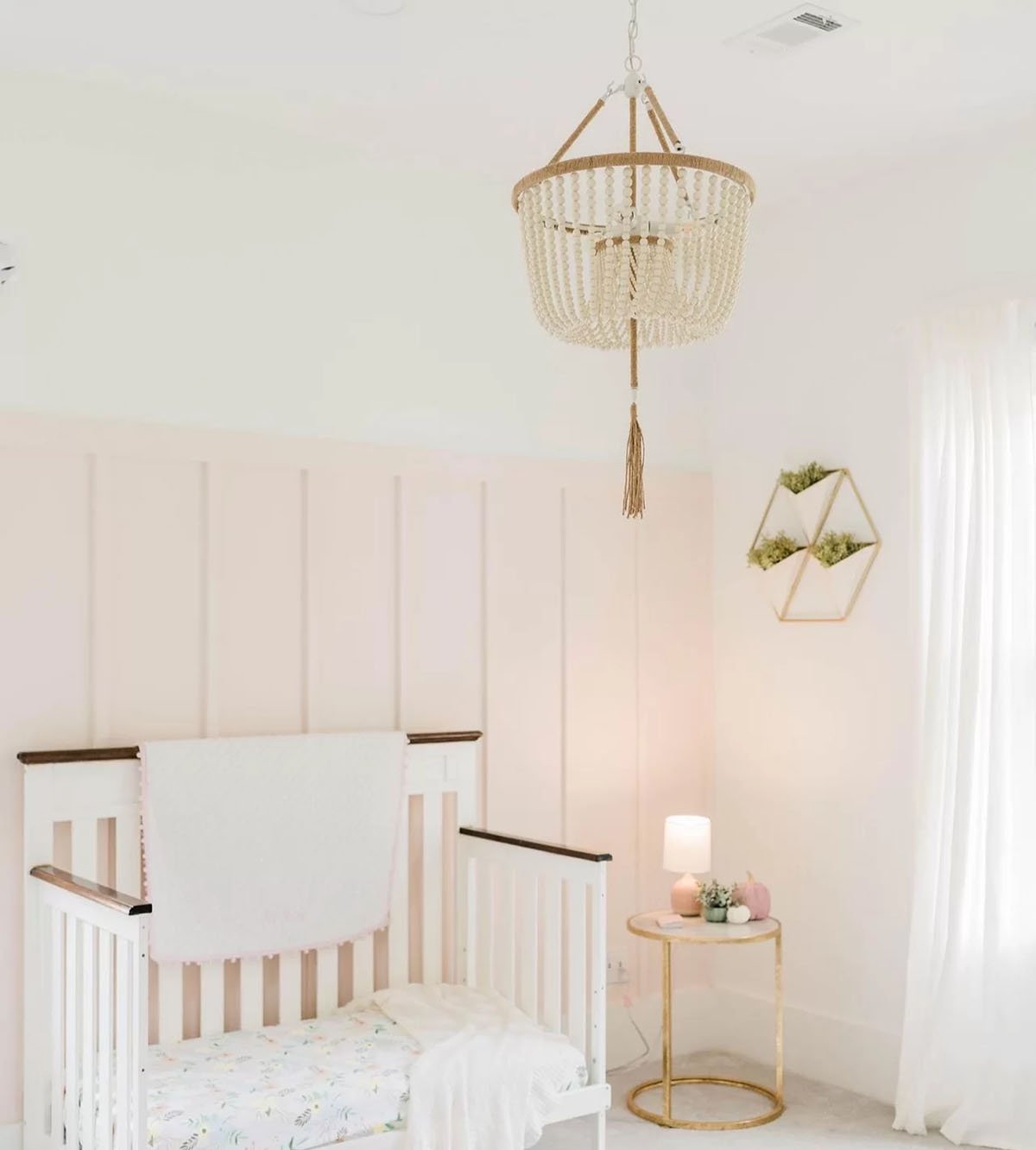
Intimate White would be a stunning color for a shiplap accent wall, similar to what was done in this nursery, but is soft and bright enough to work on all four walls.
It pairs well with shades of white, and other warm colors like brass and sage green.
Here are my suggestions for a white, mid-tone, and dark paint color to coordinate with Intimate White:
White:
Sherwin Williams Pure White (SW 7005)
Pure White is a bright, clean white that complements the soft warmth of Intimate White, creating a fresh and airy contrast.
Mid-Tone:
Sherwin Williams Agreeable Gray (SW 7029)
Agreeable Gray is a light, warm greige with subtle beige undertones that offers a subtle contrast.
Dark:
Sherwin Williams Gauntlet Gray (SW 7019)
Gauntlet Gray is a deep, warm gray with brown undertones for dramatic contrast.
7. Sherwin Williams Romance
Sherwin Williams Romance (SW 6323) is a warm blush pink shade with slight coral undertones. It has an LRV of 66, making it a light paint color.
It pairs well with natural wood tones as well as gold and white. SW Romance is a versatile color that can handle more saturated accent colors.
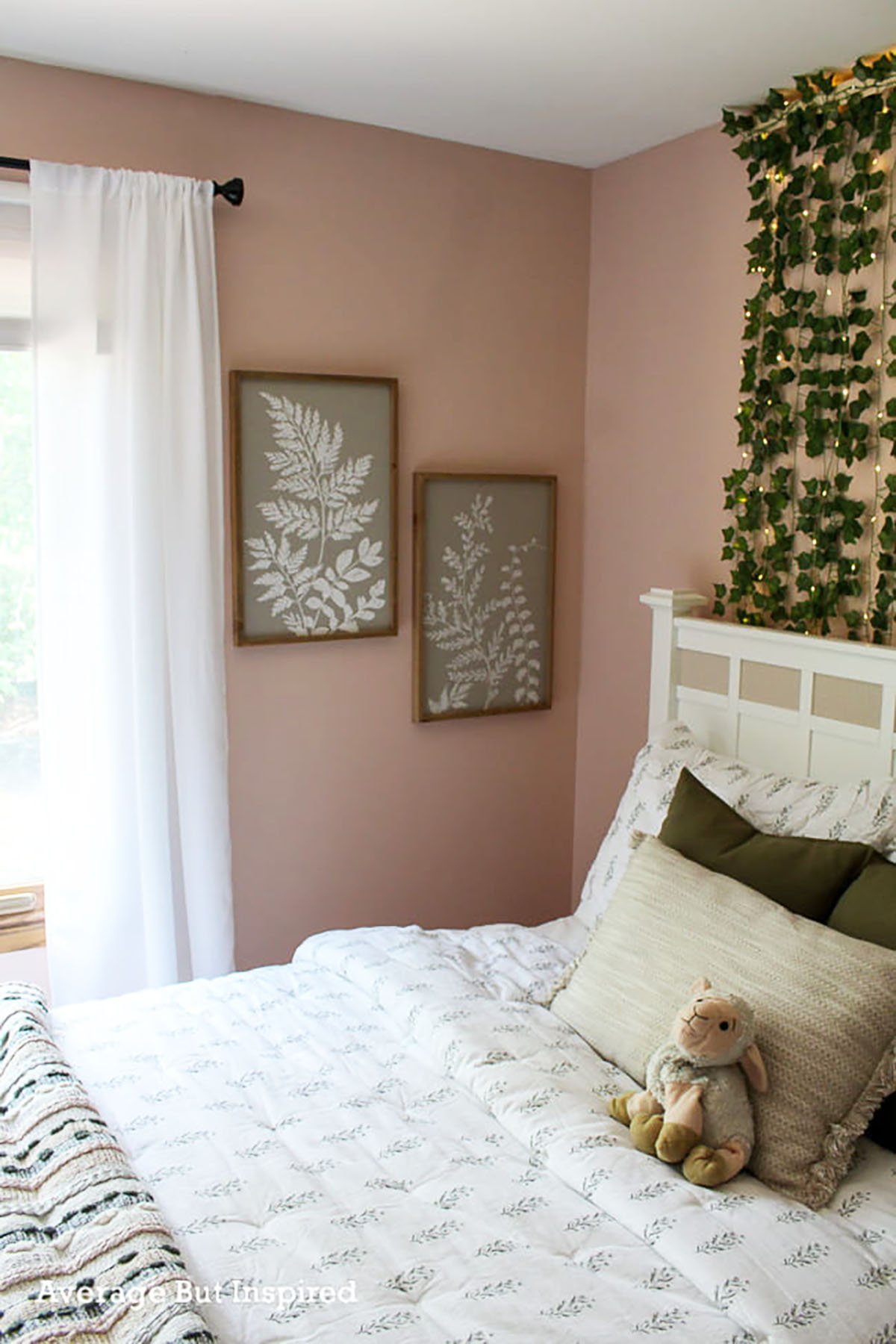
It is a perfect color for playrooms like what Arin Solange did here. It is a soft shade and not too overpowering, but has a good saturation of color. It also is not one of the blush pink shades on this list that seems strictly like a nursery paint color.
Here are some ideas for coordinating colors for Sherwin Williams Romance:
White:
Sherwin Williams Snowbound (SW 7004)
Snowbound is a soft, warm white that pairs nicely with Romance, offering a clean and bright contrast without being too stark.
Mid-Tone:
Sherwin Williams Repose Gray (SW 7015)
Repose Gray is a light, warm gray with subtle undertones that complement Romance well, providing a neutral and sophisticated contrast.
Dark:
Sherwin Williams Naval (SW 6244)
Naval is a deep, rich navy blue that adds a dramatic and elegant contrast to Romance, providing depth and a modern touch to the color scheme.
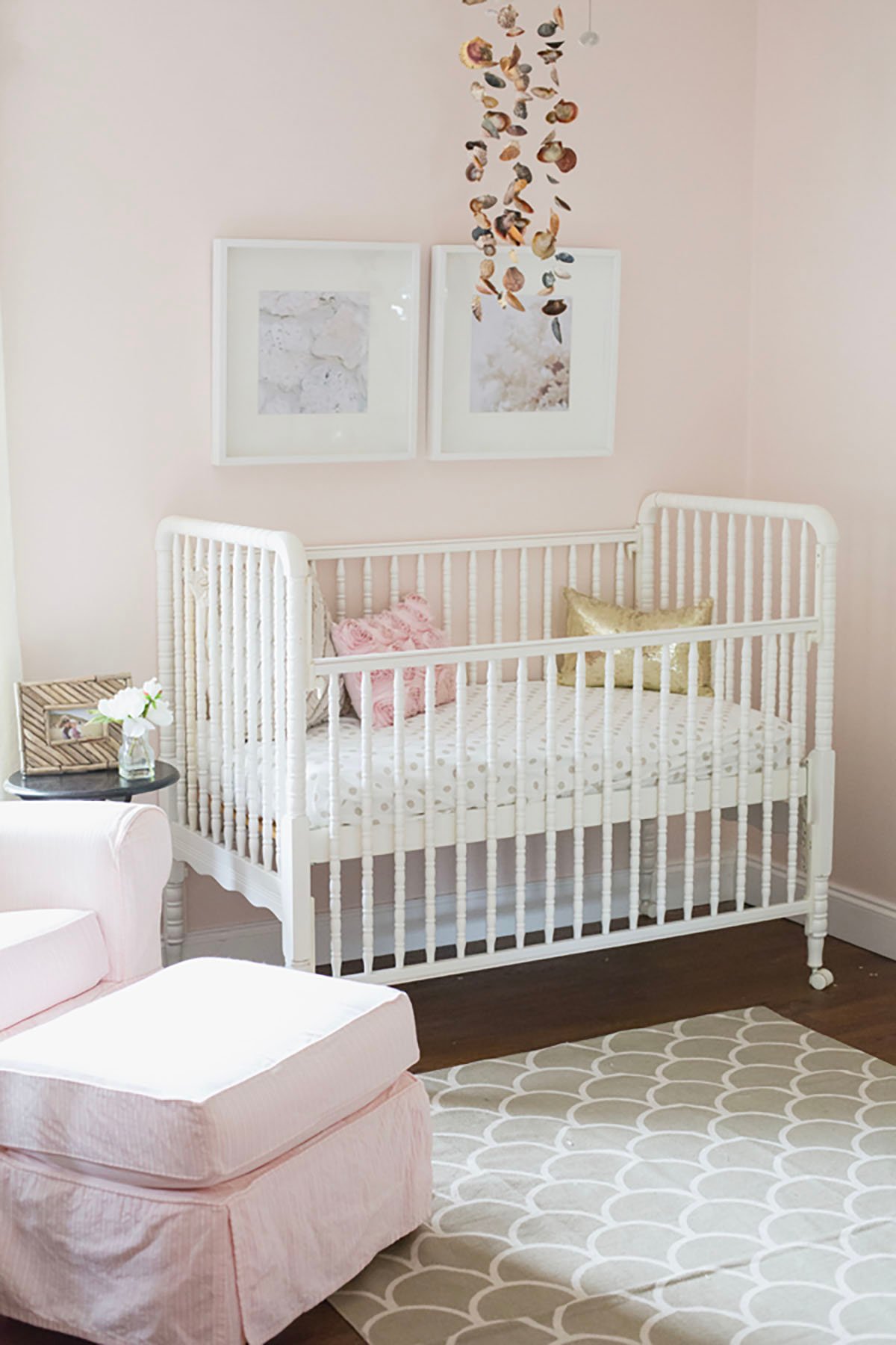
8. Benjamin Moore Gentle Butterfly
Benjamin Moore’s Gentle Butterfly (2173-70) is one of my favorite shades of blush pink for a nursery or little girl’s room. It has an LRV of 82, putting it on the high end of off-white paint colors (82 would make it white). This soft blush shade acts like the perfect neutral backdrop.
BM Gentle Butterfly reflects a significant amount of light, perfect for brightening up a dark room where that extra light is crucial. It pairs well with whites, neutrals and pastel shades. You can also introduce pops of darker colors like navy blue or emerald green for a fun contrast.
It’s such a gentle and pretty color, adding a cheerful touch without being too strong.
Here’s a coordinated palette for Benjamin Moore Gentle Butterfly:
White:
Benjamin Moore Chantilly Lace (OC-65)
A bright, clean white that pairs beautifully with the soft warmth of Gentle Butterfly.
Mid-Tone:
Benjamin Moore Classic Gray (OC-23)
A light, neutral gray that offers a subtle and elegant contrast to Gentle Butterfly.
Dark:
Benjamin Moore Kendall Charcoal (HC-166)
A rich, deep charcoal gray for dramatic contrast, grounding the palette.
9. Benjamin Moore Head Over Heels
Benjamin Moore Head Over Heels (AF-250) is a warm peachy pink paint color. It has an LRV of 73, which makes it an off-white paint color.
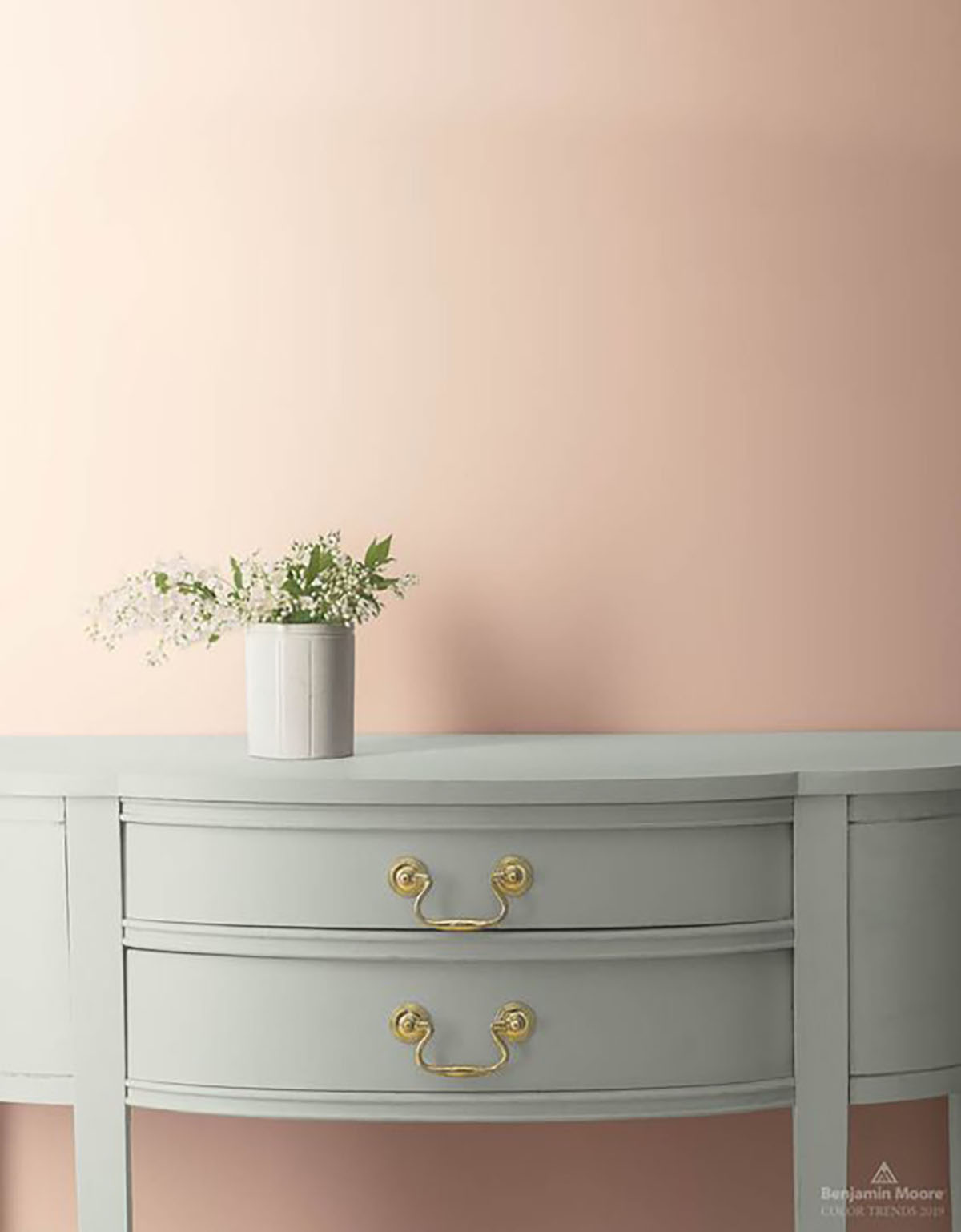
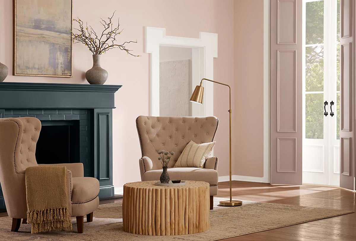
BM Head Over Heels pairs well with both light and dark shades, like muted tones of green, beige, gray and brown. Gold hardware would be a perfect accent with this color like in this photo from Benjamin Moore.
White:
Benjamin Moore Simply White (OC-117)
Simply White is a bright, clean white with a hint of warmth. It complements the soft warmth of Head Over Heels, providing a fresh and airy contrast.
Mid-Tone:
Benjamin Moore Sea Salt (OC-120)
Sea Salt is a soft, muted green with gray undertones. It offers a fresh and calming contrast to Head Over Heels, adding a bit of color while maintaining a soothing palette.
Dark:
Benjamin Moore Hale Navy (HC-154)
Hale Navy is a deep, rich navy blue that provides a bold and sophisticated contrast to Head Over Heels, adding depth and a touch of elegance to the palette.
10. Sherwin Williams Blushing
Sherwin Williams Blushing (SW-6617) is a warm blush pink color that makes any space feel inviting. It reflects a significant amount of light which can help brighten up rooms.
With a red undertone, it can create a cheerful atmosphere and vibrancy. It coordinates well with peach colors as well as whites and gold.
Here are my suggestions for a white, mid-tone, and dark paint color to coordinate with Blushing:
White:
Sherwin Williams Alabaster (SW 7008)
Alabaster is a warm, creamy white that pairs beautifully with the soft warmth of Blushing, creating a soft and harmonious contrast.
Mid-Tone:
Sherwin Williams Silverpointe (SW 7653)
Silverpointe is a light, neutral gray with subtle cool undertones. It offers a balanced and sophisticated contrast to Blushing, adding depth while maintaining a cohesive look.
Dark:
Sherwin Williams Iron Ore (SW 7069)
Iron Ore is a rich, deep charcoal gray that provides dramatic contrast.
11. Benjamin Moore First Light
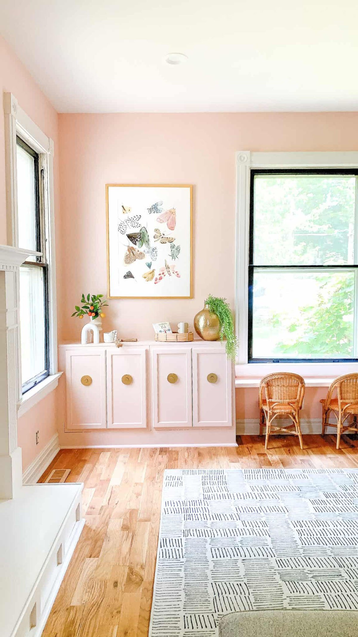
Benjamin Moore First Light (2102-7) is the perfect balance between cool and warm. It was Benjamin Moore’s 2020 Color of The Year – and for good reason!
BM First Light has strong beige undertones while still looking pink, making it a perfect neutral pink, that feels adult-like and not strictly for a nursery.
First Light has an LRV of 73, and has enough color depth while still having that light and airy quality. It’s a great paint color for bedrooms and really comes to life when that bright morning light (first light!) hits it.
First Light pairs well with bright whites (SW Chantilly Lace) or warmer, creamier whites like BM White Dove. It also looks great with soft grays like Benjamin Moore Gray Owl (which has a soft green undertone) or a dark color like Benjamin Moore Kendall Charcoal.
12. Sherwin Williams Faint Coral
Sherwin Williams Faint Coral (SW-6329) is a lighter blush pink color with a high light reflectance. This color can make a room feel much bigger and more open. It has light peach undertones for warmth perfect for various spaces. It pairs well with shades of blue and white and other shades of pink like Inspired By This did in the nursery.
Here are my suggestions for a white, mid-tone, and dark paint color to coordinate with Faint Coral:
White:
Sherwin Williams Pure White (SW 7005) Pure White is a bright, clean white that pairs well with the soft warmth of Faint Coral, providing a fresh and crisp contrast.
Mid-Tone:
Sherwin Williams Accessible Beige (SW 7036) Accessible Beige is a light, warm beige with subtle gray undertones. It offers a neutral and sophisticated contrast to Faint Coral, adding depth while maintaining a harmonious feel.
Dark:
Sherwin Williams Rock Bottom (SW 7062) Rock Bottom is a deep, rich charcoal with green undertones.
13. Benjamin Moore Odessa Pink
Benjamin Moore Odessa Pink (HC-59) is a darker, warm dusty pink shade that works well in many spaces. It reflects a moderate amount of light without being overpowering. It has soft red and beige undertones giving it that warm, dusty feeling.
It’s perfect for adding a touch of warmth as an accent wall for a calming environment.
Here are some suggestions for a white, mid-tone, and dark paint color to coordinate with Odessa Pink:
White:
Benjamin Moore Chantilly Lace (OC-65) Chantilly Lace is a bright, clean white that complements the soft warmth of Odessa Pink, providing a fresh and airy contrast.
Mid-Tone:
Benjamin Moore Silver Satin (OC-26) Silver Satin is a light, neutral gray with subtle warm undertones. It offers a sophisticated and balanced contrast to Odessa Pink.
Dark:
Benjamin Moore Nightfall (1596) Nightfall is a deep, rich charcoal with cool undertones, perfect for adding depth and contrast.
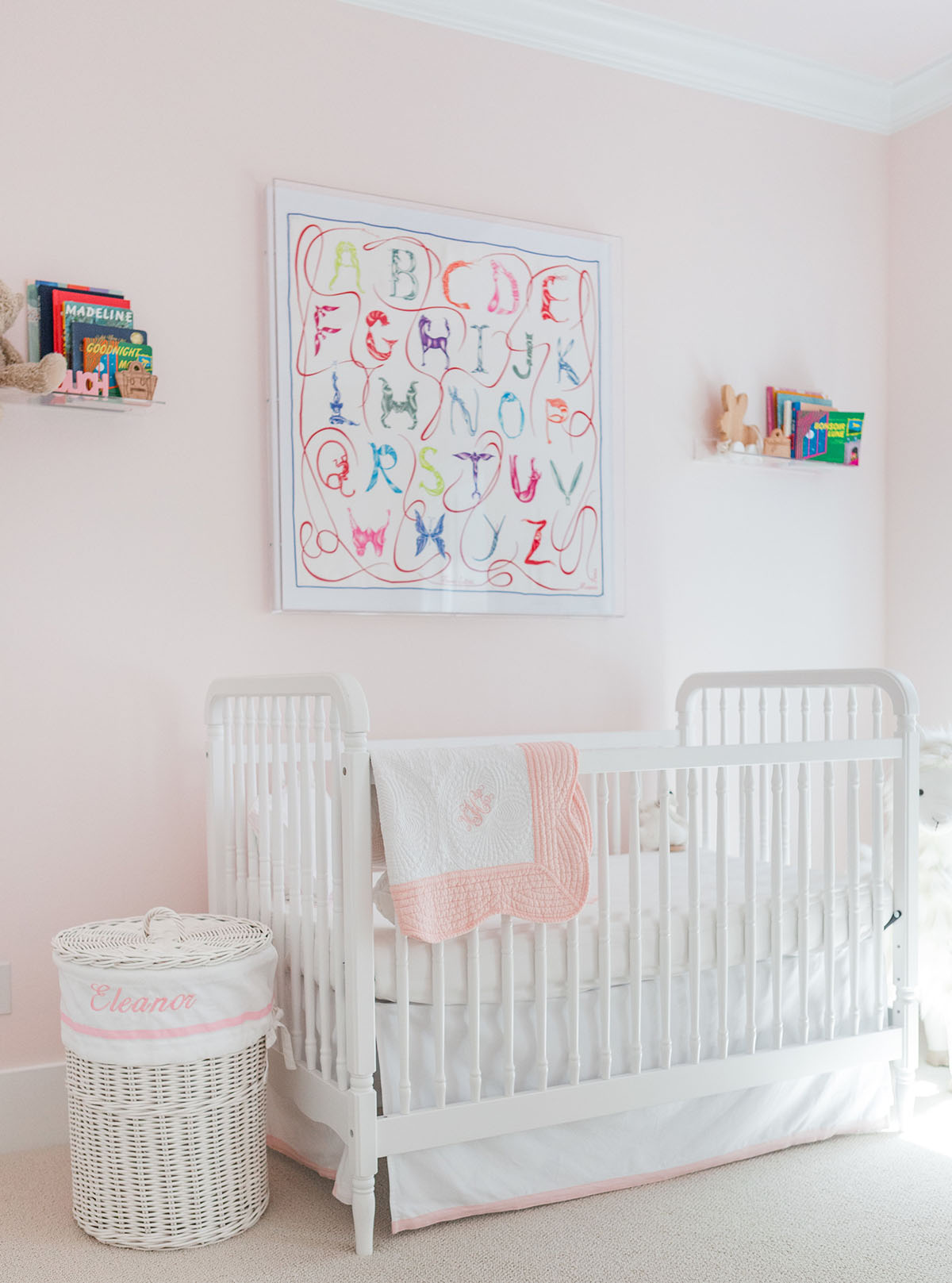
14. Benjamin Moore Pink Bliss
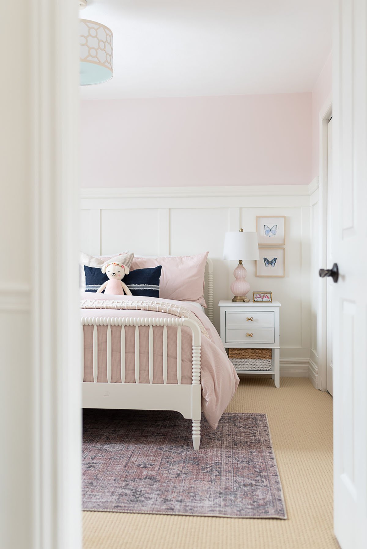
Benjamin Moore Pink Bliss (2094-70) is a gentle color that brings a light and airy feeling to rooms. It can make rooms feel better with its high light reflectance value. It pairs well with neutral shades, lighter pinks, warm whites, and dark blues like in this bedroom from Nick and Alicia.
White:
Benjamin Moore Chantilly Lace (OC-65) Chantilly Lace is a bright, clean white that complements the soft warmth of Pink Bliss, providing a crisp contrast.
Mid-Tone:
Benjamin Moore Edgecomb Gray (HC-173) Edgecomb Gray is a light, neutral gray with taupe undertones.
Dark:
Benjamin Moore Wrought Iron (2124-10) Wrought Iron is a deep, rich black with subtle warm undertones.
15. Sherwin Williams Malted Milk
Sherwin Williams Malted Milk (SW 6057) is the perfect true blush shade. It’s a soft neutral color with subtle red and brown undertones. It goes beautifully with wood textures and neutral shades to bring out the color better. Natural light will make this color feel warmer while artificial light will lighten it up.
Here are my suggestions for a white, mid-tone, and dark paint color to coordinate with Malted Milk:
White:
Sherwin Williams Alabaster (SW 7008) Alabaster is a warm, creamy white that pairs beautifully with the soft warmth of Malted Milk, creating a soft contrast.
Mid-Tone:
Sherwin Williams Repose Gray (SW 7015) Repose Gray is a light, warm gray with subtle undertones.
Dark:
Sherwin Williams Black Fox (SW 7020) Black Fox is a deep, rich brown with subtle warm undertones.
Final Thoughts
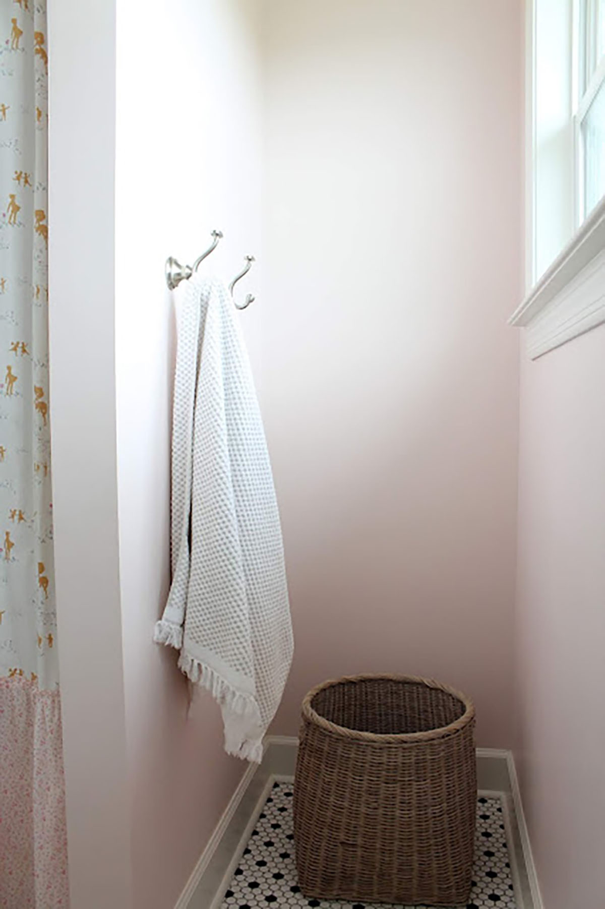
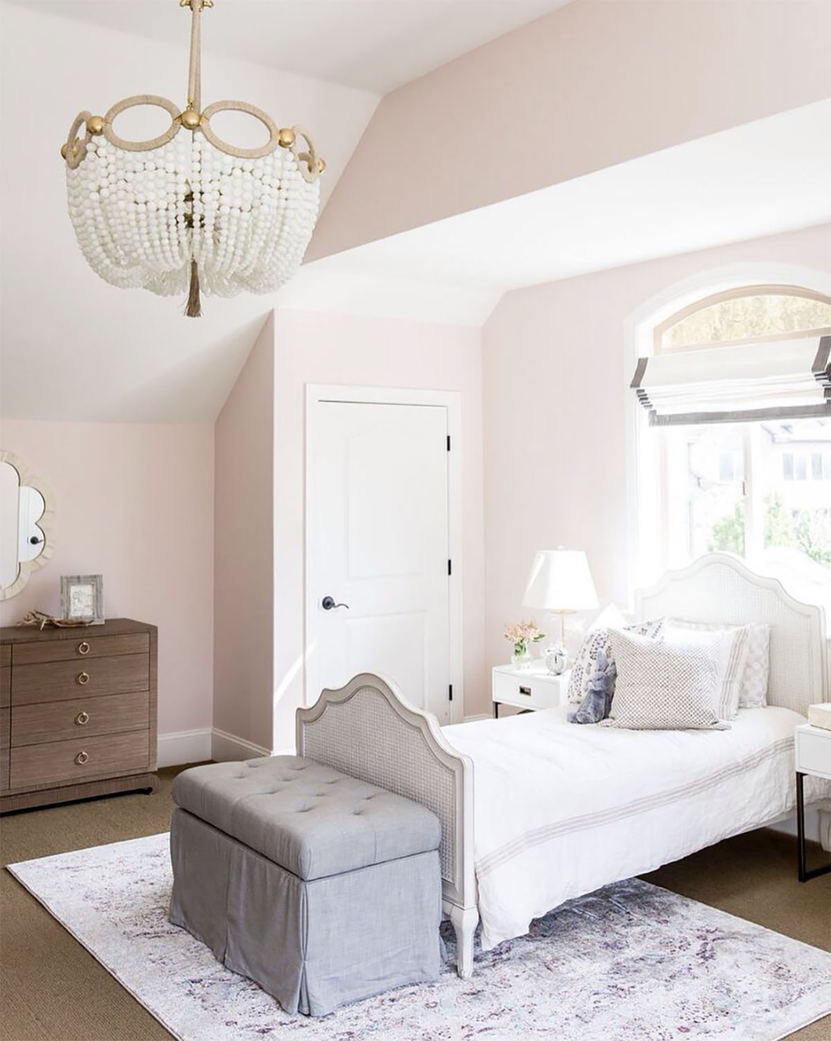
Blush pink is a perfect color if you are looking for a more neutral addition of color. It works well when used in a whole room or as just an accent wall. There are so many different shades to choose from depending on the lighting situation and design style of your space.
Remember, shades of blush pink are not just for nurseries! This is such a warm, romantic shade that’s perfect for creating a cozy and inviting bedroom or living room.

Would simply white trim work with Benjamin Moore Gentle Butterfly?