


Content may contain affiliate links. When you shop the links, I receive a small commission at no cost to you. Thank you for supporting my small business.
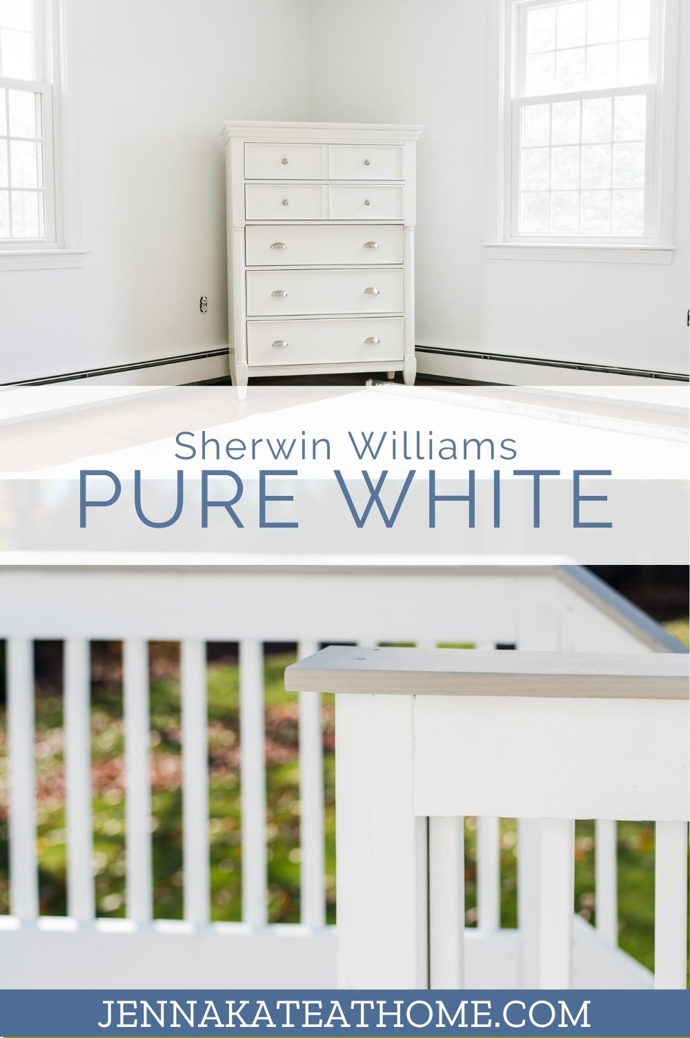
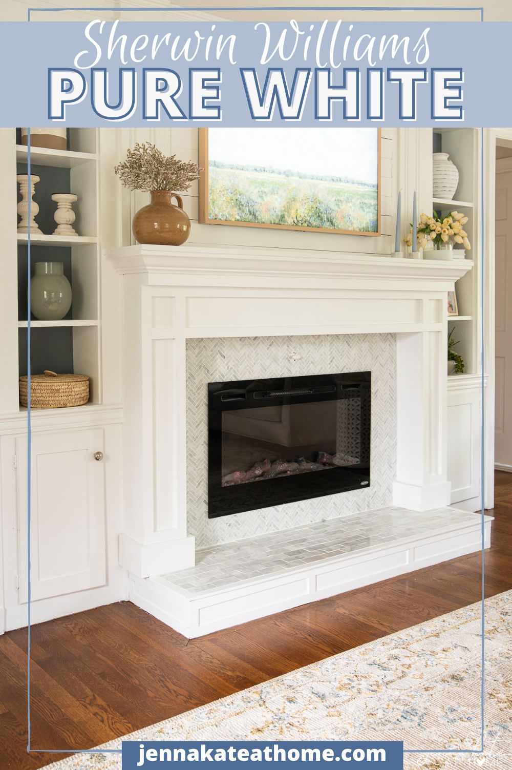
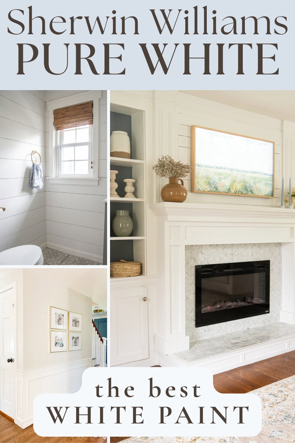
If I could only choose one white paint color for trim, it would be Sherwin Williams Pure White.
We’ve gradually repainted almost every piece of trim, every interior door and most of our millwork in Pure White over the last few years, and I still haven’t found another white that works as effortlessly.
It has enough warmth to soften a room, but never so much that it looks creamy. It works equally well with warm greiges, cool blues, natural wood and crisp marble – which is exactly why it’s become my default recommendation.
If you’re trying to choose one white for trim, cabinets or even walls, here’s everything I’ve learned after living with it throughout our own home.
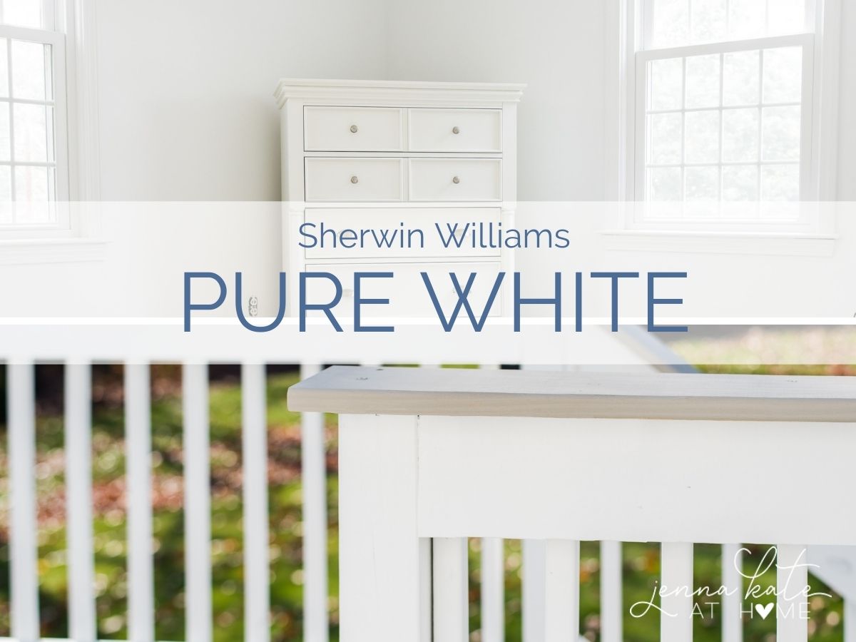
Pure White is a Great Choice if:
- You’re overwhelmed by white paint choices.
- You want one trim color for your entire house.
- You don’t like stark whites.
- You decorate with both warm and cool colors.
- You want timeless instead of trendy.
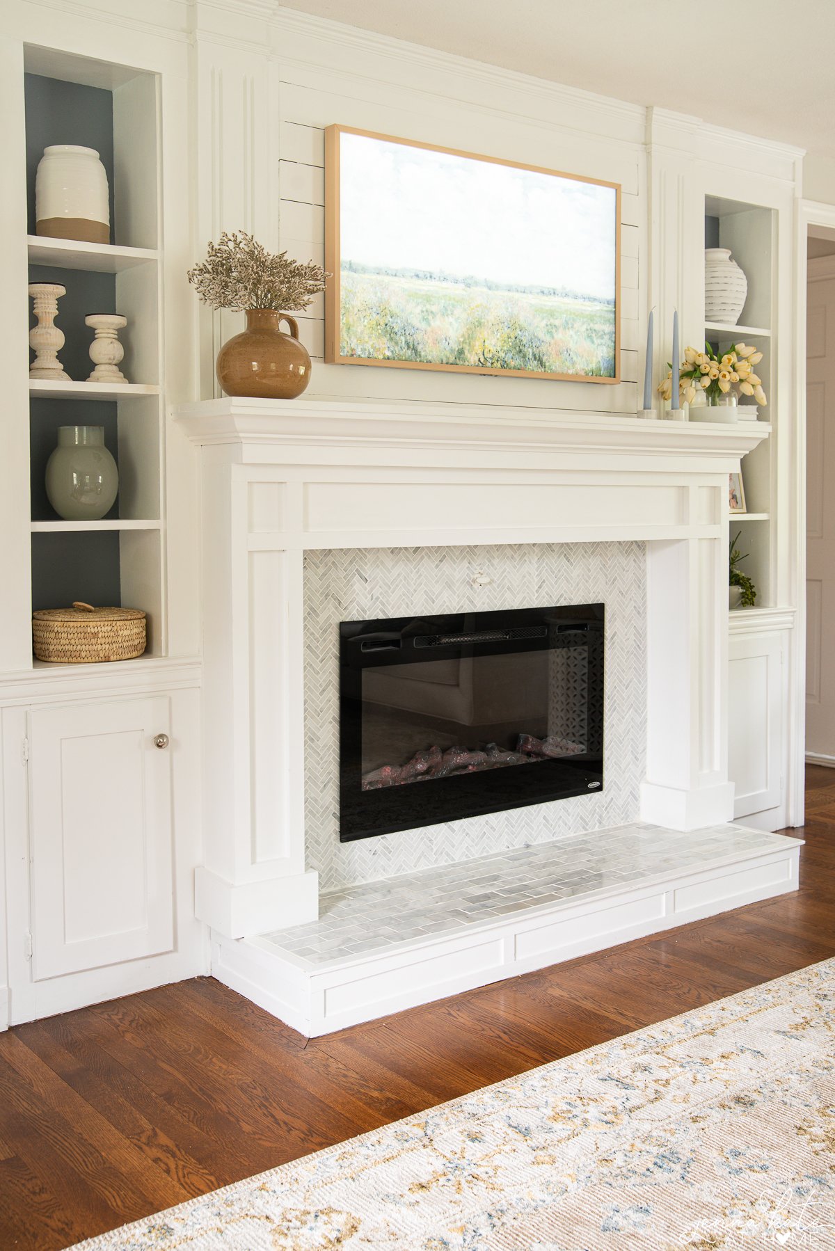
What Does Pure White Look Like?
Pure White is one of those rare whites that actually looks white. It doesn’t feel icy like Extra White, but it also doesn’t have the creamy softness of Alabaster or White Dove.
To me, it’s right in the middle, and that’s exactly why I’ve found it so easy to decorate with over the years. It doesn’t compete with warmer paint colors like Alabaster or White Dove, but it also doesn’t feel icy next to cooler blues and grays. It’s one of those rare whites that quietly complements everything around it instead of drawing attention to itself.
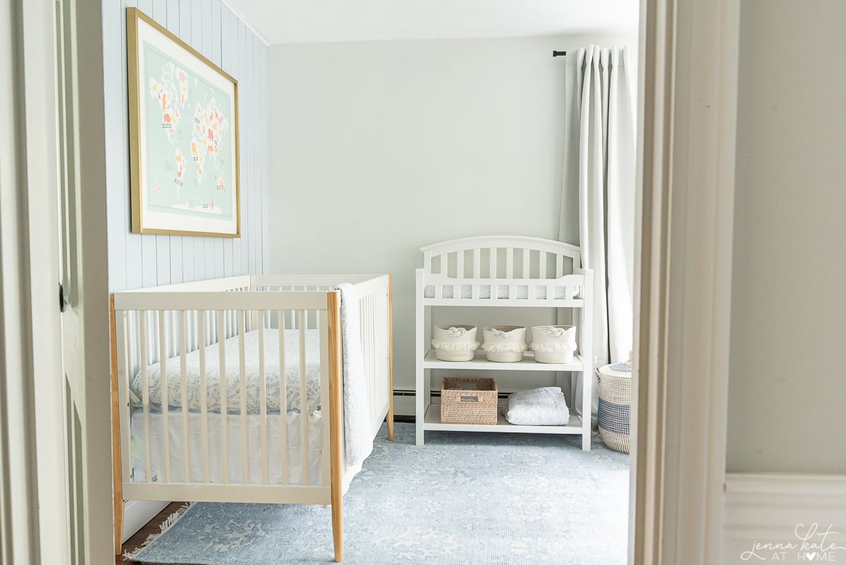
Why I Chose Pure White for Every Room
If you’ve been following my blog for a while, you might remember that Pure White wasn’t always my go-to trim color.
When we first moved into our home, all of the trim was painted Benjamin Moore Decorator’s White. At the time, I loved its clean, bright look, but as our home evolved, I found myself wanting something just a little softer.
Next came Sherwin Williams Extra White. It was fresh and crisp, but over time I started noticing that it could feel a little stark, especially in rooms with cooler natural light. Compared to the warmer wall colors I was gravitating toward, it sometimes looked almost too bright.
That’s what eventually led me to Sherwin Williams Pure White.
It still gives me that crisp, clean white trim I love, but without feeling cold or sterile. The tiny hint of warmth softens it just enough, while its subtle gray undertone keeps it from looking creamy or yellow. To me, it’s the perfect balance.
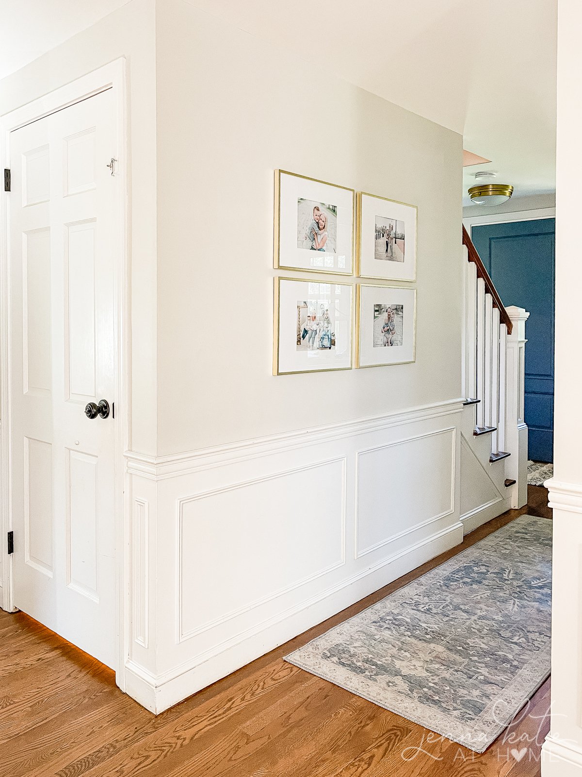
Over the last few years, we’ve gradually repainted almost every piece of trim and every interior door in our home in Pure White. It pairs beautifully with every wall color we’ve used – from Repose Gray to White Dove and even Swiss Coffee.
How Lighting Affects Pure White
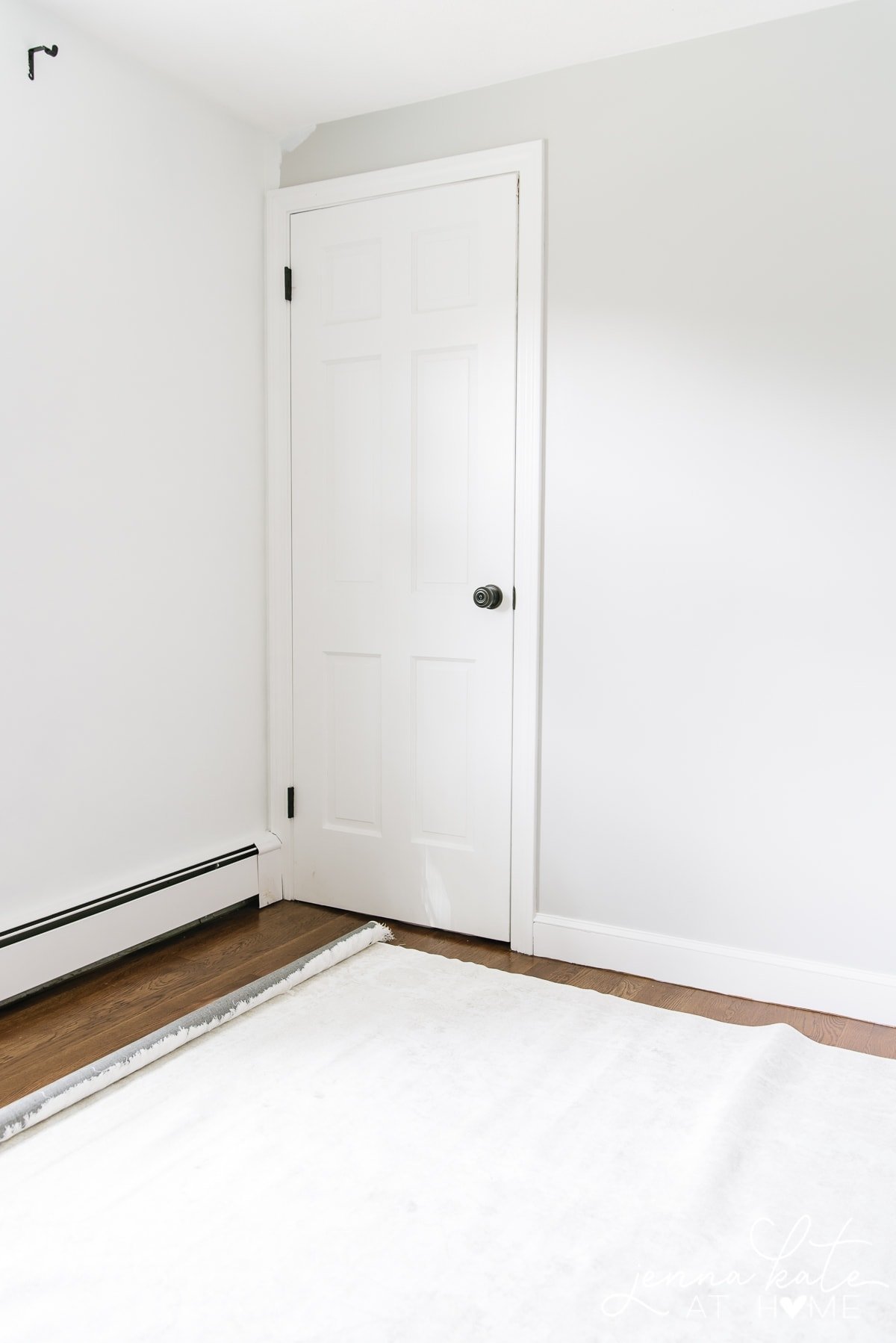
One of the reasons I’ve come to trust Pure White as a trim color is that I’ve lived with it in just about every lighting condition imaginable. It’s on all of the trim and interior doors throughout our home, and we also used it on the ceilings in our family room addition.
What I’ve found is that it stays remarkably consistent. It always reads as a soft, clean white without suddenly looking yellow or icy blue, which is exactly what I want from a trim color.
I do have a different opinion when it comes to using Pure White on walls, though.
Pure White on Walls
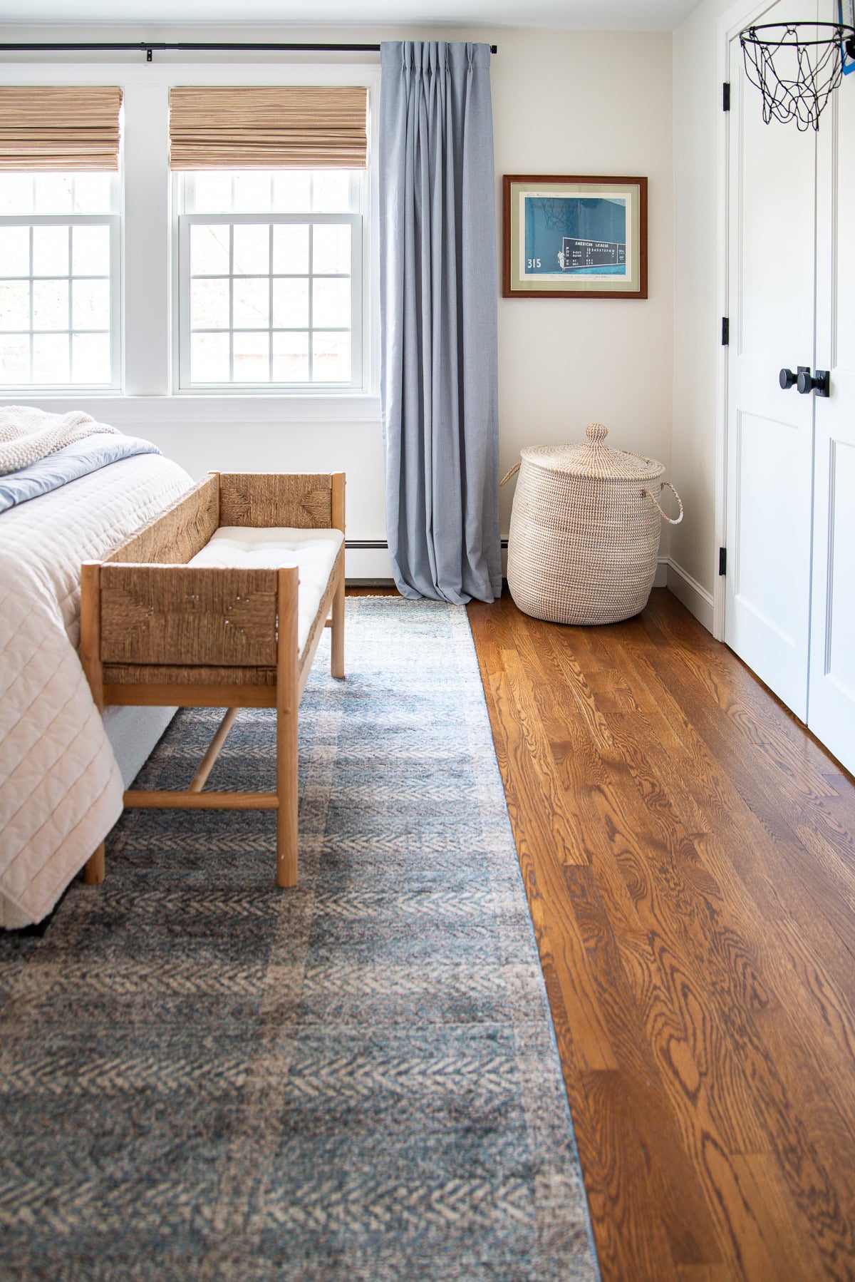
When we first painted my youngest son’s nursery (now his bedroom), I used Pure White on both the walls and trim. At first, I loved the fresh, bright look, but over time I realized it wasn’t quite working for me.
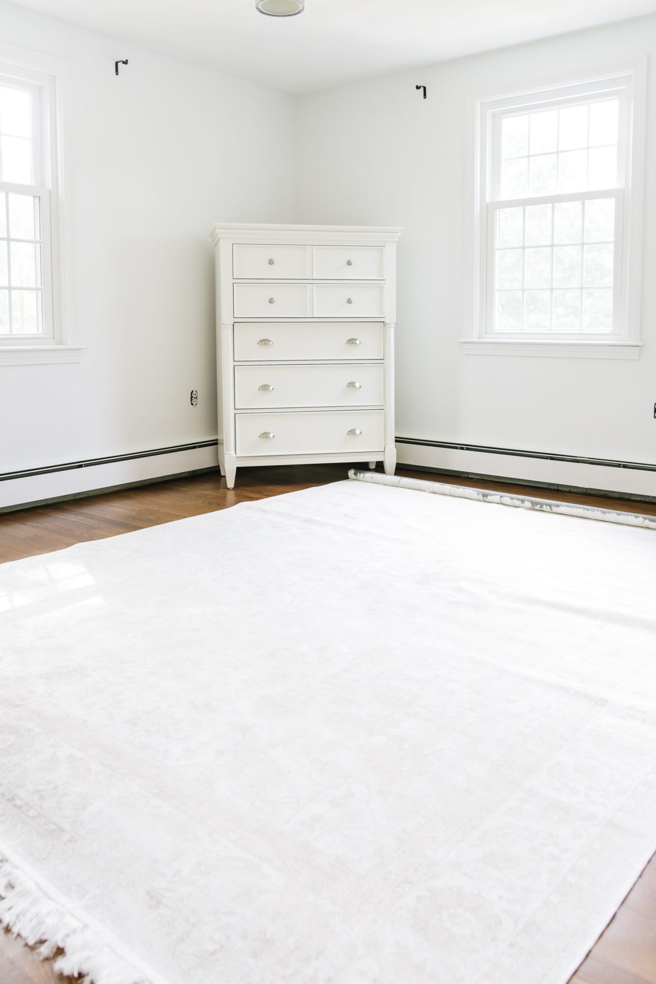
The room has southeast-facing windows, so it’s flooded with beautiful natural light until early afternoon. During those hours, the walls look crisp, bright and exactly what you’d hope for from a white paint color.
Later in the day, though, once that natural light disappears, the subtle gray undertone becomes much more noticeable. Like most true white walls, Pure White starts reflecting the colors around it, and I found the room could feel a little flat and dull.
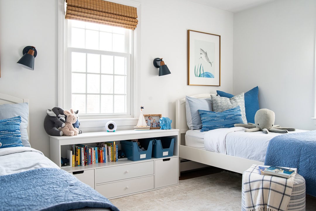
Eventually, I painted all of the trim Benjamin Moore Van Deusen Blue, and that extra contrast completely transformed the room. The Pure White walls suddenly felt intentional instead of blending into everything else.
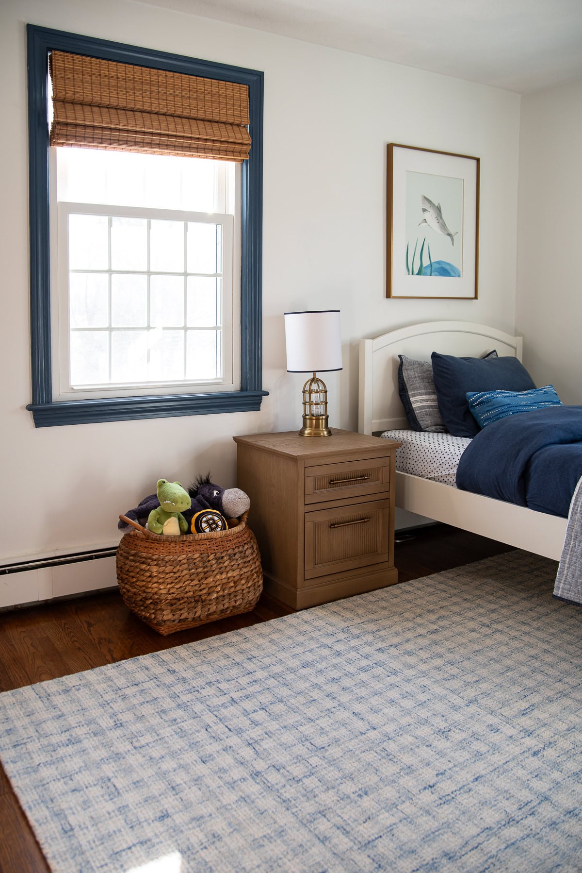
That experience is one of the reasons I generally prefer Pure White on trim, millwork and ceilings rather than throughout an entire room. If I’m choosing a white for walls, I almost always reach for something a touch softer, like White Dove.
How It Changes Throughout the Day
One of my favorite examples of Pure White’s undertones came from our powder room.
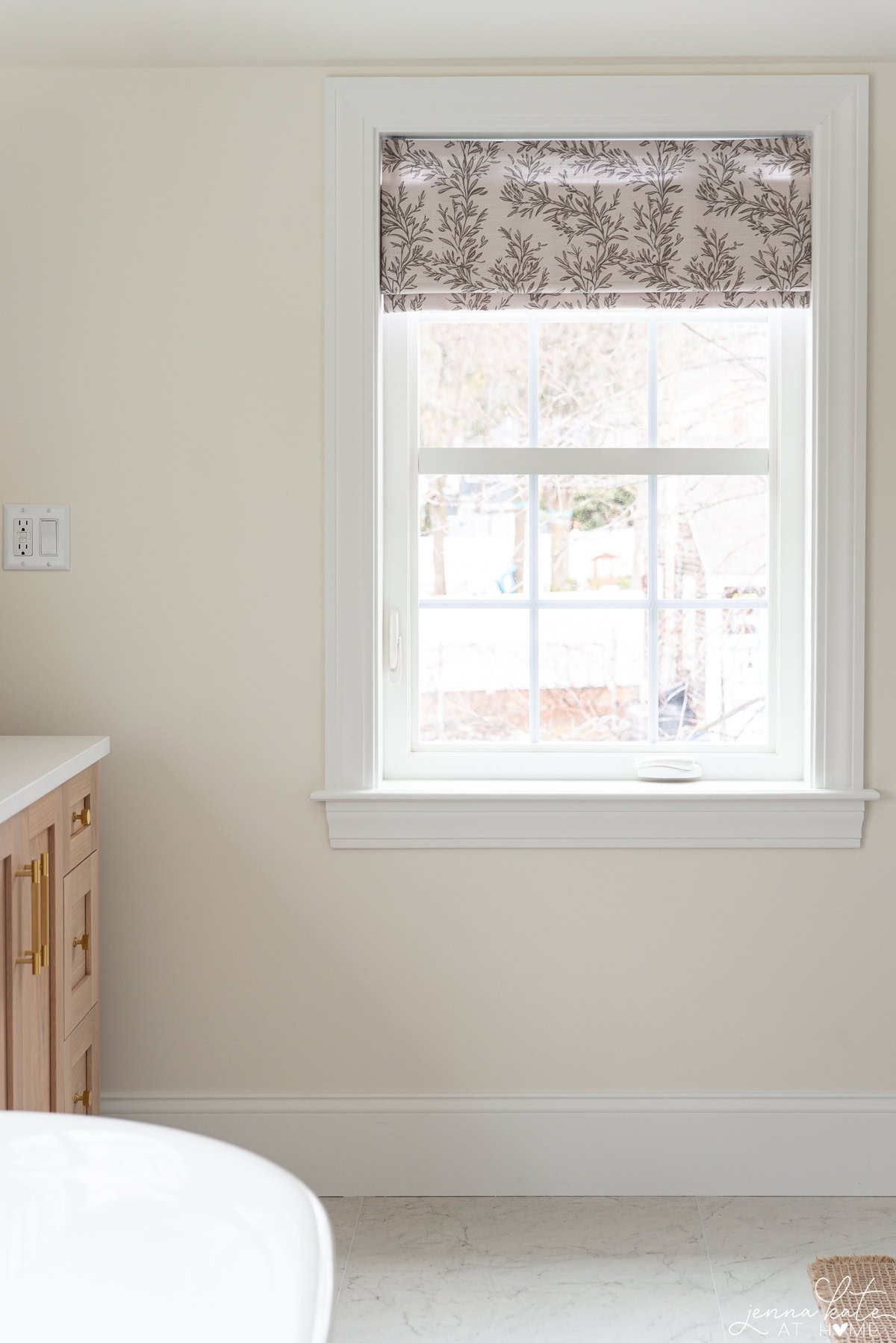
When the room still had a west-facing window, I could watch the walls change dramatically throughout the day. In the morning, when there wasn’t much natural light, Pure White looked noticeably softer and the gray undertone became more apparent. By late afternoon, warm sunlight poured into the room and completely transformed it, bringing out its warmth and making it look much brighter.
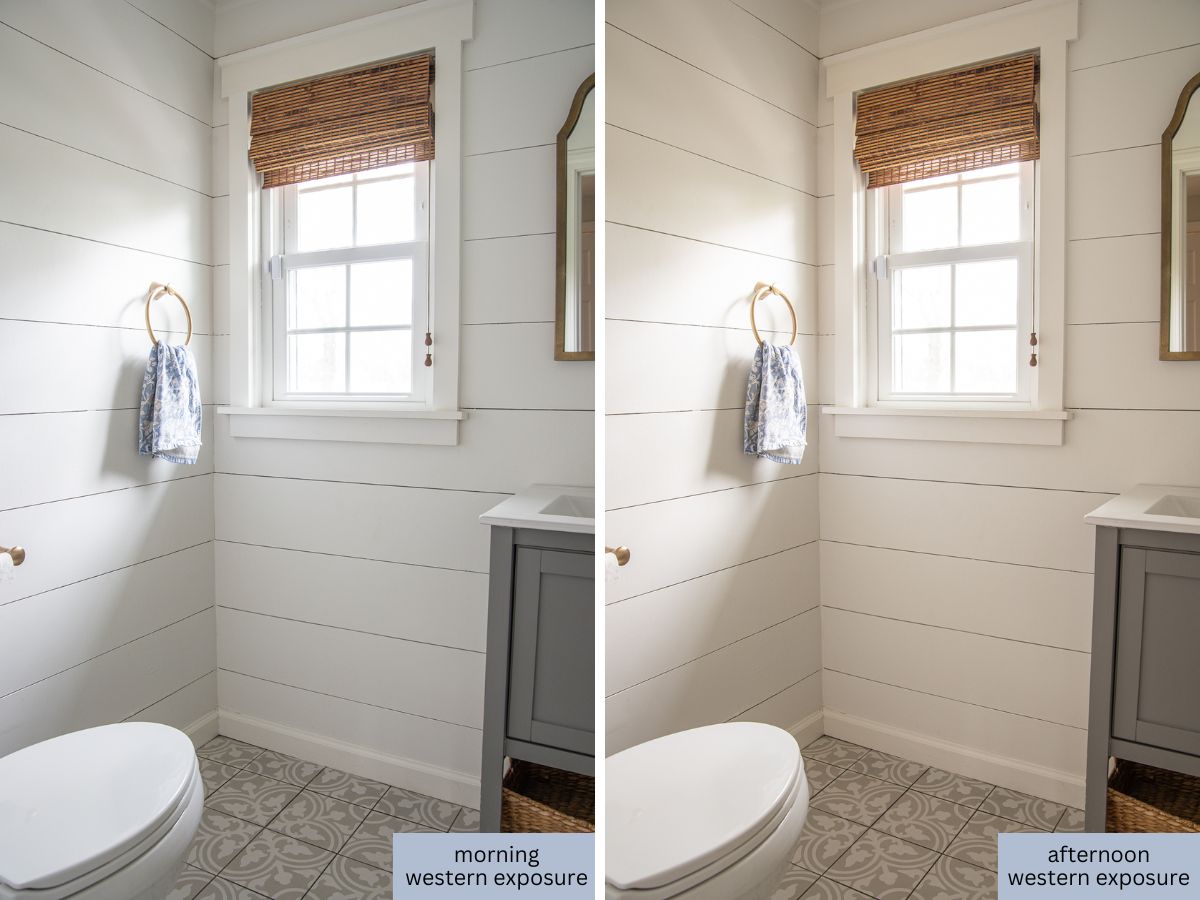
We removed that window when we built our family room addition, so now the room is lit almost entirely by artificial light. Interestingly, Pure White still looks soft and warm – it never feels harsh or clinical, even without natural sunlight.
Pure White Outside
We also used Pure White on our deck before we built our addition, pairing it with our bright white siding.
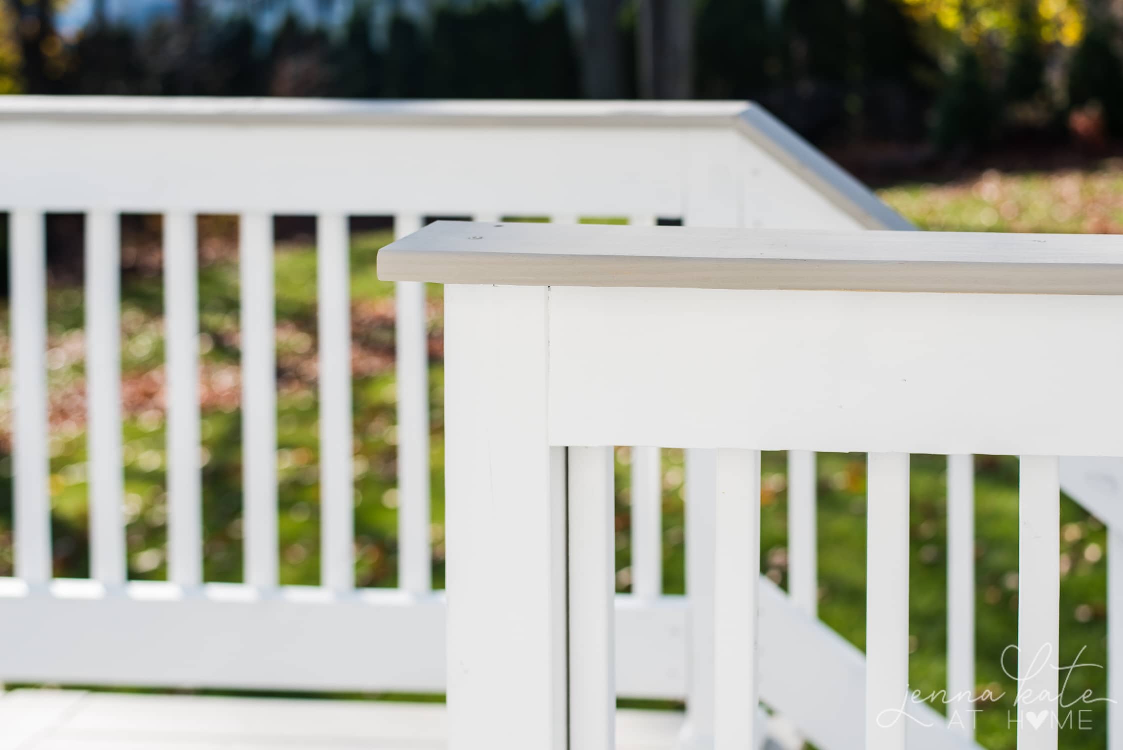
It blended beautifully and reinforced something I’d already noticed inside the house: Pure White has enough warmth to soften a space, but it still reads as a clean white. If I were choosing a white for exterior trim or architectural details today, I’d happily use it again.
Color Comparisons
Pure White vs. Extra White
Now, let’s compare Pure White to other popular Sherwin Williams white shades.
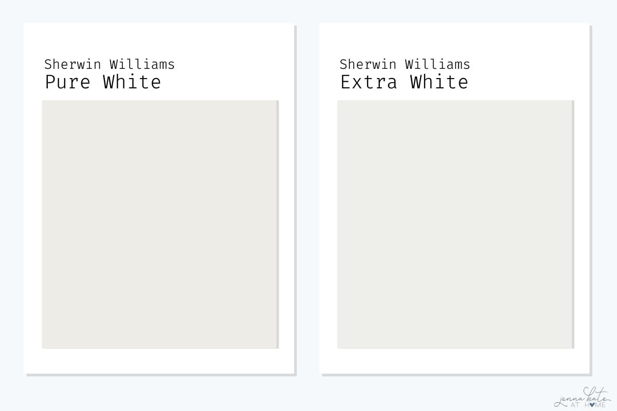
This is probably the comparison I get asked about most.
For years, our trim was Sherwin Williams Extra White, and while I still think it’s a beautiful crisp white, I eventually found myself wanting something a little softer.
Pure White has just enough warmth to take away that slightly stark look, but it still reads as white in almost every lighting condition.
If your style leans modern and you love crisp contrast, Extra White is a great choice. If you want one white that works with just about everything, I’d choose Pure White every time.
Pure White vs Alabaster
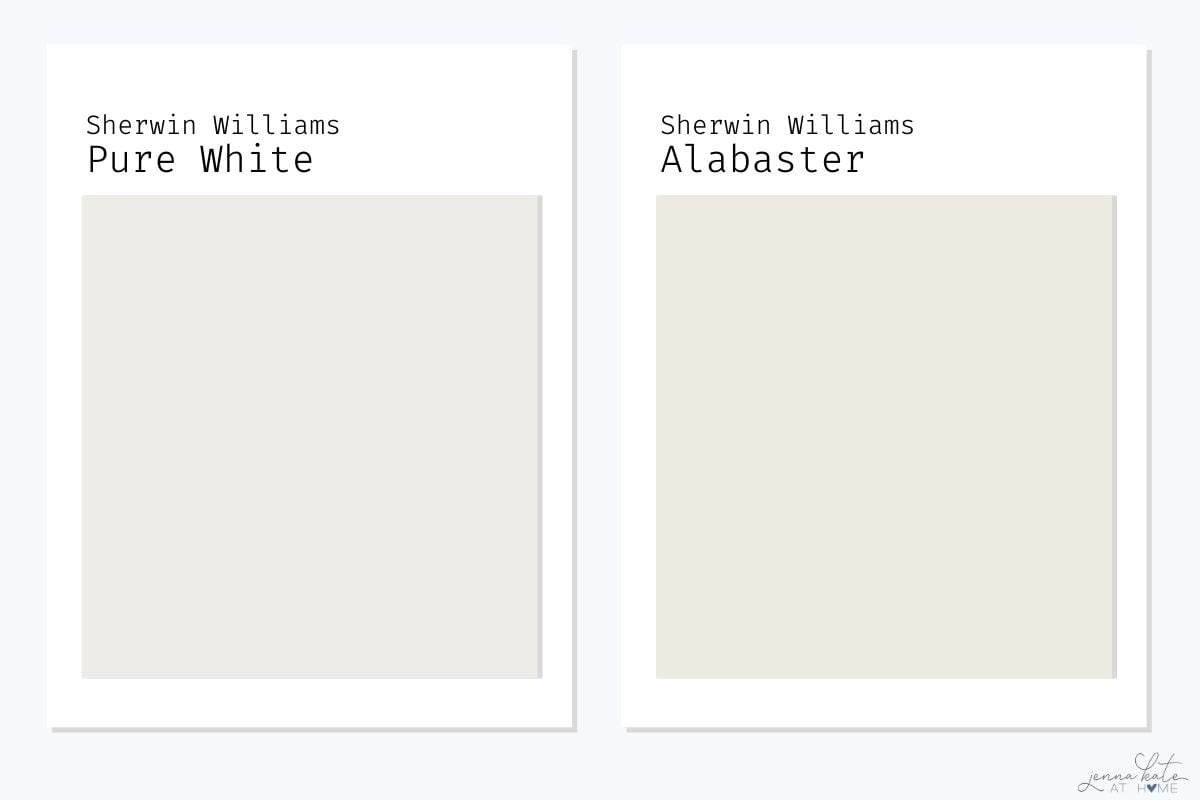
Pure White and Alabaster are two of Sherwin Williams’ most popular white paint colors, but they create very different looks.
Pure White is brighter and cleaner, with just enough warmth to keep it from feeling stark. Alabaster, on the other hand, is noticeably warmer and creamier, giving it a softer, more relaxed feel that borders on off-white.
I love Alabaster for walls, especially if you’re after a cozy, welcoming space. But when it comes to trim, doors or cabinetry, I almost always prefer Pure White. It gives you that classic white look without feeling cold, and I find it pairs more easily with a wide variety of wall colors.
If you’re choosing one white for your entire home, I’d sample Pure White first. If you want a softer, warmer white that becomes part of the room rather than quietly framing it, Alabaster is a beautiful alternative.
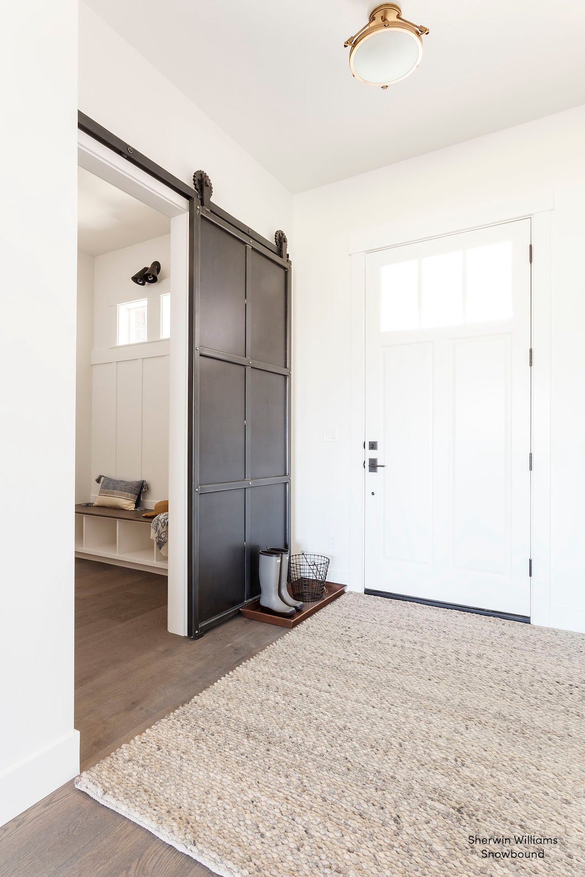
Pure White vs Snowbound
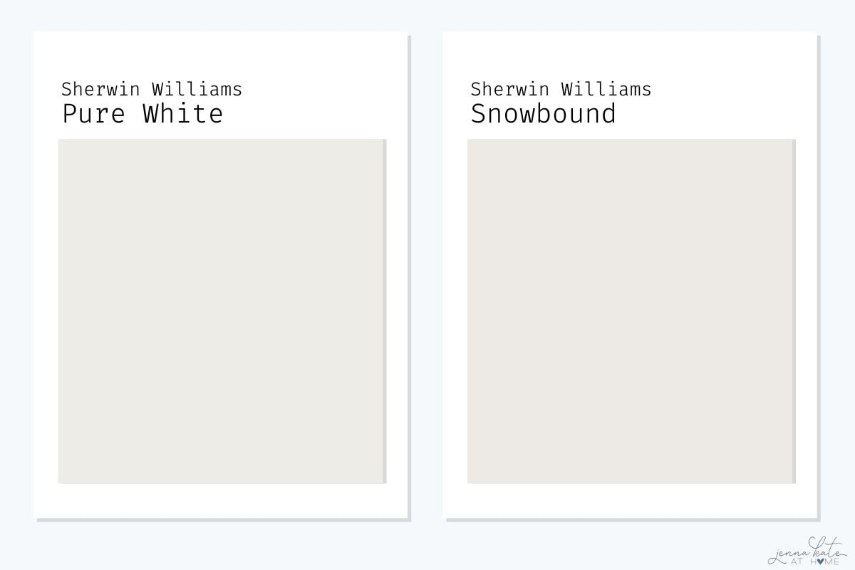
Although they’re very similar in brightness, Pure White and Snowbound have noticeably different undertones.
Pure White is a soft white with the slightest hint of warmth, while Snowbound has a taupe undertone that can sometimes look pink or slightly creamy depending on the lighting. Because of that, Snowbound tends to feel more like an off-white than a true white.
If you’re painting walls and want a softer, warmer backdrop, Snowbound can be a beautiful choice. But for trim, millwork and doors, I find Pure White much easier to work with. It stays cleaner and more consistent throughout the day, which is exactly why we’ve gradually repainted all of the trim in our own home with it.
If I were choosing between the two today, Pure White would be my pick for almost every trim project. Snowbound is one I’d reserve for walls where its warmth can really shine.
Pure White vs High Reflective White
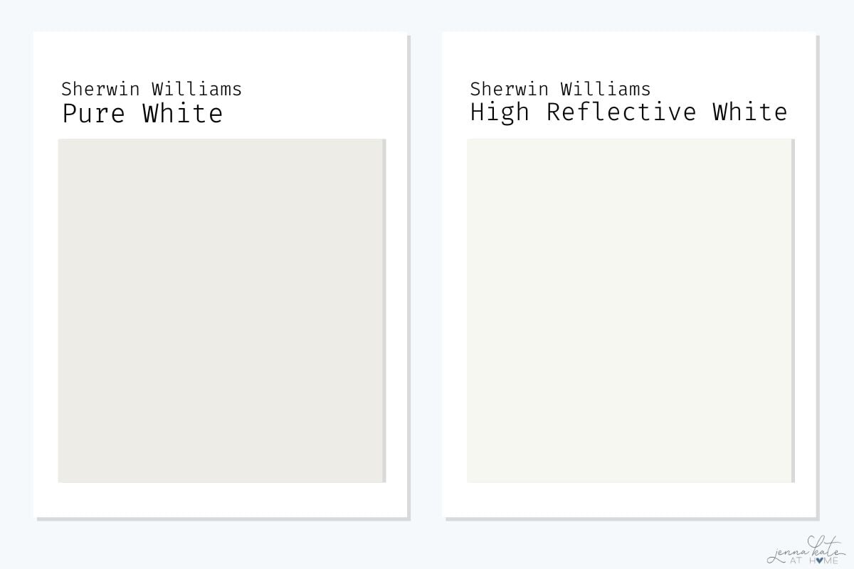
These two whites couldn’t be more different.
High Reflective White is Sherwin Williams’ brightest white, with virtually no visible undertones. If you’re after a crisp, gallery-style white that feels modern and ultra-clean, it’s hard to beat.
Pure White, on the other hand, has just enough warmth and softness to make it feel more comfortable to live with every day. That subtle warmth is exactly why I’ve chosen it throughout our own home—it works beautifully with both warm and cool paint colors without ever feeling sterile.
Unless you’re intentionally after an ultra-modern, high-contrast look, I’d almost always recommend sampling Pure White first. It still reads as white, but it’s much more forgiving in different lighting conditions and easier to decorate with over time.
Don’t Forget…
Don’t forget – no matter what you’ve read or photos you’ve seen online, it’s really important to sample paint colors in your home before committing!
Samplize provides real paint samples that are easy to move around your home, and cheaper than buying a gazillion paint pots! It’s the only way I buy paint samples.
My Favorite Paint Colors to Pair with Pure White
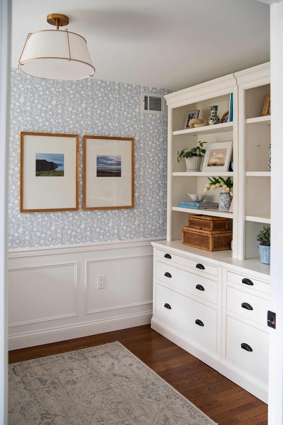
One of the reasons I’ve continued using Pure White throughout our home is because it pairs beautifully with almost every color palette. Whether your home leans warm or cool, it’s one of those rare whites that never feels out of place.
These are the paint colors I reach for most often alongside Pure White:
- SW Drift of Mist
- BM White Dove
- SW Repose Gray
- SW Sea Salt
- SW Shoji White
- SW Greek Villa
- SW Alabaster
- BM Seapearl
When Not to Use Pure White
As much as I love Pure White, I don’t think it’s the perfect white for every situation.
If you’re looking for a white wall color
This is probably my biggest caveat. While I absolutely love Pure White on trim, doors and millwork, I rarely use it on walls anymore. Like many true whites, it reflects the changing light throughout the day and can sometimes feel a little flat or gray once the sunshine disappears.
If I’m choosing a white for walls, I almost always reach for something a little softer like Benjamin Moore White Dove.
If you want an ultra-bright modern white
If your goal is a crisp, gallery-style white with almost no warmth, Pure White may feel a little too soft. In that case, I’d sample Sherwin Williams High Reflective White or even Extra White instead.
Would I Still Choose Pure White Today?
Absolutely.
Of all the paint colors I’ve used over the years, this is probably the one I’d be least likely to change. We’ve repainted almost every piece of trim in our home Pure White because it simply works.
If I were building another house tomorrow, Pure White would still be my trim color.
More White Paint Colors
Still on the hunt for the perfect shade of white? Then these might do the trick!
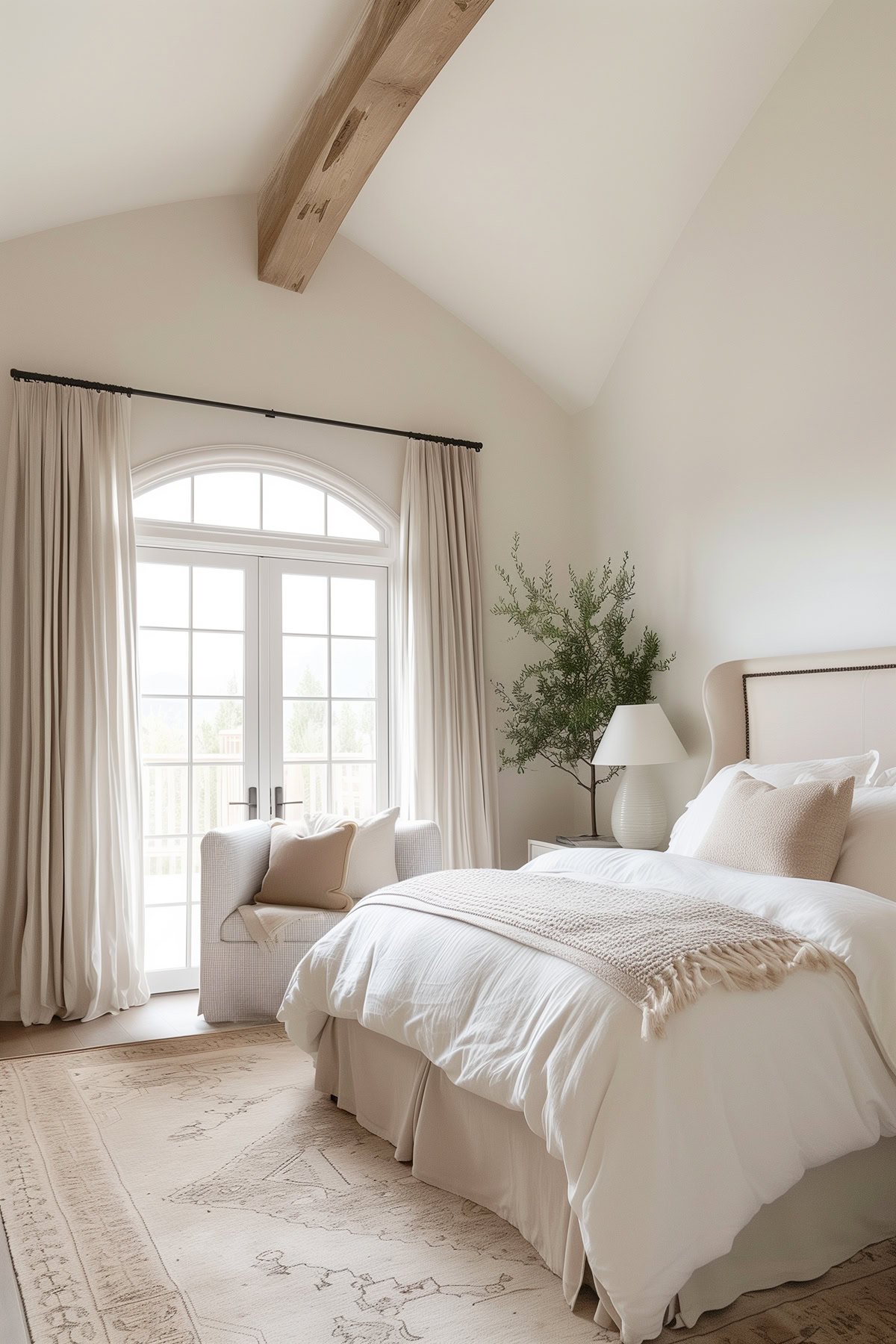
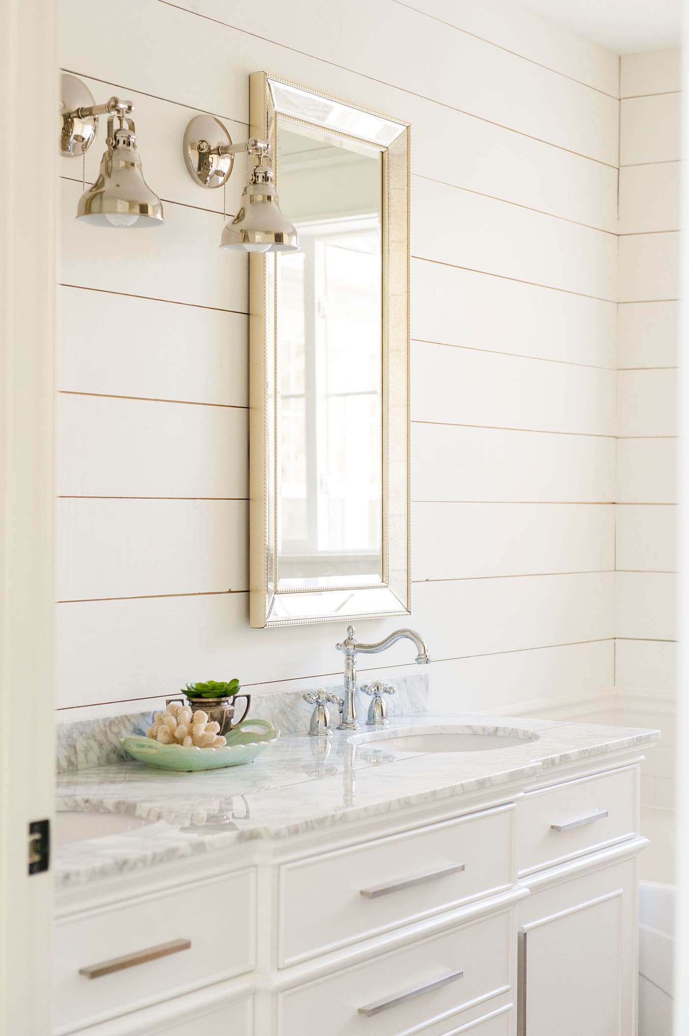
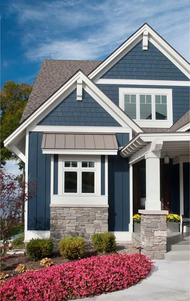
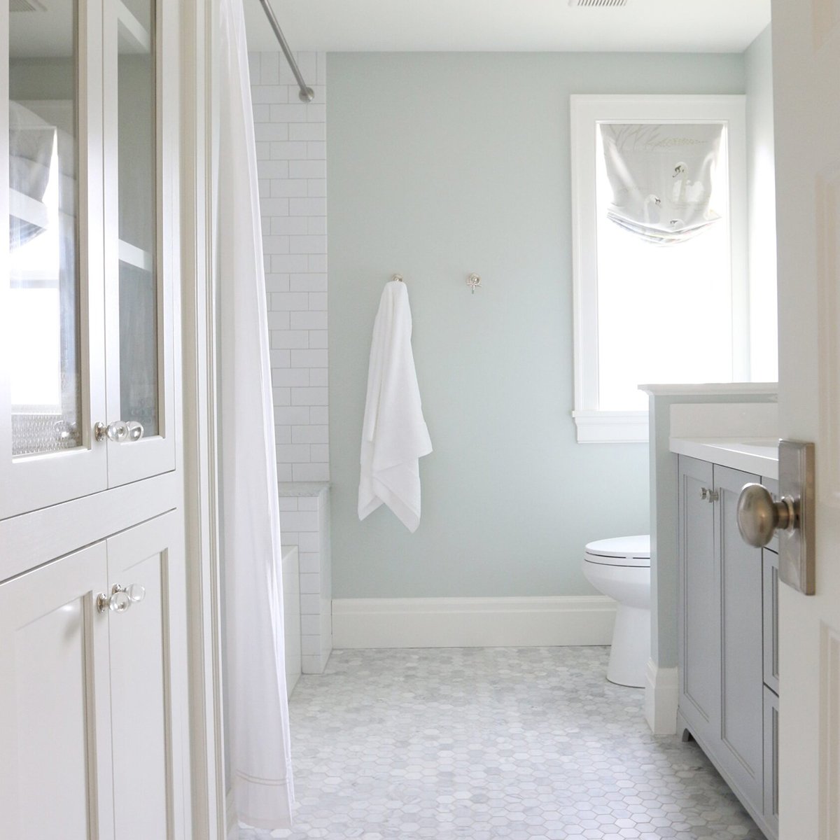
I’ve read a few times that some houses don’t look good with white walls. What circumstances would cause that to be the case? I’m planning on painting most of my house white, but reading that makes me a little nervous.
I think the houses that don’t look good with white walls are the ones that feel cold and sterile. It’s really important that first you choose the right white, and second that you warm up the space with lots of warm wood tones, soft furnishings and some color (even if it’s just throw pillows).
what color is the wall
SW Pure White
I’ve browsed through soo many white paint color articles !! These walls almost look gray to me.. is the room north facing?
East and south! They look slightly gray because the white in the wallpaper is much whiter PLUS the walls are painted in a matte finish which doesn’t reflect light. Eggshell looks much brighter white.
This article gave me so much peace. We painted our kitchen cabinets Pure White a year ago and they are beautiful. We are taking the leap and using Pure White on all the main floor walls and trim. This article gave me reassurance that it will be a good choice! Thank you!
Is the wall and trim the same color?
Yes. Just different sheens.
Looks fantastic. What color and sheen did you use for the ceiling?
Ceiling is always flat ceiling paint in just the standard off-the-shelf color. I never bother with tinting.