Content may contain affiliate links. When you shop the links, I receive a small commission at no cost to you. Thank you for supporting my small business.
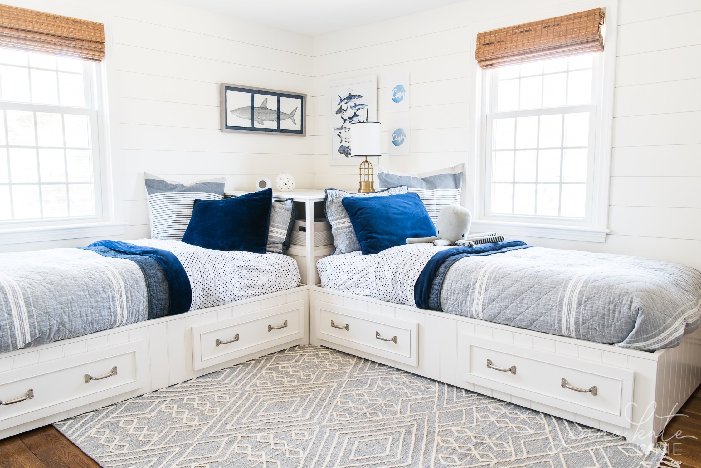
If you’re looking for a cool white paint color that feels clean but not stark, Benjamin Moore Decorator’s White (OC-149) might be on your radar. With subtle gray and violet undertones, it’s a designer favorite for trim, cabinetry, and crisp modern spaces.
But is it right for your home? In this post, I’ll break down exactly how Decorator’s White behaves in different lighting, what it pairs well with, and when you might want to skip it.
With an LRV of 84.6, it’s not the brightest white available, but it is a great option for a more subtle feel. In contrast, Sherwin Williams Extra White has an LRV of 86 and Benjamin Moore Chantilly Lace has an LRV of 92.
Decorator’s White at a Glance
- Paint Code: OC-149 / CC-20
- LRV: 84.6
- Undertones: Cool gray, slight violet/blue in certain light
- Finish Options: Interior & exterior
- Pairs Well With: Cool grays, crisp whites, navy, blue-greens
- Best For: Trim, cabinetry, modern spaces, coastal homes
When Should You Avoid Decorator’s White?
- You want a creamy or warm backdrop
- You’re pairing it with yellow-toned trim or woodwork
- Your home has lots of green reflection (landscaping right outside the window!)
- You’re relying on a lot of incandescent lighting
Is Benjamin Moore Decorator’s White Warm or Cool?
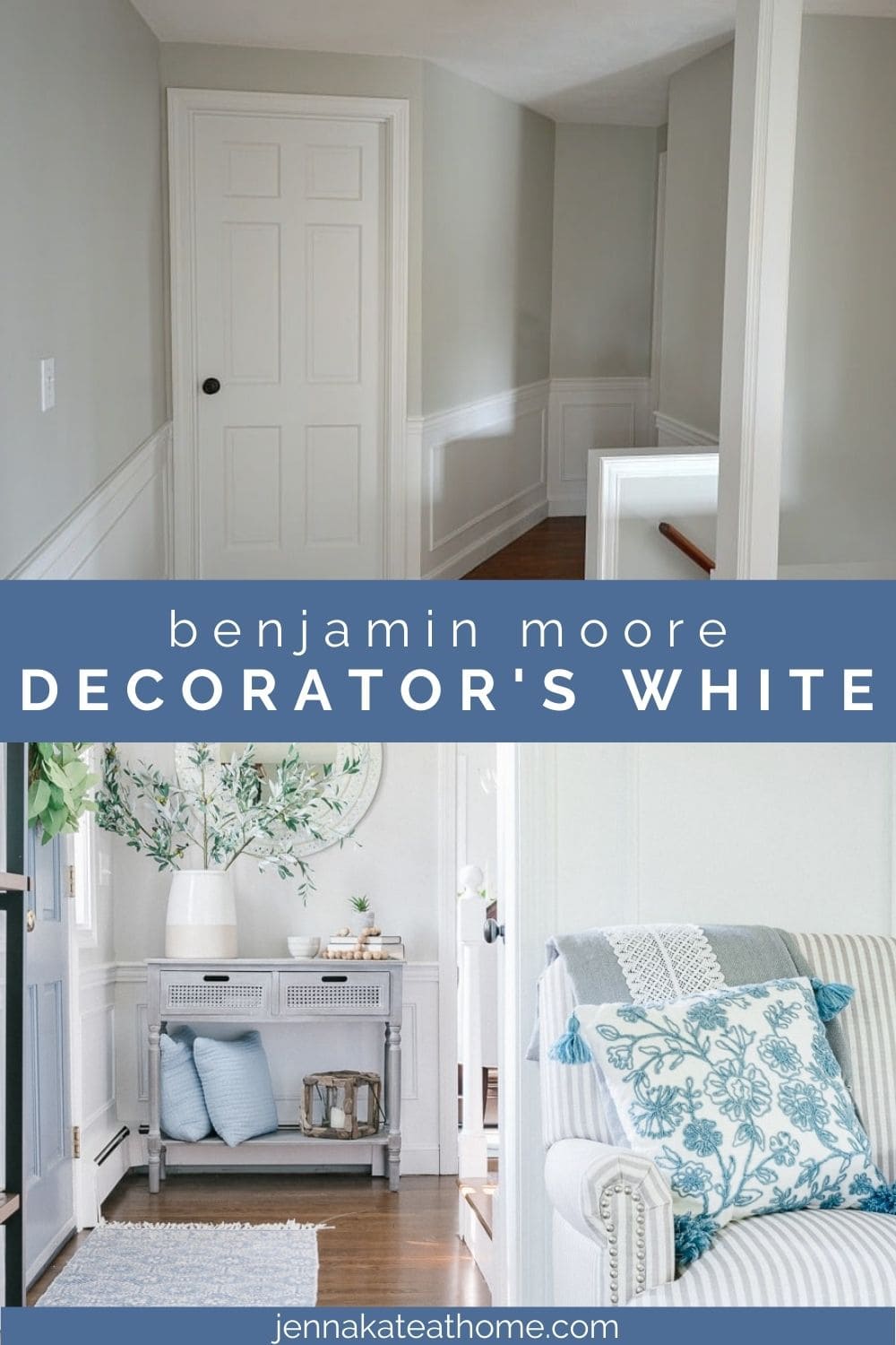
Decorator’s White is definitely a COOL toned paint color since it has a slightly gray undertone, but if you’re using it on trim and doors, it will just appear as a bright white.
It’s only when you do a side-by-side comparison to an even brighter white (Chantilly Lace for example), the cool undertones will become more evident and it will look a little dingy.
Is Decorator’s White Too White?
No! This is exactly the reason why I originally chose Decorator’s White for all the trim, doors and wainscoting in my house.
Benjamin Moore Decorator’s White is a soft white paint color that leans cool because of its slight gray undertone. This undertone stops it from being overly bright and white and adds the perfect amount of softness.
Related: The Best Cool White Paint Colors.
How Does Light Affect Decorator’s White?
How much light your room gets is very important when it comes to cooler colors and this one is no different! If your home has an abundance of really bright light (the vast majority of homes do not fall into this category) than you may want to consider a slightly warmer white, like Benjamin Moore Simply White or their popular White Dove.
North-facing rooms may bring out more of the blue undertones. On the contrary, south facing rooms may appear softer but not quite hit a creamy status.
jenna’s tip
If you’ve ever painted a “cool” white and it turned lavender in your room, chances are your lighting and surrounding colors amplified hidden undertones. Decorator’s White is especially sensitive to this.
If your room is east facing with warm morning light and cool afternoons, you may experience a bit of the undertones shining through until midday in which the appearance shifts to a much softer white until sunset.
Western exposure may be reversed with a soft white until midday in which the afternoon presents the blue, green, or purple undertone. Again, this will depend on how your windows are laid out and how much sun your room receives.
Related: How to Spot Undertones in Paint Colors.
Where Can I Use Decorator’s White?
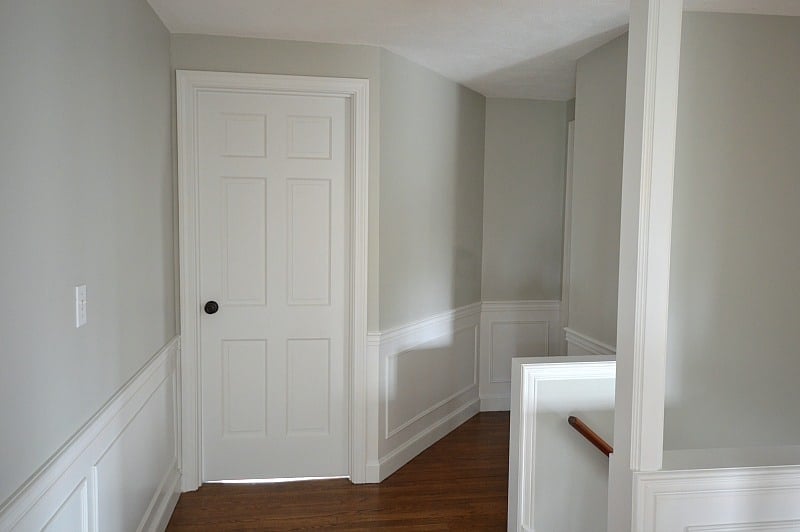
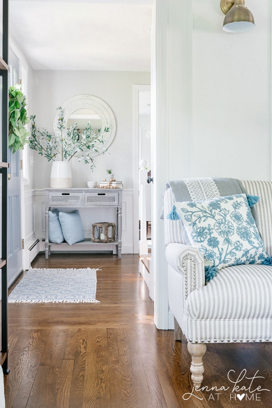
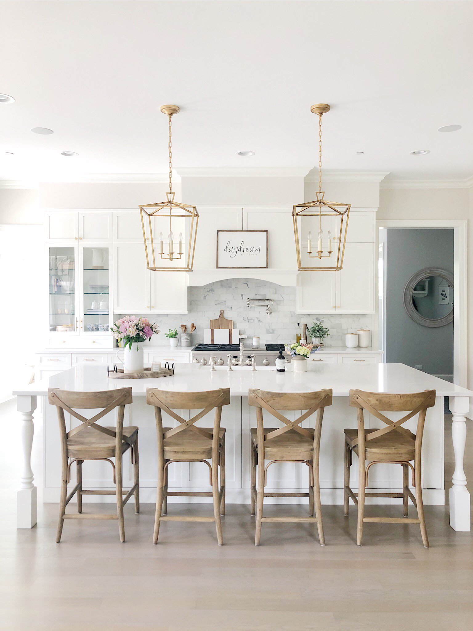
I’ve read other blog posts that suggest that Decorator’s White is not a good entire house choice for trim. I have to say that I disagree. Having had it in our entire home for the first 3 years, I’ve had beautiful results that worked in the cooler light on the east and west sides of our home as well as the sunnier exposures.
However, I agree that it would not be the best choice as a whole house white if you’re also planning to paint walls and cabinets this color, as the gray undertone may be limiting.
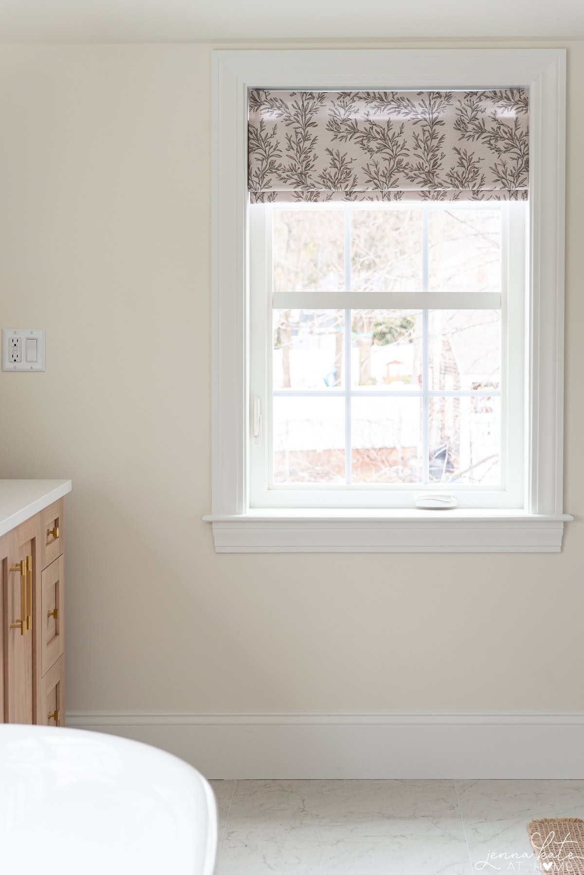
How Does Decorator’s White Look on Trim?
Decorator’s White is a nice choice for trim color and base moldings because it won’t look cold and stark, no matter what wall color or room exposure it is paired with.
However, put it against a brighter, starker white like Sherwin Williams Extra White or Benjamin Moore’s Super White and you will instantly see that slight gray undertone coming out.
In fact, next to a very bright white like that, it looks like a dirty white! Don’t worry, it doesn’t ever look dirty under normal circumstances, just when you see it side by side like that. Overall, I’ve found it a great trim color for most homes!
How does Decorator’s White Look on Both Walls and Trim?
If you’re going for bright white walls and need a trim to coordinate, I’ll let you in on a designer secret – use the same paint color but use matte or slight sheen of eggshell on the walls and satin or semi-gloss for the trim details.
Because of the difference in sheen, it won’t look like the same color but you won’t have to worry about weird undertones! And if you’re painting the ceilings, use a flat paint which will complete your all over white look and help hide imperfections.
Is Benjamin Moore Decorator’s White Good for Kitchen Cabinets?
Again, I’ve had good experiences with this color and think it would be a great choice for both kitchen and bathroom cabinets for a clean, fresh look, AS LONG as you don’t try to introduce warm colors into the mix.
You’ll want to paint your walls, and ceiling and trim the same color for consistency, and stick with a cool-toned color palette.
How is it on the Exterior of a Home?
This cool white paint color makes a great exterior color for your trim or siding, especially if you are pairing it with other similar undertones. A light grey house would look absolutely spectacular with Benjamin Moore Decorator’s White as the accent on the trim and siding.
Just remember, if your windows or other trim pieces are pure white you’ll see a slight shift between the different whites. Depending on the look you are going for, this might not be your favorite combination. Otherwise, paint away!
What Paint Colors Coordinate Well With Decorators White?
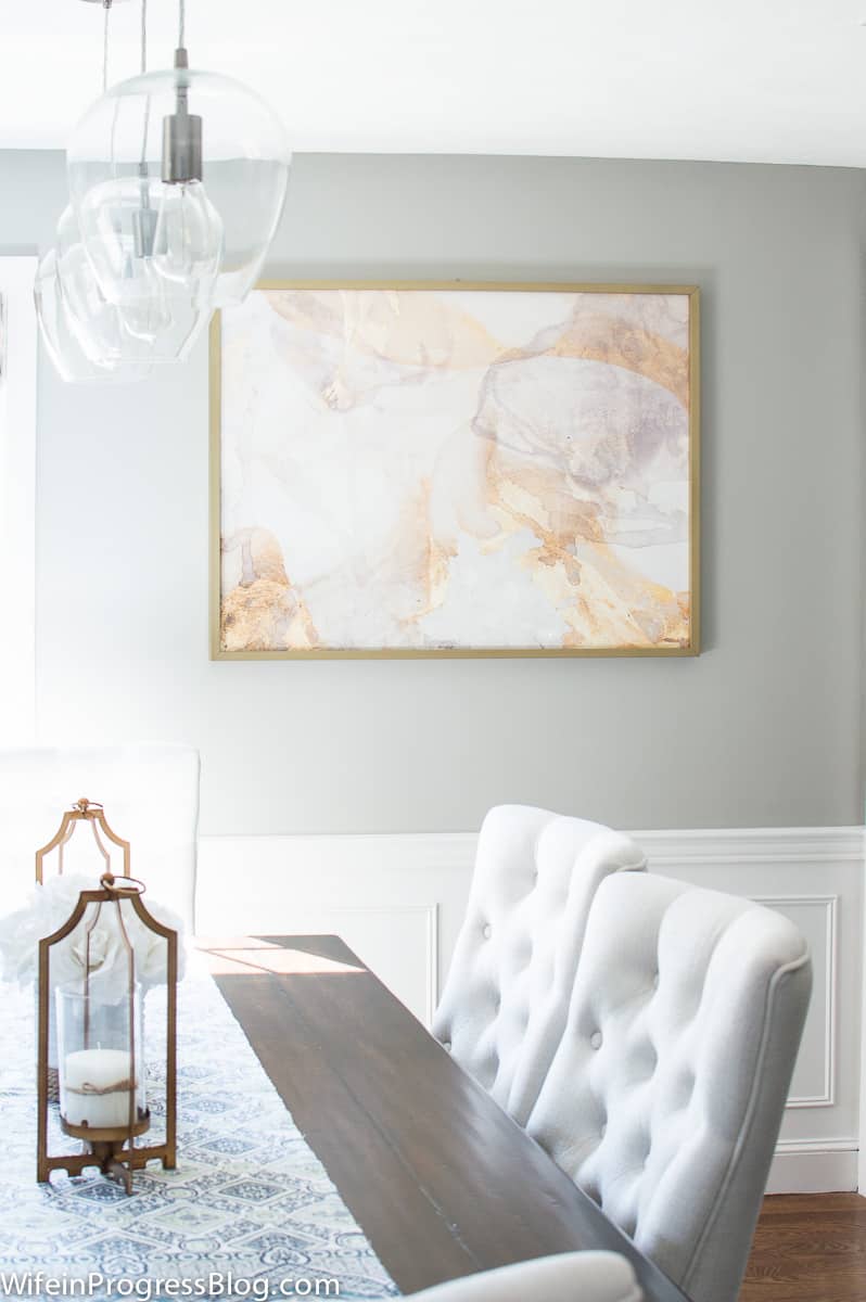
Decorator’s White looks great paired against shades of gray, greige as well as blue undertoned colors. These all pull out the natural undertones and elements of the paint color.
Some complimentary colors that look great paired with Decorator’s White include SW Repose Gray, SW Mindful Gray, BM Stonington Gray, Behr Light French Gray and SW Naval. I would steer clear of pairing it with any brighter whites, unless you want to make it look dingy.
Quick Comparison: Decorator’s White vs Similar White Paints
| Color Name | Code | LRV | Undertone | Feel |
|---|
| Decorator’s White | OC-149 / CC-20 | 84.6 | Cool gray, slight violet | Soft, crisp, cool |
| Chantilly Lace | OC-65 | 92 | Neutral, slightly blue | Brightest white |
| White Dove | OC-17 | 83.16 | Warm gray | Cozy, creamy |
| Simply White | OC-117 | 89.52 | Yellow/creamy | Very bright, warm |
| Cloud White | OC-130 | 85.05 | Warm with slight yellow | Soft and warm |
| BM White | OC-151 | 83.56 | Cool, slightly blue-gray | Clean and fresh |
| SW Extra White | SW 7006 | 86 | Cool with hint of blue | Crisp and bright |
| SW Pure White | SW 7005 | 84 | Warm with touch of gray | Soft and balanced |
Decorator’s White vs Chantilly Lace
Chantilly Lace (OC-65) is Benjamin Moore’s brightest white with an LRV of 92. Compared to Decorator’s White, it feels more neutral and less gray. In certain lights, it can lean slightly blue or pick up reflections from the environment. If you want the cleanest, purest white possible, Chantilly Lace is a top contender.
Want to see how Chantilly Lace looks in real rooms? Check out my Chantilly Lace Paint Review.
Decorator’s White vs White Dove
White Dove (OC-17) is a warm white with soft gray undertones and an LRV of 83.16. It creates a cozy, creamy look and pairs beautifully with both warm and cool tones. In contrast, Decorator’s White is cooler and more modern but doesn’t mix as easily with warmer colors.
Decorator’s White vs Simply White
Simply White (OC-117) is significantly brighter than Decorator’s White and leans creamy due to its yellow undertones. In incandescent lighting, it can appear quite warm. While it’s popular for trim and walls, I personally find it trickier to work with as a whole-house trim because of that yellow undertone.
Decorator’s White vs Cloud White OC-130
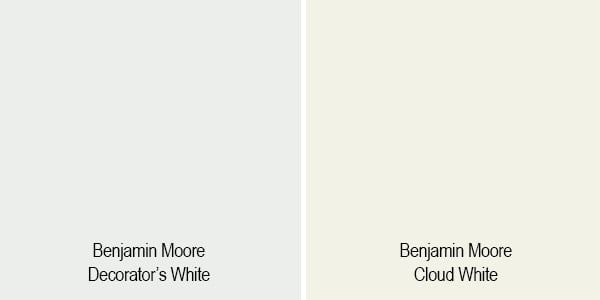
Cloud White (OC-130) is a warm white with a subtle yellow undertone and an LRV of 85.05. It creates a cozy and soft backdrop, especially in north-facing rooms. Compared to the crisp coolness of Decorator’s White, Cloud White feels more traditional and inviting.
Decorator’s White vs BM White
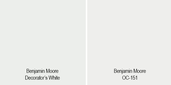
BM White (OC-151) has an LRV of 83.56 and a cooler blue-gray base, making it somewhat similar to Decorator’s White. However, it’s less violet and typically feels more neutral overall.
Decorator’s White vs Sherwin Williams Extra White
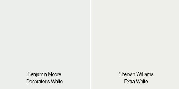
Extra White (SW 7006) is slightly brighter than Decorator’s White and leans cooler with a faint blue undertone. If you’re looking for a very crisp trim white, this is a good choice—just be mindful that it may accentuate Decorator’s White’s grayness if used together.
Decorator’s White vs Sherwin Williams Pure White
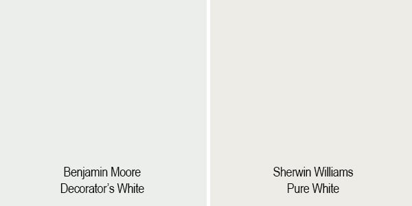
At first glance, these two whites might seem similar in depth—they have nearly identical LRVs (Decorator’s White at 84.6 and Pure White at 84). But that’s where the similarities end.
Pure White leans neutral-warm with a hint of gray to soften it, making it more forgiving and versatile alongside warm or cool colors. It rarely looks stark and plays nicely with creamy tones, soft beiges, and muted colors.
Decorator’s White, on the other hand, is distinctly cool. Its gray and subtle violet undertones make it crisp but also more finicky—especially in shadowy or north-facing spaces, where it can take on a chilly or slightly purple cast. It pairs best with other cool tones and can look off when used alongside warmer finishes.
If you’re deciding between the two, think about your overall palette:
Warmer woods, creamy whites, or earthy neutrals? Pure White may be a safer bet.
Cool grays, blues, or crisp modern tones? Go with Decorator’s White.
Don’t Forget…
Don’t forget – no matter what you’ve read or photos you’ve seen online, it’s really important to sample paint colors in your home before committing!
Samplize provides real paint samples that are easy to move around your home, and cheaper than buying a gazillion paint pots! It’s the only way I buy paint samples.
Frequently Asked Questions
Yes, it can be—especially if you’re aiming for a cool, crisp look that matches your trim or cabinetry. Just keep in mind that ceilings tend to catch shadows, so Decorator’s White may appear slightly grayer overhead. For a seamless look, use flat sheen on ceilings and the same color in satin or semi-gloss for trim.
Super White (OC-152) is cleaner and brighter than Decorator’s White, with fewer visible undertones. While Decorator’s White leans gray (and occasionally violet in certain lighting), Super White is more of a “true white,” making it ideal when you want contrast with wall colors.
It’s possible, but not ideal. Decorator’s White is a cool-toned white, and when paired with warm paint colors (like creamy beiges or yellows), the contrast can make it appear dingy or mismatched. For better harmony, stick with cool or neutral undertones in your palette.
Final Thoughts
If you are looking for a cooler white that isn’t overly bright or stark, then Benjamin Moore’s Decorator’s White is a great paint color to consider.
Whether you decide to use it on trim, doors and moldings or just as a wall color, remember that this is a color that works best alongside other similarly cool-toned colors.

Hi Jenna – I love how decorator’s white leans cool and slightly gray. I’d like a touch more contrast between walls and bright white trim (thinking Chantilly lace trim). Is there a BM color with all the same properties of DW that’s just a touch darker? The main room gets all light with windows on all walls. Thank you for such helpful info!
Hi. The Simply White looks amazing in your boy’s room! I live in an apartment with windows only on one side that all face southwest (and there aren’t a lot). My struggle is real with picking paint colors because I need things to be calming and clean. They painted everything a greige color and I feel like it is so dingy and dark in here. My goal is to open it up in here while keeping it calm and clean. I have BM Metro 1459, Simply White, Decorators White, and Chantilly. Do you have any recommendations? Please and thank you :)
With south west light you can get away with any shade of white! If you want a bright, crisp white I would go with Chantilly Lace. If you want something softer, then Simply White.
Hi, I am considering using decorators white on walls and Chantilly lace on trim. Would it be a good match? and standard ceiling white on ceilings.
Chantilly Lace will make decorator’s white look kind of gray and dingy. I would choose or the other and use it for both walls and trim. Chantilly Lace is a more flexible shade of white – so do it matte or eggshell on the walls and satin or semi-gloss on the trim.
I’m using Decorators White in Satin on my walls what trim would you recommend?
I would actually recommend using the same color on your trim, but do eggshell on your walls and satin or semi-gloss for trim.