


Content may contain affiliate links. When you shop the links, I receive a small commission at no cost to you. Thank you for supporting my small business.
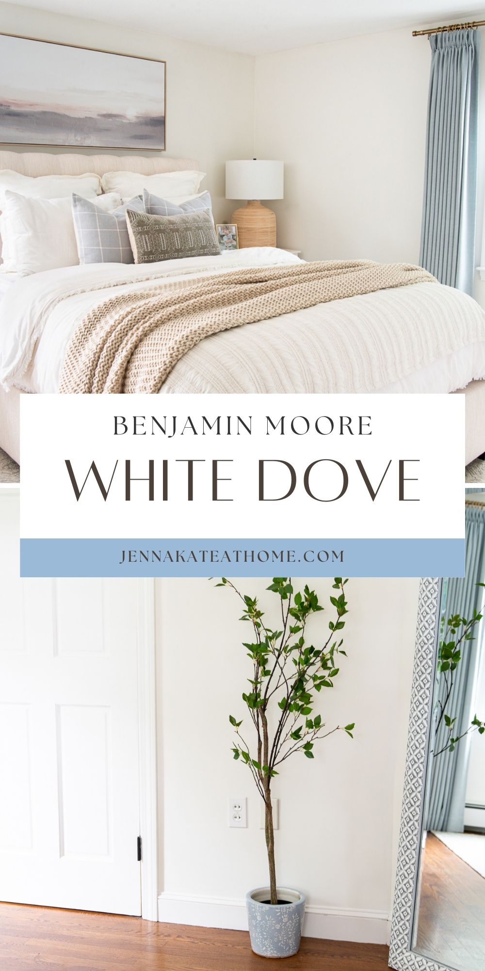
Benjamin Moore White Dove (OC-17) has been one of my favorite white paint colors for years, and unlike some paint colors I’ve gradually moved away from, this is one I’d happily choose again today.
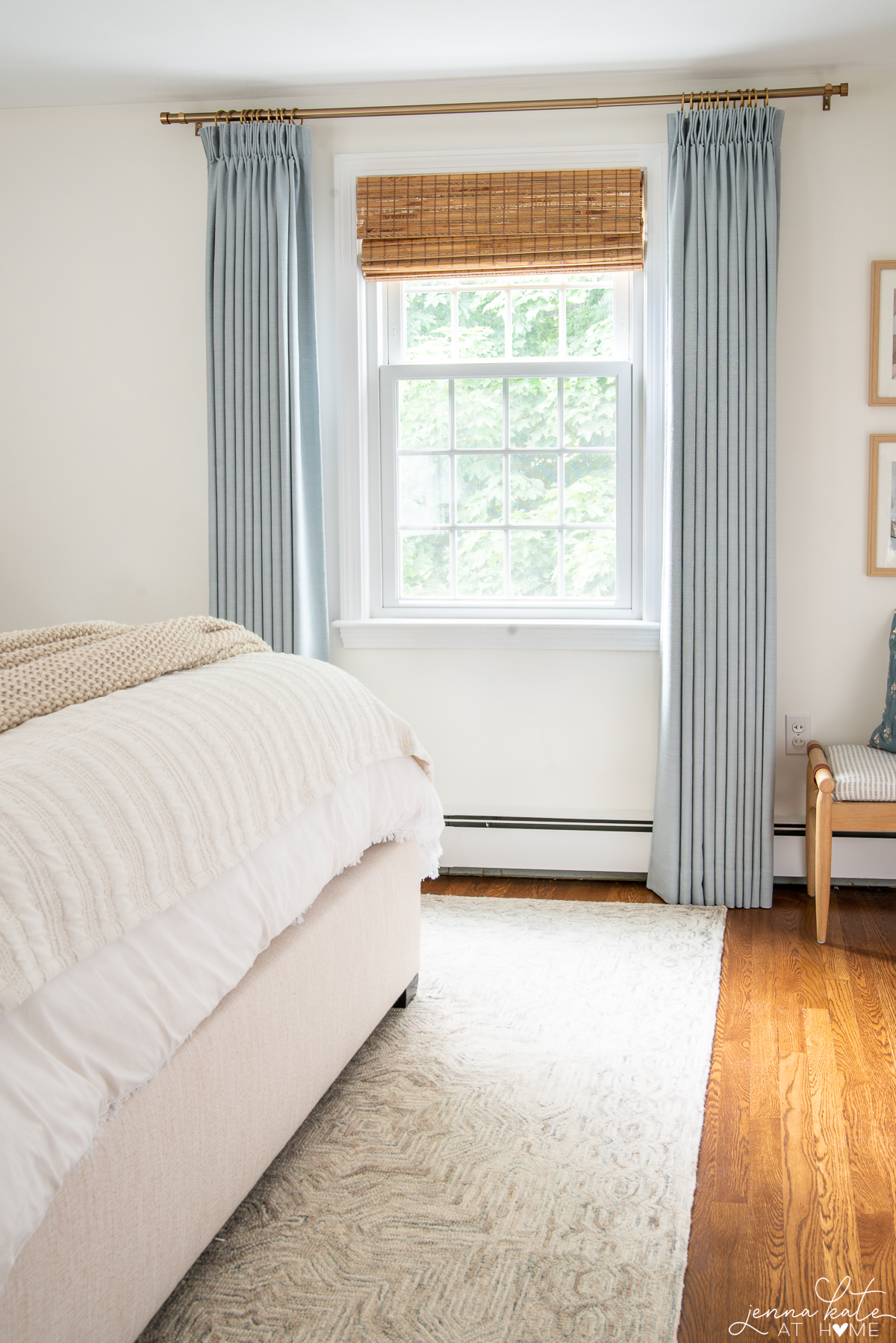
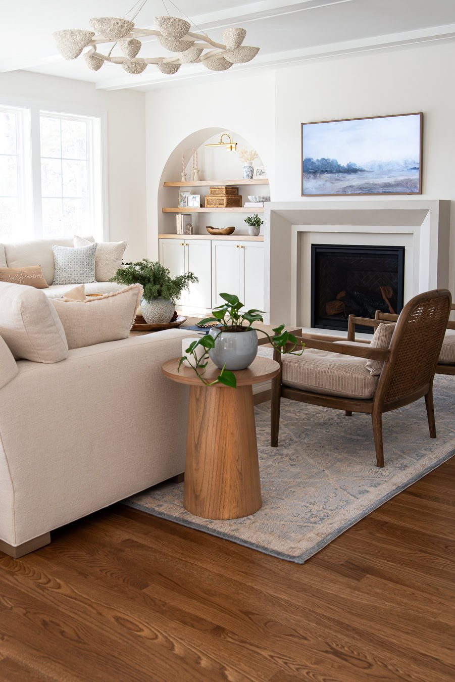
We used White Dove on the walls in our family room addition because I wanted a space that felt light and bright without looking stark or sterile. It has just enough warmth to soften a room, but a subtle gray undertone keeps it from ever feeling too creamy or yellow.
What I’ve come to appreciate most after living with White Dove is just how adaptable it is. It looks equally beautiful in two completely different rooms in our home, which isn’t something I can say about many paint colors.
If you’re wondering whether White Dove is the right white for your home, here’s everything I’ve learned after living with it for several years.
White Dove is a Great Choice if:
- You want white walls that don’t feel stark.
- You decorate with blues, crisp whites and natural wood.
- You want a timeless white that works in both traditional and modern homes.
- You’re looking for one white that works beautifully in almost any room.
What Does White Dove Look Like?
White Dove is a soft warm white that sits right on the edge between white and off-white. With an LRV of 85, it’s bright enough to feel fresh without ever looking stark. In bright rooms it often reads almost white, while in lower light it takes on a softer, creamier appearance.
Related: How to Find the Undertones of Paint Colors.
What I love most about White Dove is its balance. The warm undertones stop it from feeling cold or sterile, while a subtle gray base keeps it from becoming overly creamy or yellow. That’s also why it works so well with the blues, crisp whites and natural wood tones that I tend to decorate with throughout my home.
Don’t Forget…
Don’t forget – no matter what you’ve read or photos you’ve seen online, it’s really important to sample paint colors in your home before committing!
Samplize provides real paint samples that are easy to move around your home, and cheaper than buying a gazillion paint pots! It’s the only way I buy paint samples.
How Lighting Affects White Dove
Bright, South- and West-Facing Rooms
Our family room addition gets an incredible amount of natural light thanks to large banks of windows and a 12-foot sliding glass door. I expected White Dove to wash out and simply look white, but that’s never happened.
Instead, it keeps its soft warmth throughout the day. The room feels bright and airy, but the walls still have enough depth to feel warm and inviting rather than stark.
North-Facing Rooms
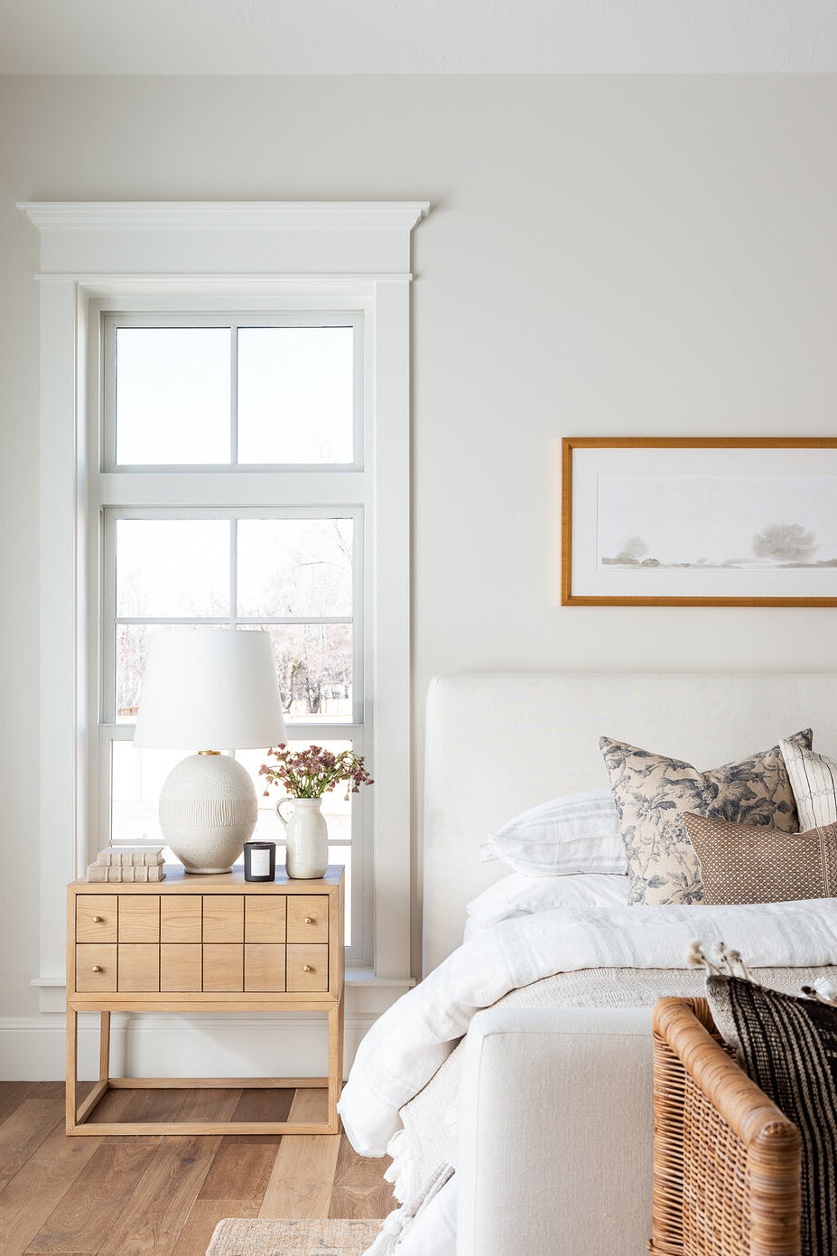
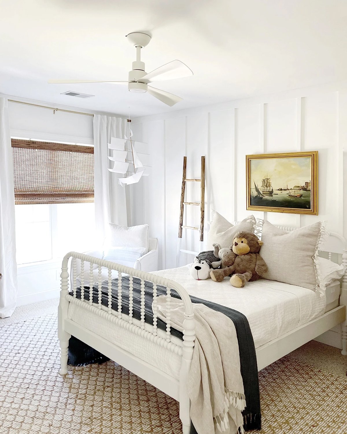
We also used White Dove in my son’s north-facing bedroom, which couldn’t be more different. The room is naturally much darker and cooler, yet White Dove works just as beautifully there.
Instead of looking dull or dingy – which some whites can in northern light – it brightens the space while adding just enough warmth to make the room feel cozy. That versatility is one of the biggest reasons it’s become one of my favorite white paint colors.
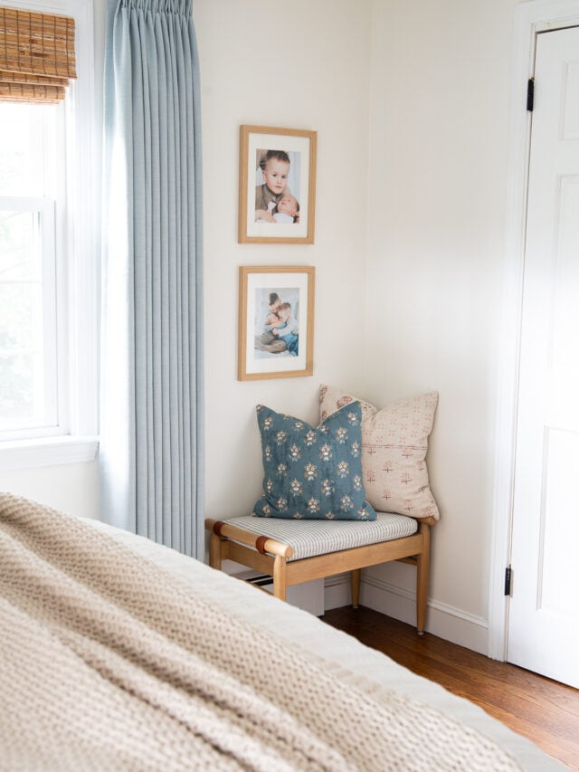
One of my favorite aspects of White Dove is that I love it just as much in one of the brightest rooms in our house as I do in one of the darkest.
White Dove in Real Homes
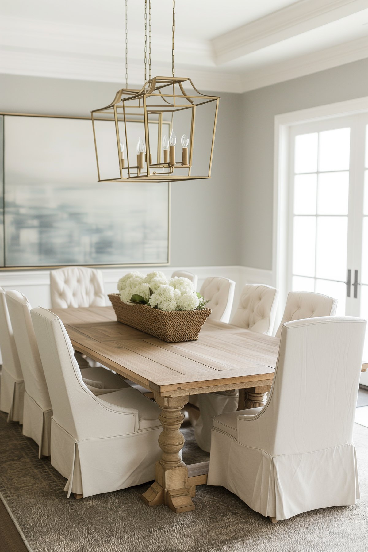
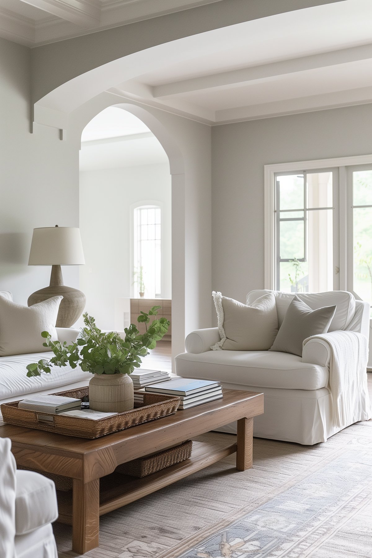
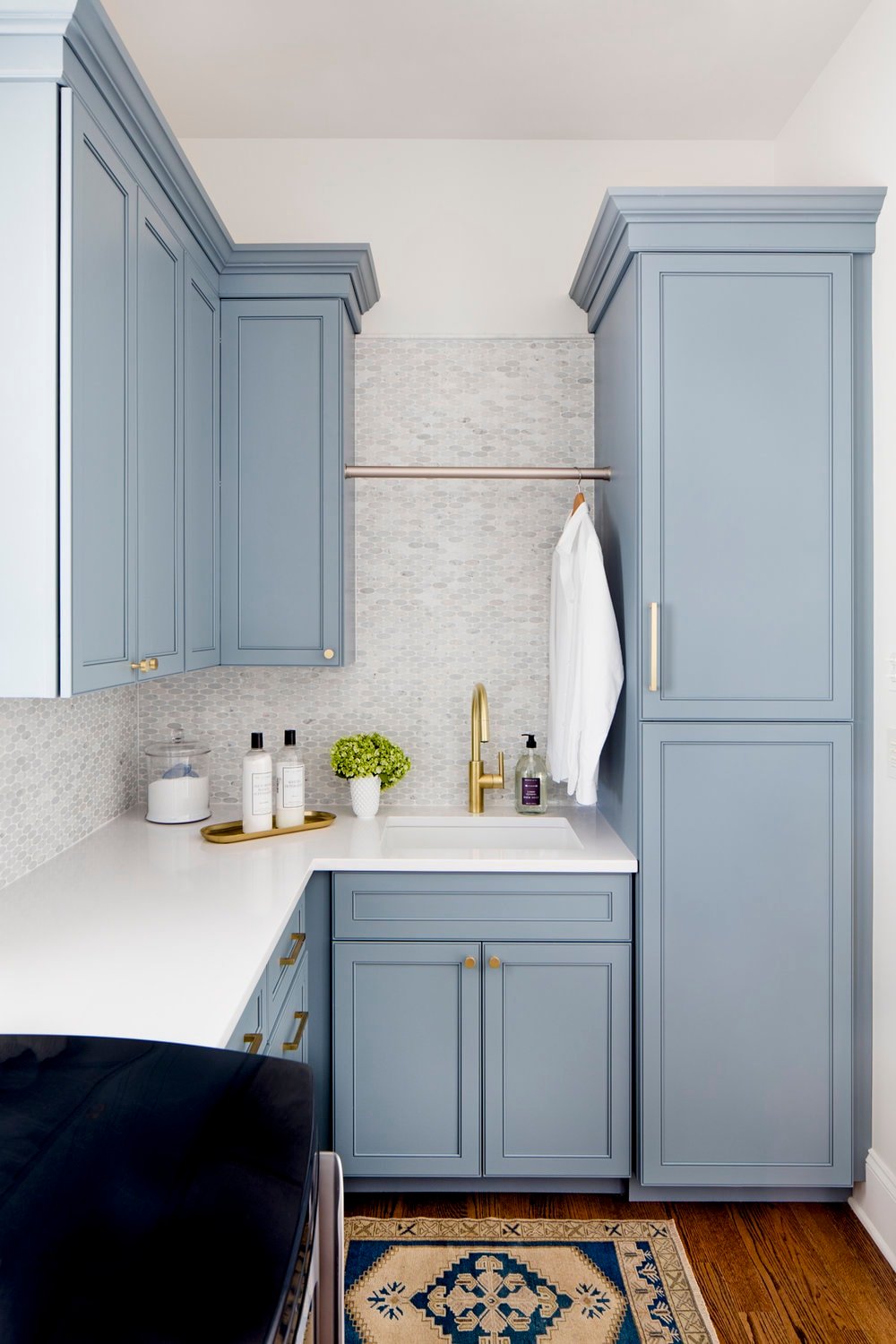
One of the things I love most about White Dove is how differently it behaves depending on the room. Here are a few real-life examples so you can see how it changes with lighting and surrounding finishes.
Kitchen Cabinets
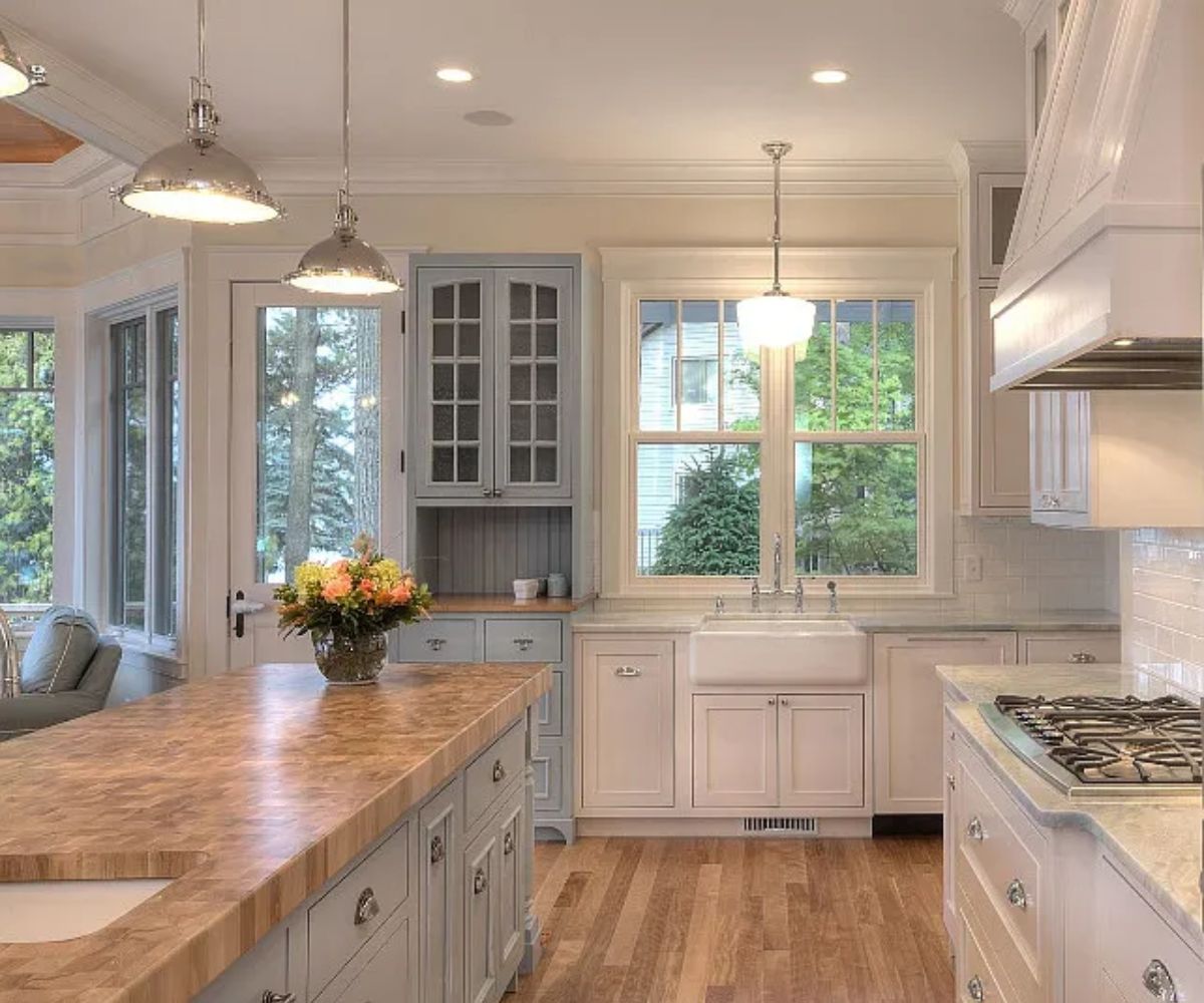
If you’re looking for a cabinet color that’s timeless rather than trendy, White Dove is hard to beat.
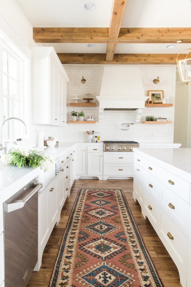
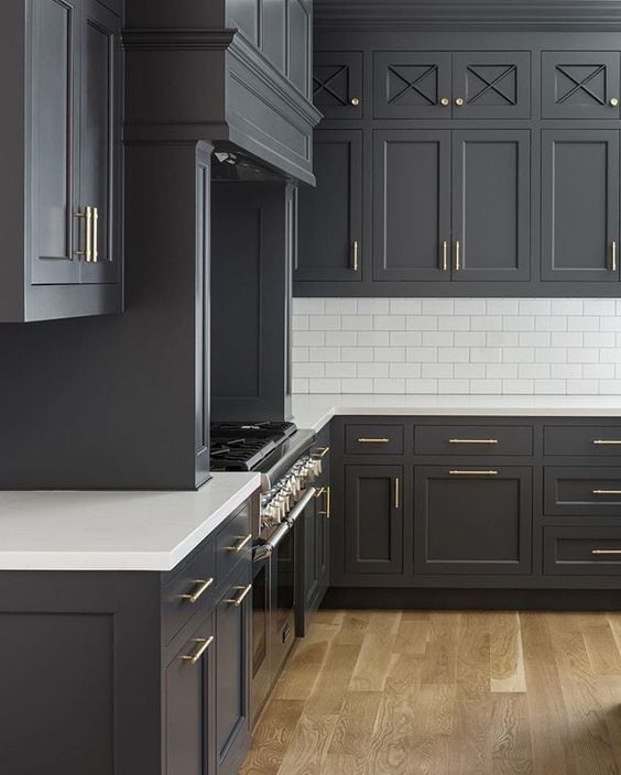
White Dove is one of my favorite cabinet colors because it feels timeless rather than trendy. In bright kitchens like this one, it stays soft and inviting without looking overly creamy, allowing the countertops, backsplash and natural light to take center stage.
Family Room
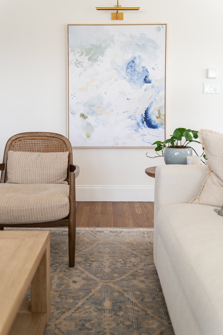
This is where I used White Dove in our own home, and honestly, I wouldn’t change a thing.
Because the room gets so much natural light, I wanted a paint color that still felt soft rather than disappearing into bright white. White Dove has enough warmth that the walls always feel inviting, but they never look too creamy.
Bathroom
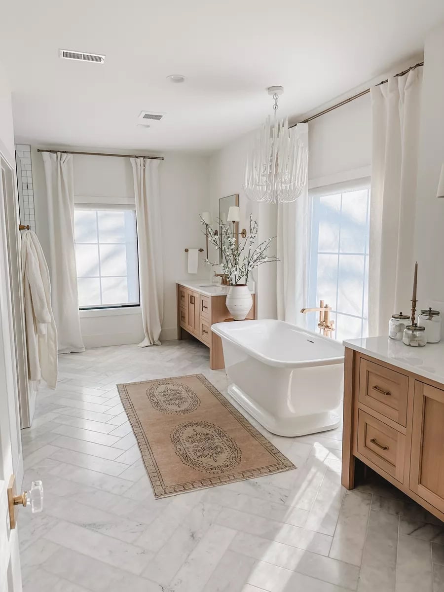
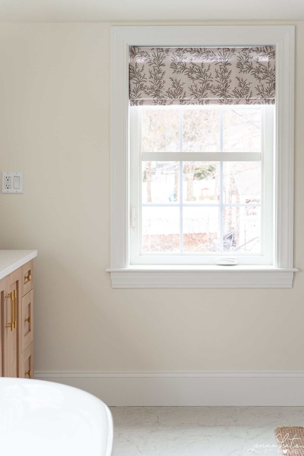
White Dove is just as beautiful in a bathroom as it is in the rest of the home. Whether you use it on the walls, ceiling or vanity, it creates a soft, spa-like backdrop that never feels stark or clinical.
Is it a Good Exterior Color?
If you’re after a timeless white exterior, White Dove is definitely worth sampling. It has enough warmth to soften a home’s architecture without reading obviously cream, making it a beautiful choice for everything from traditional Colonials to modern farmhouses.

Related: My favorite exterior paint colors.
White Dove as a Trim Color
While I love White Dove on walls, it’s equally beautiful on trim, moldings and cabinetry. In fact, it’s been one of Benjamin Moore’s most popular trim colors for years because it creates a softer, more traditional look than bright whites like Chantilly Lace.
One of the reasons designers continue to reach for White Dove on trim is that it works beautifully with both warm and cool wall colors. Instead of creating a crisp, high-contrast look, it softens the transition between walls and trim, making a room feel warm, layered and timeless.
If your decorating style leans traditional, transitional or modern farmhouse, White Dove is an excellent trim choice. It also pairs beautifully with warmer wall colors like greiges, taupes and creamy whites.
Personally, I tend to prefer Sherwin Williams Pure White for trim because I like the slightly crisper contrast it creates. But if your goal is a softer, more classic look, White Dove is hard to beat.
Best Trim Colors for White Dove
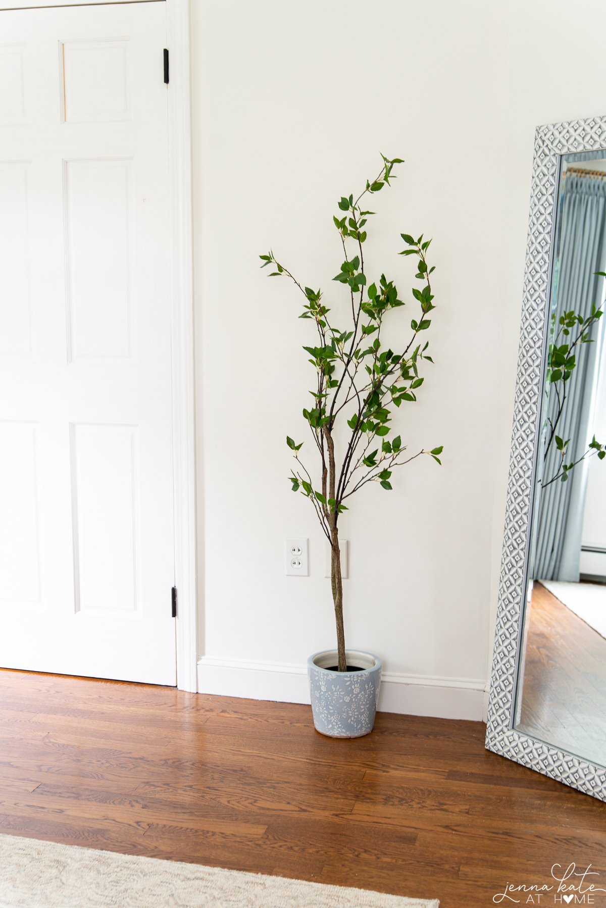
If you’ve read many of my paint color reviews, you’ll know that Sherwin Williams Pure White is still my favorite trim color. I also love it paired with White Dove walls because it adds just enough contrast without feeling harsh.
With that being said, if you want a softer tone-on-tone look, I would also use White Dove on the trim, but in a higher sheen like satin or semi-gloss which will reflect more light and make the trim appear just slightly lighter than the walls.
Related: Learn which paint sheen is best to use for your project.
My Favorite Colors to Pair With White Dove
One of the reasons I love decorating with White Dove is because it’s incredibly versatile. It works just as well with crisp blues and cool grays as it does with warm woods, brass finishes and layered neutrals.
If I were building a whole-house palette around White Dove, these are the colors I’d reach for first.
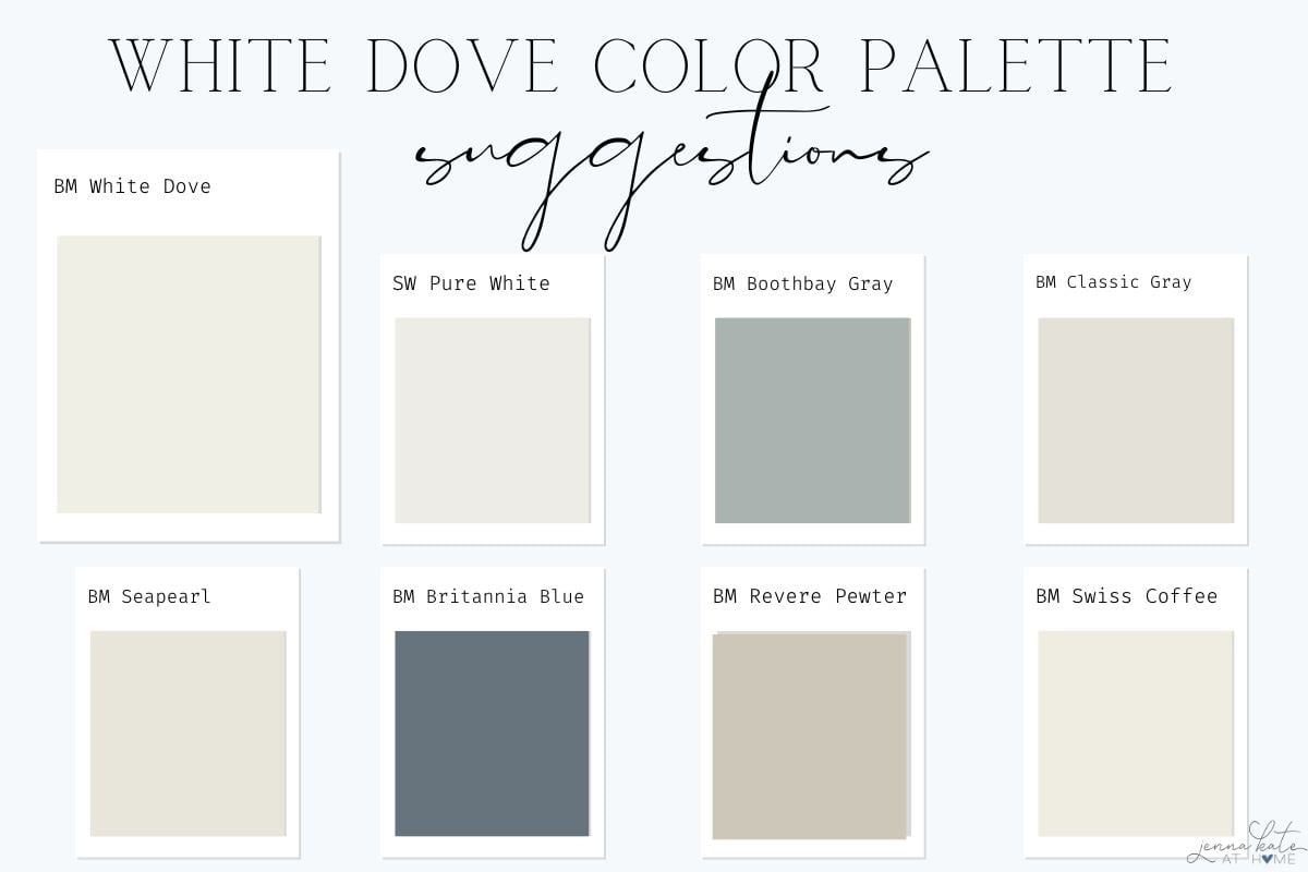
Trim
- White Dove OR for more contrast, Sherwin Williams Pure White
Soft Neutrals
Accent Colors
- Boothbay Gray
- Britannia Blue
Deeper Neutrals
When NOT to use White Dove
If you want a bright gallery-style white
White Dove isn’t a true white. If your goal is a crisp, clean backdrop, I’d sample Benjamin Moore Chantilly Lace instead.
If your home has lots of cool marble
White Dove can sometimes feel a little too creamy when paired with very cool white marble or quartz. In those situations, I’d usually sample a cleaner white like Chantilly Lace instead.
If you want maximum contrast
One of White Dove’s biggest strengths is its softness. If you’re after a dramatic black-and-white look with crisp architectural contrast, a brighter white will usually give you the result you’re after.
Color Comparisons
White Dove vs Simply White
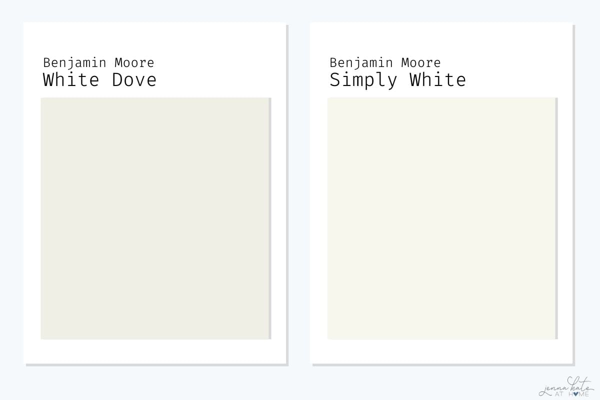
These are probably the two Benjamin Moore whites I get asked about most often.
Simply White is brighter and noticeably warmer than White Dove. In some homes it can even take on a yellow cast under artificial lighting.
White Dove feels softer and a little more balanced because that subtle gray undertone keeps the warmth in check.
Personally, I reach for White Dove more often because I find it easier to decorate with.
BM White Dove vs Sherwin Williams Extra White
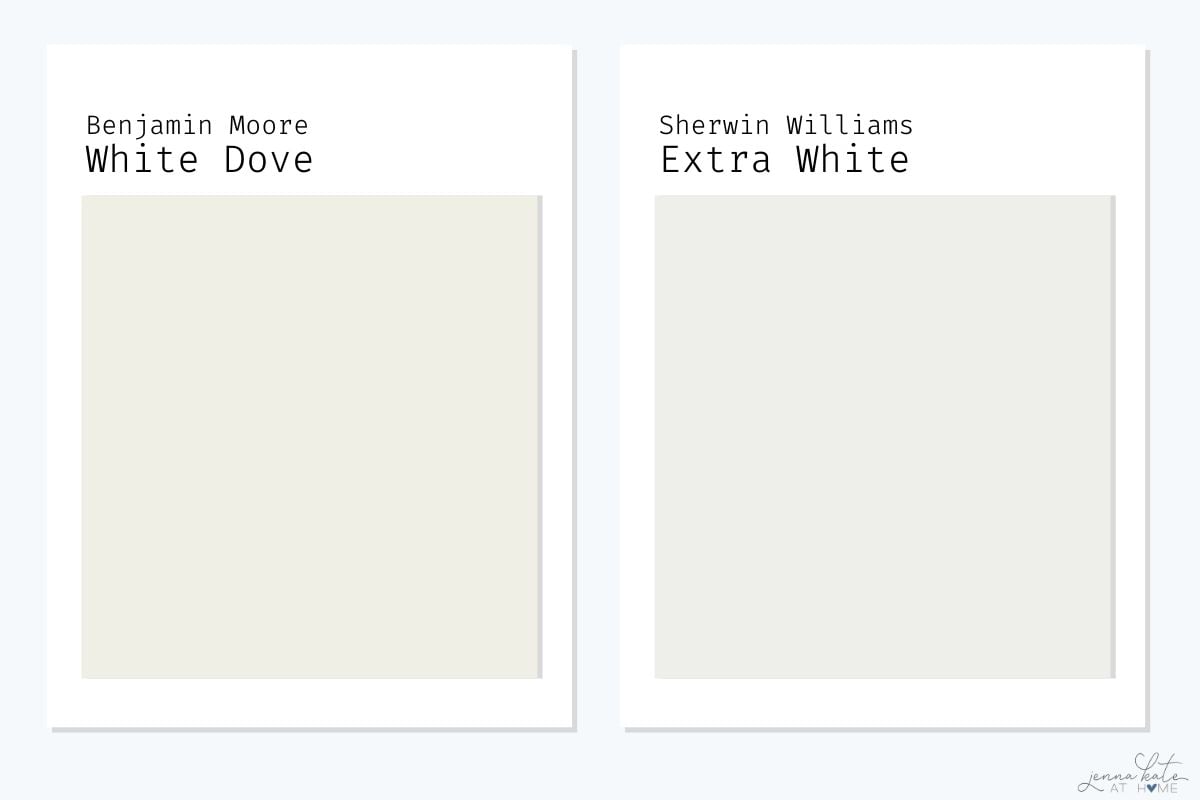
These two whites create completely different looks.
Sherwin Williams Extra White is crisp, bright and cool, making it a great choice if you’re after a clean, modern white. White Dove, on the other hand, has a softer warmth that feels much more relaxed and lived in.
Personally, I almost always reach for White Dove on walls because it’s easier to decorate with. If I’m painting trim and want a brighter contrast, that’s when I choose Extra White instead.
Benjamin Moore Dove White vs Sherwin Williams Alabaster
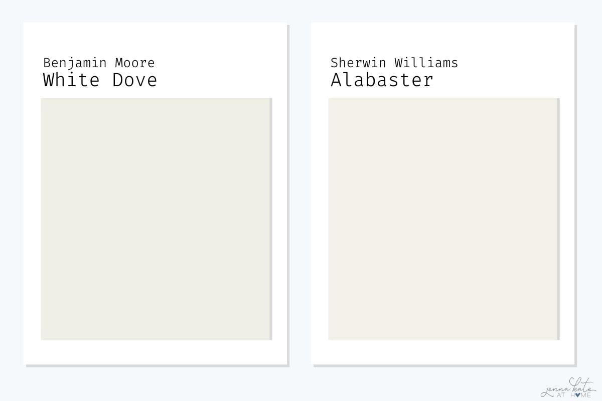
These two are often compared because they’re both soft, warm whites with almost identical LRVs, but they create slightly different moods.
Alabaster is a little creamier and warmer than White Dove, giving it a cozy, inviting feel that works especially well in traditional and farmhouse-style homes. White Dove still feels warm, but that subtle gray undertone keeps it looking a little fresher and more balanced.
I love both paint colors, but if your home has a lot of blues, white oak or cooler finishes like mine, I’d choose White Dove. If you’re decorating with warmer woods and earthy tones, Alabaster is a beautiful alternative.
White Dove vs. Chantilly Lace
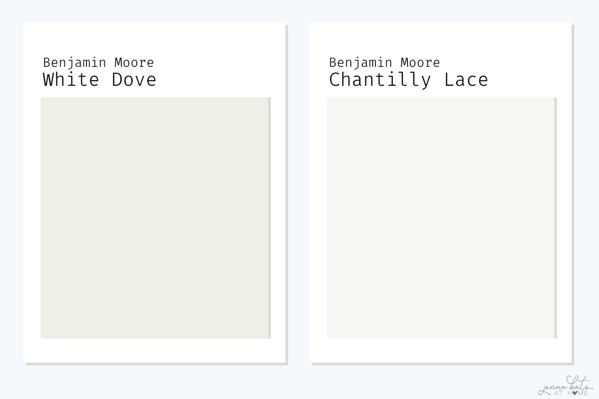
These two couldn’t be more different.
White Dove is a soft, warm white that adds warmth and depth to a room, while Chantilly Lace is a bright, crisp white with very little warmth. If you’re after that clean, gallery-white look, Chantilly Lace is hard to beat.
Personally, I tend to reserve Chantilly Lace for trim, cabinetry or homes with a very modern aesthetic. For walls, I almost always prefer White Dove because it feels softer, more welcoming and much easier to live with every day.
White Dove vs Swiss Coffee
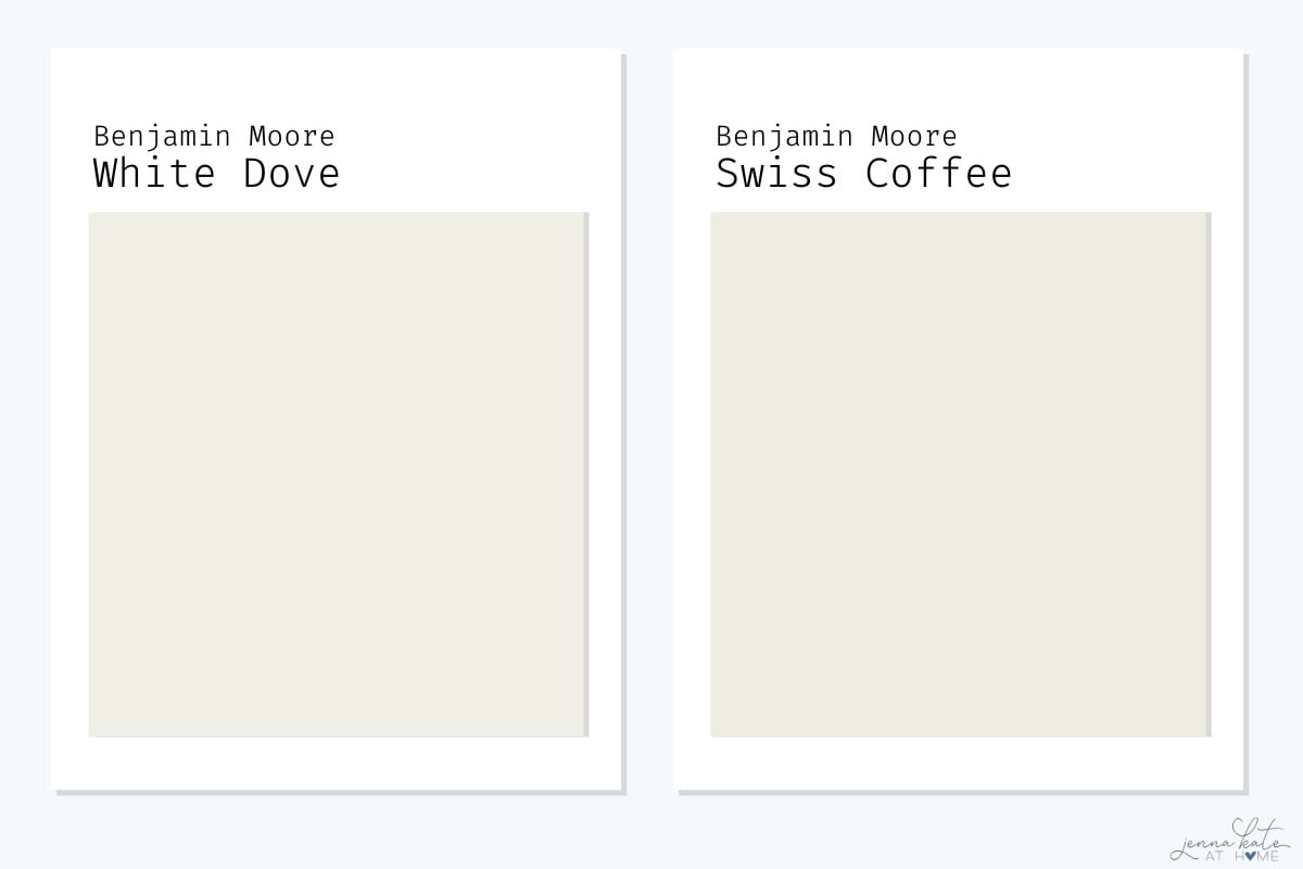
White Dove and Swiss Coffee are both beautiful warm whites, but Swiss Coffee leans a little creamier and warmer overall. It also has a slight green undertone that can become more noticeable depending on your lighting.
If you love the warm, layered look that Studio McGee is known for, Swiss Coffee is definitely worth considering—especially lightened by 25%, which is how they often use it.
For my own home, though, I still prefer White Dove. That subtle gray undertone keeps it feeling a little fresher and makes it easier to pair with the blues, crisp whites and natural wood tones I tend to decorate with.
BM White Dove vs Sherwin Williams Greek Villa
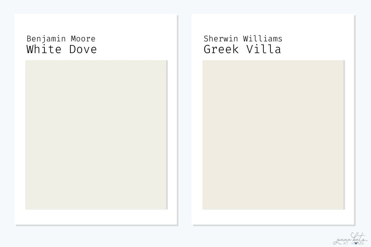
White Dove and Greek Villa have a lot in common. They’re both soft, inviting whites that work beautifully throughout an entire home and have very similar light reflectance values.
The biggest difference is that Greek Villa is just a touch warmer and creamier, while White Dove feels a little more balanced thanks to its slight gray undertone.
If I were choosing between the two today, I’d still reach for White Dove first because I think it’s a little more versatile across different decorating styles and lighting conditions. That said, if you prefer a warmer, more relaxed look, Greek Villa is a beautiful choice.
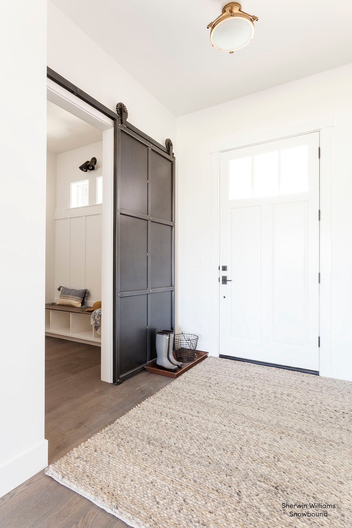
BM White Dove vs Sherwin Williams Snowbound
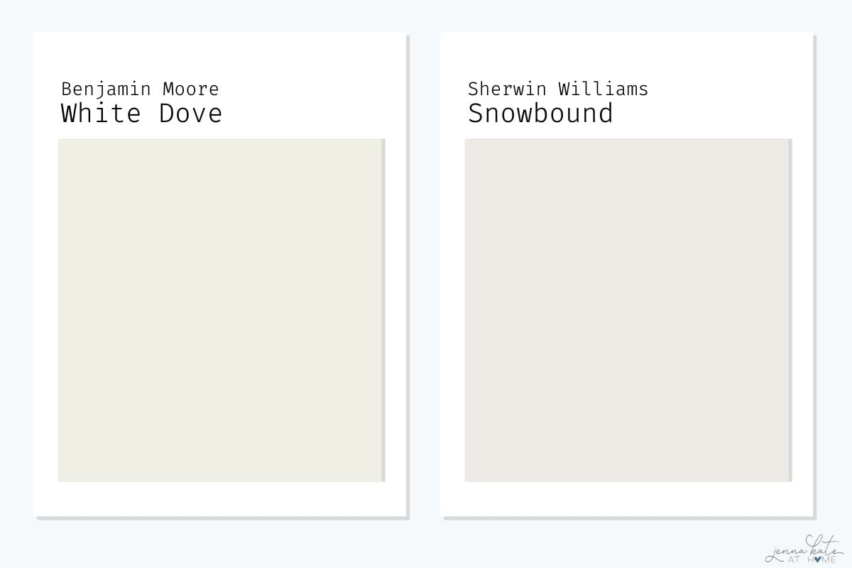
Although they’re similar in brightness, White Dove and Snowbound have very different undertones.
White Dove is a soft, warm white, while Snowbound has cooler gray and subtle pink undertones that can become more noticeable in certain lighting conditions.
If your home leans modern with cooler finishes, Snowbound can work beautifully. But if you’re looking for a white that’s forgiving, timeless and easy to decorate with, I’d almost always recommend White Dove instead. I simply find it to be the more versatile choice in a wider variety of homes.
Questions I Frequently Get Asked
Yes! It’s a nice warm white that won’t gray out on your ceiling, so it’s a good choice for low light rooms. I particularly like it when the walls are already white dove and you carry it to the ceiling in a flat sheen.
Other colors similar to White Dove are Benjamin Moore Swiss Coffee (creamier), Benjamin Moore Simply White (brighter), and Sherwin Williams Alabaster (creamier).
White Dove does not look gray, however it is a warm white with a slight gray base which stops it from look too warm.
Would I Choose White Dove Again?
Absolutely.
In fact, it’s one of the few paint colors I’ve never fallen out of love with.
As decorating trends have shifted over the years, I’ve replaced some of my old favorite grays with lighter neutrals. White Dove, though, has remained a constant.
It’s one of those rare whites that feels just as beautiful in a bright, sun-filled room as it does in a darker north-facing space. It has enough warmth to feel inviting, but enough gray to pair effortlessly with the blues, crisp whites and natural wood tones I love decorating with.
If you’re looking for one soft white that works beautifully in a wide variety of homes, White Dove would be one of the first paint colors I’d sample.

I am looking for an exterior color to paint brick to look white but not blinding or stark white. Its a modern french country that would need to go with black roof, iron ore and light to medium wood accents. Any recommendations between white dove (using for cabinets and trim inside), alabaster, greek villa or something else?
I already have simply white trim including a fireplace and built in bookcase. I currently have a green color in my living room but want to lighten it up. Would white dove look too warm with the cool trim? I have south East and north west facing windows (both sides of the house)
Simply white is not a cool white, it is a warm white. Get a sample of white dove and paint it next to where your trim is to see if you like it. You’ll know quickly whether it works in your space or not!
Hello and thank you for the info on White Dove. A year ago we painted the exterior of our Florida MCM home White Dove. It’s very soft looking and not a harsh white. We paired it with a soft green that looks like a baby blue. I think a brown or Grey would also be an attractive companion color. My painter liked the White Dove so much that he painted his own house the same color!
I love the warmth of white dove And I am thinking of using it on my trim and doors as well and a different finish then the walls what do you suggest for the ceiling white dove or another white
I would keep it all white dove. Another white on the ceiling may make yours walls and trim look too creamy. If you keep it the same, it will look amazing. Search for Alexis Andra Austin on IG, her entire house is white dove (ceilings, trim, walls)
White dove definitely has yellow undertones and in fact looked too yellow in my south/west facing living room!
I used White Dove in a large long room above our garage with east and west facing windows. It, too, turned an ugly yellow. I even painted large paint swatches over the primed walls. So many factors go into a specific paint color looking as it claims: Natural lighting, overhead lighting, type of flooring and trim color. I’m chalking this up to experience and blaming the old beige carpet we haven’t torn out yet, but even the ceiling looked dingy yellow. I was also color washing that room so I repainted everything with BM Chantilly Lace. I love Chantilly Lace but, for me, it requires at least 3-4 coats for proper coverage even with walls that prepped with a white primer.
Great analysis of this beautiful color! Any thoughts of using it as a cabinet color next to Agreeable Gray walls, and/or using it as an adjacent wall color to Agreeable Gray?