Content may contain affiliate links. When you shop the links, I receive a small commission at no cost to you. Thank you for supporting my small business.
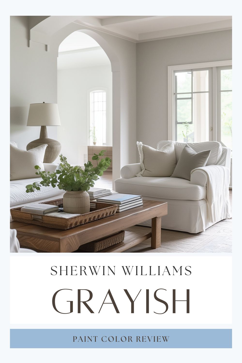
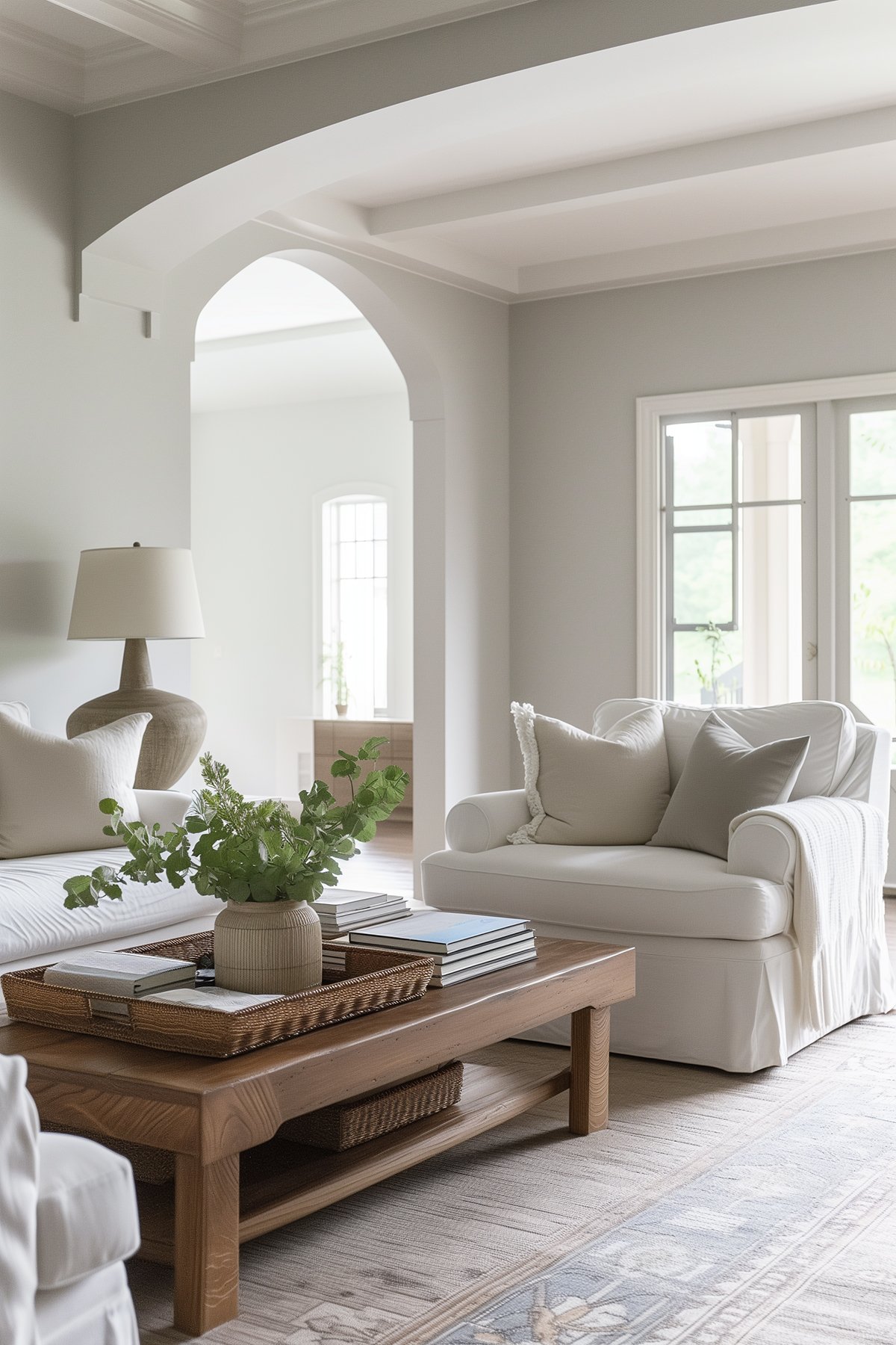
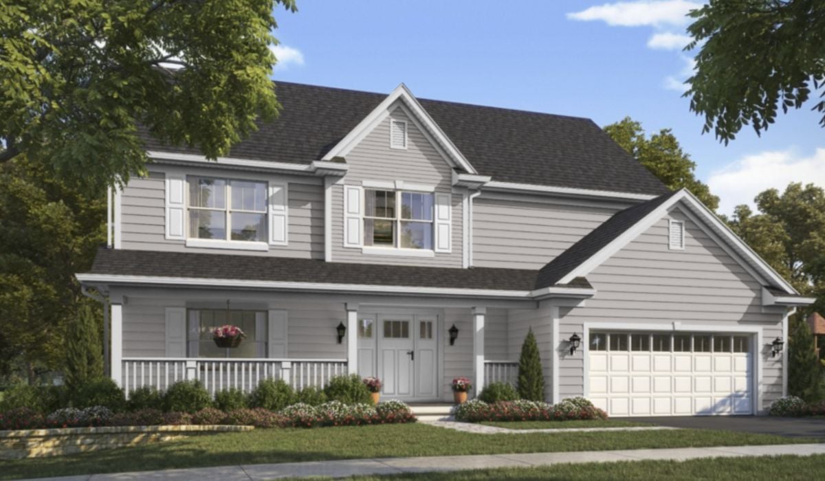
Sherwin Williams Grayish is more than just a gray color to use on the exterior of your home. It’s also perfect for interior spaces like the living room and dining room. With purple undertones and a very cool appearance, Grayish offers a medium-toned color that brings a sophisticated and neutral color palette to any room.
When I first discovered Sherwin Williams Grayish, I quickly realized it’s not your typical gray paint color. It’s a unique blend of cool and warm tones, making it a perfect paint color for various spaces.
What Color is Grayish?
Grayish is a stunning, cool-toned gray with a balanced blend of RGB values, giving it a nuanced hue. This neutral gray paint color reveals a fascinating mix of cool and warm undertones, making it an ideal choice for a diverse color scheme in your home.
Look at how the color changes from the top left to the bottom right.
What is the LRV?
Light Reflectance Value (LRV) is an indicator of the amount of light that is reflected by a color when it is illuminated by a light source. A higher value (closer to 100) means that a color will reflect more light back at you and a lower value (closer to 0) means that a color will appear darker, or absorb more light.
What sets Grayish apart is its position in the gray color family with a Light Reflectance Value (LRV) of 60, which places it in the mid-toned gray category. It’s not super light, but it has a presence that’s hard to ignore.
Is it a Warm or Cool Color?
Grayish leans cooler and is a very modern color. However, depending on lighting, furniture in your room, and other factors, if enough red is brought out it can get warmed up quite a bit!
What Are The Undertones of Grayish?
Grayish has definite purple undertones, a hint of coolness, yet there’s also a touch of pink or red warming it up. This fascinating mix means it reads cooler compared to many popular greige paints.
Trim Color and Grayish
For trim color, a clean, crisp white like Benjamin Moore’s Chantilly Lace or Sherwin Williams’ Extra White complements Grayish perfectly. These white paint colors enhance Grayish’s unique undertones, making it the best choice for a sophisticated look.
How Does Light Affect Grayish?
In terms of how light affects Grayish, it’s a chameleon. In rooms with north-facing windows or limited natural light, it leans into its cool, purple side. But introduce it to a room with a south-facing window and warm, yellow-toned light, and it transforms, appearing less cool, less purple.
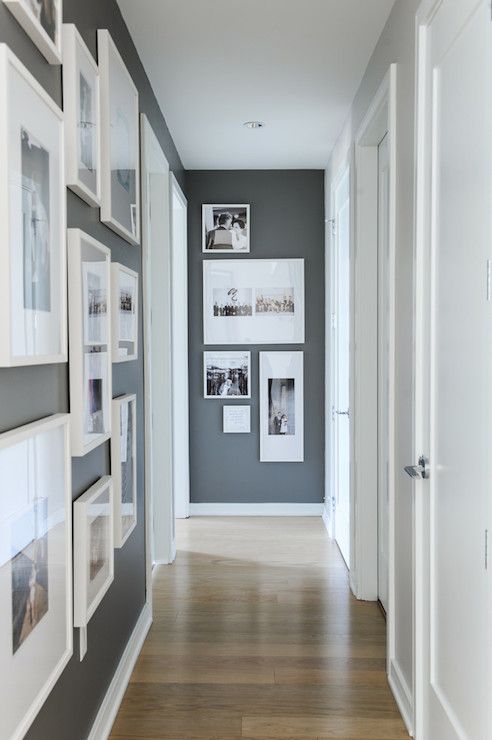
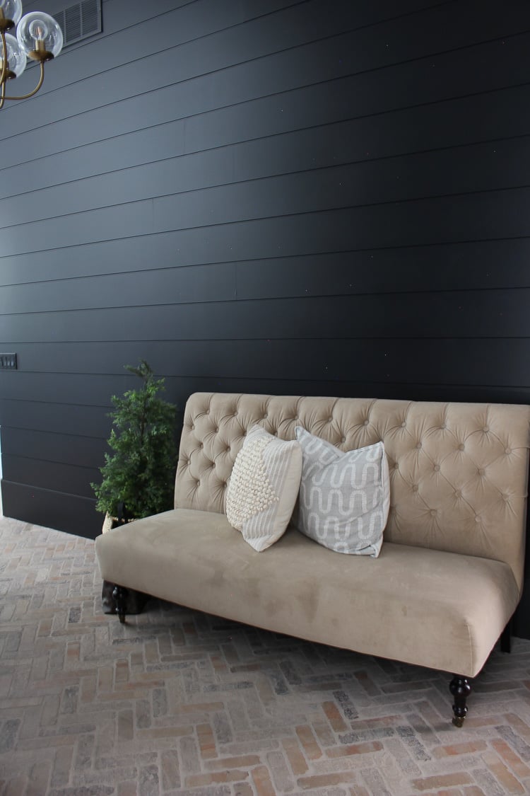
Where to Use Grayish: Beyond Bedrooms and Bathrooms
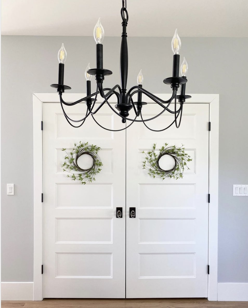
Apart from smaller rooms like guest bedrooms or bathrooms, Grayish shines in larger spaces like living rooms and dining rooms. Its neutral paint color and cool colors make it a versatile choice for central areas of your home.
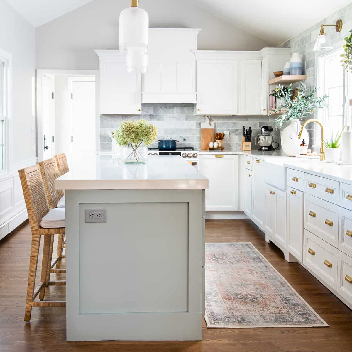
Grayish in the Kitchen: Perfect for Cabinets
Thinking of a new color for your kitchen cabinets? Grayish offers a cool and sophisticated option. Its neutral gray tones work well with both cool light and warm white light bulbs, ensuring that your kitchen maintains its chic appearance throughout the day.
Coordinating Colors and Color Palette
Now, let’s talk about the color palette. Grayish pairs beautifully with a range of colors, from cool grays to warm grays like Accessible Beige and Revere Pewter. These combinations help in creating a harmonious color scheme throughout your home.
Where to Use Grayish
I see Grayish shining in smaller spaces like guest bedrooms or bathrooms. In these settings, its coolness provides a calming backdrop.
It’s particularly striking in rooms with large windows, where it looks lighter, warmer, and less purple. And for homes with stone and brown accents, or darker floors and finishes, Grayish offers a beautiful contrast.
Thinking of using it outside? Absolutely! The outdoor light makes it feel warm, cozy, and inviting – perfect for home exteriors.
SW Grayish Coordinating Colors
Coordinating colors with Sherwin Williams Grayish can enhance its cool and sophisticated character while balancing its purple undertones. Here are some great options:
- Crisp Whites: To contrast Grayish’s cool tones, consider using crisp white colors like SW Extra White or Benjamin Moore’s Chantilly Lace. These whites create a fresh and clean look, especially for trims, ceilings, and molding.
- Soft Blues and Greens: Colors like SW Halcyon Green or Moody Blue work beautifully with Grayish. These hues complement the coolness of Grayish while adding a gentle splash of color.
- Neutral Beiges and Greiges: Warm neutrals like SW Accessible Beige or the popular SW Agreeable Gray offer a soft contrast to Grayish. These colors work well in adjoining rooms or as accent colors, providing a balanced and harmonious look.
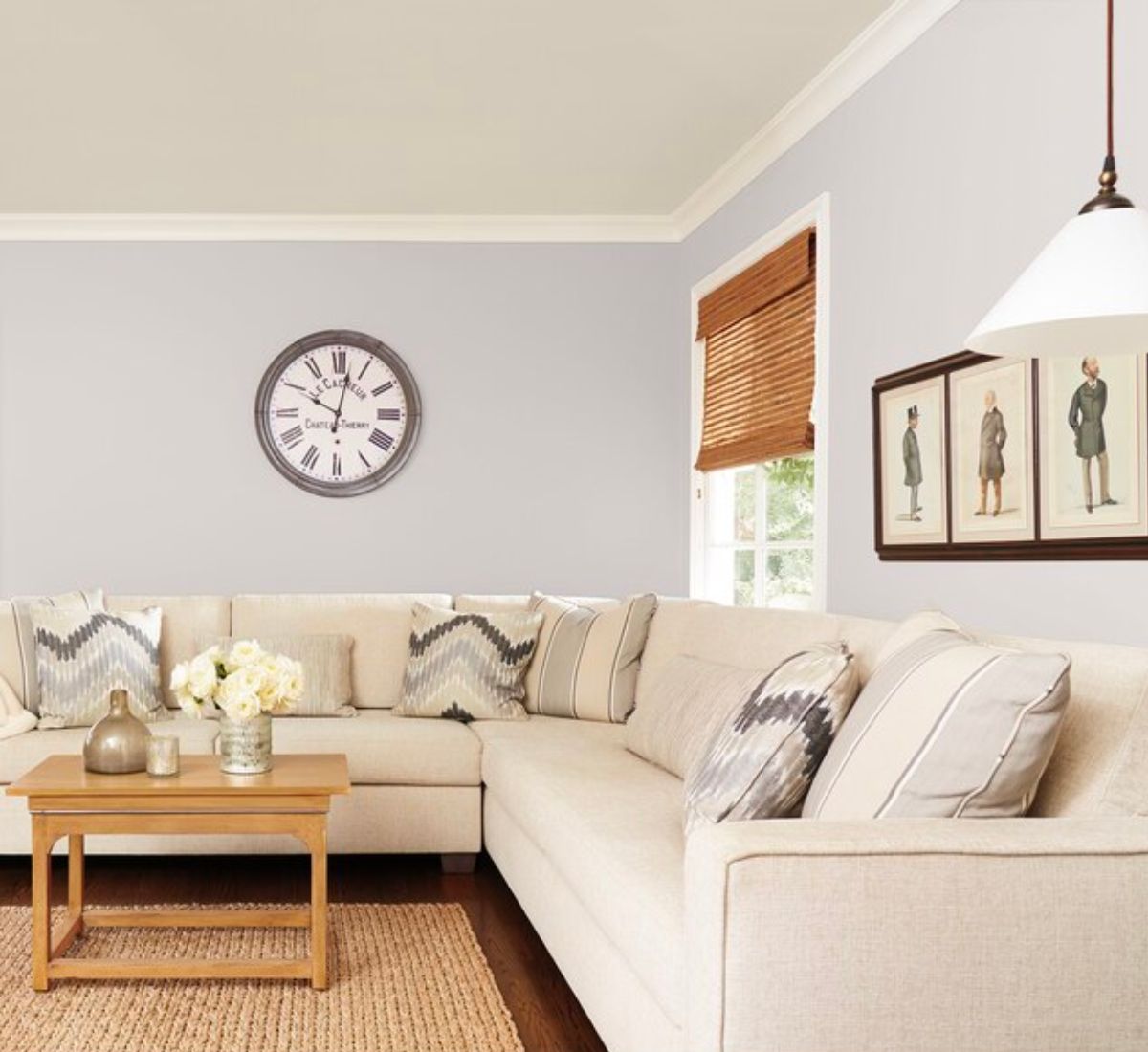
SW Grayish vs. SW Agreeable Gray
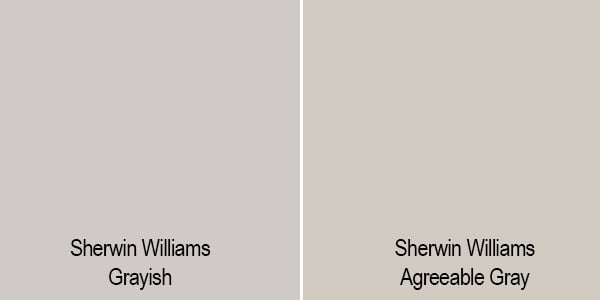
Sherwin Williams Agreeable Gray and Grayish are two popular gray paint colors. They are both shades of gray and have a comparable LRV. So, what’s the difference? Agreeable Gray is much more warm-toned with yellow and tan undertones. If you tend to like more cool, purple-toned colors then Grayish is for you!
SW Grayish vs. SW Repose Gray
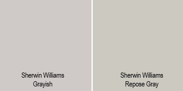
Put next to Repose Gray, Grayish feels slightly lighter and cooler, with its blue/purple undertones contrasting against Repose Gray’s warmer green undertone.
Final Thoughts
In conclusion, Grayish is a versatile, intriguing color. Its ability to change under different lighting conditions, and its compatibility with a variety of coordinating colors, makes it a great choice for those looking to bring a unique, sophisticated gray into their space.