Content may contain affiliate links. When you shop the links, I receive a small commission at no cost to you. Thank you for supporting my small business.
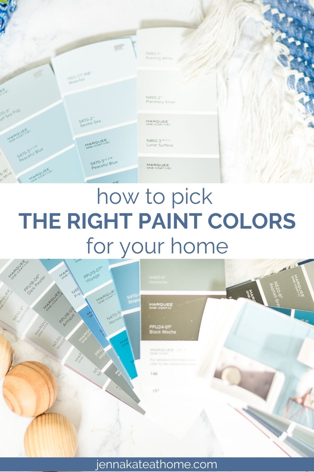
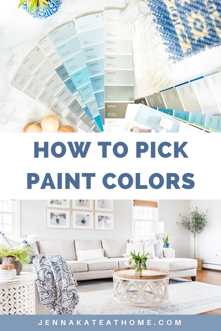
Choosing paint colors can feel completely overwhelming—especially if you don’t have a designer’s eye or a Pinterest-perfect home to work from. Whether you’re starting with a blank slate or trying to make sense of your existing finishes, this post will walk you through the process step by step.
We’ll talk color theory (in plain English), undertones, how lighting impacts paint, and how to pull it all together into a cohesive palette for your home—even if you’re starting with zero inspiration.
Where to Begin: Use What You Have
Before you start flipping through paint decks or scrolling Pinterest, stop and take a look around. What’s already in your home that isn’t changing?
- Existing floors (wood, tile, carpet)
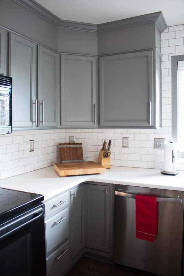
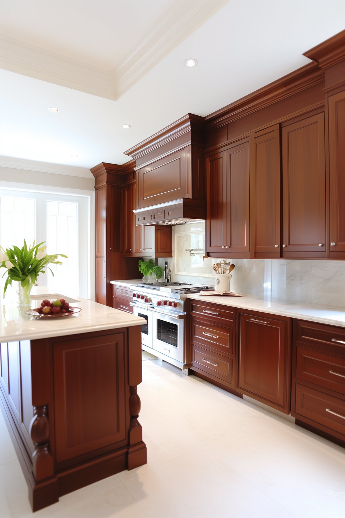
- Kitchen cabinets
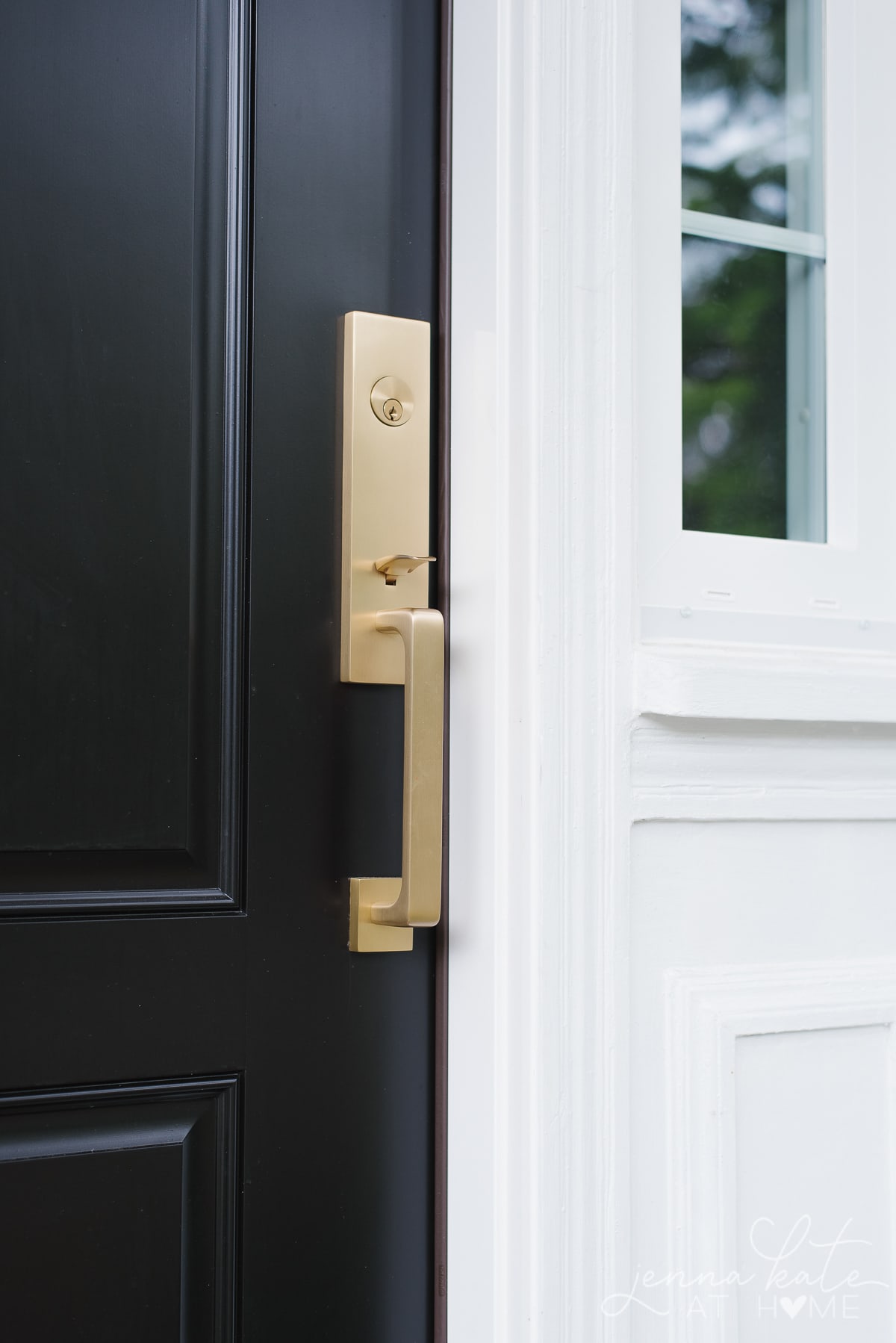
- Trim color
- Large furniture pieces
- Countertops or stone fireplaces
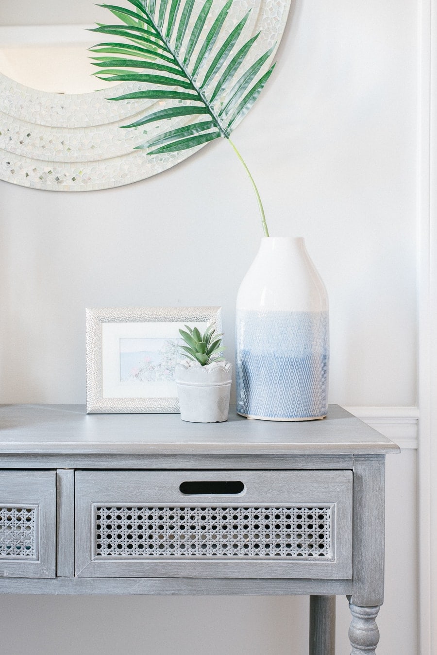
These are your fixed elements—and your paint colors need to coordinate with them. If you ignore them, you’ll end up with walls that clash (even if the color is beautiful on its own).
Jenna’s Tip
If your home is filled with warm tones (oak, beige tile, warm granite), stick with warm paint colors. If you have cooler elements (gray floors, black accents, white marble), choose cooler tones.
Don’t Start With Paint—Start With a Piece You Love
If you’re decorating from scratch or changing your whole color scheme, let your inspiration come from something tangible—a rug, a pillow, artwork, or even a favorite outfit.
Ask yourself:
- What colors am I naturally drawn to?
- What do I love wearing over and over again?
- What makes me feel calm or happy?
Then find a neutral version of that color to use on your walls. Paint is the backdrop to your space—it doesn’t have to be bold to be impactful. Just make sure it complements the undertones in your finishes—especially wood, tile, and countertops.
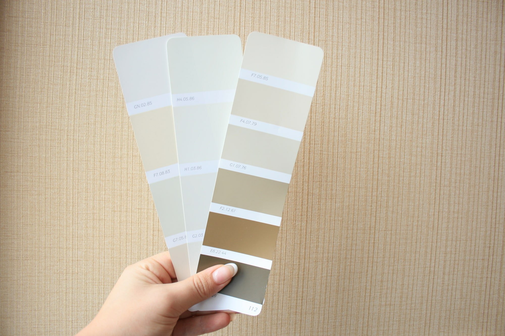
Understand Paint Undertones (This Part Matters!)
Every paint color has an undertone—even whites, beiges, and grays. Understanding undertones is what separates “that color looks weird” from “that color is perfect.”
Here’s the simplest way to figure it out:
- Look at the darkest shade on the color strip. That’s the base tone.
- Compare it to pure white. If it looks yellow, red, blue, green, or purple—you’ve found the undertone.
JENNA’s Tip
- Hold your paint swatch next to a bright white piece of printer paper. This helps reveal the undertone and whether it leans yellow, pink, green, blue, etc.
Example: A light gray with a blue undertone will look icy in a north-facing room. A beige with pink undertones might clash with your taupe sofa.
Stick to undertones that repeat in your fixed finishes. If your flooring has a yellow undertone, don’t pick a paint color with a green undertone. They’ll fight.
How Light Affects Paint Color
Natural and artificial lighting can completely change how a paint color looks in your home.
- North-facing rooms: Light is cool and indirect. Colors will look darker and cooler.
- South-facing rooms: Warm light all day. Colors will appear brighter and warmer.
- East-facing rooms: Warm morning light, cool afternoon light. Great for warmer neutrals.
- West-facing rooms: Cool morning light, very warm evening light. Watch out for undertones shifting throughout the day.
Always test your color in multiple places—and at different times of day.
RELATED: The Best Paint Colors For Every Room Exposure.
Real Life Example
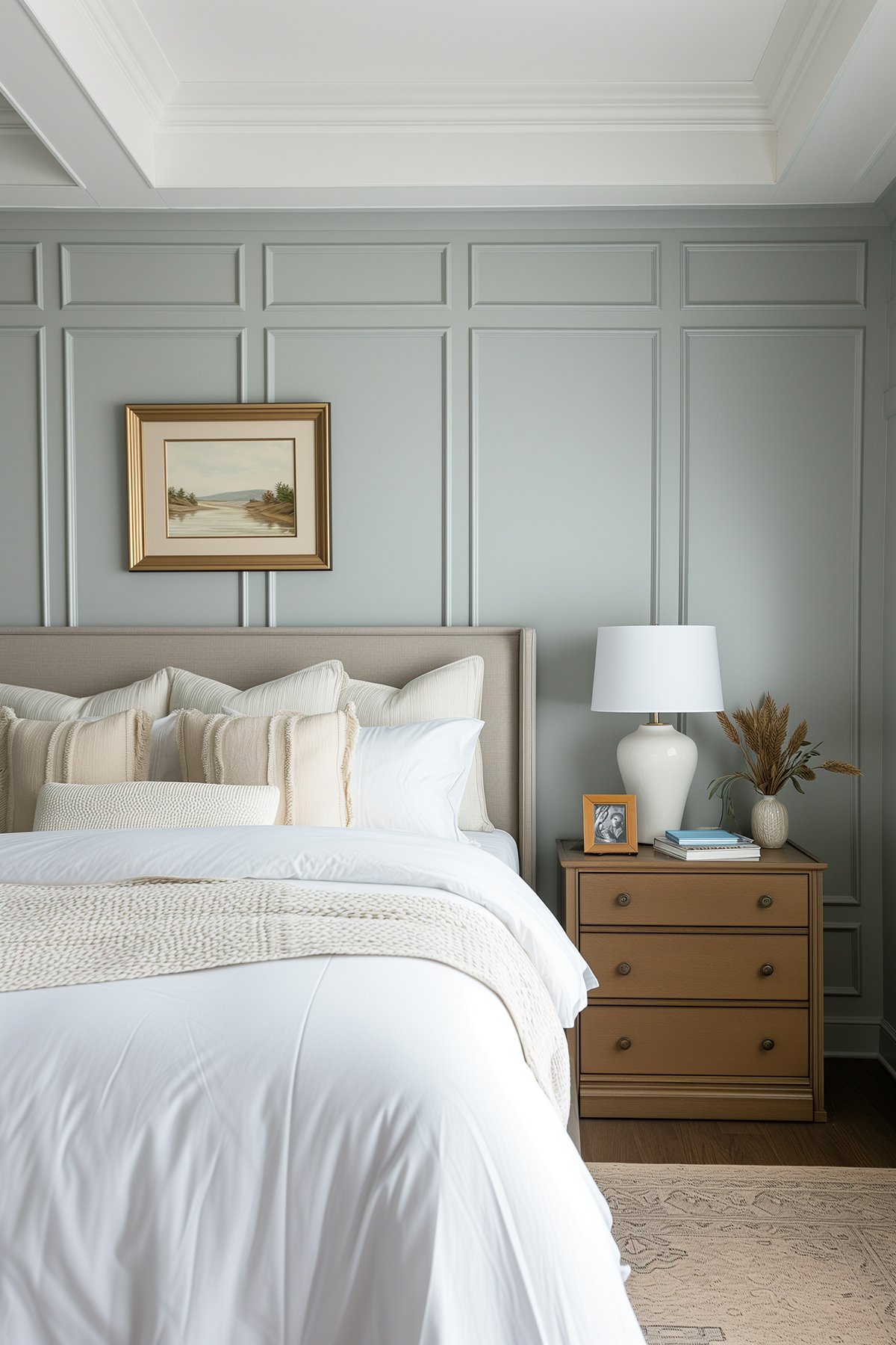
Let’s say you have golden oak floors and cream trim. If you try to paint your walls a cool gray, the oak will suddenly look very orange—and not in a good way. But if you choose a warm greige with subtle beige undertones, it blends beautifully and tones down the orange.
Color theory in action: Use analogous colors (next to each other on the color wheel) to blend, or complementary colors (opposites) to contrast and highlight.
Should You Paint Your Whole House the Same Color?
In many cases, yes—especially if you want a cohesive, airy feel. Use a main neutral color throughout and add variation with accent walls, trim colors, or smaller spaces like powder rooms and offices.
Stick to neutral walls and add color through:
- Art
- Rugs
- Pillows
- Accent furniture
This makes your home feel polished and flexible as trends (or your tastes) change.
Tips for Creating a Whole-Home Color Palette
If you’re painting several rooms, use this formula:
- 1 Main Neutral – Greige, soft white, light beige (used in main living areas)
- 1-2 Accent Neutrals – Deeper versions of the main color (for bedrooms, offices)
- 1 Bold Color – For a fun powder room, dining room, or front door
- 1 Trim Color – A soft white that works with both warm and cool tones
This is the formula I use in my own home and it keeps everything feeling consistent without being boring.
I’ve written a whole other post about Choosing a Whole House Color Palette that delves into this topic a little more and explains why sticking to a neutral color palette for the majority of your home is a good idea.
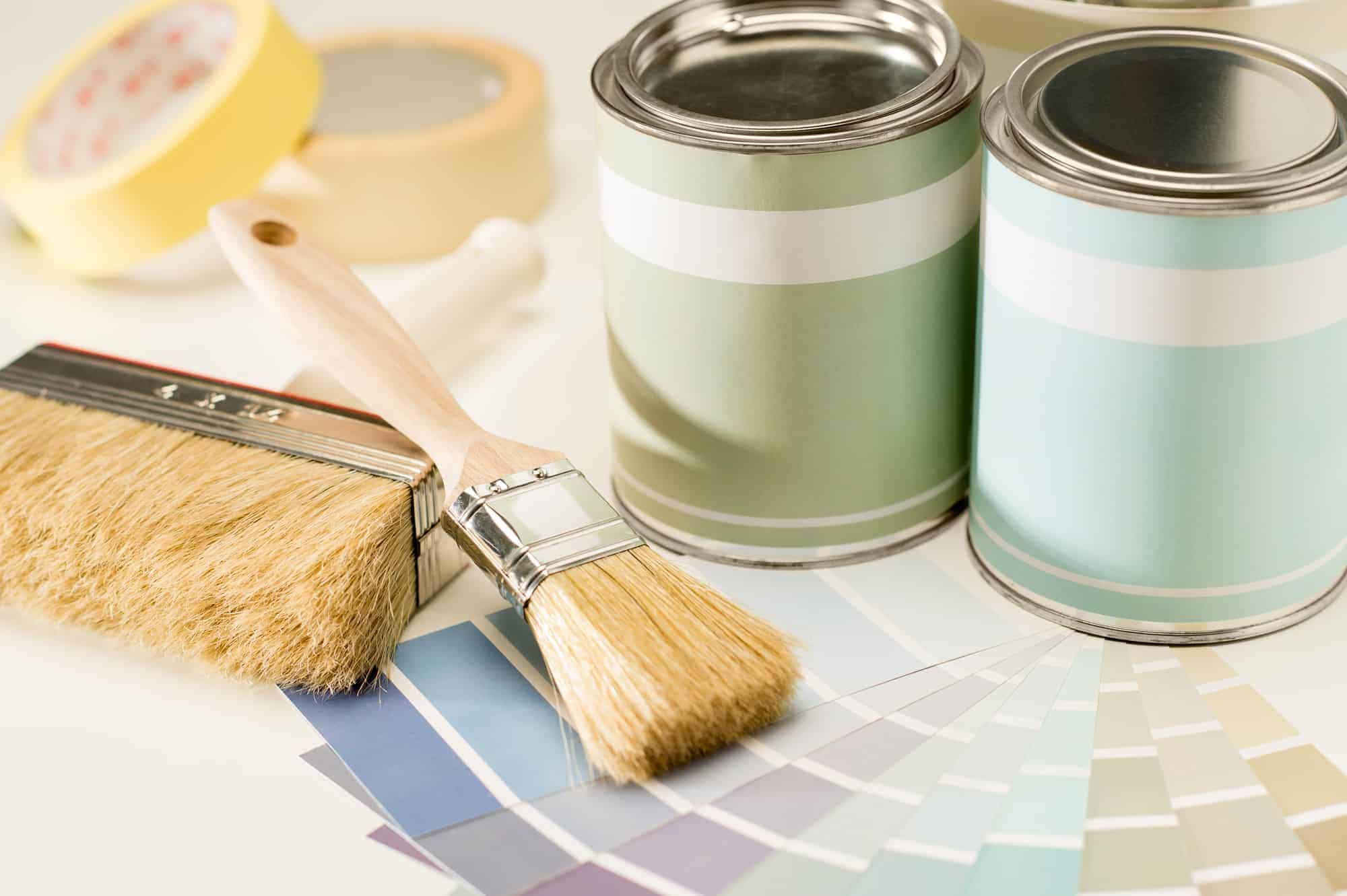
Sample Before You Commit
Paint colors look different on the wall than they do on a tiny swatch. That’s why I always recommend real samples, not just paint chips.
I personally love Samplize peel-and-stick samples—they’re made with real paint and let you move them around the room throughout the day.
Stick them next to your:
- Trim
- Flooring
- Cabinets
- Countertops
…and check the color at different times of day. This is the only way to know how a paint color will truly look in your home.
Common Mistakes to Avoid
- Don’t skip the sample step—even if you “know” the color.
- Don’t pick paint based on how it looks in someone else’s home.
- Don’t forget about sheen—it affects how the color looks.
- Don’t ignore fixed finishes like flooring and countertops.
Jenna’s Tip
Don’t second-guess yourself to death. If you’ve tested a color and you like how it looks in your lighting and with your finishes—that’s all that matters.
Frequently Asked Questions
Stick with a soft neutral like a warm greige, creamy white, or light taupe. These colors work well with most wood tones, metal finishes, and decor styles—and give you flexibility to change furniture or accents later.
Light, airy colors like soft whites, pale grays, and light beiges reflect more light and visually expand a space. Just make sure they don’t feel too stark in low-light rooms—always test first!
Start with one main neutral that works in your main living areas. Then build off of that with slightly deeper tones or coordinating shades for bedrooms and bathrooms. Limit your palette to 3–5 main colors total for a cohesive look.
Lighting, undertones in your room, and even sheen affect how paint reads on your walls. A swatch in the store might look totally different in your home—which is why testing samples is so important.
You can, especially with a neutral like soft white or greige. Just vary the accent colors and finishes to add interest from room to room. If you prefer more variety, keep a common undertone throughout to maintain flow.
Warm colors have undertones of red, yellow, or orange and feel cozy or inviting. Cool colors have blue, green, or violet undertones and feel crisp or calm. Neither is better—it just depends on your home’s finishes and your personal preference.
Start small! Try a soft muted version of the color you like, or use it in a bathroom or office where you’re less likely to grow tired of it. You can also bring in color through decor first, then match your paint to something you already love.
Final Thoughts
You don’t need to be a designer to pick the right paint colors for your home. You just need to:
- Start with what you already have
- Learn how undertones work
- Pay attention to lighting
- Sample, sample, sample
Don’t Forget To Always Use Real Paint Samples!
Don’t forget – no matter what you’ve read or photos you’ve seen online, it’s really important to sample paint colors in your home before committing!
Samplize provides peel and stick paint samples made with real paint, that are easy to move around your home, and cheaper than buying a gazillion paint pots! It’s the only way I buy paint samples.
Whether you’re painting one room or your whole house, these tips will help you confidently choose paint colors that work with your home—not against it.
Still stuck and not sure where to start? Try Benjamin Moore Classic Gray, or Benjamin Moore White Dove, or Sherwin Williams Drift of Mist. These tried-and-true colors work with most finishes and lighting.


HI Jenna! Great info on here! I’m doing a kitchen remodel, cabinets in Stonington Gray, which white would you pair with it for walls and trim?
Hi Jana – any of the more neutral/cooler whites will look great. You’re going to want your trim to match throughout your home though. BM Chantilly Lace is a popular choice for a nice bright white and I also love SW Pure White.
My home was built in the 90s and has the orangey Maple solid wood everywhere.
All of the doors, trim, kitchen cabinets, even parquet flooring that runs from front door to the living room, across the back side of the living room, to the entry of the kitchen!
Help!!
What neutral would work with all of that orangey Maple wood???
Painting over, replacing, and staining are way out of the budget.
Thanks!
Hi Janis, this question is best suited to our Ask a Decorator service!
Hi Barbara,
I’m decorating our new house in southern Florida. The kitchen doesn’t get much natural light. I want a light blue beachy island but all the blue colors turn gray. Any suggestions?
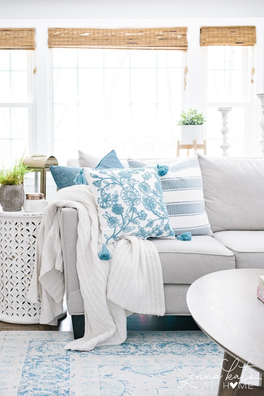
Great post! How has your living room rug held up? I’ve been agonizing over rugs, and I need to buy several. With 6 kids and a dog I need them to be durable and able to withstand high traffic. I love the colors and design of this one. It’s also much more affordable than the other 12×15 rugs I’ve been looking at (wool and silk). Also is it as light as it looks in your pictures? I also have always always loved blue and my color scheme is layers of different blues, grays, white and flax. So excited to stumble across your blog.
Hi April! It has held up great. It’s got enough color that it hides dirt well. We just vacuum it a few times a week and I’ve had to spot clean a few areas where the kids spilled or threw up on it (lovely! haha).
Thank you! I’m so hesitant to buy anything large online because the return shipping is a killer. I’m pretty much committed if I order. I considered it for my front entry large rug and side entry runner. I’m also looking for a 12×15 rug for the living room. Since no kids are technically allowed in that room (tell that to them), I thought about investing in something nicer. Thanks again for your help.
I always order the smallest available size (ie: 2’x3’, 3’x5’) rug for color sampling before making the decision to order the larger sizes I need for the rooms. So much easier – and less expensive – to return!
Ah yes! I’ve done that before! Great idea!
Hi Jenna! Thanks for your blog. We’re thinking of paintIng most of our home BM Dove Wing or Classic Gray. What would you recommend for the trim. Extra white seems bright and BM Cloud White might be to yellow. Our home gets little natural sunlight.
Thank you!
Anne
If extra white is too bright, BM Decorator’s White or SW Pure White would be good choices! (They are about the same color)
I am considering repose gray for the whole house. What trim color would go well with it? A creamy white?
Hi Barbara! It personally think it looks best with a brighter white – BM Decorator’s White or SW Extra White. If your home is already a creamier white, then BM Simply White is also a good choice.