Content may contain affiliate links. When you shop the links, I receive a small commission at no cost to you. Thank you for supporting my small business.
Not all whites are created equal—and Extra White proves that subtle undertones can make or break your space.
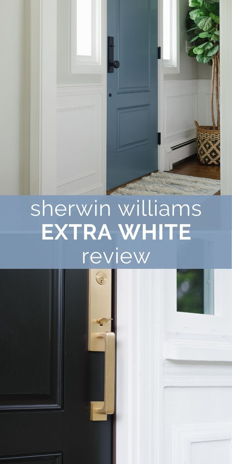
If you’re hunting for a crisp, clean white that feels modern and fresh—without going icy or clinical—Sherwin Williams Extra White (SW 7006) might be just what you’re looking for. This bright white is one of Sherwin Williams’ most popular trim and cabinet colors, but it also has surprising versatility as a wall or even exterior shade.
In this review, I’ll break down the undertones, real-life applications, best trim pairings, and how it compares to similar shades like Pure White, Alabaster, and Chantilly Lace.
What Color Is Sherwin Williams Extra White?
Despite its name, Extra White isn’t the brightest white in Sherwin Williams’ lineup (that title goes to High Reflective White). However, with an LRV of 86, it’s still incredibly bright—and one of their cleanest whites with a slightly cool undertone.
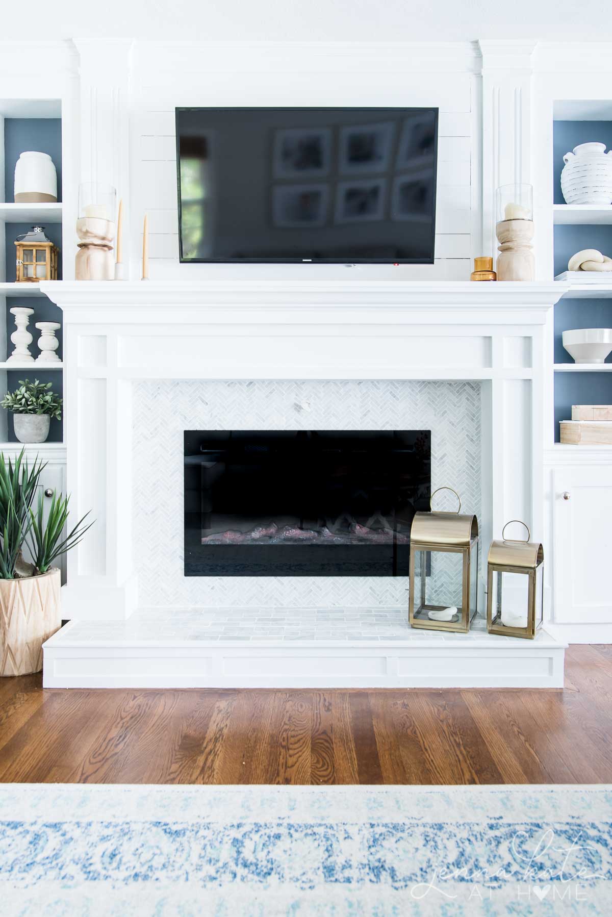
It’s a go-to for trim, cabinetry, and ceilings, especially when paired with cool or neutral wall colors.
LRV of Extra White: Why It Matters
Extra White’s Light Reflectance Value (LRV) is 86. That puts it firmly in the high-reflectance category, meaning it will bounce a lot of light around a room. But it also has a tiny bit of depth, which helps it avoid looking sterile like some ultra-bright whites.
In a nutshell:
- LRV 86 = bright, reflective white
- Not stark, but noticeably cooler than creamy whites
- Looks crisp and clean without feeling clinical
If you want to understand how LRV impacts color choices, I have a full guide explaining everything you need to know about LRV.
Extra White Undertones: What You Need to Know
Extra White has a subtle blue-gray undertone, which makes it feel cool but not cold. In south-facing or warm-lit rooms, this undertone is barely noticeable. In north-facing or low-light rooms, it may read a little gray or even slightly blue—especially when paired with cooler furniture or finishes.
Important note: Extra White can vary slightly depending on paint formula.
- Wall paints: Slightly cooler finish due to the base formula
- Trim/cabinet paints: Slight warmth can appear from the yellow tint in the base
This subtle shift is one reason I recommend using the same finish on walls and trim (or at least sampling both finishes before committing).
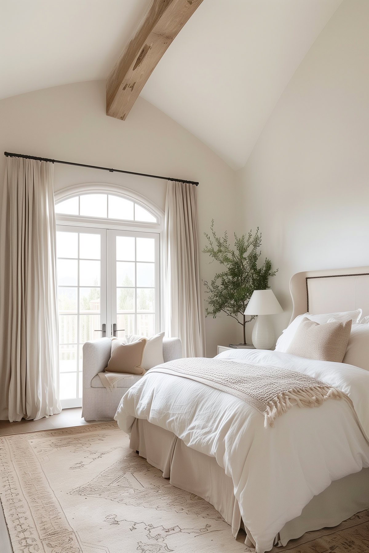
Where Extra White Works Best
Extra White is one of the most versatile whites—especially for cool-toned palettes or modern spaces. Use it for:
- Exteriors: Works well with cool-toned siding or brick and factory-finished whites
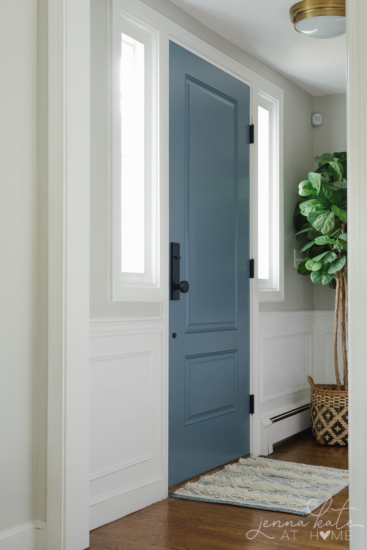
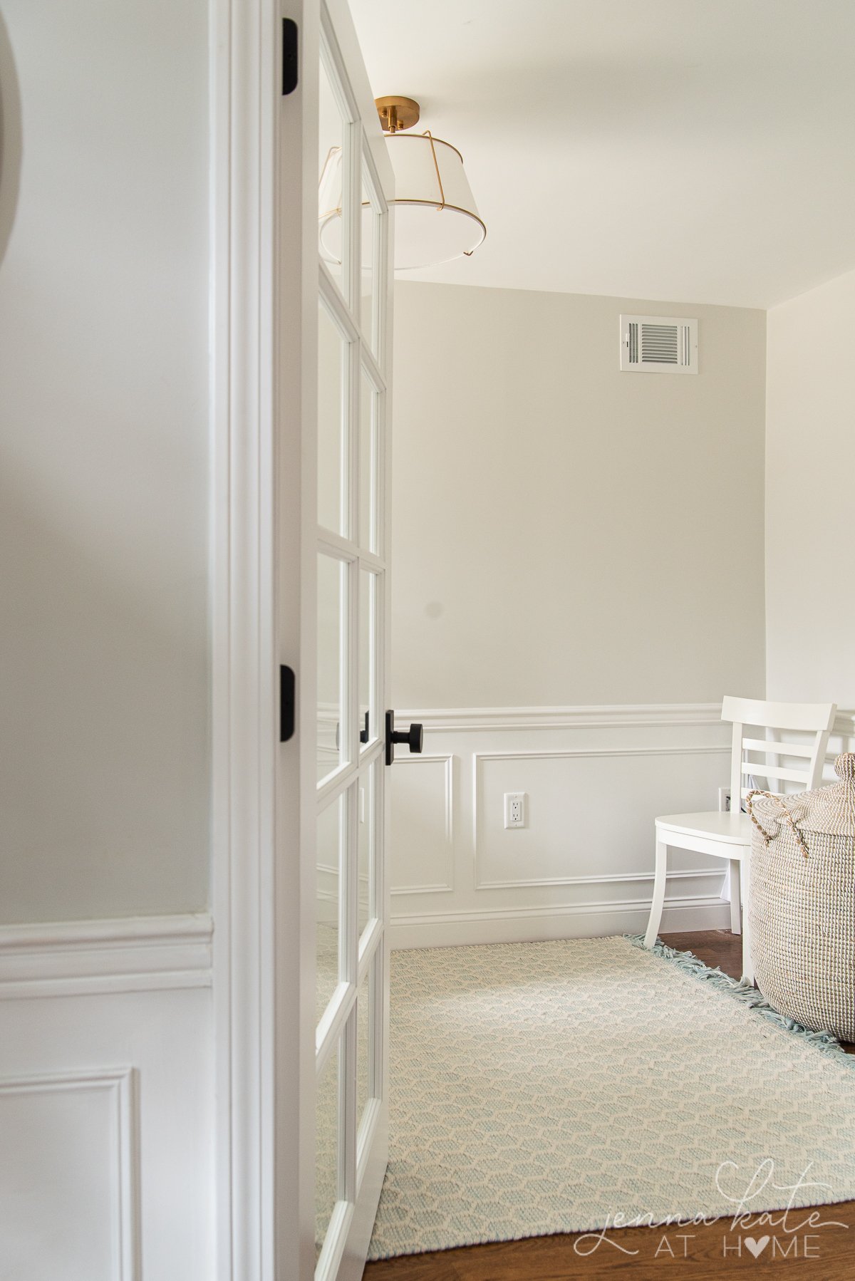
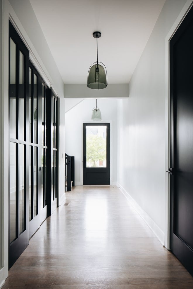
- Trim and doors: Clean and crisp
- Ceilings: Especially effective in rooms with gray or blue walls
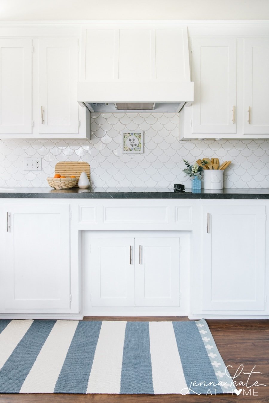
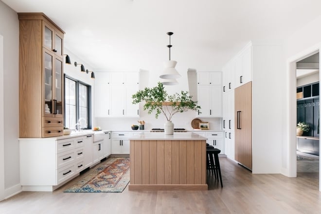
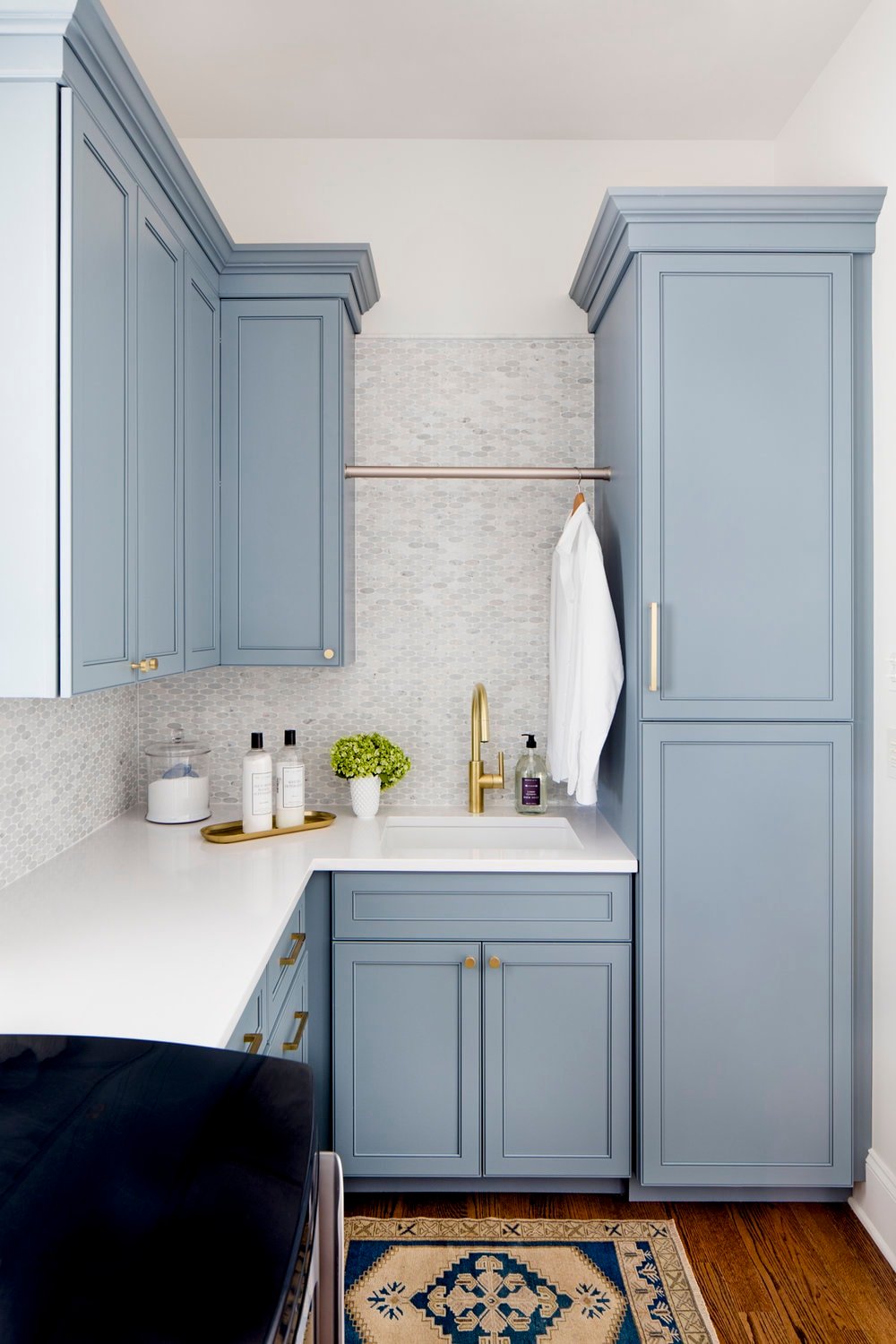
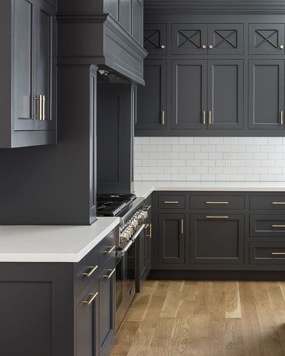
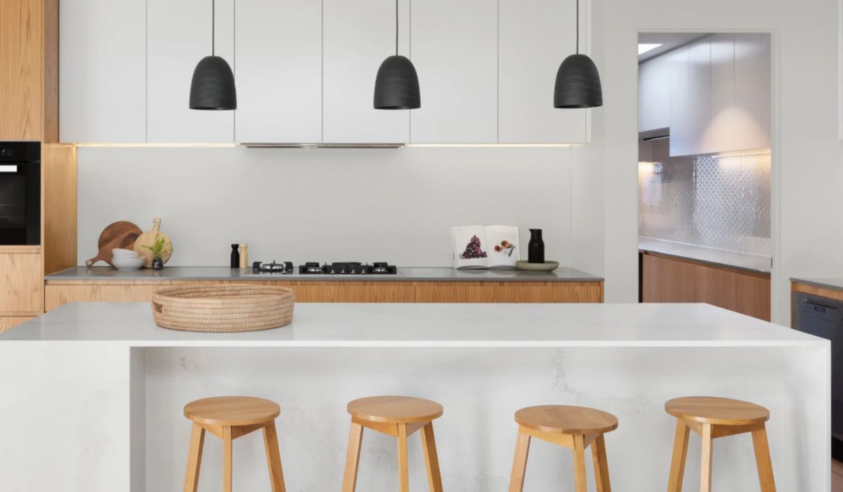
- Cabinetry: A sleek, high-contrast option in modern or transitional kitchens
- Walls: Best in bright spaces or homes with predominantly cool finishes
- Closets and pantries: Keeps smaller spaces feeling bright, open, and clean—even with limited or artificial lighting.
Where It Might Not Be the Best Fit
- If your home has a lot of warm wood tones or beige walls, Extra White may look too stark or blue by contrast.
- Avoid pairing it with warm whites like Alabaster, White Dove, or Swiss Coffee—they’ll highlight its coolness.
- In very dark, north-facing rooms, it might look dingy or gray.
Best Trim and Ceiling Pairings for Extra White
- Same Color, Different Sheen: Use Extra White on both walls and trim but in different finishes. I recommend eggshell or matte for walls and satin or semi-gloss for trim. This gives subtle contrast without undertone clashing.
- High Reflective White: If you want even brighter trim, this ultra-white shade offers a crisp contrast.
- Pure White: A slightly warmer alternative that blends more easily with both warm and cool palettes.
Extra White vs. Other Popular Whites
Sherwin Williams Extra White vs. Pure White
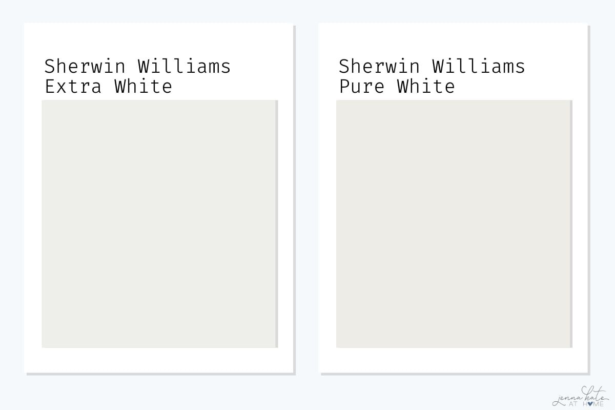
Pure White (SW 7005) is slightly warmer than Extra White. It has a touch of yellow and gray, giving it a softer, more versatile feel. Extra White is crisper and cooler, and may show more blue or gray undertones in certain lighting. Pure White is a better choice if you’re working with mixed warm and cool tones.
Verdict: Pure White is softer and more versatile; Extra White is cooler and crisper, better for modern palettes.
SW Extra White vs SW Alabaster
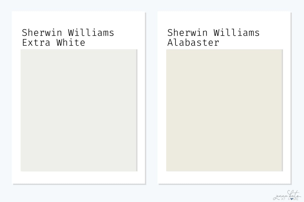
Alabaster (SW 7008) is a creamy, warm white with a soft beige undertone. Compared to the cool, crisp Extra White, Alabaster feels much cozier and is better suited for traditional or warm-toned spaces. These two are not good pairings for trim and walls unless strong contrast is desired.
Verdict: Alabaster is warmer and creamier; better suited for traditional or cozy spaces. Extra White feels brighter and more modern.
Sherwin Williams Extra White vs. High Reflective White
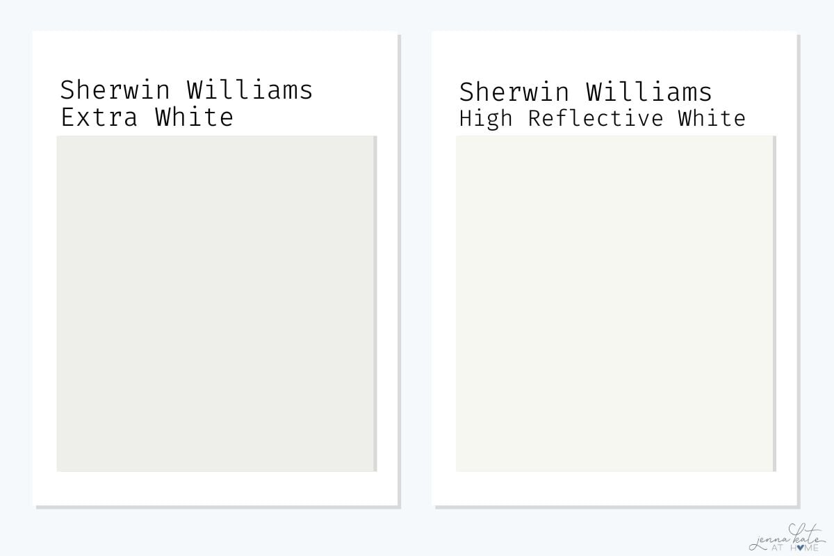
High Reflective White (SW 7757) is Sherwin Williams’ brightest white, with an LRV of 93 compared to Extra White’s 86. It’s more neutral with fewer undertones, while Extra White can lean blue in cooler lighting. High Reflective White is best for ultra-modern, high-contrast looks.
Verdict: High Reflective White is the brightest and most neutral white SW offers; Extra White is a touch softer and slightly cooler.
Sherwin Williams Extra White vs. Benjamin Moore Chantilly Lace
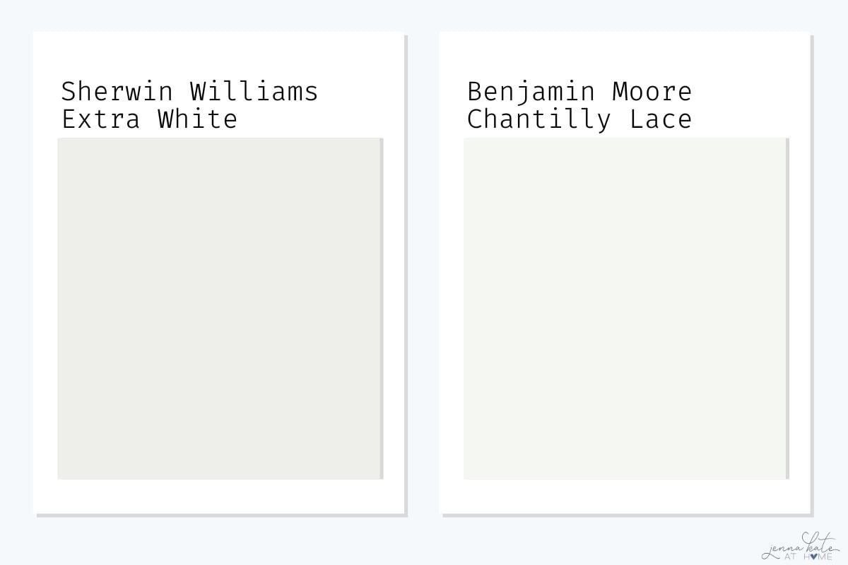
Chantilly Lace (BM OC-65) is a clean, neutral white that’s slightly brighter than Extra White. While both can work in modern spaces, Chantilly Lace is more flexible across lighting conditions due to its near-zero undertones, making it a safer choice if you don’t want the risk of blue flashing.
Verdict: Chantilly Lace is more neutral and flexible across lighting; Extra White may show cool undertones in low light.
Sherwin Williams Extra White vs. Benjamin Moore Decorator’s White
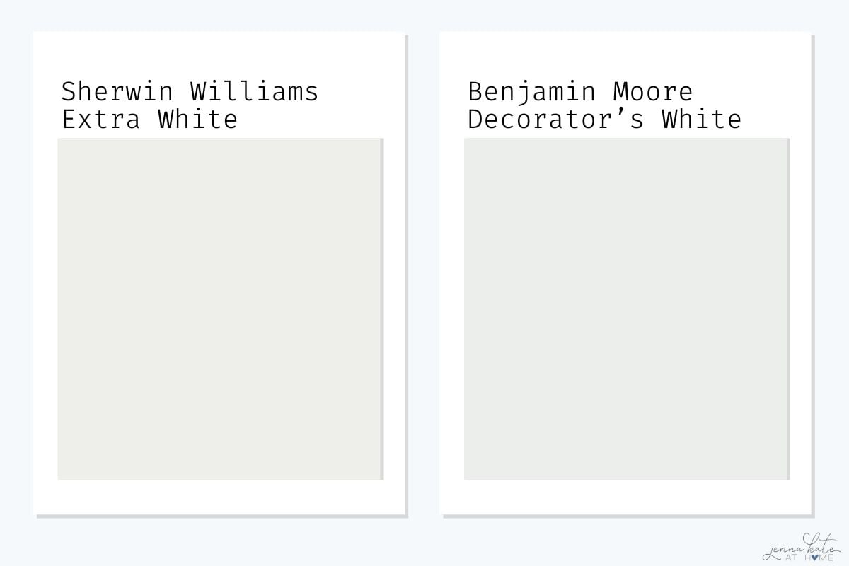
Decorator’s White (BM OC-149) has noticeable cool violet-gray undertones and an LRV of 82.64, making it darker and moodier than Extra White. It’s a nice alternative if you want a cooler white with a bit more depth and softness.
Verdict: Decorator’s White is darker and moodier with stronger gray-violet undertones; Extra White is brighter and cleaner.
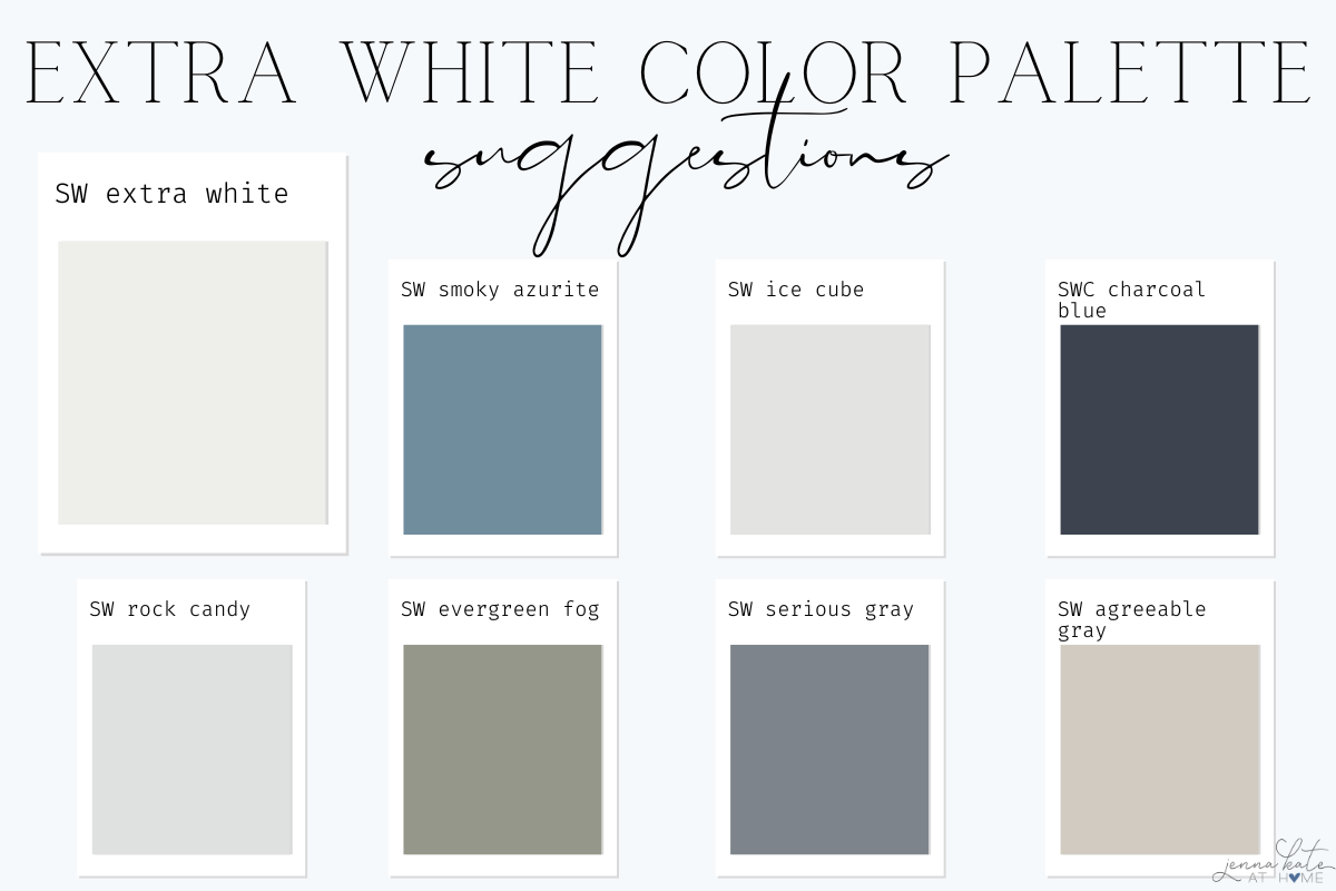
Coordinating Colors for Extra White
Pair Extra White with cool, crisp shades for a fresh and cohesive palette:
- Natural woods or light oak – to warm it up without clashing
- SW Smoky Azurite – deep, moody blue
- SW Ice Cube
- SW Charcoal Blue
- SW Rock Candy – icy gray-blue
- SW Passive – soft cool gray
- SW Sea Salt – green-gray with coastal vibes
- SW Iron Ore – dramatic charcoal contrast
Frequently Asked Questions
Not in bright or south-facing rooms. In darker rooms, it may feel too cool or flat unless you balance it with warm furnishings.
Yes! Just use different sheens—matte or eggshell for walls, satin or semi-gloss for trim—for subtle dimension.
Rarely. It’s one of the least likely to go yellow, even in warm lighting.
Extra White is cooler and cleaner. Pure White is slightly warmer and softer.
Absolutely. It reflects a lot of light and gives that seamless “barely there” ceiling look.
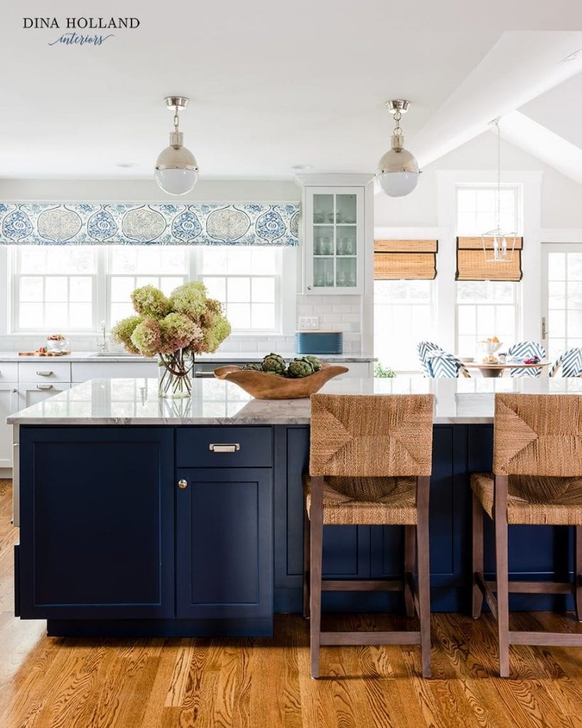
Yes, especially paired with black shutters or navy doors. Just keep in mind it can look cooler outdoors.
Don’t Forget…
Don’t forget – no matter what you’ve read or photos you’ve seen online, it’s really important to sample paint colors in your home before committing!
Samplize provides real paint samples that are easy to move around your home, and cheaper than buying a gazillion paint pots! It’s the only way I buy paint samples.
Final Thoughts
Sherwin Williams Extra White is a crisp, clean, cool white that works beautifully in modern and coastal homes—or any space with a cool color palette. While not the brightest white in the lineup, it delivers a striking contrast against mid-tone colors and remains a favorite for trim, cabinets, and beyond.

We started painting our house Extra White and it looks crisp and pretty on one part of the back and gray and dull (yuck) on the other. We are getting really nervous on how the front of our house will look. We are in panic mode and our painter said we can switch to Pure White if we want to (this was the other color we were considering). Do you think this is a safer bet? I was concerned it would look to warm with the sun but I would take warm over gray at this point. The front of our house faces the South. We are using Black Tricorn for trim and will be installing black gutters. Help as we need to decide asap. Thank you!
Extra White can look slightly cool/gray when compared to a brighter white, but shouldn’t when standing alone. The side that’s looking gray is in shadow I’m assuming? Pure White is slightly warmer and softer and doesn’t have as much of that coolness to it. You could also go with a brighter white like SW High Reflective White which is whiter than Extra White but has a smidge of warmth to it to stop it looking cool/gray/blue.
Hello Jenna,
What is the interior wall color next to you front door? Thank you!
It’s SW Repose Gray
My home builder has selected Extra White for all of the walls in our home and Pure White for the trim. What do you think of them together like this? I would have switched them around and used the brighter one for trim. Or I’m tempted to use Pure White for trim and walls. Thanks for your expert opinion!
I definitely would not pair them together like that. Either switch them like you suggested or use one for both wall and trim.
Oh I can’t thank you enough for responding so quickly!! Apparently our cabinets will be pure white as well (this cannot be changed). Do you still think the best option for this big open concept space is pure white cabinets, walls, and trim but in different sheens? That’s a lot of PW! But I think better than dingy looking trim & cabinets next to EW walls. Thanks again for your time!
In the kitchen what is the color of the wall on the side of the refrigerator
It’s SW Repose Gray lightened by 50%
Hi! So when you buy the paint you can request repost gray at 50% lighter? Would you say this is a good paint for all walls in a home if trim and ceilings (and cabinets in kitchen) are extra white? How much does the 50% effect the LRV-looks perfect and have been searching for a very very light gray Any undertone concerns? (I initially considered ice cube but seems it could look too blue)Thanks!
Yes it looks great with Extra White! Lightening it changes the LRV to approximately 70ish, so a (barely) off-white color. Another great choice for a light gray is BM Paper White which has an LRV of 74.
What is the color blue that you used in the back of the built ins?
SW Serious Gray
Is there a big difference between SW Extra White and BM Decorators White? Is it easy to see where you have two different trim colors if you’re switching colors?
Yes – decorators white will look gray and dingy (almost dirty) next to extra white