Content may contain affiliate links. When you shop the links, I receive a small commission at no cost to you. Thank you for supporting my small business.
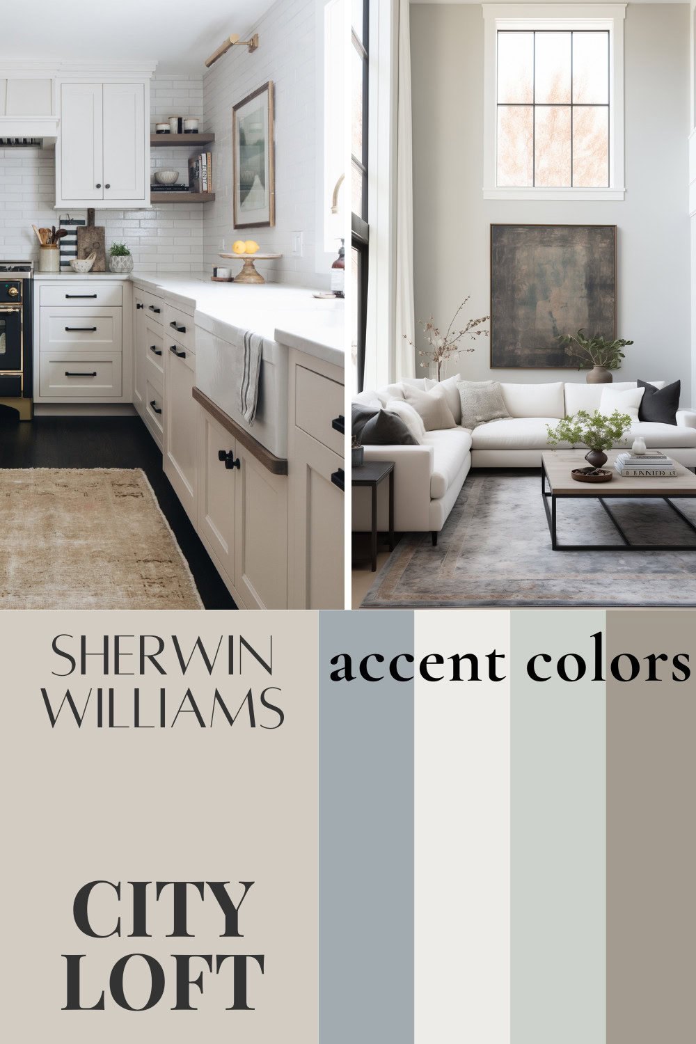
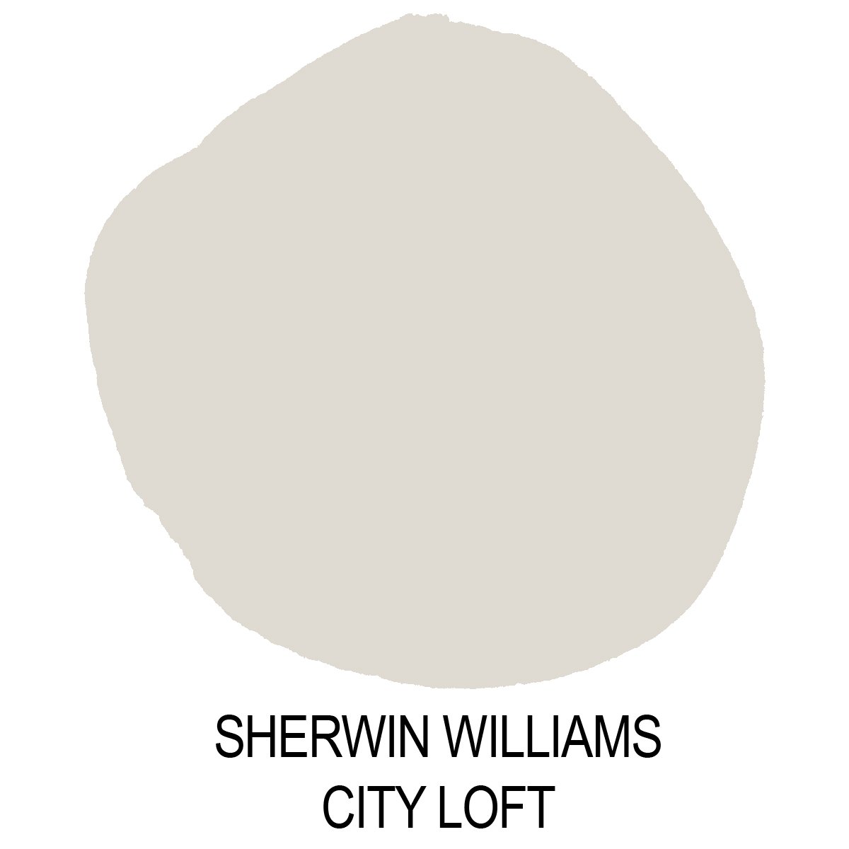
City Loft by Sherwin Williams (SW 7631) is a light-toned, warm gray paint color that is quite a popular choice in rooms where a light and airy look is desired.
In the right lighting conditions, City Loft is so pretty! However, it’s also a bit of a chameleon color because of its taupe undertone, which can flash pink or purple depending on the light and the surroundings.
What Are City Loft’s Undertones?
Everyone’s favorite question! City Loft has undertones that are gray, beige, and taupe. Taupe means that is has a soft pink/purple undertone, which is very common in warm gray paint colors. Don’t let that scare you!
A more taupe undertone is present in many of my favorite paint colors, such as Repose Gray and Incredible White. How apparent they are depends on the lighting conditions in your room, the surrounding environment (rugs, furniture and even what’s outside the windows). It also depends on how sensitive you are to these colors – what might not bother me, may drive you bonkers!
For this reason, before deciding on a paint color, I like to compare my Samplize paint swatches against a bright white surface and that really helps me to see the underlying colors.
What’s The LRV of City Loft?
City Loft has an LRV of 70, putting it on the lighter end of the scale, pretty close to being an off-white paint color. So if you’re looking for a paint color that offers nice contrast on your walls while still brightening up your room, this is a good choice.
However, City Loft can get washed out in really bright rooms, and can look a little dull and dingy if you’re dealing with a particularly dark room, so keep that in mind.
Is it a Warm or Cool Color?
Because of its slight beige undertones, Sherwin Williams City Loft is a warm paint color, but it does have enough gray to stop it from being too warm. This balance makes it a perfect candidate for creating a warm yet modern look.
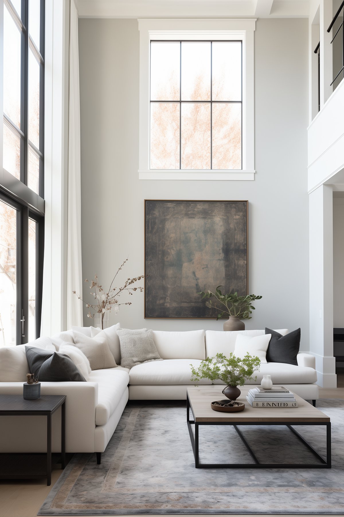
Real Room Examples
City Loft is one of those soft neutral paint colors that really will work well in any space, provided it has the right lighting conditions.
It works great in a room that is full of neutral tones and bright whites to really make it pop. This color works great with both light and dark floors, which makes it easy to place in almost any space. It truly will cozy up any of your spaces.
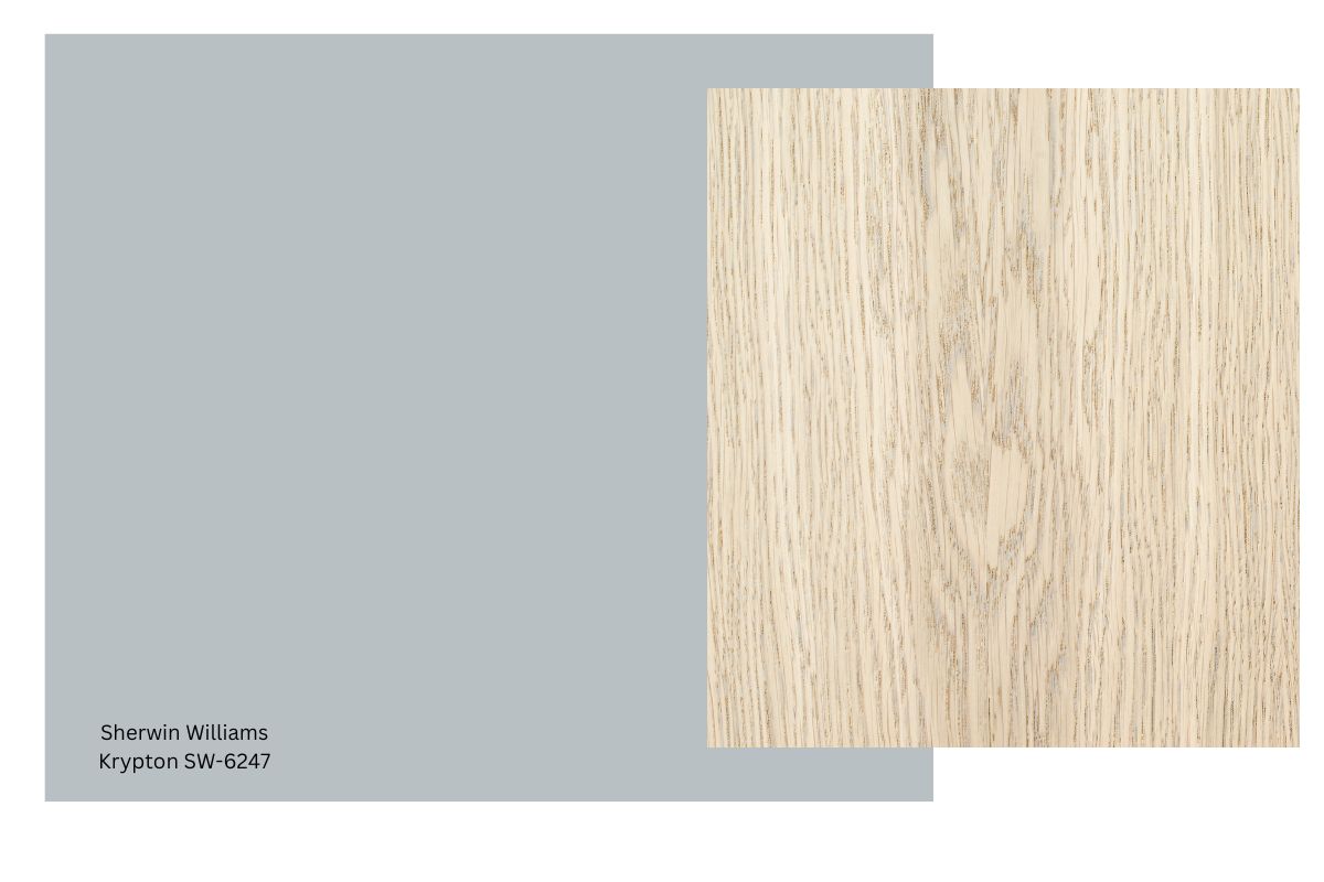
Looking for paint colors for light wood floors? City Loft is stunning!
In the real room examples below, pay attention to how the paint color will change depending on where the light and shadows fall.
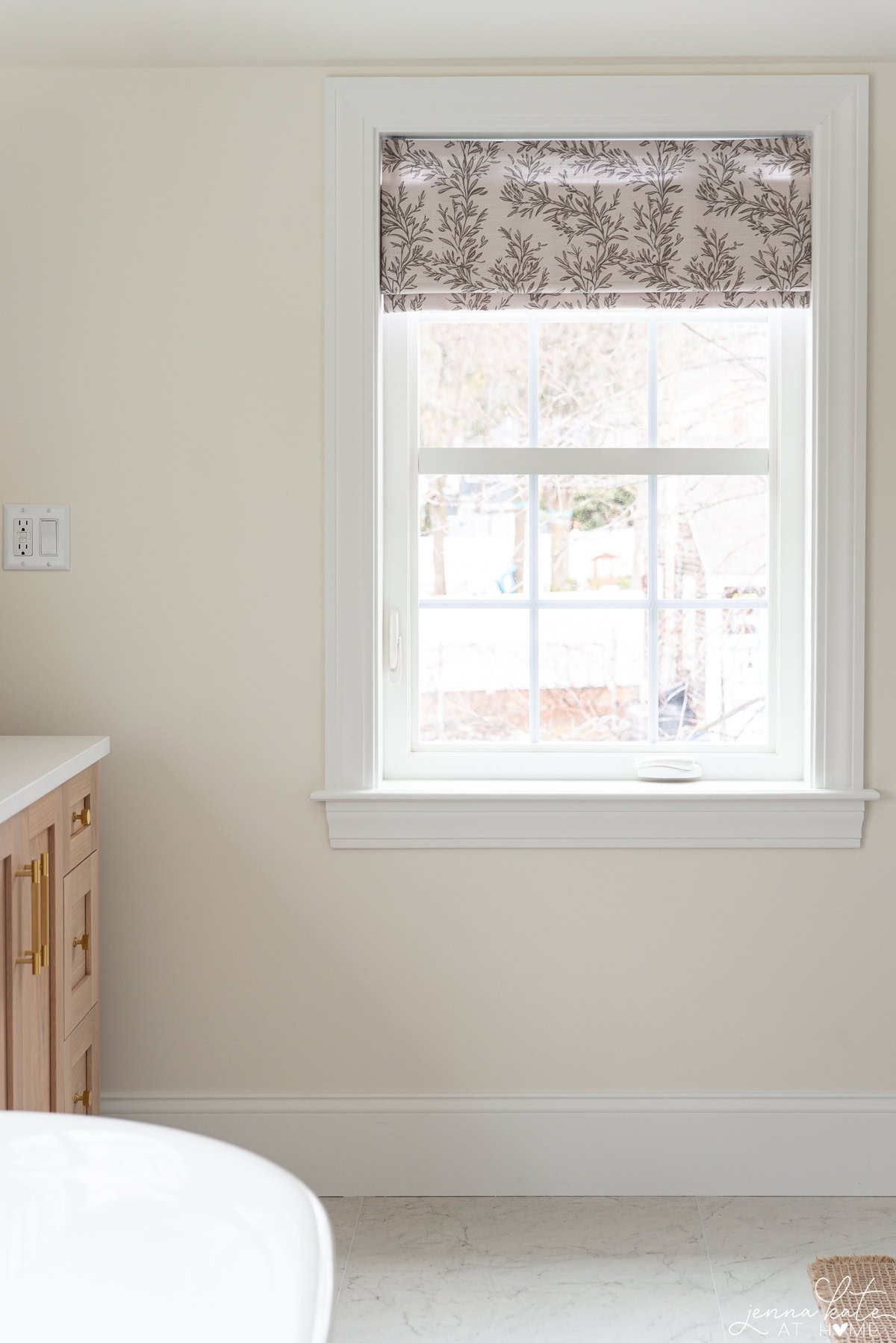
Dining Room
Here is when that chameleon color we referred to really shines through.
This room is getting nice bright light coming in from the left, which is really lifting the paint color. However, the dark accent pieces (photo frames and ceiling light) help pull out some of the warmer tones.
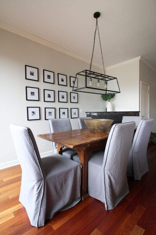
The trim paint color is a bright crisp white, which helps showcase the color on the walls. Using a softer, creamier white on the trim would not help to make the wall color pop.
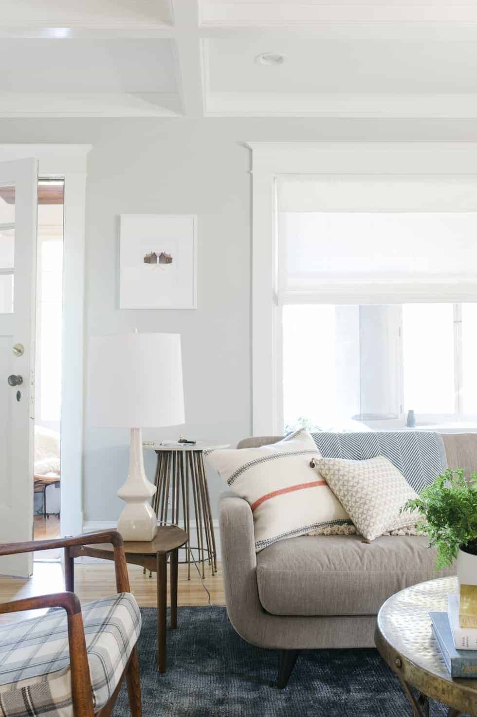
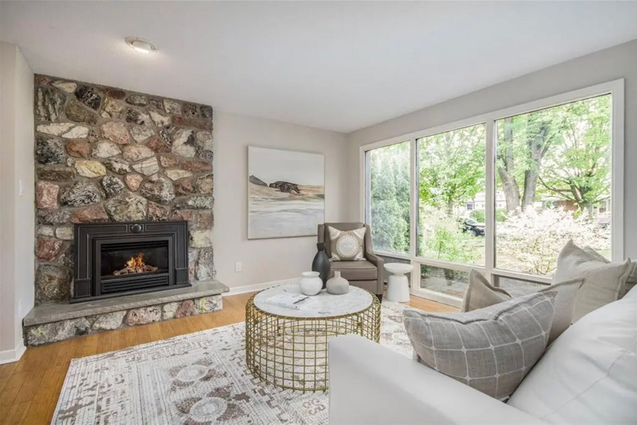
Living Room
In this living room, you can see how City Loft can pull considerably more gray when the light coming into the room is north facing.
It still has just enough warmth to keep it a warm gray, but it definitely loses some of that real warmth that we can see when artificial light or warmer southern light is introduced.
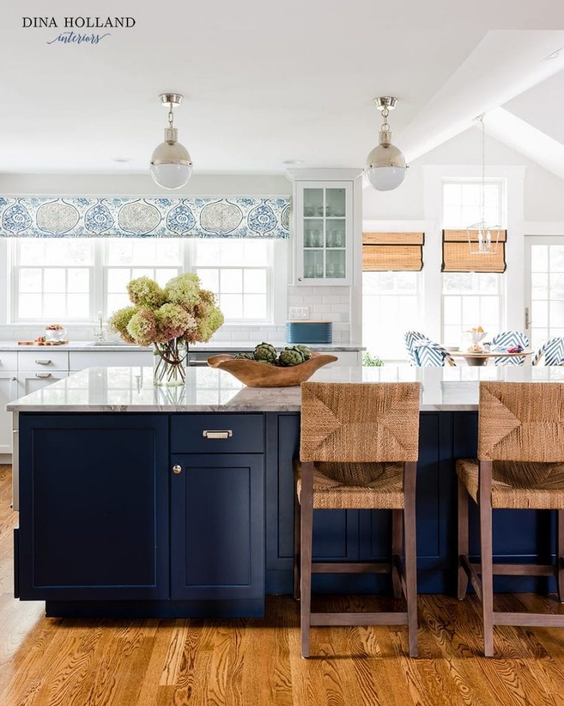
Kitchen Cabinets
While probably not my first choice, I actually really love City Loft as a kitchen cabinet color in this kitchen, and I think if you have a similarly well-lit kitchen and want a really soft warm off-white look, then it could be a contender.
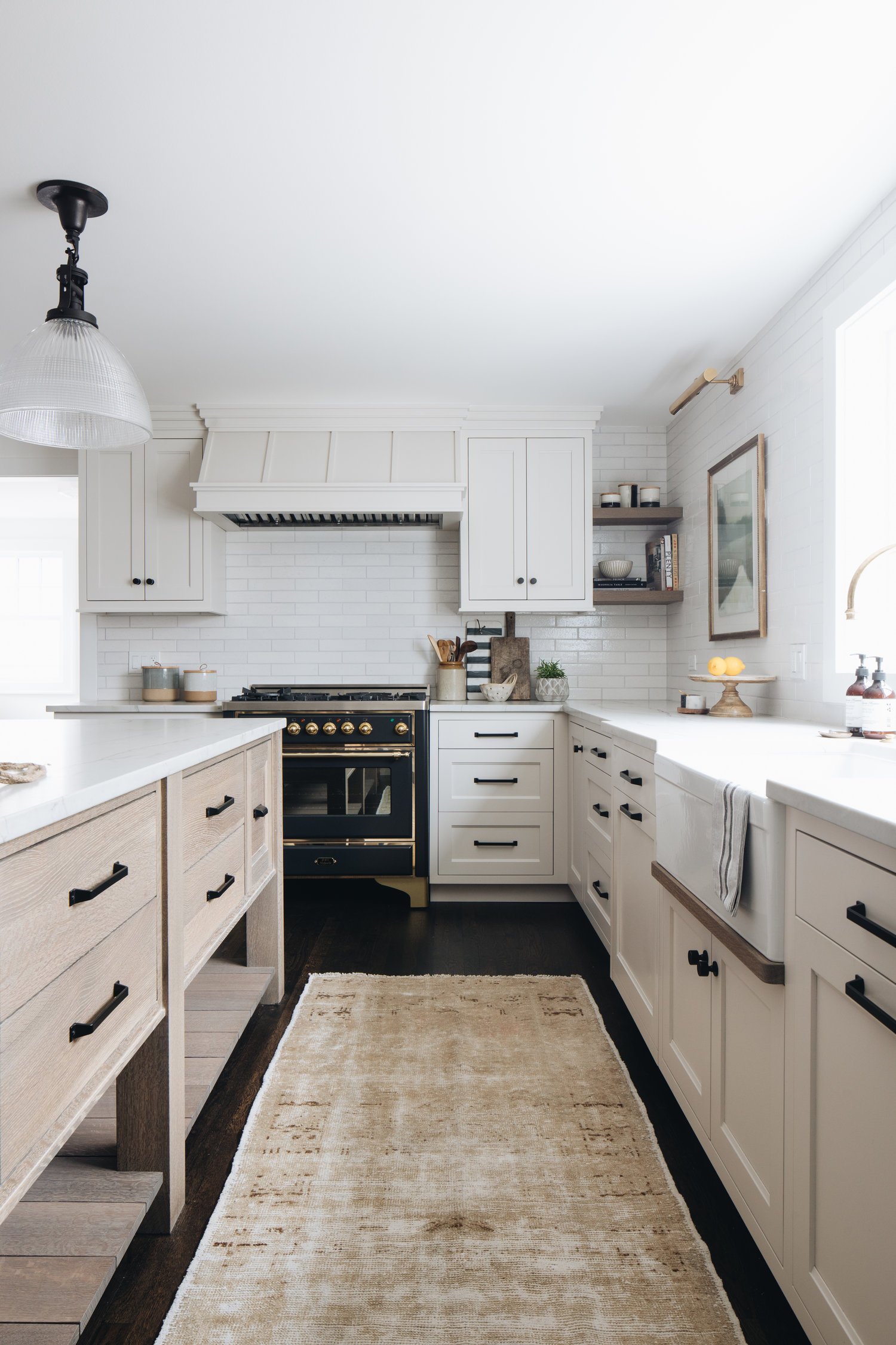
Notice how the abundance of natural light washes most of the color from City Loft in this space. The cabinets look more of a soft white than a warm gray; you’ll have to look carefully where the cabinets meet the ceiling to see the differentiation in color.
The choice of a pinkish tone wood for the island is smart too, as both the warmth and pink undertone mesh well with City Loft.
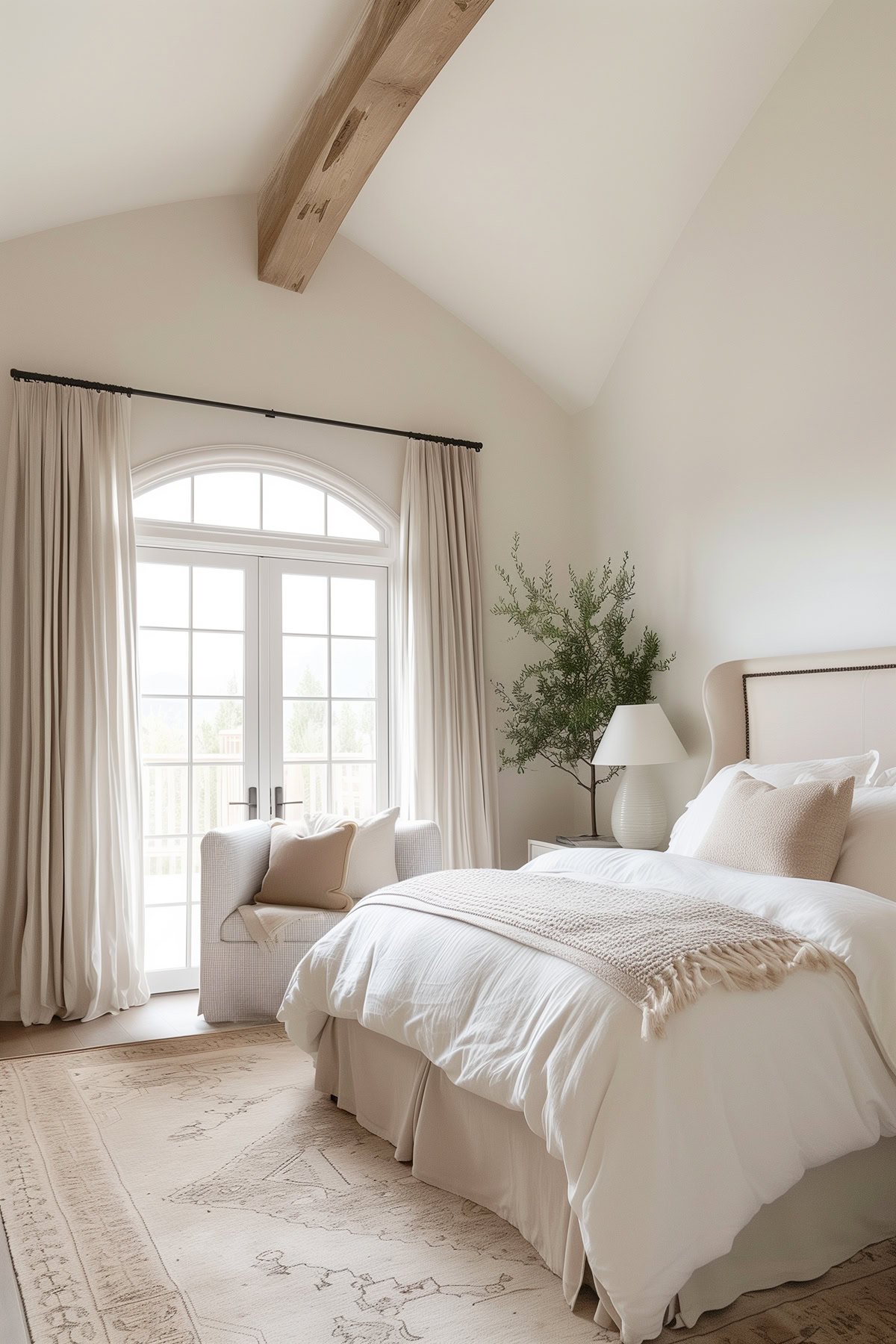
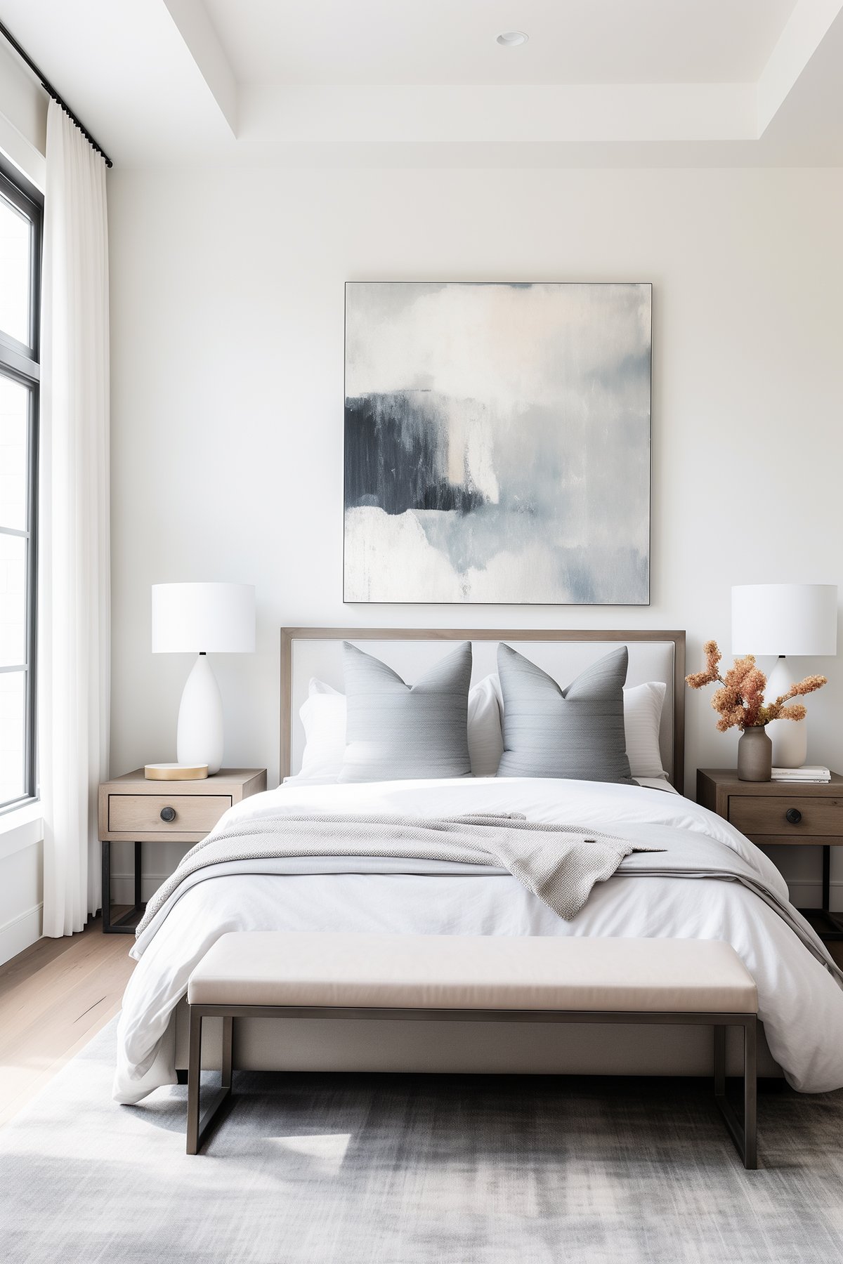
Bedroom
City Loft in this bedroom reads much warmer (almost beige) especially with yellow tones added by artificial light. You can see the difference in color between the lighted areas and the shadows.
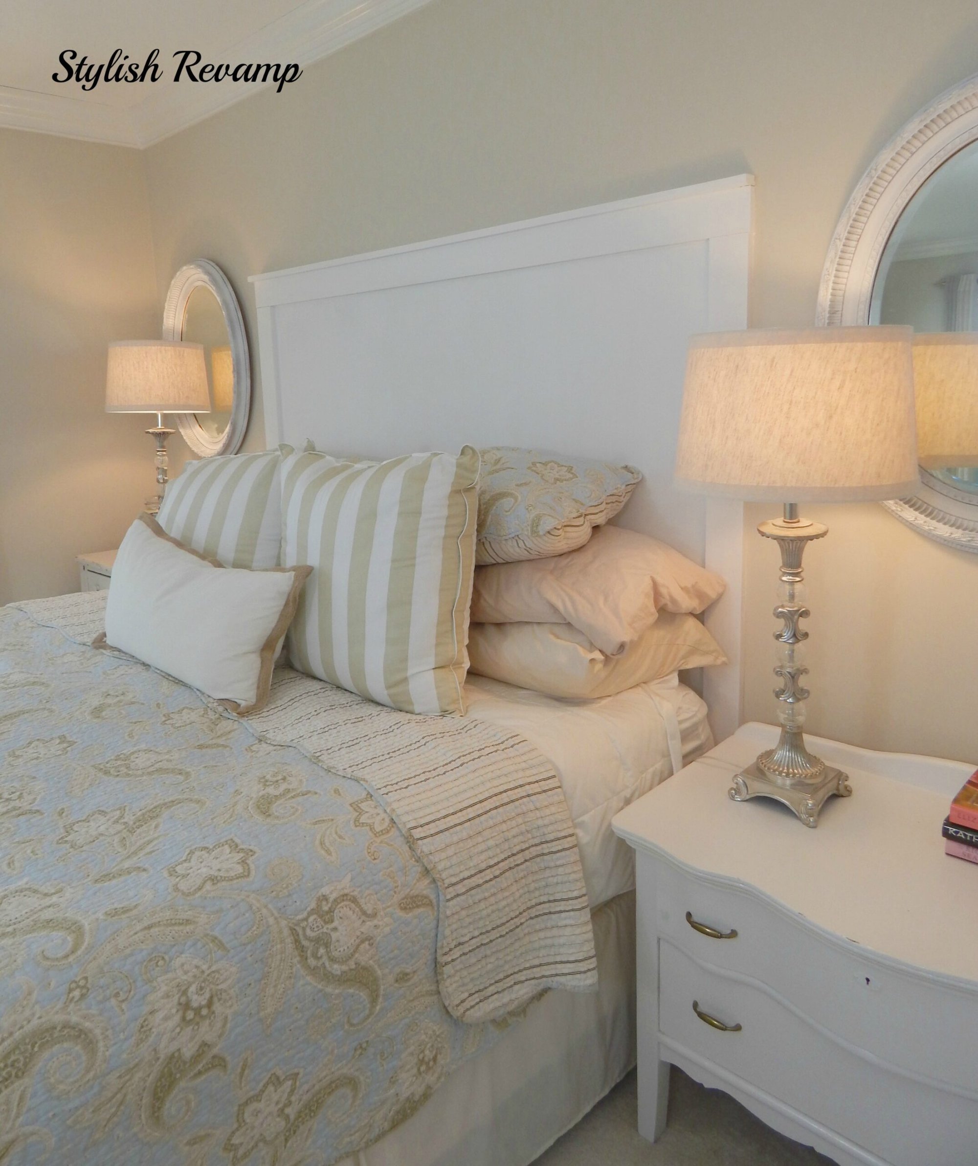
Again, pay attention to where the crown moulding and ceiling meet the walls.
Here is where you can really tell how warm City Loft can get when the lighting conditions are darker and that yellow-toned artificial light is brought in.
Such a vast contrast between this and the kitchen cabinets above!
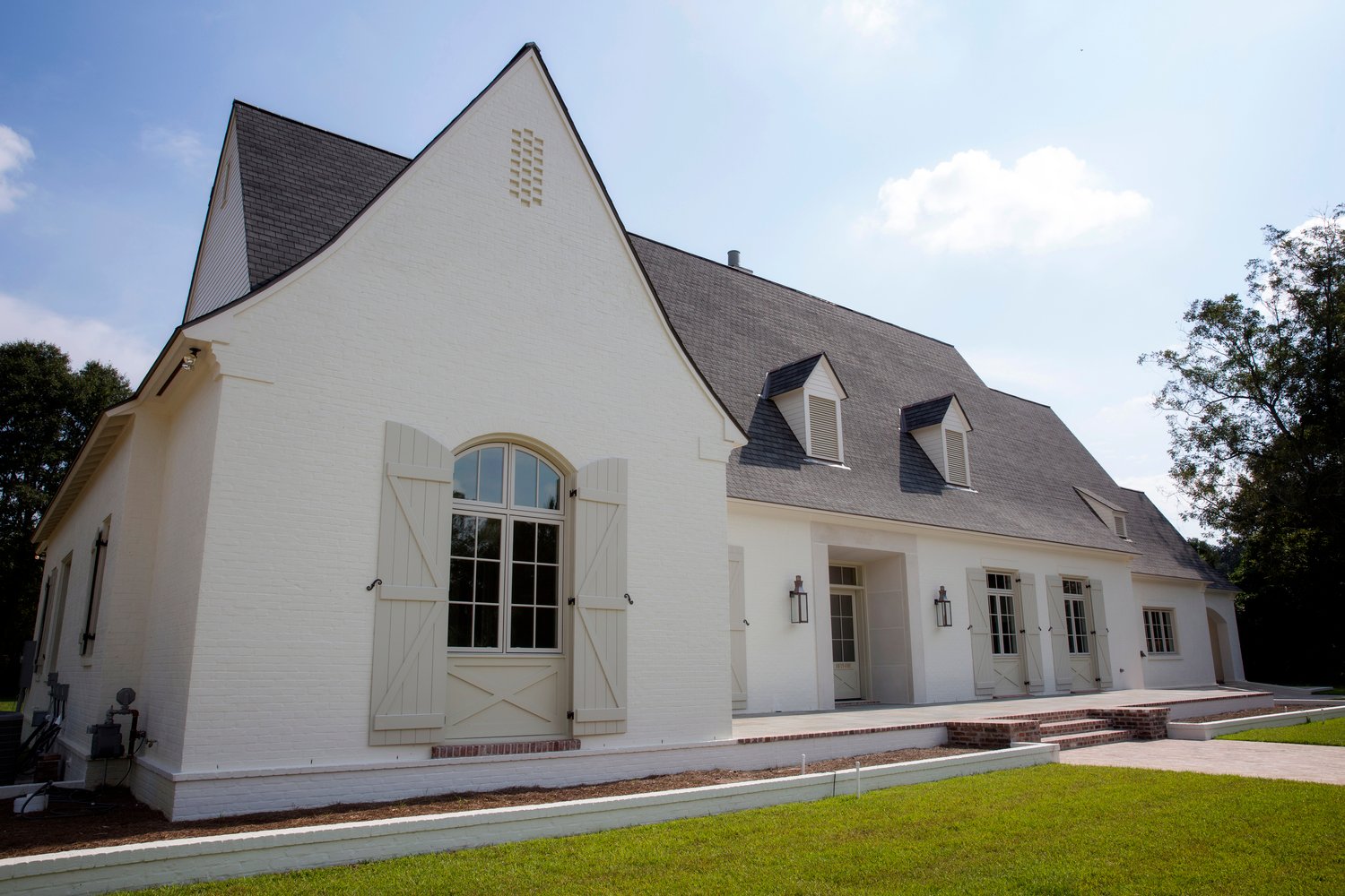
City Loft as an Exterior Color
I love how City Loft is used as the contrasting shutter color on this creamy white house. Instead of the stark contrast we’re used to seeing with shutters, this tone-on-tone look is very soft and subtle.
This effect also works equally well on interiors, if you want to do contrasting trim.
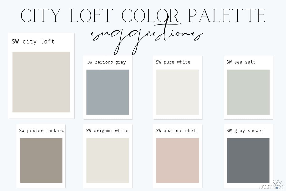
Coordinating Colors
SW City Loft is the perfect color to pair with other neutrals like cream, bright white, brown, wood tones, or beige. it is also versatile enough to be paired with bolder colors like black, dark gray, or even navy.
It can work in a transitional color scheme with neutral shades, or even as part of a coastal/beachy color scheme with cooler colors like SW Sea Salt.
Here are a few examples of coordinating colors:
Room Exposure: City Loft Under Different Lights
Understanding how room exposure affects the appearance of City Loft is crucial in predicting how it will look in your home. The direction your room faces can significantly influence how this warm paint color presents itself.
North-Facing Rooms
In north-facing rooms, natural light tends to be cooler and somewhat harsher. This type of light can bring out the cooler gray aspects of City Loft, subduing its warm beige undertones.
In my experience, City Loft in a north-facing room maintains a more consistent color throughout the day, but it tends to appear as a more muted, soft gray rather than a warm greige.
If you prefer warmer tones, you might want to amplify the room with warm artificial lighting or accent colors.
East-Facing Rooms
East-facing rooms are unique in that they get a burst of warm, yellow light in the morning, which then fades into cooler light for the rest of the day. In the morning, City Loft will likely appear warmer and lighter, accentuating its beige and warm gray hues.
As the day progresses and the natural light becomes cooler, the color might shift to show more of its gray personality.
South-Facing Rooms
South-facing rooms are a dream for warmer colors like City Loft. They receive a substantial amount of natural light throughout the day, and this light tends to be warmer, especially in the Northern Hemisphere.
In these rooms, City Loft will show its warmer side, enhancing the beige and warm undertones and making the space feel cozy and inviting. The color will appear lighter and more vibrant, possibly leaning towards the off-white range, especially if the room has a high LRV.
West-Facing Rooms
West-facing rooms can be quite dramatic for colors like City Loft. They get a moderate amount of light in the morning but are bathed in warm, intense light in the afternoon and evening.
During the morning, City Loft may appear as a gentle, muted color, but as the sun sets, it can transform into a warm, glowing hue. Colors like this are a great choice to help balance out the tricky light in west facing rooms!
Considerations for Artificial Lighting
It’s not just natural light that affects City Loft’s appearance; artificial lighting plays a significant role too. Light bulbs with a cooler temperature can enhance the gray aspects, while warmer bulbs will bring out the beige and warm tones. It’s a good idea to test City Loft under your home’s artificial lighting to see how it interacts, especially in rooms used mainly at night.
Sherwin Williams City Loft vs SW Agreeable Gray
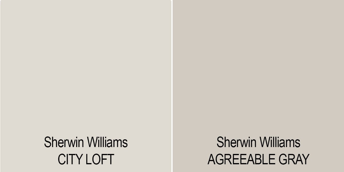
When you compare the LRV of the Sherwin Williams City Loft with Sherwin Williams Agreeable Gray both colors have strong beige and gray undertones.
When placed next to each other you can see they are both warmer colors. Agreeable Gray does come across more gray when side by side. However, City Loft gives a much lighter and brighter feeling than Agreeable Gray, since it has an LRV of 70, compared to Agreeable Gray’s LRV of 60/which can come off as quite dark and heavy in darker rooms.
Sherwin Williams City Loft vs SW Drift of Mist
City Loft and Drift of Mist are both light, warm grays that lean toward the off-white end of the spectrum due to their higher LRVs. The key difference is in their undertones: City Loft has a subtle violet-pink undertone, adding warmth, while Drift of Mist tends toward a faint green, giving it a cooler edge.
City Loft’s pinkish undertone tends to be more versatile, blending well with a wide range of interior finishes. In contrast, Drift of Mist’s slight green can be more challenging to match, unless your decor or finishes share similar undertones. My best tip? Test out samples of both in your space to truly see how they interact with your unique environment and lighting. It’s the most reliable way to make the right choice!
Frequently Asked Questions
When you compare Sherwin Williams City Loft to a beige, it looks gray. But, when you compare it to a gray, it looks much more beige or even taupe. The surroundings and lighting will determine the color that will come across in your space.
For trim Sherwin Williams Pure White is always a safe bet. It’s a bright white with just a smidge of warmth so it never looks cold. It looks great with all wall colors, but it’s especially the correct choice if the color is warm.
For a really bright, crisp white you could also pair this color with SW High Reflective White, which would really make the City Loft pop. Benjamin Moore Chantilly Lace would also be a great choice.
On the other hand, I would avoid pairing City Loft with yellow-based whites like SW Alabaster.
Final Thoughts
Remember this is a chameleon color and if you are thinking about using Sherwin Williams City Loft, it is very important to make sure you get a sample of it first.
Don’t Forget…
Don’t forget – no matter what you’ve read or photos you’ve seen online, it’s really important to sample paint colors in your home before committing!
Samplize provides real paint samples that are easy to move around your home, and cheaper than buying a gazillion paint pots! It’s the only way I buy paint samples.
Observing the color at different times of the day in various rooms, whether north-facing with subtle light or east-facing with bright morning rays, can help you decide if it’s the right fit for your space.