


Content may contain affiliate links. When you shop the links, I receive a small commission at no cost to you. Thank you for supporting my small business.
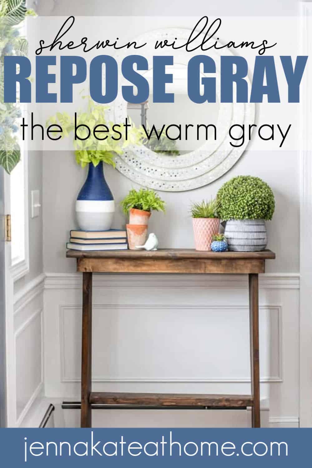
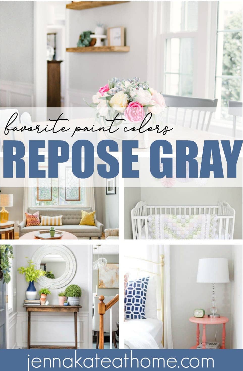
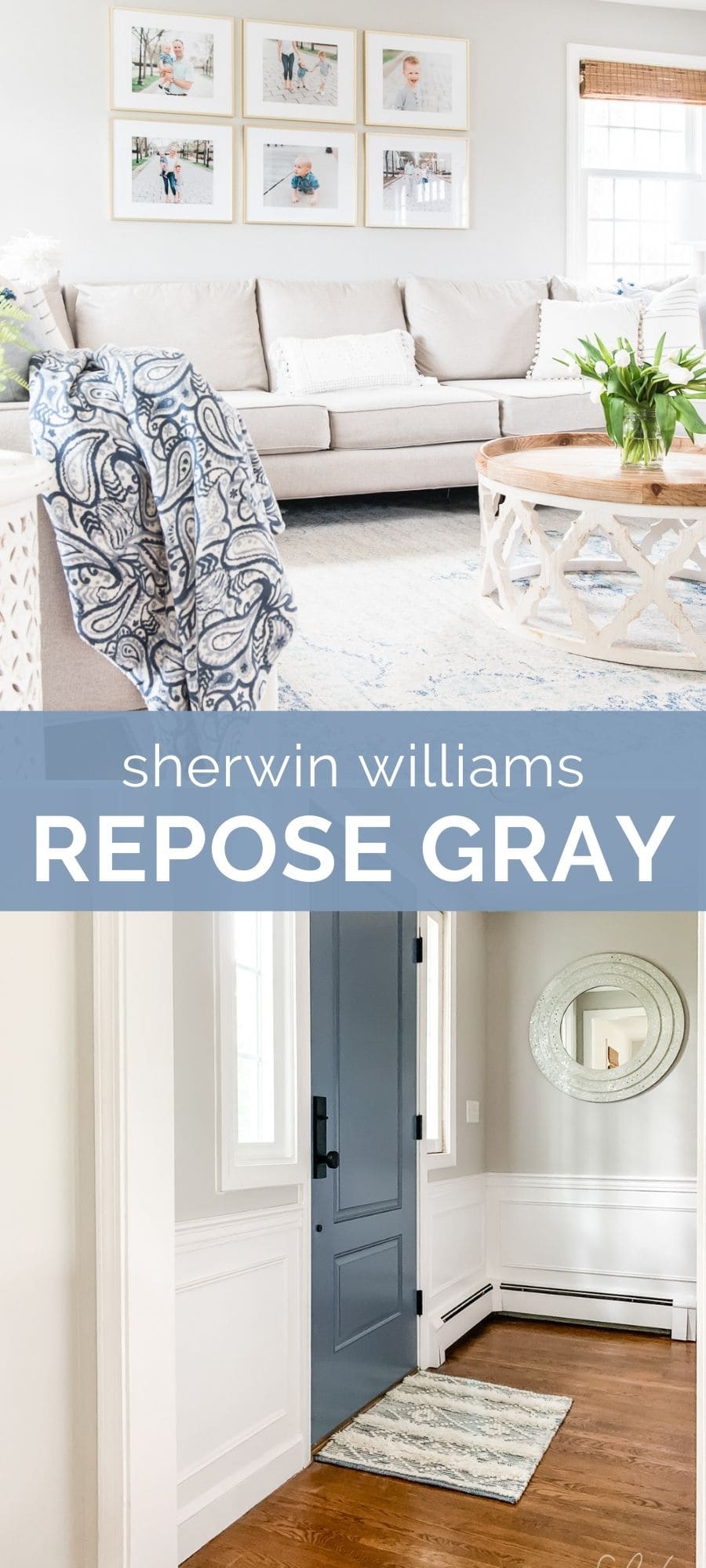
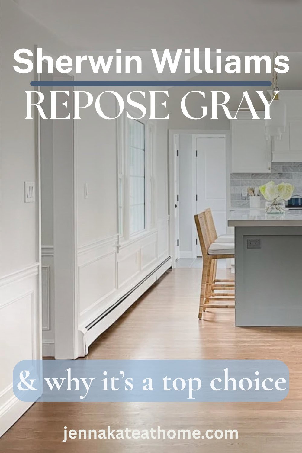
For nearly ten years, Sherwin Williams Repose Gray was the paint color I recommended more than almost any other. I used it throughout my own home, suggested it to thousands of readers, and genuinely believed it was one of the most versatile greiges Sherwin Williams made.
Today, I still love it, but my opinion has changed.
Today, I’m a little more selective about where I recommend it. I find it looks its absolute best in bright, well-lit rooms or when mixed at 50% strength, where its beautiful undertones shine without feeling too heavy.
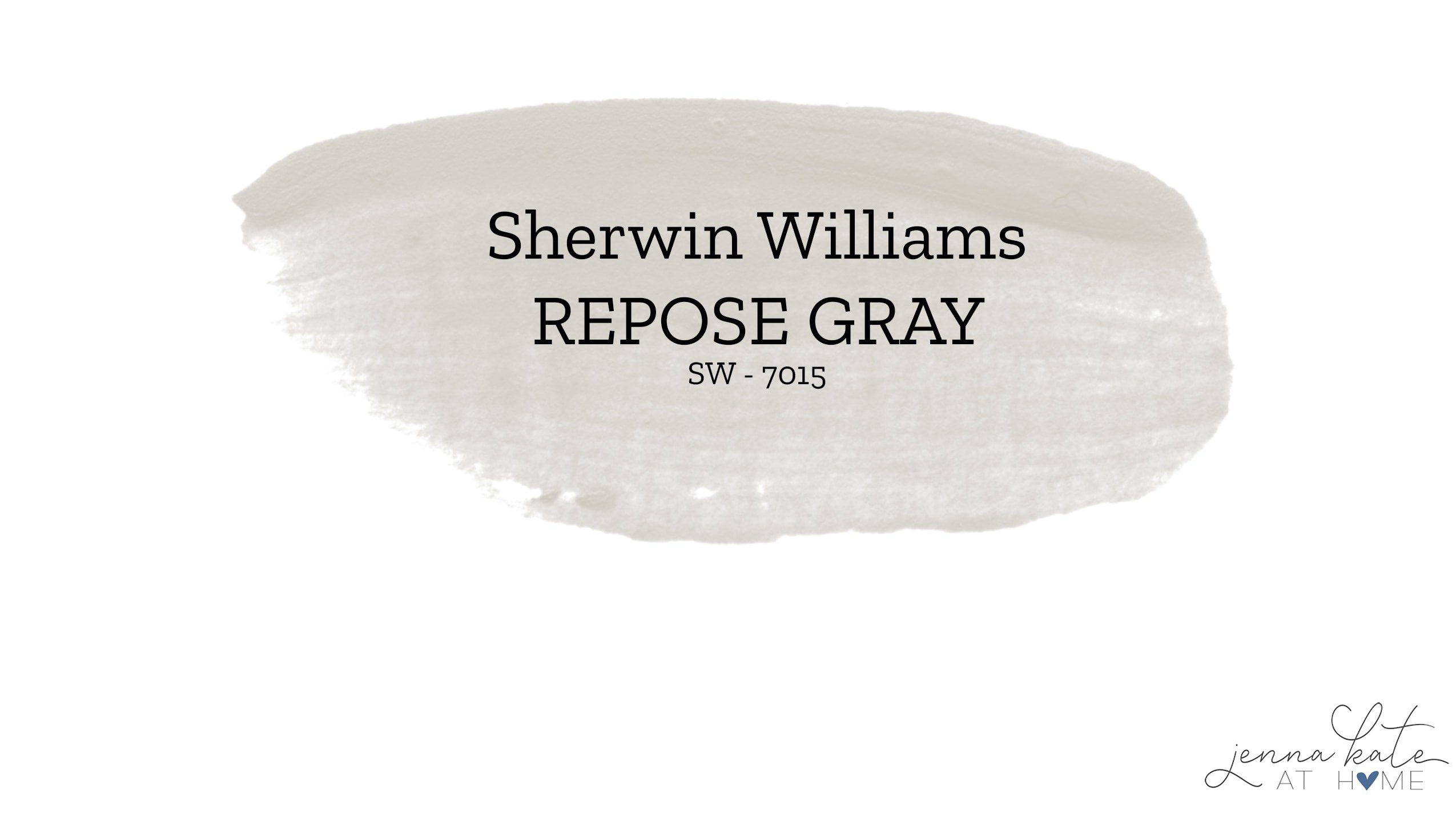
If you’re considering Repose Gray for your home, here’s everything I’ve learned – from its undertones and lighting to how it compares to other popular greige paint colors.
Sherwin Williams Repose Gray at a Glance
- Color Family: Warm gray (greige)
- LRV: 58 Undertones: Green + taupe
- Best For: Living rooms, kitchens, cabinetry and whole-house color schemes
- Pairs Well With: Pure White, White Dove, Alabaster
- My Verdict: One of Sherwin Williams’ best greiges, especially in bright rooms or at 50% strength.
What Does Repose Gray Look Like?
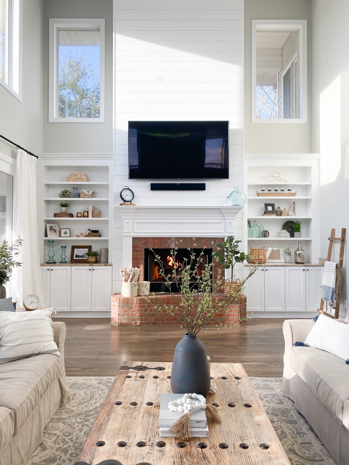
Sherwin Williams Repose Gray sits right on the line between gray and greige, but if I had to describe it in one word, I’d call it a warm gray. With an LRV (Light Reflectance Value) of 58, it’s a medium-depth neutral that feels balanced rather than too light or too dark.
What makes Repose Gray so versatile is its subtle green and taupe undertones. Unlike many gray paint colors that can look icy blue or overly cool, Repose Gray stays soft and inviting without drifting into beige territory. It’s one of the reasons it’s remained one of Sherwin Williams’ most popular whole-house paint colors for years.
That’s actually why I chose it for our home. Every other gray I sampled in our kitchen looked noticeably blue, especially on cloudy New England days. Repose Gray was the first color that stayed true to gray while still feeling warm and welcoming.
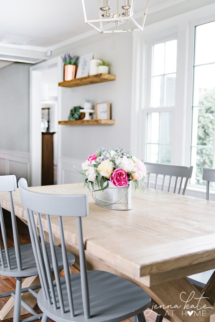
Like every paint color, lighting makes a huge difference. In bright, sun-filled rooms, Repose Gray reads as a soft, classic gray. In darker spaces, its green and taupe undertones become more noticeable, giving it a slightly warmer appearance. Because of that, I now tend to recommend Repose Gray in brighter rooms – or mixed at 50% strength if you’re after a lighter, more modern look.
If you’re new to paint colors, I’ve put together a guide explaining what LRV is and why it matters when choosing paint.
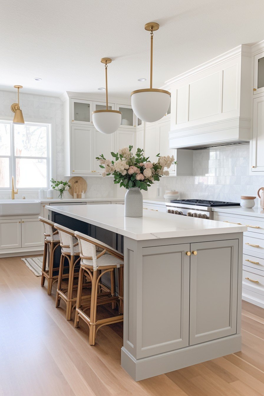
One thing I still love about Repose Gray is how adaptable it is. Those subtle undertones allow it to work with both cool and warm finishes, making it easy to pair with crisp white trim, natural wood tones, brass hardware, or black accents. Compared to a warmer greige like Benjamin Moore Revere Pewter, Repose Gray stays noticeably grayer and never develops that muddy look that some warmer neutrals can.
Don’t Forget To Always Use Real Paint Samples!
Don’t forget – no matter what you’ve read or photos you’ve seen online, it’s really important to sample paint colors in your home before committing!
Samplize provides peel and stick paint samples made with real paint, that are easy to move around your home, and cheaper than buying a gazillion paint pots! It’s the only way I buy paint samples.
Decorating with Repose Gray
What White Trim Color Goes With Repose Gray?
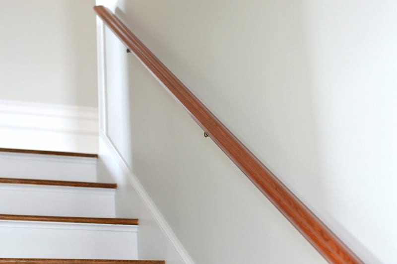
One of the reasons Repose Gray has remained so popular is because it pairs beautifully with both warm and cool whites.
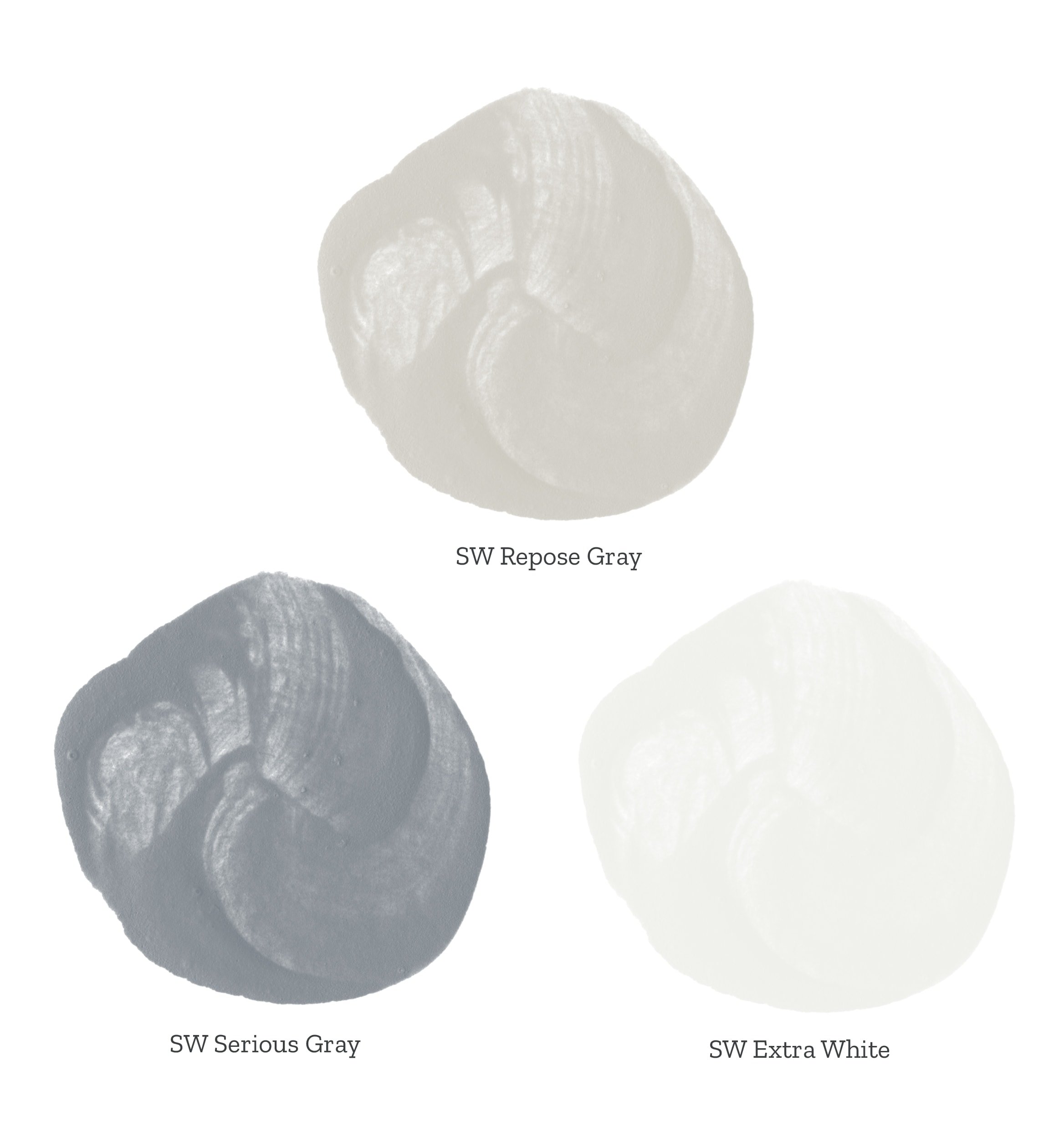
If you prefer a bright, crisp look, Sherwin Williams Extra White or Benjamin Moore Chantilly Lace create clean contrast.
For a softer, more balanced pairing, Sherwin Williams Pure White is my favorite. If your style leans warmer, Benjamin Moore White Dove or Simply White are also beautiful choices.
If I had to choose just one, though, it would still be Sherwin Williams Pure White.
Is Repose Gray a Good Whole House Paint Color?
Yes, but this is one recommendation that’s changed for me over the years.
When I first started using Repose Gray, I recommended it at full strength throughout an entire home. I still think it’s a beautiful whole-house neutral, but today I’d approach it a little differently.
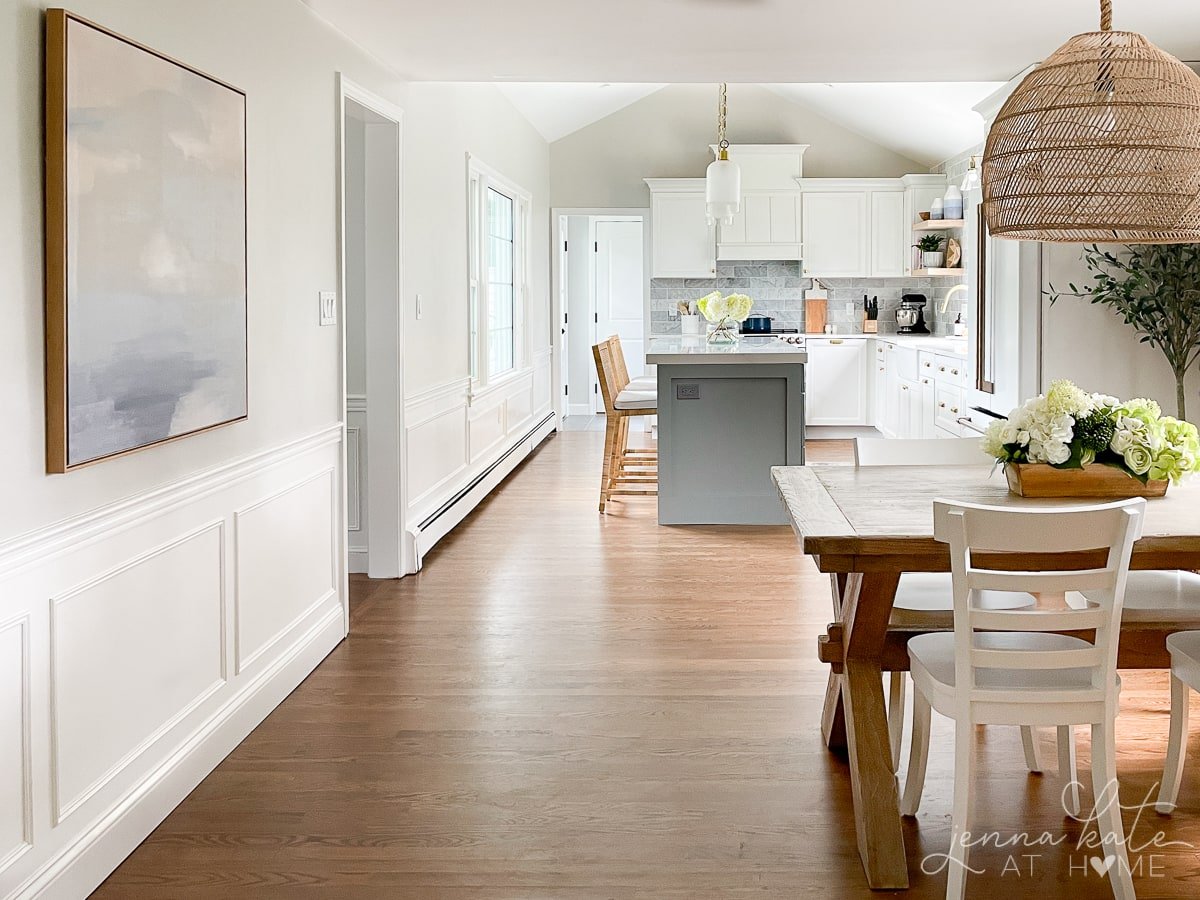
If your home gets plenty of natural light, I still love Repose Gray at full strength. But if your rooms are darker – or if you prefer the lighter, airier look that’s become popular over the last few years – I almost always recommend Repose Gray at 50% strength instead.
RELATED: Best Whole House Paint Colors
In fact, that’s exactly what I eventually did in my own home, and I honestly wish I’d done it sooner.
You still get the balanced undertones that make Repose Gray so versatile, but the lighter formula feels fresher, brighter, and a little more forgiving in everyday spaces.
If you’re ordering from Sherwin Williams, simply ask for “Repose Gray at 50% strength.” They’ll know exactly what you mean.
JENNA’S TIP
If you’re considering Repose Gray for an entire home, be sure to sample both the full-strength and 50% versions side by side. The difference is subtle, but seeing them in your own lighting makes it much easier to decide which is the better fit.
Can Repose Gray be Used as a Cabinet Color?
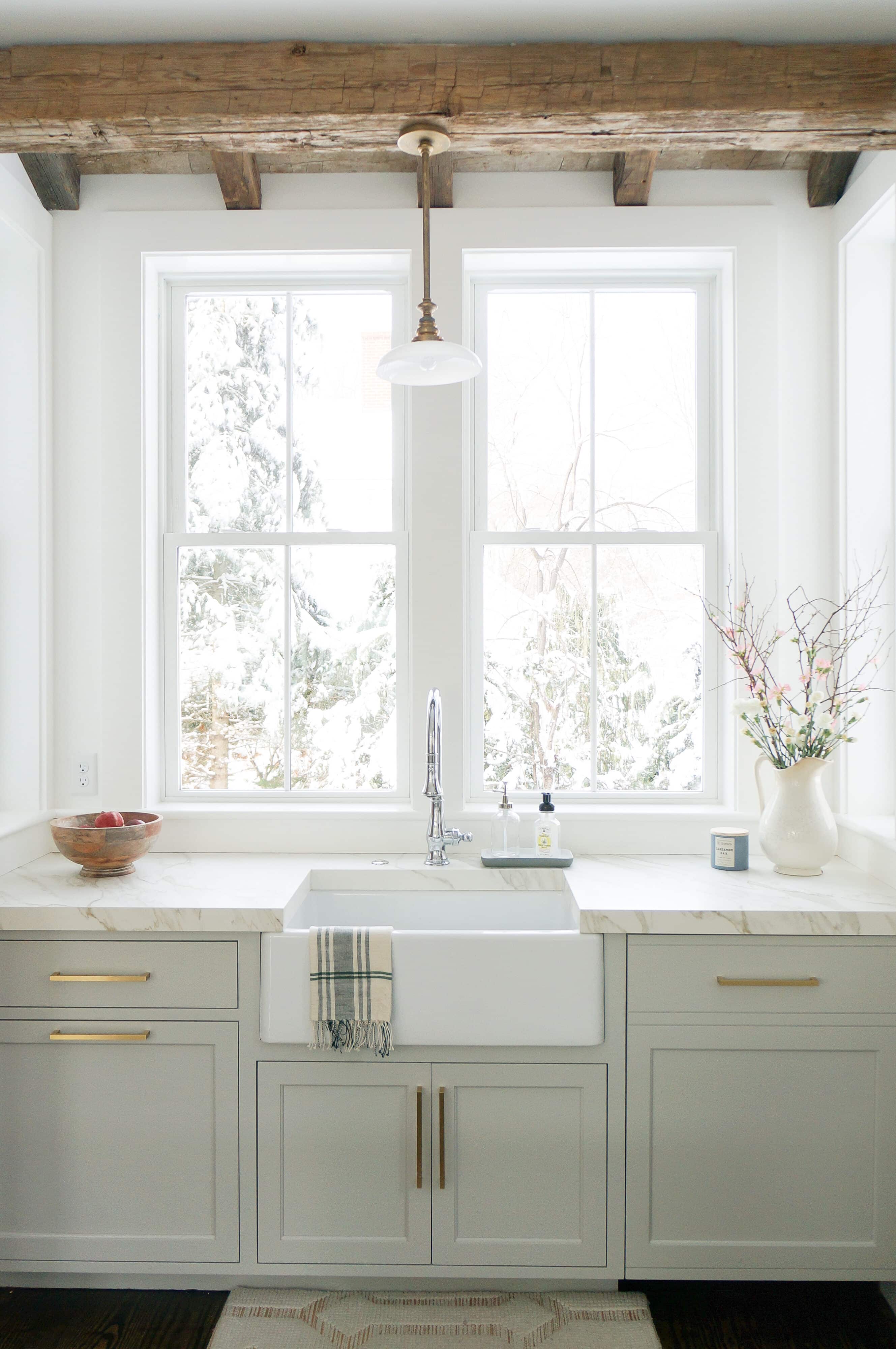
Yes! Not only is it a lovely wall color, but Repose Gray is one of my favorite paint colors for cabinets. Whether you prefer brass, black or silver hardware, it will work with all of them!
The Colors I’d Pair with Repose Gray
One of the reasons I’ve recommended Repose Gray for so many years is because it’s incredibly easy to decorate with. It works just as well with crisp whites and cool blues as it does with warm woods, brass finishes and earthy greens. Here are some of my favorite color pairings.
Sherwin Williams Serious Gray
If you’ve followed me for a while, you probably know I have a thing for blue paint colors. Serious Gray has a beautiful gray-blue tone that complements Repose Gray without competing with it. It’s one of my favorite choices for a front door, built-ins or an accent wall when you want a little more contrast while keeping the overall palette soft and timeless.
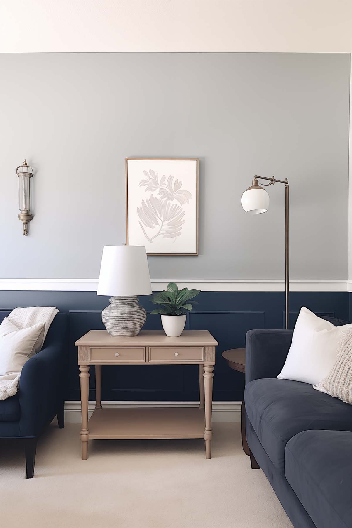
2. SW Naval (SW 6244)
If I had to pick one bold accent color to pair with Repose Gray, it’d be Naval. I love the contrast of a deep navy against Repose Gray because it feels classic without being too traditional. It’s one of my favorite combinations for built-ins, doors and accent walls.
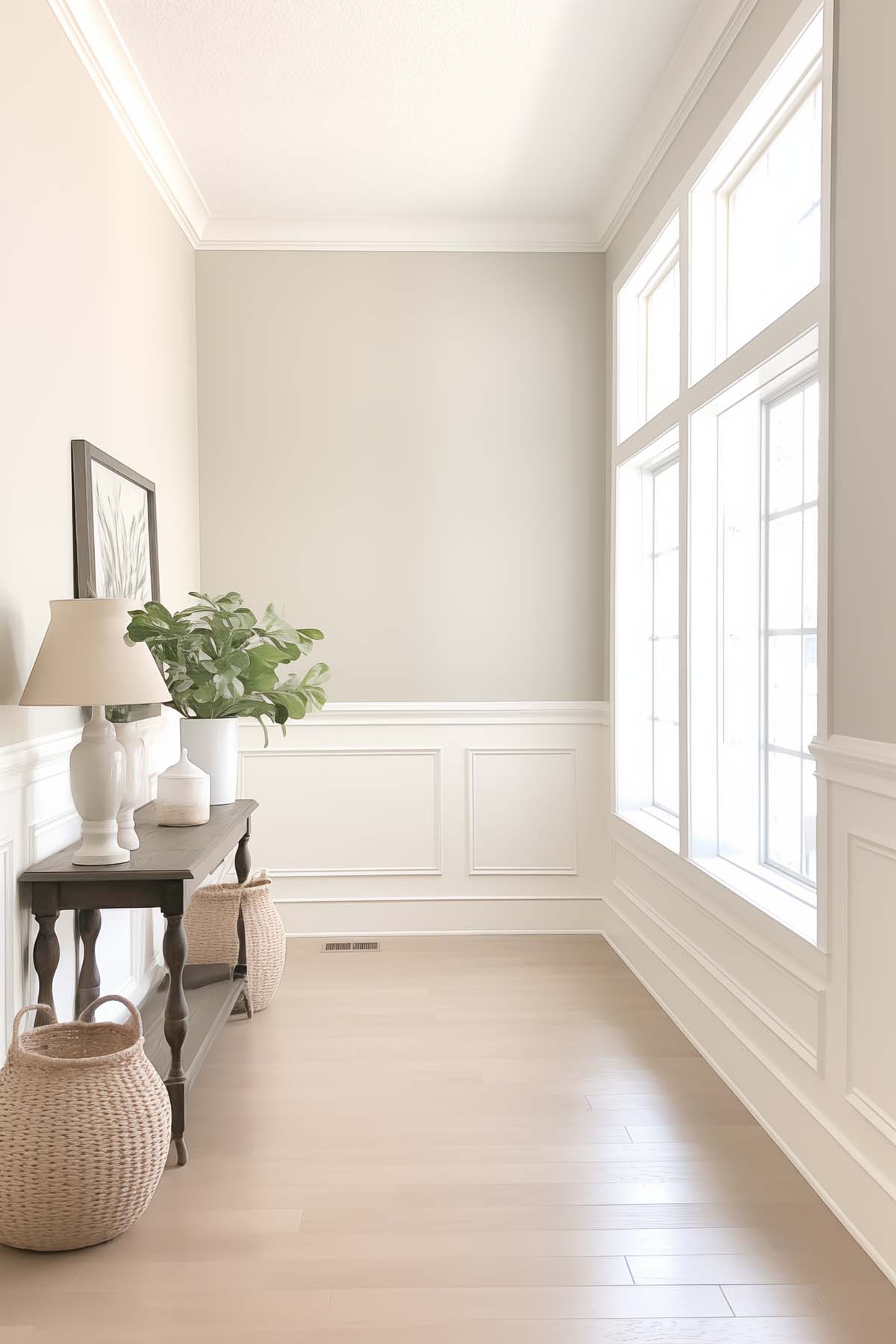
3. SW Alabaster (SW 7008)
Alabaster is a beautiful choice if you’re looking for a softer white than Pure White. I love using it when I want the room to feel warm and relaxed rather than bright and crisp. It’s especially pretty in bedrooms or living rooms where you’re after a cozy, inviting feel.
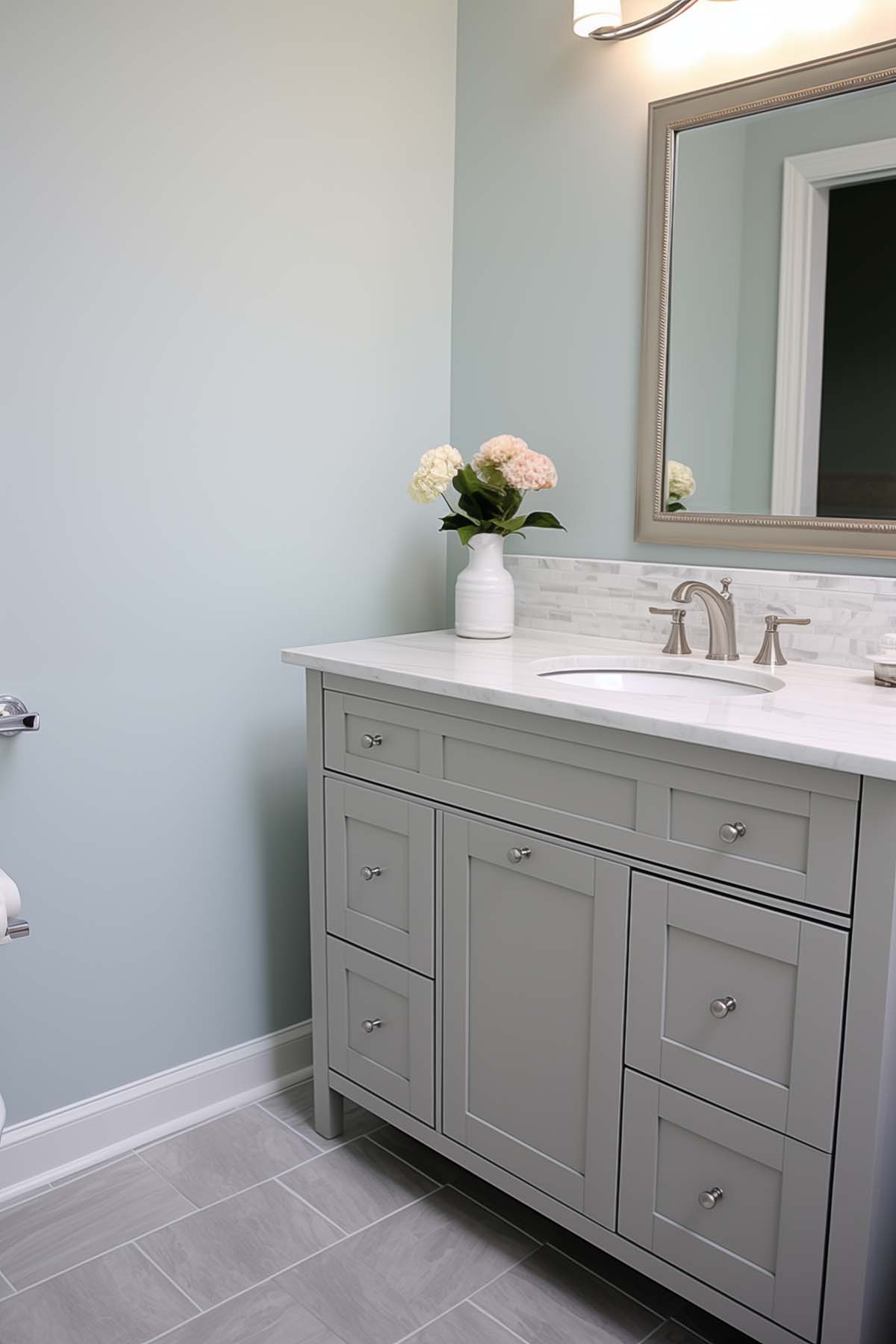
4. SW Sea Salt (SW 6204)
Sea Salt has always been one of my favorite paint colors, so naturally I love it with Repose Gray. Since both colors have subtle green undertones, they work beautifully together without clashing. I especially like this combination in bathrooms, laundry rooms or anywhere you’re trying to create a calm, spa-like feel.
5. SW Coral Rose (SW 9004)
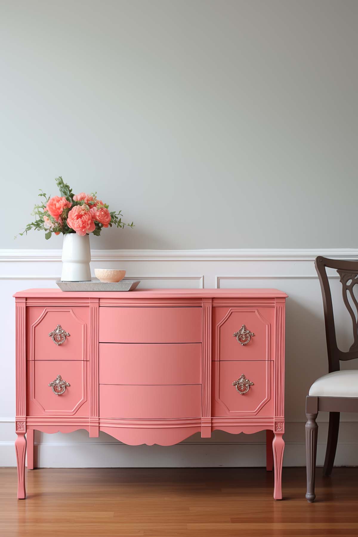
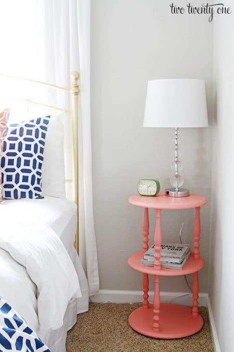
If you’re someone who likes to decorate with pops of color, Coral Rose is a beautiful way to warm up Repose Gray. I probably wouldn’t paint an entire room this shade, but I’d absolutely use it in smaller doses – on an accent table, in throw pillows, fresh flowers, or as one of the accent colors in a rug. It’s an easy way to add warmth and personality without committing to a bold wall color.
Repose Gray Compared to Other Popular Paint Colors
One of the questions I’m asked most often is how Repose Gray compares to other popular greige paint colors. While they all fall into the same neutral family, they each have slightly different undertones, depth and warmth, making one a better choice than another depending on your home’s lighting and existing finishes. Here’s how I compare the colors I recommend most often.
Repose Gray vs Agreeable Gray
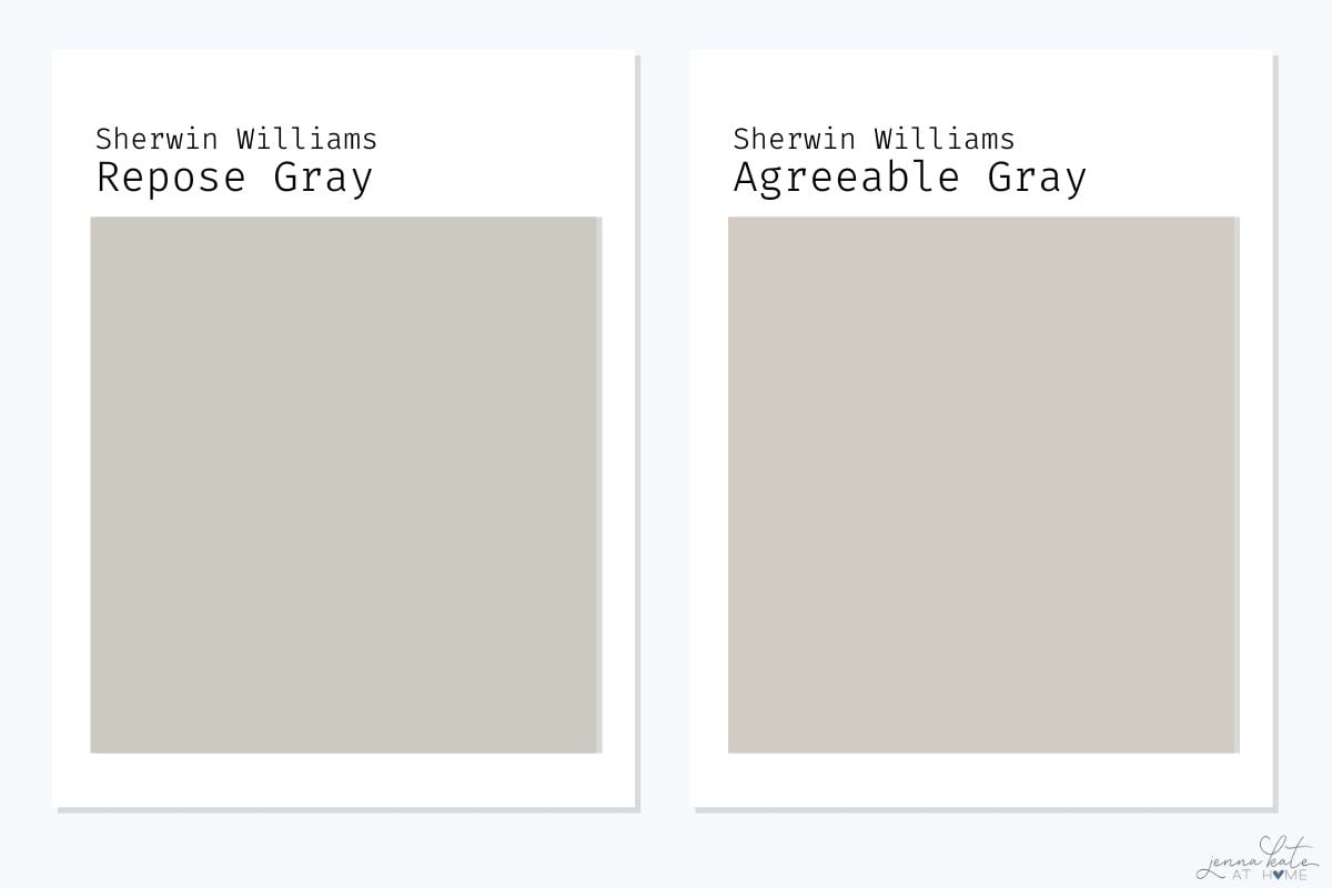
Agreeable Gray is another very popular warm gray or greige paint color.
Repose Gray is a bit more gray than Agreeable Gray, which has a stronger beige undertone, making it more of a greige. So Repose Gray is cooler, but it’s still a warm gray. It’s also just a smidge darker than Agreeable Gray, but the difference is barely noticeable.
If you’re deciding between the two, my main question for you would be whether you want more of a gray paint color or something warmer. If you want a color that’s warmer, then Agreeable Gray would be the way to go.
Repose Gray vs Accessible Beige
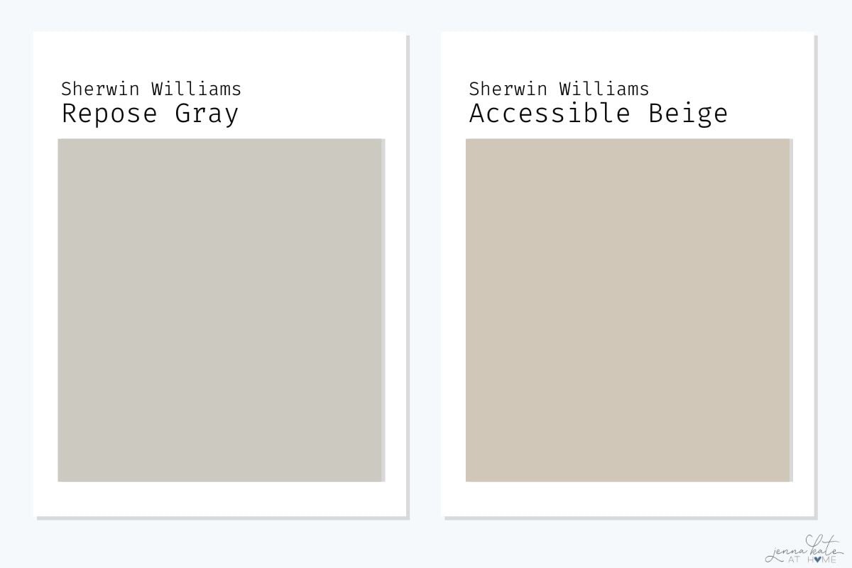
If you’re deciding between Repose Gray and Accessible Beige, the biggest difference is warmth. Repose Gray is a true greige that leans more gray, while Accessible Beige has noticeably warmer beige undertones. In bright rooms they can look surprisingly similar, but in lower light Accessible Beige generally feels softer and cozier, while Repose Gray maintains a more classic gray appearance.
I tend to recommend Repose Gray if you want a cleaner, more contemporary look. If your home has lots of warm wood tones, beige tile or cream finishes, Accessible Beige is often the easier color to work with.
Read my full Sherwin Williams Accessible Beige review.
Repose Gray vs Drift of Mist
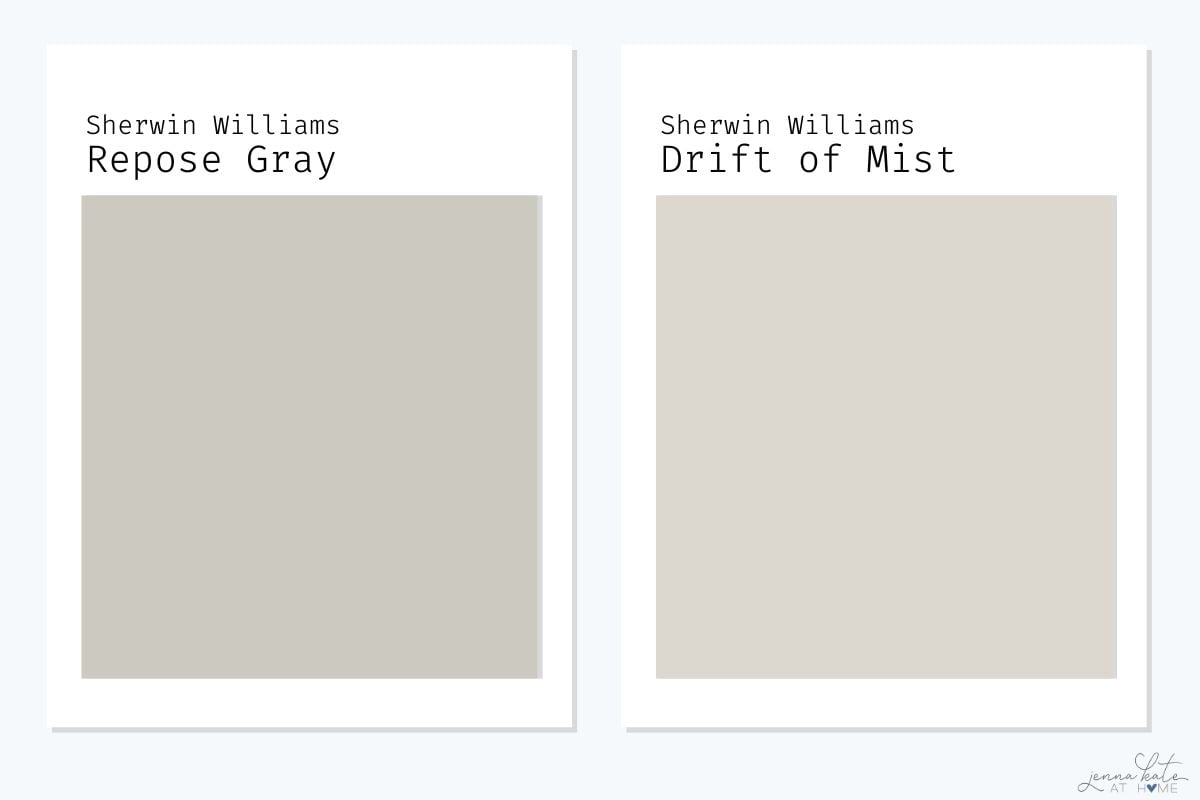
If you love Repose Gray but worry it may feel a little too dark, Sherwin Williams Drift of Mist is one of my favorite alternatives. Drift of Mist shares a similar soft greige feel but is noticeably lighter, making it a better choice for homes with limited natural light or for anyone wanting a brighter whole-house paint color.
In fact,if you asked me today which one I’d paint my own house, I’d probably choose Drift of Mist in most rooms because I prefer slightly lighter paint colors than I did a few years ago.
See my complete Sherwin Williams Drift of Mist review.
Repose Gray vs City Loft
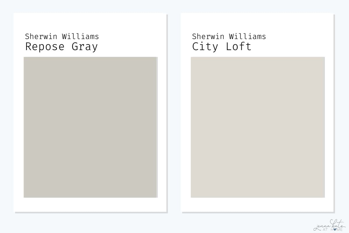
City Loft and Repose Gray are often compared because they’re both versatile whole-house paint colors, but they create very different moods. Repose Gray reads as a true greige, while City Loft is lighter and softer with subtle creamy warmth.
If your goal is a bright, airy home, I would recommend City Loft. If you prefer a little more depth and contrast against white trim, Repose Gray might be the better choice.
Read my Sherwin Williams City Loft review.
Repose Gray vs Mindful Gray
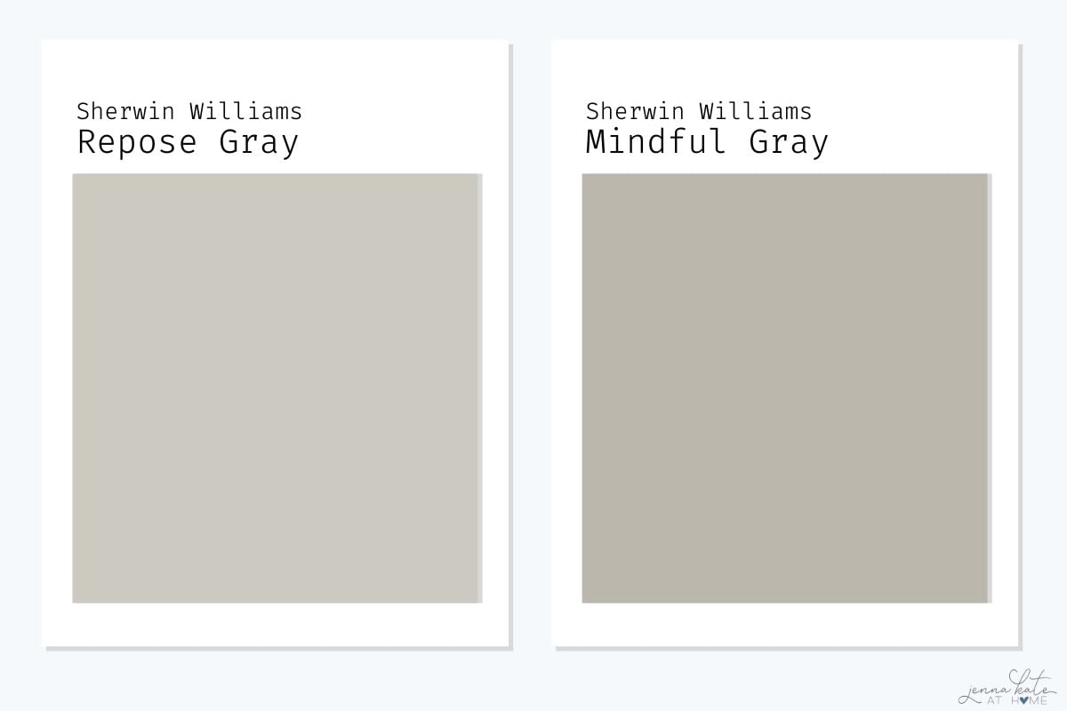
Mindful Gray is darker and richer than Repose Gray. While they share similar undertones, Mindful Gray has more depth and can feel considerably heavier on large walls. I’ve also found that the green undertone is considerably more apparent.
If you like Repose Gray but want a little more drama, Mindful Gray is a great option. If you’re worried about a room feeling dark, I’d stick with Repose Gray – or even consider Drift of Mist if you want something lighter.
Learn more about Sherwin Williams Mindful Gray.
Repose Gray vs Edgecomb Gray
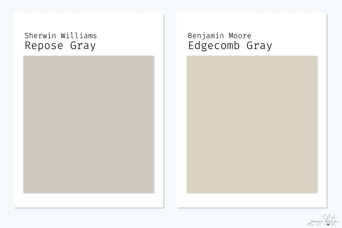
Benjamin Moore Edgecomb Gray is one of the closest Benjamin Moore alternatives to Repose Gray, but it has a noticeably warmer, more beige appearance. Repose Gray feels slightly cleaner and more neutral, while Edgecomb Gray creates a softer, warmer look.
If you’re trying to decide between Sherwin Williams and Benjamin Moore colors, both are beautiful choices. Your lighting and existing finishes will usually determine which works best.
Read my complete Edgecomb Gray review.
Repose Gray vs Wordly Gray
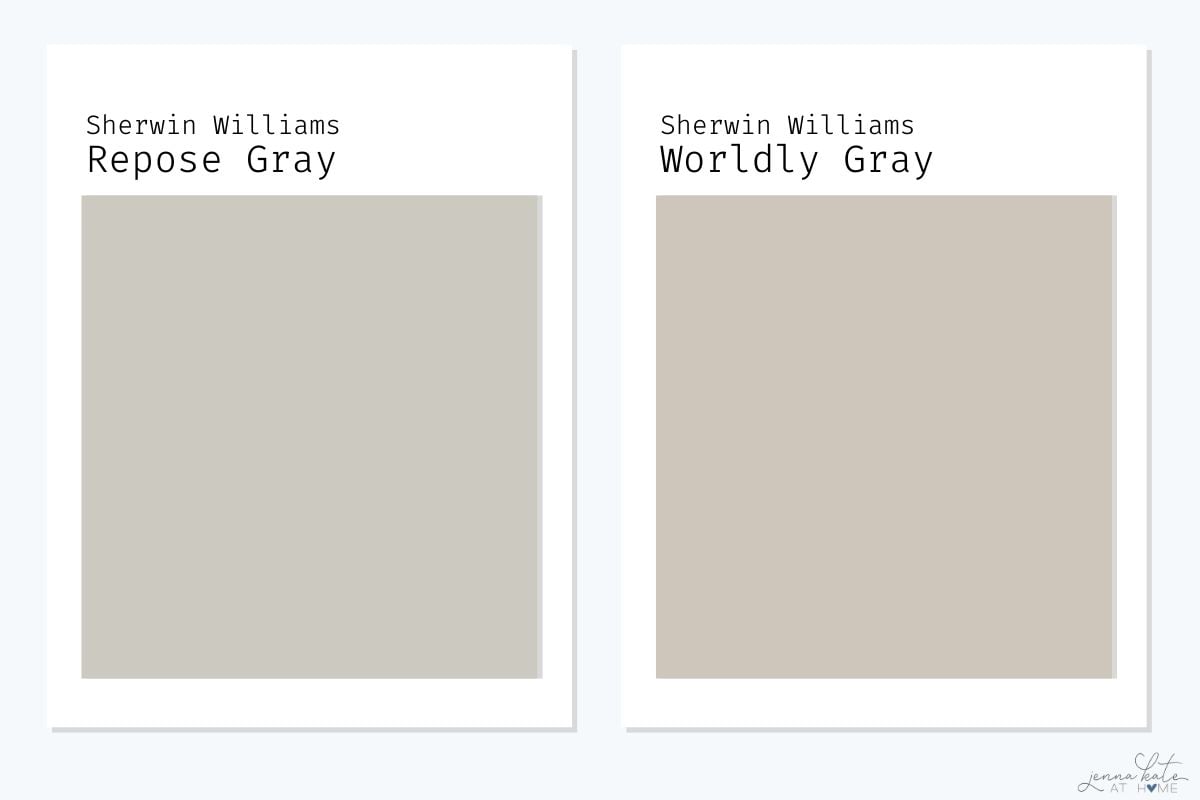
Worldly Gray sits somewhere between Repose Gray and Accessible Beige in warmth. It has stronger beige undertones than Repose Gray, making it a great choice for homes with warmer flooring or traditional finishes. If you’re after a cleaner gray look, Repose Gray is usually the better fit.
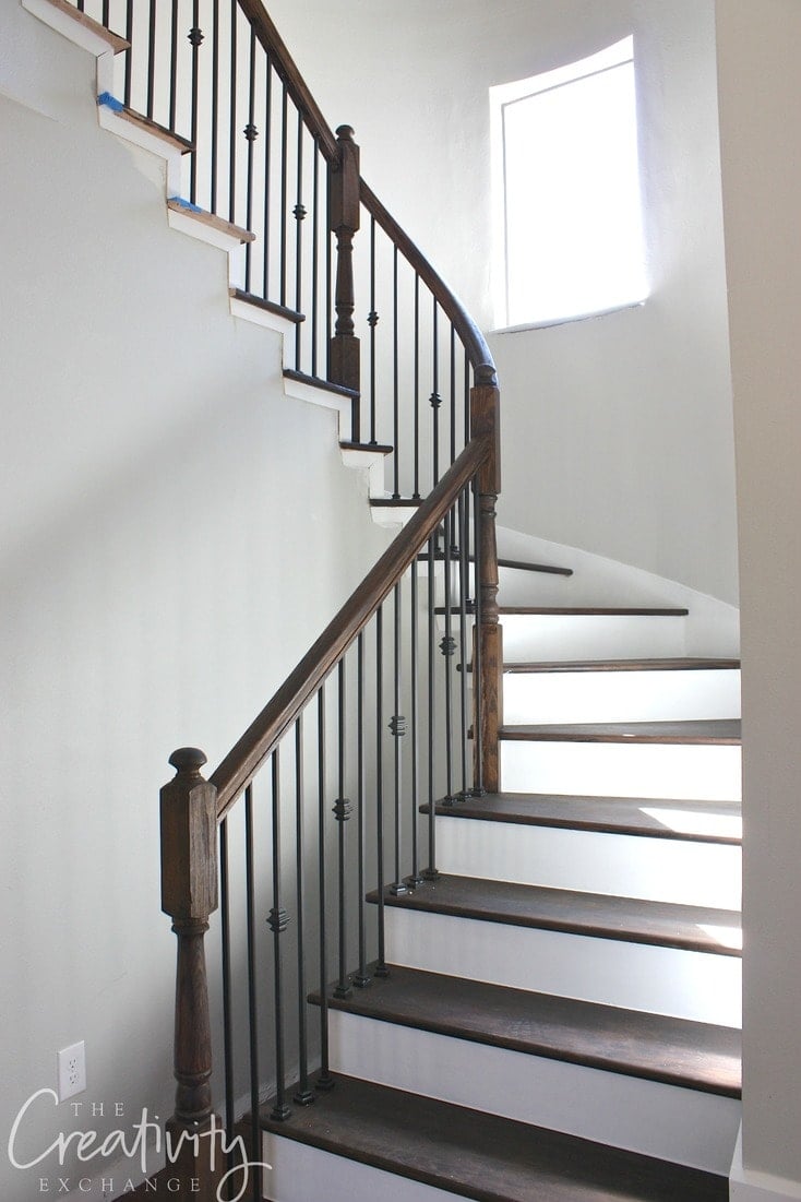
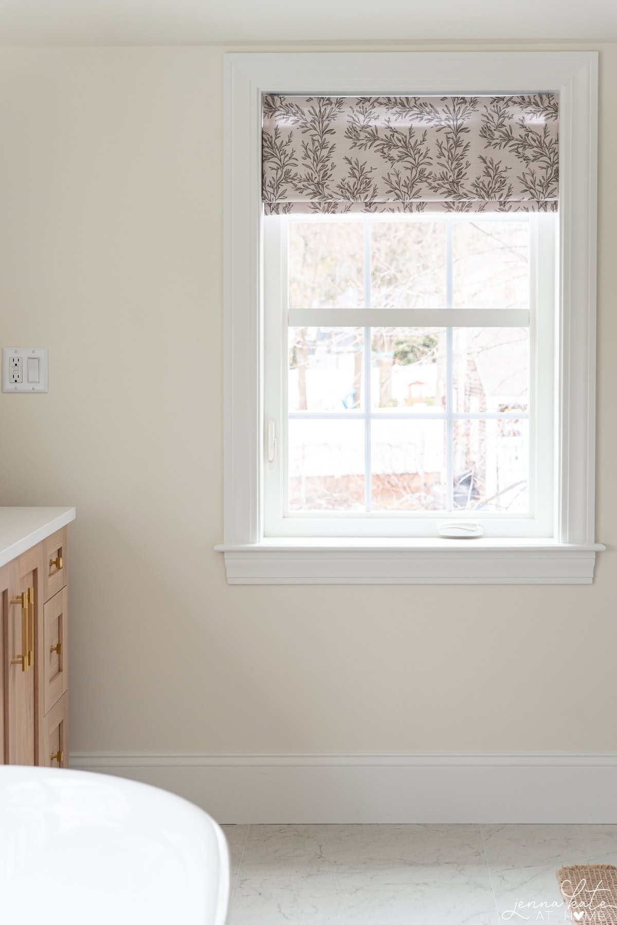
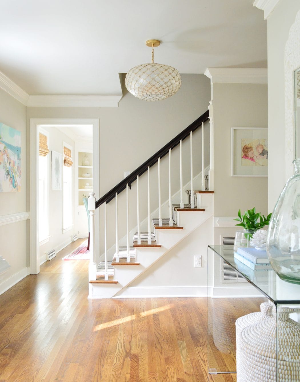
What Repose Gray Looks Like in Real Homes
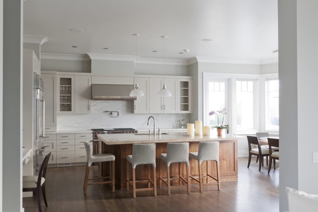
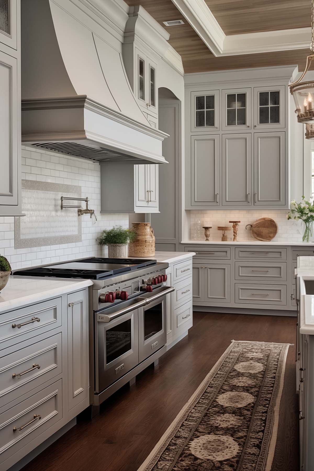
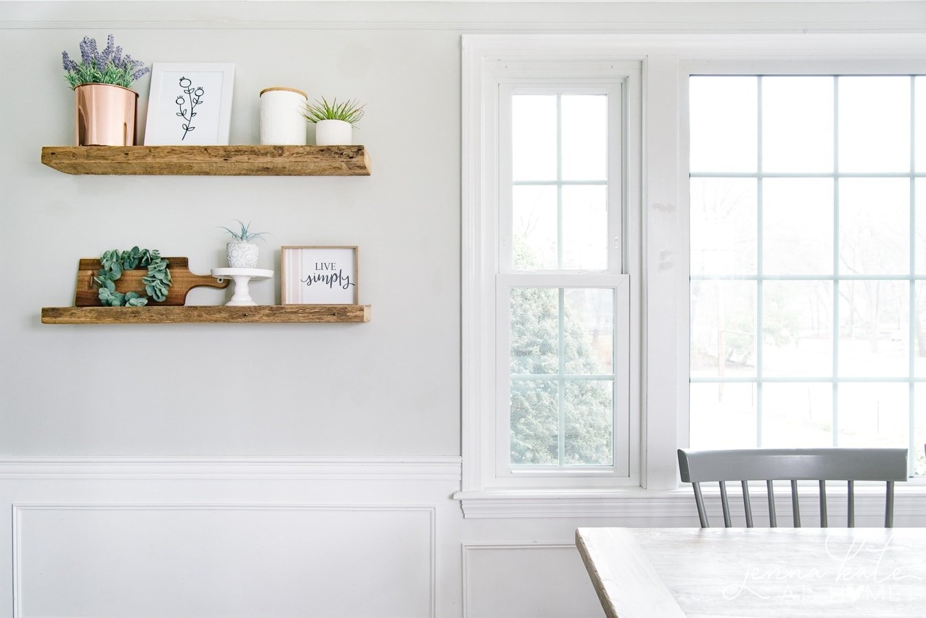
One of the best ways to decide if a paint color is right for your home is to see it in real spaces. Below you’ll find Repose Gray used in kitchens, living rooms, bathrooms, bedrooms and entryways. As you look through the photos, notice how the amount of natural light changes the way the color looks from room to room.
Repose Gray in Living Rooms
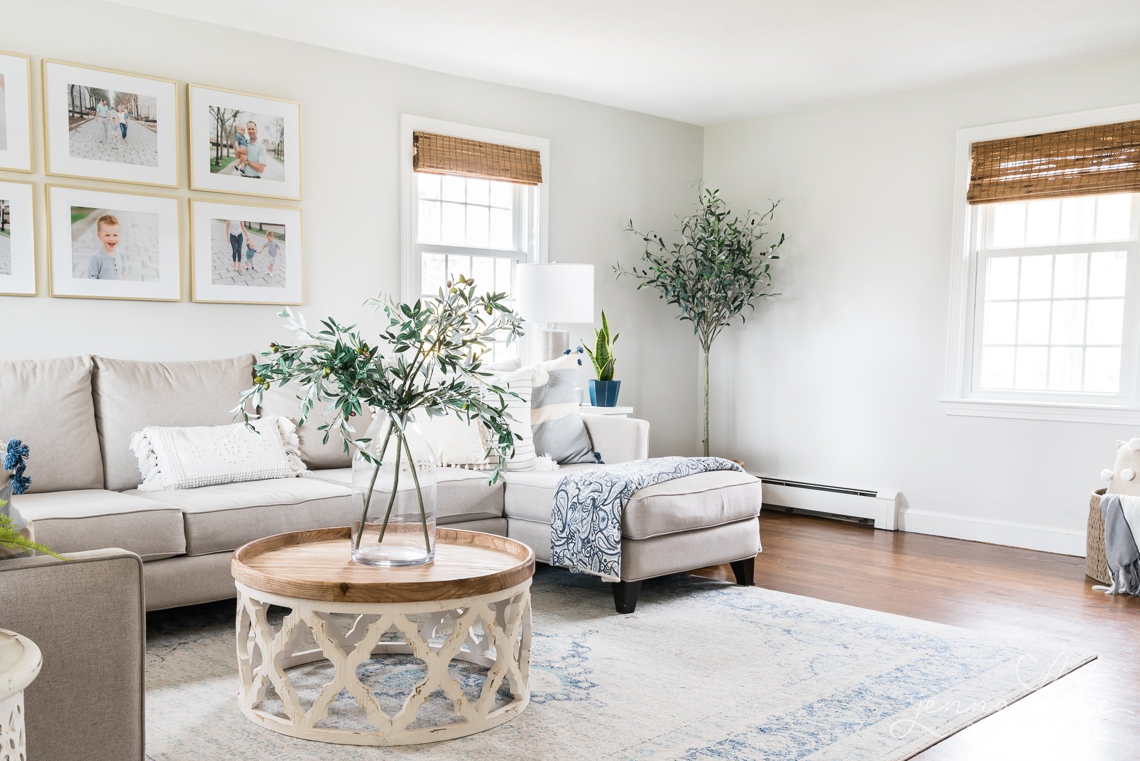
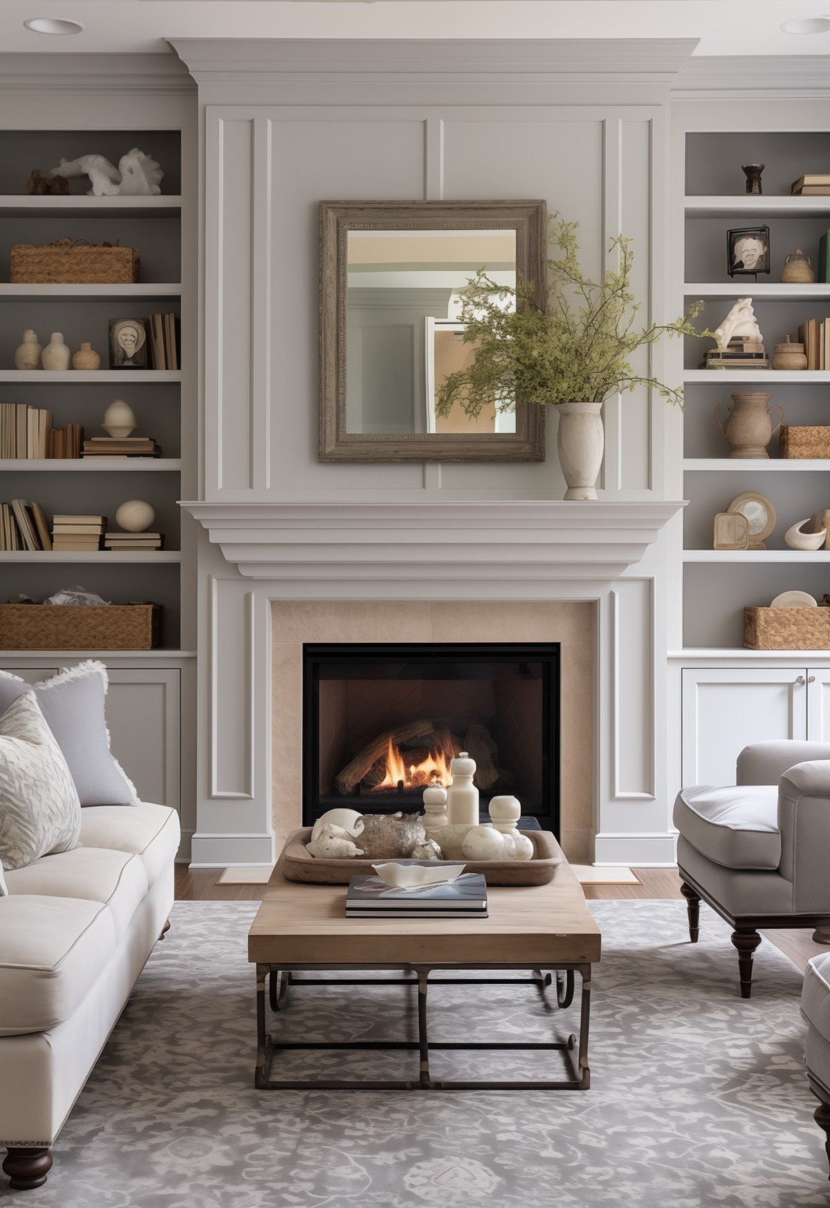
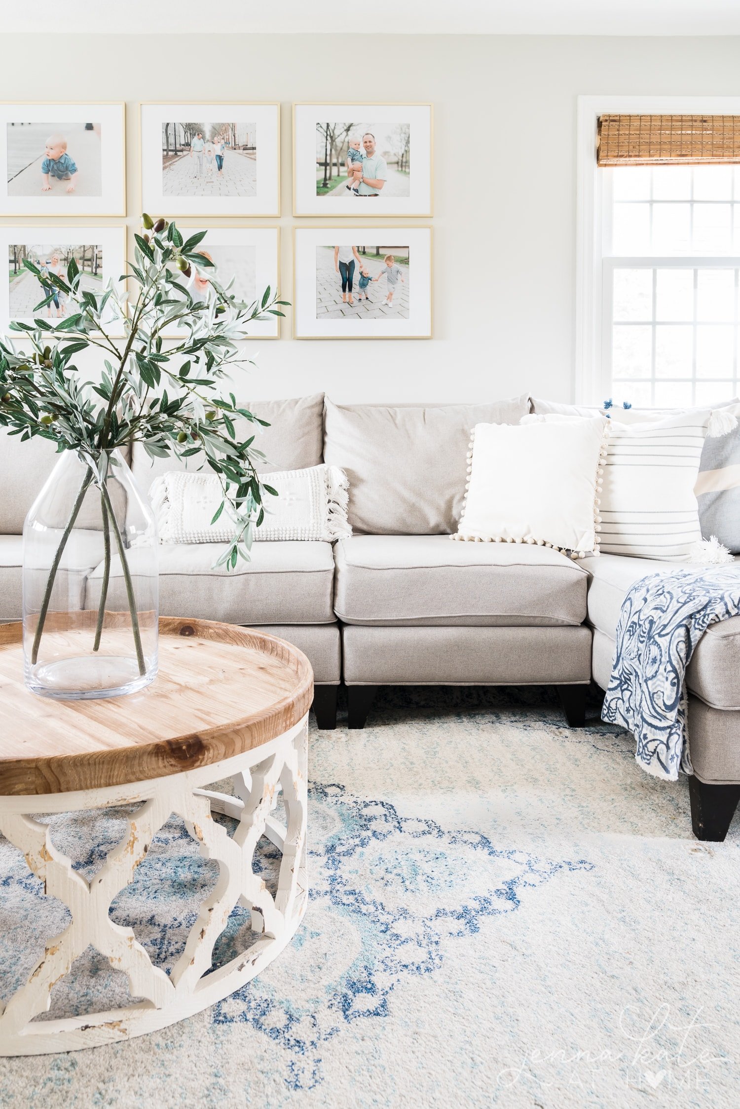
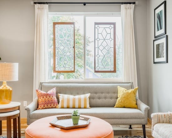
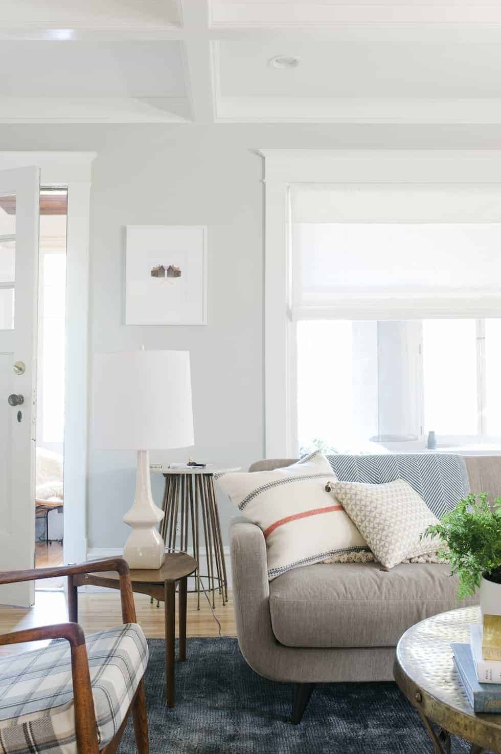
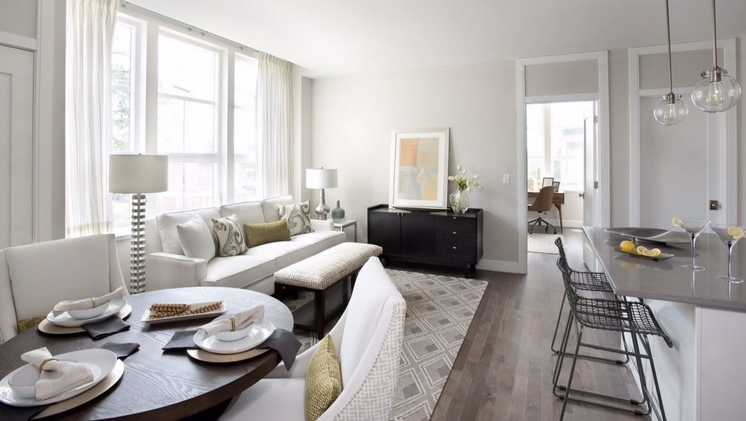
Living rooms are where lighting has the biggest impact on Repose Gray, and it’s also where my opinion of this color changed the most. After repainting my own living room in the 50% version, I realized just how much brighter and airier it felt.
RELATED: My favorite living room paint colors.
Repose Gray in Bathrooms
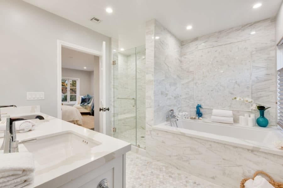
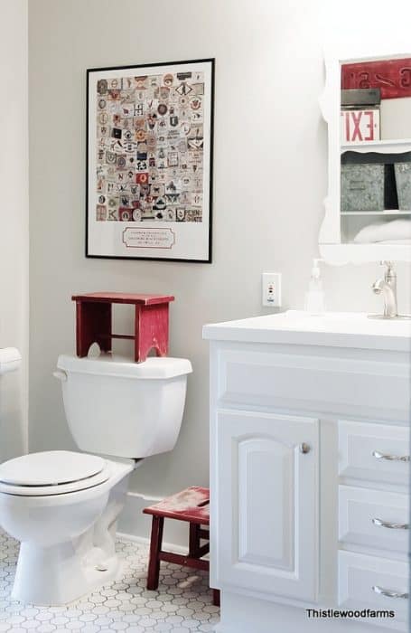
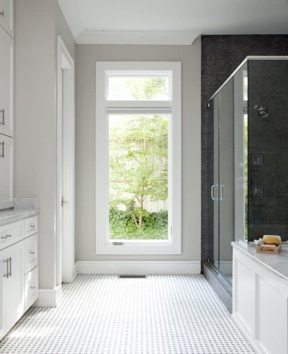
Bathrooms are one of my favorite places to use Repose Gray because the white trim, tile and fixtures help keep the color feeling fresh and clean. It’s warm enough that it never feels cold, but still reads as a true gray in most well-lit bathrooms.
RELATED: The best bathroom paint colors.
Repose Gray in Kitchens
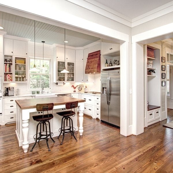
Kitchens are where I’ve personally used Repose Gray the most, and they’re also where my opinion has evolved. You’ll notice my older kitchen photos show the original color at full strength, while my more recent updates use the 50% version for a lighter, brighter look.
RELATED: The Best Paint Colors For a Small Kitchen.
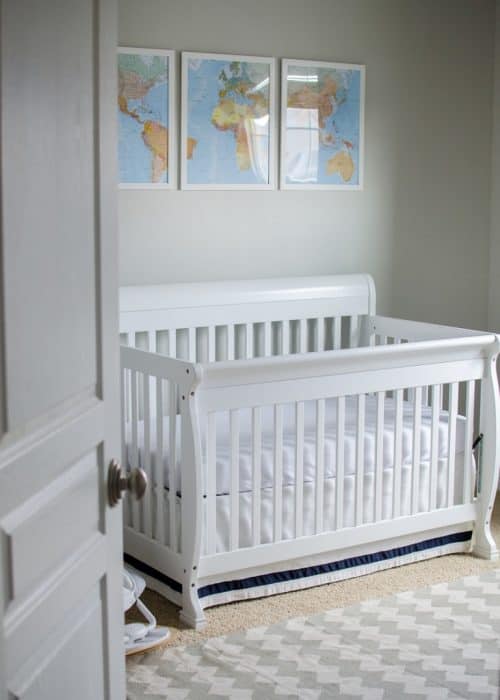
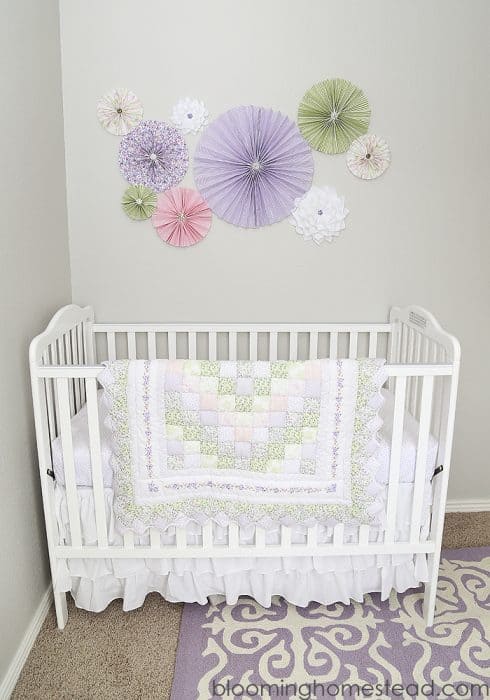
Repose Gray in Bedrooms
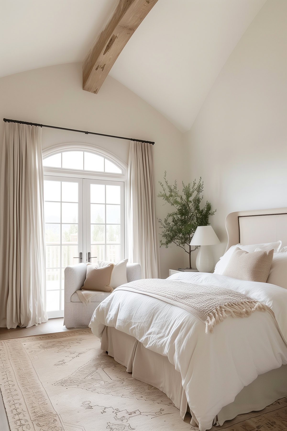
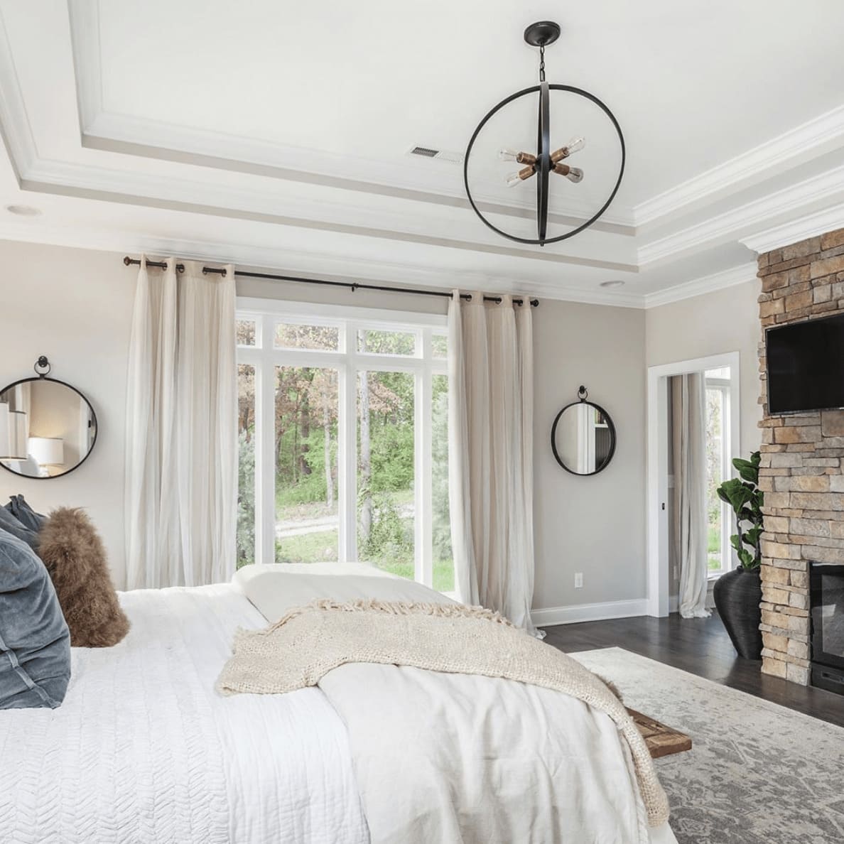
White trim, bright light and light colored furnishings definitely help favor the cooler side of this paint color. So if you want it to lean towards gray more than its warmer side, keep that in mind.
RELATED: The Best Paint Colors for Bedrooms.
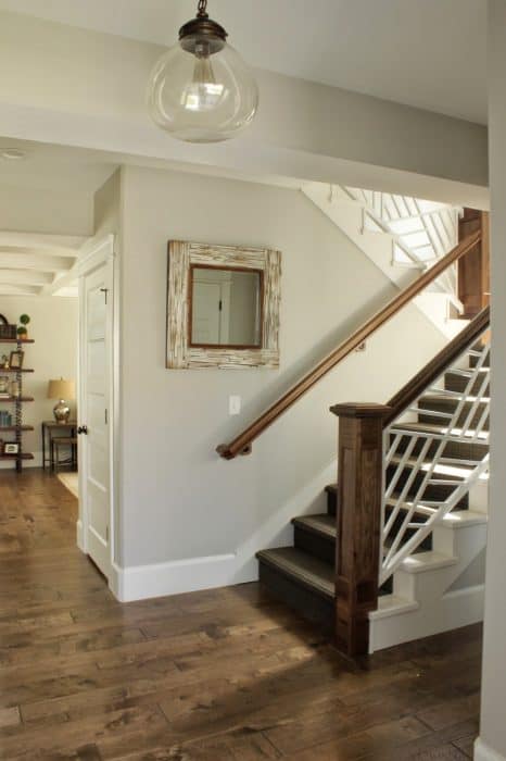
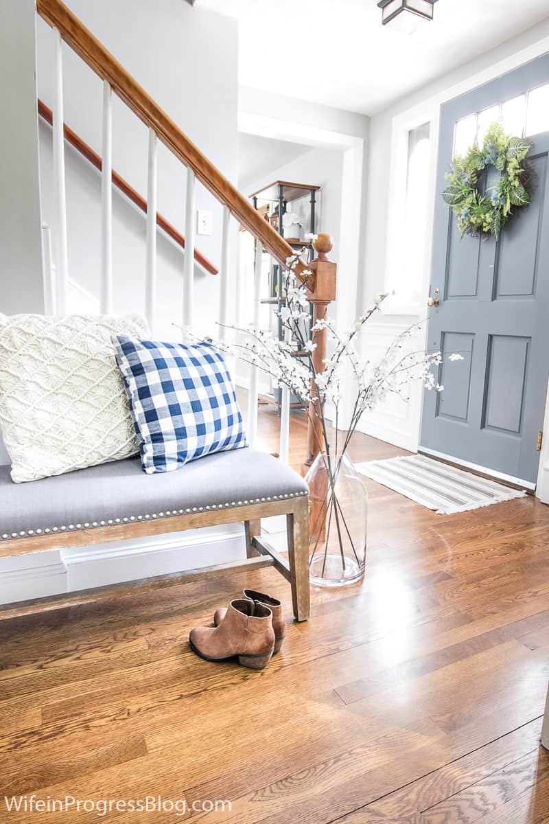
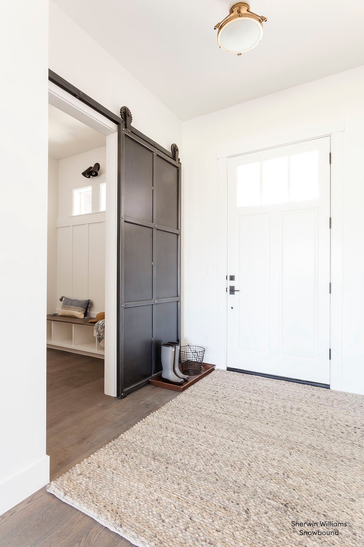
Repose Gray in Entryways and Mudrooms
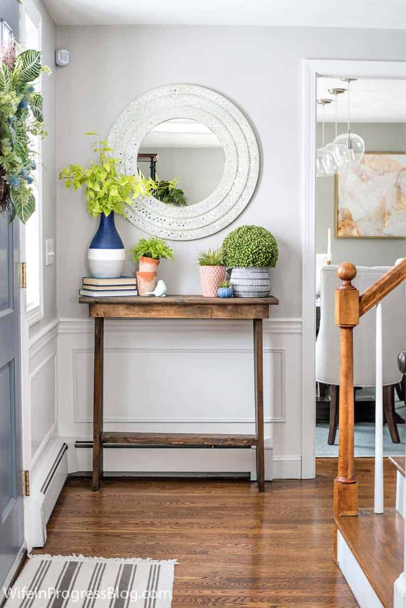
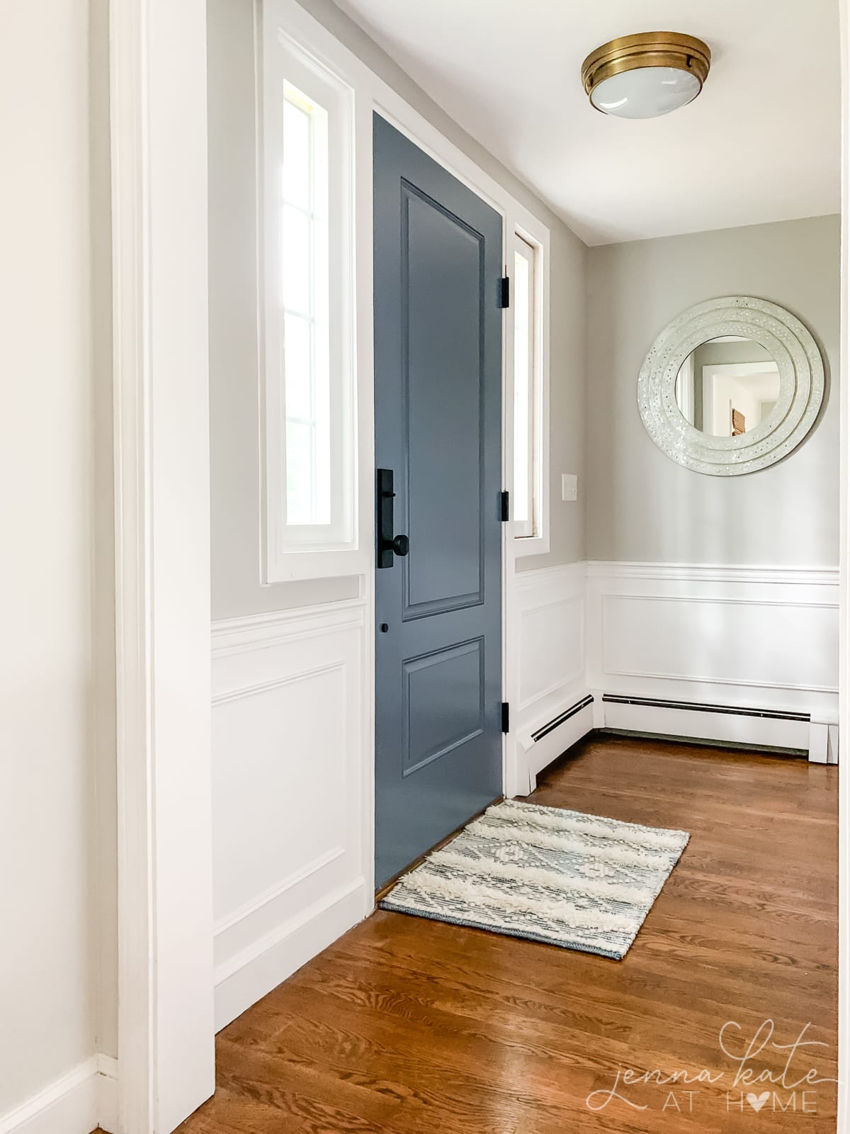
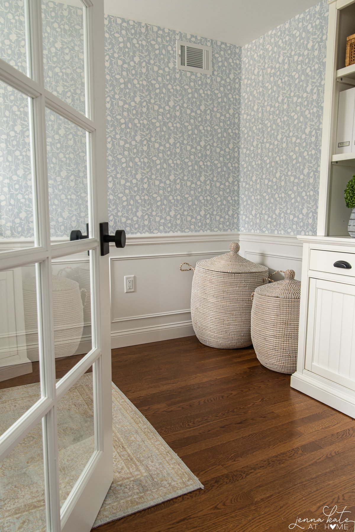
In the following photos, you can see how well Repose Gray works when paired with warm woods. A lot of warmer grays will start to look muddy or too beige when paired with darker woods, but this one still maintains its gray color.
Questions I Get Asked Most Often
Repose Gray is popular because of its ability to work well with both warm and cool color schemes. It pairs beautifully with cool whites and blues, and just as well with warm wood tones, brass, creams and warm whites.
Repose Gray is not as popular as it was a few years ago as warmer beiges start to become trendy again. However, it is still a stunning color that works well with so many different color schemes that it’s one you should definitely consider! Those that have it, love it!
Repose Gray works best in larger spaces that get a lot of natural light. If you want to use it in a smaller space, I would suggest having it lightened by 50% to reduce the intensity and produce a lighter, brighter color.
Yes! Repose Gray is a beautiful exterior color. Since colors look much lighter on the exterior of a house because of the abundance of natural light, Repose Gray is a beautiful lighter gray on a house exterior.
Don’t Forget To Always Use Real Paint Samples!
Don’t forget – no matter what you’ve read or photos you’ve seen online, it’s really important to sample paint colors in your home before committing!
Samplize provides peel and stick paint samples made with real paint, that are easy to move around your home, and cheaper than buying a gazillion paint pots! It’s the only way I buy paint samples.
Would I still use Repose Gray today?
Absolutely! But I’d use it differently than I did ten years ago.
Repose Gray is still one of Sherwin Williams’ best greige paint colors and one that I continue to recommend regularly. The difference is that today I’m much more intentional about where I use it.
Decorating trends have shifted toward lighter, airier neutrals over the last few years, and living with Repose Gray has changed the way I recommend it. I love it in bright rooms with plenty of natural light, paired with crisp white trim, or mixed at 50% strength when I want a lighter, airier feel.
If you’re looking for a timeless gray that won’t feel cold or sterile, Repose Gray is still one of my favorite recommendations. Just be sure to sample it in your own home before committing -lighting makes all the difference.
Hi Jenna! I’m going nuts over here with a North/east facing room! I have a lighter grey sofa in the room already and am trying to find a grey that will suit going with it. Every time I put something Greige up, it looks muddy (have tried pale oak, winds breath, Edgecomb grey) and terrible behind the sofa. How does repose do next to other greys (fairly cool grey)?
Thanks!
Would SW extra white trim and cabinets go well with Repose? I love bright white cabinets look, but don’t want it to be too stark, or have any yellow undertones.. as we’re also doing Carrara Marble in our Master. Please help!
Is there a SW version of BM Decorator’s White? Or Behr?
Hi Jack – you can get any color mixed up by any brand. If you prefer Sherwin Williams, just ask them to color match to Decorator’s White. They will pull up the color code on their computer and mix it in their own paint.
Back in 2012 when we built our new home, we also our home painted repose grey. It’s been 5 years and I don’t regret it one bit. It’s still beautiful and like you we tried on like 20 different colors before picking this one.
Do you have an exterior white trim that you would recommend to go with the exterior of repose grey? we will have black windows and white trim but looking for a good white trim.
My kitchen faces North, with some, not a lot of light. I am planning on painting walls warm B.M. Cotton Balls, My counter tops are color of slate green. I was hopeing to find the right light gray
for cabinets. Could I use the Repose Gray, or Light French Gray maybe? there will be light
wood nearby and an ochre plastered wall 15 ft away. Thank you so much, Nancy
Hi Nancy – Repose Gray is BEAUTIFUL on cabinets! Which Light French Gray are you talking about? The Behr one is in fact blue and the SW one is actually very dark – you can see it in my mudroom here. I wouldn’t recommend it for cabinets. Another nice light gray (a good bit lighter than Repose) is BM’s Paper White. I hope that helps!
Hi Jenna! I enjoyed your post. We are buying a new construction home & have to pick a single wall color (SW) for the whole house before it is built. I want gray, but the main room is north-facing and I don’t want the room to look dark. There is no way to sample colors in advance so I’m thinking Repose. Is there a SW warm gray you know of that brightens a room better than Repose? Does Repose go with SW Alabaster cabinets and SW Dovetail kitchen island do you think?
Yikes – that’s a lot of pressure since you can’t even sample the color, first?! I have a lot of dark areas and very bright areas in my home and Repose Gray looks beautiful in both. It’s closer to gray when it’s bright and a bit more beigey when it’s darker but always beautiful. Both Alabaster and Dovetail are on the warmer side so I think it will all work together. Even if your builder told you it needs to be a SW paint – remember that you can color match any other brand, too. So for instance if you love BM Decorator’s White for trim you have have them get that color mixed up in SW paint. Hope that helps and good luck!