Content may contain affiliate links. When you shop the links, I receive a small commission at no cost to you. Thank you for supporting my small business.

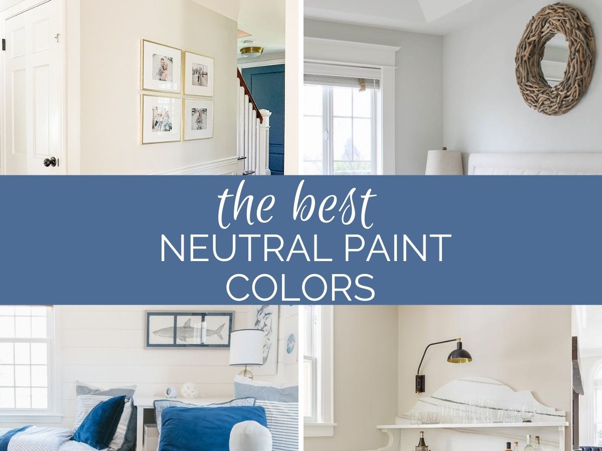
Paint your walls a neutral color scheme and you’ll have the perfect palette for decorating. Here are the best neutral paint colors for your home in 2024.
RELATED: Best cream paint colors
1. Sherwin Williams Repose Gray
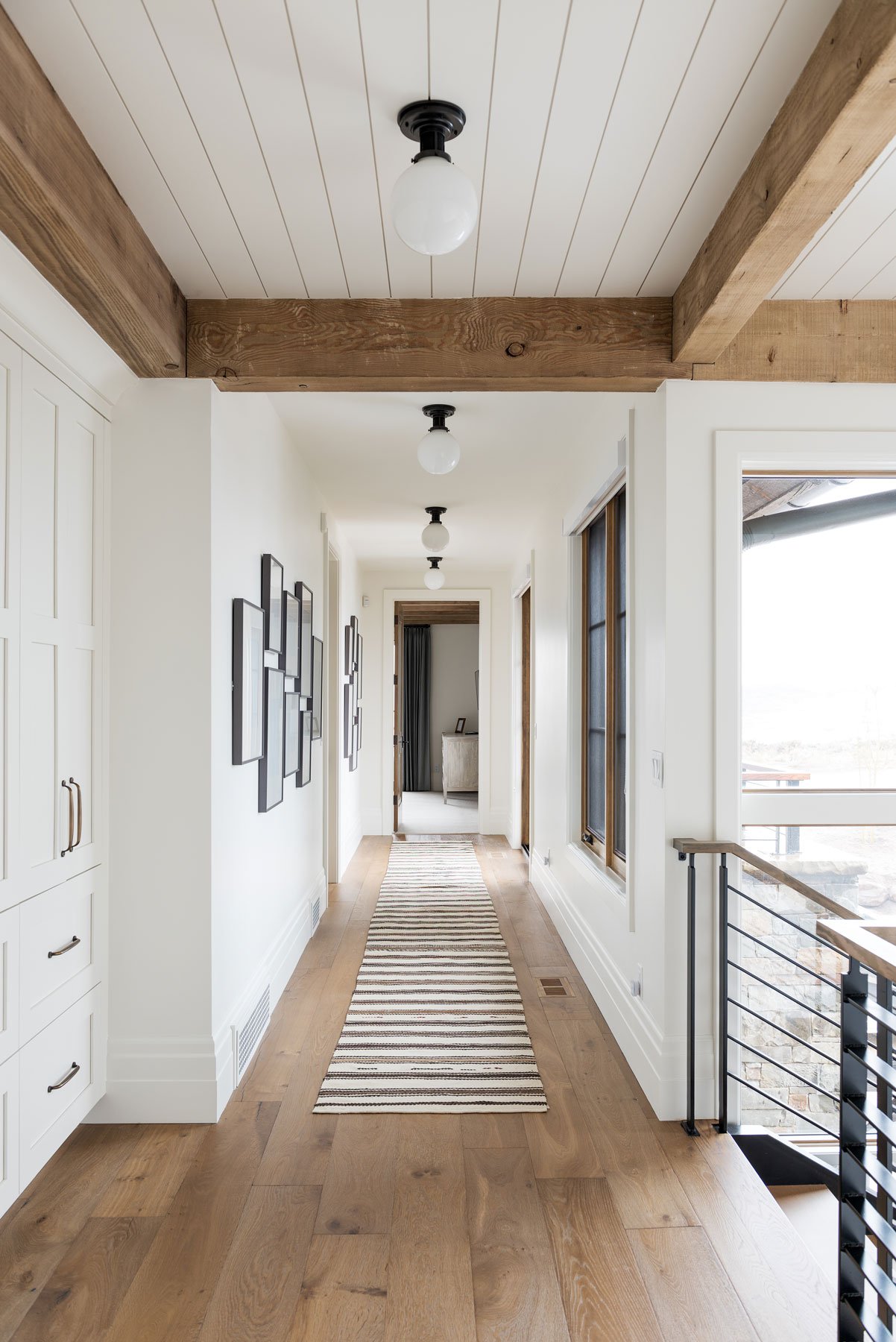
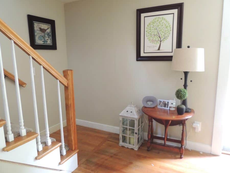
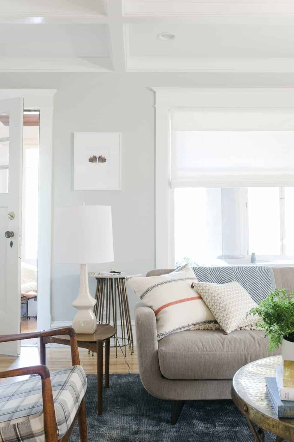
Repose Gray is one of the best selling paint colors for interiors. I’ve used it throughout my own home and absolutely love it. It has been one of my favorite colors for years now, and I love how it looks everywhere I’ve used it, especially as a backdrop for my favorite blue gray accents.
Repose Gray is a warm gray that has slight green and purple undertones. But don’t let that scare you away! Those colors simply add just the right amount of warmth to ensure it never feels like a cold gray.
I regularly have Repose Gray lightened by 50% at my local store, and love how light and airy the lighter version is.
Repose Gray is one of the most popular whole-house colors in recent years, especially for homeowners who still love gray but need something just a little warmer.
2. Sherwin Williams Crushed Ice
SW Crushed Ice is a beautiful greige paint color that works well in transitional spaces with a good amount of light. Despite its name, it does not have an icy appearance.
In fact, Crushed Ice is quite warm and can even skew a touch pink. It’s lighter than Repose Gray, but has more saturation of color. It was another contender for my kitchen remodel, but ended up being just a little too warm for what I wanted.
3. Sherwin Williams Agreeable Gray
Another incredibly popular neutral paint color from Sherwin Williams. Agreeable Gray is considerably warmer than Repose Gray, firmly leaning more into the “greige” category.
However, it’s one of those funny paint colors that can change color depending on the light – sometimes it leans more gray, and sometimes it looks quite beige.
Agreeable Gray is a popular choice for living rooms and kitchens, and as a whole-house color.
4. Benjamin Moore Wind’s Breath
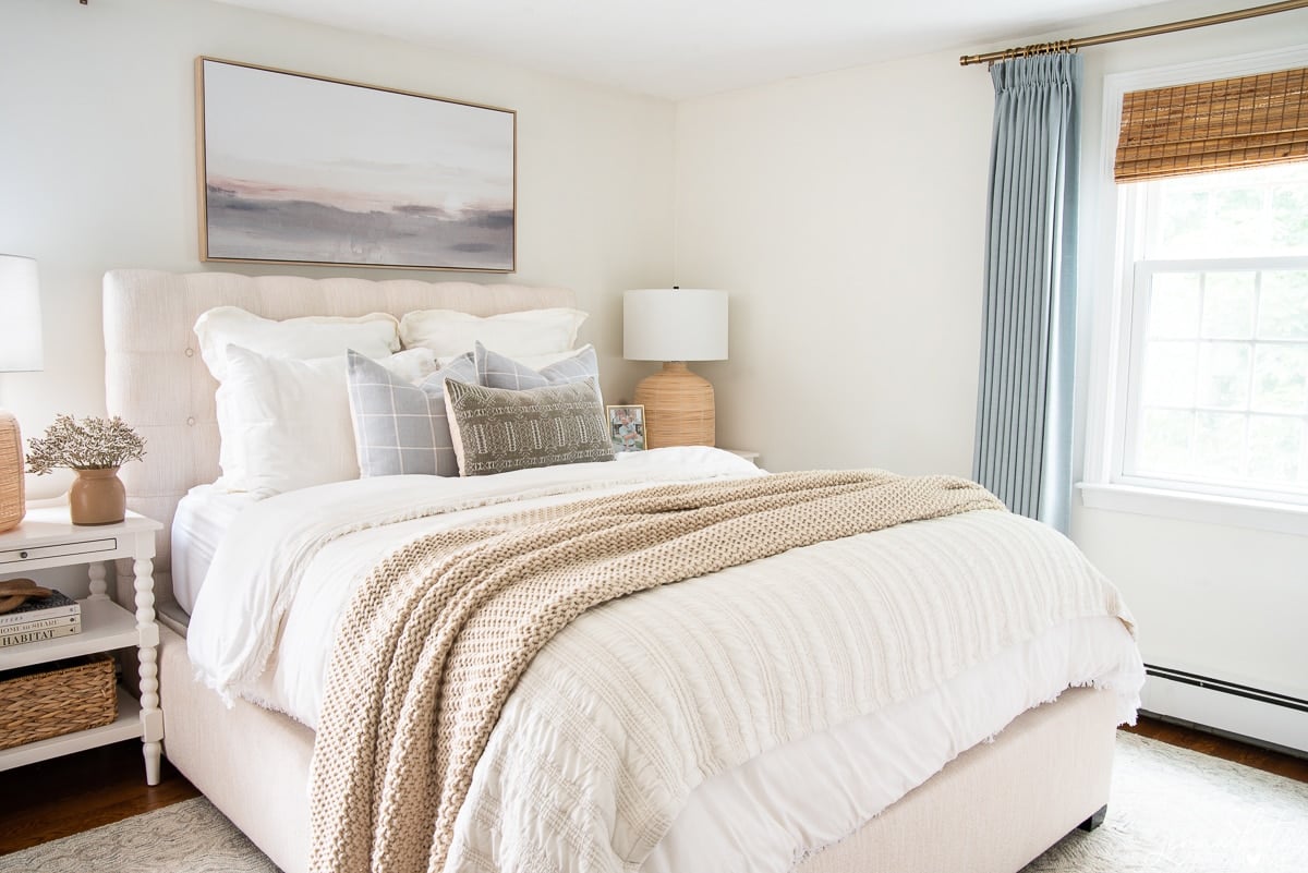
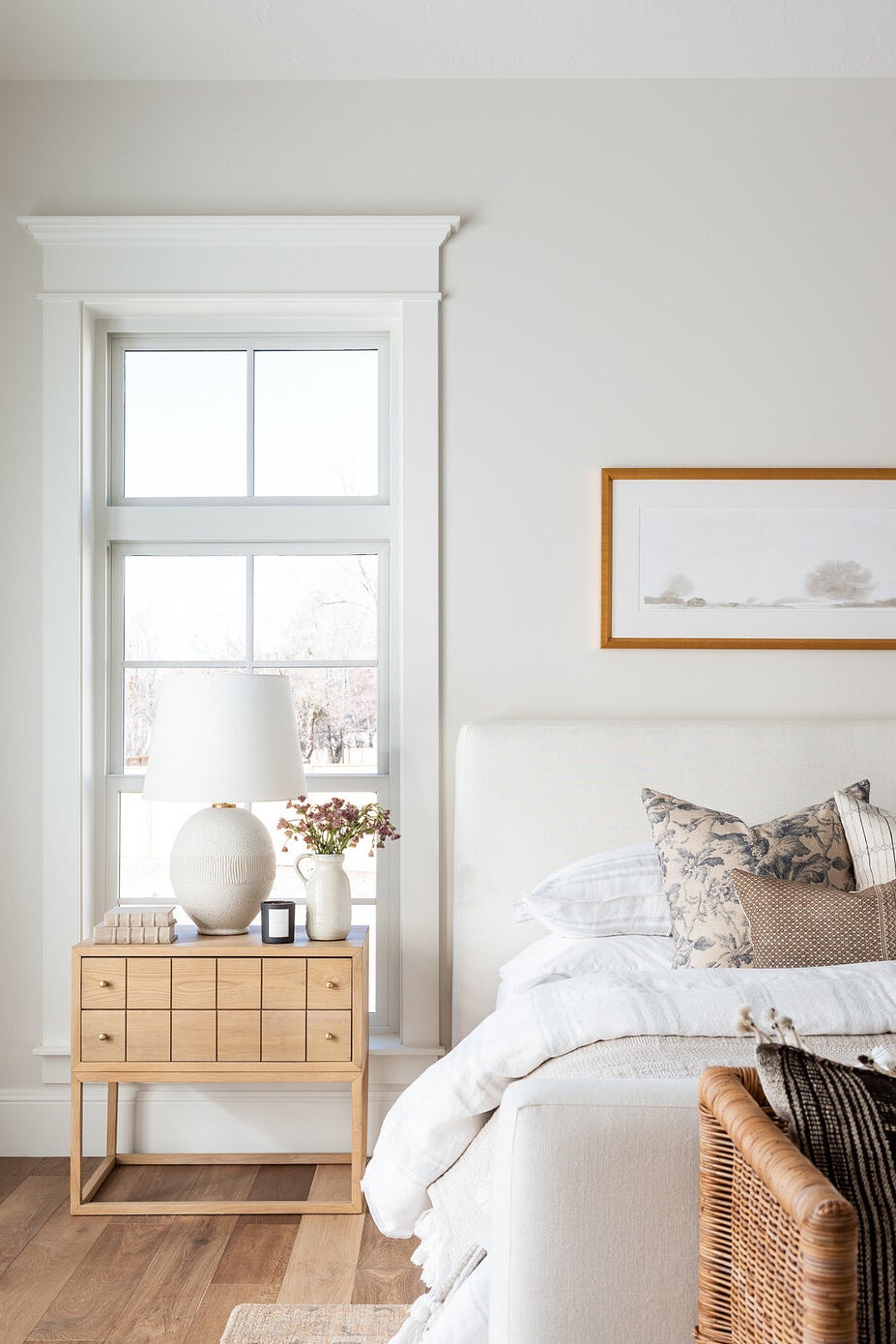
BM Wind’s Breath is one of my favorites of the warm neutrals. It’s an off-white shade that has the perfect balance of warmth but with just enough gray to stop it being too warm.
I first saw Wind’s Breath in my friend’s bedroom and instantly fell in love with its warmth and softness. Paired with white trim, it’s the fresh modern version of a traditional beige. This will be a paint color that becomes very popular for 2024.
5. Benjamin Moore Classic Gray
BM Classic Gray has also been gaining in popularity recently. I would consider this paint color to be the quintessential greige. It’s a perfect mix of beige with just the right amount of gray undertones to stop it being too warm.
It will look grayer in darker corners but in a room with a lot of light it is beautifully soft and bright, and adds the right amount of warmth. It is a true warm neutral. If you like Repose Gray but want a bit more warmth, then I think Classic Gray will be perfect for you.
6. Benjamin Moore Balboa Mist
BM Balboa Mist is a light warm gray paint color, that just about falls into the greige category.
In north facing rooms, or hiding in the shadows, it can look a bit grayer. While in brighter, warmer spaces with lots of sunlight it will look more beige.
7. Sherwin Williams Accessible Beige
Accessible Beige is one of Sherwin Williams’ top paint colors, and for good reason. It’s an excellent choice if you’re looking for a neutral that has a bit more saturation and warmth, while still having that slight gray base to tone it down.
I also love accessible beige as a paint choice for trim and doors, especially when paired with white or off-white walls.
8. Sherwin Williams Drift of Mist
I discovered SW Drift of Mist when choosing between colors for my kitchen remodel.
It is very similar in tone to Repose Gray lightened by 50%, making it a wonderful light and airy color.
However, in certain light, it has a distinct green cast. For this reason, I think it would be better suited on an individual room basis, and not as a whole house color.
9. Benjamin Moore Paper White
BM Paper White is another go-to paint color of mine. It’s a very very soft gray, but technically falls into the “off-white” category.
It has just enough green in it to stop it from ever feeling cold. In fact, it’s my number one choice for east and west facing rooms that can feel cold and dark at one end of the day and warm and sunny at the other end.
It balances out really well for both lighting conditions to create the perfect neutral backdrop.
10. Benjamin Moore Simply White
A highly popular shade of white, Simply White was actually Benjamin Moore’s Color of The Year back in 2016.
It’s still as popular as it was that year, and makes a great choice for a warm, creamy white for walls and trim.
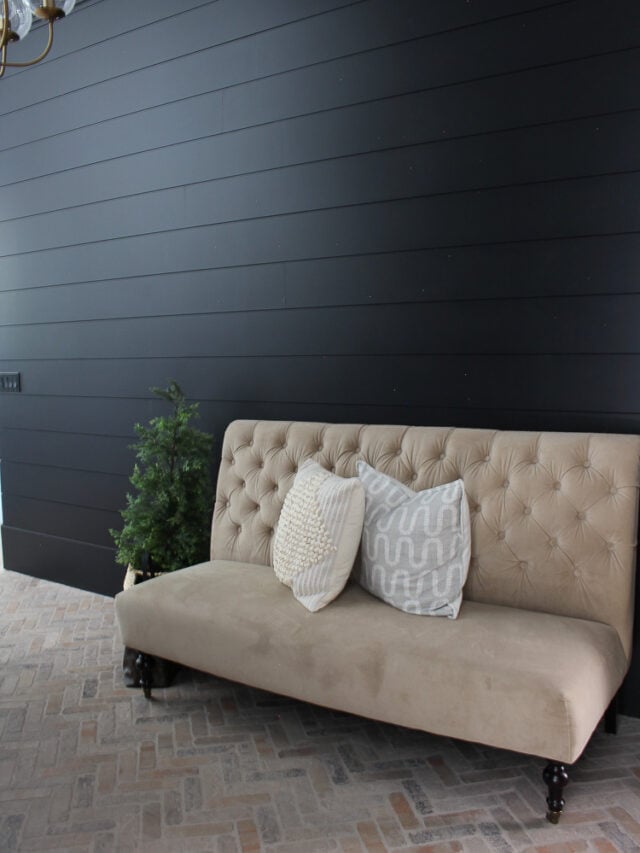
The one caveat with this color is that it can skew quite yellow, so opt for a higher sheen on the walls (I don’t recommend this color in a matte finish, which is what we painted the boys’ shiplap with).
It should be fine during the daytime, but incandescent light may bring out that yellow. In which case, consider switching your bulbs to a cooler daylight variety to combat those yellow undertones.
11. Sherwin Williams Alabaster
Alabaster is a soft, creamy white. It verges almost on the territory of being off-white, but is just light enough to still be considered white.
If you are looking for a warmer white that doesn’t have any of the starkness or coldness or other whites, this may be the perfect choice for you!
12. Benjamin Moore White Dove
Benjamin Mooore White Dove is another soft, warm white. It feels warm and creamy but never comes across yellow.
In bright light, it looks almost like a clean white but with just a hint of softness. White Dove is a popular choice for trim but also makes a beautiful neutral paint color for walls.
Warm whites like White Dove are a great choice for neutral walls because they work well with other warm tones, but equally, work as a beautiful counterbalance to cool tones like blues and greens.
13. Sherwin Williams Creamy
Sherwin Williams Creamy is a stunning cream paint color. It will add a warm, cozy, and inviting feel in your space. It helps make your space look fresh, welcoming, and bright at all times.
If you’re looking for a light, fresh and well, creamy, neutral…this is the right choice for you!
14. Benjamin Moore Navajo White
Another beautiful creamy paint color is BM Navajo White, Similarly to Simply White, artificial light will bring out more of the yellow tones. But don’t let that scare you off!
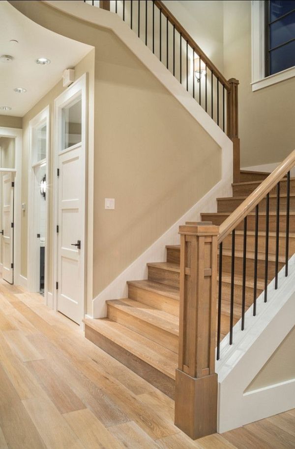
This is a wonderful warm white paint color that can serve as the perfect neutral backdrop for an entire home. It works particularly well in a more traditional home, filled with warm wood tones.
15. Manchester Tan by Benjamin Moore
Beige and tan paint colors are having a moment again in 2024, and I’m happy to see this popular color from the last decade making a resurgence.
Manchester Tan works wonderfully alongside warm wood tones and honey oak. But equally works with bright white trim to clean a warm vibe for any room in your house.
16. Bleeker Beige by Benjamin Moore
Benjamin Moore’s Bleeker Beige is the perfect beige that holds true in sunlight and is subtle and highly adaptable. It can be considered a taupey beige, but it does have just a smidge of gray that stops it from being overly warm.
Bleeker Beige is a great choice if you have a lot of dark wood furniture and white trim. It’s a great neutral that works particularly well in a modern traditional style home, but I’ve seen it work equally well in coastal-style homes paired with lots of navy blue!
Why Neutral Paint Colors Are A Still Popular Choice
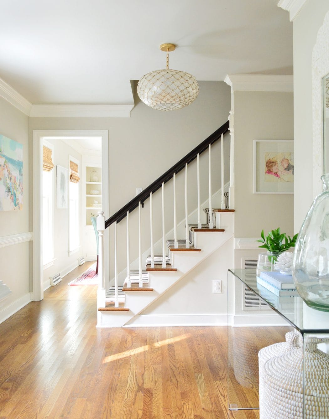
For 2024 neutral paint color trends we are seeing less of the cool grays and stark whites of the past, and more warmth bring brought into interior spaces thanks to warmer grays and greige paint colors, creamy whites, and even shades closer to beige.
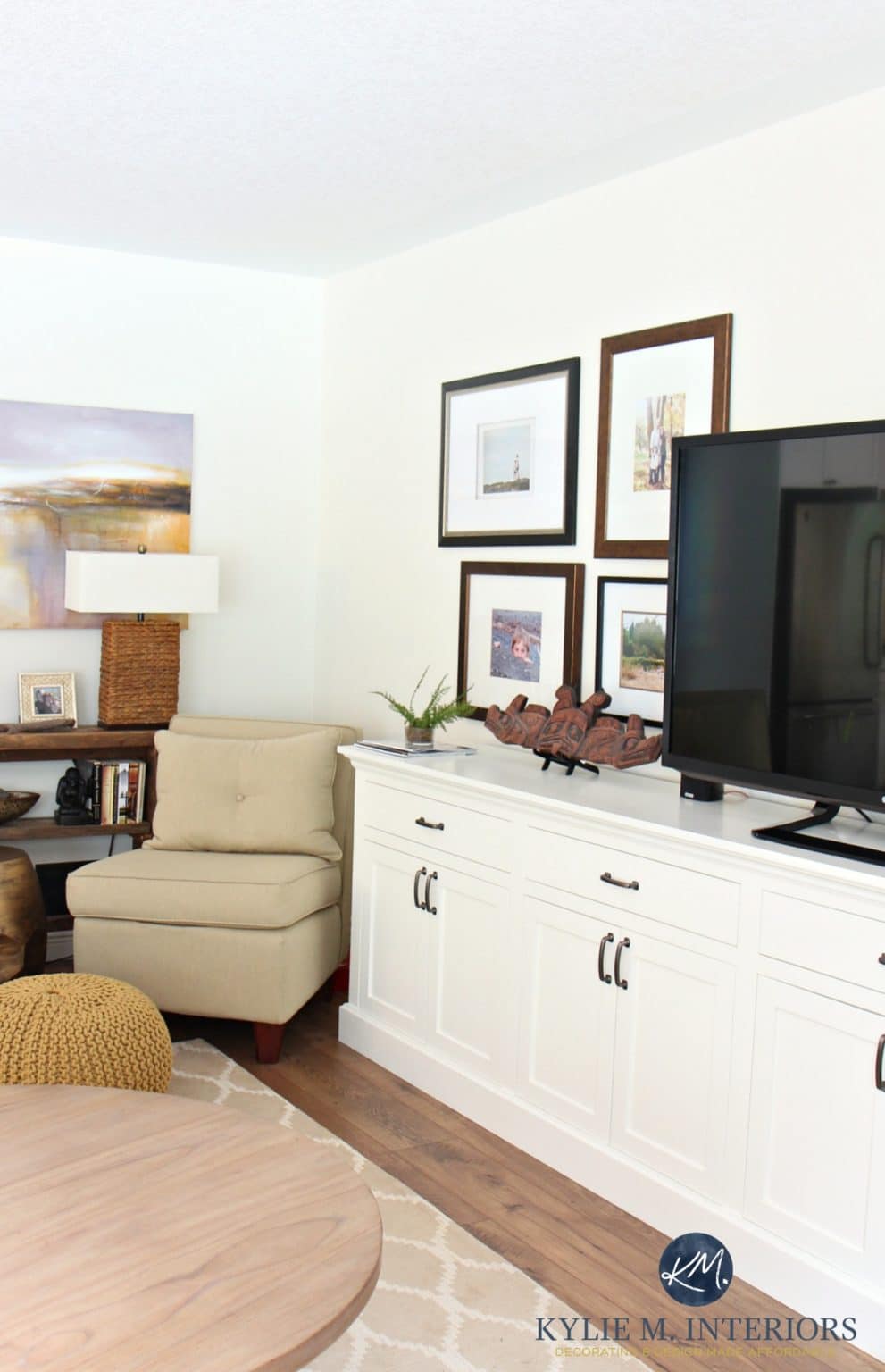
As far as paint colors go, neutral colors remain the most popular wall colors chosen by interior designers in 2024. The neutral color palette of greige, beige, tan, mushroom and grey is a great choice when you want to create an interior with a clean, modern feel.
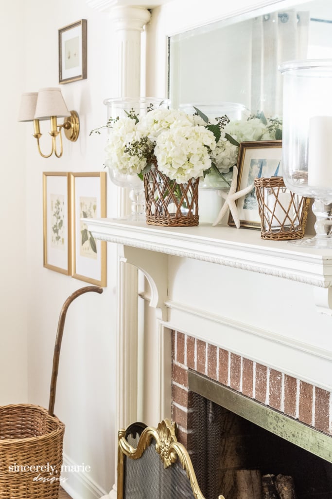
Warm white colors as well as shades of cream are another great choice when you’re trying to achieve a neutral look in your home. The right white paint color (or cream) will look warm, and soothing and play well with modern decor styles too – especially if paired with clean lines and finishes like warm wood furniture.
Neutral wall colors don’t have to be boring, either. The idea is that you’re creating a blank canvas for the rest of your furnishings and accessories to shine. Plus, neutral paint colors on your walls make it easy to change out the rest of the colors in your home should you ever feel the desire to do so.
These paint colors can also work well in both traditional and contemporary settings, making them a versatile choice no matter your decorating style.
Do neutral colors make a room look bigger?
Neutral colors often make a room look bigger and more open.
Lighter neutrals like soft whites, light grays, or beiges can reflect light and give the illusion of more space. They provide a clean, uncluttered look, making the walls seem to recede and the room feel airier.
To enhance this effect, you can add mirrors and good lighting. Using a consistent color palette for walls and large furniture can also help to create a seamless look that expands the space visually.
Can I use neutral paint colors with bold accents?
Yes, you can definitely use neutral paint colors with bold accent colors. Neutral colors like beige, gray, or white provide a calm, versatile background. Adding bold accent colors through items like cushions, artwork, or a feature wall in the dining room can make the space lively and interesting.
This approach allows you to change up your accent colors whenever you want a fresh look without repainting the entire room.
It’s a great way to create a dynamic space that can easily evolve with your tastes.
Think Outside of The Box
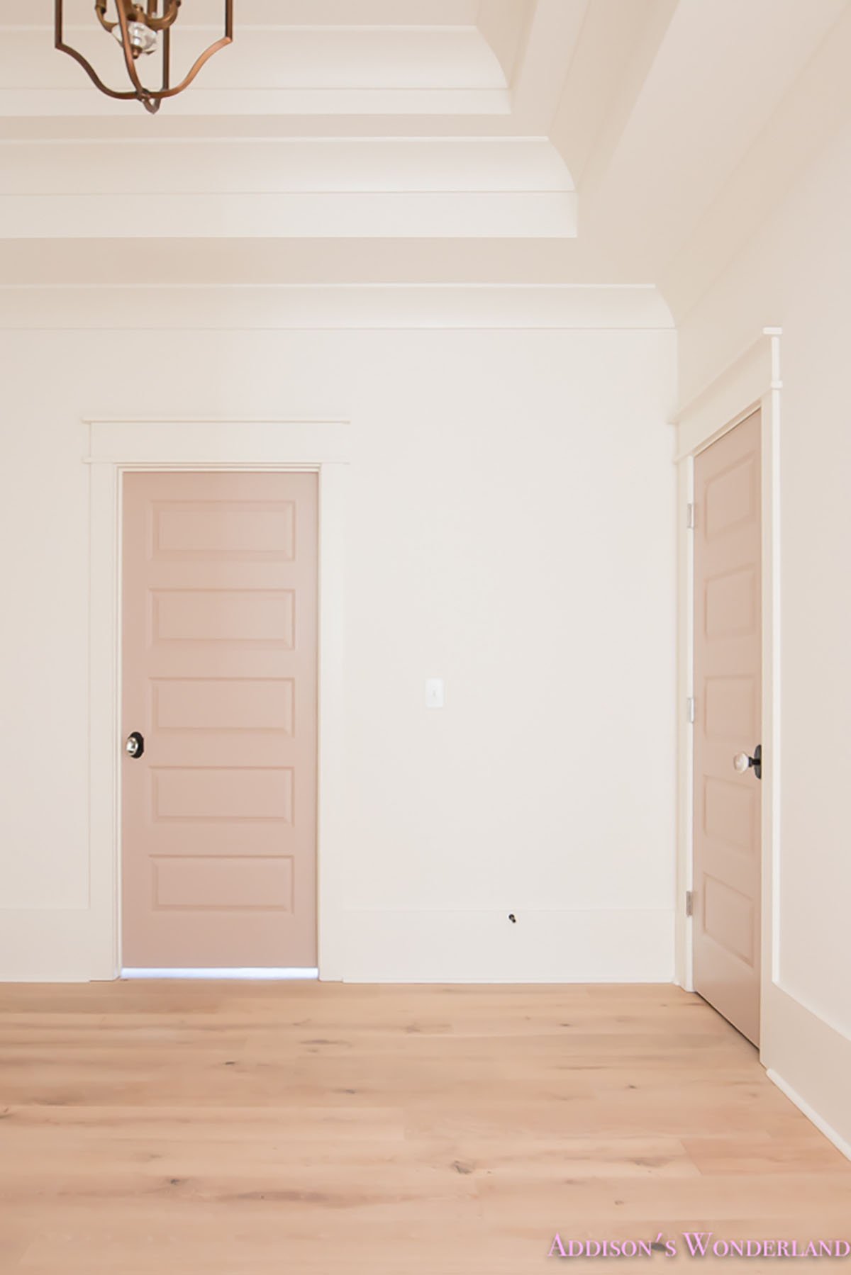
A “neutral” paint color does not have to mean gray, greige, white or beige. In fact, any soft hue of a color can be used as a neutral.
While you may not want your whole house color scheme to be pastel pink, that may serve as a neutral in a little girl’s room. Similarly, a soft blue-gray paint color would be a stunning neutral for a bedroom or bathroom.
Don’t Forget…
Don’t forget – no matter what you’ve read or photos you’ve seen online, it’s really important to sample paint colors in your home before committing!
Samplize provides real paint samples that are easy to move around your home, and cheaper than buying a gazillion paint pots! It’s the only way I buy paint samples.
Final Thoughts
Warm neutral paint colors are more flexible than cooler toned grays, so if you like to decorate with both warm and cool tones, stick with the warm undertones of a greige, beige or warm white.
For best results, be sure to test the paint colors in your home to see how it looks in the light during different times of the day, as well as alongside the other colors you’re choosing to use in the space.
I hope this paint guide has given you some ideas and inspiration as you find the perfect neutral paint color for your home this year.
And remember, don’t let trends dictate how you decorate your home. At the end of the day, your home should be an expression of your personality and unique style! Don’t be afraid to think outside the box and do what feels right for you and your home!
i just painted my entire house in benjamen moore MUSLIM. The living room is Wild mushroom, Are these popular colours for 2024? Are theses neutral colours?
yes! Those warmer mushroom and tan paint colors are huge right now!
Thanks for your post! I’ve picked Wind’s Breath as a whole house color for a beach condo and your blog helped with that decision. Now I’m trying to decide trim color. Leaning toward White Dove? Do you think that’s a good choice?
If you’re looking for a warm creamy white White Dove is a great choice!
I agree, wonderful blog and colour choices. Thank you!
Great information! I’m loving SW Accessible Beige for trim and doors. What white paint would your recommend for the walls? Do you think SW Aesthetic White works? Or do you have a go to white you use with Accessible Beige?
Hello! what would you use for trim with white dove?
I would also use white dove as the trim color in semi gloss, then eggshell on the walls.
Thank you for all the info . Betty appreciate ! Can you please help me to decide what white color paint will go with chantilly lace kitchen cabinets?? I want my entire house in white but us difícil because I want something white neutral . Help me please!!!
If your cabinets are Chantilly Lace then that’s what I would stick with